

UX Buzzwords Visit Planet Honest

Summary: A list of 57 overused buzzwords about user experience and user interface design, together with both their official definitions and what they often mean in real life.
I unabashedly stole this idea from Allie K. Miller: ask ChatGPT to explain overused buzzwords as if we lived on “Planet Honest.” Here’s what it gave me, in terms of overused buzzwords about UX and UI. (I realize that “UX/UI” is an overused term in its own right, but I asked for buzzwords about both acronyms to get broader coverage.)

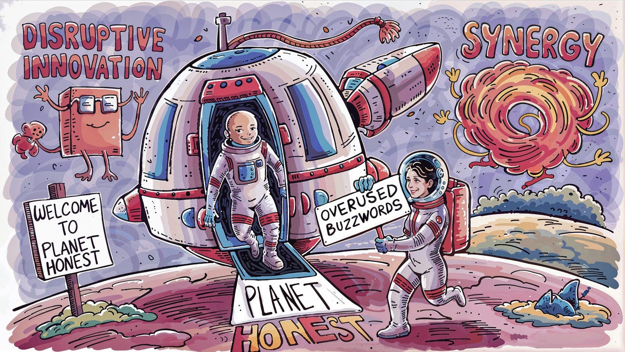
“Ladies and Gentlemen: we are approaching Planet Honest. Hope you enjoy your vacation in this place where everything is exactly as it seems.” (Midjourney)
The following list shows the 57 top overused buzzwords in boldface, as chosen by ChatGPT.
The first definition for each buzzword ChatGPT’s ultra-short explanation of each buzzword, aiming to summarize the standard, or intended, meaning of each term.
The second definition for each buzzword is the revealing “Planet Honest” description that explain what each term means in practice, if we have to be honest.
Accessibility
Usable by all, including disabled
More about compliance than genuine usability
Actionable Insights
Useful findings from data
Rarely as clear or as useful as promised
Aesthetic
Pertaining to visual beauty
Overused to justify pretty over practical
Agile
Methodology for rapid development
Excuse for chaotic work processes
Bandwidth
Capacity to handle work
Overused to excuse delays or lack of responsiveness
Best Practices
Highly recommended methods
Often outdated or not universally applicable
Big Data
Large datasets reveal patterns
Often just a lot of data, little insight
Bootstrap
Start something with minimal resources
Often a glorified term for underfunded
Call to Action
Prompts user to take action
Overwhelmingly everywhere, often pushy
Color Palette
Scheme of colors used
Often too rigidly adhered to
Conversion Rate
Percentage of user desired actions
Obsessively tracked but often manipulated
Dark Mode
Dark-themed user interface
Trendy but sometimes just a battery saver
Deep Dive
Thorough examination
Usually just a longer meeting than necessary
Empathy
Understanding users' feelings, needs
Often feigned to impress stakeholders
End-to-End
Covering all process stages
Seldom truly covers every step
Engaging
Captures and holds attention
Usually means just visually appealing
Figma
UI design and prototyping tool
The new must-use, trendy software
Flat Design
No shadows, textures, gradients
Often too simplistic, lacks depth
Gamification
Applying game elements to apps
Makes boring tasks superficially interesting
Grid System
Structure for layout precision
Rigorously used until it's suffocating creativity
Hamburger Menu
Three-line menu icon
Ubiquitous to the point of user annoyance
Hero Image
Large banner image
Overused to the point of cliché
High Fidelity
Detailed, close to final design
Often a premature commitment to a design
Holistic
Considering the whole system
Used to describe vague, all-encompassing strategies
Infinite Scroll
Never-ending page content
Leads to endless distractions
Innovation
Something new and effective
Often just old wine in new bottles
Intuitive
Easy to understand and use
Usually means missing user manual
Iterative
Process improving in cycles
Often an excuse for releasing unfinished products
Journey Mapping
Visualizing user's experience
Rarely actionable, often just a pretty picture
Leverage
Use something to maximum advantage
Mostly means exploiting whatever's available
Low-Hanging Fruit
Easy tasks to accomplish first
Often underestimates the complexity of "easy" tasks
Material Design
Visual language from Google
Becoming the generic face of apps
Microinteractions
Small, interactive design elements
Overemphasized for minor delights
Minimalist
Simple, clean design focus
Sometimes just an excuse for lack of features
Mockup
Model of final design
Confused with prototype, misleads expectations
Mood Board
Collection of style inspiration
Often a procrastination tool rather than useful
Onboarding
Introduction for new users
Overly long, tests user patience
Pain Points
User problems needing solutions
Overdramatized to push solutions
Parallax Scrolling
Background moves at slow rate
Gimmicky and often irrelevant to user experience
Persona
Fictional users guide design
Often overly stereotyped, not representative
Pixel Perfect
Extremely precise design alignment
Obsessive detail that users never notice
Responsive
Adapts to user's screen size
Expected standard, nothing special anymore
Responsive Design
Works on any device smoothly
Expected standard, not a perk
Scalability
Ability to grow without limits
Seldom as seamless as claimed
Seamless
Transition without interruption
Rarely as smooth as advertised
Skeuomorphism
Digital objects mimic real life
Outdated, though sometimes nostalgic
Splash Screen
Initial screen of app
Annoying barrier to app content
Storytelling
Using narrative for engagement
Sometimes just a way to sugarcoat data
SVG (Scalable Vector Graphics)
Scale without quality loss
Overused without considering performance
Synergy
Combined efforts create value
Overused in meetings to sound smart
Touchpoint
User interaction moments
Used to make mundane interactions sound strategic
Typography
Art of arranging type
Obsessed over but often illegibly small
User Flow
Path taken by user on site/app
Simplified to the point of unrealistic
User-Centered Design
Design focusing on user needs
Overpromised, underdelivers on actual needs
White Space
Empty, unmarked design space
Sometimes there's just too much emptiness
Wireframe
Low-detail outline of interface
Often too rigid, limits early creativity
I did not edit a single one of these descriptions, whether the “standard” (supposed) meaning of each buzzword or the “Planet Honest” description. Honest: everything is reproduced here exactly as it was generated by ChatGPT from my prompt.
Everything that AI knows, it learned by reading the Internet. Thus, the “honest” descriptions are derived from the collective complaints of thousands of UX practitioners writing blog articles, X posts, and so forth about how these buzzwords worked for them in their projects.
I have to say that the Planet Honest versions ring true. I have never liked trendy buzzwords, partly because they are often just so much vocabulary inflation and don’t add much compared to older terminology.
You can hide a lot under a thick layer of fancy words, but clarity wins the day.
Welcome to Planet Honest. You should visit more often. (Ideogram)
About the Author
Jakob Nielsen, Ph.D., is a usability pioneer with 41 years experience in UX and the Founder of UX Tigers. He founded the discount usability movement for fast and cheap iterative design, including heuristic evaluation and the 10 usability heuristics. He formulated the eponymous Jakob’s Law of the Internet User Experience. Named “the king of usability” by Internet Magazine, “the guru of Web page usability” by The New York Times, and “the next best thing to a true time machine” by USA Today.
Previously, Dr. Nielsen was a Sun Microsystems Distinguished Engineer and a Member of Research Staff at Bell Communications Research, the branch of Bell Labs owned by the Regional Bell Operating Companies. He is the author of 8 books, including the best-selling Designing Web Usability: The Practice of Simplicity (published in 22 languages), the foundational Usability Engineering (27,172 citations in Google Scholar), and the pioneering Hypertext and Hypermedia (published two years before the Web launched).
Dr. Nielsen holds 79 United States patents, mainly on making the Internet easier to use. He received the Lifetime Achievement Award for Human–Computer Interaction Practice from ACM SIGCHI and was named a “Titan of Human Factors” by the Human Factors and Ergonomics Society.
· Subscribe to Jakob’s newsletter to get the full text of new articles emailed to you as soon as they are published.
· Read: article about Jakob Nielsen’s career in UX
· Watch: Jakob Nielsen’s 41 years in UX (8 min. video)