Summary: Optimal AI benefits require an architectural shift in UX to transition from AI-enhanced add-ons to foundational AI-centric designs. Redefine. Reimagine. Reconstruct.
More companies have started to release products with built-in AI, but mostly in the form of AI enhancements to existing workflows. The biggest gains in both usability and customer value are likely to come from completely new products that rethink the workflow and create new user experiences from the bottom up that don’t just have AI added but are created around the capabilities offered by AI.
As equivalent examples from recent history, the best websites didn’t come from porting printed publications and adding a search feature. Similarly, the best mobile services didn’t come from morphing existing websites into responsive designs but from creating new products, such as having a car service pick you up at your current location.
Easily said, but what do we mean by AI-native products and workflows? Olivia Moore from A16Z presented a good set of ideas in a recent video. Of course, my discussion in this article is my own interpretation so don’t blame Moore if you don’t agree. Do watch the video for her original insights.
(As an aside, the fact that I’m basing a UX article on a venture capital video instead and not on papers and articles by UX people is yet another indictment of the lack of deep engagement and poor quality of thinking about AI that continues to characterize the UX field. It’s as if most UXers are happy to see the future being built without them because they can’t be bothered working on AI.)
Moore points out that legacy products will have difficulties creating completely new AI user experiences because their current customers depend on the existing features and workflows of the old products. Legacy vendors can’t just rip those features and replace them with fully new workflows. Similarly, Google’s business model has impeded them from completely pivoting from a search engine to an answer engine like Perplexity. Their half-hearted attempts have thus failed so far, despite Google having many times more AI engineers and UX designers than Perplexity.
This reasoning supports the likelihood that new AI-native startups will disrupt many existing legacy software providers.
1. Filling in the Blank Page
As her first example of an AI-native feature, Moore mentions getting rid of the blank page or empty object that’s the default starting point for traditional applications. Countless hours have been lost to writer’s block as users stare at such blank pages. Instead, most AI-native tools, whether Uizard’s Autodesigner or Midjourney’s image creator allow you to get a complete starting point with a few words of prompting. Revising or editing such a first draft is much easier than creating from scratch with nothing but a blank page to guide you.
Blank page! What to do, how to start? Time is ticking! So frustrating. (Midjourney)
AI’s initial attempt to fill in the blank page is rarely enough. But it gets you started and often saves substantial time.
2. Iteration
Since it’s a given that AI’s first attempt won’t be exactly what you want, an important element in AI-native workflow is support for iteration. This should go beyond traditional command-based user interfaces and utilize the intent-based outcome specification that characterizes good AI usability.
Midjourney has several good examples:
Image variations with either minor or major changes
Inpainting specific parts of an image. For example, the above image of the blank-page syndrome didn’t initially feature a blank page, but rather showed a notebook with drawings. I selected the offending area of the image and reprompted for it to be inpainted with a blank page.
Pans and zooms.
Similarly, Udio allows you to select a part of a song and ask for it to be changed.
Keep iterating, moving, and possibly changing directions. Good AI products natively support this process and allow users to specify what they want changed, not how to accomplish those changes. (Midjourney)
3. Refinement and Upscaling
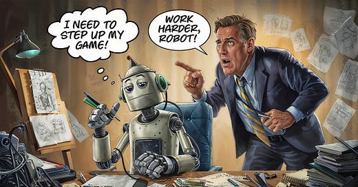
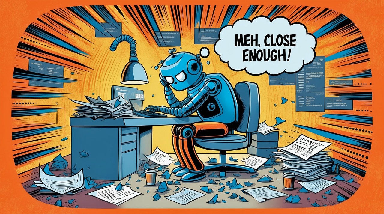
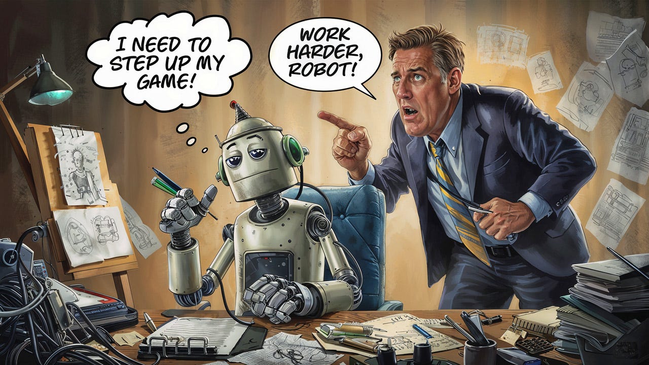
Besides iteration, Moore also mentioned the need for refinement and upscaling as part of a native AI workflow. For these steps, the user is satisfied with the basic creation but wants to improve it. More refined, detailed, or otherwise polished. This is not a matter of changing direction, but of lavishing more resources on the same basic thing. Something we can do with AI: work harder, you lazy robot!
Don’t let AI get away with mediocre work. Make it work harder and produce a refined, upscaled version. (Leonardo)
If you ask, AI can often step up its game and produce a more polished version of the deliverable. (Ideogram)
Most AI image tools (though not Ideogram at present) have an upscale function. Leonardo’s doesn’t just add resolution but can also often make the image more beautiful if you ask. (It has a parameter for how closely to hew to the original lower-resolution image when upscaling.) Our challenge in UX is to discover the equivalent of upscaling or beautifying for other data types.
4. Multimodal UX
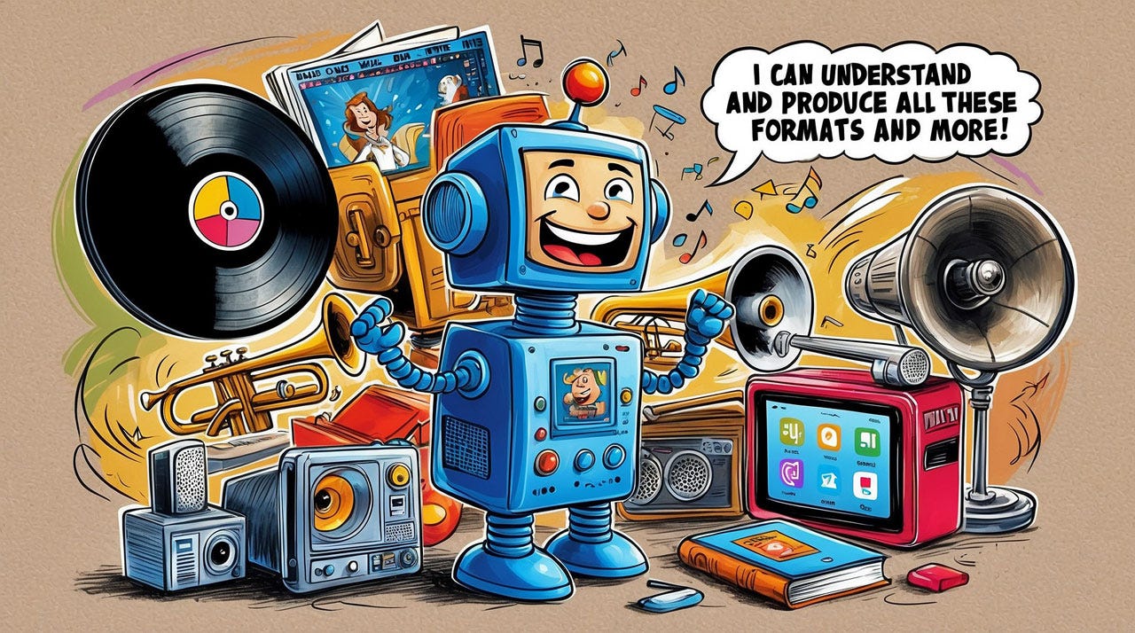
One of Moore’s other examples of AI-native UX is the multimodal system that understands and combines many media formats, often text, images, video, and audio (including speech and music). ChatGPT 4o (where “o” stands for “omni”) is a classic example, though many of its media capabilities aren’t shipping at the time of writing. However, the demos clearly show native capabilities to understand and combine the many modalities that would have been manipulated in separate applications before AI.
This multimodal capability allows ChatGPT 4o to engage in more natural and human-like conversations, seamlessly switching between input and output formats. For example, a user can upload an image and ask a question about it, and ChatGPT-4o can respond with a text or audio answer.
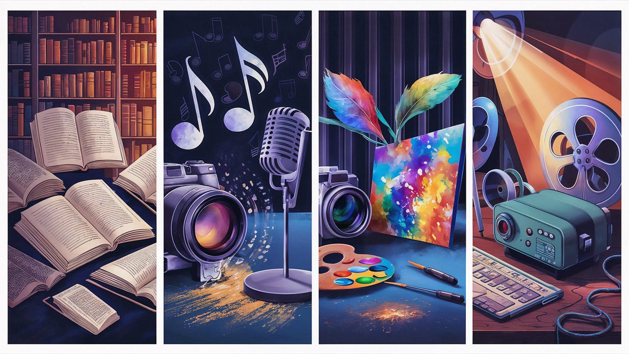
OK, sometimes current AI doesn’t fill in the blank page well. This was Midjourney’s first attempt to illustrate the single-word prompt “multimedia.”
Leonardo did better.
Ideogram’s visualization of multimedia.
AI does better with multimodal interaction because it can understand and interpret the many different formats, meaning that it can serve as an integration mechanism for previously separate media formats.
5. Remixing
Moore’s final idea for AI-native workflows is to support remixing. As she puts it in the video, “you can take anything and instantly make it something else; put your own spin on it.”
Remixing. (Midjourney)
AI can transform and blend seemingly disparate objects because it understands the nature of the initial object(s) and the nature of the changes the user is asking for. AI can understand objects as a whole and apply global transformations. It also understands smaller elements and can change them one at a time. For example, you can ask for a cartoon to be more humorous or a song to be moodier, but you can also ask for a single stanza to be changed. You can ask for a monkey to have a famous person's face or be rendered in the style of 17th-century Dutch portrait paintings. Ovid would have had a heyday.
The Roman poet Ovid wrote the famous book “Metamorphoses.” He would have loved AI: if you can think up a story about Daphne being transformed into a laurel tree, you can make that animation in a minute. (Leonardo)
Human languages are just one element in this AI-driven remixing, but an important one in our globalized economy. AI can effect a wholesale transformation of something from one language, say English, to one or more other languages, say French, Chinese, and Arabic:
Uizard’s Autodesigner 2 can translate a full UI prototype into other languages. This type of AI remix will facilitate a substantial increase in international usability studies. (Leonardo)
As I have done before, we can ask for an article to be summarized and transformed into Haikus. Here you go, for another take on the present article:
Old tasks, slightly eased,
AI sprinkles on the top,
True change lies deeper.
No more empty space,
AI fills the void with form.
Iteration starts.
First attempts are rough,
But AI can then refine,
Polishing its work.
Remix anything,
Add your own creative spin,
AI empowers.
Embrace the unknown,
Shape the future with AI,
UX, find your voice.
AI as Haiku master: it can remix an article into a poem. (Leonardo)
As another example, I took my article on future-proofing education in the age of AI and remixed it into a song and music video (YouTube, 2:33 min.): I made the soundtrack with Suno and the animations for the video with Luma Dream Machine, based on a still image (shown below) originally made with Ideogram and then upscaled to 4K with Leonardo. (Watch my music video to the end for a bit of a nasty surprise when Luma Dream Machine lost it. I kept this clip in my video to show the limits of current AI.)
Obviously, we’ll want all these steps integrated into a single AI-native workflow rather than having to piece together a solution from several best-in-class AI tools specializing in individual media forms. The problem is that AI is still so relatively poor at creating high-quality content that one does need to use several best-in-class products to achieve a good-enough result. (Compare with the music video I made for the same song using Runway for the animation. Not as good as the Luma Dream Machine animation.)
The current generation of AI remixing is great at emergent storytelling, where parts of the transformation happen without explicit user instruction. For example, in my new music video, I prompted Luma Dream Machine to zoom out for one of the cuts, and it took it upon itself to zoom way out in a drone shot and then pan 180 degrees to show the audience (which was not present in the image I used for image-to-video generation.)
Of course, sometimes the AI is too emergent and makes story elements the creator doesn’t want. But then it’s a simple matter of either not using them (leaving those video cuts on the virtual cutting room floor) or inpainting them with a new iteration. AI remixing empowers highly niche multi-format creators (can it be more niche than making a UX song?), leading to a new era of reconceptualized authorship.
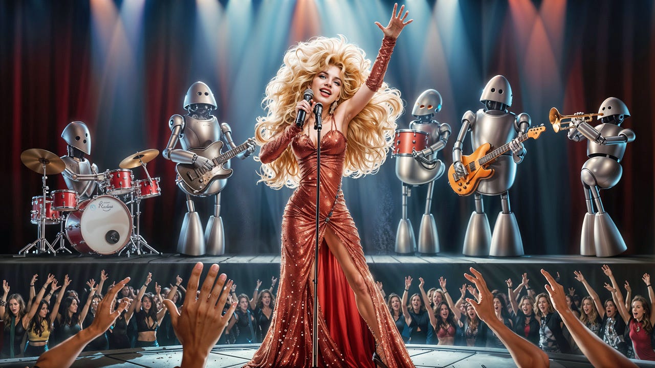
AI as songwriter-singer: it can remix my article into a song and then perform it. (Ideogram)
6. Guided Exploration
This last point was not in Olivia Moore’s video, but I'll cover it here since it’s a good match for the 5 principles she mentioned.
AI can help users’ creativity by suggesting likely directions for further exploration. This is an extension and combination of the blank page, iteration, and remix workflows Moore discussed.
Since AI understands both the global main concept of the user’s current work object and the details of specific elements, it can use its universal knowledge of past human work to suggest a small number of possible enhancements or modifications. Examples include:
Reduce the required reading skill level needed to easily understand the current text, given the known reading skills of your usual target audience. If the user accepts this suggestion, AI can rewrite the entire document for the preferred reading level. (This article has a 10th-grade reading level, which is easier than the 12th-grade reading level I usually target, given my highly intellectual audience. However, I will refrain from rewriting the text to make it more complicated since users never like that.)
Change the style of an image.
Insert or remove a character or element in an image.
Change the pacing of a video.
Change the setting for a video. (This last feature is included in Runway version 3.)
The AI can suggest some instead of having the user think up ideas for modifications or new directions. Recognition beats recall, also in creative tasks. The user is not limited to accepting the AI suggestions: often, seeing 5 ideas will spark a 6th.
Signs pointing in different directions can give you ideas for places to go. (Midjourney)
Using the 6 AI-Native Workflows in Design
When designing a product that uses AI, make a point of using the 6 AI-native workflows in this article as a checklist for design ideas. You probably won’t include all 6 in a single product, though you certainly may. It is guaranteed that more AI-native workflows will emerge in the future as more good UX specialists start working on designing and researching AI products, and when this happens, add them to your checklist.
Checklists are one more application of the heuristic of recognition over recall. Even if you know all the workflows, you’re less likely to forget one of them if you use a checklist.
When exploring how to design an AI product, make sure to go through the checklist of 6 AI-native workflows in this article and consider whether they would be useful for your users. (Midjourney)
Olivia Moore descended from the lofty heights of VC investment to bring us boulders with commandments for native AI workflows. Actually, these are not commandments to necessarily do something, but commandments to consider each of these workflows when designing a new AI-native UX. Note that the right boulder has room for many more concepts yet to be designed. (Leonardo)
About the Author
Jakob Nielsen, Ph.D., is a usability pioneer with 41 years experience in UX and the Founder of UX Tigers. He founded the discount usability movement for fast and cheap iterative design, including heuristic evaluation and the 10 usability heuristics. He formulated the eponymous Jakob’s Law of the Internet User Experience. Named “the king of usability” by Internet Magazine, “the guru of Web page usability” by The New York Times, and “the next best thing to a true time machine” by USA Today.
Previously, Dr. Nielsen was a Sun Microsystems Distinguished Engineer and a Member of Research Staff at Bell Communications Research, the branch of Bell Labs owned by the Regional Bell Operating Companies. He is the author of 8 books, including the best-selling Designing Web Usability: The Practice of Simplicity (published in 22 languages), the foundational Usability Engineering (27,141 citations in Google Scholar), and the pioneering Hypertext and Hypermedia (published two years before the Web launched).
Dr. Nielsen holds 79 United States patents, mainly on making the Internet easier to use. He received the Lifetime Achievement Award for Human–Computer Interaction Practice from ACM SIGCHI and was named a “Titan of Human Factors” by the Human Factors and Ergonomics Society.
· Subscribe to Jakob’s newsletter to get the full text of new articles emailed to you as soon as they are published.
· Read: article about Jakob Nielsen’s career in UX
· Watch: Jakob Nielsen’s 41 years in UX (8 min. video)








Congratulations on your hounors young Titan! A true leader and pioneer! UX❤️AI
Love this check list!