UX Roundup: AI in Mathematics | Mainstreaming Usability | Sparkles Emoji | Changing E-Commerce Guidelines | SFTechWeek Event
Summary: AI makes mathematics research more scalable | Usability has entered the mainstream | Sparkles emoji as the icon for AI in user interfaces | Changes to e-commerce usability guidelines | SFTechWeek event last week
UX Roundup for October 14, 2024. (Leonardo)
Happy Columbus Day! (Midjourney) Of course I know that the Siberians walked across the Bering Land Bridge between Asia and America 20,000 to 40,000 years before Columbus, and even my own Viking ancestors beat Columbus in sailing from Europe to the New World. But Columbus gets the credit for bringing knowledge of the discovery back to the Old World and making it widely known. Knowledge dissemination is as important as knowledge discovery if you want to effect change.
Also happy Leif Erikson Day, which appropriately was celebrated a few days before Columbus Day, on October 9. (Midjourney) Leif was first European to reach America, about 500 years before Columbus: he gave it the name Vinland which was promptly forgotten. However, if we are to celebrate a Viking, I would pick Erik the Red who discovered Greenland around 985 and gave it the name that’s still used. (And yes, Greenland was green back then due to a period of global warming. The name wasn’t just a marketing ploy to attract settlers.) Leif was Erik’s son, as indicated by his patronymic, so it was clearly an exploring family.
AI Makes Mathematics Research Scalable
Terence Tao presented a lecture on The Potential for AI in Science and Mathematics as part of Oxford University’s Mathematics lecture series (YouTube, 53 min. video). Tao is supposedly the world’s leading mathematician, but in true professor style, his presentation style is not very compelling. I only recommend watching the video if you are incredibly interested in the topic.
Tao is bullish on the potential for AI to advance math and science, particularly in making tedious research steps more efficient. He stated that it’s not a big problem that current AI often produces false proofs, because you can feed an AI-generated proof to another AI specialized in checking proofs. (It’s much easier to check an existing math proof and pinpoint a flaw than to come up with an original proof in the first place.)
AI can accelerate advanced research in theoretical mathematics by quickly processing many ideas. Another AI can check the first AI’s proofs and identify any errors. (Midjourney)
I particularly interesting point that I have never heard discussed elsewhere is that AI makes scientific collaboration more scalable in mathematics. Traditionally, mathematics has been a rather solitary discipline (contrary to almost all modern hard sciences) where, at most, one can have about 5 mathematicians collaborate. Any more, and collaboration breaks down.
The problem is that each mathematician on a team needs to understand all the contributions made by any of the other collaborators. That means that any time somebody proposes a contribution, the other 4 mathematicians must spend considerable time understanding that contribution. (Which is not easy at the cutting edge of advanced math.) This doesn’t scale, and at a very small number of colleagues, each mathematician spends so much time trying to understand the contributions of the other collaborators that he or she has no time left to create additional insights.
Tao presented a case study (that I can’t claim to understand in detail) where AI assistance was able to reduce this collaboration overhead sufficiently that he was able to lead a team of 20 mathematicians to produce a result.
While the specifics of academic math at the highest level are unusual, it is important for us to consider how similar effects can generalize to other fields. Most current work on using AI for productivity and creativity has focused on individual knowledge workers, but the potential for accelerating team efforts is even bigger.
Traditionally, mathematicians could not scale research collaboration beyond a very small team size, especially compared with the hundreds of scientists that collaborate on advanced physics. More mathematicians can be brought onto a project with AI help, which bodes well for the general hope of using AI to accelerate team processes. (Ideogram)
Usability Has Gone Mainstream
While watching Terence Tao’s lecture (see preceding news item), it struck me that he frequently employed the term “use case,” which used to be a rather specialized concept in product management and usability. It’s hard to imagine anybody further removed from product design than the world’s leading theoretical mathematics professor. And yet he freely (and correctly) used our terminology.
The concept of use cases was first introduced by Ivar Jacobson in 1986, and I remember learning about it when Jacobson and I both participated in an elite workshop organized by IBM Research around 1992 about methods for creating encapsulated descriptions of how people use computers. Back then, a few years after Jacobson had invented the “use case” concept, it was esoteric and the topic of debate at a meeting of the world’s leading user interface researchers. Now, it’s commonplace and used by mathematicians.
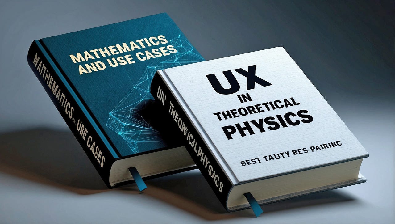
Two textbooks you’ll never see. And yet, UX terms and concepts are now employed far beyond our field. (Leonardo)
I view this example as a demonstration of the broader point that usability has gone mainstream. In some ways, we’ve won, and people from other disciplines now accept our main ideas as good and reasonable goals. (Of course, product usability still isn’t good enough, but that’s more because there’s still work to be done than because other disciplines reject us the way they did in the 1980s and 1990s when we faced severe adversity.)
Today’s design professionals can confidently bring our message to the world, knowing that other disciplines are receptive. This is infinitely better than the oppressive situation when I started in the field. (Ideogram)
Another example is that when The New York Times published a profile of me in 1998, the headline read Making Web Sites More 'Usable' Is Former Sun Engineer's Goal, complete with scare quotes around “usable” (and scare quotes were also applied to the word “usability” in the body of the article). I actually think the Times’ editors made the right call, because I remember always having to explain to people what I did. But for the last 10 years or more, I can simply say, “I’m in UX,” and people know what it means.
Making computers and humans work better together used to be an esoteric topic for a few thousand weirdos like me. Now, it’s mainstream. Good. (Ideogram)
The “Sparkles” Emoji (✨) Representing AI
The Wall Street Journal had a fun article about how the “sparkles” emoji ✨ has become the standard way to represent AI features in a user interface. (Subscription required.)
They traced the sparkles back to 1990 when Adobe used it for Photoshop's “magic wand” tool. Back then, I doubt that the magic wand was AI-powered, but apparently it seemed magic enough to warrant those sparkles.
For actual AI features, the WSJ credits Jasper with the first use of sparkles in 2021. Three years later, and this icon is everywhere.
In fact, it’s so ubiquitous that some designers have already simplified to remove the two small stars and only show a single large four-pointed star to symbolize an AI feature. I dislike this simplification since the original emoji is simple enough already. Jakob’s Law explains the benefits of using the same icon everywhere.
The “sparkles” emoji has become the standard UI representation for AI features. (Leonardo)
Icons can be classified as one of three types, depending on how literally they represent the underlying concept they refer to:
Resemblance Icons directly depict or represent a physical object. They have a clear visual similarity to what they represent, making them easily recognizable.
Reference Icons use analogies or metaphorical connections to represent actions or concepts. They don’t directly depict the object, but leverage our understanding to convey meaning.
Arbitrary Icons have no inherent meaning or resemblance to what they represent. Their meaning is learned through repeated exposure and association.
Generally, the closer the match between the icon and the object, the easier the icon is to understand. For example, using a robot to represent AI is a reference icon. (A robot icon that represents robots would be a resemblance icon.)
The 3 basic types of icons: Resemblance icon (using an envelope to represent mail), reference icon (using a stylized heart shape to represent a human heart which again represents love or liking), and arbitrary icon (using a star to represent a rating scheme). Leonardo.
The sparkles are somewhere between reference icons and arbitrary icons. Sparkles are supposedly emitted by magic wands when doing magic, so they would be a true reference icon for the concept of magic. (A picture of a wizard would be a resemblance icon.) But AI is not magic, so sparkles have too indirect a connection with AI to be a true reference icon.
I guess the point is that many people currently think of AI as being magic, following Clarke’s Third Law. Named after science fiction author Arthur C. Clarke, this law states, “Any sufficiently advanced technology is indistinguishable from magic.” Right now, AI is that advanced for many people, but I guess that soon enough, it’ll become ordinary and expected. When this happens, the sparkles will have become a purely arbitrary icon for AI.
Will sparkles still be used by then? Possibly, because users will have become accustomed to this icon, in the same way people have no problem recognizing a floppy disk icon as meaning “save,” even though the floppy died decades ago.
On the other hand, it’s also likely that the need for a special “AI” icon will vanish because AI will be so tightly integrated with all software features that it will be meaningless to call them out.
Changes To E-Commerce Usability Guidelines
I’ve said this before, but the Baymard Institute is the world’s leading expert on e-commerce usability, based on the extreme amount of user research they’ve conducted across an immense number of retail sites. In fact, I would classify them as one of the top two UX consulting firms in the world right now. (The other top-two UX expert firm is MeasuringU which specializes in quantitative UX metrics. Of course, there are many, many more top UX design firms, from Frog on down, as well as generalized UX firms like the UX Design Institute, which is a good place to get general training and a diploma in UX. But in terms of focused expertise on an important UX topic, Baymard and MeasuringU are unparalleled.)
Recently, Baymard released its updated design guidelines for finding products on an e-commerce site. The task of finding products is one of the top three issues in e-commerce design since if the customer can’t find the product, then the customer can’t buy the product. Anything else is irrelevant! (The other top issues are shopping cart abandonment vs. checkout — because of the importance of actually separating customers from their money — and the product descriptions themselves, since it’s even more important to convince users that your products are worth buying.)
Making it through the maze until the point where the user has completed a purchase involves many design steps, each with their own UX guidelines. However, finding the product comes first: if the customer can’t find the product, the customer can’t buy the product. And it won’t matter how compelling the product description is or how easy the checkout process is. (Midjourney)
For this update round, Baymard conducted 219 qualitative usability test sessions. It’s important to recognize that these 219 tests are on top of all the many earlier sessions they have conducted during the preceding decade since they started conducting user research on e-commerce in 2013.
Taking a new close look at the design guidelines for e-commerce usability (Leonardo)
I’ve been involved in researching the same design problem many times, and when you keep studying a problem, you gain deeper and deeper insights. Your first study will find the big and glaring issues, which is why I always recommend just getting started right now if you’ve never done user testing. You’ll find a lot of important issues immediately.
But the second (and subsequent) time you study the same thing, you already know many of the issues to look for. It’s so much easier to check for something you know than to discover something completely new. Thus, you don’t spend many resources on following up on the old insights to see whether they have changed or whether there are new nuances to add to your existing knowledge. This means that you have research resources to spare to look for new things, which is why your knowledge accumulates with repeated research.
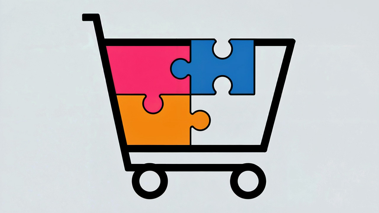
Every time you conduct more user research on the same problem, you gather more puzzle pieces for a complete understanding of how to best design within that domain. (Ideogram)
(The reason this accumulation works is that most usability insights don’t change much from year — or even from one decade to the next. UX Is People, and usability insights are based more on human characteristics than technology. Humans don’t change.)
UX Is People (Ideogram)
Baymard lists 6 old usability guidelines that have now changed based on the new research:
Have a feature for users to modify the number of “items per page” in product listings. Don’t expect heavy use of this feature, but it helps users who want it.
Use “quick views” for visually-driven products (such as fashion), but avoid “quick views” for spec-driven product types.
Use pagination for long lists. (They still recommend infinite loading as an alternative, which I don’t.)
Intermediary category pages are now optional for sites facing IA difficulties implementing subcategories. Subcategory pages are still beneficial to users when the subcategories make sense and can be cleanly presented.
“Shop” or “Products” top-level navigation are no longer counterindicated on desktop. They do add an extra navigational layer and should be avoided on mobile. I can see how websites that provide substantial content besides pure shopping can benefit from this top-level nav, even at the cost of an extra click. (Remember that the number of clicks is less critical for usability and conversion than the clarity of each of the clicks.)
Vertical sidebar filtering is now preferred over horizontal filtering toolbars.
Baymard also added 24 new design guidelines for product finding, but they’re keeping those insights for their paying customers. Fair enough. Somebody’s gotta pay for all the work going into this research.
User research is the foundation for selling online. Good to see that we’re still gaining insights into this important area of UX. (Ideogram)
SFTechWeek Event Last Week
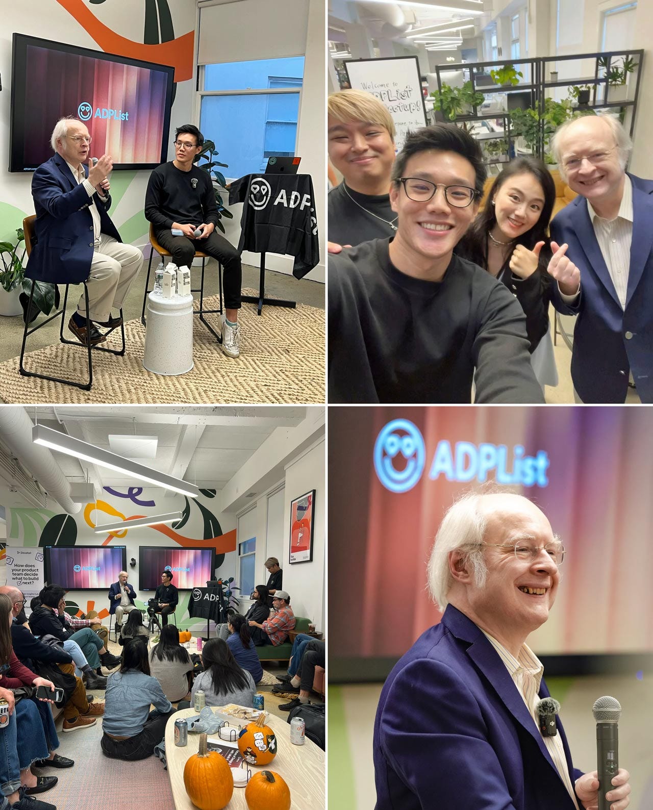
I spoke at an event with Felix Lee (head of ADPList) hosted by ADPList and sponsored by Dovetail (thank you, DT!) last week at the Dovetail building in San Francisco. Funky HQ, as one expects from a leading software company these days. Made for a nice event venue.
I was happy to see Dovetail describe itself as an “AI-First company.” Bodes well for the future of their product, which has always been useful for user researchers. Anybody who’s not AI-first will not have a future in product design or usability.
More than a thousand people had registered for free event tickets, but unfortunately the space (nice as it was) only held a few hundred, so most had to be turned away. (Some people tried to gate crash, but security was tight enough to prioritize people with actual tickets.)
Luckily, the session was recorded, so stay tuned to the ADPList YouTube channel for the video. (You might as well subscribe; they have a lot of other great videos. Julie Zhou was my favorite so far.)
I must have posed for at least a hundred selfies that evening: very enthusiastic crowd. Here are some photos:
Event photos courtesy of Yan Liu (Microsoft Principal Product Designer, the woman next to me in the selfie in the upper right) and Vikram Sri Nitesh Tantravahi (Salesforce Senior Product Designer).
About the Author
Jakob Nielsen, Ph.D., is a usability pioneer with 41 years experience in UX and the Founder of UX Tigers. He founded the discount usability movement for fast and cheap iterative design, including heuristic evaluation and the 10 usability heuristics. He formulated the eponymous Jakob’s Law of the Internet User Experience. Named “the king of usability” by Internet Magazine, “the guru of Web page usability” by The New York Times, and “the next best thing to a true time machine” by USA Today.
Previously, Dr. Nielsen was a Sun Microsystems Distinguished Engineer and a Member of Research Staff at Bell Communications Research, the branch of Bell Labs owned by the Regional Bell Operating Companies. He is the author of 8 books, including the best-selling Designing Web Usability: The Practice of Simplicity (published in 22 languages), the foundational Usability Engineering (27,599 citations in Google Scholar), and the pioneering Hypertext and Hypermedia (published two years before the Web launched).
Dr. Nielsen holds 79 United States patents, mainly on making the Internet easier to use. He received the Lifetime Achievement Award for Human–Computer Interaction Practice from ACM SIGCHI and was named a “Titan of Human Factors” by the Human Factors and Ergonomics Society.
· Subscribe to Jakob’s newsletter to get the full text of new articles emailed to you as soon as they are published.
· Read: article about Jakob Nielsen’s career in UX
· Watch: Jakob Nielsen’s 41 years in UX (8 min. video)


As glad as I am to see UX as an accepted discipline, I am proportionally dismayed that it is now being continually referred to as UX/UI. I see these as different and discreet disciplines that are entwined but not necessarily synonymous. Too often the necessary problem definition and dissemination are lost because of the rush to get to deliverables. I run into this everyday in my work, and after a certain point I get tired of explaining it fresh. It's 50 First dates.