


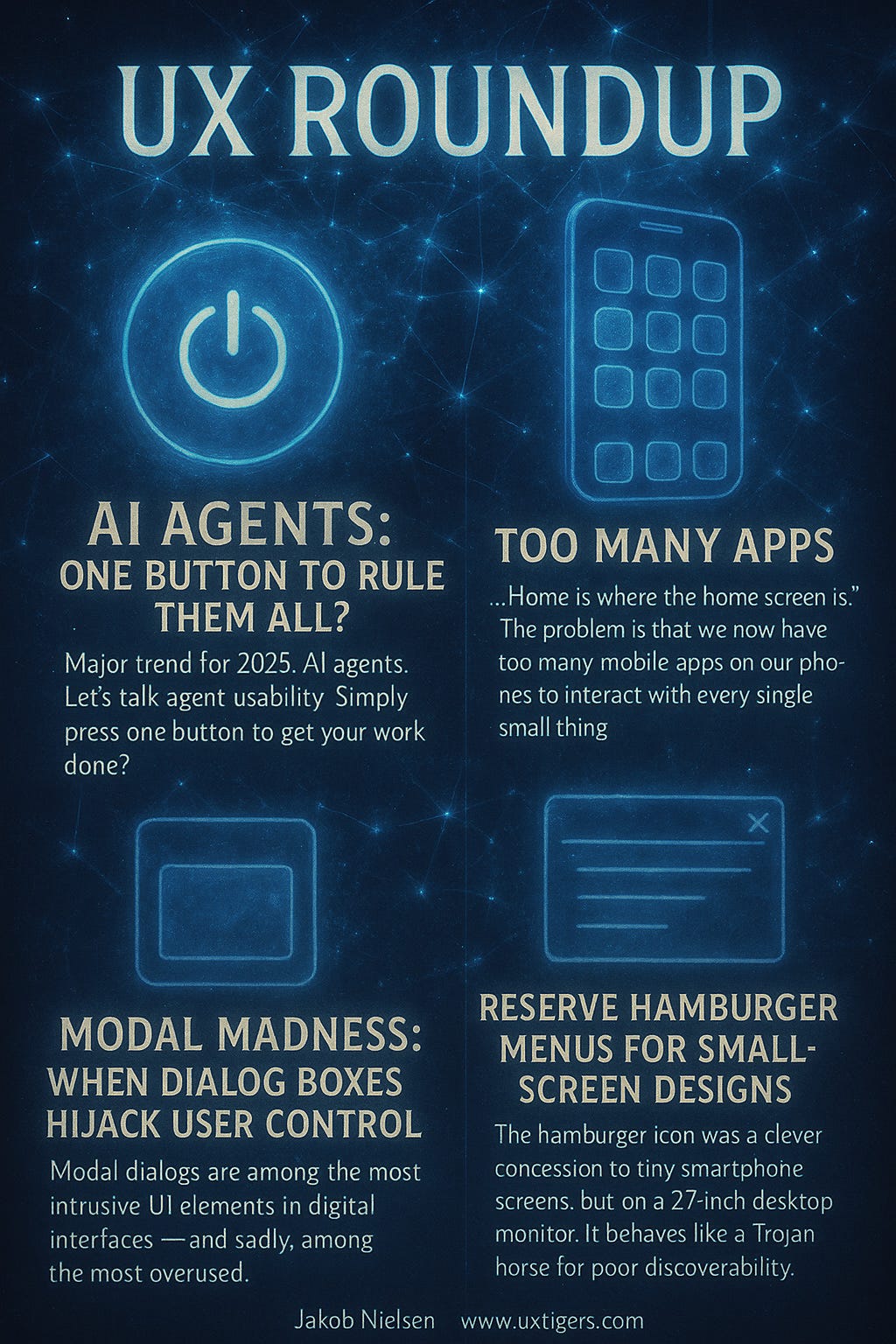
UX Roundup: Hamburger Menus | AI Agents | App Overload | Web Images | Modal Overuse

Summary: Reserve hamburger menus for small-screen designs | AI agents must remain under user control | One app per thing in your life = app overload | Images stand out on web pages | Overusing modal dialog boxes
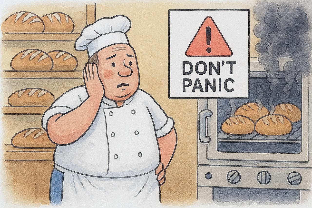
UX Roundup for June 9, 2025. (ChatGPT)
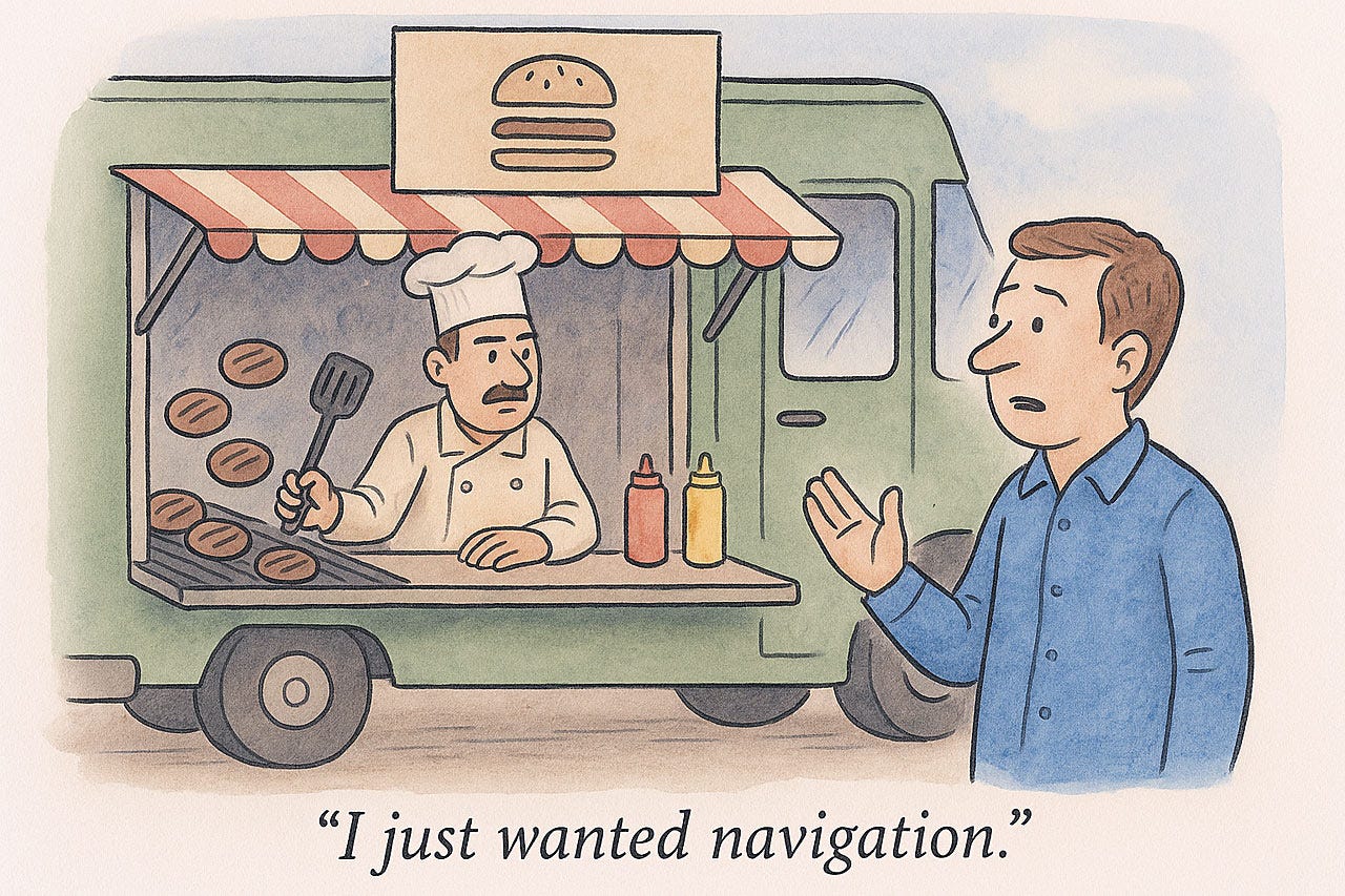
Reserve Hamburger Menus for Small-Screen Designs
The hamburger icon was a clever concession to tiny smartphone screens, but on a 27-inch desktop monitor, it behaves like a Trojan horse for poor discoverability. Hiding core navigation behind three stacked lines violates the Visibility principle: links users cannot see may as well not exist. When menus are concealed, task-completion times rise and exploratory behavior plummets because users fail to form a correct mental model of the site’s structure. Worse, the icon inserts an avoidable interaction cost. Instead of one decisive click on a plainly labeled section, users must first open the drawer, maybe even wait for an animation, scan the list, and then click again. More steps for the same outcome.
Mobile UIs must sometimes trade efficiency for pixel economy; pocket real estate is merciless. Desktop interfaces suffer fewer space constraints. Squandering keyboard-and-mouse resources just to mimic a phone layout is like shipping cargo in thimbles when the container ship is paid for. Give desktop users direct, persistent navigation: tabs, a well-placed sidebar, or even a mega menu so that they can orient instantly. Adapt to the hardware at hand and reserve the hamburger for the only place it makes sense: the snack bar, not the toolbar. Keep power users happy.
(ChatGPT)
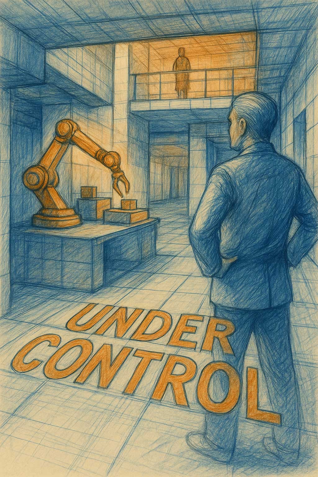
AI Agents: One Button to Rule Them All?
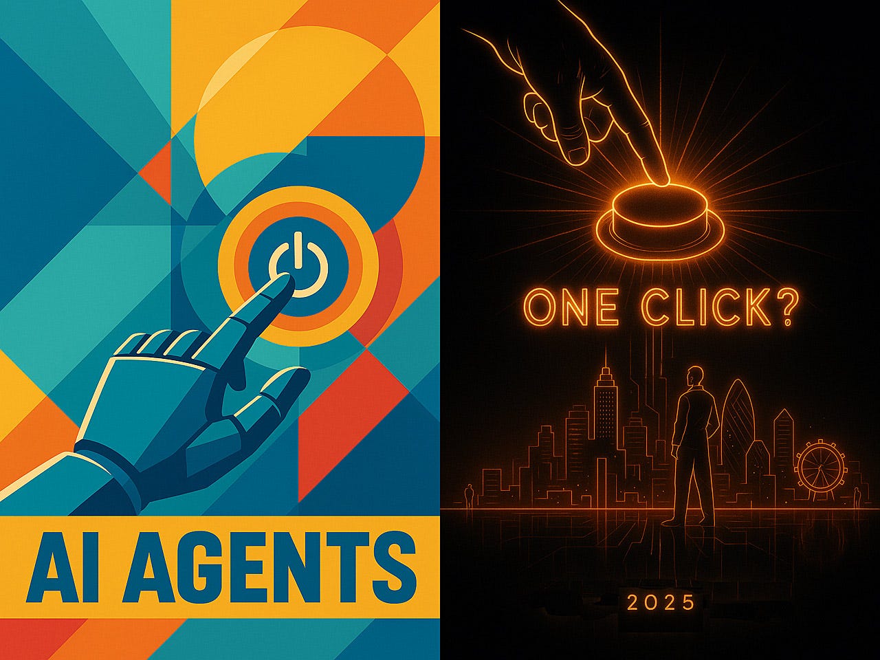
Major trend for 2025: AI agents. Let’s talk agent usability. (ChatGPT)
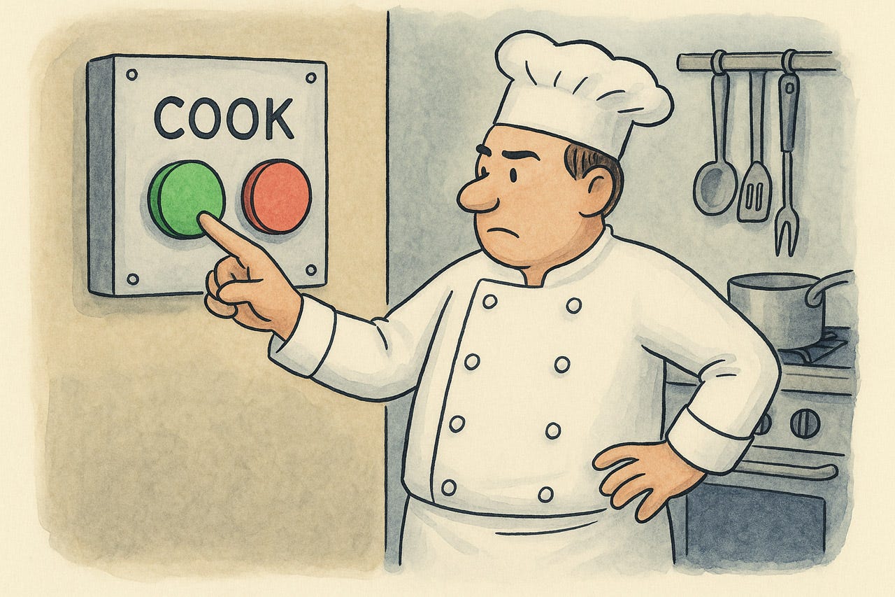
Simply press one button to get your work done? Sounds like the ideal user interface, but why have to press the button in the first place. If the computer knows what should be done, it should just do it. (ChatGPT)
Many people expect 2025 to be the year of AI agents, where the computer will indeed do the work on its own, without explicit user instructions. The long-term usability for these systems remains to be seen, but all experience shows that the first iteration of a new technology usually suffers from usability teething problems. I am less concerned about the inevitable press reports about rogue AI agents that did something wrong. That’ll be fixed in the next release, though it’s probably prudent to advise against using those early agents for truly critical tasks.
Some early agents are guaranteed to produce results like this. (ChatGPT)
My bigger concern is how to ensure the long-term usability of agents. Two issues will definitely need to be addressed:
Allowing for each undo or partial roll-back of agent actions, in case they don’t produce the desired results. Even better, include features for users to adjust the outcome of agent actions while the agent learns from these adjustments to do better next time.
Support real-time monitoring and adjustment of agent actions if they can’t be undone. (For example, sending an email or executing a wire transfer.)
Bottom line: AI agents must remain under user control, but that’s a usability issue: users should understand what the agent is doing and how to modify its behavior. It’s not enough that these actions are possible; they must be easy.
What we want to see. (ChatGPT)
Some design techniques that might help:
Progressive disclosure. Show high-level intent first (“I’m drafting a contract”) and reveal granular tool calls only if the user expands the view.
Inline “Fix-It” Chips: when an agent outcome is off, pre-designed chips could suggest quick adjustments as one-click actions (e.g., “shorten email,” “change tone”). The easier it is for users to correct the agent, the more often they’ll do it. Even the most minor corrections should flow back to reinforcement learning for the AI.
Scope boundaries. Prevent overreach and reduce mental model complexity by making users set explicit limits up front on what AI is allowed to do. (The design of such scoping tools will be tough to get right, requiring extensive usability work.)
Transparent memory to review past actions, with a timeline of past goals, state snapshots, and user corrections. People often won’t get their adjustments exactly right the first time around, so they need to be able to review an adjustment and adjust it. (In any case, it’s always easier to edit than to think up from scratch.)
Default safety rails to minimize catastrophic edge cases even when the user has not established his or her own boundaries. (We know people are lazy, so we must design for this reality.) For example, the agent might rate-limit spending, recipients, or data deletions until the user has lifted such caps.

Five design ideas for improving AI agent user experience. (ChatGPT)
Too Many Apps
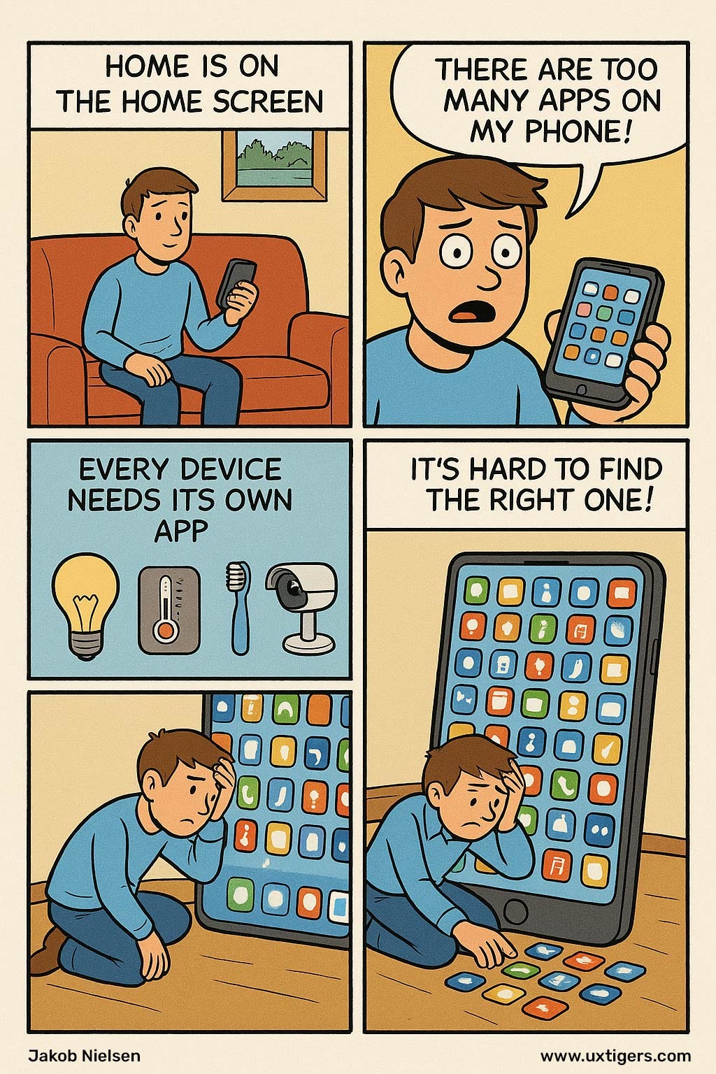
“Home is where the home screen is.” The problem is that we now have too many mobile apps on our phones to interact with every single small thing. (ChatGPT)
Smartphones were supposed to simplify living, yet our phones now resemble junk drawers stuffed with single-purpose apps. Every device, from light bulb to toothbrush, demands its own icon, login, firmware updater, and parade of permission dialogs. Usability suffers accordingly.
Fragmentation violates two of the most basic usability heuristics: consistency and user control. Switching from the thermostat app to the garage-door app means relearning gestures, iconography, and navigation metaphors that should have been standardized long ago. Worse, each vendor hides essential commands behind promotional clutter, burying critical actions under loyalty programs and cross-selling.

Too many apps! Fragmentation increases cognitive load. (ChatGPT)
The cumulative cognitive load is brutal. Users spend more time hunting for the right app than adjusting the actual device.
Integration platforms promise relief, but most merely add another layer of complexity. Until the industry adopts shared controls and open standards, the burden remains on homeowners to curate a Byzantine app collection, update countless passwords, and pray that nothing crashes during a firmware push at 2 a.m.
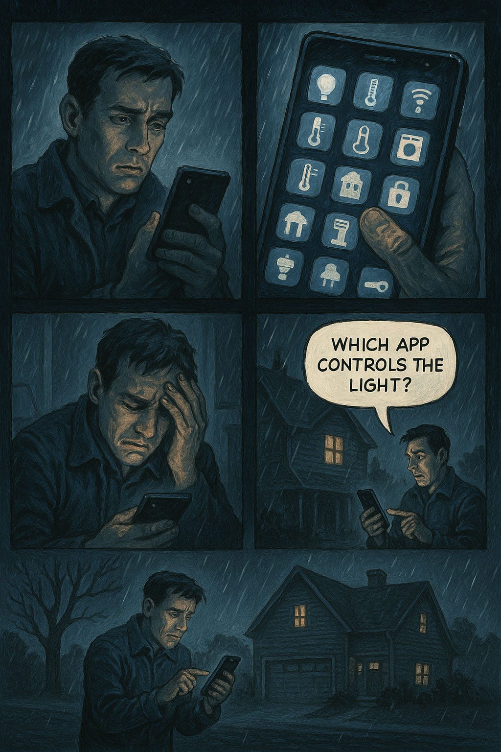
The more apps you get, the harder it becomes to find the one you need. In this case, the user would get less soaked if he returned to the house and used the regular light switch. (ChatGPT)
The solution is obvious yet difficult: consolidate. Vendors must expose device functions through common operating-system panels, not proprietary walled gardens. Designers should favor sparse, declarative interfaces over flashy dashboards. And regulators might nudge with certification labels that reward interoperability, not lock-in. Until then, we continue brushing our teeth through a maze of tiny icons. For users, abundance becomes confusion when every appliance speaks a different visual dialect today.
Images Stand Out on Web Pages

Images pop when contrasted with the wall of text found on many websites (including mine!). (ChatGPT)
Images create immediate visual differentiation in layouts dominated by text. This attention-drawing power serves two functions: (1) it provides cognitive relief from demanding textual processing, and (2) it creates natural entry points into the content.
More pragmatically, I count the times I have heard test users complain, “This is too much text,” even when faced with only a few lines.
You may know me for being famously anti-images for the sake of fast download of web pages. This standpoint was absolutely justified during the dot-com bubble when most users were on dial-up modems, and watching a big picture download was only slightly more entertaining than watching paint dry. Now, with broadband, the picture has changed.
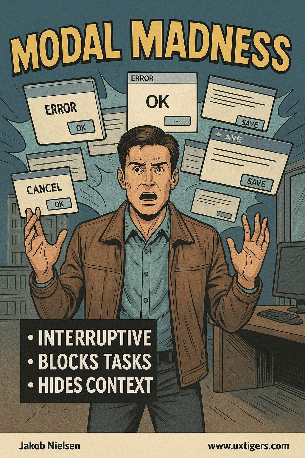
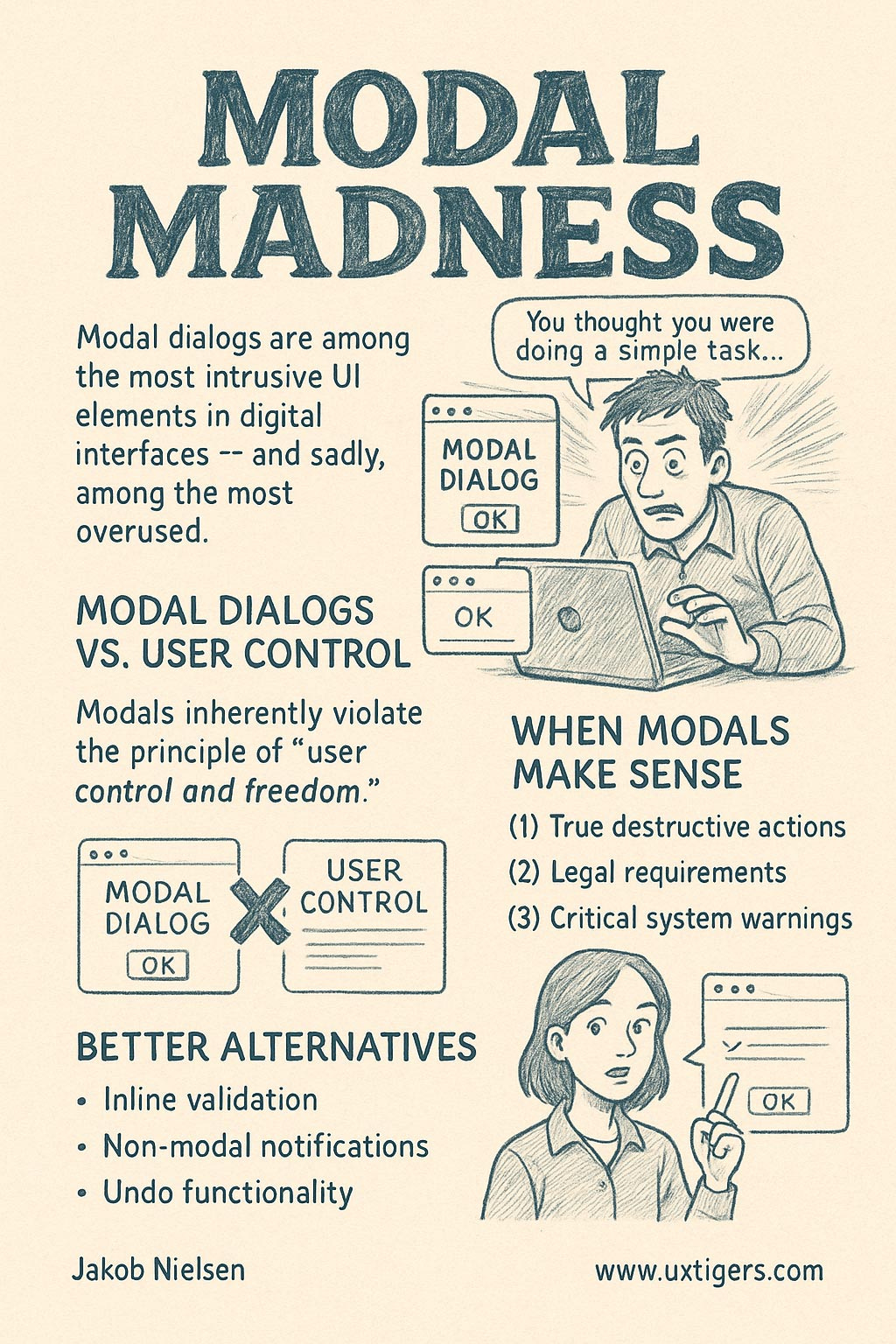
Modal Madness: When Dialog Boxes Hijack User Control
Modal dialogs are among the most intrusive UI elements in digital interfaces — and sadly, among the most overused. The average user encounters this frustrating pattern daily: they attempt a simple task like saving a document, only to face an onslaught of popup windows demanding immediate attention before they can continue.

You thought you were doing a simple task, only to be flooded by pop-ups with additional requests that you can’t bypass. (ChatGPT)
Modal Dialogs vs. User Control
When examining this design pattern against usability heuristics, modals inherently violate the crucial principle of “user control and freedom.” This heuristic states that users should be able to navigate freely and undo mistakes without friction. Modal dialogs, by definition, do the opposite:
They forcibly interrupt the user's workflow
They prevent interaction with the underlying interface
They often hide context that users need to make informed decisions
They create a psychological penalty for simple actions
Research shows that users frequently click through modal dialogs without reading them: a defensive behavior developed after experiencing too many unnecessary interruptions. This defeats the very purpose designers intended.
Limit the use of modals. (ChatGPT)
When Modals Make Sense
Despite their problems, modal dialogs have legitimate uses when implemented judiciously:
True destructive actions: Before permanently deleting important data, a modal confirmation is appropriate.
Legal requirements: For age verification or terms acceptance, where documentation is necessary.
Critical system warnings: When immediate attention is genuinely required to prevent data loss.
The key difference lies in frequency and necessity. A well-designed interface uses modals sparingly as the exception, not the rule.
Better Alternatives
Instead of reflexively creating modals, designers should consider:
Inline validation and feedback
Non-modal notifications that don't interrupt workflow
Undo functionality instead of confirmation dialogs
Progressive disclosure of options
Remember: Every modal presents a tax on the user’s attention and patience. When a user clicks “save,” he or she is expressing intent. Responding with a barrage of interruptions doesn’t respect that intent, but drowns it in unnecessary friction.
About the Author
Jakob Nielsen, Ph.D., is a usability pioneer with 42 years experience in UX and the Founder of UX Tigers. He founded the discount usability movement for fast and cheap iterative design, including heuristic evaluation and the 10 usability heuristics. He formulated the eponymous Jakob’s Law of the Internet User Experience. Named “the king of usability” by Internet Magazine, “the guru of Web page usability” by The New York Times, and “the next best thing to a true time machine” by USA Today.
Previously, Dr. Nielsen was a Sun Microsystems Distinguished Engineer and a Member of Research Staff at Bell Communications Research, the branch of Bell Labs owned by the Regional Bell Operating Companies. He is the author of 8 books, including the best-selling Designing Web Usability: The Practice of Simplicity (published in 22 languages), the foundational Usability Engineering (28,463 citations in Google Scholar), and the pioneering Hypertext and Hypermedia (published two years before the Web launched).
Dr. Nielsen holds 79 United States patents, mainly on making the Internet easier to use. He received the Lifetime Achievement Award for Human–Computer Interaction Practice from ACM SIGCHI and was named a “Titan of Human Factors” by the Human Factors and Ergonomics Society.
· Subscribe to Jakob’s newsletter to get the full text of new articles emailed to you as soon as they are published.
· Read: article about Jakob Nielsen’s career in UX
· Watch: Jakob Nielsen’s first 41 years in UX (8 min. video)