The Year in Image Generation
Summary: For each month of 2025, here is the best image I made that month. The collection shows the progress of AI-generated images over the year, in terms of the complexity of imagery that creators can now attempt. I used 5 different image tools to create the winning pictures, using GPT Image-1 the most.
(Nano Banana Pro)
2025 made one thing clear: image rendering is no longer the hard part. Editorial selection is. When you can generate dozens of plausible variations in a minute, the scarce resource becomes the same one UX has always fought over: attention. The best images earn attention by buying clarity, not by being loud.
This abundance has fundamentally changed the economics of explanation. For thirty years, digital publishing settled for the approximate match: using a stock photo of a handshake to represent a merger because commissioning custom art was cost-prohibitive. In 2025, the cost of bespoke illustrations dropped to zero. I no longer have to hunt for a generic image that is close enough to my point; I simply build the exact visual the concept requires. We have moved from an era of visual decoration to an era of visual specification, in which images are built to match the exact concept, not merely accompany it. (Great for usability: I spent decades campaigning against filler stock art. Now AI will kill them in favor of communicative images.)
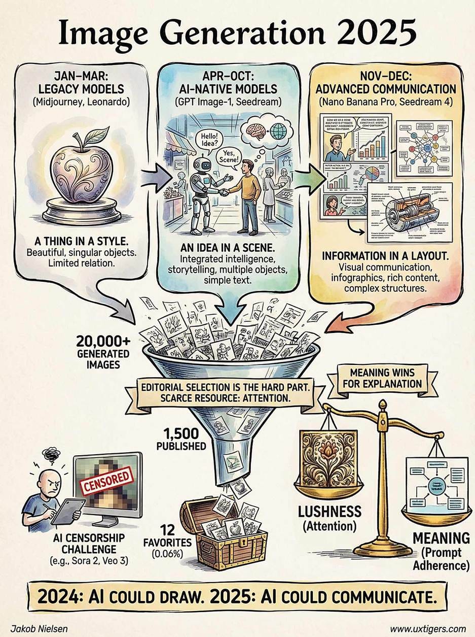
I generated roughly 20,000 images across various AI models in 2025, publishing about 1,500 in my newsletter (a 7.5% success rate). This post highlights the top 0.06%: my 12 favorites, selected one per month. I’m not claiming these are the absolute best images I made; if I picked solely on quality, the late‑year leaps (Nano Banana Pro and Seedream 4) would steamroll the early work. The one‑per‑month rule provides a more honest timeline of how the technology evolved.
My other year-end articles:
Top 10 Themes, Trends, and Status for AI (My Top 10 Articles)
Highlights reel with clips from my best music videos (YouTube)
For comparison, see: Top 10 UX Images of 2024.
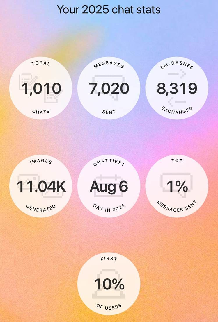
ChatGPT sent me a “year wrapped” update in late December, claiming that I’m in the top 1% of users and that I generated 11,040 images with its image model in 2025. In total, I made about 20,000 images with AI this year, so ChatGPT accounted for more than half of my output. Having a native image model that pairs rendering with the reasoning and world knowledge of a large language model was a drastic improvement when it launched in March 2025. (The 1.5 release in December was therefore that much more disappointing, and I have virtually stopped using ChatGPT for images. I am hopeful for a substantial improvement with a full version 2.0 in 2026.)
The year can roughly be divided into three periods:
January–March (drawing a thing in a style): Early 2025 belonged to legacy AI image models such as Midjourney and Leonardo, which could draw beautiful pictures of a single thing but could not relate multiple concepts to each other in a single image.
April–October (drawing an idea in a scene): Dominated by OpenAI’s GPT Image-1 model. Text rendering improved enough that simple comic strips with short text in speech bubbles became possible. The models also got better at placing multiple objects in the same picture and keeping their relationships roughly right, which made storytelling practical. Toward the end of this period, the Chinese model Seedream made a strong showing, with prettier and more complex images than those drawn by GPT Image-1.
November–December (drawing information in a layout): The age of Nano Banana Pro, which I declared to be the “ChatGPT moment for visual communication,” meaning that it enables everybody to draw complex and intricate images, such as infographics and comic strips with dramatically richer content than those drawn in the year’s earlier months. This last period shifted the goal of AI images from art to visual communication.
During the dot-com era, I was an anti-graphics fanatic, famously recommending tiny images. That wasn’t out of hatred for visual art, but out of respect for 1990s download speeds. Today, broadband has shifted the scarcity curve. Bandwidth is cheap; attention is expensive. I no longer flinch at adding a 3 MB image to an article, provided that image buys enough clarity to justify its pixels. Cognitive bandwidth is the new bottleneck, not download speed.
Today I’ll celebrate the best images I published in 2025. The selection is purely my own and was based on a combination of aesthetics and how well the image communicates an important point I was writing about.
As you scroll, look for three kinds of progress. First, whether the model can keep multiple concepts coherent in a single frame instead of collapsing into a collage. Second, whether it can render text that’s readable at newsletter size. Third, whether it can handle layout (panels, labels, and infographic structure) without turning the image into ornamental noise.
Here we go:
January 2025
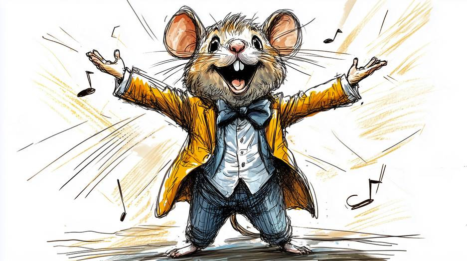
Midjourney: If we learned one thing from the master of animation, Walt Disney himself, it’s that cute animals can be engaging performers. AI video tools just need to step up their game on lip-syncing non-human characters. Unfortunately, as of the end of 2025, that still hasn’t happened, so I mostly use humans as my avatars. (UX Roundup for January 20.)
February 2025
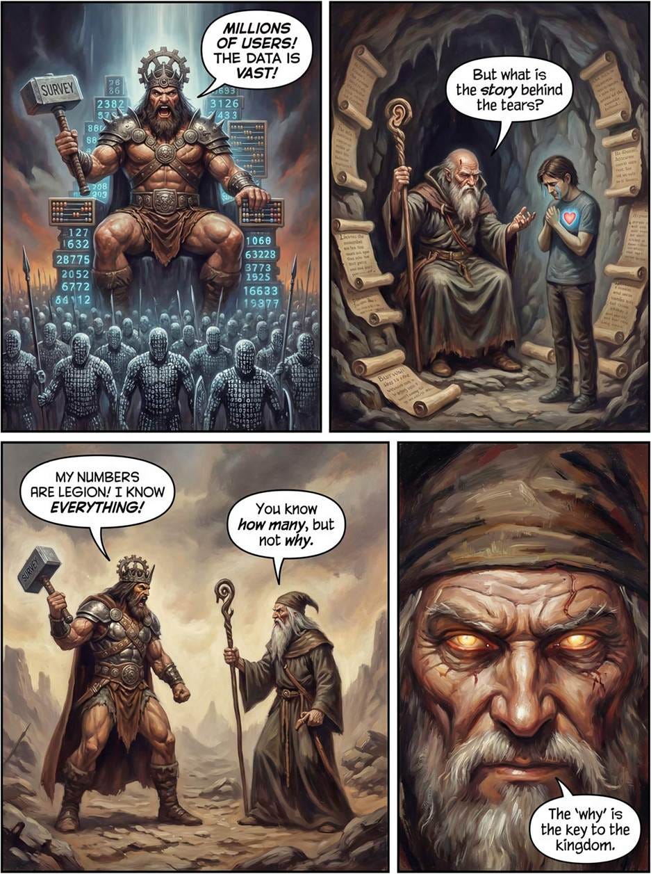
Leonardo: “Deep Research” reasoning models from OpenAI and Google dive into published sources and synthesize them into detailed, readable reports. This was important enough that I wrote an entire article about Deep Research (and made a music video, using a simpler version of this image that worked better with the animation models I had available at the time).
March 2025
Midjourney: There used to be a wide gap between user needs and what computers supplied. UX bridged this gap, which is why it had high ROI around 2000. From my article “Declining ROI From UX Design Work.”
April 2025
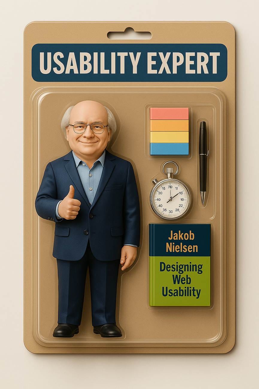
GPT Image-1: Myself as an action figure was one of the first images I made after ChatGPT’s native image model came out, in the UX Roundup for April 7. I also made an animated version of this image for a song.
May 2025
GPT Image-1: “No more user interface” was a very popular article, though a controversial prediction among UX designers who are tied to the old world.
June 2025
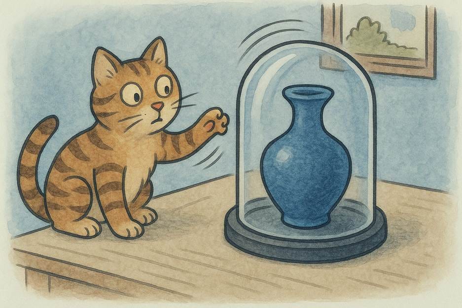
GPT Image-1: Usability Heuristic 5 (Error Prevention) means that making it harder to commit errors (especially destructive errors) results in fewer user errors. From my article “The 10 Usability Heuristics in Cartoons,” which featured 80 funny cartoons.
July 2025
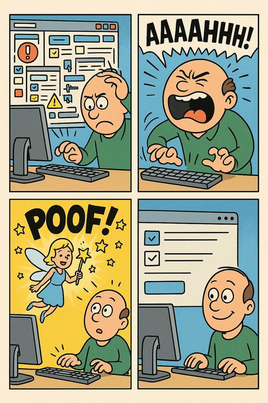
GPT Image-1: Don’t we all wish it were this easy to achieve simplicity in the user experience? Unfortunately, simple design is hard work. However, once achieved, simplicity does feel as if the good fairy is looking out for you. UX Roundup for July 14.
August 2025
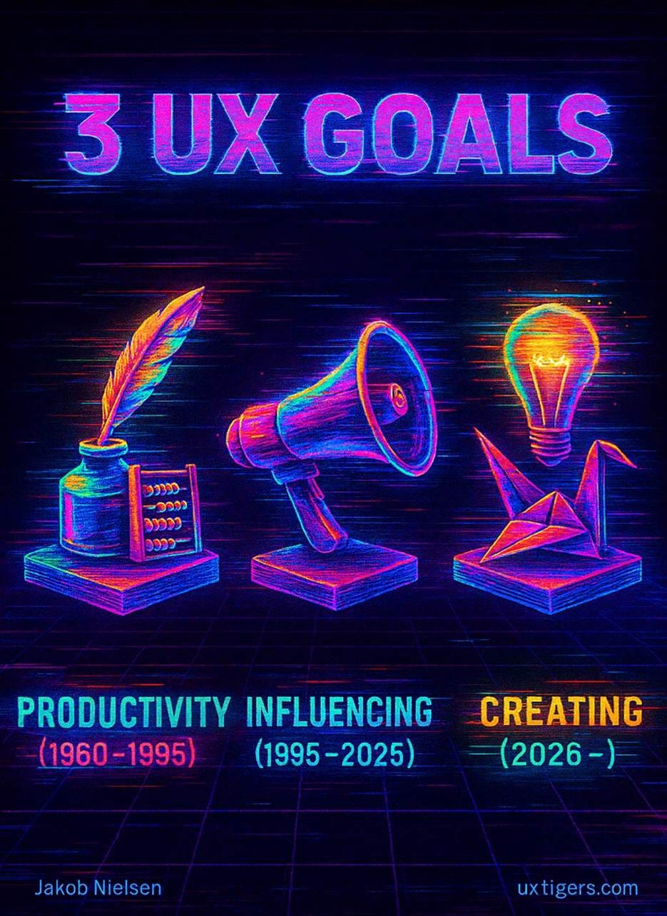
GPT Image-1: UX design has progressed through three main goals: initially, in the mainframe and PC eras, we aimed to improve employee productivity when using our software. During the web era, influencing consumers to buy or stay on our website became more important. The AI era will be a time of individual empowerment and creativity, especially with generative AI, whereas AI agents will handle traditional work and purchasing.
September 2025
Seedream 4: I had awarded Amazon 6 skulls for dark design in 2023 when the FTC filed a lawsuit against them. I ran this image of the 6 skulls and a pile of gold in the September 29 UX Roundup when the case was settled, with Amazon agreeing to pay a fine of $2.5 billion. That means each skull’s worth of dark design cost Amazon $417 million. From a technical perspective, enjoy the perfect ray tracing of the reflection of the gold coins in the skulls.
October 2025
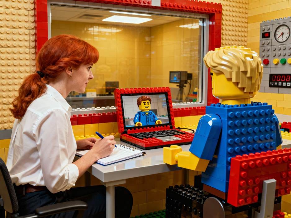
Seedream 4: LEGO had an opening for a usability testing specialist in its Copenhagen office, which I promoted to my readers in the October 20 UX Roundup because I thought it would be a dream job for many people. It was an entry-level position, too, which is increasingly rare now that AI outperforms newbie humans at newbie jobs. I love that this image combines a photorealistic human with a make-believe LEGO usability lab and an adult-sized minifigure test user.
November 2025
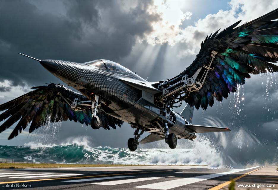
Seedream 4: Airplanes don’t fly like birds. AI brains shouldn’t be like human brains. Illustration for my piece “Should AI Mimic Human Cognition?” in the UX Roundup for November 17.
December 2025
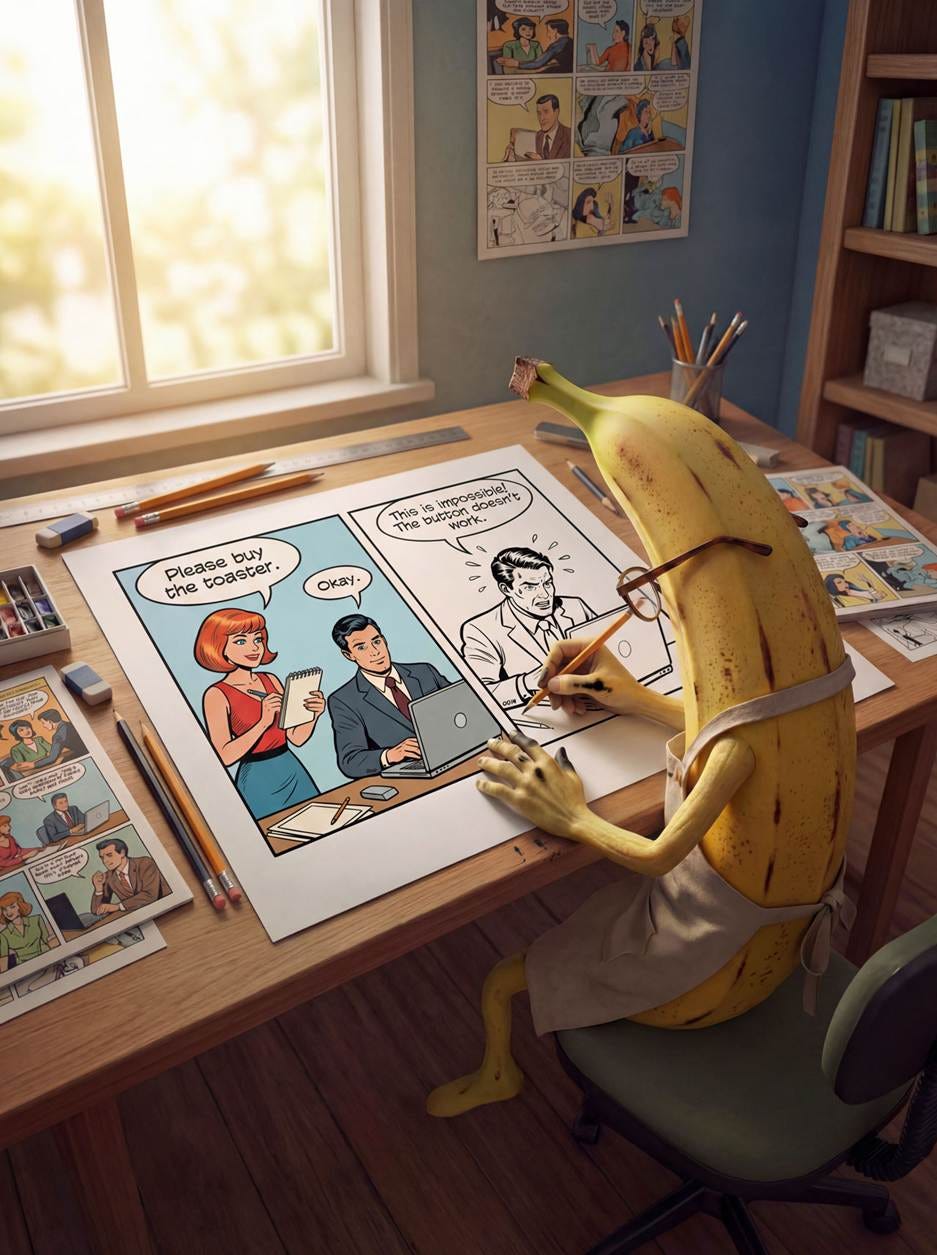
Nano Banana Pro: the social media posting image for my article “Usability Testing Process Explained in Comic Strips.” The comic strip the banana is coloring doesn’t actually appear in the article: I designed an abbreviated 2-panel strip to simplify this image.
Winning Image Model
I made my 12 winning images with these models:
GPT Image-1: 5 images
Seedream 4: 3 images
Midjourney: 2 images (Midjourney was the clear winner last year with 7 top images. How far the mighty have fallen.)
Leonardo: 1 image
Nano Banana Pro: 1 image
I mentioned in the introduction that GPT Image-1 was the model I used to make the most images this year, and this is reflected in its top-12 ranking.
75% of this year’s top images were from models launched this year. (Seedream 1.0 was available in China in 2023, but international use of the model didn’t start until Seedream 3.0 in April 2025.) The only reason older models racked up a 25% score is my methodology this year, with choosing one image per month. If I had used the traditional method of simply picking the 10 absolutely best images, the older models would have been at 10% at best. This data point indicates that the AI race is not locked down yet: there is still ample room for new approaches and models, not just for upgrades to existing models (which are useful enough, of course).
Considering the full collection of images, it’s clear that the complexity of images that creators can successfully attempt to make with AI has increased substantially. In fact, most of the images from the first half of the year that I’m not showing you here seem rather primitive now.
Midjourney’s simple images had a richness worth noting. Seedream approaches Midjourney’s lushness with much stronger prompt adherence, meaning that it shows what I ask for.
If you’re choosing a tool for explanatory graphics, the year’s lesson is simple: lushness buys attention; prompt adherence buys meaning. And meaning wins when the image is supposed to teach.
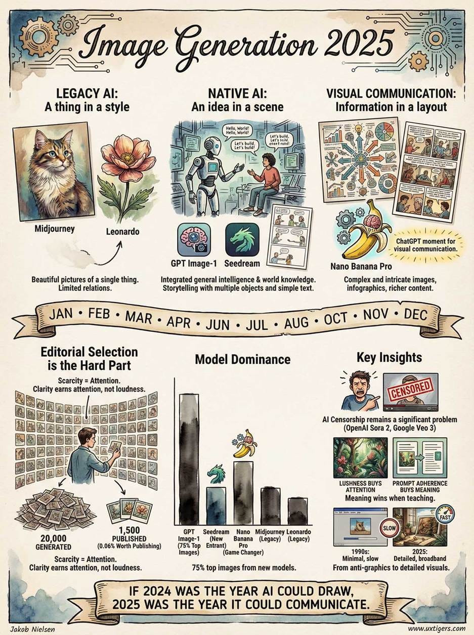
However, this precision brings a new risk. Early AI art had six fingers, an obvious tell. 2025’s AI infographics often feature “hallucinated drawing,” such as bar charts in which the bars don’t match the numbers, or process diagrams with arrows that lead nowhere. We have traded the Uncanny Valley of faces for the Uncanny Valley of Information: images that look factually authoritative at a glance but crumble under scrutiny.
This infographic that I made with Nano Banana Pro to represent this article contains several hallucinated drawings. The worst is the bar chart, which doesn’t match the actual data. For example, both Seedream and Midjourney had more top-12 images than Nano Banana Pro, and GPT Image-1 didn’t account for 75% of the top images. (My “75%” statistic applied to the sum of new image models launched in 2025, not any single model.)
Hallucinations have been dropping steadily for general AI (large language models), and I expect hallucinated drawings to fall as well, becoming much less of a problem in 2026 with the release of image models like GPT Image-2, Seedream 5, and hopefully Nano Banana 2. (As well as new models from new labs that are only rumors for now.)
Runner-Ups
Limiting myself to one image per month proved too hard. Here are a few images that were second-rated in a month but still worth revisiting:
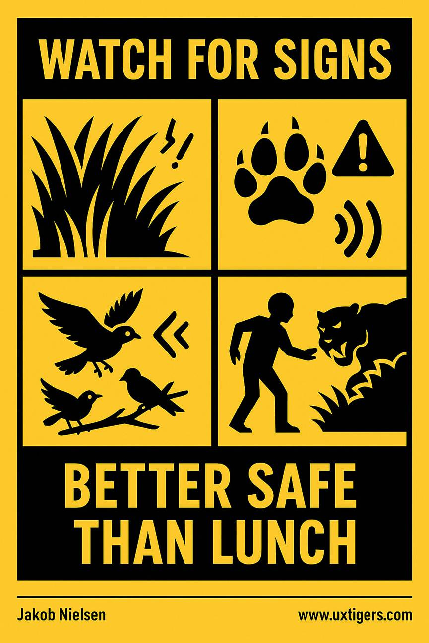
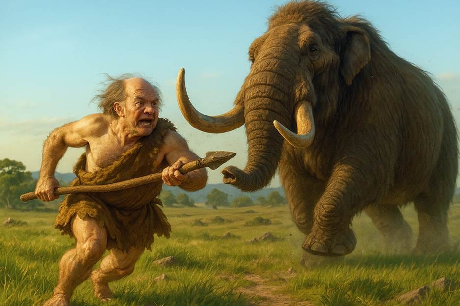
GPT Image-1: The early hominins didn’t have workplace safety hazard posters, but those of them who were better at connecting the signs of a dangerous predator with the likely presence of that predator would be less likely to be eaten and thus more likely to have passed their genes down to us. (From my article Metaphor in UX Design.)
GPT Image-1: Eliminating excess design ideas can leave behind a great UX. (From my piece “Less Is More” in the UX Roundup for July 28.)
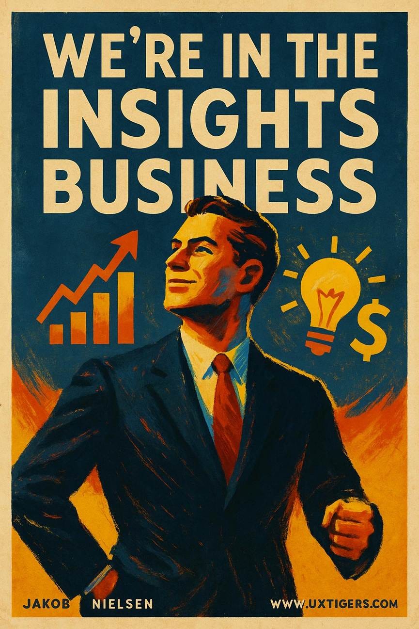
GPT Image-1: I just love this smug guy, whom I used to illustrate the point that user researchers are in the insights business for my article “Why Beats What: Prioritize Qualitative User Research Over Quantitative.” I animated this image for my song on qualitative user testing.
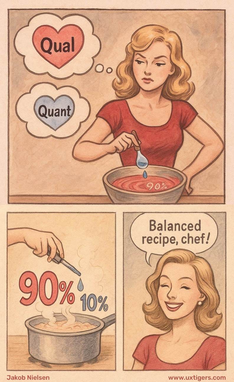
GPT Image-1: A second favorite image from that article about qualitative vs. quantitative user research, illustrating my point that a small drop of Quant does wonders, but that the majority of the meal should be Qual.
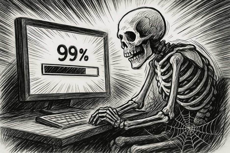
GPT Image-1: Long waits are deadly. It adds insult to injury if you furthermore can’t trust the progress bar. An illustration for my article on the Top 10 UI Annoyances.
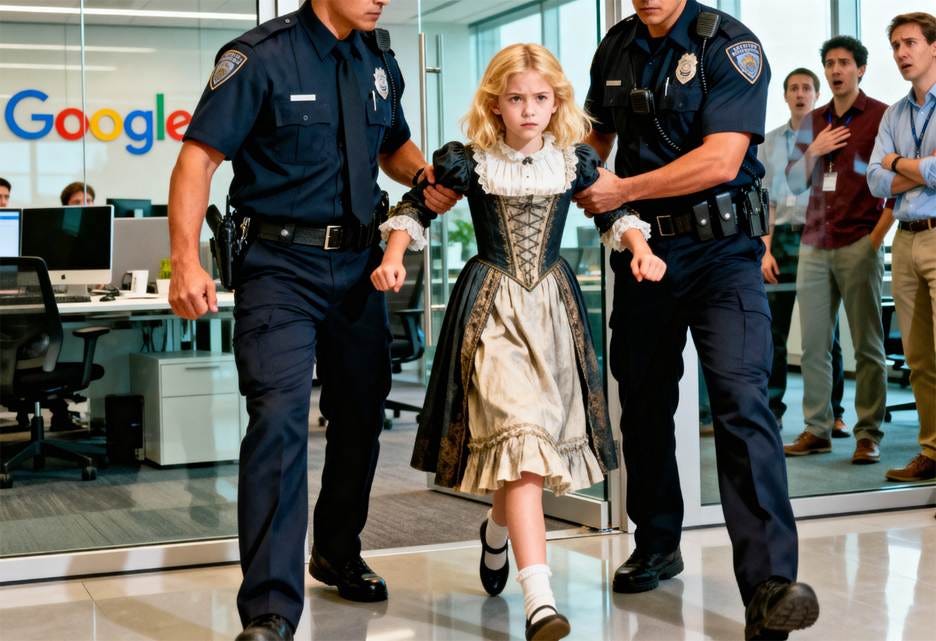
Seedream 4: Goldilocks banned by Google. AI censorship remains one of the most significant problems for creators, especially in image and video creation. OpenAI’s Sora 2 is so restrictive that it blocks many ordinary projects, and in October Google’s Veo 3 refused to produce a wholesome Goldilocks clip for my video on latent affordances. Goldilocks famously judged porridge as too cold, too hot, or just right, and a similar point applies to visualizing features in a user interface: some should be kept latent rather than shown everywhere. Luckily, Chinese Seedream is less censored than American Google, at least for subjects that matter most to creators.
This highlights a new, necessary skill for the modern creator: Model Arbitrage. Just as we once chose between Photoshop and Illustrator based on the file type, we now switch between US and Chinese models based on how freely they allow us to create. When Silicon Valley’s Puritan morals become creative handcuffs, I’ve learned to route my prompts to models with different cultural biases to get the job done.
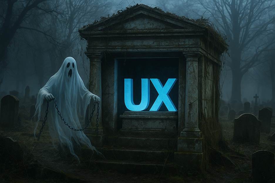
GPT Image-1: The “Ghost of UX Past” and me (more or less) as a mammoth hunter were two of the metaphors for my article on the need for UX professionals to pivot their careers now, before it’s too late and superintelligence has arrived. Don’t be chained down by the legacy methods that defined the first stage of your career, if you don’t want to end up as the last great hunter in the age of agriculture.
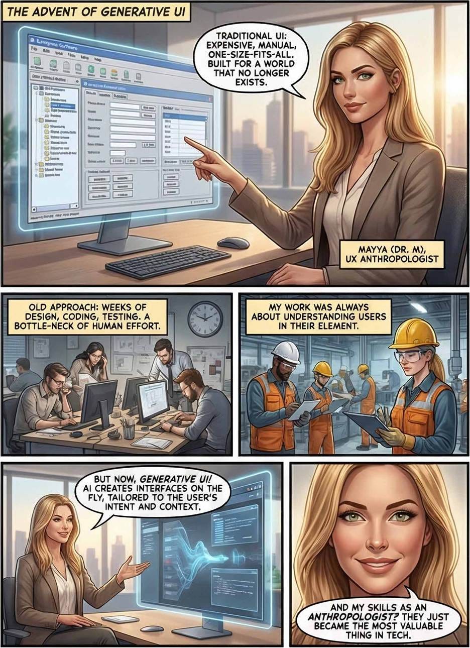
Nano Banana Pro: I went on a comic-strip spree after Nano Banana Pro enabled me to make much more complex comics than I could before. Here, page 1 of a strip about the rise of UX Anthropology to understand user workflows and environments, which is becoming more important than legacy UI design skills, and a page about the value of qualitative research.
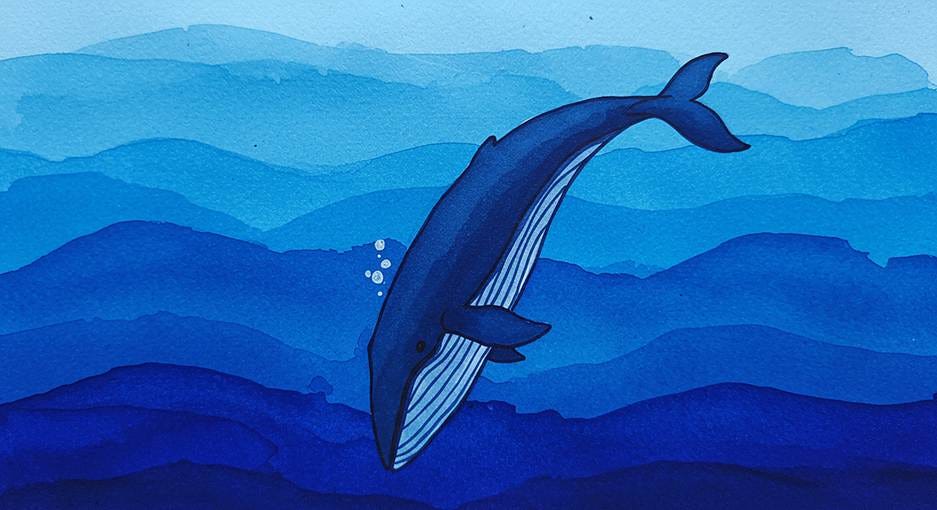
Google Imagen 3: I think this is one of the most beautiful images I made in 2025, but it doesn’t qualify as the top image for its month (January) because it doesn’t really communicate anything. It’s a picture of a whale because that animal is the logo of DeepSeek, which I wrote about.
Bonus: Most Absurd Images of 2025
All the absurd images in this section were made with the GPT Image-1 model. It hallucinated much more wildly than the other image models. (The other models would make plenty of mistakes, but usually along the lines of misinterpreting the prompt or misspelling the text. GPT was uniquely absurd when it went astray.)
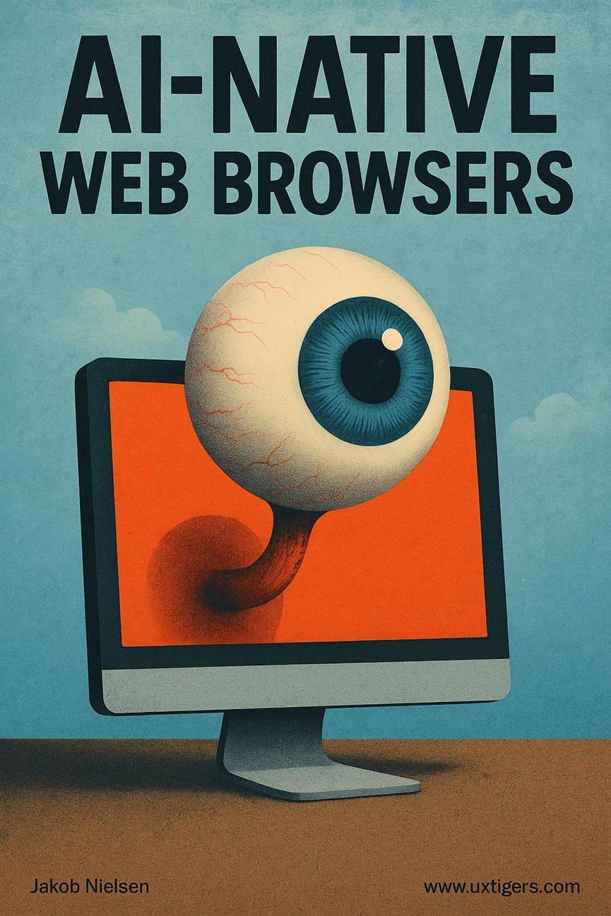
This was probably my most absurd image of the year. I got it out of the GPT Image-1 model in July when I was trying to make an illustration for a piece about AI-native web browsers. The giant eyeball attached to the screen almost works as a metaphor for browsing (an AI eye on the website) but it’s still absurd. I like it anyway.
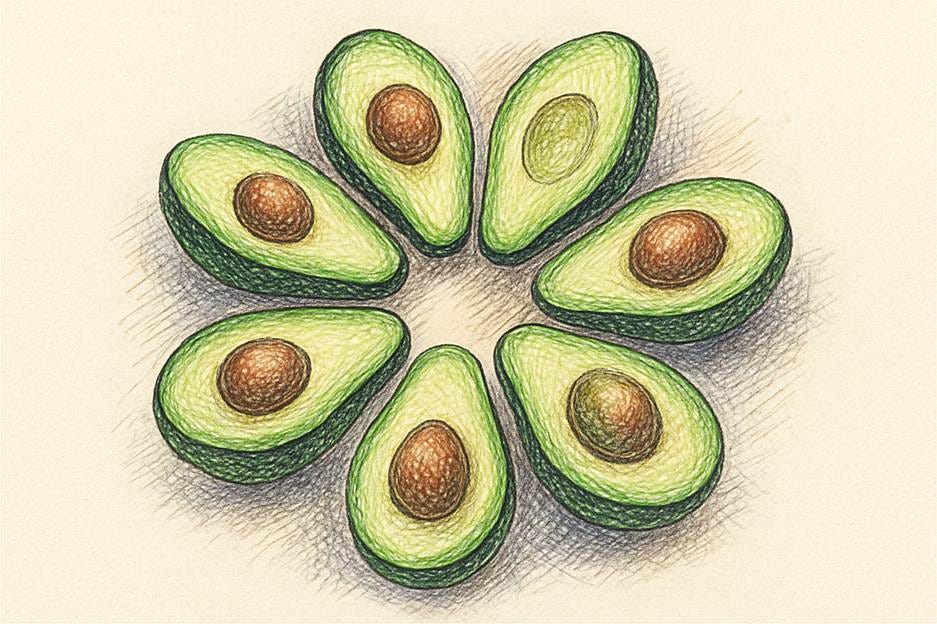
This was a variant illustration for my article on progress indicators: a creative interpretation of the spinner as a healthy meal.
The next three images have no relation to anything I prompted for. Just pure wildness from the guts of the image model.
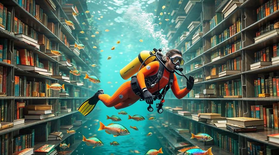
I’ll leave you with one last image that’s very pretty, but I never found a way to spin it as an illustration for an actual article:
Conclusion
If 2024 was the year AI learned to draw, 2025 was the year it learned to communicate.
About the Author
Jakob Nielsen, Ph.D., is a usability pioneer with 42 years experience in UX and the Founder of UX Tigers. He founded the discount usability movement for fast and cheap iterative design, including heuristic evaluation and the 10 usability heuristics. He formulated the eponymous Jakob’s Law of the Internet User Experience. Named “the king of usability” by Internet Magazine, “the guru of Web page usability” by The New York Times, and “the next best thing to a true time machine” by USA Today.
Previously, Dr. Nielsen was a Sun Microsystems Distinguished Engineer and a Member of Research Staff at Bell Communications Research, the branch of Bell Labs owned by the Regional Bell Operating Companies. He is the author of 8 books, including the best-selling Designing Web Usability: The Practice of Simplicity (published in 22 languages), the foundational Usability Engineering (29,665 citations in Google Scholar), and the pioneering Hypertext and Hypermedia (published two years before the Web launched).
Dr. Nielsen holds 79 United States patents, mainly on making the Internet easier to use. He received the Lifetime Achievement Award for Human–Computer Interaction Practice from ACM SIGCHI and was named a “Titan of Human Factors” by the Human Factors and Ergonomics Society.
· Subscribe to Jakob’s newsletter to get the full text of new articles emailed to you as soon as they are published.
· Read: article about Jakob Nielsen’s career in UX
· Watch: Jakob Nielsen’s first 41 years in UX (8 min. video)






The shift from lushness to prompt adherence as the winning metric for explan atory graphics is spot on. Midjourney's decline from 7 top images last year to 2 this year pretty much confirms that beautifull rendering alone doesn't cut it when you're trying to teach something. I ran into this exact tradeoff when comparing outputs, gorgeous but vague versus precise but utilitarian. The Uncanny Valley of Information is a real problem tho, especially with hallucinated charts that look authoritative until you actually check the numbers.