
Cognitive Load Is a Budget, Not an Enemy: Design for the Brain’s 4 Chunks

Summary: Cognitive load is the mental effort users spend to perceive, understand, decide, and act within an interface, drawn from a working memory that holds roughly 4 chunks. The design task is allocation: spend that scarce budget on the user’s goal, cut everything else, and mind the new debts run up by open loops and Slow AI. 26 design guidelines show how.
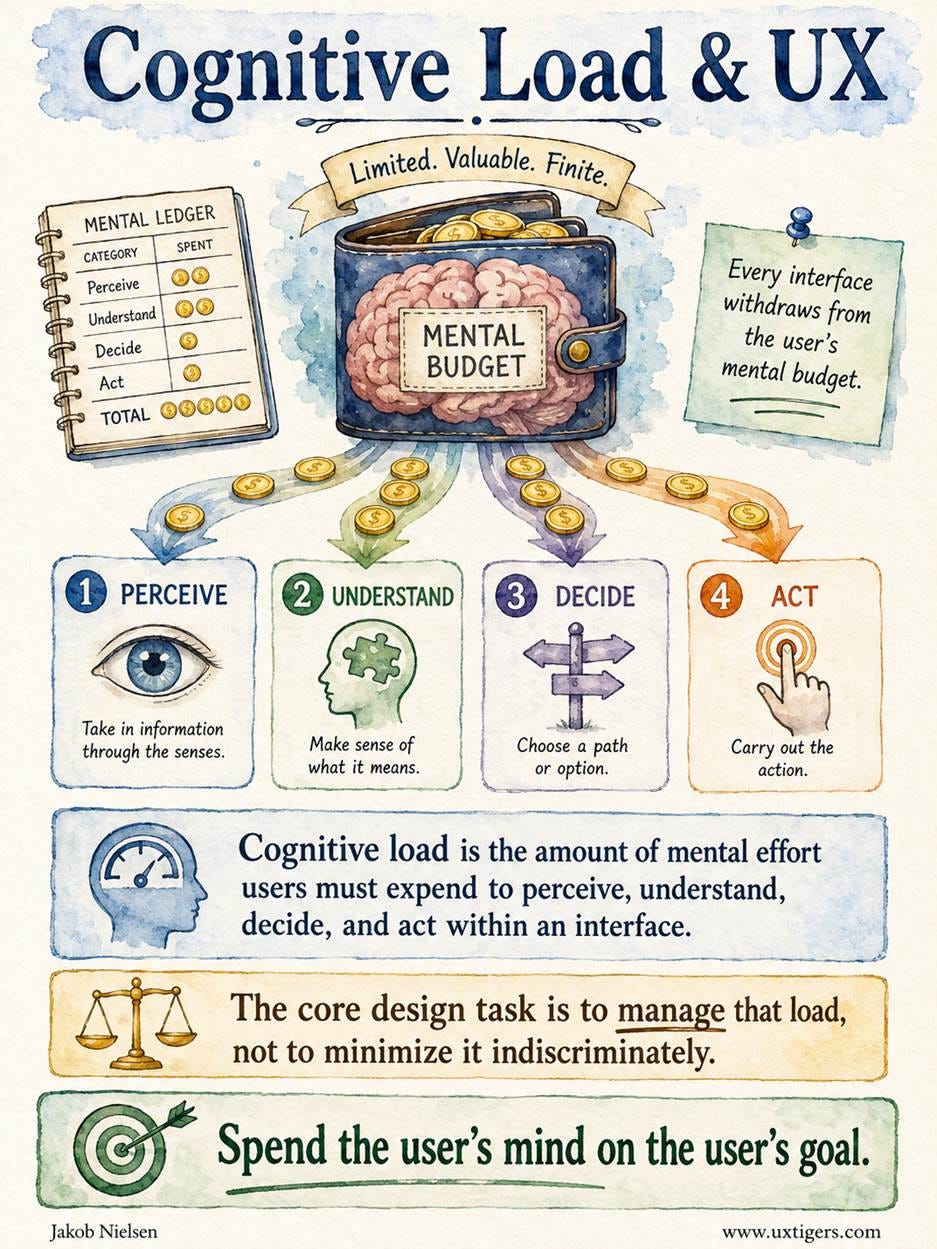
Definition: Cognitive load is the amount of mental effort users must expend to perceive, understand, decide, and act within an interface. The core design task is to manage that load, not to minimize it indiscriminately.
A Wider Definition of Cognitive Load
For years, I used a narrower textbook definition: cognitive load is the working-memory capacity a task consumes at a given moment. That definition remains the accounting core of everything that follows, because working memory is the scarcest resource in any user interface. But design drains mental effort at every stage of an interaction, from the instant the eye scans a screen to the moment the finger commits to a button. (Purists reserve “cognitive load” for the working-memory piece and call the wider construct “interaction cost” or “workload.” Fine. The currency is the same, and working-memory slots remain the scarcest line item in the ledger, but I prefer a single name for the whole shebang.)
Mental effort is physiological, and measurably so. In 1966, Daniel Kahneman and Jackson Beatty published Pupil Diameter and Load on Memory in Science, showing that people’s pupils dilate with each additional digit they hold in mind and constrict as they report the digits back. Mental load literally shows in the eyes. (Poker players and usability researchers agree on little, but they agree on that.)

Mental load shows in the eyes: pupils dilate with every extra item held in working memory.
Users arrive at your product with a fixed budget for this effort, and your design writes the spending plan whether you intend to or not. Hence, my aphorism for this article: spend the user’s mind on the user’s goal. A design that devotes nearly the whole budget to the task feels fast and simple. A design that spends the budget on itself, on deciphering labels, hunting for buttons, and remembering codes, feels stupid, and users transfer the feeling to themselves before they transfer their business to a competitor.

My slogan: Spend the User’s Mind on the User’s Goal. (Muse Image)
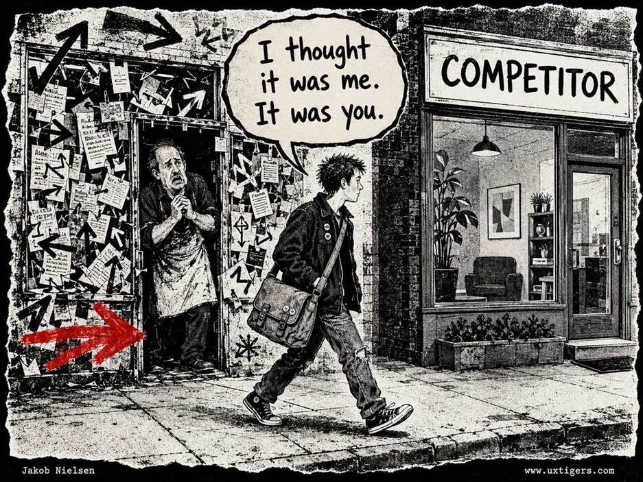
Users blame themselves for a confusing design first, and switch to a competitor second.
Notice what the definition avoids saying. It never says “minimize load.” Some load is inherent in the task: comparing 12 retirement funds is hard, no matter how pretty the comparison table. And some load is an investment: the effort of learning your product’s model pays off on every future visit. So the goal is allocation, and allocation requires knowing where the resource goes.
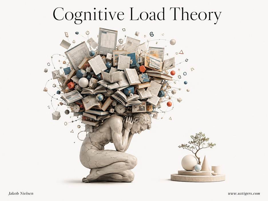
Cognitive load theory assesses how your design spends the users’ meager mental resources.
The Science: 70 Years of Auditing a Tiny Account
Our understanding of limited human mental capacity took off in 1956, when George Miller of Harvard published The Magical Number Seven, Plus or Minus Two in Psychological Review, estimating short-term memory at 7 plus or minus 2 chunks and confessing, “I have been persecuted by an integer.” The persecution was optimistic. Nelson Cowan of the University of Missouri reanalyzed the evidence in his 2001 Behavioral and Brain Sciences article The Magical Number 4 in Short-Term Memory, concluding that the realistic limit for most adults under most conditions is about 4 chunks. Design for 4.

Miller’s Law, as originally stated by George Miller, was that short-term memory could hold only 7 ± 2 chunks of information. Any extra chunks you try to remember will come crashing down. Later research revised the memory capacity of average-IQ humans to an even more intimidating number: 4. Unless the woman in this illustration is a genius, 3 more of her balls will crash.
Worse, the balance evaporates. Lloyd and Margaret Peterson showed in a classic 1959 experiment that when rehearsal is blocked, recall of a 3-letter string falls from about 80% after 3 seconds to 10% after 18 seconds. Working memory is a leaky bucket, and the lid never closes. Remember that 18-second figure; it returns with a vengeance when we reach AI tools that make users wait 3 hours.
Two escape hatches keep humans functional despite our tiny working memory capacity. The first is chunking: recoding many items into one. A credit card number displayed as 4 groups of 4 digits is the same 16 digits at roughly 1/4 the cost. The second is long-term memory, which is effectively unlimited and stores schemas that working memory can treat as single chunks. William Chase and Herbert Simon of Carnegie Mellon University demonstrated the trick in their 1973 study Perception in Chess: after a 5-second glance, a chess master reconstructed real game positions far better than a novice, because the master saw a handful of familiar patterns where the novice saw two dozen scattered pieces. On random boards, the master’s advantage largely vanished. Expertise is compression. (Alan Baddeley and Graham Hitch’s 1974 model splits the machinery into a verbal loop, a visuospatial sketchpad, and a central executive, which is why well-chosen audio can carry information in parallel with graphics instead of competing with on-screen text.)
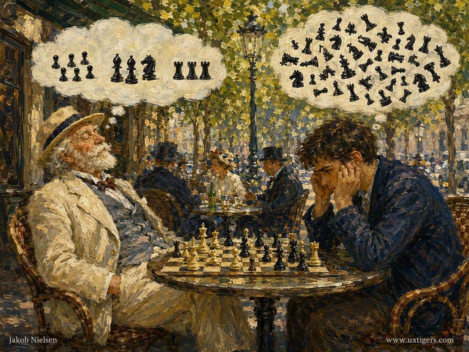
Expertise is compression: the chess master sees 3 patterns where the novice sees two dozen individual pieces.
Cognitive load theory itself was born in a classroom, far from any design studio. John Sweller of the University of New South Wales published Cognitive Load During Problem Solving in Cognitive Science in 1988, after finding that students who ground through stacks of math problems learned less than students who studied worked examples: the mental gymnastics of solving consumed the very capacity needed for learning. Sweller, Jeroen van Merriënboer, and Fred Paas later divided load into three types in their 1998 article Cognitive Architecture and Instructional Design:
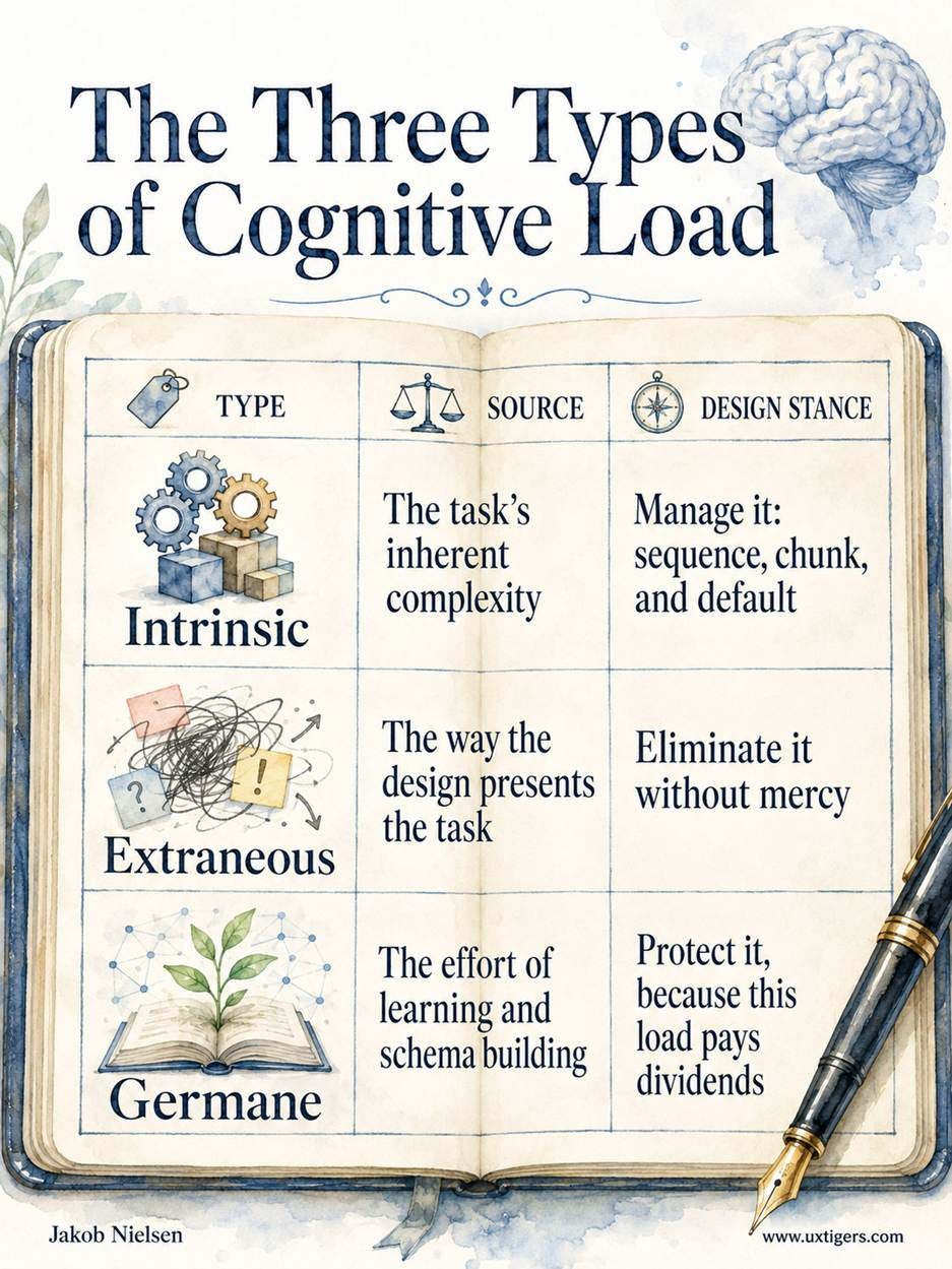
Intrinsic load rises with what Sweller calls element interactivity: the number of pieces that must be considered simultaneously. Choosing a font is low interactivity; choosing a mortgage is high, because rate, term, fees, and penalties all interact. And why does an instructional theory belong in UX? Because every unfamiliar interface is instructional material. Users are diverted from their main task to learn your navigation, your labels, and your form logic on the fly, whether you meant to teach or not.

Every unfamiliar interface is instructional material: an added burden on users.
Where the Budget Leaks: The 4 Stages of Interaction
The expanded definition earns its keep by localizing the leaks. My good friend Don Norman described the two gulfs users must cross in The Design of Everyday Things: the gulf of execution (figuring out what to do) and the gulf of evaluation (figuring out what happened).
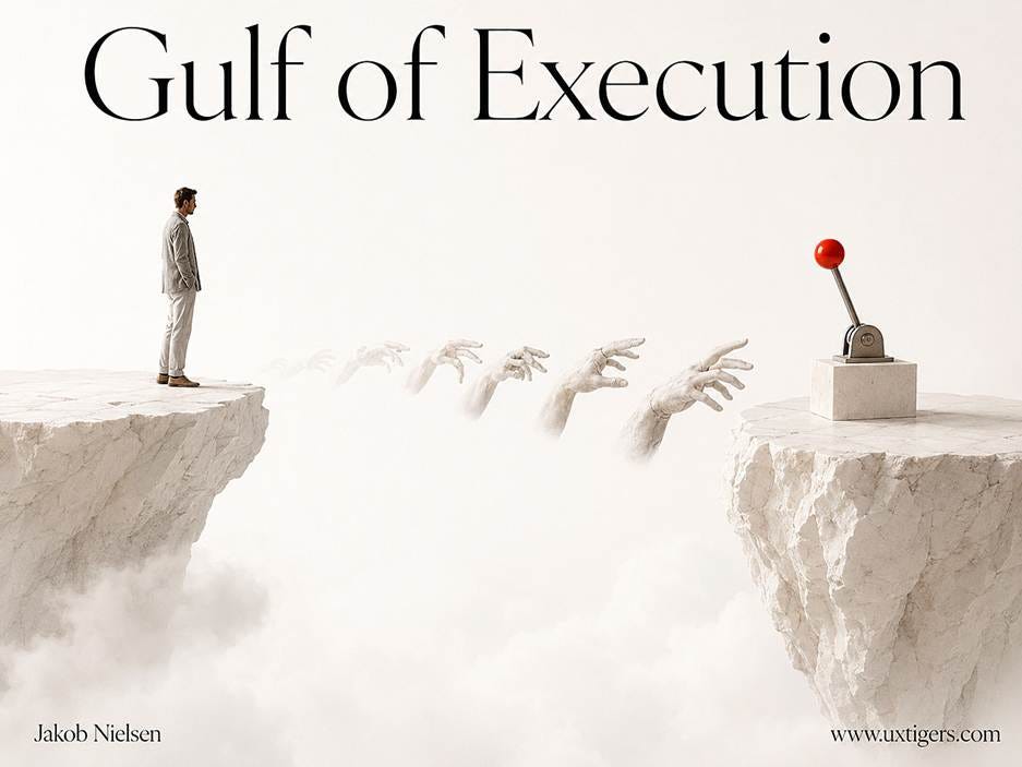
The Gulf of Execution is the gap between what users want to accomplish and how easily they can identify, understand, and perform the interface actions needed to achieve it successfully.

The Gulf of Evaluation is the gap between what a system has done and how easily users can perceive, interpret, and accurately judge the resulting state against their intended goal.
Stretch those gulfs across the 4 verbs of my definition, and you get a stage-by-stage audit:
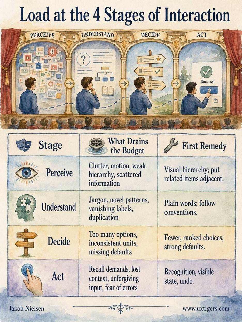
Three findings from the cognitive load literature map directly onto these stages.
Split attention taxes perception. Paul Chandler and John Sweller showed in a 1992 study that learners given physically integrated text and diagrams outperformed learners who had to glance back and forth between separated sources, because mentally integrating scattered information is pure extraneous load. The UX translation: labels belong beside their fields, error messages beside the offending input, and the running total beside the cart. Every centimeter between related items is a tax.
The redundancy effect taxes understanding. Presenting identical information twice simultaneously, such as a narrator reading exactly the words shown on the slide, forces users to reconcile two streams and performs worse than either stream alone. Make channels complement each other; never duplicate them.
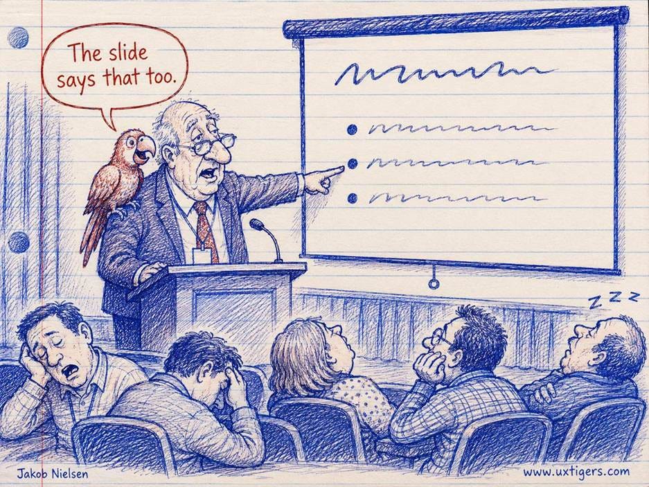
Exact duplications make information harder to understand. Have the parrot say something different from the speaker or the slides.
The expertise reversal effect taxes action. Slava Kalyuga, Paul Ayres, Chandler, and Sweller documented in 2003 that the scaffolding that helps novices (step-by-step guidance, explanations, wizards) actively slows and harms experienced users, for whom it’s redundant clutter. This finding is the theoretical license for layered design: onboarding that can be skipped, progressive disclosure with a clear information scent, and accelerators such as keyboard shortcuts and type-ahead that let practiced users bypass the training wheels.
Deciding gets its own classic: William Hick showed back in 1952 that decision time grows with the logarithm of the number of equally likely options, which is why a wall of 40 unranked menu items punishes twice: slow to scan and heavy to compare.

Hick’s Law says that the more options you have to choose from (here, which door to use), the longer it takes to decide.
A Load Audit of 6 Common Designs
In theory, theory and practice should be the same, but it’s still safest to review practice before accepting a theory. So let’s audit 6 common designs the way an accountant audits expenses, counting chunks where we can.
1. Password rules revealed after failure. The user invents a password, submits, and only then learns the rules: 8+ characters, 1 uppercase, 1 digit, 1 symbol, no repeated characters. That’s 5 constraints to hold while composing a string, in a 4-chunk head: over budget by design. And the error message usually appears at the top of the page, far from the field, stacking split attention on top of the overdraft. The fix costs nothing: show the rules beside the field before typing starts, and check off each one live as it’s satisfied.

State the rules up front; don’t force users to guess and remember.
2. One-time codes across devices. A 6-digit code arrives on the phone, and the user must carry it to the laptop and retype it before it expires. A random 6-digit code is 6 chunks by itself, the 18-second decay clock starts at first glance, and the app switch en route flushes the buffer. Display the code as 2 groups of 3, allow paste, or better yet, kill the retyping entirely with a tap-to-approve prompt.

Two-factor authentication is often torture, as it forces users to carry more information across devices than they can remember.
3. The forgetful booking flow. The user picks an outbound flight, proceeds to the return screen, and the outbound choice vanishes. Now he or she must remember airline, departure time, and price, 3 of the 4 available chunks, while comparing return options, or open a second browser tab, which is the user paying your extraneous load out of pocket. Airlines that keep the chosen outbound flight visible respect the user’s mental budget, so they deserve more of our dollar budget.
4. Comparison shopping in mixed units. One plan costs “$10/month billed annually,” the next “$96/year,” the third “$0.35/day.” Before the user can decide anything, he or she must normalize 3 price formats. That’s mental arithmetic the design assigned as homework. Show a single canonical unit everywhere, and let the marketing team cry.
5. Vanishing placeholder labels. The label lives inside the field as gray placeholder text, so the first keystroke deletes it. Halfway through a long form, the user wonders whether that box wanted a billing or a shipping address, and the interface has eaten the answer. A persistent visible label converts an ongoing recall tax into free recognition.
6. Infinite scroll’s lost places. Where was that blue jacket? On a paginated list, the answer is a chunk-sized bookmark: page 3. On an infinite scroll, position exists only as scroll distance, which working memory can’t encode, so refinding means rescanning. Endless feeds are fine for idle browsing; for anything users compare or return to, give items addresses.

The bottomless scroll swallows the user’s place: that blue jacket is down there somewhere, and “somewhere” is not an address.
The credit side of the ledger uses the same mechanisms in reverse. Inline validation confirms each field the moment it’s completed. Postal-code lookup turns a 5-line address into 1 field plus a pick list. Password managers act as prosthetic memory, and “buy again” lists replace recall of a product name with recognition of its picture. None of these is glamorous. All of them are cheap. Every one returns chunks to the user’s goal.
Load Laundering: When “Simplification” Cooks the Books
The most common abuse of cognitive load theory is load laundering: relocating complexity from the visible screen into the user’s head, then booking the result as simplicity. Hiding primary navigation behind a hamburger icon removes no load; it converts cheap recognition into expensive recall and wayfinding. A minimalist screen with 5 vague labels can impose more load than a busy screen with 20 clear ones. White space is not a load meter.

An invisible menu that’s only revealed when you open a hamburger icon is a usability abuse if you have a large desktop screen available. (It’s an acceptable tradeoff on a tiny mobile screen.)

An overly minimalist interface with a few items floating in space without labels or instructions: nobody could accuse it of clutter (you don’t overlook the button), but it’s still hard to use.
The second abuse is misdiagnosis: treating intrinsic load as extraneous. Airline fare rules and financial trade tickets are inherently complex, and amputating the information experts need exports the load to phone calls and sticky notes rather than reducing it. Of course, the opposite sin thrives too: dashboards that strafe a person with 40 numbers, 6 colors, and 3 animations at once, demanding a 5th and 6th chunk and forcing a cognitive overdraft that the user pays in errors and abandonment.
How do you tell honest simplification from laundering? Measure behavior. If task time, error rates, and rereading drop, the load truly fell. If users now hunt, backtrack, and memorize, you laundered it. Progressive disclosure done right (defer secondary features behind clearly labeled doors) passes this test. Done wrong, it’s a shell game.
AI Moved the Load; It Didn’t Remove It
Modern AI is the biggest reallocation of cognitive load since the graphical user interface, and most teams haven’t updated their ledgers. As I argued in AI Is First New UI Paradigm in 60 Years, intent-based outcome specification lets users state what they want instead of operating the machinery of how. Execution load, the traditional heavyweight line item of clicking through menus, filling forms, and wrestling tools, collapses. Wonderful. But the demands on the budget never shrank; instead, two other line items ballooned.
Articulation load. A blank prompt box is the recall-over-recognition anti-pattern elevated to a philosophy: the user must generate, from nothing, a precise prose specification of a goal he or she may only half understand. I documented in The Articulation Barrier that roughly half the adult population of rich countries such as the United States and Germany scores as low-literacy in OECD data, and writing is harder than reading. For these users, the prompt box is the most expensive interface element ever shipped.

The blank prompt box demands a precise specification of a goal the user may only half understand.
The remedy is 40 years old, and it is Sweller’s: worked examples. Suggested prompts, templates, and editable examples convert composition (brutal) into recognition and modification (cheap). So do hybrid UIs that surround the prompt box with good old buttons, sliders, and previews.

Karaoke without lyrics is no fun, even if in theory you can sing anything. Structure scaffolds usability.
Verification load. AI output arrives fluent, confident, and intermittently wrong, so the gulf of evaluation widens into a canyon. Checking a 20-page research report you never wrote is high intrinsic load; the honest response is to support the checking, since skipping it would mean shipping unverified claims. Designs that cite sources inline, show diffs against the previous version, and expose the steps taken cut the cost of verification the way chunking cuts the cost of a card number.
Thus the AI-era budget reads: articulation up front, verification at the end, execution nearly free in between. Now add the dimension that classical theory ignored: time.
Load Over Time: The Zeigarnik Effect
Classical cognitive load theory is a snapshot: how many chunks does this moment demand? But interfaces also create deferred load, effort billed later, and the mind has a documented weakness for exactly this kind of debt: it can’t stop fingering the IOUs.
The origin story is psychology’s best restaurant anecdote. In 1920s Berlin, the Gestalt psychologist Kurt Lewin noticed that a waiter recalled unpaid orders in perfect detail yet forgot them the moment the bill was settled.
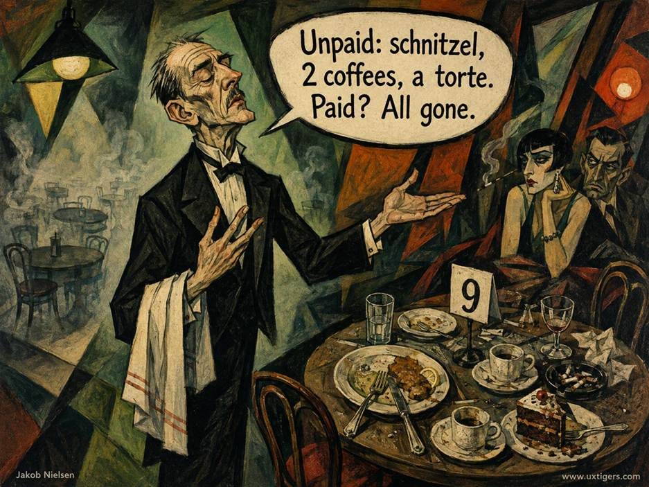
The Zeigarnik Effect was discovered in a German restaurant: the waiter had much better memory for unpaid orders than for settled bills.
His doctoral student, the Lithuanian-born Bluma Zeigarnik, took the observation into the lab at the University of Berlin: she gave people small tasks (puzzles, clay figures, boxes to assemble) and interrupted half of them midway. Participants recalled the interrupted tasks about twice as often as the finished ones, a 90% memory advantage replicated across 107 participants in three samples and published in 1927 as On Finished and Unfinished Tasks (PDF). In Lewin’s terms, starting a task creates a tension system that completion releases and interruption preserves. That’s why the unpaid invoice and the abandoned cart resurface at 11 pm while today’s finished tasks have politely vanished.

The Zeigarnik Effect: interrupted tasks create a mental pull.
One caveat: later replications have been inconsistent, and the effect bends with motivation. Kenneth McGraw and Jirina Fiala of the University of Mississippi ran a sly test in 1982: among 40 students interrupted during a spatial puzzle, 86% of those expecting no payment spontaneously returned to it during free time, versus only 58% of those expecting to be paid. An open loop nags hardest when the task is the user’s own; turn it into somebody else’s errand, and the tension slackens. (Maria Ovsiankina, another Lewin student, had already shown that people don’t merely remember interrupted tasks; given the chance, they spontaneously resume them.)
The finding that turns all this into design guidance came much later. E. J. Masicampo and Roy Baumeister of Florida State University showed in their 2011 Journal of Personality and Social Psychology paper Consider It Done! (PDF) that unfulfilled goals intrude on unrelated reading and depress performance on unrelated puzzles, but making a concrete plan for the goal eliminated the interference, without completing anything. The mind releases a loop once the loop has a handle. Thus the design translation: saved state plus a visible resume path is the plan. When the interface visibly holds the user’s unfinished business, the user’s head can put it down.
Interruption research prices the alternative. Sophie Leroy (then at the University of Minnesota) demonstrated in two 2009 experiments what she named attention residue: after switching away from an unfinished task, part of your attention stays behind and degrades whatever you do next. And Gloria Mark of the University of California, Irvine, with Daniela Gudith and Ulrich Klocke, found in a CHI 2008 study (PDF) that interrupted workers actually finish faster, compensating by sprinting, but suffer measurably higher stress, frustration, and effort. (The famous claim that refocusing takes exactly 23 minutes and 15 seconds is attributed to Mark in interviews; you won’t find that number in the paper, so cite the stress finding and skip the folklore.)
Of course, once designers learned that open loops command attention, some began planting them. I call the abuse loop farming: manufacturing incompleteness and harvesting return visits. The profile-strength meter stuck at 70% until you surrender a phone number. Badge counts that never reach zero. Streaks that punish a vacation. These designs create tension instead of relieving it, and the crop is user anxiety. Does loop farming at least pay? My best guess (unproven, but I’d bet on it) is that it backfires over time, because manufactured incompleteness teaches users to distrust every progress indicator you show, honest ones included. These attention abuses may not be the darkest of dark designs, but they’re definitely gray, and often dark gray.
Slow AI: Deferred Load, Plus Interest
Now combine the two halves of this article. AI reallocated the instantaneous budget toward articulation and verification, and AI agents stretch the whole transaction across time. As I analyzed in Slow AI: Designing User Control for Long Tasks, agentic AI resurrects batch processing, the original 1945 interaction paradigm, with runs of 10 minutes, 3 hours, or 2 days replacing turn-taking conversation. (I suffered batch processing personally in the 1970s, during its supposed death throes. The overnight printout was rarely worth the suspense.) Every Slow AI run converts present work into deferred load, and deferred load accrues interest. Three bills arrive:
The reminder bill. A running agent turns the user’s task into a prospective-memory problem: remember to come back, and remember what you asked for. Given that unrehearsed working memory decays in about 18 seconds, expecting anyone to retain intent across a 3-hour run is malpractice. Everything must be externalized: a persistent status surface, plus a run contract that restates the request in the system’s own words before the run starts. The contract is also the Masicampo–Baumeister plan in disguise: once the loop visibly has a handle, the user’s mind can release it and do other work, instead of compulsively checking, which is Zeigarnik tension expressed through a refresh key.
The reinstatement bill. When results finally arrive, they arrive as an interruption at a machine-chosen moment, exactly the switch that Leroy and Mark showed to be expensive. The user must then reload the entire task context into a 4-chunk working memory: the original goal, the constraints, what “good” looks like. This reinstatement cost is the interest on the deferred load, and it compounds with delay. Designs pay the subsidy by recapping at delivery: here’s what you asked, here’s what I did, here’s what changed. Checkpoints and progressive disclosure of partial results (both discussed in my Slow AI article) reduce the principal by keeping the user’s schema warm during the run, like a plate under the heat lamp.
The verification bill. Articulation happened at hour 0; verification lands at hour 3, when context is coldest and the deliverable is largest. Checking a 40-file code change or a 20-page report in one sitting is the highest-intrinsic-load moment in the entire workflow, scheduled at the worst possible time. Interim reviews, conceptual breadcrumbs that show the agent’s reasoning, and diffs against known-good baselines spread that bill into installments.
And then users multiply everything. Anyone running 5 parallel agents maintains a meta-task list (what did I ask each one, how far along is it, what does it need from me) that busts the 4-chunk account before any actual work begins. Cowan’s number doesn’t care how advanced your AI is. An external status board for all running work isn’t a nicety; it’s arithmetic. I predict that within 2 years, “context reinstatement” will be a standard chapter in the design system of every serious AI product, right beside the color tokens. Consider that a prediction on the record.
26 Design Guidelines for Managing the Mental Budget
Treat working memory as a budget the user brings to your product: you can’t increase it, but you decide how it gets spent, and now also when. The guidelines follow the stages of the definition, then the time dimension, then measurement.
Perceiving (Guidelines 1–4)
Make every element pay rent. If a control, image, or line of copy fails to advance the user’s task, it’s spending attention without returns. Cut it.
Put related information next to each other. Labels beside fields, errors beside the offending input, totals beside the cart. Split attention is a designer-imposed tax with a full refund available.
Rank the screen by task importance. Visual hierarchy should mirror the user’s priorities, so attention lands on the goal first and on decoration never.
Let nothing move without a reason. Animation, badges, and autoplaying media seize attention, the entry gate to working memory, by force. Motion must earn its theft.
Understanding (Guidelines 5–8)
Write plainly. Every specialist term a user must decode is a chunk spent on vocabulary instead of the task. Define necessary terms crisply on first use.
Follow conventions first. Jakob’s Law: users spend most of their time on other sites, so borrowed schemas are free capacity. Save novelty for genuine differentiators.

Jakob’s Law of the Internet User Experience states that users spend most of their time on other sites and learn from their cumulative experience on those sites. If your design works the same way as most of these other user interfaces, it’ll be easy to use. Differ, and you introduce usability problems.
Keep labels persistent. Placeholder-only labels vanish at the first keystroke, converting cheap recognition into a recall tax collected on every field.
Avoid saying the same thing twice at once. Simultaneous identical narration and text force users to reconcile two streams (the redundancy effect). Make channels complement each other.
Deciding (Guidelines 9–12)
Present few options, and structure the rest. Decision time grows with the logarithm of the choice count, per Hick, so group and rank whenever many options are unavoidable.
Default aggressively, but visibly. Every sensible prefill is one decision the user no longer carries; keep it visible so the minority can change it in one glance.
Compare in constant units. Normalize prices, dates, and specs to a single canonical unit. If users must convert $0.35/day into dollars per year, you’ve assigned homework.
Support hard comparisons; don’t amputate them. Intrinsic complexity such as fare rules needs aligned, side-by-side attributes. Deleting the information exports the load to a second tab.
Acting (Guidelines 13–17)
Prefer recognition over recall. Show options, history, and system state; never require users to remember codes or values across screens.
Keep context visible across steps. Display earlier selections (flight, plan, configuration) throughout every multi-step flow.
Chunk long strings, and forgive input formats. Display card numbers as 4 groups of 4, and accept them with or without spaces and dashes.
Prefer undo to confirmation. A confirmation dialog taxes every action to prevent rare mistakes; undo charges only the mistaken ones.
Give experts accelerators without burdening novices. Expertise reversal cuts both ways: shortcuts, type-ahead, and recent-item lists provide a fast lane while the guided path stays intact.
Across Time (Guidelines 18–24)
Preserve state, and offer visible resumption. Drafts, carts, forms, and playback positions must survive interruption, because interruption is the normal case. “Continue where you left off” is the plan that releases the tension.
Use honest progress that can reach zero. Real step counts, real percentages, and task lists that actually close, with the closing acknowledged. A bar that starts at 60% for free is a lie with a fill color.
Close loops early and emphatically. Inline validation, instant save confirmations, and receipts are micro-completions that release micro-tensions before they accumulate.
Open only the user’s own loops, and make every loop dismissible. Prompts serving the company’s wish list are loop farming in miniature. Offer both “not now” and “never,” and make never mean never.
Restate the request in a run contract. Before any long AI run, echo what was asked, the constraints, and the expected duration. The user’s memory should never be the system of record.
Reinstate context at delivery. When a long run completes, recap the request, summarize what was done, and show what changed, delivered at a moment the user chose rather than as an ambush.
Give parallel work one external status board. Nobody tracks 5 running agents on a 4-chunk budget. Provide one glanceable surface for all open runs, or the user’s head becomes your database.
Measuring and Triaging (Guidelines 25–26)
Triage by load type before cutting. Classify each element as intrinsic, extraneous, or germane: delete the extraneous on sight, support the intrinsic with sequencing and defaults, and feed the germane with worked examples.
Measure load; don’t eyeball it. Watch task time, errors, rereading, and backtracking with 5 users, add the NASA-TLX workload questionnaire after tasks, and include interrupted sessions, because your users’ reality contains Slack.

The NASA-TLX scale is not just for astronauts. It’s a simple way to assess users’ mental workload. Don’t let the nerdy name intimidate you.
Conclusion: Balance the Books
Memory research spent 70 years settling the size of the account: roughly 4 chunks, fading within 18 seconds. Everything else is your choice. Classic design decides how the budget gets spent at each instant: on the goal or on the interface. Open loops decide the debts users carry between visits. And Slow AI decides the interest, charged in full at the moment of return. The ledger is audited at every screen, and now at every homecoming too.
So run the audit. Pick your product’s most important flow this week and count what each screen asks the user to hold: every code, every remembered choice, every unit conversion, every “where was I?” Then work through the 26 guidelines and start paying down the debts. The user’s memory limit is a law of nature; your clutter is a choice. Balance the books, and users will call your product simple, which is the highest compliment a 4-chunk brain knows how to give.
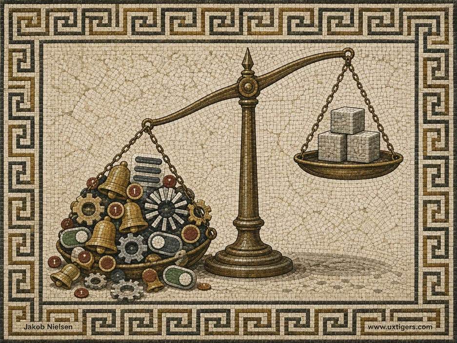
UI clutter is a design choice that weighs users down. (All images in this article made with GPT Image 2, except as indicated.)
About the Author
Jakob Nielsen, Ph.D., is a usability pioneer with 43 years experience in UX and the Founder of UX Tigers. He founded the discount usability movement for fast and cheap iterative design, including heuristic evaluation and the 10 usability heuristics. He formulated the eponymous Jakob’s Law of the Internet User Experience. Named “the king of usability” by Internet Magazine, “the guru of Web page usability” by The New York Times, and “the next best thing to a true time machine” by USA Today.
Previously, Dr. Nielsen was a Sun Microsystems Distinguished Engineer and a Member of Research Staff at Bell Communications Research, the branch of Bell Labs owned by the Regional Bell Operating Companies. He is the author of 8 books, including the best-selling Designing Web Usability: The Practice of Simplicity (published in 22 languages), the foundational Usability Engineering (31,280 citations in Google Scholar), and the pioneering Hypertext and Hypermedia (published two years before the Web launched).
Dr. Nielsen holds 79 United States patents, mainly on making the Internet easier to use. He received the Lifetime Achievement Award for Human–Computer Interaction Practice from ACM SIGCHI and was named a “Titan of Human Factors” by the Human Factors and Ergonomics Society.
· Subscribe to Jakob’s newsletter to get the full text of new articles emailed to you as soon as they are published.
· Read: article about Jakob Nielsen’s career in UX
· Watch: Jakob Nielsen’s first 41 years in UX (8 min. video)