Gestalt Principles for Visual UI Design
Summary: Rooted in over a century of psychological research, the 9 Gestalt principles are essential for designing user interface layouts. Proximity, similarity, enclosure, and more guide the eye, turning visual chaos into clarity.
Ever wonder why some interface layouts just feel right? It’s not magic; it’s science! This article explains the 9 main Gestalt principles and shows how these timeless psychological insights can transform your UI designs. Whether you’re a seasoned pro or a UX newbie, these tips will help you craft layouts users love.
Gestalt theory is one of the oldest insights for user interface design: it explains why users tend to see certain design items as belonging together or being part of a whole. I learned it when I started in UX 41 years ago, but the original research is more than 100 years old, originating with German psychologists like Max Wertheimer. In fact, “Gestalt” is a German word meaning whole or unified configuration.
The Gestalt principles are a set of psychological laws that describe how humans perceive and organize visual information. These principles are widely used in visual design to create cohesive, intuitive layouts and interfaces.
Anne Chan created a very nice carousel that explains most Gestalt principles with simpler graphics than the cats and other elaborate examples I’m showing here.
Here, I’ll discuss the Gestalt principles most relevant to user interface design. (If you read the psychology literature, there are more, but the following 9 are the most important for you to know.)
1. Proximity
Objects close to each other are perceived as a group, even if they differ in shape, color, or size. This principle is crucial for organizing information and creating logical groupings within layouts.
Proximity can be used to create implicit relationships between elements without the need for explicit borders or connectors. It's particularly useful in designing information hierarchies, menu structures, and page layouts.
Example: In a restaurant menu, dish names are typically placed closer to their descriptions and prices than to other dishes. This proximity helps diners associate the information correctly without the need for additional visual cues. Corporate websites often show all their social media icons next to each other, making it easy for users to understand that all of those icons represent social media, even if they don’t know one of the icons.
Due to the proximity principle, people will interpret this image as showing two groups of 4 cats each. (Leonardo)
2. Similarity
Elements sharing visual characteristics such as shape, color, size, or orientation are perceived as related or part of a group. This principle is fundamental in creating visual hierarchies and organizing information.
Similarity can be used to create patterns, suggest relationships between disparate elements, or guide users through a design. It's particularly useful in interface design for creating recognizable icons or categorizing information.
Example: In a user interface, clickable buttons hopefully share the same color and shape. Users quickly learn to associate these visual characteristics with interactive elements, improving usability.
The Gestalt principle of similarity predicts that you will perceive two groups of cats in this image. (Leonardo)
Even though this is a very different type of image, and even though one of the black cats is cuddling up to the white cats, Gestalt theory still predicts that you will perceive two groups of cats here. (Leonardo)
3. Enclosure
Design elements enclosed within a boundary are perceived as a group, separate from elements outside the boundary. This principle is closely related to both proximity and similarity but focuses specifically on the use of borders or containing shapes.
Enclosure is often used to create distinct sections in a design, to highlight important information, or to separate different categories of content. It's particularly useful in interface design for creating dropdown menus, modal windows, or distinct content areas.
Example: In a digital dashboard, related metrics or data visualizations might be enclosed in individual cards or boxes. This use of enclosure helps users quickly distinguish between different sets of information and understand the organization of the dashboard.
You immediately identify that there’s a separate group of sheep in the pen. Maybe they’re the next ones to be sheared. (Leonardo)
4. Closure
When presented with incomplete information, our brains fill in the missing parts to perceive a complete image. This allows us to recognize patterns and shapes even when parts are obscured or missing.
This principle enables designers to create more engaging and minimalist designs. By leaving some elements incomplete, designers can encourage active participation from the viewer in interpreting the design.
Example: We can often read handwritten text even when letters are not fully formed or connected, as our brains fill in the missing parts. Another example is the ubiquitous “hamburger” icon consisting of three horizontal lines that are not connected, yet users perceive it as a cohesive button representing a single object.
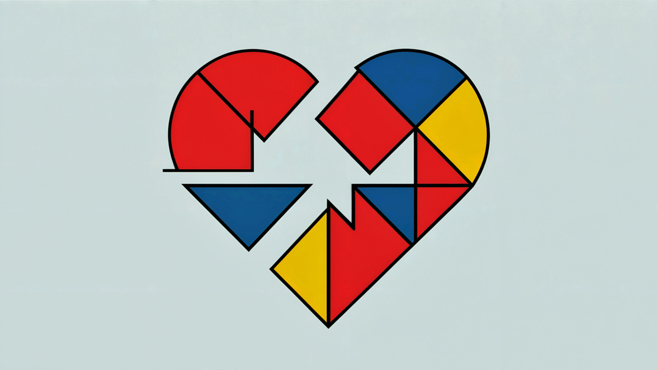
This will likely be seen as a “broken heart” icon — maybe for a social media site — and not as a collection of many separate brightly colored polygons. (Ideogram)
5. Continuity
The human eye naturally follows lines, curves, or a sequence of shapes, even when they intersect with other elements. Our visual perception tends to continue patterns and smooth paths rather than abrupt changes in direction.
In user interface design, continuity helps create a sense of flow and guides users through the interface. It can direct attention, improve navigation, and enhance the overall user experience by making designs feel more intuitive and cohesive.
Designers can leverage continuity by aligning elements, using directional cues, and creating visual paths. This principle is particularly useful for organizing information, guiding users through multi-step processes, and creating harmonious layouts that feel natural to navigate.
Example: In a data visualization dashboard, a line graph displays various trends over time. The continuity principle is evident in how the viewer’s eye naturally follows the ups and downs of each line, even when it crosses grid lines or other data points.
You naturally follow these birds along their smooth flight path across the evening sky. This is clearly a flock, not random individual birds with no relationship: you can easily discern where they’re going. (Midjourney)
6. Connectedness
Elements that are visually linked by a connector such as a line or arrow are perceived as being more related than elements with no connection. This principle helps users understand relationships between different parts of an interface or design.
Designers use this principle to guide the viewer's eye through a composition or to create a sense of movement. It's particularly effective in creating flow in layouts and directing attention to key information.
Example: In process flowcharts or organizational diagrams, lines connecting different shapes or nodes clearly illustrate relationships and sequences. For instance, in a company org chart, lines connecting executive positions to subordinate roles visually represent the hierarchy and reporting structure, making it easy for viewers to understand the organizational layout at a glance.
The difference between connectedness and the previous principle of continuity is that continuity is often used to guide the viewer’s eye through a design, whereas connectedness is used to explicitly group related items.
Classic concept diagram where you can easily see what concepts are connected. (Leonardo)
7. Common Fate
Elements moving or changing together are perceived as related. This principle is particularly relevant in interactive and animated designs.
In user interface design, common fate can be used to group related actions or to provide feedback on user interactions. It's also a powerful tool in data visualization for highlighting trends or relationships.
Example: In a weather app, icons representing different weather conditions might all move in the same direction to indicate wind direction, utilizing the common fate principle to convey information.
It’s hard to visualize the “common fate” Gestalt principle in a still image, because it involves change (often movement). I asked Claude Sonnet for 10 ideas, and only one worked. If you were watching these people dancing, you would typically be able to identify the couples because they tend to move in synch and enter and leave the dance floor together. (Midjourney)
8. Prägnanz (Good Figure)
The principle of Prägnanz, also known as the law of good figure or law of simplicity, states that people tend to interpret ambiguous or complex images as the simplest form possible. Our brains naturally organize information into the most basic, recognizable patterns.
This principle encourages designers to simplify complex information and use familiar shapes and patterns. It's particularly useful in icon design and in creating memorable logos.
Example: The icons used in road signs use simple, easily recognizable shapes and symbols for quick comprehension. You can interpret many of these icons in other ways, but the simplest meaning rules when you quickly drive past the sign.
Compare Ideogram’s suggestion for a street sign for “roadwork” (left) with the European standard sign (right). Yes, we could interpret the European sign as a balloon floating over a headless person, and it’s doubtless safer to wear a hard hat for this kind of work, as drawn by Ideogram. But instead of interpreting the European circle as a balloon, the Prägnanz principle makes viewers assume they’re looking at a picture of a working person. And even though the black pile in the bottom right of the European sign doesn’t look like gravel, we still interpret the image correctly. Ideogram’s version adds unnecessary extraneous detail that would slow down sign recognition.
9. Figure-Ground
The figure-ground principle describes how the human visual system separates elements into foreground (figure) and background (ground). This separation is crucial for object recognition and focus. The principle states that any visual field can be divided into these two parts, with the figure being the object of focus and the ground being everything else.
In complex designs, figure-ground relationships can be ambiguous, jeopardizing usability but leading to interesting visual effects. Designers often manipulate this principle to create visual interest, guide attention, or convey multiple meanings within a single image.
Techniques for designating something as the figure include:
Focus: Sharp, clear elements are perceived as figure, while blurred, faded, or tinted elements tend to be seen as ground.
Contrast: Using contrasting colors, values, or textures to make the figure stand out from the background. For example, using a dark figure on a light background or vice versa.
Color: Warm colors (yellows, oranges, reds) tend to advance and be perceived as figure, while cool colors (blues, greens, purples) tend to recede and be perceived as ground.
Size: Larger elements are more likely to be perceived as figure, while smaller elements tend to recede into the background.
Detail: Adding more detail or complexity to an element makes it more likely to be perceived as figure.
Enclosure: Elements enclosed within a boundary tend to be perceived as figure against the surrounding ground.
Overlapping: When elements overlap, the element that appears to be on top is more likely to be perceived as figure.
Shape: Closed forms or recognizable shapes are more likely to be perceived as figure.
Texture: Elements with distinct textures tend to stand out as figure against a smoother ground.
Motion or implied motion: Moving elements or those that imply movement are more likely to be perceived as figure.
Example: Road signs are designed to stand out against their background, making the sign the figure and the busy traffic the ground. Similarly, in a “lightbox” effect on a website, a popup becomes the figure while the rest of the page is dimmed and becomes the ground. (Don’t overuse this, but when it is beneficial to users to have their attention directed to a popup, usability is enhanced by taking advantage of the figure-ground principle.)
What’s figure, what’s ground? Your ability to easily separate the two is a key Gestalt principle. (Midjourney)
Using Gestalt Principles in UI Design
The Gestalt principles have two primary uses in UX:
Design elements with the same UI function should be shown as being related. For example, using the same visual design, making the elements appear close together, and enclosing them in a box. Using all the Gestalt principles for one set of design elements may be overkill, but multiple principles can often work together and improve usability more than if you relied on a single Gestalt principle to make similar things feel related. For example, if you only used color coding (relying on the similarity principle), color-blind users might not perceive those elements as similar.
Design elements with different UI functions should not be perceived as being similar. Use the Gestalt principles in reverse. For example, use different colors or ensure the items are placed far apart on the screen.
The first point about making similar things appear related also extends to design elements that may be different but should be used together. For example, the price and the “Buy” button on an ecommerce product page should be near each other.
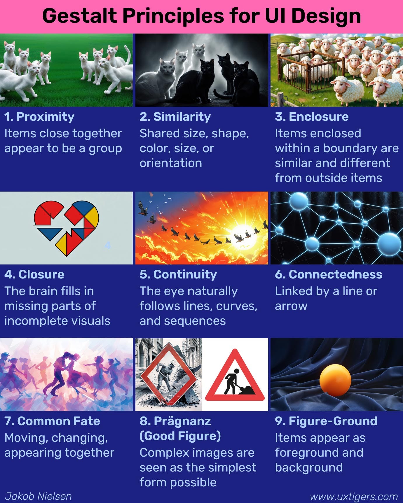
Infographic to summarize this article. Feel free to reuse as long as you give the URL for this article as the source.
About the Author
Jakob Nielsen, Ph.D., is a usability pioneer with 41 years experience in UX and the Founder of UX Tigers. He founded the discount usability movement for fast and cheap iterative design, including heuristic evaluation and the 10 usability heuristics. He formulated the eponymous Jakob’s Law of the Internet User Experience. Named “the king of usability” by Internet Magazine, “the guru of Web page usability” by The New York Times, and “the next best thing to a true time machine” by USA Today.
Previously, Dr. Nielsen was a Sun Microsystems Distinguished Engineer and a Member of Research Staff at Bell Communications Research, the branch of Bell Labs owned by the Regional Bell Operating Companies. He is the author of 8 books, including the best-selling Designing Web Usability: The Practice of Simplicity (published in 22 languages), the foundational Usability Engineering (27,376 citations in Google Scholar), and the pioneering Hypertext and Hypermedia (published two years before the Web launched).
Dr. Nielsen holds 79 United States patents, mainly on making the Internet easier to use. He received the Lifetime Achievement Award for Human–Computer Interaction Practice from ACM SIGCHI and was named a “Titan of Human Factors” by the Human Factors and Ergonomics Society.
· Subscribe to Jakob’s newsletter to get the full text of new articles emailed to you as soon as they are published.
· Read: article about Jakob Nielsen’s career in UX
· Watch: Jakob Nielsen’s 41 years in UX (8 min. video)


