
10 GUI Design Elements Build Every User Interface

Summary: Almost every screen you design is assembled from 10 basic interaction elements: buttons, forms, menus, links, dialog boxes, alerts, icons, checkboxes and radio buttons, tabs, and search. Each is decades old but still misused daily. This article defines the GUI design alphabet, traces its history, and distills 86 evidence-based design guidelines, plus bonus coverage of windows and the pointer.
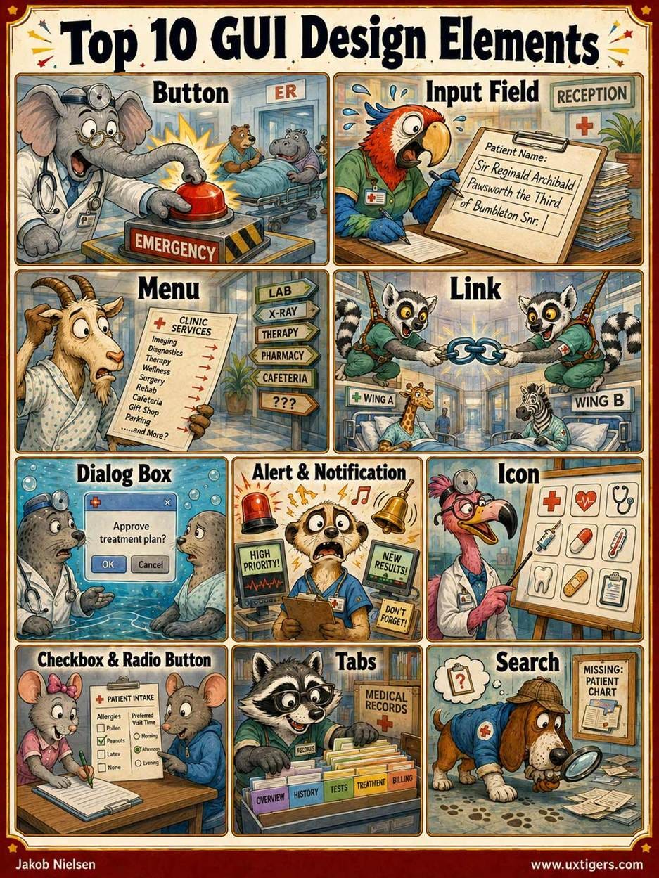
The 10 design components you must master to build any modern user interface.
The graphical user interface (GUI) runs on a small vocabulary. Strip away the branding, and nearly every screen you used today was assembled from roughly a dozen standard parts: a button here, an input field there, a menu across the top, links in the middle, and a dialog box interrupting at the worst moment. This set is our interaction alphabet: just as 26 letters suffice to write every English word, about 10 elements suffice to compose almost every user interface ever shipped. Screens differ endlessly. The letters don’t.
The 10 sort into families as neatly as the chemical elements in the periodic table: buttons act; forms, checkboxes, and search take input; menus, links, and tabs get you there; dialogs and alerts are the system talking back; icons are the symbols everything else wears. They even parse as speech acts. The button commands, the alert asserts, the dialog asks, the link promises, the form interviews, and search, alone among them, listens.
I recently published a complete history of the GUI, tracing 64 years from Spacewar! in 1962 to the interactive world models of 2026. (For the 5-minute version with a beat, watch my music video about the GUI (YouTube). I stand by the iPhone-launch B-roll.) The short version: the GUI won not through any single invention but through the synergy of 4 elements, Windows, Icons, Menus, and Pointer, remembered by the acronym WIMP. Together, they turned the computer from a command sequence into a workspace.
That article covered GUI history. Now to GUI practice. Below are the top 10 GUI design elements, ranked by how much of users’ daily interaction rides on each. For each, I define it, trace where it (and often its odd name) came from, explain how it helps usability, warn where misuse hurts, and close with guidelines you can apply tomorrow. Two of the four WIMP letters (icons and menus) earn top-10 slots on their own merits; the other two (windows and the pointer) get a bonus section, because designers now inherit them more than they design them.
Why write about 40-year-old controls in 2026? Because they’re violated daily, and because of Jakob’s Law: users spend most of their time on other sites and apps, so they expect yours to work like everything else they already know. These 10 elements are the “everything else.”
The familiar wins because conventions are a commons. Every product that ships a recognizable magnifying glass deposits a little more collective learning; every novel “insights” glyph withdraws it. And like every commons, the polluter rarely pays. When a site hides desktop navigation behind a hamburger or cross-dresses a link as a button, the hesitation it creates isn’t confined to that site: it degrades a shared asset the next interface depends on. Design has externalities. Please be a good citizen, not the experience polluter.
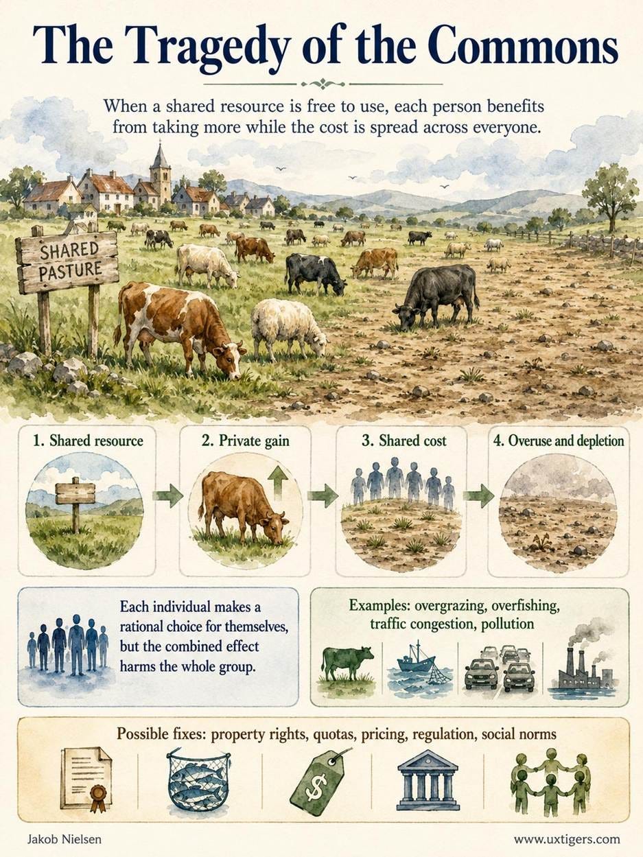
The tragedy of the commons is so common in economics that it got a name. The original example was overgrazing. UX now adds its own example to join overfishing and traffic congestion: degrading design conventions.
1. Buttons: Press to Make Something Happen
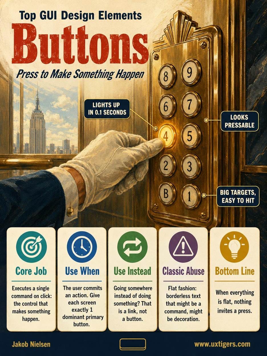
Definition: A button is a self-contained control that executes a single command when clicked or tapped.
The button is the workhorse of interaction design. Whatever else a task involves, it almost always ends with a button press: “Buy Now,” “Send,” “Save,” or the fateful “Delete.” Buttons are the only element that changes the world rather than the view. Links and tabs move the user; menus and dialogs merely rearrange the conversation; a button commits. Money moves, files vanish, messages become unsendable. That asymmetry is why buttons carry the strictest labeling rules in the interaction alphabet: a wrong turn costs a Back click, but a wrong button can cost a customer.
Users traverse your entire design to reach one control: the button that makes something happen. It has earned the pedestal.
The GUI button borrows a century of training from the physical world (doorbells, elevator panels), and early GUIs like the Xerox Star (1981) and the Macintosh (1984) drew buttons with borders and shading to cash in on that training. Don Norman gave the effect its name: perceived affordance. A control that looks pressable invites pressing; a control that looks like decoration invites nothing.
Then fashion intervened. The flat-design wave that crested around 2013 stripped borders and shadows from buttons, leaving users to guess which words on the screen are commands. When everything is flat, nothing invites a press.
The label is a promise about what happens next, so state the outcome with a verb: “Save Invoice,” “Place Order,” “Delete 3 Files.” A bare “OK” forces the user to reread the entire screen to reconstruct what he or she is agreeing to.
Button physics predates the button. Paul Fitts published his law in 1954: pointing time grows with distance and shrinks with target size, so bigger, closer targets are hit faster. Fitts’s law explains why Apple pinned the Lisa’s menu bar to the top screen edge in 1983 (the cursor stops at the edge, giving the target effectively infinite height), and it sets the floor for touch design: the fat-finger problem demands targets of at least 1×1 cm, a guideline most mobile designs still violate.
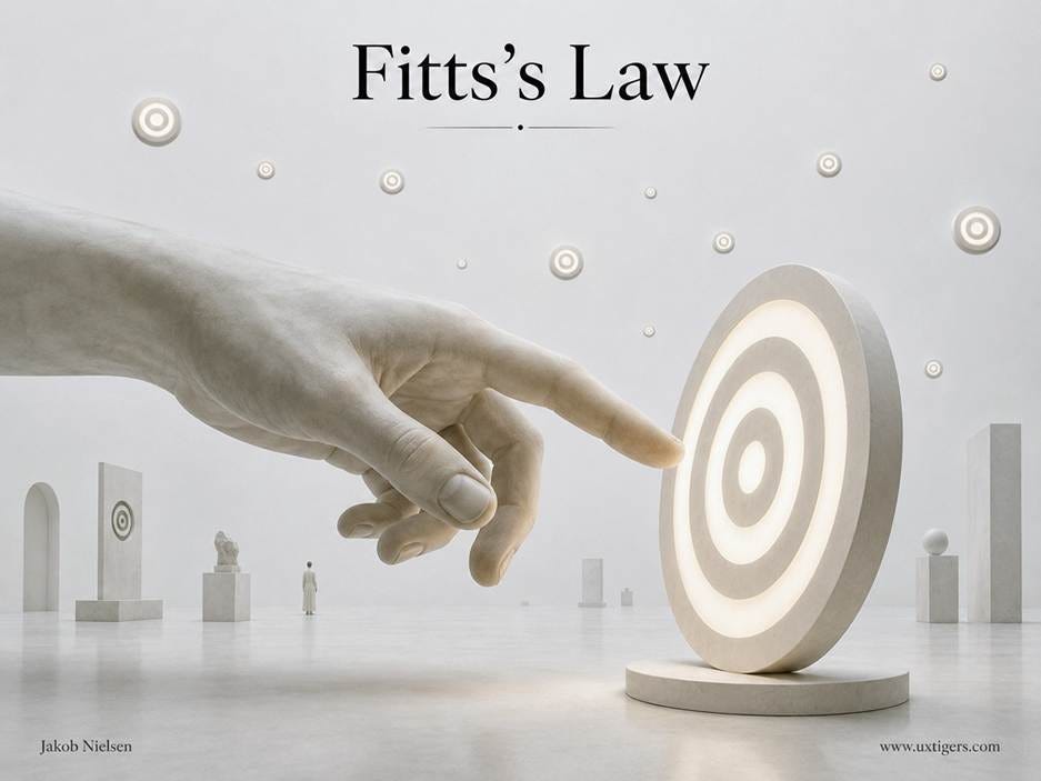
Fitts’s law in one image: pointing time grows with distance and shrinks with target size. The design translation is blunt: make frequent targets big and close.
A hybrid deserves its own mention: the split button, which fuses a command with a menu. The large zone fires the default action in 1 click (“Reply”), while a smaller attached zone, marked by an arrow or 3 dots, opens the variants (“Reply All,” “Forward”). Microsoft’s Office toolbars popularized the pattern in the 1990s, and it solves a real allocation problem: when 1 command dominates its siblings in frequency, the split button keeps the winner instantly clickable and files the rarities in a menu, precisely the split I recommend in the menus section below. 3 cautions apply. Draw a visible divider between the two zones, or each half collects the other’s clicks. Honor Fitts’s law on the small zone, which is easily undersized. And if no single default dominates, use a plain menu button instead; a split button with nothing to promote is a menu button with extra borders.
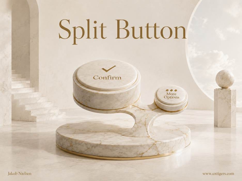
1 pedestal, 2 targets: the split button gives the default action the big zone and tucks the variants behind the small one. The size ratio is the message; frequency of use buys the bigger share of the button.
Finally, unavailable commands. Don’t hide a temporarily disabled button, and don’t let it masquerade as active: show it in a muted version of the primary color, with an explanation of why it’s inactive and how to activate it. I analyzed the evidence in Inactive GUI Controls: Show, Disable, or Hide?
Here are 8 design guidelines for buttons:
Make buttons look pressable. Contained shape, contrast against the background, and a visible state change on press.
Label every button with a verb stating the outcome. “Save Invoice,” never a bare “OK.” If the effect won’t fit in 2–4 words, the problem is deeper than the label.
Give each screen exactly 1 visually dominant primary action. Two competing primaries mean no true primary.
Respect Fitts’s law. Frequent actions get big, close targets, and touch targets measure at least 1×1 cm.
Acknowledge every press within 0.1 seconds. That’s the response-time limit for an interface to feel like it reacted.
Show disabled buttons in a muted version of the primary color, plus an explanation. Users deserve to know the feature exists and what would unlock it.
Use buttons for actions and links for navigation. Users decode the two visual languages differently; don’t cross-dress them.
Place the button where the task ends. After the fields, after the content, at the natural end of the reading flow.
2. Input Fields and Forms: Where Money Changes Hands
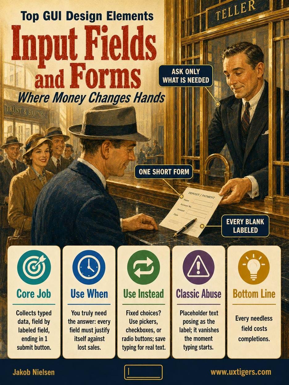
Definition: A text input field is a bounded area where the user types or edits data; a form assembles related fields into a unit that ends in a submit button.
Forms are where money changes hands: checkout, signup, lead generation. Thus, form usability converts into revenue with unusual directness. UX = profits, and nowhere is the equation shorter than in a form.
The simplest of all GUI design elements: the humble text input field. Since text is so versatile, you’ll use this a lot, unexciting as it is.
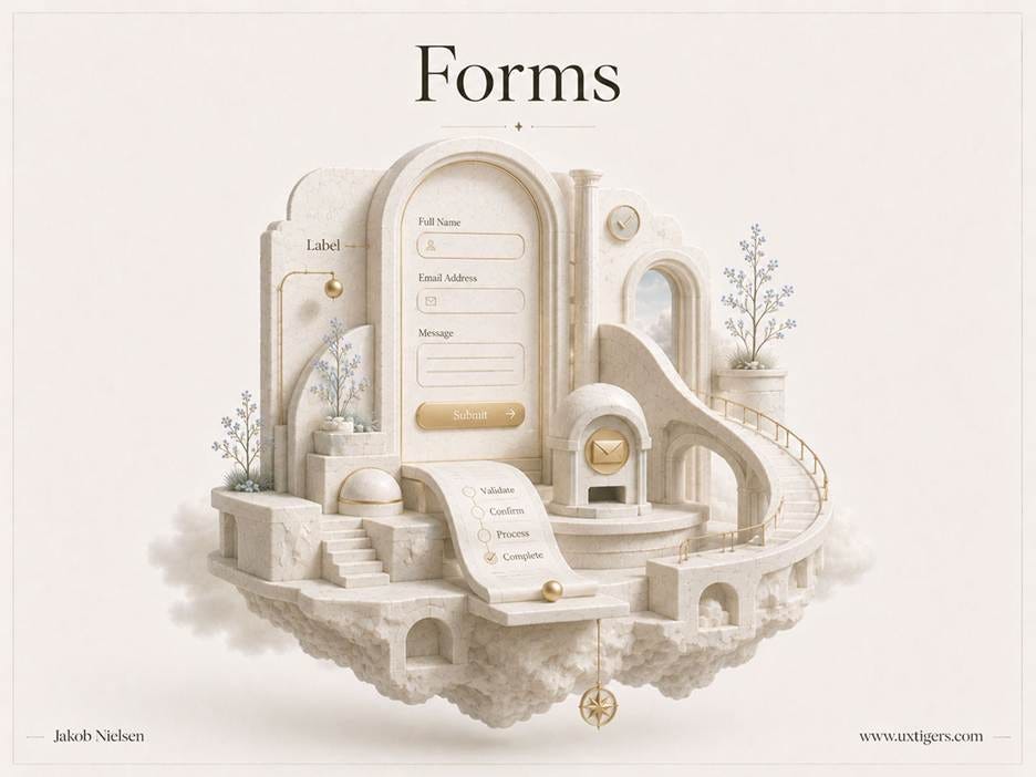
A form is a machine that converts attention into revenue: labels, fields, validation, submit. Every needless part jams the machine.
The core guidelines are old, verified, and ignored. Every field needs a persistent label, because placeholder text inside the field evaporates at the exact moment the user starts typing, which is the exact moment he or she may need it. Input formats should flex: computers exist to format data, so accept phone numbers with or without dashes and clean them up in code. Error feedback belongs next to the offending field, in plain words, with the user’s data intact. (Wiping a half-completed form because 1 field failed remains a capital offense. It still happens often enough to rank 10th on my list of top UI annoyances.)
Match the control to the data. A task that involves dates, such as booking an airline ticket, deserves a date picker rather than a naked text field and a prayer about formats. Commerce needs controls that match how shoppers think: a mini trash-can icon to remove an item from the cart, because users don’t conceive of “not buying” as “setting the quantity to 0.” Their mental model is removal, so give them removal.
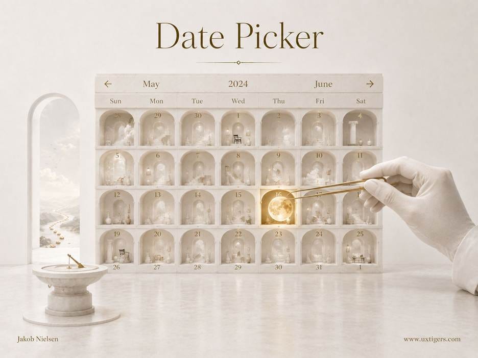
Specialized tasks can benefit from specialized input controls on the form. The date picker is standard (meaning that users understand it) and prevents many errors.
But the strongest form guideline is subtraction. Every needless field costs completions. Even an optional field levies a field tax: users must notice it, interpret it, decide whether it applies, and verify that skipping it is safe. Optional in the database is not optional in the user’s attention.
Survey methodologists have quantified this burden for decades: the U.S. Census Bureau estimates respondent minutes the way engineers estimate latency. One finding transfers from the Census to your website: perceived burden predicts abandonment better than actual burden. A form can drive users away before they’ve typed a character. There’s a counterintuitive fix: print the burden. “3 questions, 40 seconds” converts dread into a bargain. Governments are legally required to publish burden estimates for their paperwork; a form that volunteers its own signals a confidence most sites can’t fake. (But tell the truth: saying a form will take a minute when it requires 5 will lose any trust people have in your brand.)
The classic case: Expedia reported gaining an extra $12 million a year after deleting 1 optional field (“Company”) from a booking form, because customers typed their bank’s name there, then the bank’s address, and failed payment verification. Interrogate every field you’re tempted to mark as required: would you rather have the data or the sale? The best form field is the one you don’t have and users don’t have to deal with.
Here are 8 design guidelines for input fields and forms:
Delete every field that isn’t strictly needed. Each field you cut raises completions; each field you keep must justify itself against lost revenue.
Give every field a persistent label outside the field. Placeholder text is a hint, not a label; it disappears when typing starts.
Accept flexible input formats. Rejecting “(555) 123-4567” because you wanted “5551234567” is the computer delegating its job to the human.
Place error messages next to the offending field, and preserve everything the user typed. A form that punishes errors by destroying work won’t be completed twice.
Use specialized controls where they fit the task. Date pickers for dates, and a trash-can icon for removing items from a cart or list.
Lay out forms in a single column with related fields grouped. Multi-column layouts create ambiguous reading orders, so users skip fields.
Label the submit button with the outcome. “Place Order,” not “Submit,” so the final click carries no doubt.
Don’t validate half-typed input. Yelling “invalid email” mid-keystroke is premature judgment; validate when the user leaves the field.
3. Menus: Information Architecture Made Visible
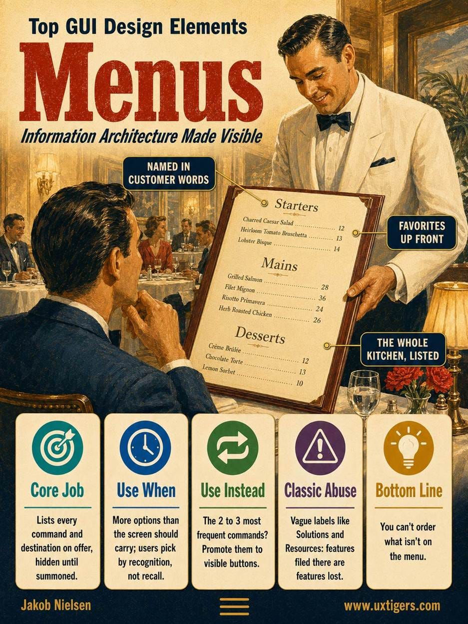
Definition: A menu is a list of commands or navigation options that stays hidden until summoned.
Menus deliver two benefits at once. They save screen space, and they support recognition over recall (usability heuristic 6): users pick from visible choices instead of remembering command names. That trade is the founding bargain of the GUI, and the name comes from the restaurant: a menu lists what the kitchen can make, and you can’t order what isn’t on it. That second clause is the whole caveat.
A menu, unlike a search box, is a completeness claim: users read it as the full inventory of what the kitchen can make. That’s the hidden epistemology of navigation: menus enumerate; search and prompts allow infinity. Choose menus when the possibility space fits on a card and search when it doesn’t. And anything filed under a label users won’t open isn’t hard to find; as far as the user is concerned, it doesn’t exist.
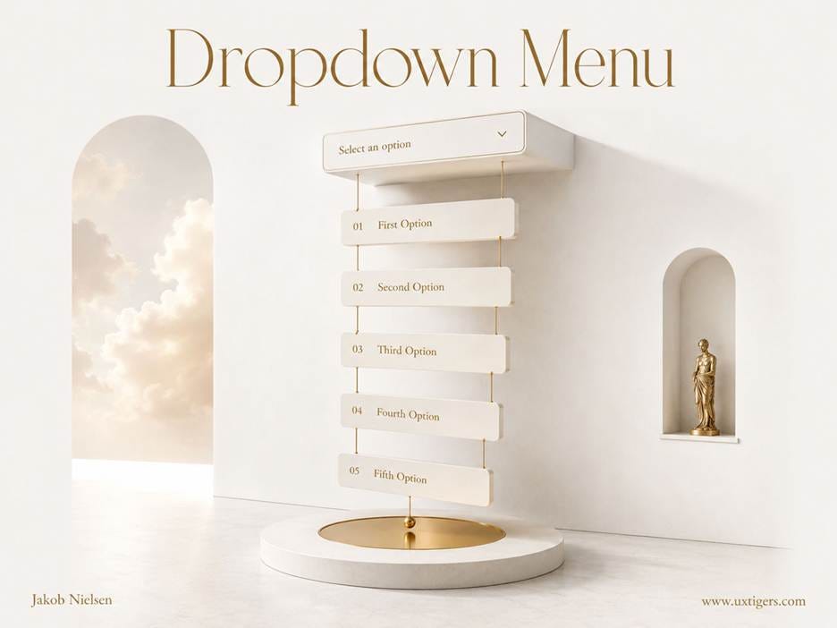
The dropdown’s bargain: 5 options rent the screen space of 1. The label on the closed state decides whether users ever see these options.
The Xerox Star shipped the first fixed drop-down menus in 1981, replacing the pop-up menus users kept losing. Apple pinned the menu bar to the top of the Lisa screen in 1983 (Fitts’s law at work again). Cascading menus added hierarchy, mega-menus supersized the dropdown for 2000s e-commerce, and the mobile hamburger (3 stacked lines, drawn by Norm Cox for the Xerox Star in 1981) got resurrected 3 decades later. Microsoft’s Office Ribbon (2007) hybridized menu and toolbar. (Credit where due: the Ribbon was a serious, user-tested attempt to tame 1,000+ commands, and its grouped, labeled icons follow half the guidelines in this article.)
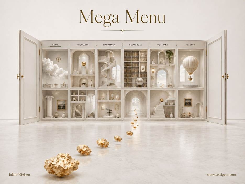
Mega menus open the door to many more options in one place, which can improve the information scent of the site’s categories by defining them through examples.
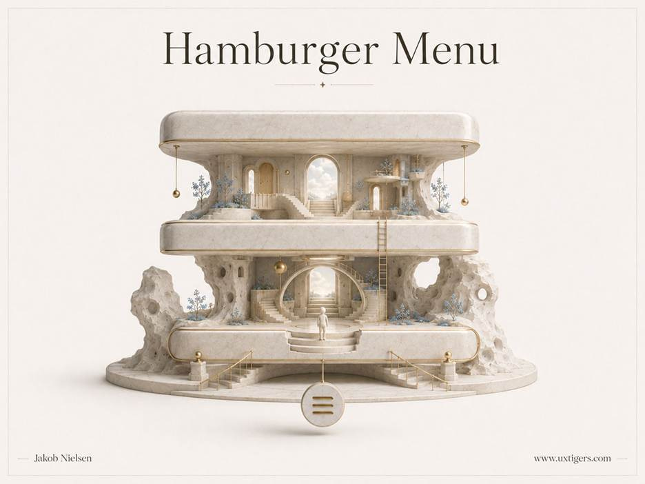
The hamburger menu has its place on mobile screens where space is at a premium. On large desktop monitors, it risks being overlooked.
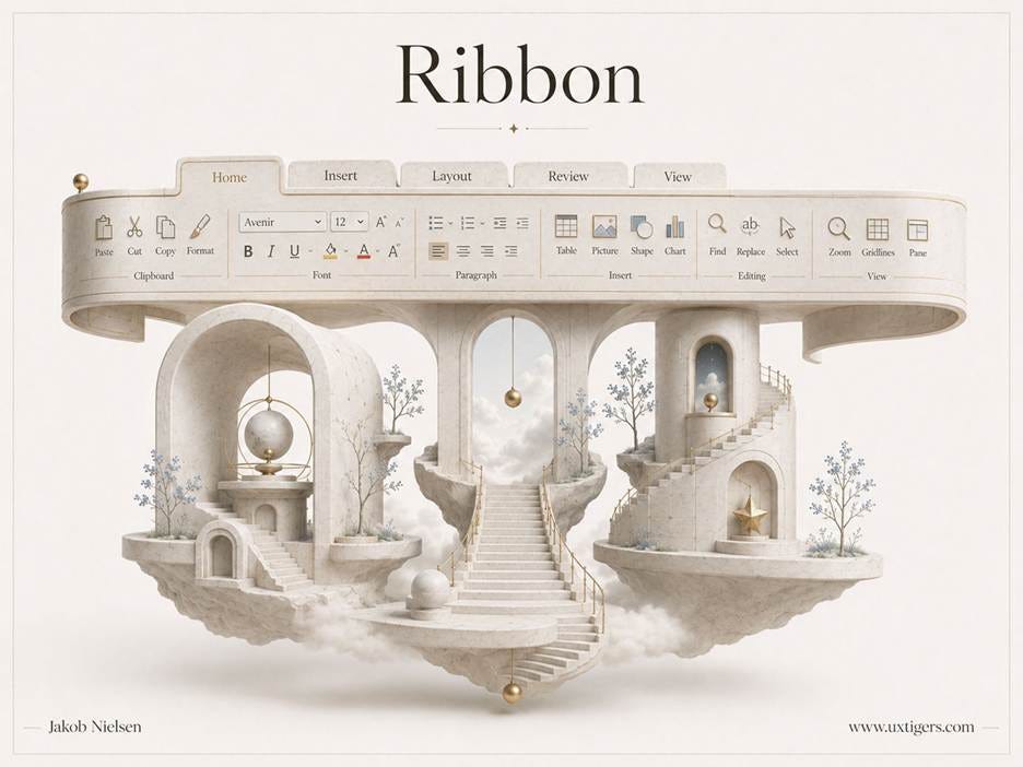
The Microsoft Ribbon was a great advance in menu design. Too bad it’s almost never encountered outside Microsoft Office.
Menu structure is information architecture made visible. The category names decide whether users find a feature or conclude it doesn’t exist: a feature filed under a vague label like “Solutions” or “Resources” is a feature lost. And the famous 7±2 limit doesn’t apply, because visible items don’t tax working memory. A long, well-labeled menu beats a short cryptic one every time.
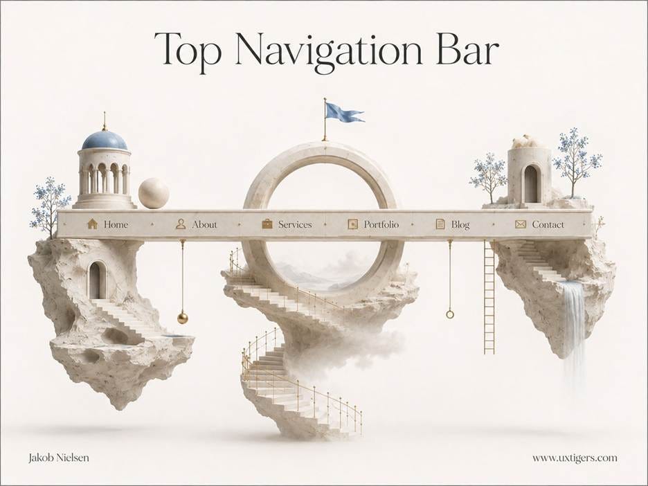
The top navigation bar is your information architecture printed where everyone can see it. The 6 words you pick decide which features exist in users’ minds.
Countless pixels have been spilled arguing over top versus side navigation on websites. The answer: it doesn’t matter. Both are standard patterns that users know and love.
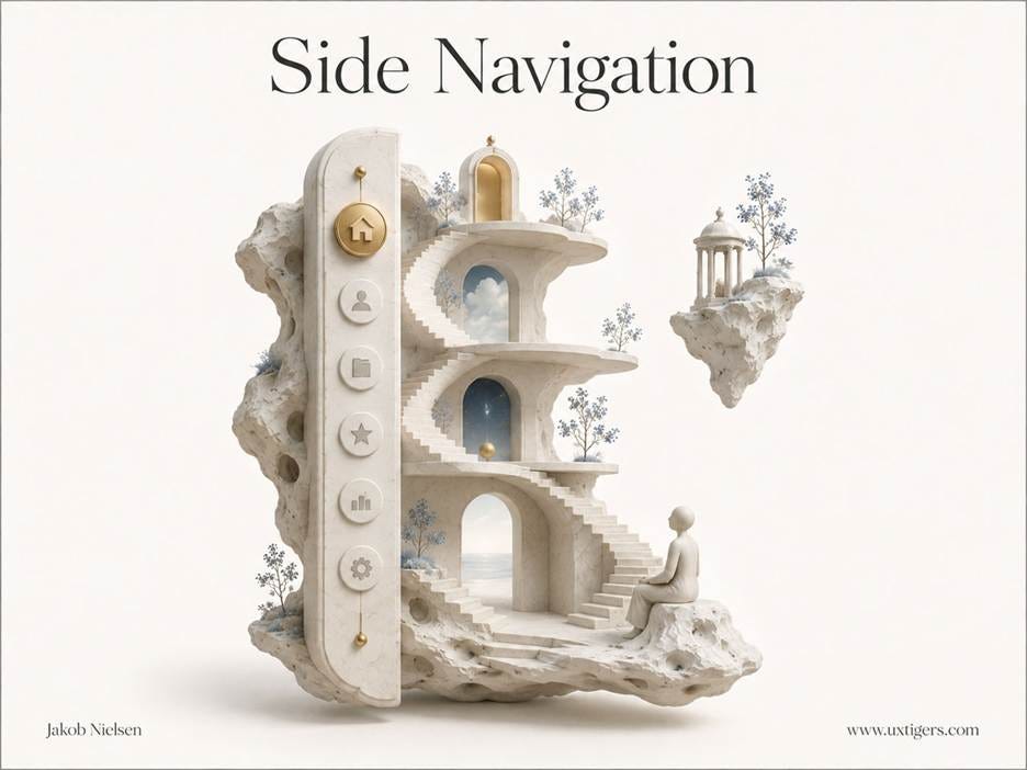
Side navigation has the advantage of allowing for a longer list of options. Since users can see and scan the options, they don’t need to keep them in memory, so don’t worry about Miller’s Law (the 7±2 memory limit).
The classic failure mode is the hover-opened cascading menu with a hair trigger: the user aims diagonally at a submenu item, the pointer crosses a neighboring entry, and the whole structure collapses mid-flight. Depth compounds the risk. The hamburger deserves its own warning: a defensible compromise on a phone, a self-inflicted wound on a desktop, because navigation users can’t see is navigation they won’t use. Out of sight, out of mind, out of business.
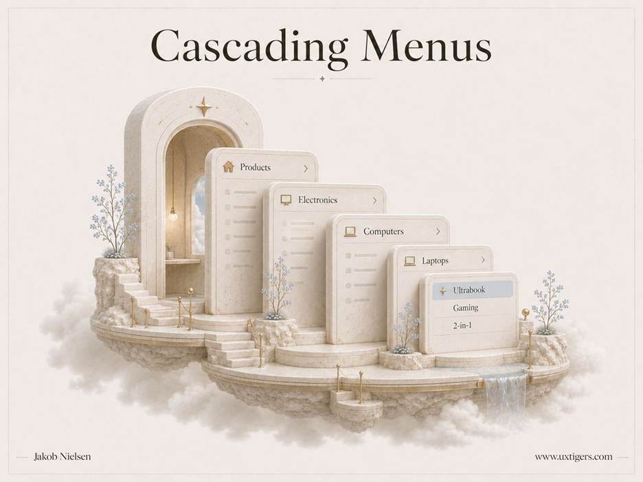
Cascading menus descend from Products to Ultrabook in 5 levels. Every added level multiplies both the pointing precision required and the chance that 1 wrong pixel collapses the stack.
My 7 design guidelines for menus:
Name categories in the users’ vocabulary, verified with card sorting and tree testing. Your org chart is not an information architecture.
Prefer click-to-open over hover-to-open. If you must use hover, add a short delay and a diagonal tolerance path.
Limit cascades to 2 levels. If the hierarchy needs more, restructure the categories rather than deepening the cascade.
Show top-level navigation on desktop screens. Reserve the hamburger for small screens where space truly forbids visible options.
Mark the user’s current location in navigation menus. A nav bar without it is a map missing the “you are here” dot.
Order items by importance and task frequency. Alphabetize only when users know the exact name of what they seek.
Keep the 2–3 most frequent commands out of menus entirely. Promote them to visible buttons; menus are for the long tail.
4. Links: The Atom the Web Is Built From
Definition: A hypertext link is text (or an image) that transports the user elsewhere when clicked.
The link is the atom the web is built from. Vannevar Bush sketched associative trails between documents in his 1945 essay “As We May Think,” Ted Nelson coined the word “hypertext” in 1963, Doug Engelbart demonstrated working links in 1968, and Tim Berners-Lee shipped the web in 1991. NCSA Mosaic colored links blue and underlined them in 1993, and the convention stuck. (I wrote my first book on the topic, Hypertext and Hypermedia, in 1990, back when links were a research area rather than the planet’s plumbing.)
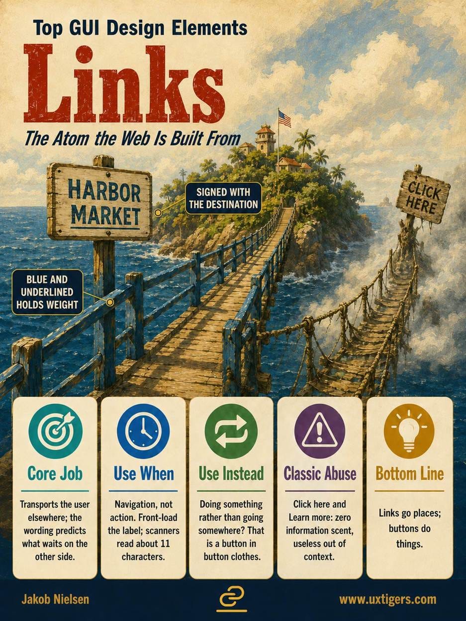
A link makes two promises: that it can be clicked, and what awaits on the other side. The first promise is visual, and color plus underline remains the strongest signal. The second promise rides on the wording, what Peter Pirolli and Stuart Card at Xerox PARC called information scent: users predict the destination from the label the way an animal follows scent to food. “Click here” and “learn more” have zero scent. Worse, scanning users often read only about the first 11 characters of a link, so a page full of “Learn more” links reads as “Learn more, learn more, learn more.” Nothing learned.
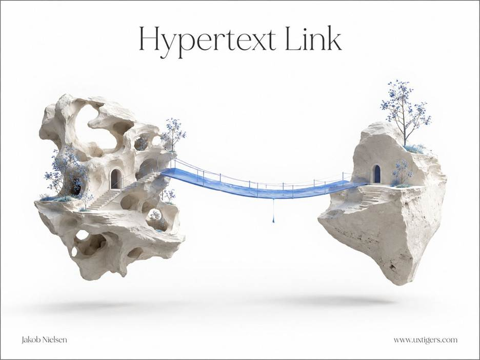
A link is a bridge between two islands of content. Blue and underlined remains the strongest signal that the bridge will hold your weight.
One boundary matters above the rest: links go places; buttons do things. Blur the two visual languages, links dressed as buttons and buttons dressed as links, and users hesitate before every click, paying a small tax across the entire interface.
The 7 design guidelines for links:
Make links look like links. Color plus underline for links inside text; color alone fails colorblind users and cheap screens.
Reserve link formatting for links. Underline nothing else, or you’ve trained users to click furniture.
Front-load the information-carrying words. The first 11 characters do most of the work when users scan.
Write link text that predicts the destination and makes sense out of context. Screen-reader users pull up lists of all links on a page; 14 “click here” entries make a useless list.
Differentiate visited from unvisited links in link-heavy designs. Showing where users have already been prevents accidental revisits and supports wayfinding.
Don’t dress links as buttons or buttons as links. The visual grammar carries meaning; garbling it costs a moment of doubt on every click.
Open links in the same tab by default. When you make an exception, flag it in the link, e.g., “(PDF).”
5. Dialog Boxes: Interruptions Must Earn Their Keep
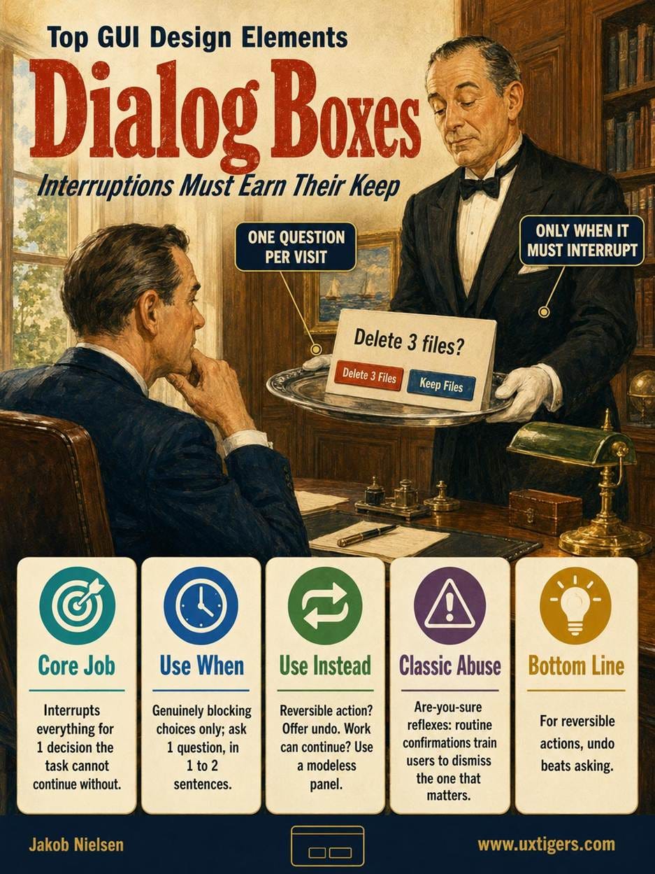
Definition: A dialog box is a secondary window that interrupts the main flow to ask a question, collect a decision, or deliver news the user must acknowledge. A modal dialog blocks all other work until dismissed; a modeless dialog lets work continue.
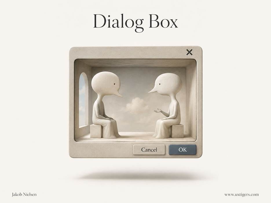
The name is straightforward: a dialog is a conversation between the system and the user. Like any conversation partner, it’s judged by whether the interruption was worth it.
The Macintosh codified the grammar in 1984: message, OK button, Cancel button. That grammar contains the classic trap. Outcome labels beat OK/Cancel, because “Delete 3 Files” versus “Keep Files” survives contexts where OK/Cancel collapses. Ask “Do you want to cancel your subscription?” above a “Cancel” button, and nobody knows what happens next.
Interruption taxes attention. A modal dialog yanks the user out of his or her task, and the working memory holding that task pays the bill. So a modal must earn the interruption: a blocking decision, an irreversible consequence, an input without which nothing proceeds.
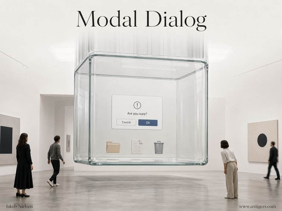
Modal dialog boxes hold the user’s task hostage until they get an answer.
Everything else belongs inline or in a modeless panel. Beware confirmation fatigue, too: pepper users with “Are you sure?” for trivial acts, and they’ll learn to dismiss on reflex, and the reflex will also dismiss the 1 confirmation that mattered. For reversible actions, undo beats asking.
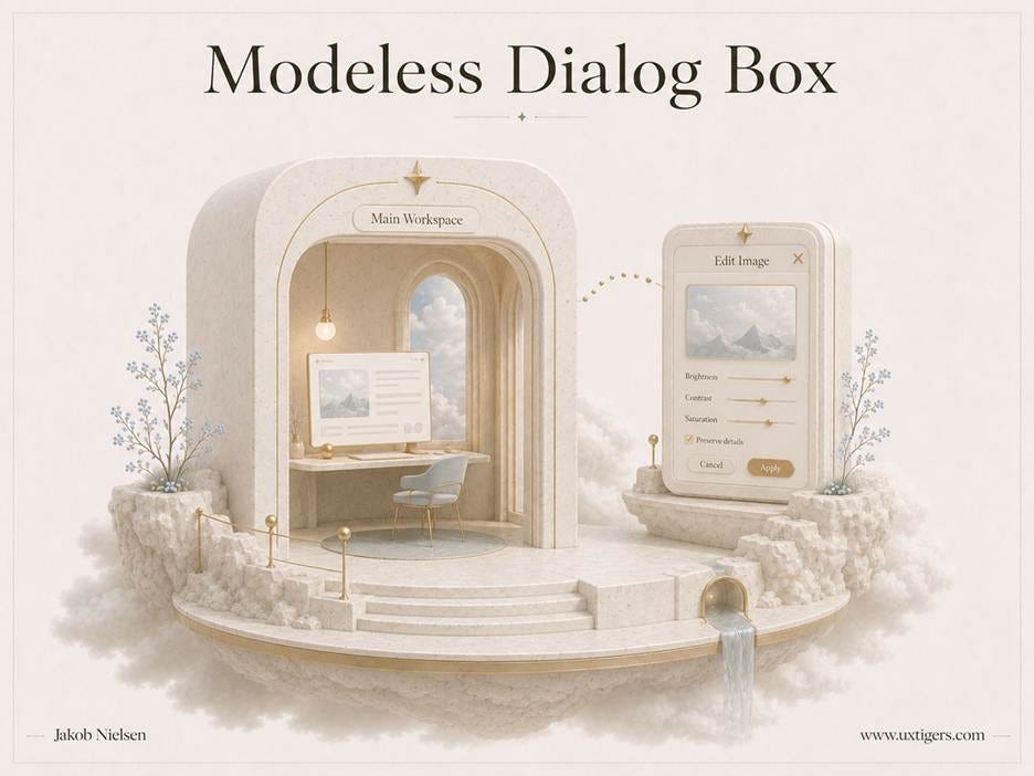
Modeless dialog boxes usually have superior usability: the conversation stays open, and so does the work.
The web shows what happens when this element escapes adult supervision: pop-up ads (invented at Tripod.com in the late 1990s; the responsible programmer, Ethan Zuckerman, has since apologized in print, and I accept on behalf of the world’s users), cookie-consent walls stacking up since 2018, and newsletter overlays demanding commitment before the visitor has read a single paragraph. Some of this is ignorance, and some is deliberate dark design. Either way, users pay.
The company pays too; it just gets a delayed invoice. Analytics credit the overlay for the 3% who subscribed and record nothing for the 97% who frowned. Resentment has no event handler. Dark patterns persist partly because their costs are real but uninstrumented, surfacing weeks later as unsubscribes and churn, unattributed. If you must run an overlay, measure what it costs, not just what it bullies into being.

The popup crashes through the wall of the user’s task, uninvited: 30% off the merchandise, 100% on the resentment. Every survey of hated advertising formats I’ve seen since the 1990s puts it at #1.
8 design guidelines for dialog boxes:
Go modal only for genuinely blocking decisions. If the user could reasonably keep working, the interruption wasn’t earned.
Label the buttons with outcomes. “Delete 3 Files” and “Keep Files” answer the question; “OK” and “Cancel” obscure it.
Make the safe choice the default, and let Esc always cancel. A stray Enter keystroke should never destroy anything.
Ask 1 question per dialog, in 1–2 sentences. Situation, consequence, choice; a dialog is not a reading assignment.
Prefer undo to confirmation for reversible actions. Undo protects users without training them to click through warnings.
Use modeless dialogs when work can continue. Find-and-replace solved this in the 1980s.
Never greet arriving visitors with an overlay. Asking for the email address before delivering any value is asking to go steady before saying hello.
Never stack dialogs on dialogs. A queue of interruptions means the design upstream already failed.
6. Alerts, Notifications, and Error Messages: The System’s Half of the Conversation
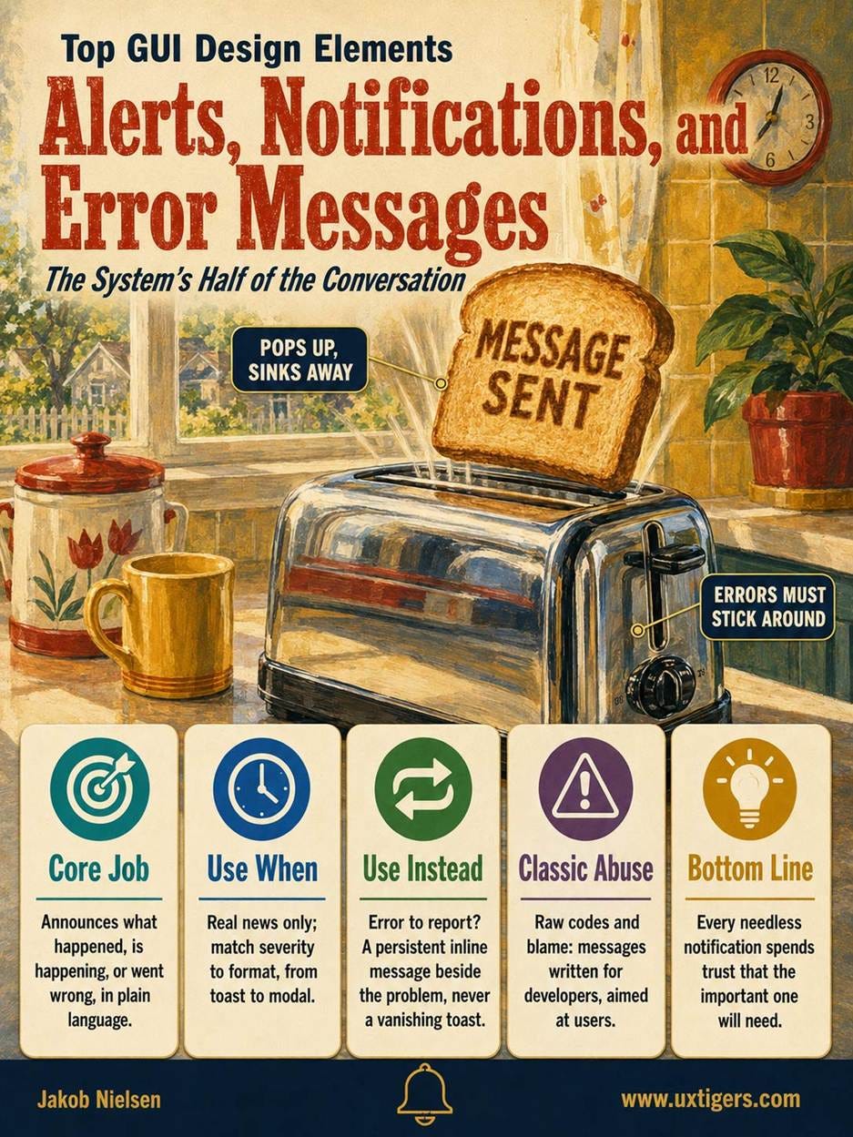
Definition: Alerts, notifications, and error messages are the system’s side of the conversation: short announcements that something happened, is happening, or went wrong.

An alert demands the user’s attention by force. Attention is fragile, and every unnecessary alarm leaves another crack.
The formats range from inline validation text to banners, badges, and toasts. The toast earned its name around 2000, when Microsoft’s MSN Messenger notifications slid up from the taskbar like bread from a toaster. That self-dismissal makes the toast fine for confirmations (“Message sent”) and malpractice for anything the user must act on: an error that evaporates in 4 seconds will be rediscovered the hard way.
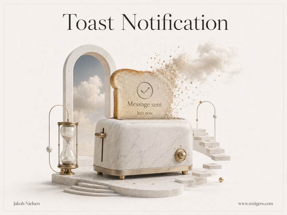
The toast pops up, confirms, and sinks away on its own. Perfect for “Message sent.” Wrong for error messages, which must persist until the problem is fixed.
Error messages are the most consequential members of the family, and their guidelines predate the GUI itself: say what went wrong in plain language, be precise about where, state how to recover, and never blame the user. I canonized these rules as usability heuristic 9 in 1994, but they were already old wisdom from the mainframe era. MS-DOS’s “Abort, Retry, Ignore?” belongs in a museum, ideally next to the laser printer that said “PC LOAD LETTER.” Yet “An error occurred” still ships in 2026: 4 decades of guidelines, ignored in 3 words. Do better, people!
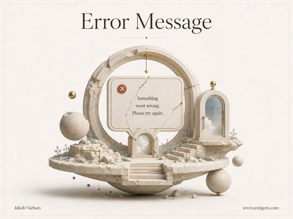
The error message is a teachable moment, assuming that it actually teaches something by explaining exactly what went wrong instead of being bland and useless.
Two more failure modes deserve naming. First, color-only signaling: roughly 1 in 12 men has red-green color deficiency, so “fields marked in red” communicates nothing to him; pair color with an icon and words. Second, notification spam: every needless notification spends trust that the important one will need. An app that runs up its badge count on trivia trains its users to ignore its badges.

Notification badges are an imposition on users and generate FOMO anxiety. Only use them to count things that users care about.
7 design guidelines for alerts, notifications, and error messages:
Write in plain language, never raw error codes alone. “Error 0x80004005” is a message the developers wrote for themselves.
Say precisely what went wrong and where. Point to the field, the file, or the step; “something went wrong” helps no one.
State the way forward. A good error message is a 1-sentence recovery plan.
Never blame the user. Ban “illegal,” “fatal,” “invalid user,” and every phrasing that assigns guilt to the person who trusted your product.
Match severity to format. Toasts for FYIs, persistent inline messages for errors that stay until fixed, and modal alerts only for catastrophes.
Signal with icon plus color plus words. Redundant coding reaches everyone, including colorblind users.
Ration notifications. Default to fewer, let users tune the volume; each interruption withdraws from a finite trust account.
7. Icons: Small Pictures, Big Misunderstandings
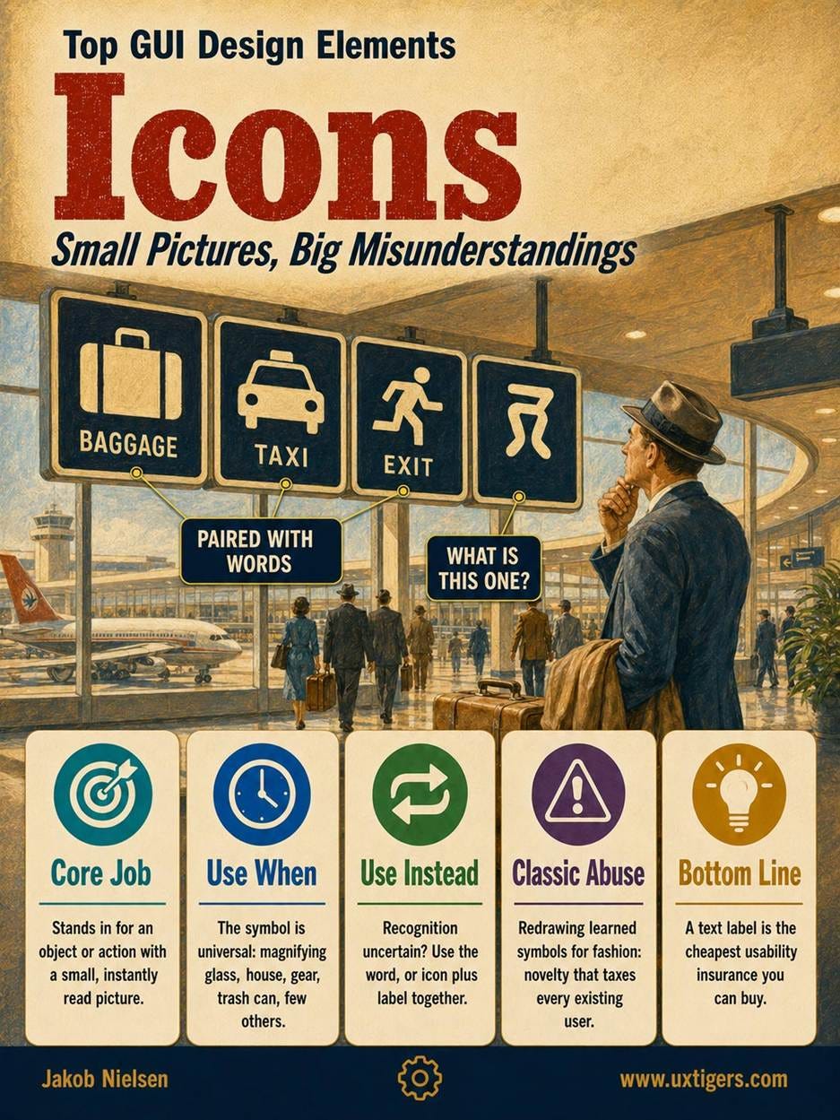
Definition: An icon is a small pictogram standing in for an object, an action, or a status.
Icons save space, survive translation, and make toolbars scannable at a glance. David Canfield Smith coined the GUI meaning in 1975, borrowing from the Russian Orthodox tradition in which an icon doesn’t merely depict its subject but embodies its essential properties. The Xerox Star shipped icons commercially in 1981, and Susan Kare drew the Macintosh set in 1984, including the trash can that users still drag things into 42 years later. The floppy-disk Save icon has outlived the floppy disk by two decades: proof that an icon can persist as pure convention, recognized by millions who never touched a floppy.
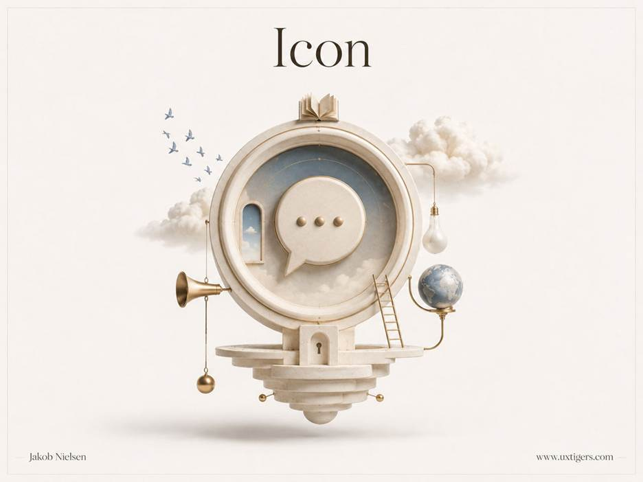
An icon compresses meaning into a thumbnail-sized picture. The compression is lossy: users decompress unfamiliar icons into the wrong meaning with impressive regularity.
The chronic weakness of icons is that users guess wrong about unfamiliar pictures, and only a handful approach universal recognition: the magnifying glass, the house, the gear, the trash can. Everything else is a hypothesis awaiting a test, hence the guideline of 30 years’ standing: pair icons with text labels unless space truly forbids it. A text label is the cheapest usability insurance you can buy. Every labeled icon is a lesson; every unlabeled icon is an exam. Repeat the pairing often enough and the label teaches the icon until the icon can stand alone, which is exactly how the magnifying glass earned its independence.
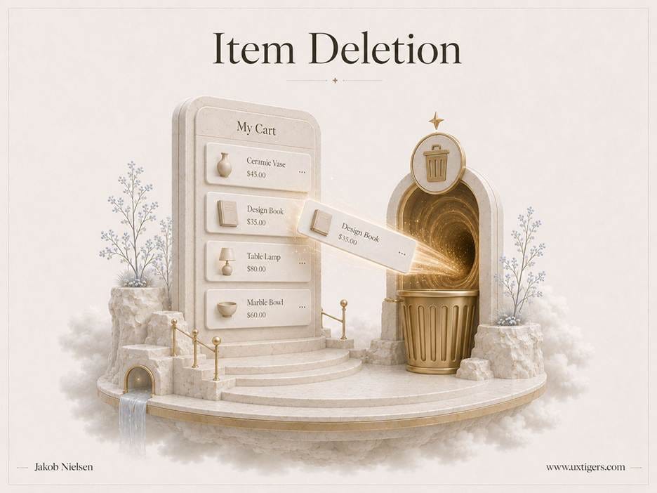
Every user knows what the trash can icon does. Keep it.
Familiar icons are convention capital: collective learning accumulated across products and decades. Redrawing a standard symbol spends that capital and sends the bill to every user. Novelty is justified only when the new symbol buys more meaning than it destroys.
Finally, the humblest icon of all: the favicon, born in 1999 with Internet Explorer 5 as the “favorites icon,” 16×16 pixels in size. Its modern job is identification in the chaos of open browser tabs: past 15–20 tabs, page titles truncate to nothing, and the favicon is the only identity your site has left. A distinctive favicon is the smallest billboard your brand will ever buy. Make it legible.
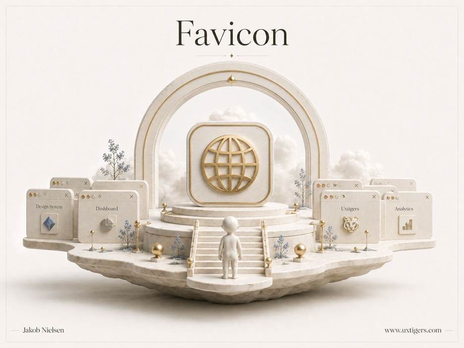
At 16×16 pixels, the favicon is often the only part of your identity that survives in a crowded tab bar. Users hunting for your tab among 30 others navigate by this postage stamp.
7 design guidelines for icons:
Pair icons with text labels. Where space truly forbids one, provide a tooltip and accept that you’ve traded learnability for pixels.
Use the standard metaphor when one exists. A new symbol for search or settings spends user attention to buy nothing.
Test recognition before trusting a metaphor. Show the icon alone to 5 users and ask what it means; hesitation is your answer.
Keep a consistent visual style with distinct silhouettes. An icon set should look like siblings that can be told apart at a squint.
Don’t redesign learned icons for fashion. Every redesign of a familiar symbol taxes every existing user to please the design team.
Ship a favicon that survives 16×16 pixels. Simplify the logo to one strong shape in a brand color; fine detail turns to mud at that size.
Reserve icon-only buttons for the universal handful. The magnifying glass can stand alone; your novel “insights” glyph can’t.
8. Checkboxes and Radio Buttons: Squares Say “Pick Any,” Circles Say “Pick One”
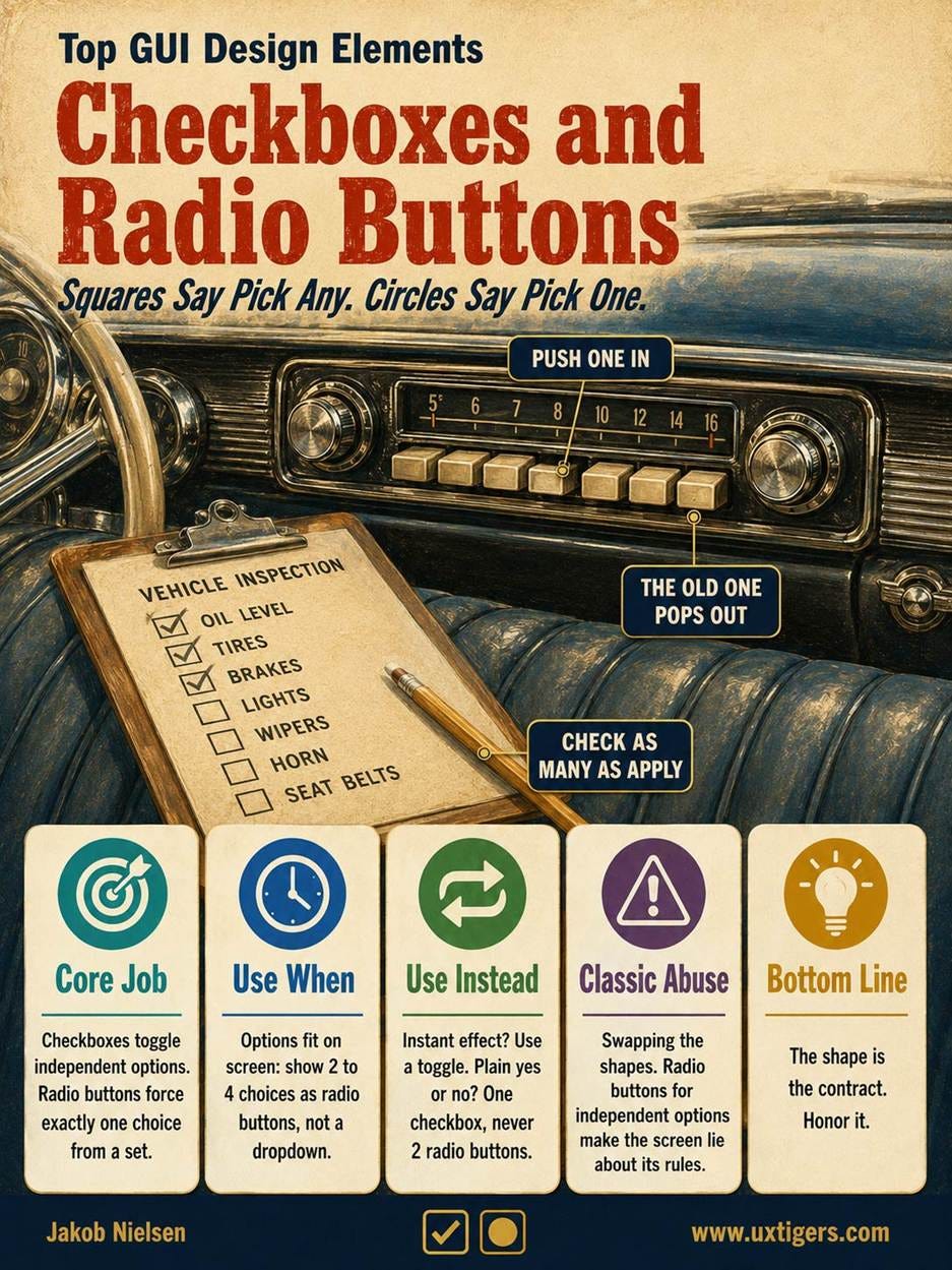
Definition: A checkbox toggles one independent option on or off, and a group of checkboxes permits multiple selections; radio buttons present a mutually exclusive set from which exactly 1 choice must emerge.
These sibling controls split the job of selection, and both names carry history. The checkbox comes from paper forms, where you check the box. The radio button comes from mechanical car-radio presets: push 1 button in, and the previously selected button pops out. (Readers of a certain age will remember the satisfying clunk; the rest of you will have to trust us.)
The controls also teach silently. The shape declares the choice model: squares say “pick any,” circles say “pick exactly 1.” Decades of exposure taught users this grammar, so when a designer swaps the two (radio buttons for independent options, checkboxes for exclusive ones), the screen lies about its own rules. Designers make this swap constantly. Stop it.

The checked square makes a quiet promise: this option is independent, and you may select as many of its siblings as you like.
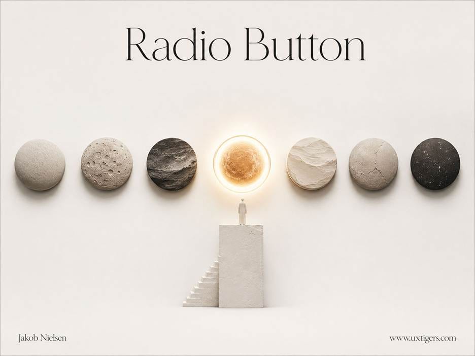
7 presets, 1 selection: push a new radio button in, and the old one pops out. Exactly 1 choice must emerge; that’s the contract the circle signs.
Radio buttons have two quirks worth engineering around. A radio group can’t be deselected once touched, so if abstention is legitimate, add an explicit “None” option. And a group with no default invites accidental non-answers, so preselect the safest or most common choice unless a default would bias a survey response.
The toggle switch is the checkbox’s flashier cousin, popularized by the iPhone in 2007, and the division of labor is clean: use a toggle when the effect is immediate (like a light switch: flip it, and the light responds now); use a checkbox when a submit button commits the choice. A toggle sitting above a Save button is a contradiction: did the setting apply when I flipped it, or when I saved? Nobody knows.
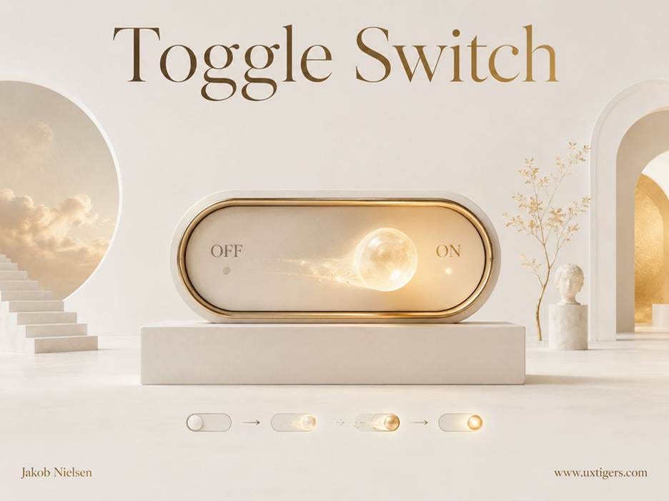
A toggle flips a setting the way a light switch flips a lamp: immediately. If a Save button must confirm the change, use a checkbox instead.
8 design guidelines for checkboxes, radio buttons, and toggles:
Use checkboxes for independent options and radio buttons for mutually exclusive sets. The shape is the contract; honor it.
Stack options vertically. Horizontal layouts create ambiguity about which label belongs to which control.
Make the labels clickable. A 14-pixel circle is a cruel target; the label multiplies the target area for free. (Fitts approves.)
Preselect a sensible default in radio groups, and add a “None” option when abstention is valid. Users can’t un-choose a radio group once touched.
Phrase options positively. “Send me the newsletter” beats “Don’t exclude me from communications,” and nested negations belong nowhere.
Use a toggle only when the setting takes effect instantly. If a submit step follows, it’s a checkbox.
Represent a yes/no choice as 1 checkbox, not 2 radio buttons. 1 control, 1 decision, half the reading.
Show 2–4 options as visible radio buttons rather than a dropdown. Seeing all choices at once beats an extra click plus a memory test.
9. Tabs: One Row, Same Type, Same Level
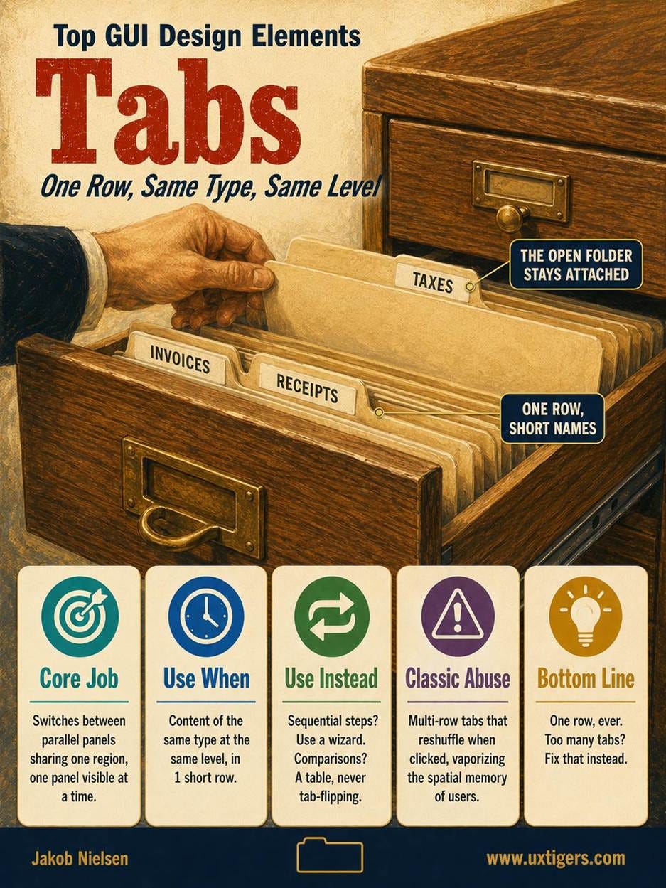
Definition: Tabs are parallel panels that share a region of the screen, with a single panel visible and the rest labeled along the edge.
The metaphor comes straight from the file drawer: card dividers with protruding labeled tabs. Tabbed dialogs entered software in the early 1990s, and browser tabs followed in the 2000s (though those belong to window management). In-page tabs suit content of the same type at the same level: a product’s details, reviews, and specs.
The physical metaphor dictates the rules. The selected tab must look attached to its panel, unselected tabs must look clickable but subordinate, labels must stay short, and 1 row is the limit. Microsoft’s mid-1990s options dialogs crammed a dozen tabs into multiple rows, and clicking a back-row tab reshuffled the rows, vaporizing the user’s spatial memory. The industry learned; don’t relearn it at your users’ expense.
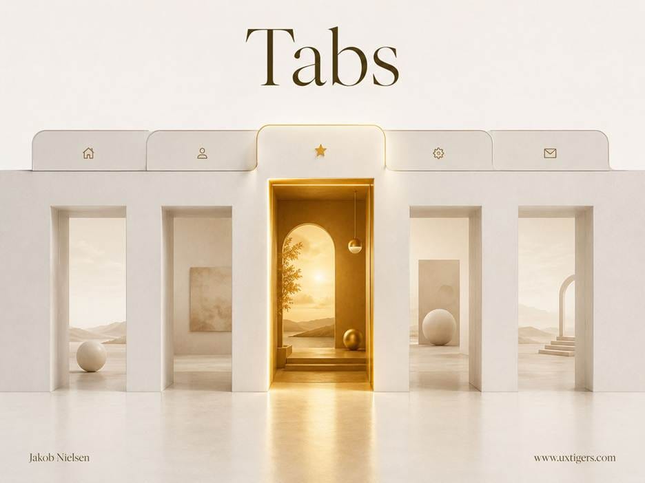
The selected tab must look physically connected to its panel, like the open door to a lit room. If users can’t tell which tab is active, the metaphor has collapsed.
Two further misuses recur. Tabs are the wrong pattern for sequential steps: a checkout is a wizard, not a filing cabinet, because steps have an order while tabs promise free movement. And tabs hide content, so if users must compare data across panels, tabs convert recognition back into recall, and your design regresses 40 years in 1 decision. Comparisons want a table.
Tabs mint places. Users think of tabbed content as locations, and places need addresses. That’s the deeper reason every tab deserves a URL: on the web, a place you can’t link to is a place that doesn’t fully exist.
My 7 design guidelines for tabs:
Use 1 row of tabs, ever. If they don’t fit, you have too many tabs or too-long labels; fix that instead.
Keep labels to 1–2 plain words. Tabs are headings for parallel content, not sentences.
Connect the selected tab visually to its panel, and make it distinct from its neighbors. Current, hovered, and unselected tabs must have 3 different appearances.
Reserve tabs for content of the same type at the same level. Sequential processes get a wizard with a visible step indicator.
Default to the tab most users need first. The first impression of a tabbed area is whatever panel you chose to open.
Never split content users must compare across tabs. Flipping back and forth is a memory test; a comparison table is the answer sheet.
Give each tab its own URL where the platform allows. Users bookmark, share, and hit Back; a tab that survives those actions behaves like a real place.
10. Search: Users State the Goal in Their Own Words
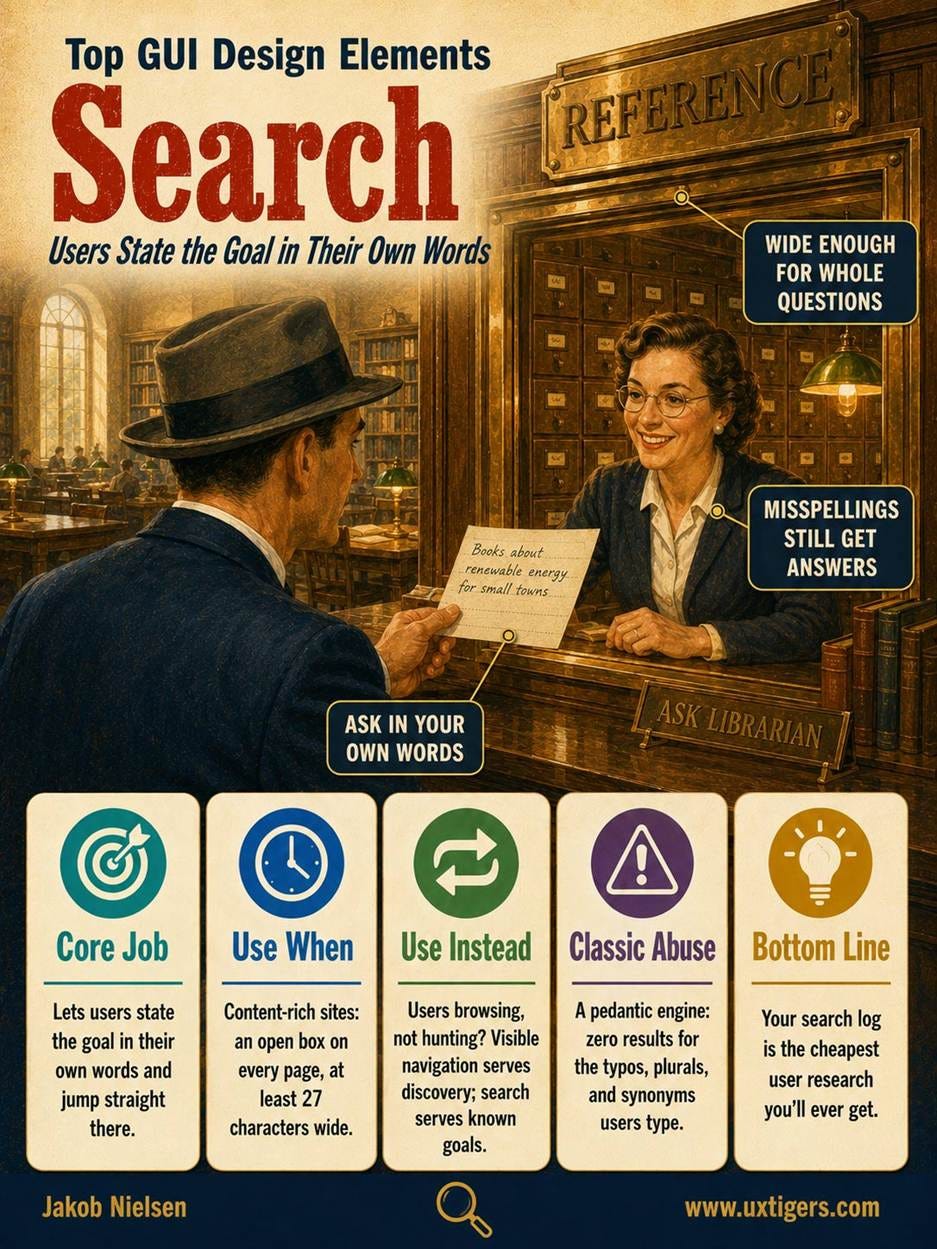
Definition: The search box is a text field plus a submit action marked by a magnifying glass, letting users state their goal in their own words instead of hunting through navigation.
Many web users have long been search-dominant, heading straight for the box on arrival. For everyone else, search is the escape hatch when the menus fail. Both need a box they can find and an engine that forgives. Google trained the planet in the empty-box idiom, and along the way the magnifying glass became one of the few icons that need no label.
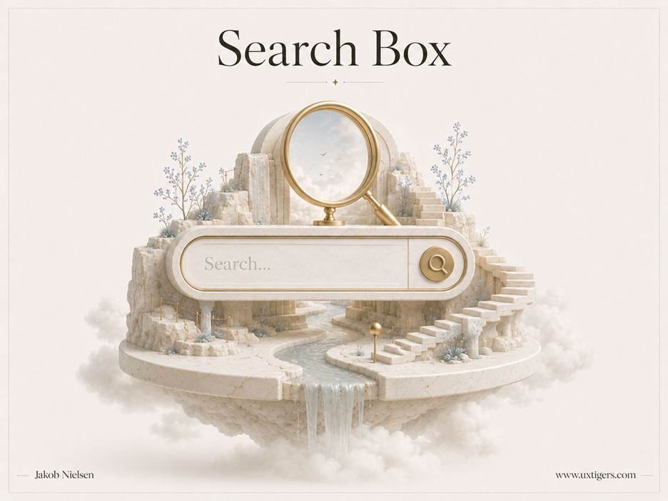
The search box is the one place in your interface where users write to you in their own words. Make it wide enough to hold the whole thought.
Search is the command line that survived. The GUI spent 4 decades replacing typed commands with visible options, yet users still march past all that graphic design to type into a box because language is the one interface that scales to infinite intents. When the space of possible desires outgrows any menu, text wins. The search box is a living fossil, and it’s still evolving: the prompt field in every AI assistant is the same fossil, reborn as computing’s newest paradigm. The interaction alphabet’s most old-fashioned letter may prove its most future-proof.
Search brings a bonus that navigation never will: the query log, where users type their goals verbatim, in their own vocabulary, spelling and all. Your search log is the cheapest user research you’ll ever get. The top queries returning poor results are your to-do list, ranked by demand.
The search box should be wide enough that users can see their entire query; query lengths keep growing, so err on the wide side. Put the box where people expect it: at the top of the page, as an open field, not a hidden icon. Tolerate typos, plurals, and synonyms, because users type “recieve” and mean receive. And treat the results page as a full user interface in its own right (a topic for another day).
Here are 8 design guidelines for search:
Show an open search box on every page of a content-rich site, at the top of the page. An icon that hides the box adds a click and subtracts visibility.
Make the box at least 27 characters wide. Users must see their whole query to edit it; scrolling inside a text field is misery.
Mark the submit with a magnifying glass, and make the Enter key work. Both are conventions users bring with them.
Forgive typos, plurals, and synonyms. The engine’s job is to find what users mean, not to grade what they typed.
Keep the query in the box on the results page. Reformulation is half of search behavior; make editing a keystroke, not a restart.
Design the results page as a full UI. Scannable titles, snippets that reveal why each result matched, and filters once collections grow large.
Index everything users consider part of the site. A search that silently skips the support section manufactures false “no results.”
Mine the search logs monthly. High-volume queries with poor results are usability bugs filed by your own users, free of charge.
Bonus: The Two Elements That Named the Paradigm
WIMP stands for Windows, Icons, Menus, and Pointer, and as my GUI history recounts, the acronym named the entire paradigm. Icons and menus earned top-10 slots above on daily workload. The remaining two letters now belong mostly to the operating system and the browser, but their rules still bite the designers who forget them.
Windows: You Inherit Yours, So Spawn More Rarely
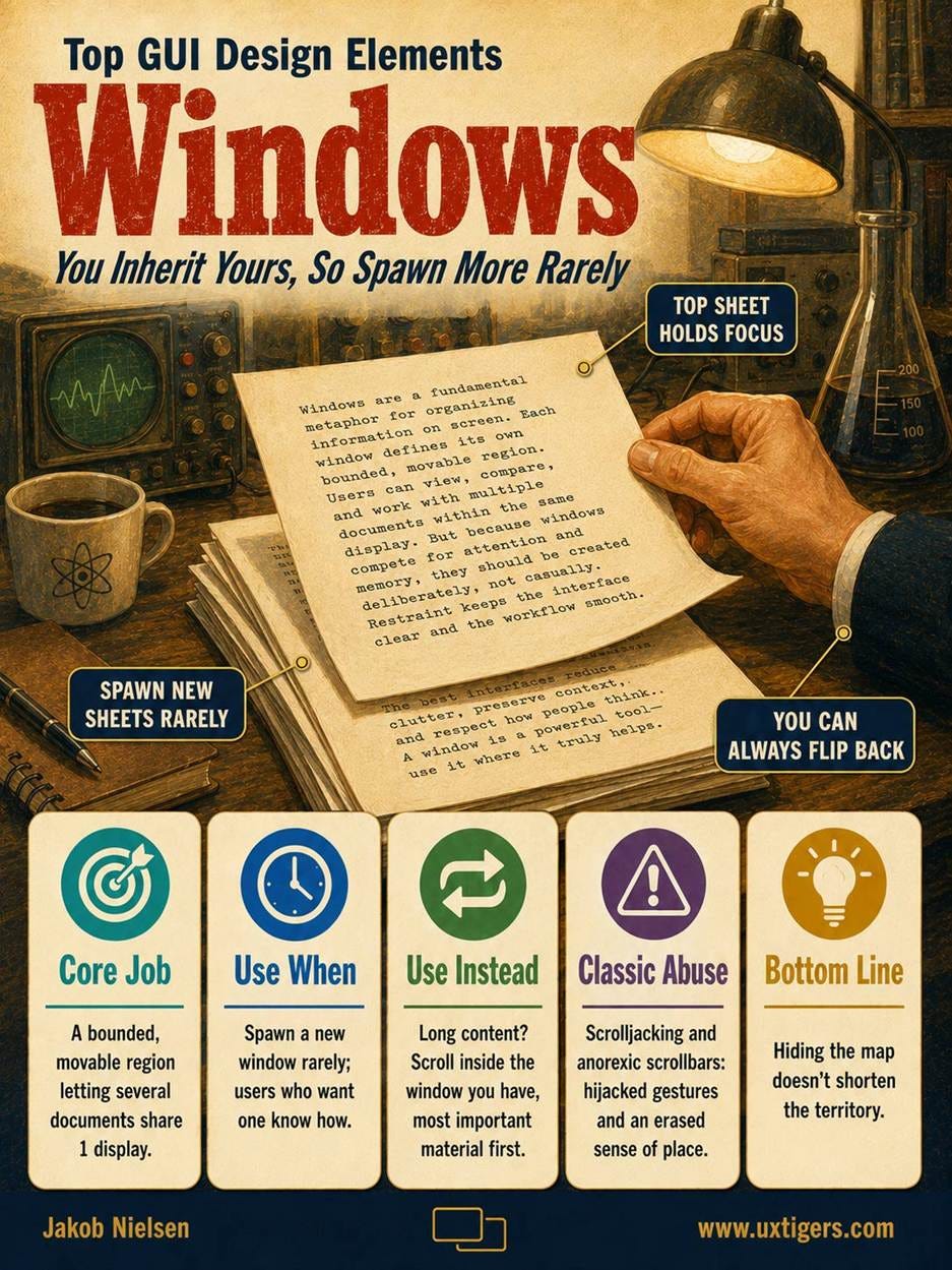
Definition: A window is a bounded, movable region of the screen that displays an application or document, letting several coexist on 1 display.
Overlapping windows debuted at Xerox PARC in the 1970s, stacking like papers on a desk, and supplied the W in WIMP. Window management has since migrated into the operating system and the browser: a web-app designer inherits the window (the browser tab) rather than designing it. The main surviving design question is when to spawn a new window, and the answer is: rarely. A surprise window breaks the Back button, the web’s reverse gear.

Windows within windows: today’s designer usually inherits the window (a browser tab) rather than drawing it. The remaining job is not to break what you inherited.
Scrollbars are the part of the window designers still touch, since scrolling is the mechanism for viewing content larger than the viewport. The scrollbar is both the control and the map: it shows where you are and how much remains. Users scroll willingly these days, but many studies still show attention piling up at the top of the page, so content order remains a ranking decision. The first screenful carries the argument.
Three scrolling sins recur. Scrolljacking hijacks the speed or direction of the user’s most practiced gesture, a betrayal dressed as delight. Thin or (even worse) invisible scrollbars erase the “how much is left?” signal. And infinite scroll on a page with a footer that users need turns that footer into a mirage: visible, approached, never reached.
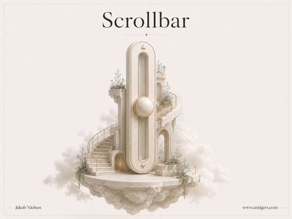
Scrollbars must be nice and fat so that users see them and can easily grab the thumb to move it. Microsoft Windows has been an offender with anorexic scrollbars in recent years. Don’t starve the scroll!
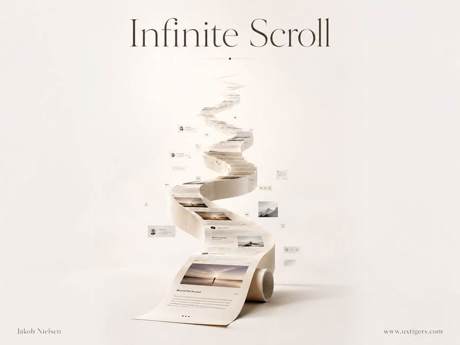
Infinite scroll can be a dark design pattern to entice users to doomscroll forever. Even when used ethically, it can make users lose their sense of place and make controls harder to reach.
6 design guidelines for windows and scrolling:
Open content in the same window or tab by default. Users who want a new tab know how to get one; don’t decide for them.
Never hijack scroll speed or direction. The scroll gesture is muscle memory; overriding it makes the whole page feel possessed.
Keep scrollbars visible on every scrollable pane. Hiding the map doesn’t shorten the territory.
Use infinite scroll only when nothing users need lives below the list. If a footer matters, use a “Load More” button instead.
Order content by importance. Users will scroll, but attention thins with every screenful, so the top is prime real estate.
Protect the Back button. Anything that breaks it, including gratuitous new windows, breaks the user’s primary undo for navigation.
Pointers and Cursors: The Hand on the Screen
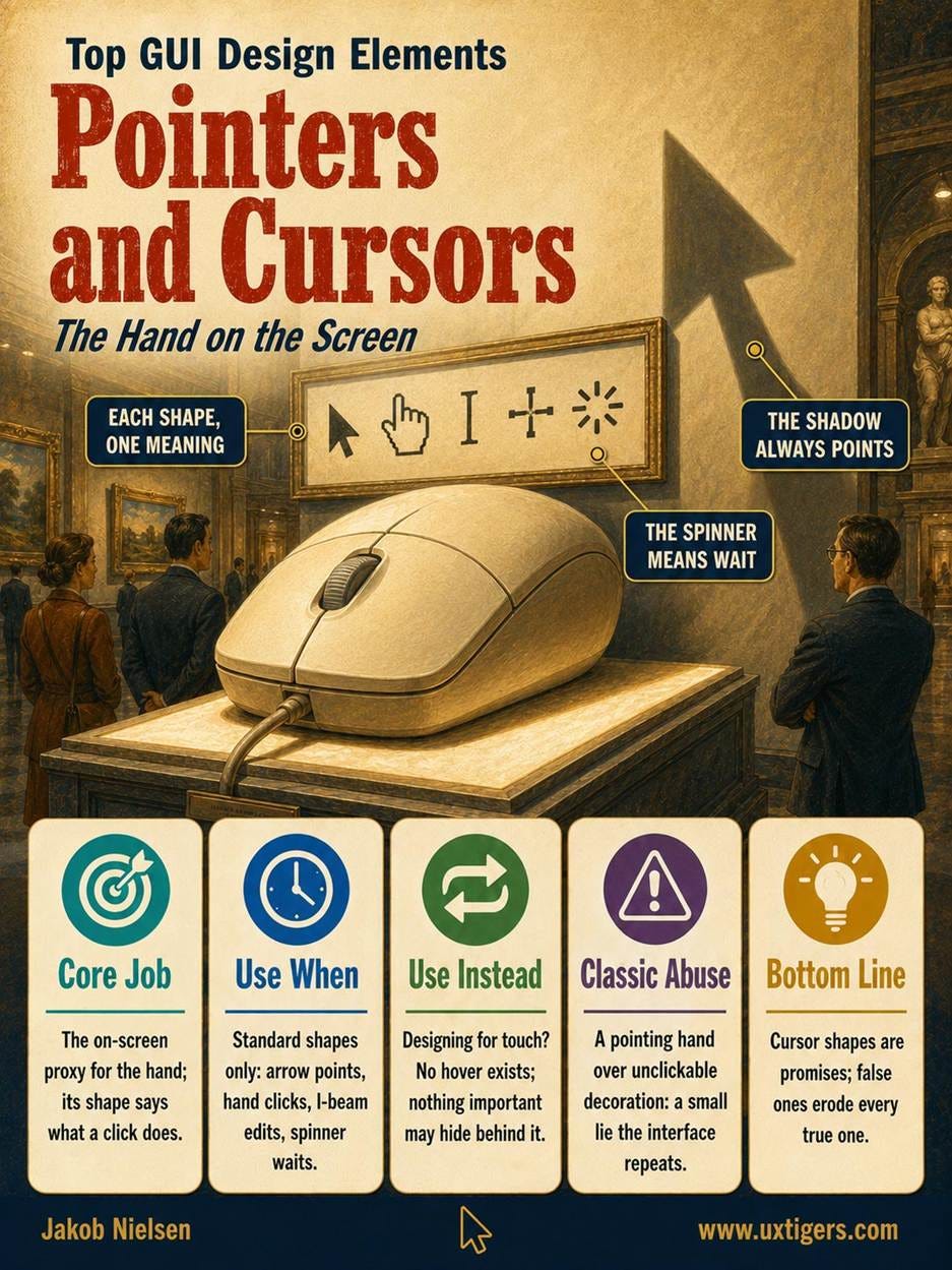
Definition: The pointer is the on-screen proxy for the user’s hand, and the cursor’s shape signals what a click will do at the current position.
A monument to the pointer: the user’s hand, projected onto the screen. Its shape is a promise about what a click will do. Keep the promise.
The pointer was born with Doug Engelbart’s mouse, built in 1964, demonstrated at the 1968 “Mother of All Demos,” and mainstreamed by the Macintosh in 1984. It supplies the P in WIMP. Its shapes form a sign language: the arrow points, the pointing hand clicks links, the grabbing hand drags, the I-beam edits text. Specialists handle the rest: crosshair, zoom magnifier, color-picking eyedropper, and the spinner that begs for patience.
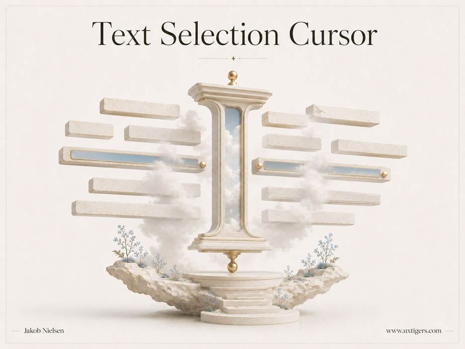
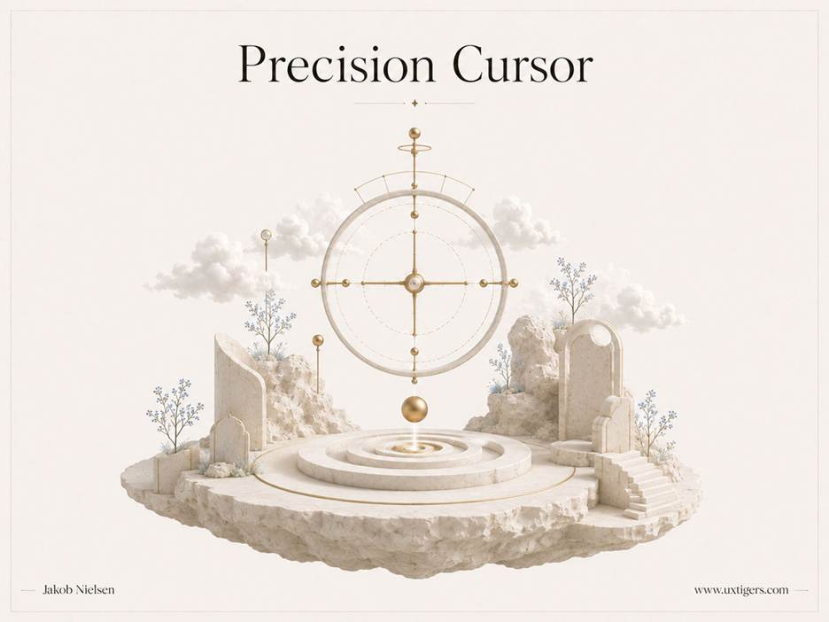

The drag-and-drop cursor, text selection cursor (I-beam), precision cursor, and the zoom-in (and out) cursor are among the specialized cursor shapes that help users understand what they can do.
Designers rarely draw cursors, but they must respect the signals. A hand cursor over unclickable decoration is a small lie, and an interface can’t afford many small lies. And touchscreens deleted the cursor entirely, taking every hover-dependent cue with it: tooltips, hover menus, hover-revealed controls. If information appears only on hover, everyone on a phone or tablet, which is to say the majority of web traffic, will never see it.
5 design guidelines for pointers and cursors:
Use the platform’s standard cursors, and don’t restyle them. A custom cursor is a novelty for the designer and a lie detector test for the user.
Show the pointing hand only over genuinely clickable elements, and the I-beam only over editable text. Cursor changes are promises; false ones erode every true one.
Show a busy indicator for any wait over 1 second. The cursor’s oldest job is honesty about whether the system heard you.
Never make hover the only path to important information or actions. Touch devices have no hover, and neither do keyboards.
Give keyboard users a visible focus indicator. The focus outline is the keyboard’s cursor; removing it for aesthetics strands everyone who navigates by the Tab key.
Conclusion: Spell with the Alphabet Users Already Know
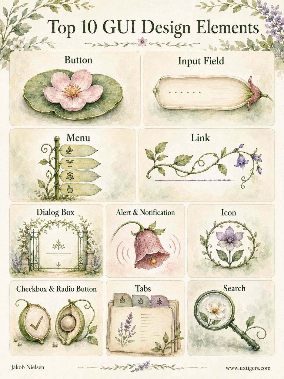
The 10 design widgets I’ve analyzed in this article. Learn this alphabet before you invent new letters.
The top 10 GUI design elements (and our two bonus elements) are old, and that’s their credential, not their weakness. Each survived a Darwinian filter of billions of users across 40+ years because each maps onto human constants: recognition over recall, perceived affordance, Fitts’s law, and the finite patience of a person who just wants to buy a plane ticket. So spend your innovation budget on your content and your service, not on breeding a new species of checkbox. Jakob’s Law guarantees the familiar version tests better anyway.
My 86 GUI usability guidelines are specific examples of three underlying UX commandments: don’t make users remember, don’t make users guess, don’t make users wait. Memory, certainty, time: every UI needs a strict budget for imposing on these three resources.
Will the interaction alphabet outlive WIMP itself? My GUI history ends with generative, intent-based interfaces that assemble screens on demand, and my prediction is that the letters will outlast the paradigm: an AI can generate the screen, but a human still has to read it, and humans read buttons, fields, and tabs.
The more generative the interface, the more invariant its controls must become. Dynamic screens weaken spatial memory; familiar widgets restore orientation. Agentic systems raise the stakes further: the old alphabet now carries supervision (approve, pause, inspect, undo) and not merely direct manipulation. AI may compose the interface, but convention makes it governable.
A closing test for your own product: familiar controls disappear into the task, and disappearing is the highest praise an interface element can earn. Which of the 10 does your product misuse the worst? My money’s on alerts if your company is evil, and on menus if it means well.
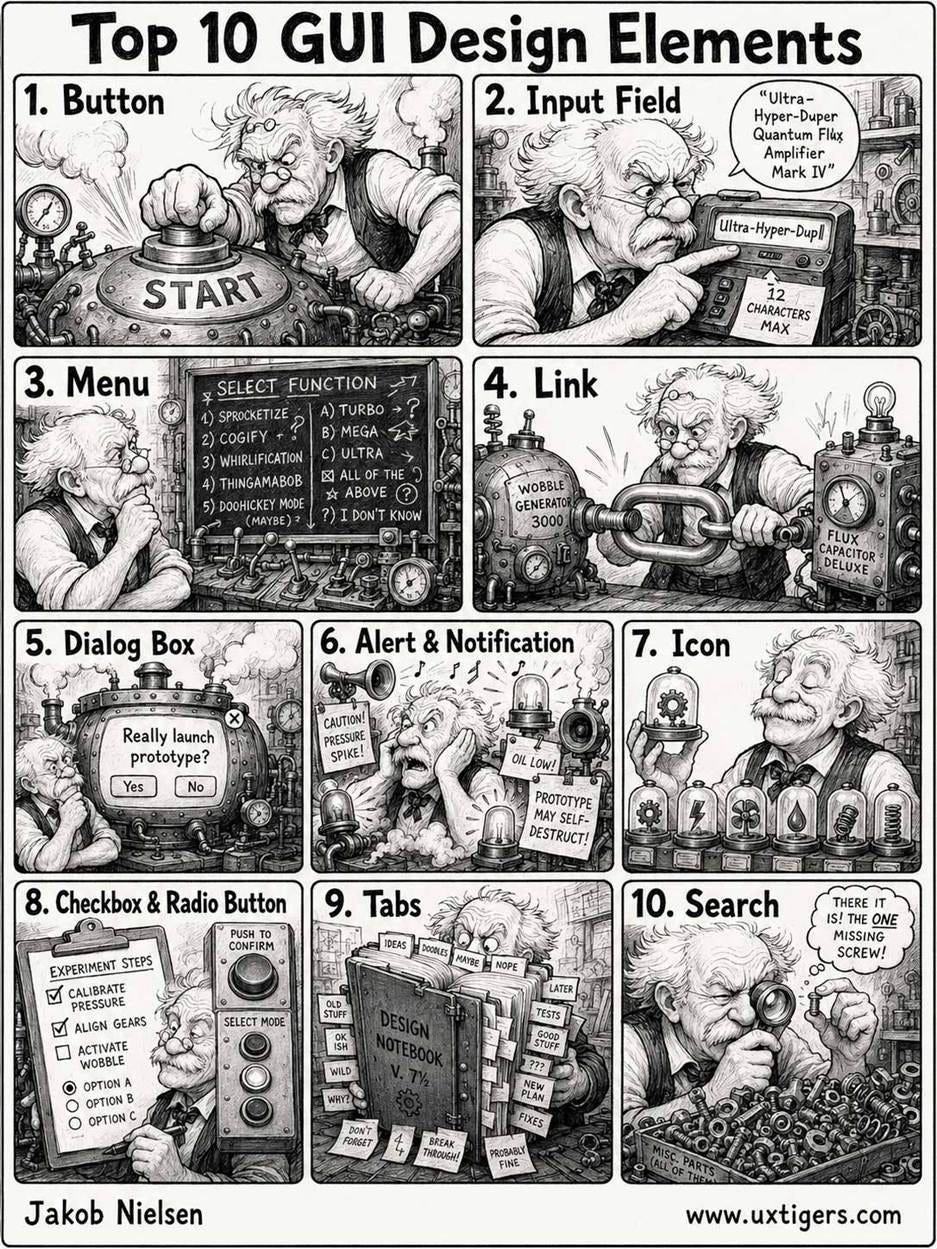
Even though they’ve been standardized for decades and their usability guidelines are well documented, many modern designs still abuse these GUI elements. (All illustrations in this article were created with GPT Image 2.)
About the Author
Jakob Nielsen, Ph.D., is a usability pioneer with 43 years experience in UX and the Founder of UX Tigers. He founded the discount usability movement for fast and cheap iterative design, including heuristic evaluation and the 10 usability heuristics. He formulated the eponymous Jakob’s Law of the Internet User Experience. Named “the king of usability” by Internet Magazine, “the guru of Web page usability” by The New York Times, and “the next best thing to a true time machine” by USA Today.
Previously, Dr. Nielsen was a Sun Microsystems Distinguished Engineer and a Member of Research Staff at Bell Communications Research, the branch of Bell Labs owned by the Regional Bell Operating Companies. He is the author of 8 books, including the best-selling Designing Web Usability: The Practice of Simplicity (published in 22 languages), the foundational Usability Engineering (31,233 citations in Google Scholar), and the pioneering Hypertext and Hypermedia (published two years before the Web launched).
Dr. Nielsen holds 79 United States patents, mainly on making the Internet easier to use. He received the Lifetime Achievement Award for Human–Computer Interaction Practice from ACM SIGCHI and was named a “Titan of Human Factors” by the Human Factors and Ergonomics Society.
· Subscribe to Jakob’s newsletter to get the full text of new articles emailed to you as soon as they are published.
· Read: article about Jakob Nielsen’s career in UX
· Watch: Jakob Nielsen’s first 41 years in UX (8 min. video)
I have always appreciated and valued the thinking and content (text and graphics) you produce. This last release is so overloaded with AI generated graphics it feels heavy handed and unnecessary. Your words have enough impact to carry the message.