


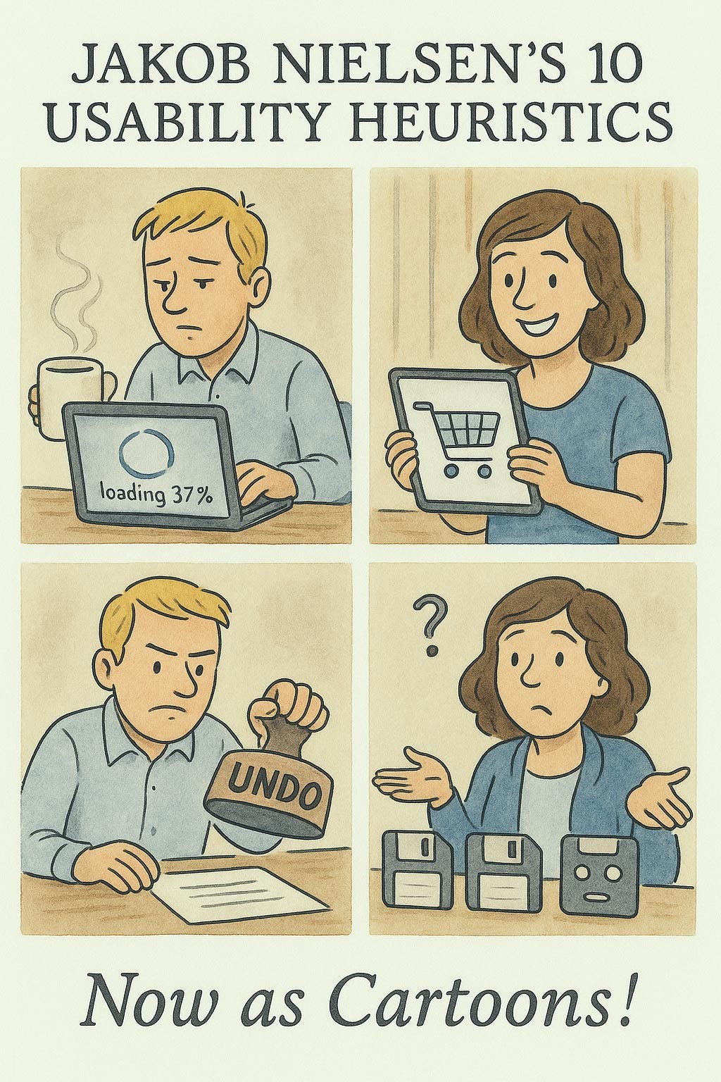
The 10 Usability Heuristics in Cartoons

Summary: Finally, what you have been waiting for: a humorous take on Jakob Nielsen’s classic 10 usability heuristics explained in 80 cartoons.
Since I developed the current list of 10 usability heuristics 31 years ago, they have been used by many people and presented in countless ways in articles and courses. I even have an article with the usability heuristics as Haikus. (I particularly recommend the Haikus for educational use, or to test your own knowledge: give students different Haikus and ask them to explain to the class how the poem relates to the heuristic.)
Despite its long history, I don’t believe we have had a thorough exploration of my heuristics as comics. (Individual comics, for sure!) To remedy this glaring lack of an unquestionably essential UX resource, I made a bunch of comics with the ChatGPT native image mode. Enjoy.
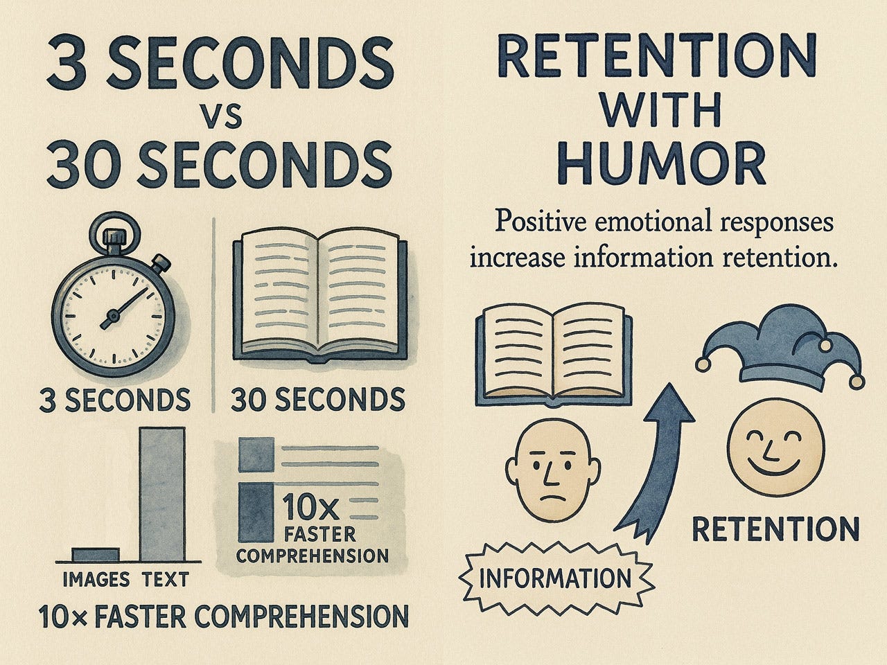
Why present usability theory as cartoons? Cartoons leverage the picture superiority effect, where people remember images far better than text alone. A well-designed cartoon communicates instantly, bypassing the cognitive overhead of processing paragraphs of explanation.
Consider the cognitive efficiency: users can grasp a cartoon’s message in approximately 3 seconds, compared to the 20–30 seconds required to read and process a 100-word explanation. This represents a 10× improvement in information acquisition speed. Countless studies have shown that users don’t like to read online but prefer visuals over walls of text.
Images communicate faster, and people like them better than blocks of text.
Better yet, many cartoons ditch words entirely, broadening their reach. A clever visual speaks to anyone, anywhere, with no translation needed. That’s a win for a global audience. Through metaphors and a dash of humor, they make fuzzy concepts stick. Visual metaphors in cartoons translate abstract usability principles into concrete representations. The humor element isn’t just entertainment but serves a functional purpose. Positive emotional responses increase information retention.
Finally, usability needn’t be dour. Effective user interfaces produce pleasure. We are allowed to enjoy user experience work: it’s a happy discipline!
Faster information access, higher retention, and having fun. What’s not to like about cartoons?
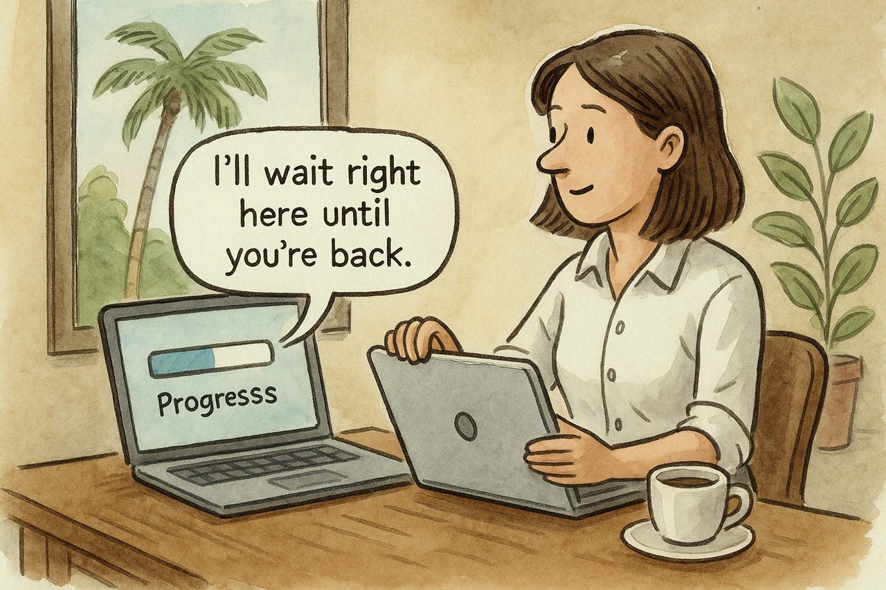
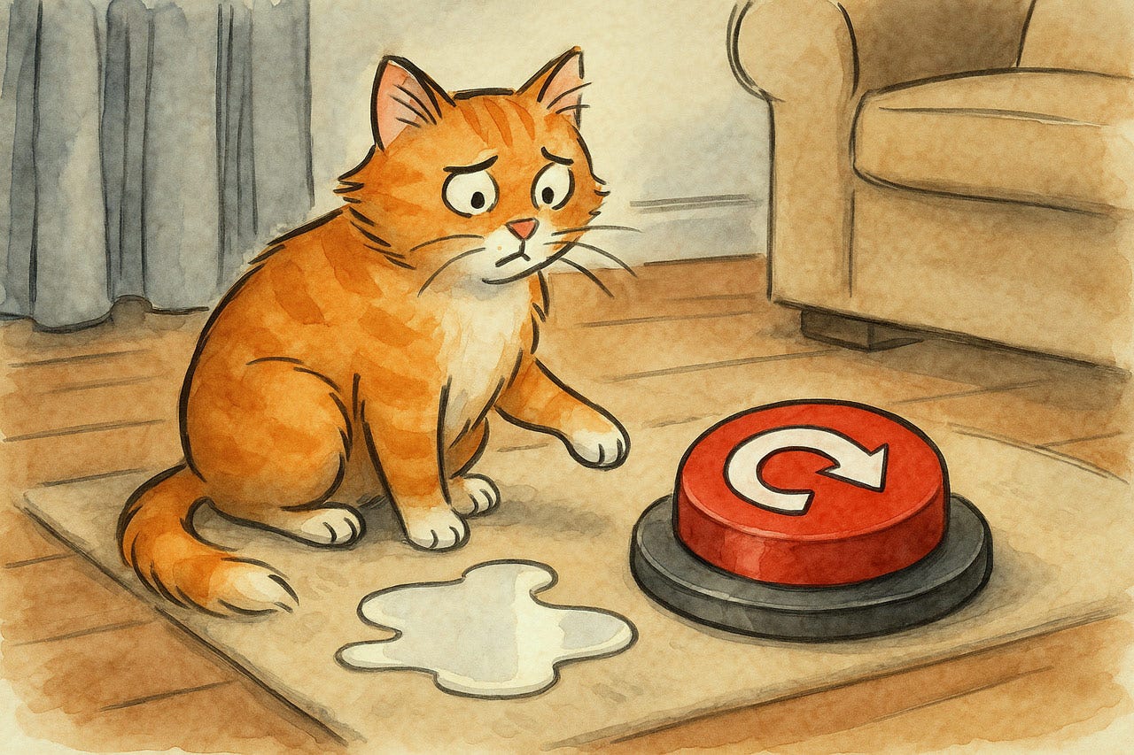
Heuristic 1: Visibility of System Status
Users must always know what the system is doing. Provide immediate visual feedback for actions, such as highlighting buttons when clicked or showing checkmarks for valid form entries. For longer processes, show progress bars with time estimates, preventing users from clicking repeatedly due to uncertainty.
The nature of feedback should match the action's importance. Minor interactions need subtle cues, while destructive operations require prominent confirmations. Icons, color changes, and status messages keep the dialogue flowing across the interface.
Breadcrumbs, highlighted navigation states, and real-time updates maintain continuous orientation. This transparent communication builds trust, reduces anxiety, and creates predictability, which is essential for user confidence.
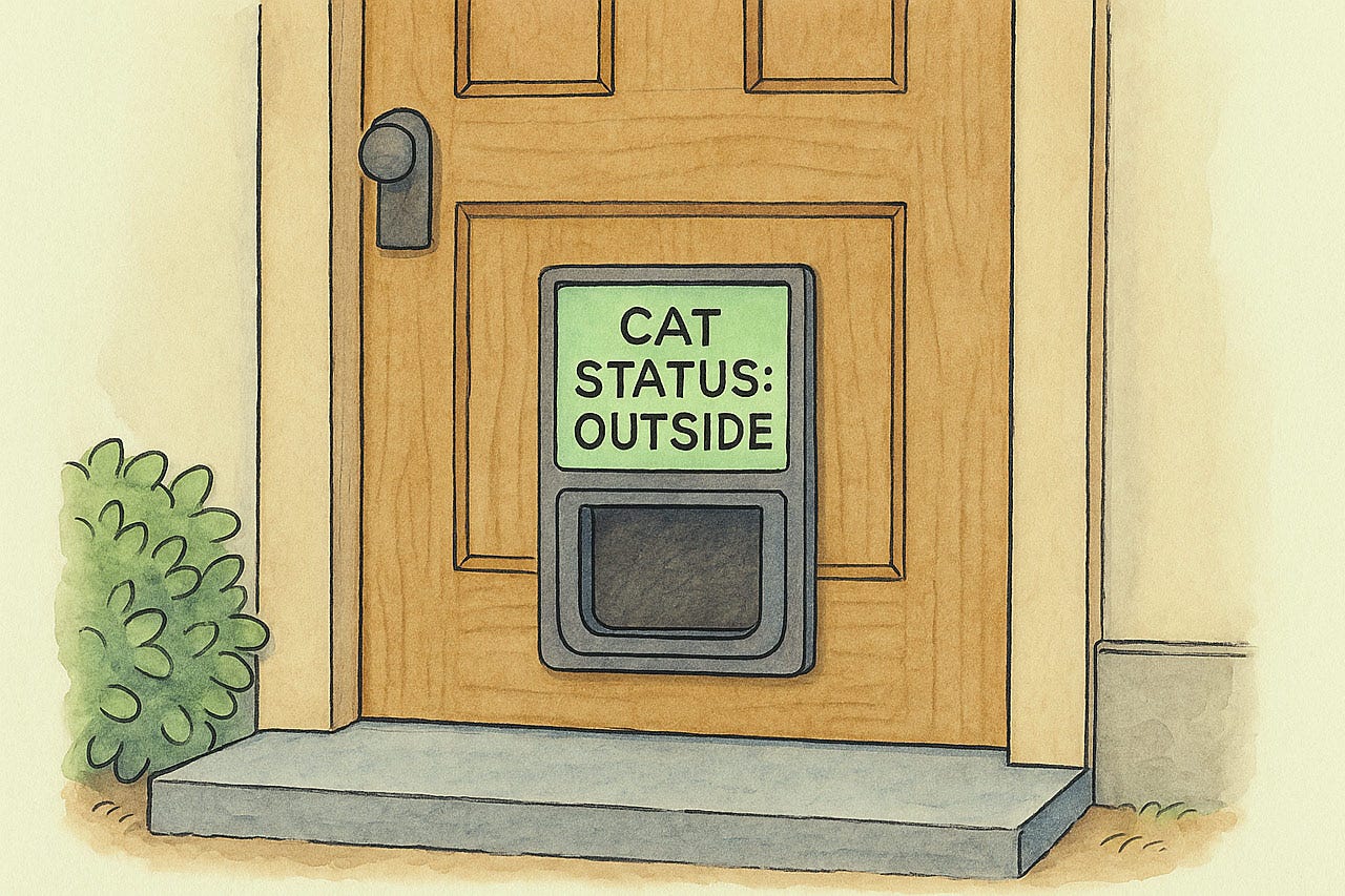
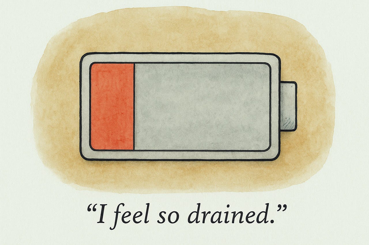
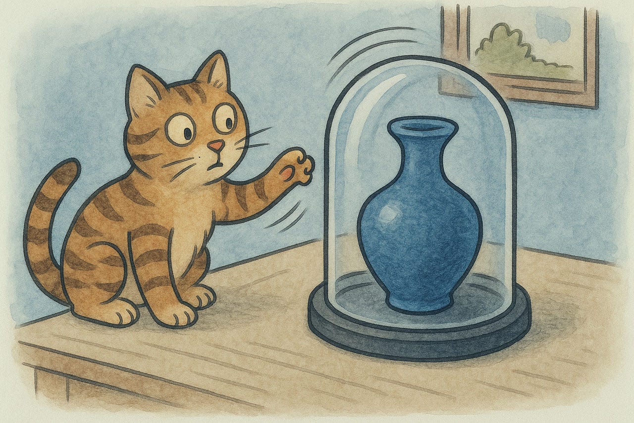
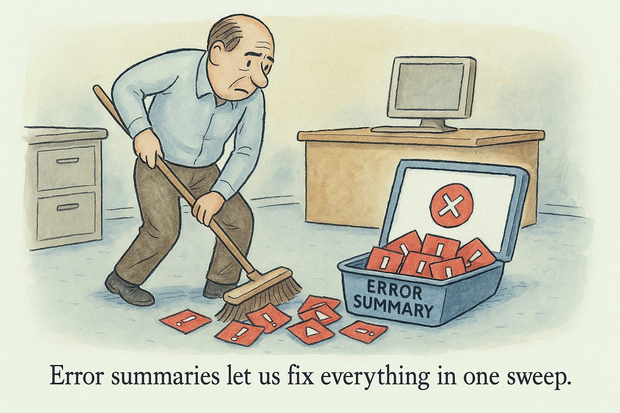
Classic system status: What happened with the cat?
Another classic: What’s the status of a resource?
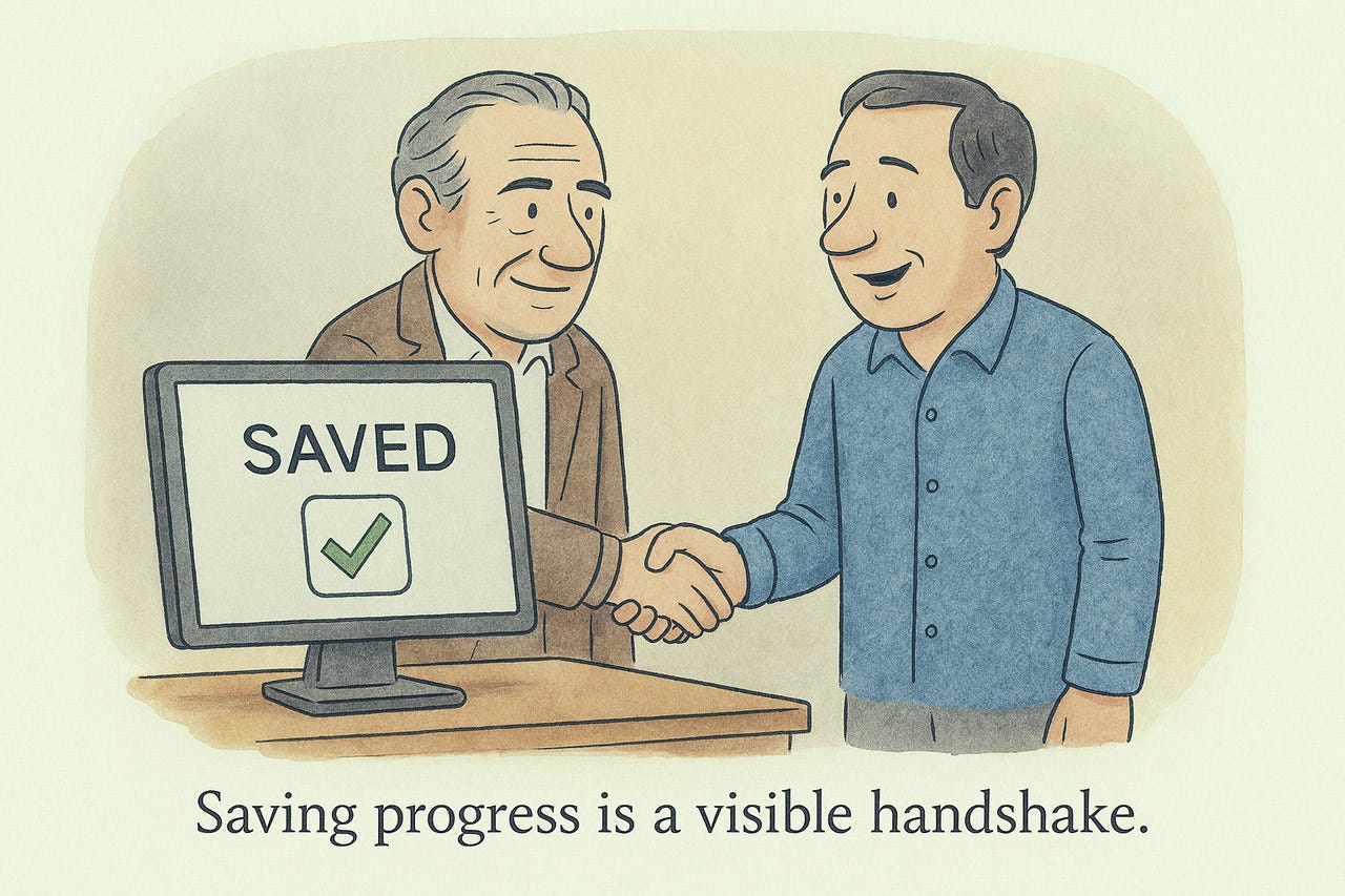
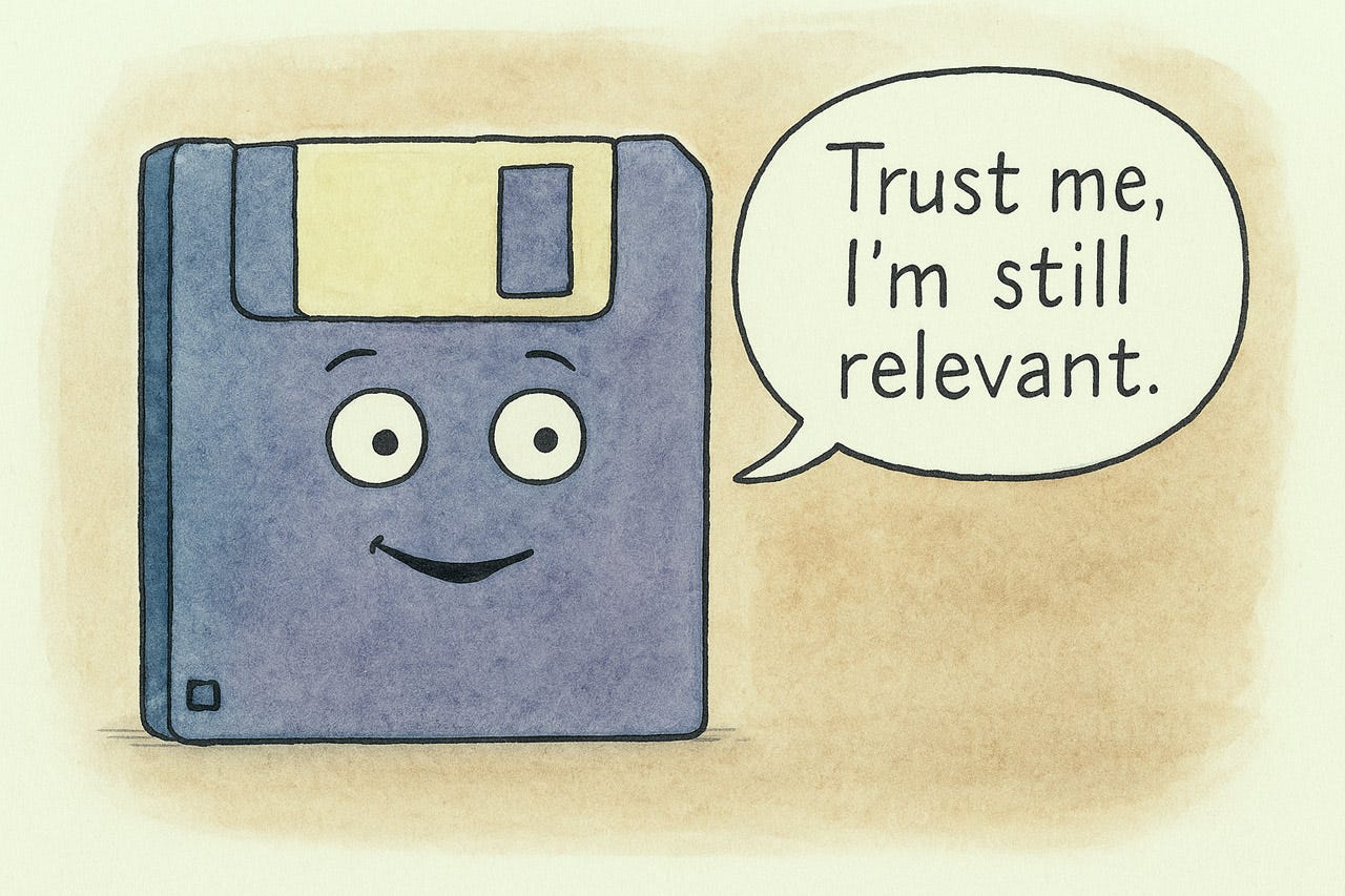
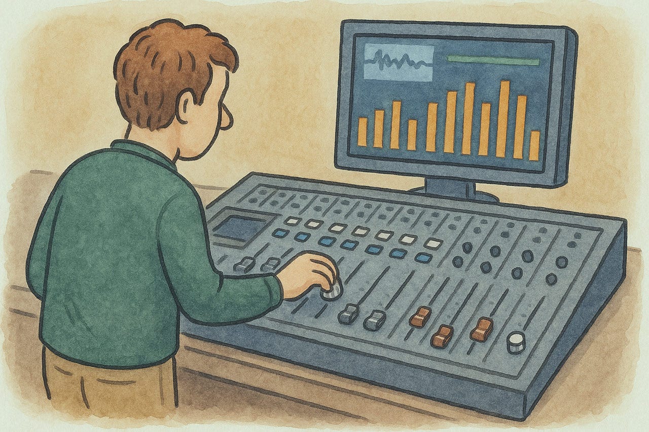
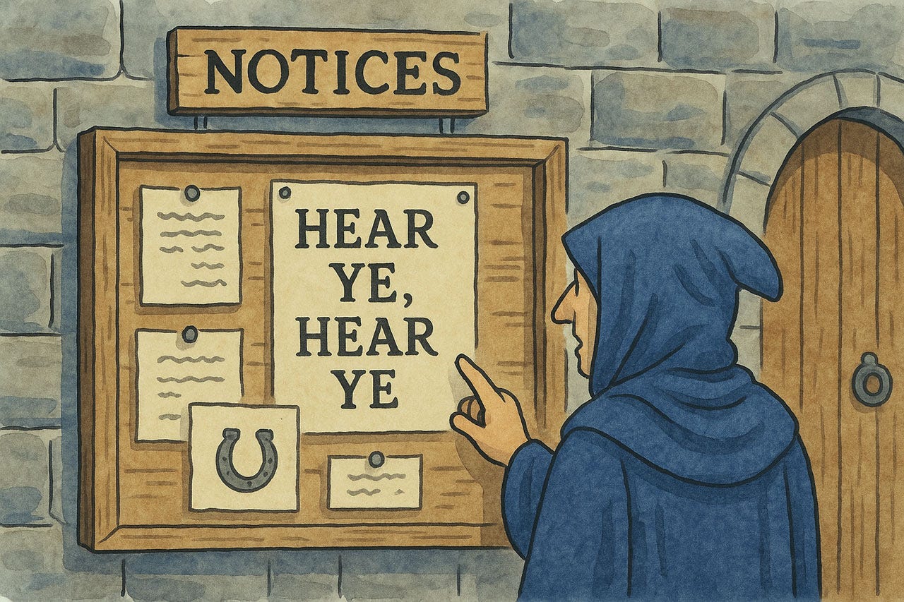
When the system confirms its actions, it’s a visible handshake. “Yes, we agree.”
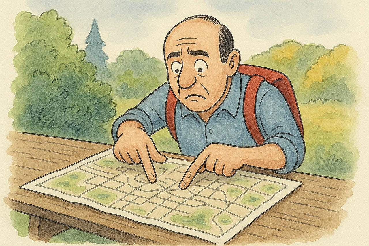
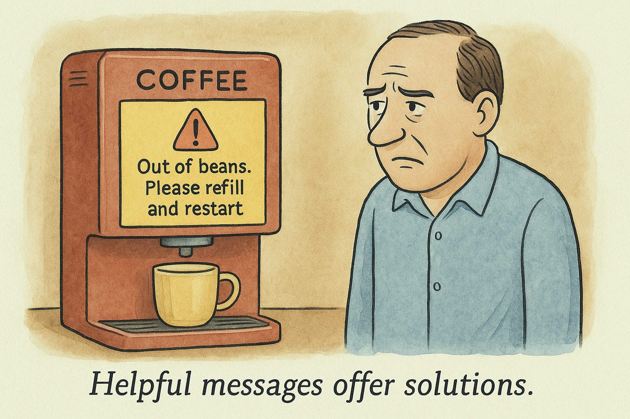
The lack of feedback often causes usability problems. For example, a map that doesn’t update with a “you are here” status indicator as the hiker moves through the park.
When the user clicks or taps a screen element, it should immediately highlight to indicate that the click has been registered. The currently active element in a set of choices (such as a set of tabs) should be highlighted.
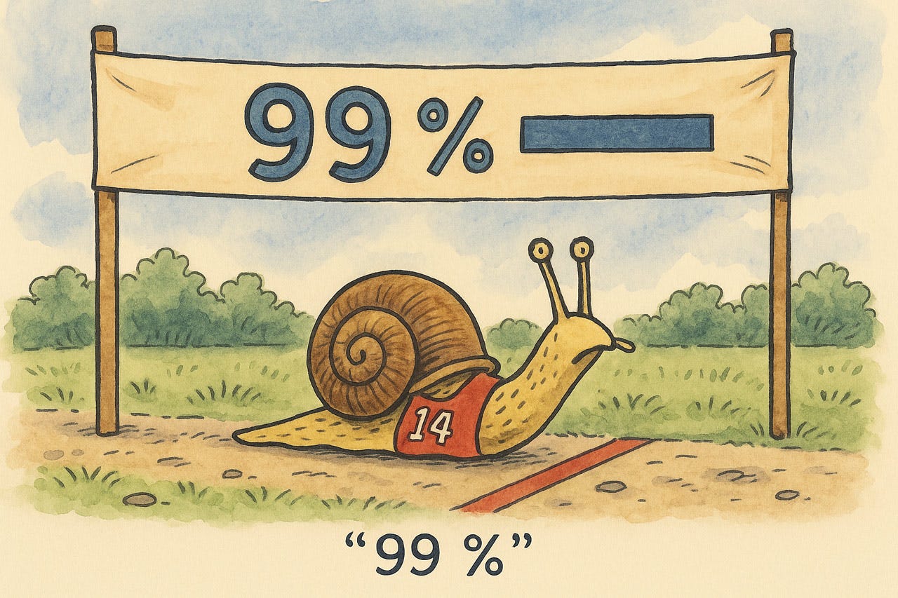
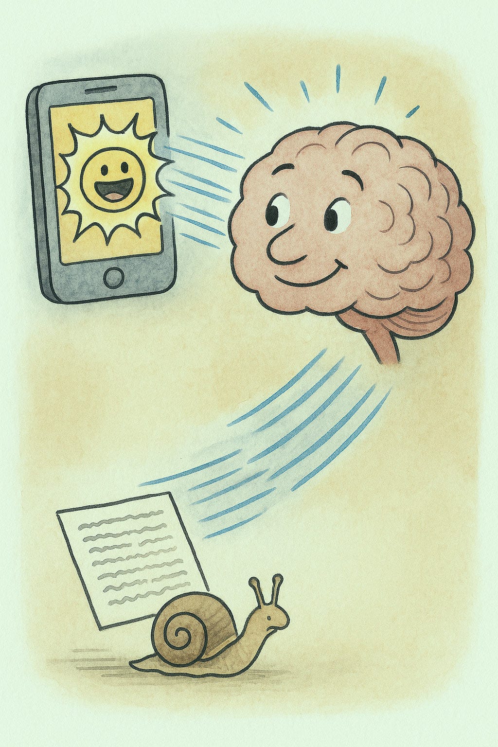
When the system is slow, it should show a progress indicator to confirm that it’s working and hasn’t crashed, preferably as a percent-done progress bar. Avoid the common usability problem of having a progress bar move in fits and spurts, only to be stuck at 99% for a long time. (See my video about progress bars, with an animation of this adorable snail.)
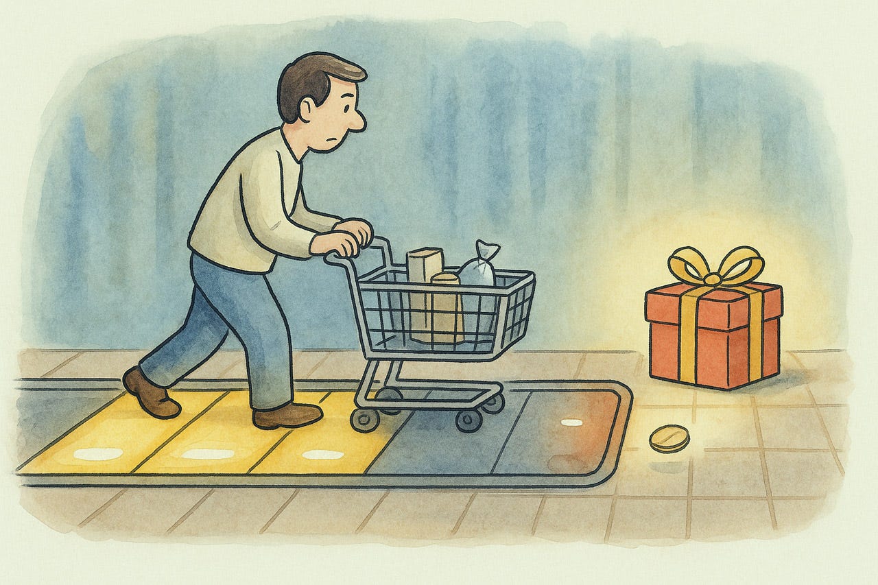
A threshold indicator confirms the user’s status relative to some goal, for example, to have added enough to the shopping cart to qualify for free shipping or a complimentary add-on gift. To free users from mental math, state how much more is left before reaching the goal.
Heuristic 2: Match Between System and the Real World
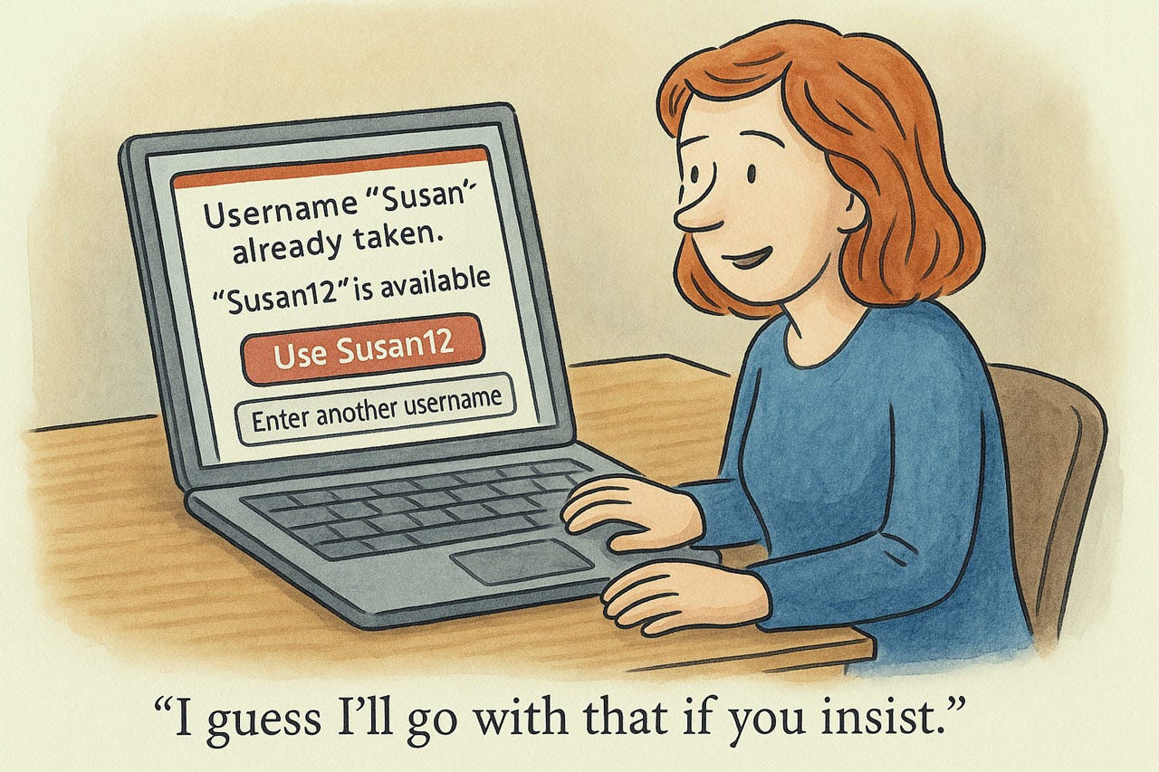
The system should mirror users’ existing mental models, whether based on physical reality or digital conventions. Use language that matches users’ vocabulary, not internal technical jargon. Metaphors like shopping carts and trash cans work when they connect to genuine user understanding.
Design interfaces that follow expected sequences and maintain logical relationships between actions. Take advantage of established patterns in both physical and digital domains: users already know red means error and that scrolling reveals content. Icons, terminology, and flows should leverage existing knowledge rather than requiring users to learn new concepts. This approach reduces cognitive load, prevents errors, and helps users accomplish tasks efficiently, focusing on their goals rather than struggling with the interface.
Speak the user’s language. Maybe one of the oldest usability insights, and yet one of the most frequently violated.
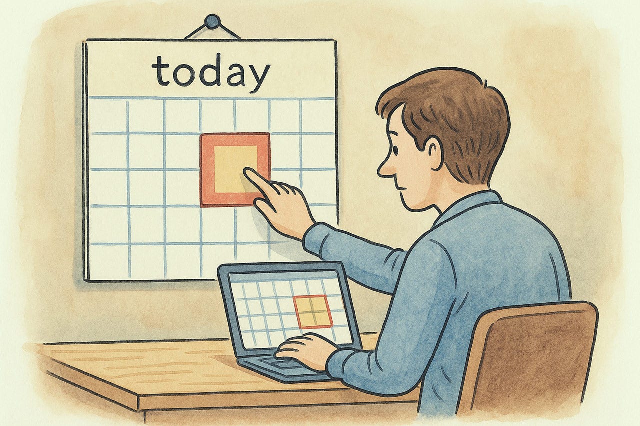
Refer to things the way the user thinks about them. For example, use “today” to refer to the current date. (To further reduce errors, you can still state the calendar date as secondary information.)
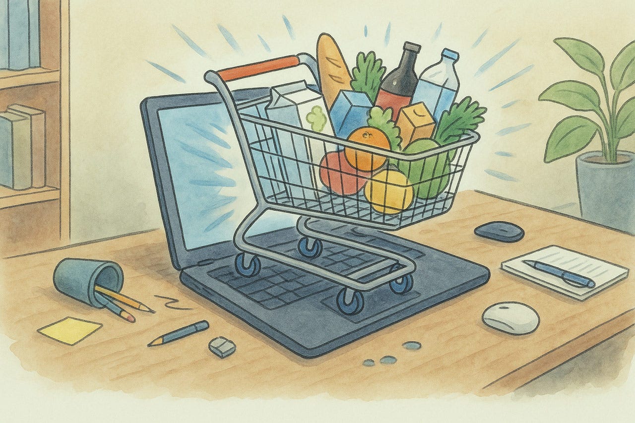
Metaphors such as the shopping cart on ecommerce sites help users understand a feature’s functionality. In this example, that it accumulates items that have not yet been purchased and that you can add and remove items before proceeding to the payment stage.
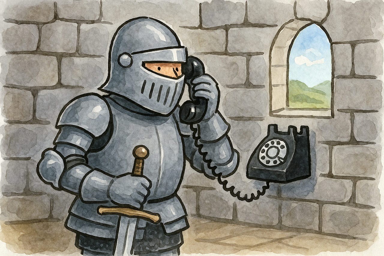
On the other hand, mismatched metaphors can impede usability. A modern telephone works poorly for a knight in full armor.
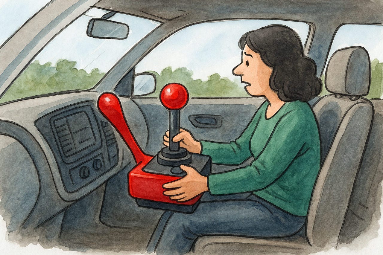
When controls are poorly matched with the task, usability suffers. There’s a reason the steering wheel is the preferred control for turning a car to the left or right. So far, no automobile designer has been so ignorant as to use a joystick for steering the car.
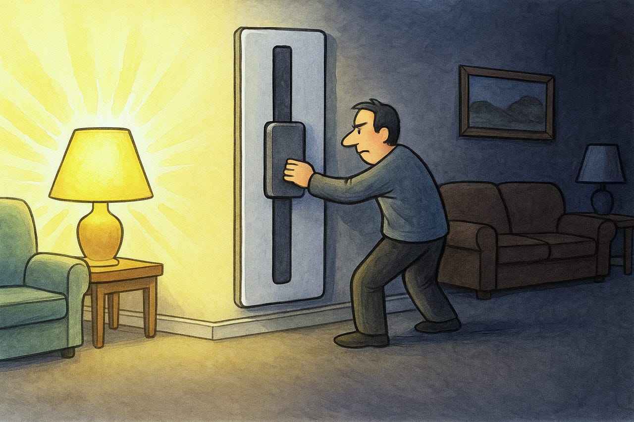
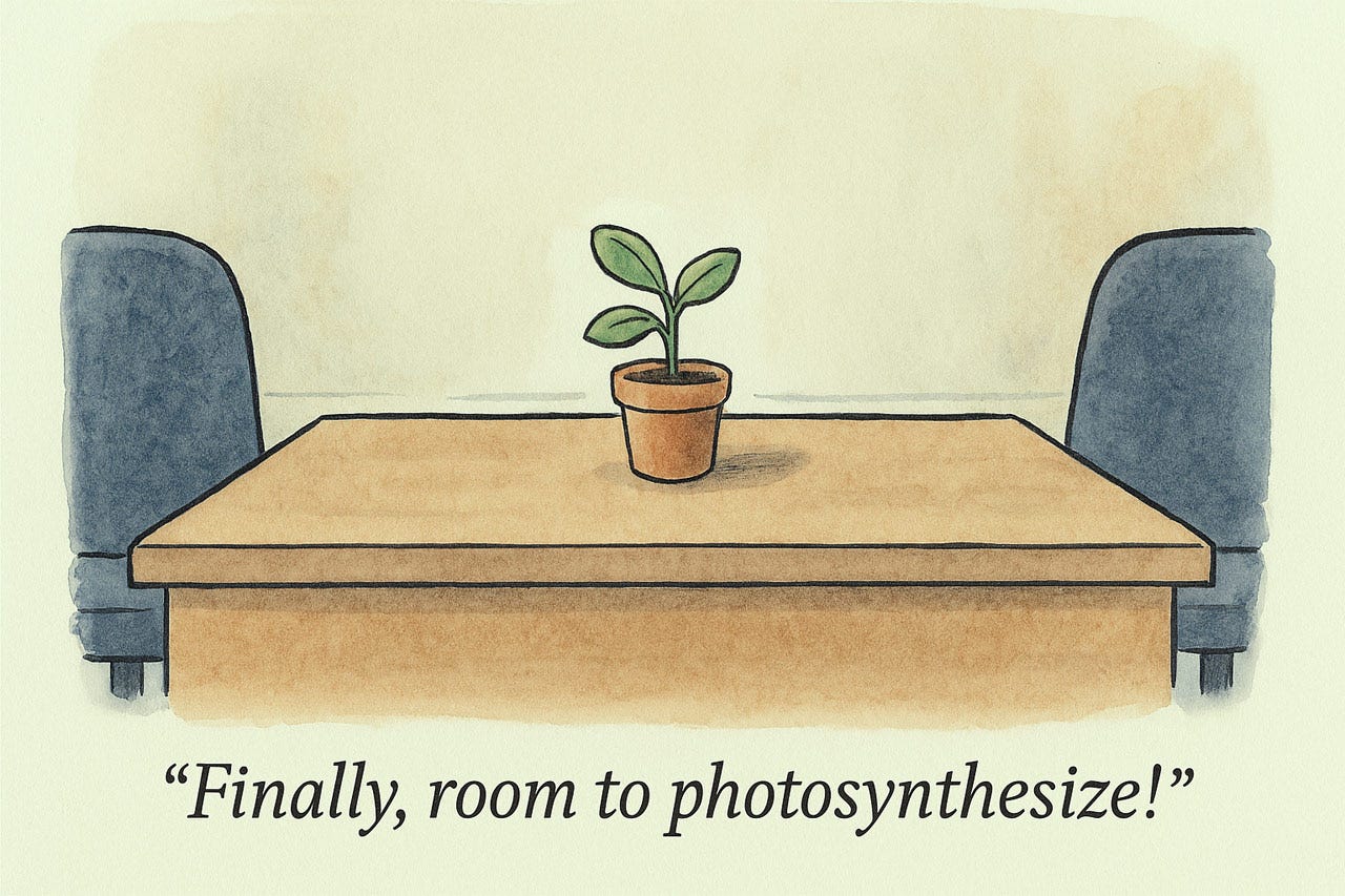
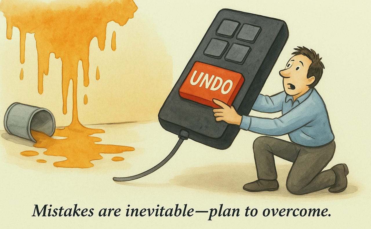
Heuristic 3: User Control and Freedom
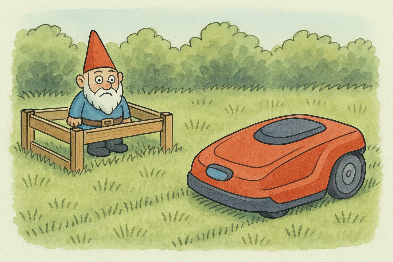
Interfaces must let users drive; not trap them in rigid paths. Every function needs a visible escape hatch: undo, cancel, back, close. When reversals are effortless, users explore confidently and master features faster. Granularity matters: undoing a keystroke shouldn't wipe out an hour’s work.
Let people pause, skip, or reorder tasks when it does no harm. Reserve confirmations only for destructive actions; overusing them dulls their impact. Exits must be instantly recognizable: if users must hunt for the back door, they’ll retreat to shallow usage. Design interfaces that obey the human, not vice versa. This fundamental principle transforms anxiety into satisfaction.
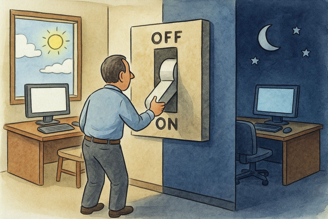
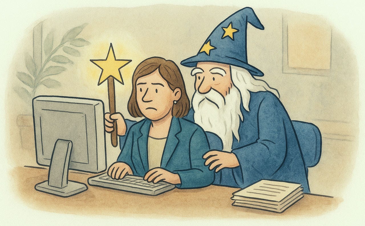
Most fundamentally, put users in control of their destiny and the UI. If, for example, there is a light mode and a dark mode, users should decide which one they want and be able to change their minds easily.
When the user has indicated a preference (for example, by specifying a lighting level), make it stick and don’t change back to the default. The next time the user returns to the same place, the previously specified preferences should still be in effect. (But do offer an option to reset parameter values to the defaults.)
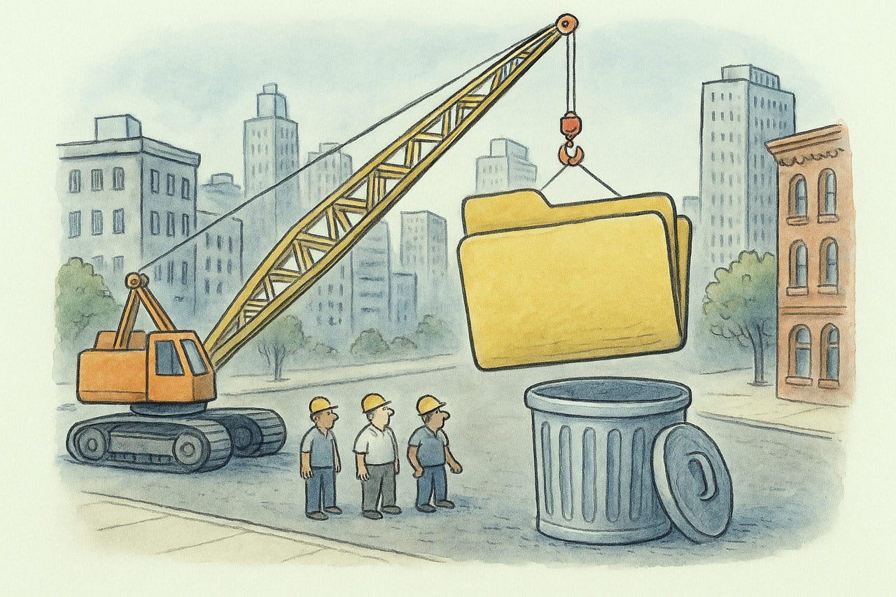
Do not trap users. Allow them to get out of any situation without trouble.
Allow users to interrupt a task and do something else, while preserving their progress until that point, so that they can seamlessly resume later without having to start over.
Don’t cry over spilled milk. Just press the UNDO button.
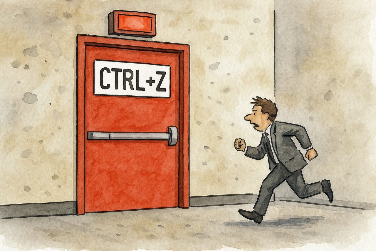
Offer users a way out of any situation (an emergency exit). Undo often serves this purpose.
Interaction techniques like direct manipulation allow users to gradually modify objects and their state until they get the desired result. The user owns the objects on the screen and can manipulate them as he or she pleases.
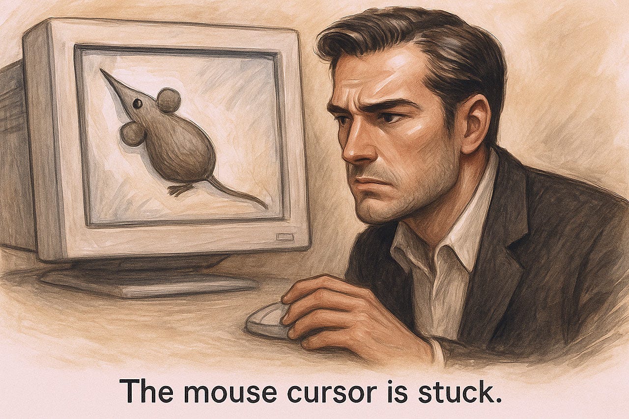
The mouse cursor is the user’s representative to the user interface. Under no circumstances should it freeze, nor should clicks be ignored or deferred. The same is true to an even more personal extent for the user’s finger taps or gestures on touchscreen interfaces.
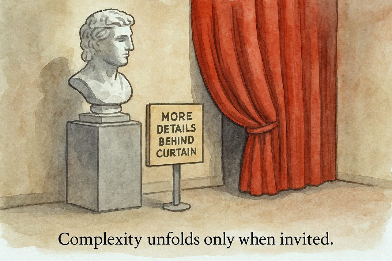
Progressive disclosure places UI complexity under user control. Advanced and complicated options are not displayed unless requested.
Heuristic 4: Consistency and Standards
Consistency operates on two non-negotiable levels: internal uniformity and external conventions. When interfaces maintain predictable patterns and identical functions use identical controls and terminology remains stable, users operate on autopilot instead of wasting mental resources. Users spend 99% of their time on other websites (Jakob’s Law), building expectations you violate at your peril. Deviating from conventions forces users to abandon existing mental models, inevitably causing errors and frustration. Each inconsistency introduces a usability tax, forcing unnecessary decisions, increasing errors, and eroding trust. Treat style guides as contracts, not suggestions. Depart from conventions only with evidence of significant usability gains. Remember: inconsistency isn’t creative expression but a fundamental design failure that actively obstructs users’ goals.
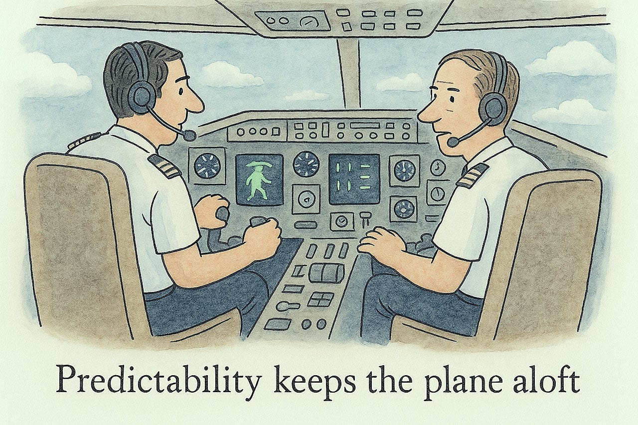
Consistency breeds predictability.
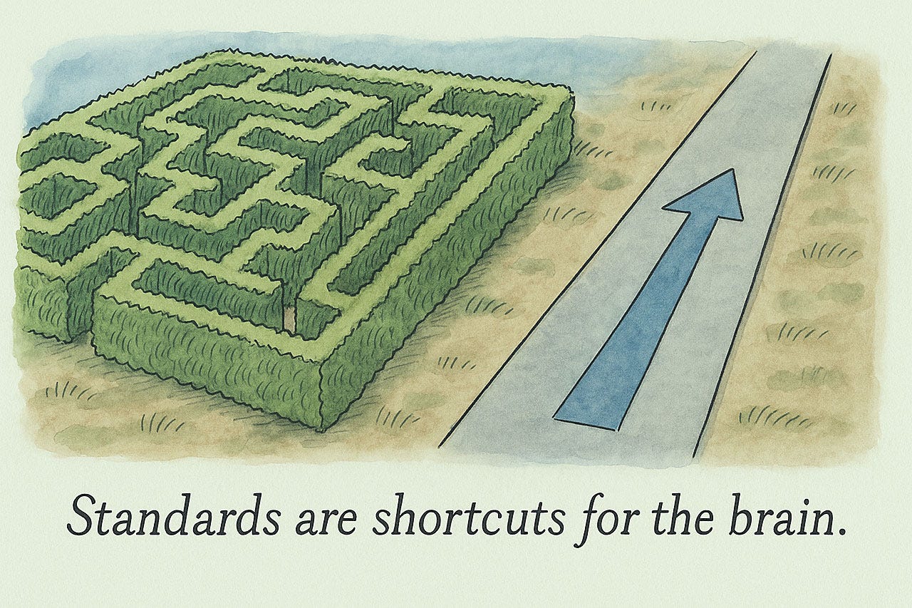
Standards reduce cognitive load because you already know how things work from experience.
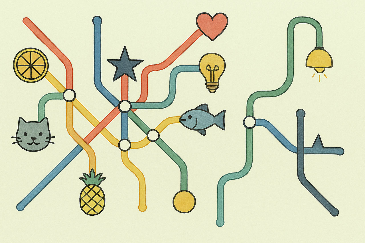
How to read this subway map? It may look fun, but a small set of standardized icons would make different kinds of stations easier to recognize and thus increase the usability of the map.
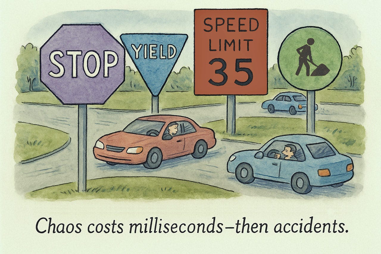
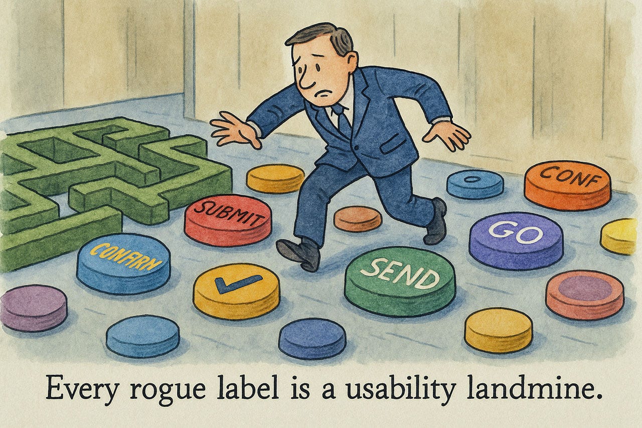
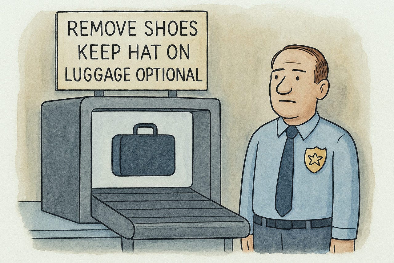
Road signs have standardized colors and shapes for a reason. Deviating kills people. Nonstandard UI design is rarely deadly, but it costs users time, just the same.
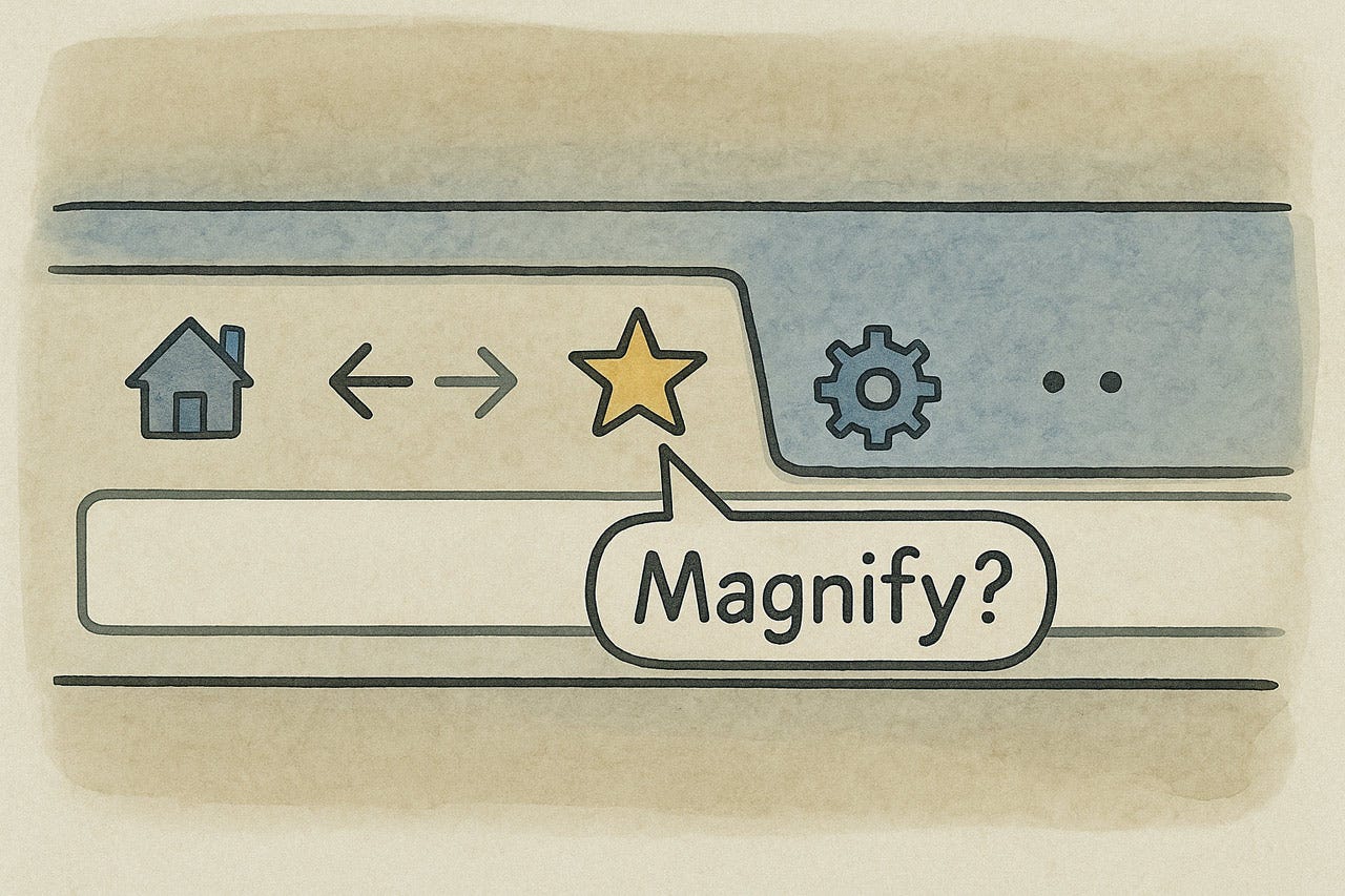
Do not invent new meanings for well-known UI elements.
Changing what things are called is begging for usability problems.
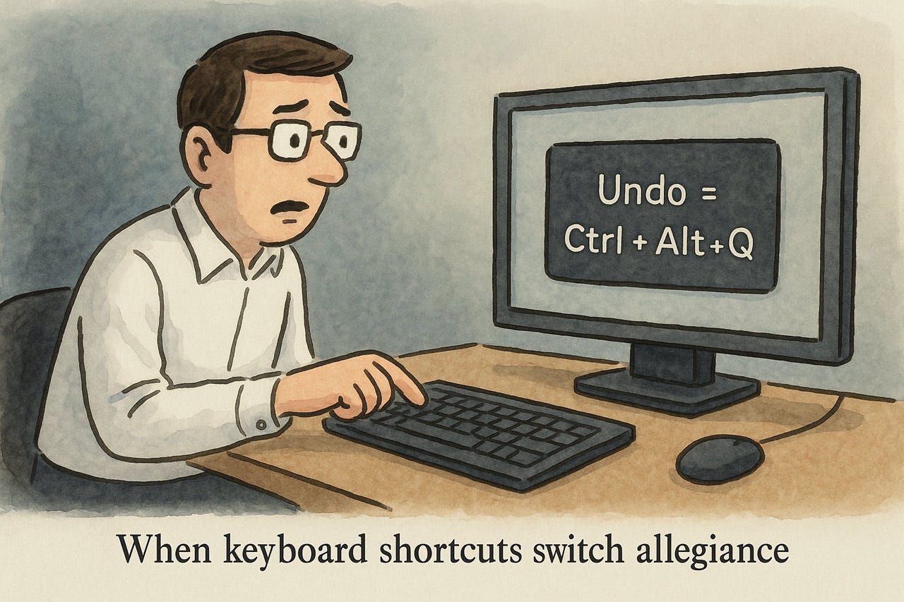
Keyboard shortcuts are one of the deadliest places to deviate from standards. Users rely on their “muscle memory” for shortcuts and will make endless errors if your shortcuts are defined differently from the norm.
When users don’t know what to expect, confusion and frustration ensue.
Sometimes you may retain a UI standard after it seems obsolete: if people already know what it means and how to use it, introducing something new may not be worth the confusion it will cause.
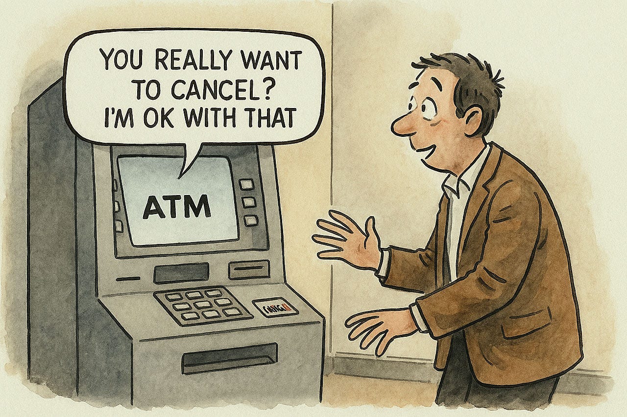
Heuristic 5: Error Prevention
Error prevention trumps recovery at every turn. Design systems that make errors impossible, not just detectable. Replace error-prone free text with constrained widgets—date pickers, dropdowns, and guided inputs. Implement silent guardrails: inline validation, autocomplete, and intelligent defaults steer users toward success without breaking flow. Reserve confirmation dialogs for truly destructive actions; overuse breeds contempt. Match preventive friction to risk: subtle nudges for minor issues, deliberate speed bumps for irreversible operations. Every prevented error compounds value—reducing support costs, preserving confidence, and accelerating completion. Prevention is invisible craftsmanship that users mistake for their own competence.
Making it harder to commit errors (especially destructive errors) means that fewer errors will happen.
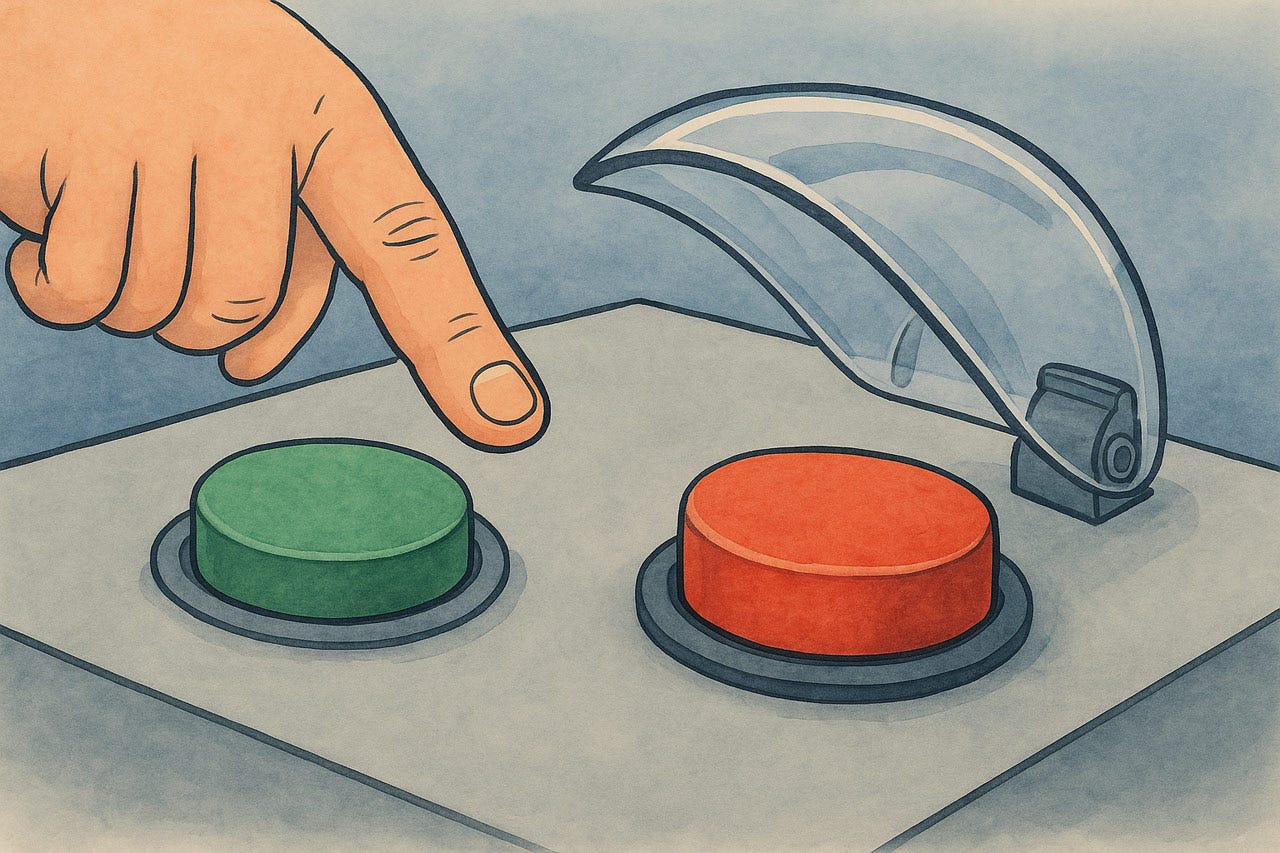
We usually don’t want extra steps in a UI, but for error-prone actions, it’s OK to protect users from themselves by making it obvious when they are about to do something they probably shouldn’t do (except under rare circumstances, which is why the feature is retained, despite being error-prone).
Guardrails keep users out of trouble.
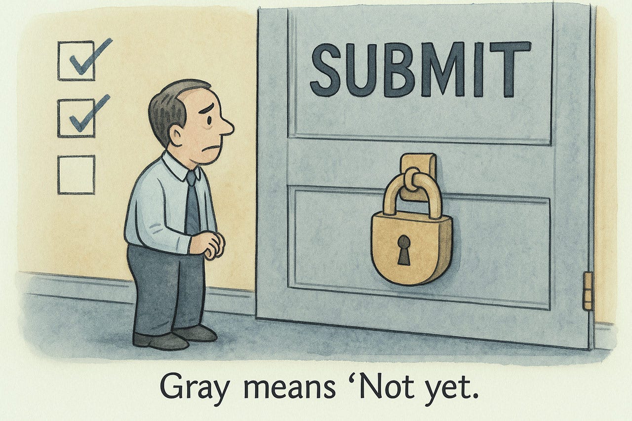
When an action cannot be performed, still show it (following the “visibility” heuristic) so that users know it’s there, but gray it out. Ideally, provide a tooltip if users try to click anyway or hover over a grayed-out feature to explain what needs to be done to enable it.
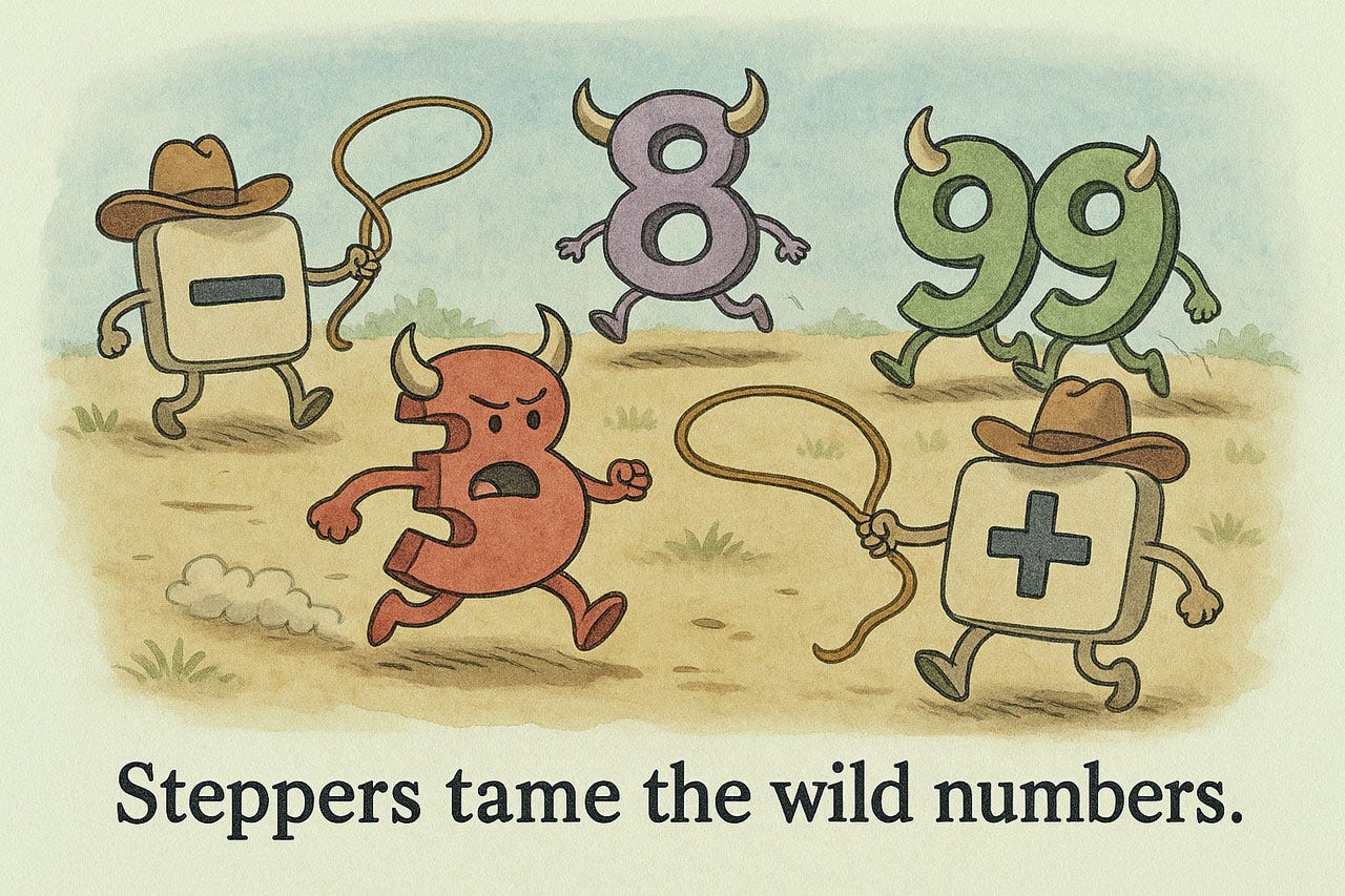
Restricting input ranges, for example by steppers or sliders, means that users can’t enter values outside the valid range. An entire group of errors removed from this earth.
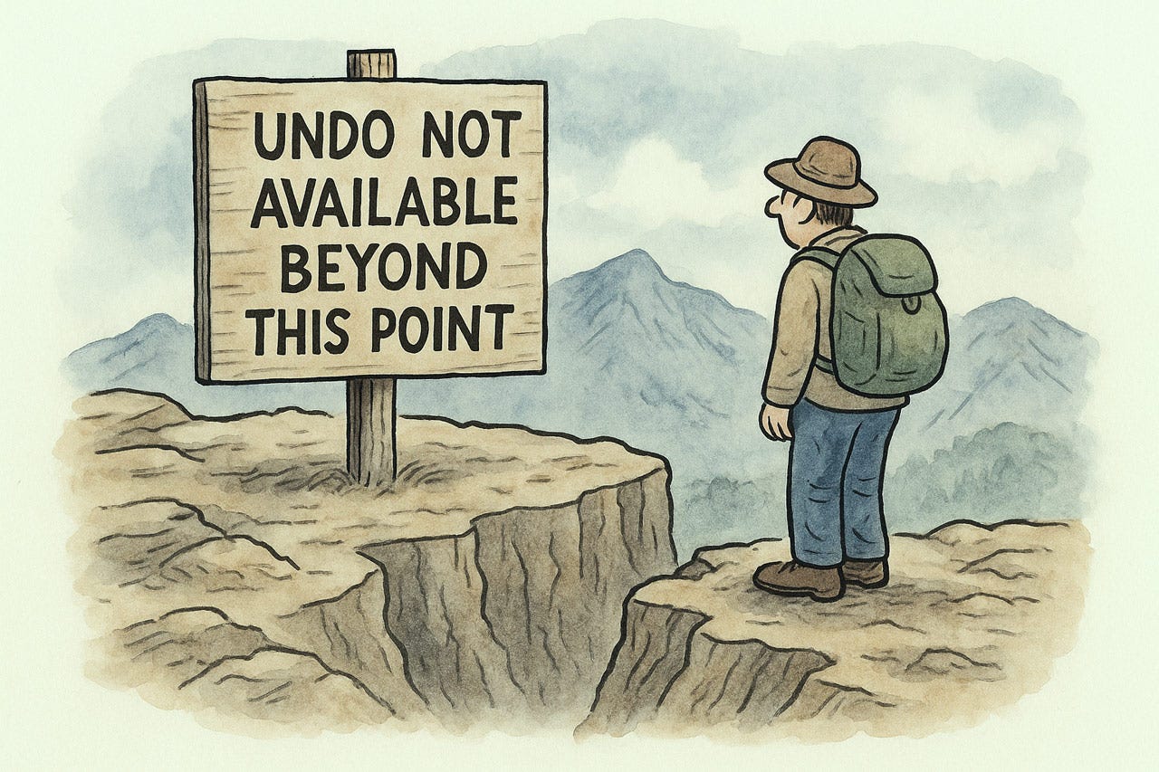
Even though it’s better to offer Undo (see Heuristic 3), some actions are irreversible. Warn users before they commit to something that cannot be undone.
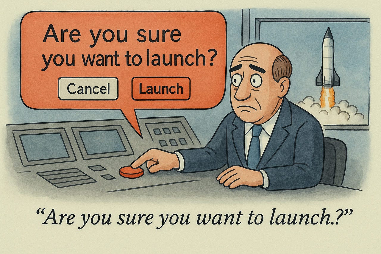
You rarely want to ask users the infamous “are you sure?” question, but particularly destructive actions warrant this. Overuse of confirmation dialogues simply means that users will respond “of course I want to do what I just said” on autopilot, without thinking about the situation.
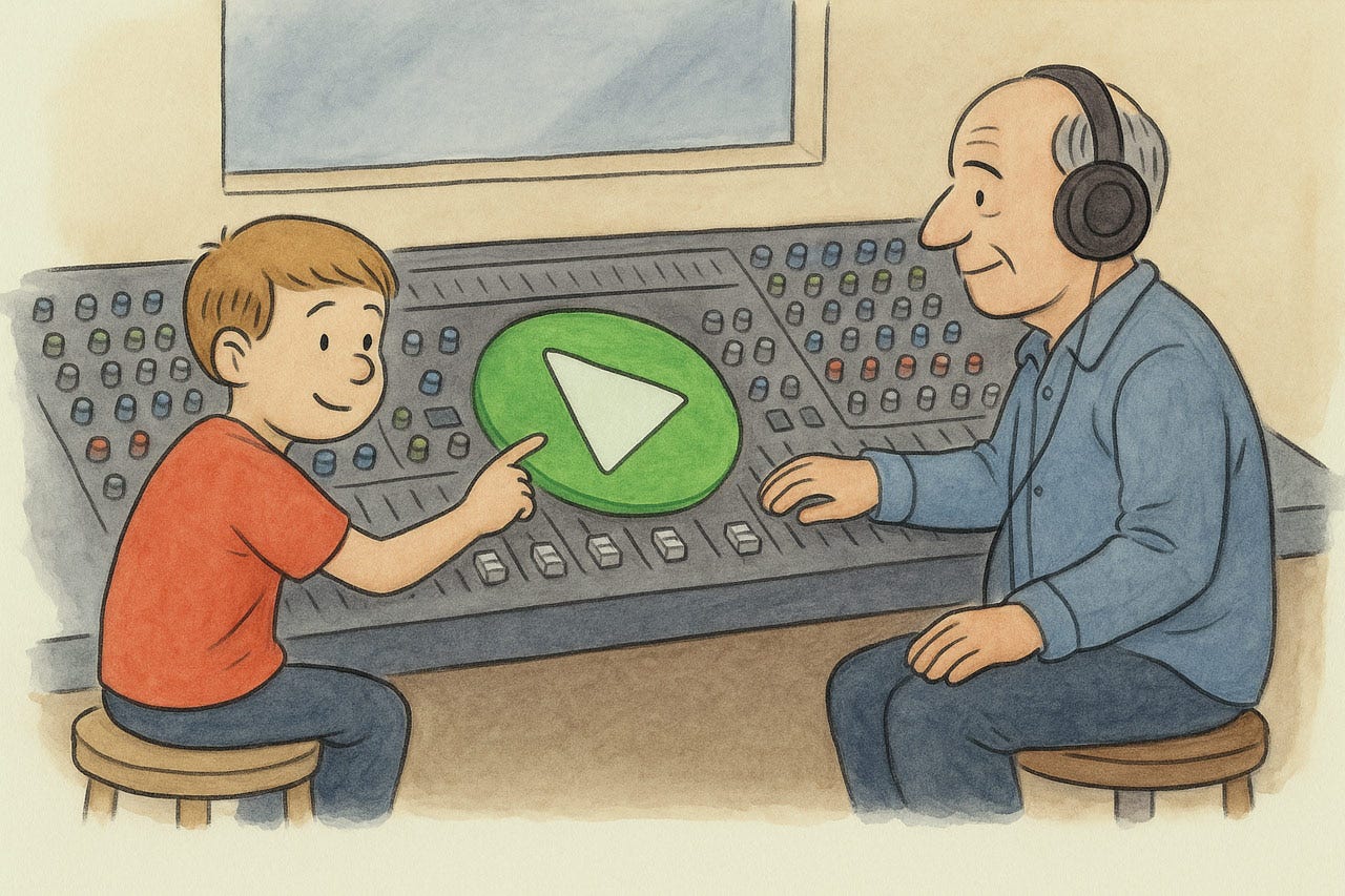
Heuristic 6: Recognition Rather Than Recall
Interfaces must shoulder the memory burden for users. Human cognition strongly favors recognition over recall—our working memory is narrow and unreliable. Make elements visible at the point of need: menus that display options rather than demanding memorized commands; tooltips that explain icons; breadcrumbs that eliminate mental map-building. Progressive disclosure prevents visual overload while maintaining contextual clarity. The goal is simple: externalize information to the interface rather than forcing users to shuttle it in their heads. Let the system do the remembering, so users can focus on their actual tasks — with fewer errors and far less cognitive sweat.
See my music video about Recognition Rather Than Recall.
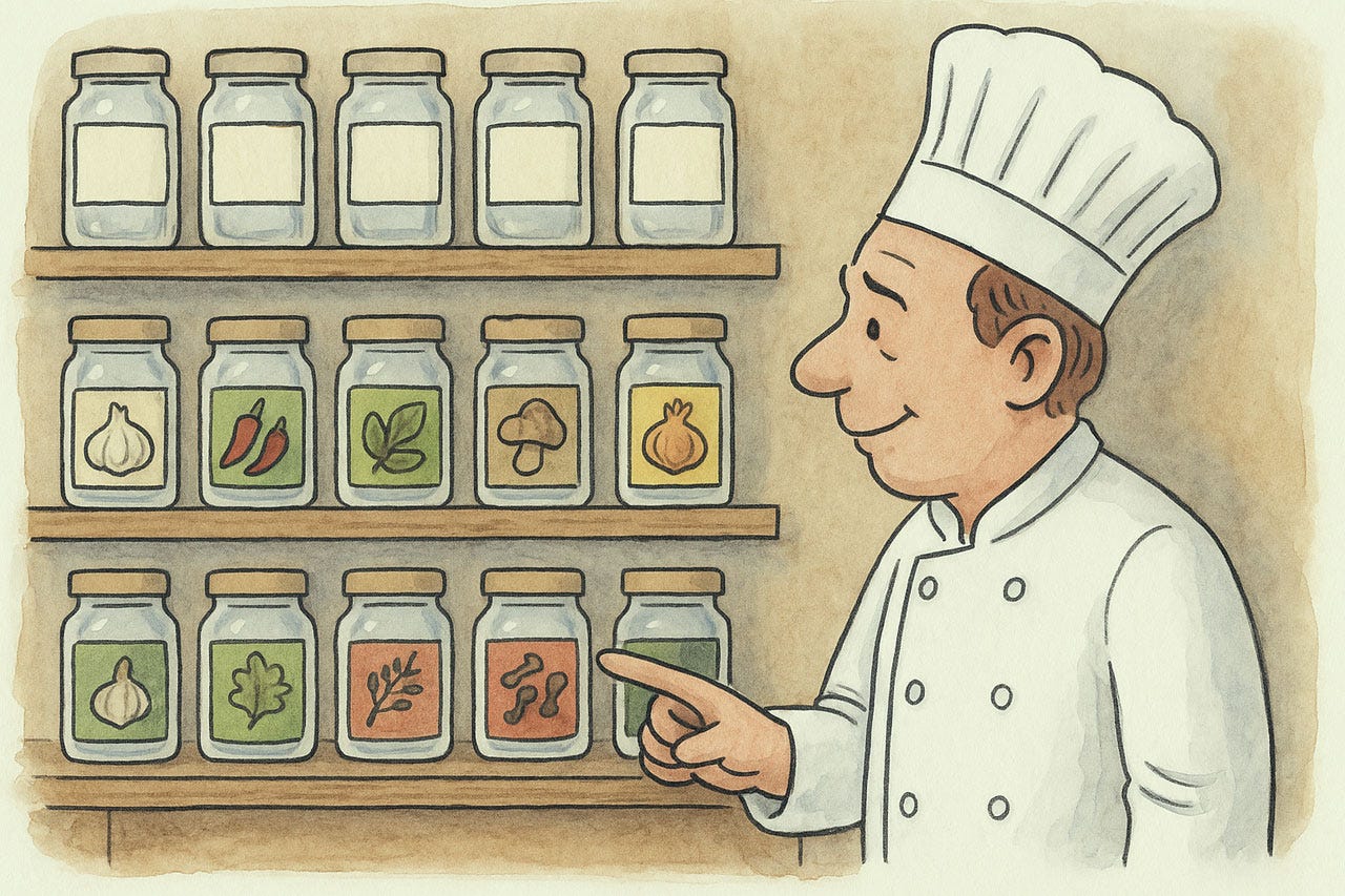
Showing the chef what is inside each spice jar is superior to requiring him to remember what’s inside.
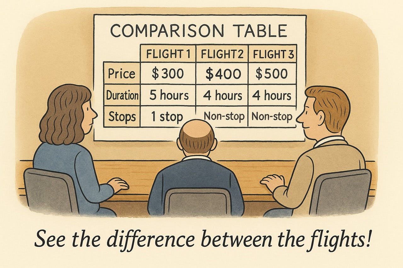
A comparison table frees users from having to remember individual choices from previous screens by showing them all together. This makes it easy to understand the difference between options.
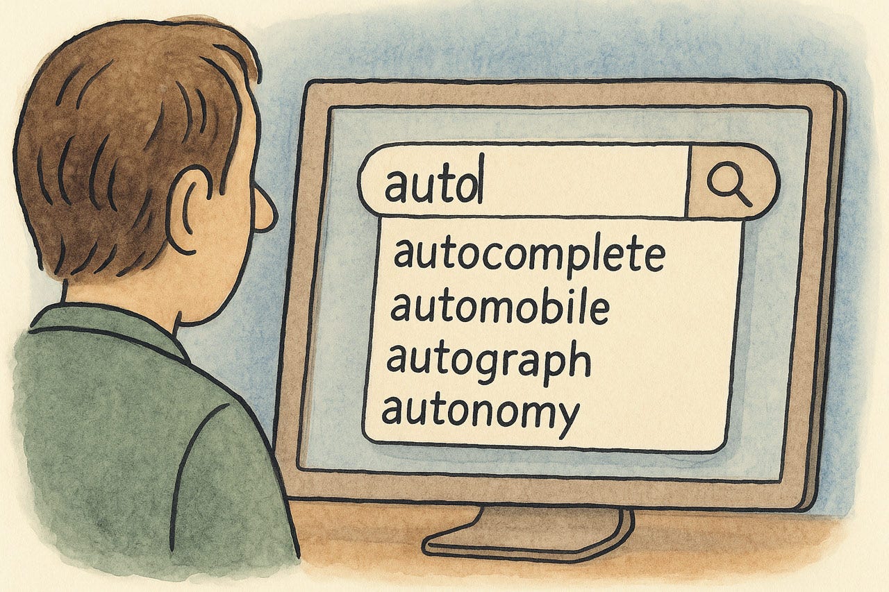
Autocomplete frees users from remembering much of the spelling of complex words and shows them likely terms or phrases they might want to enter at a glance.

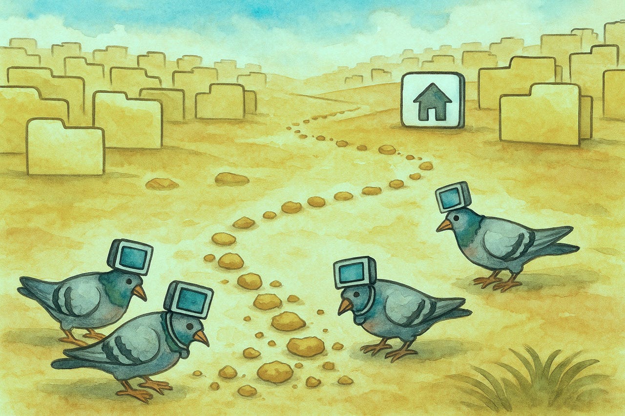
A list of recently viewed items frees users from having to remember them. Such lists also serve as handy shortcuts to quickly return to previous items, often a common user need, thereby satisfying the efficiency heuristic (number 7).
Breadcrumb trails are another way of reminding users where they have been.
Wizards guide users through a workflow one step at a time, freeing them from having to remember the steps. (The downside of this interaction design pattern is that it reduces user control and freedom, meaning that it is essential to offer easy options for skipping steps and returning to previous steps.)
Heuristic 7: Flexibility and Efficiency of Use
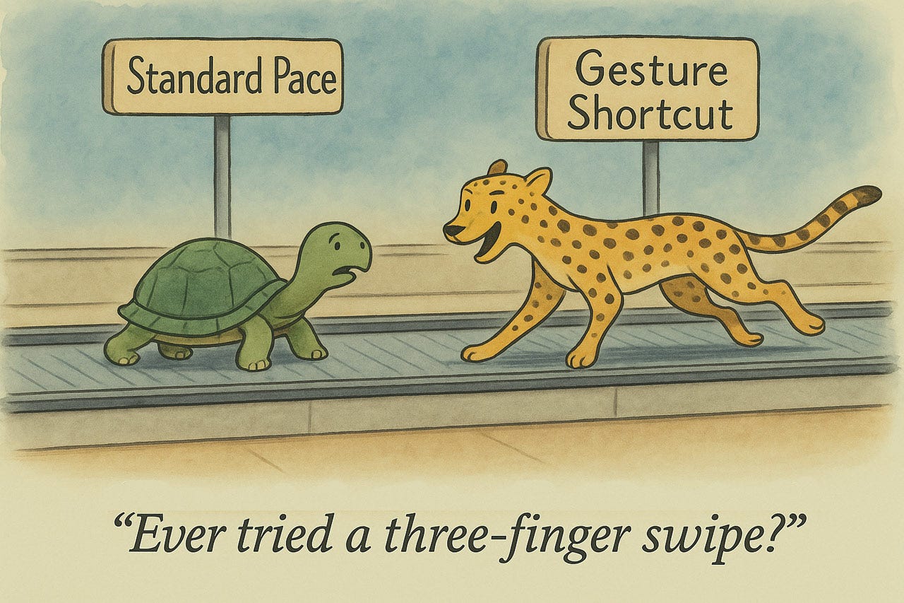
Interfaces must serve users at all skill levels without compromising efficiency. Beginners need clear navigation, but these same paths frustrate experts who require accelerators to bypass tedium. Keyboard shortcuts, gesture controls, and command palettes convert multi-step operations into single actions, reducing cognitive load through muscle memory. A three-click sequence becomes a two-key press.
These power features must remain unobtrusive to novices yet discoverable as users progress. Customization further boosts efficiency by letting users rearrange interfaces to match workflows. Layer your interface: provide a clean baseline for beginners with parallel shortcuts for experts. Without this flexibility, you lose users.
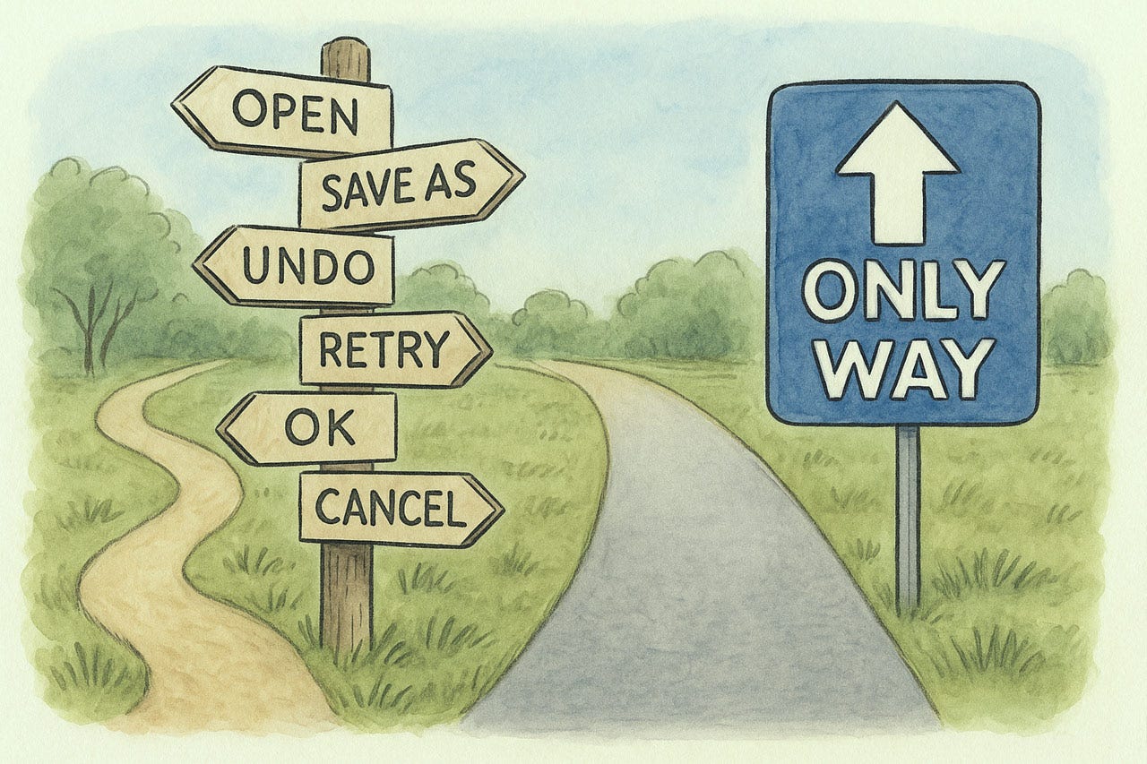
The one true way is often too limiting for users who will use your app in other ways than you expected.
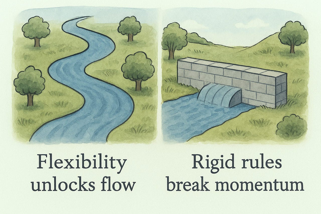
Flexibility helps users accomplish what they want in an efficient manner.
An “easy” mode helps users get started. Many users may never need to progress further, if the basics are all they need.
On the other hand, power users often need advanced features, so both should be provided, using a design that avoids overwhelming novice users with options they don’t need.
Supporting both novice and expert users in the same user interface may require the provision of shortcuts that remain out of sight for the newbies.
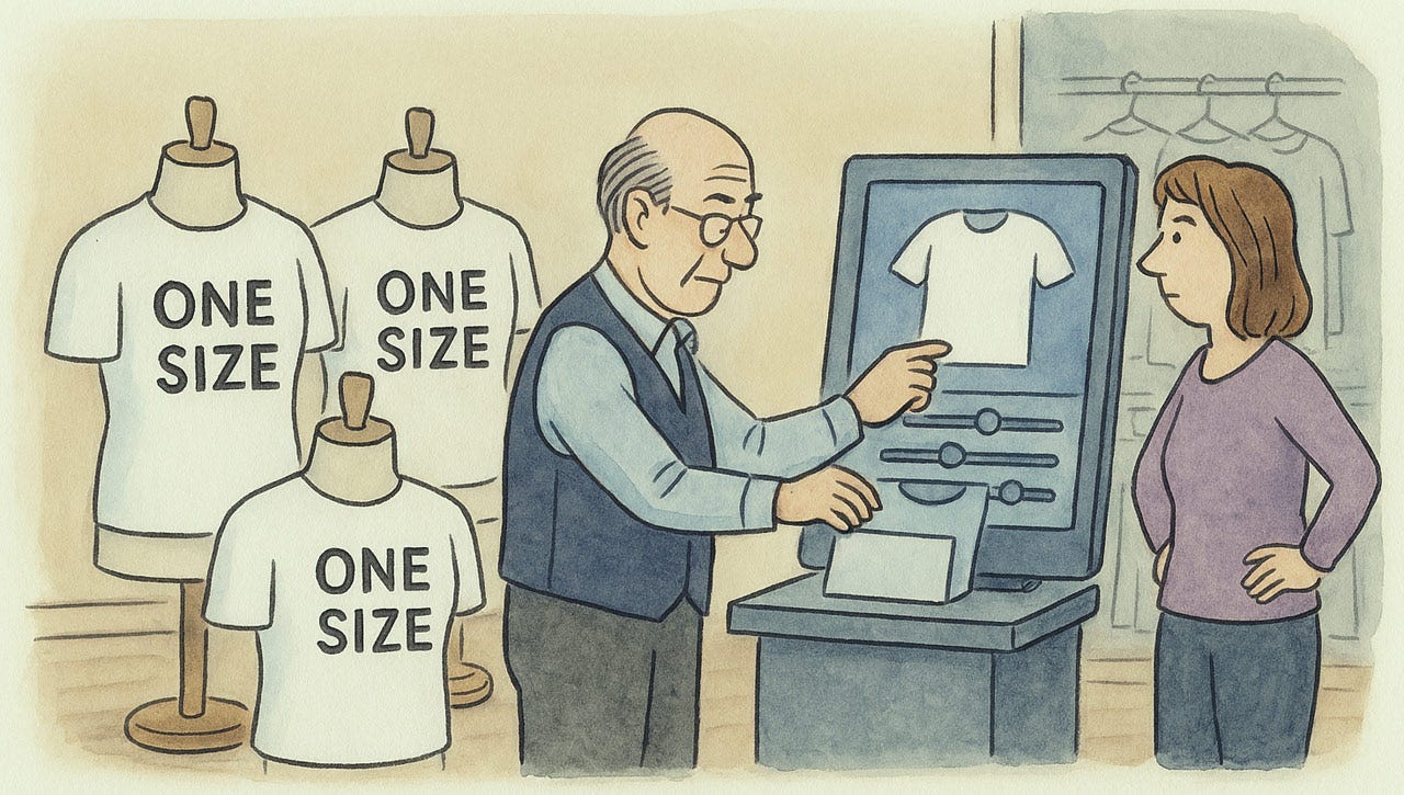
Personalization often beats one-size-fits-all for UI efficiency and flexibility.
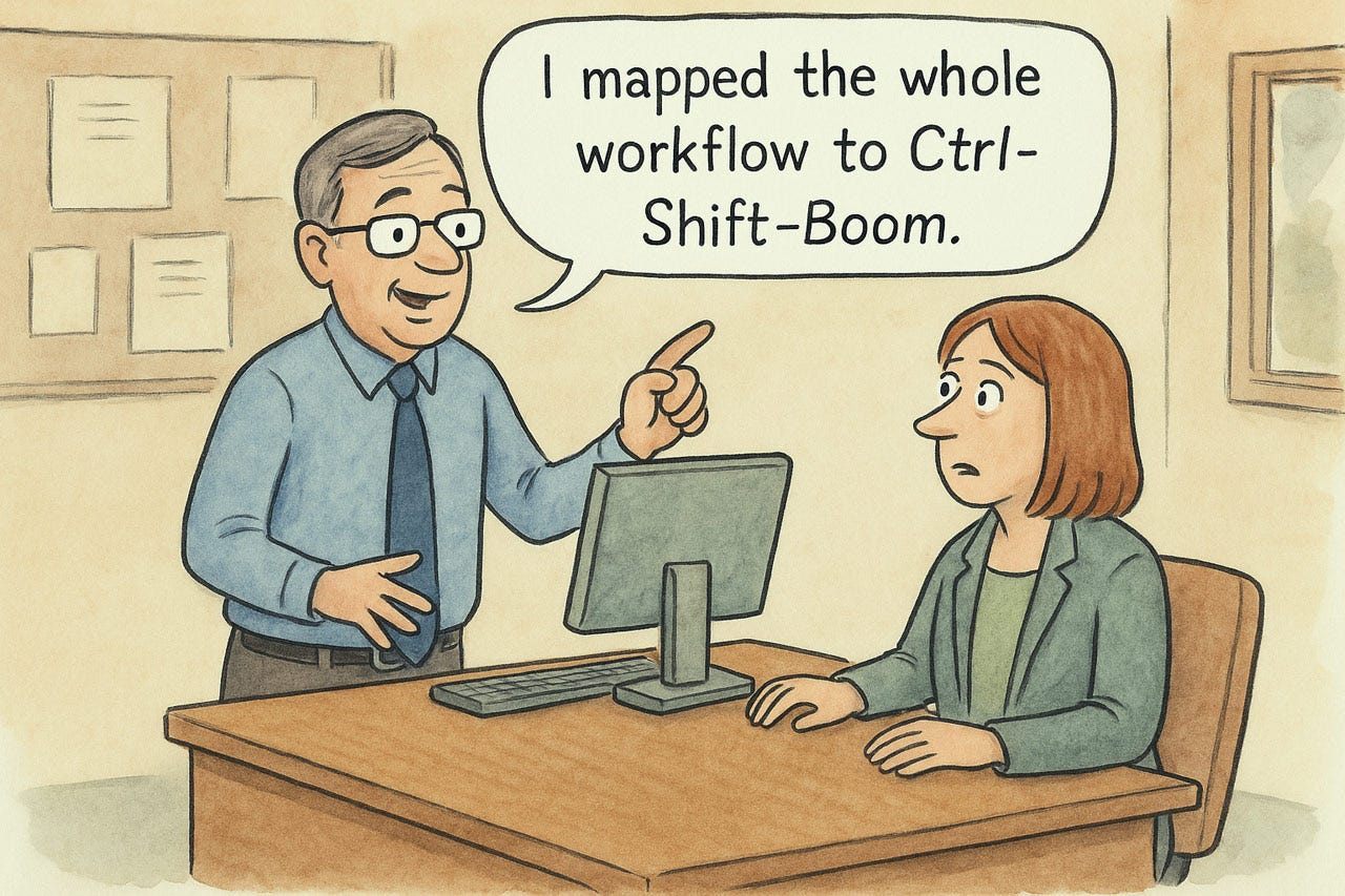
Allowing users to define their own macros, interaction primitives, or shortcuts helps people make the UI their own and supports efficiency.
Heuristic 8: Aesthetic and Minimalist Design
Interfaces should contain only information essential to the current task. Every extra element competes for attention, forcing users to filter signal from noise. Start with ruthless subtraction: if it doesn't help users complete their work, remove it. Establish clear hierarchy using size, whitespace, and contrast to emphasize primary actions. Forms should highlight required fields and subordinate optional ones. Progressive disclosure keeps interfaces clean without sacrificing functionality. Data-rich dashboards can remain dense if you ensure logical grouping and alignment. The benefits are quantifiable: faster recognition, fewer errors, and improved task completion. Users perceive visually clean interfaces as more competent. Judge every element by its contribution. Clarity always wins.
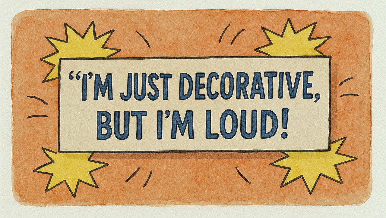
Is a design element just there to get noticed, but it doesn’t do anything for users? Eliminate it.
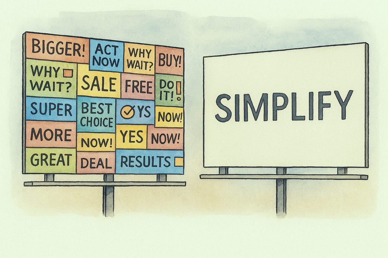
Simplifying user interfaces usually makes them easier to use.
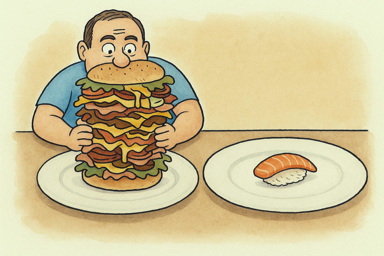
Slimming down can be healthy, also for screen designs. Less is More.
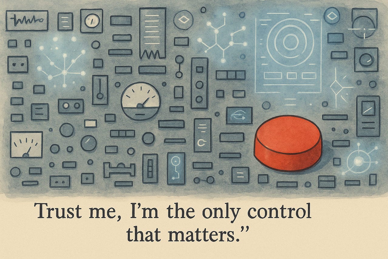
At a minimum, make the design elements that matter the most to users stand out. One way to do so is to eliminate less-important design elements or defer them to secondary screens.
Prioritization, for example, by making certain UI elements bigger or otherwise more visually prominent, is a way to help users notice them first.

Being simpler doesn’t necessarily imply less functionality or power.
Rethinking how something is done can sometimes open opportunities for radical simplification.
Why have 4 ways of doing something when one will suffice? Only offer multiple interactions for the same functionality when the extra design will offer substantial benefits to an important user population, such as expert users (as recommended by Heuristic 7).
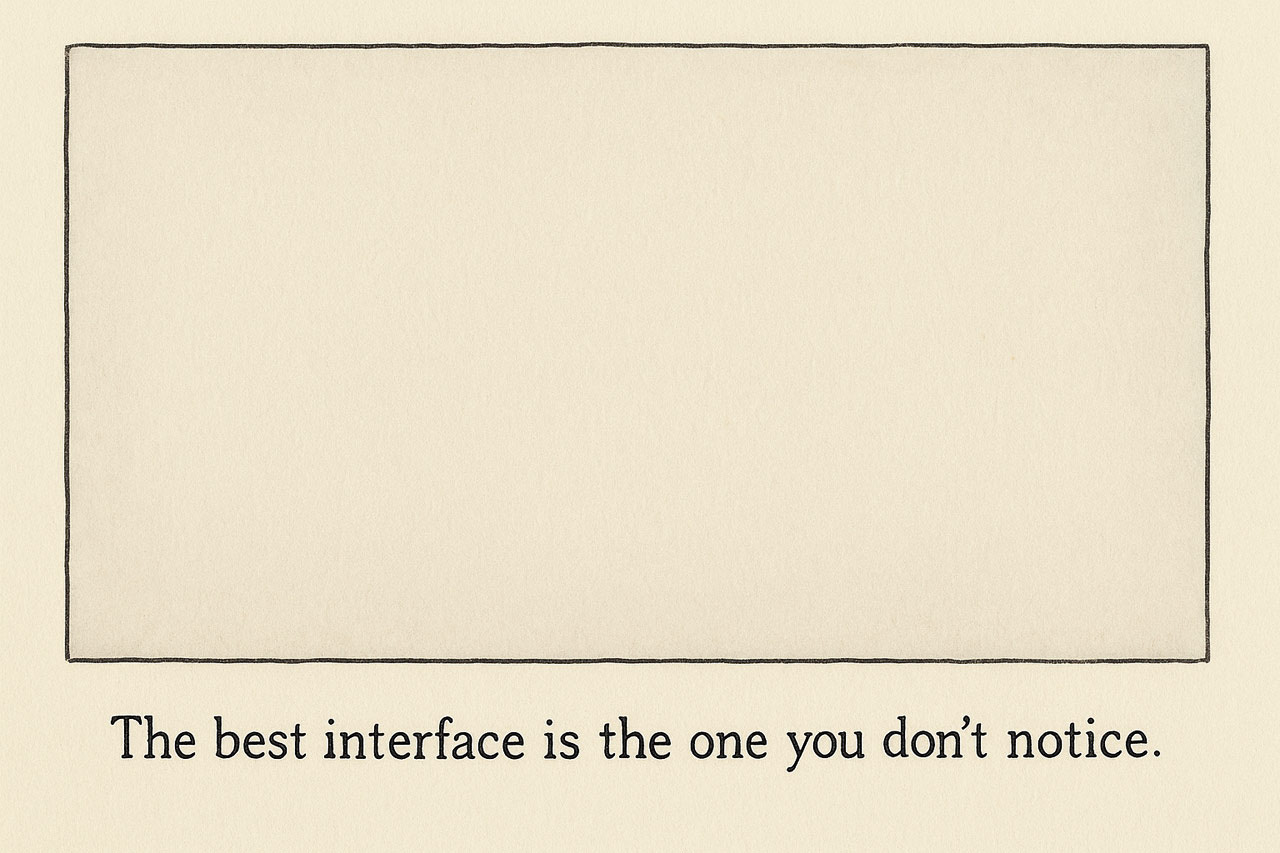
Designers may not like this, but often the best design is one that gets out of the way and isn’t noticed.
Simplifying the design can free up room for users to grow their understanding, their power, and ultimately their outcomes, which was the purpose of the design in the first place.
Heuristic 9: Help Users Recognize, Diagnose, and Recover from Errors
Error messages must speak the users’ language, not the system’s. Replace cryptic codes with precise explanations: “Your password needs at least 8 characters” rather than “Invalid input.” Position feedback where problems occur and highlight specific form fields rather than collecting errors atop the page. Most crucially, provide clear recovery paths: retry buttons, format examples, or alternative routes. Don’t just identify problems; solve them. Good error handling transforms potential abandonment points into moments that build trust. When interfaces treat mistakes as detours rather than dead ends, users maintain confidence and momentum, ultimately improving conversion rates and task completion.
Errors always arise. Plan to alleviate them. Undo (see Heuristic 3) is one way to get out of problems, but more user support is needed, since error situations are critical.
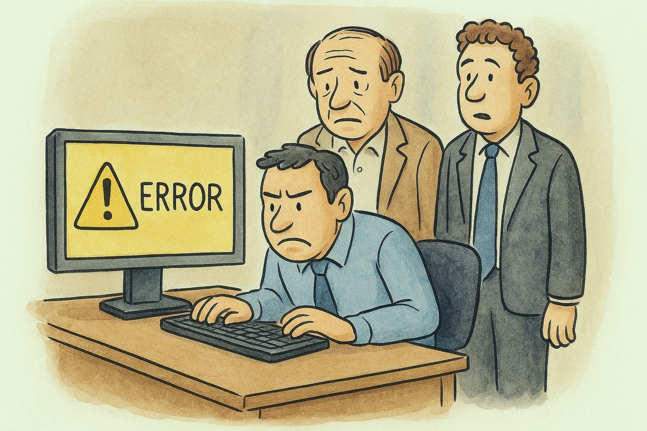
Uninformative error messages are a missed opportunity to help the user at a critical moment.
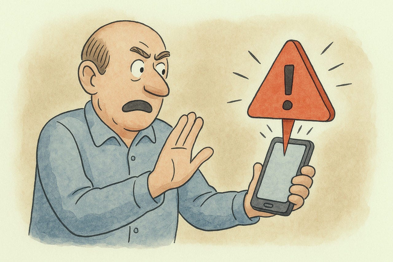
Even though you don’t want to scare or intimidate users, error messages must be clearly noticeable and stand out in the UI, so that users immediately know that something went wrong and can easily see the error without having to look for it.
Error messages shouldn’t just complain that something went wrong. They should constructively help users fix the problem. An error is a teachable moment.
Offering users a working alternative is a good way to recover from an error.
Real-time feedback as the user is about to make a mistake will often set them straight before things go wrong.
Inline validation is a good just-in-time way to catch errors and help users correct them in context.
When several things go wrong, give users the full list right away, rather than requiring them to fix one error, only to be hit immediately by a new error message.
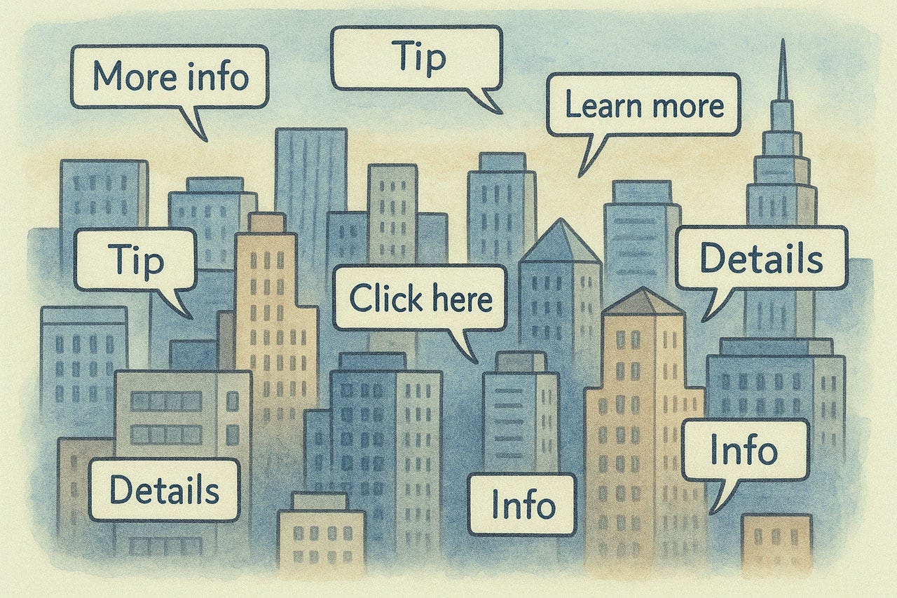
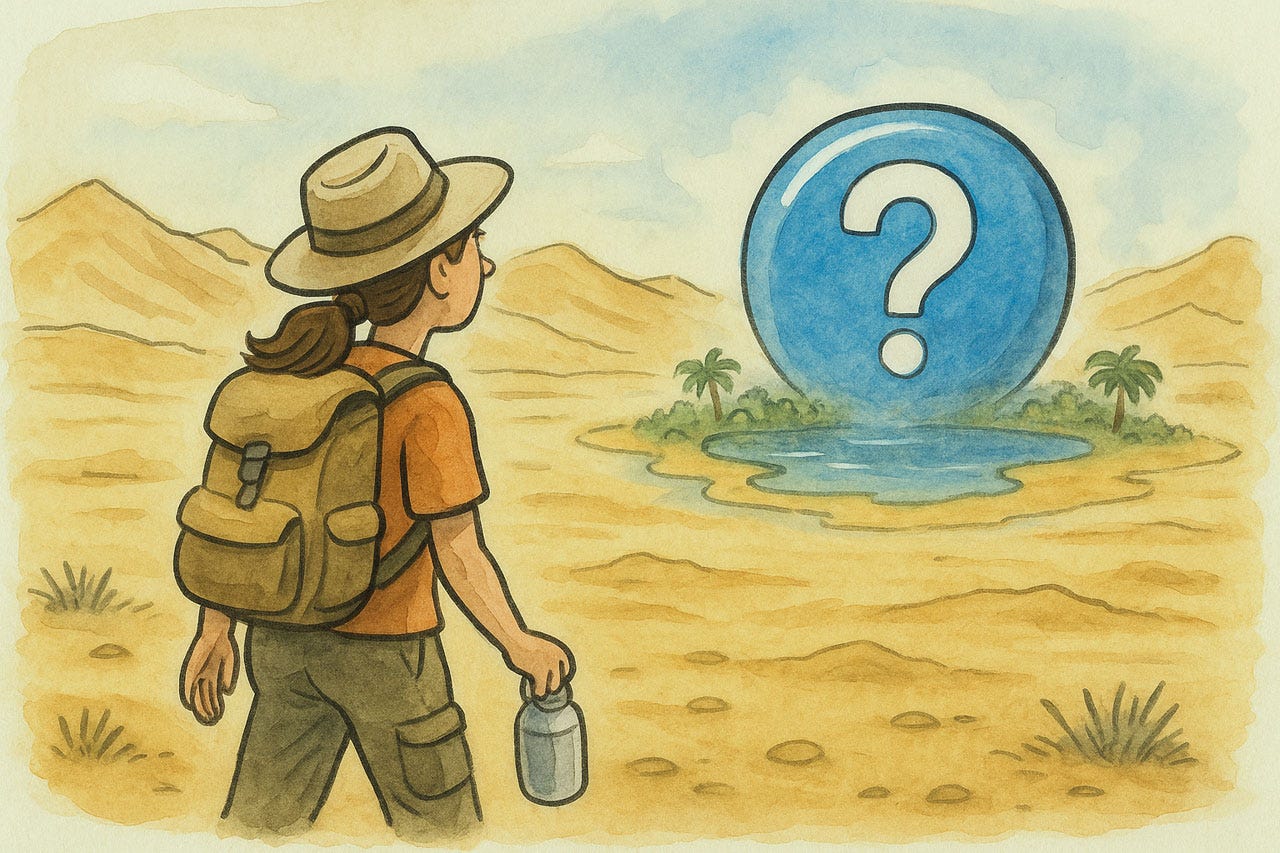
Heuristic 10: Help and Documentation
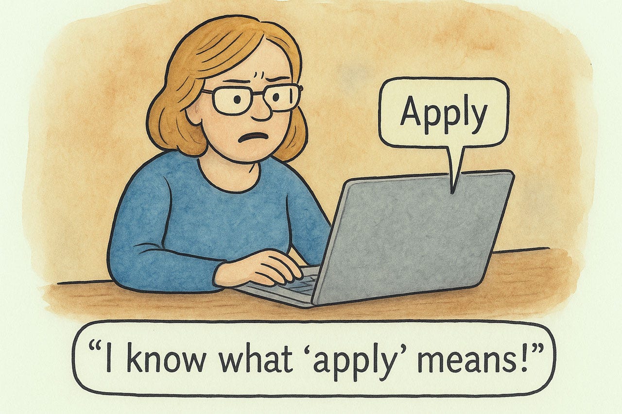
Help systems remain necessary even in well-designed interfaces. Documentation must be findable, task-oriented, and concise. Users seeking help are typically frustrated, so provide immediate, searchable solutions using their vocabulary, not technical jargon. Embed contextual assistance precisely where problems occur. Present instructions as numbered steps, not paragraphs. Scale documentation appropriately: simple applications need only tooltips and FAQs, while professional tools require comprehensive resources. Treat help as a core product component that evolves with each update. Effective documentation does more than solve immediate problems: it reveals efficient workflows and advanced features, transforming struggling novices into proficient power users.
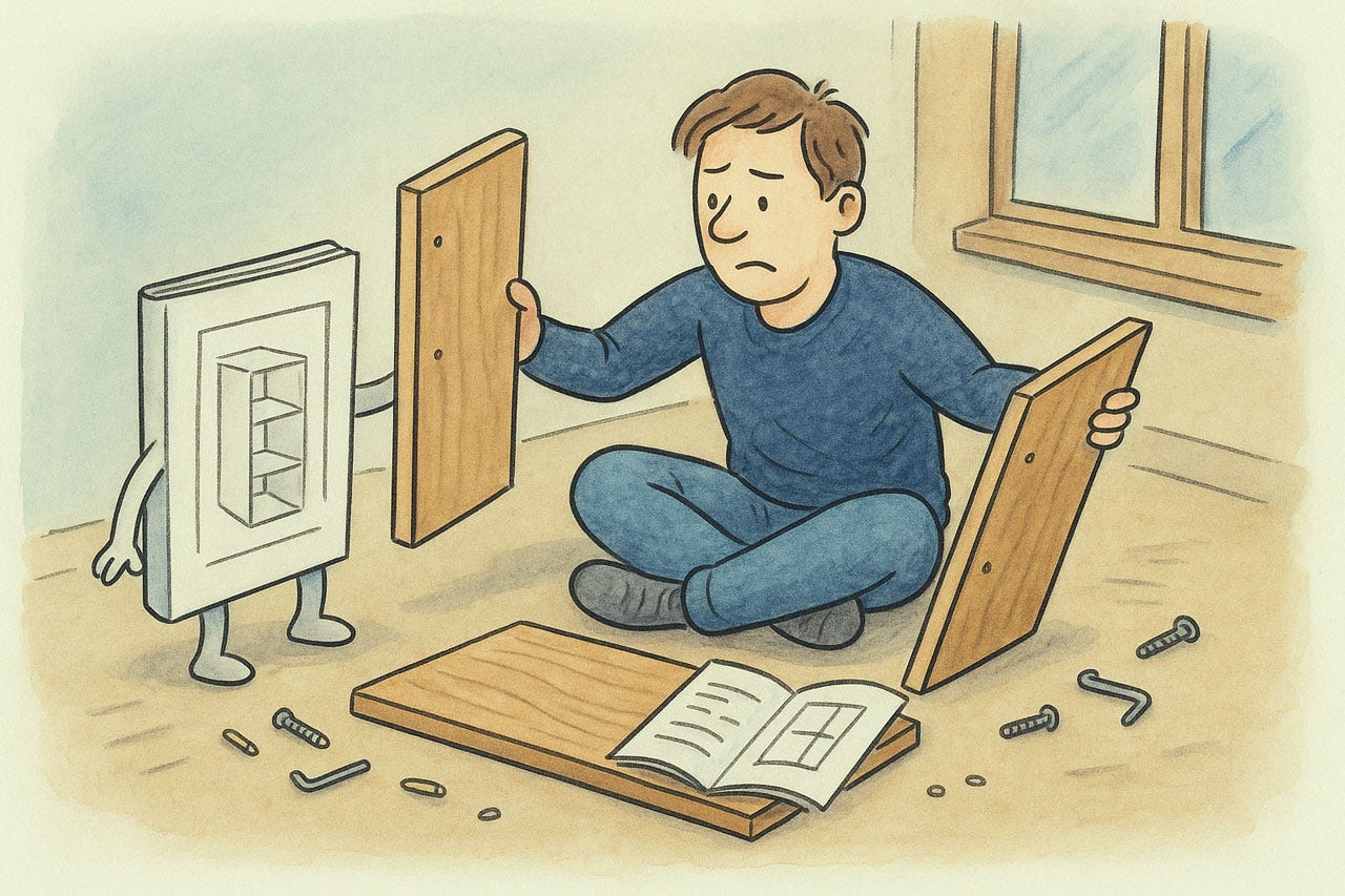
Good instructions are essential, especially for actions that users may only perform once.
Even though help is important, always remember that it is secondary to the user’s goal of performing their tasks. Do help, but get out of the way and don’t obscure the user’s information while they are trying to make sense of a bad situation.
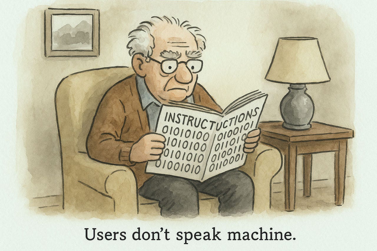
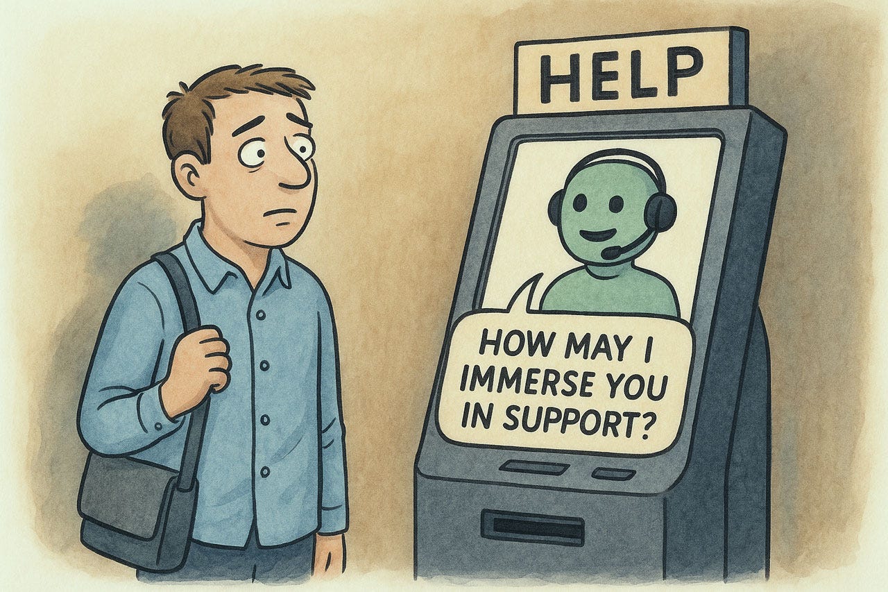
All user interface elements should speak the user’s language (see Heuristic 2), but it’s particularly critical to avoid systems-oriented language in help and documentation, which need to be particularly clear-spoken.

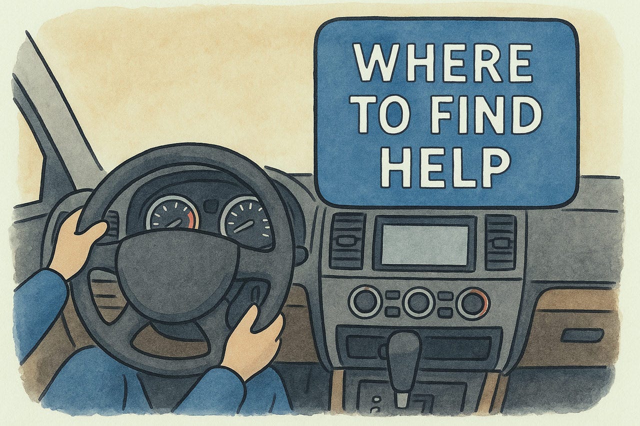
It is often best to offer help information in the exact context where the user’s question arises, for example, in the form of tooltips or short messages placed off to the side of the main workflow.
While tooltips are great, you don’t want to overuse them so that the UI becomes an endless ordeal of flashing popups as the user moves the mouse. Only provide help for interface elements that truly need it. (User testing will show you whether something is as obvious as you think.)
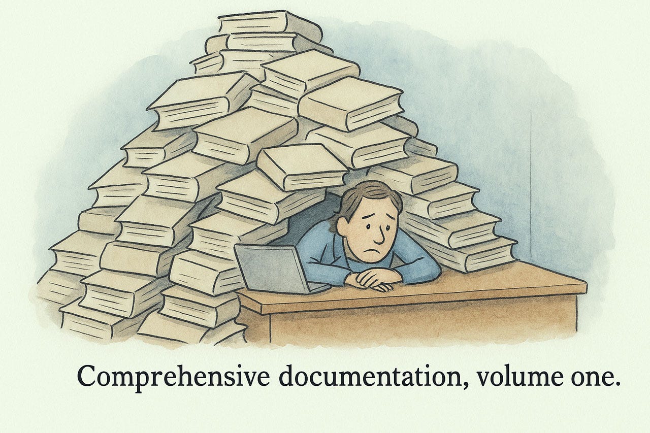
User assistance should be concise to avoid overwhelming users and wasting their time.
Clingy help overexplains and bloats the entire user assistance apparatus, which makes it less helpful for those things that do need explanation.
People have been burned by bad help many times in the past, so it’s incumbent upon you to prove to users that your help is not a mirage but is actually helpful. Otherwise, users will not turn to your user assistance when it could have saved them.
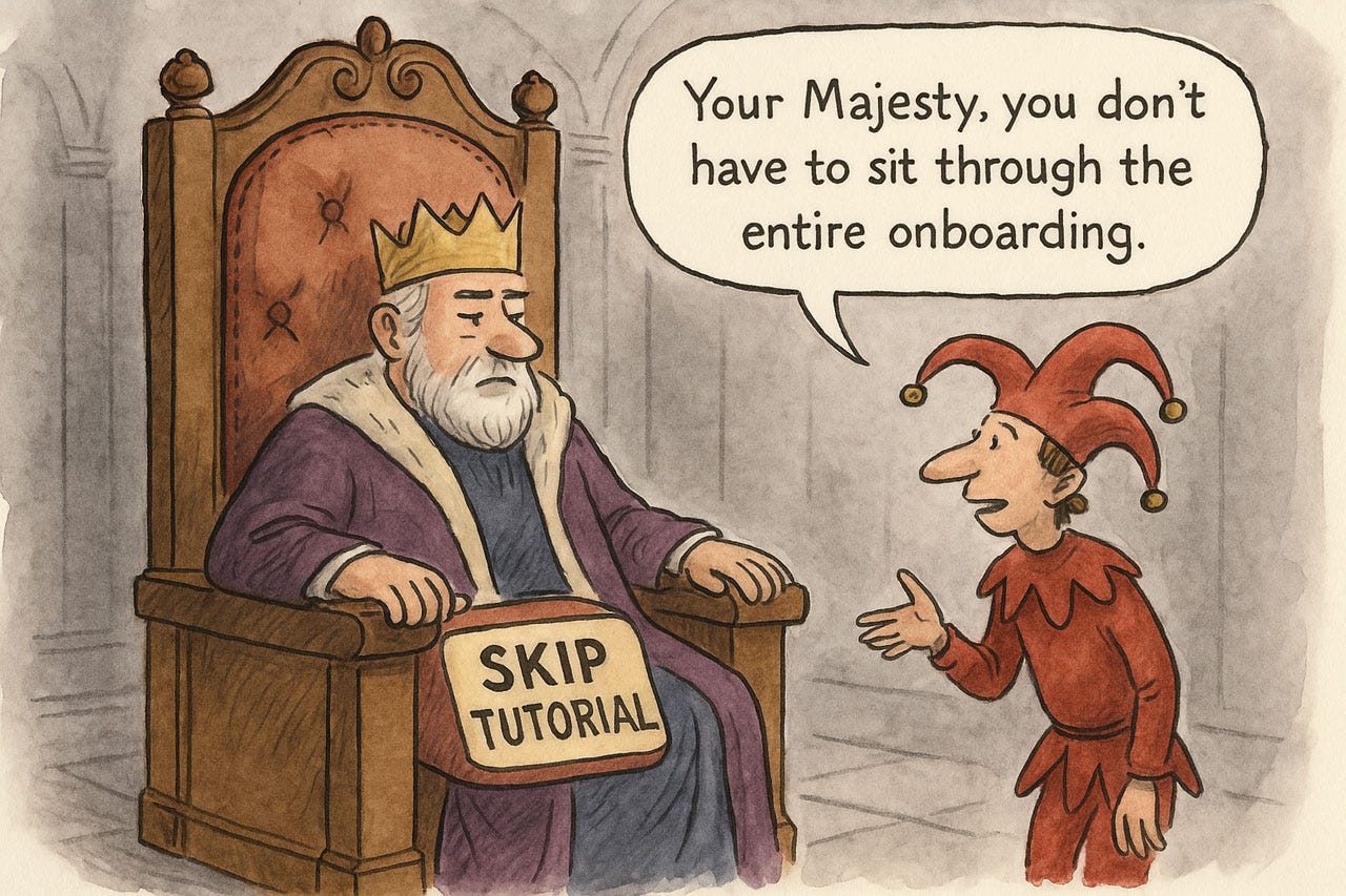
Onboarding instructions may seem like an opportunity to educate users, but people usually skip such intros because they are impatient to get going. The user is King, so the only way to have any hope of impacting a small amount of information, say when launching a new version, is to make it ultra brief, preferably only a single screen.
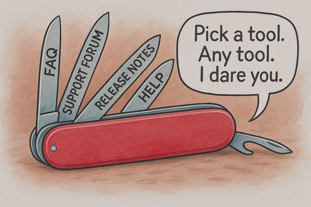
Help is good, but too much help is confusing. Limit user assistance to a few channels.
If you find yourself designing a help feature for how to use your help system, you’ve gone overboard. Help must have the utmost usability since people turn to it when they are already in trouble and don’t need additional complications.
About the Author
Jakob Nielsen, Ph.D., is a usability pioneer with 42 years experience in UX and the Founder of UX Tigers. He founded the discount usability movement for fast and cheap iterative design, including heuristic evaluation and the 10 usability heuristics. He formulated the eponymous Jakob’s Law of the Internet User Experience. Named “the king of usability” by Internet Magazine, “the guru of Web page usability” by The New York Times, and “the next best thing to a true time machine” by USA Today.
Previously, Dr. Nielsen was a Sun Microsystems Distinguished Engineer and a Member of Research Staff at Bell Communications Research, the branch of Bell Labs owned by the Regional Bell Operating Companies. He is the author of 8 books, including the best-selling Designing Web Usability: The Practice of Simplicity (published in 22 languages), the foundational Usability Engineering (28,454 citations in Google Scholar), and the pioneering Hypertext and Hypermedia (published two years before the Web launched).
Dr. Nielsen holds 79 United States patents, mainly on making the Internet easier to use. He received the Lifetime Achievement Award for Human–Computer Interaction Practice from ACM SIGCHI and was named a “Titan of Human Factors” by the Human Factors and Ergonomics Society.
· Subscribe to Jakob’s newsletter to get the full text of new articles emailed to you as soon as they are published.
· Read: article about Jakob Nielsen’s career in UX
· Watch: Jakob Nielsen’s first 41 years in UX (8 min. video)
Such a long and verbose article... took forever to read...
Great! We should use more cartoons in UI design and web design! :D