Information Scent: How Users Decide Where to Click
Summary: Link labels and navigation options must clearly describe the content users will find. Users follow scents of relevance. Navigation becomes intuitive. Content discoverable. Experience enhanced.
Information scent is the bundle of cues (link labels, headings, snippets, and images) that lets users predict, before they click, whether a path leads to what they want. Strong scent is the cheapest findability fix in all of UX, and weak or misleading scent is the main reason people can’t find content that’s sitting right there. Fix your first 2 words, and the rest of your information architecture matters far less than you’d think.
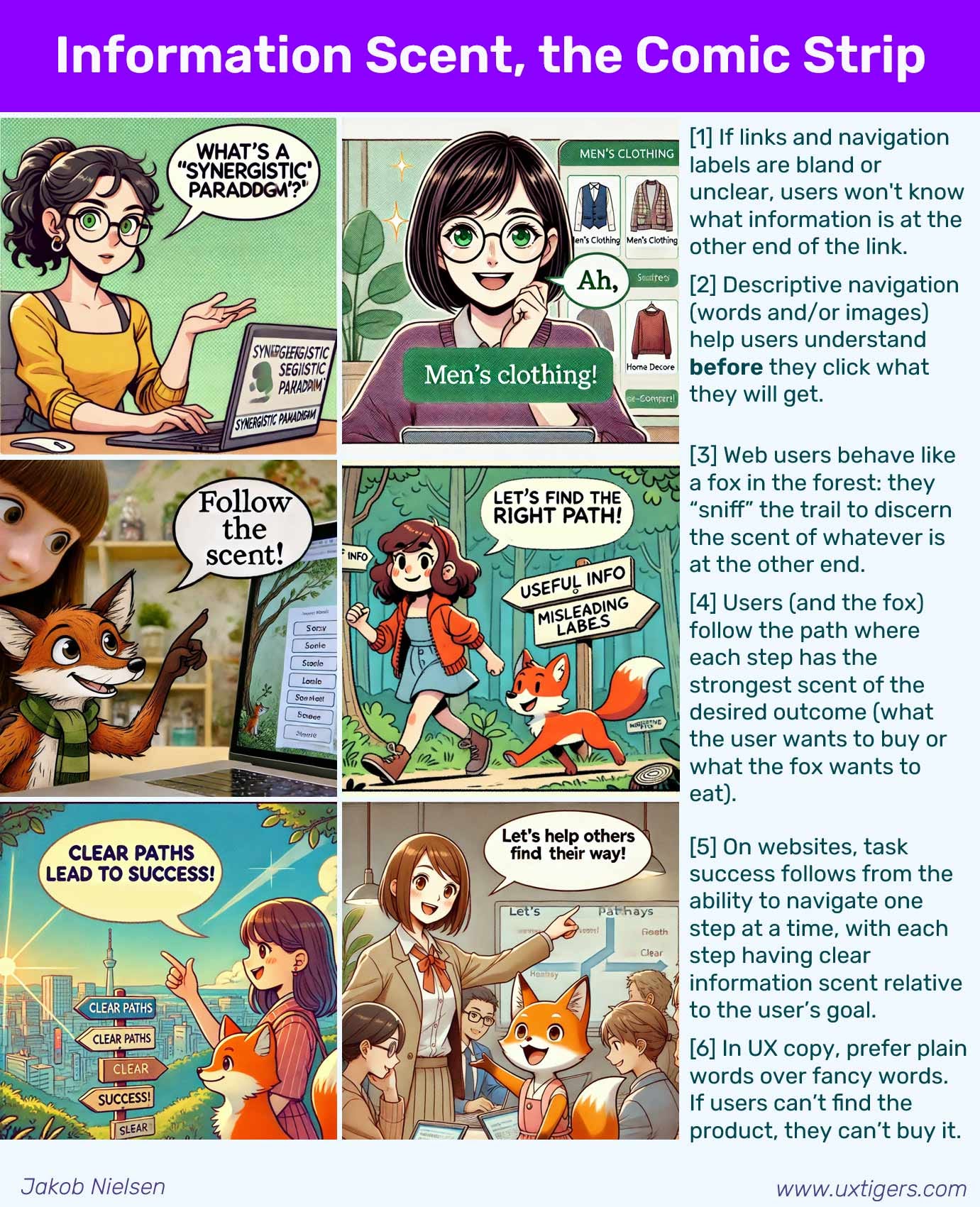
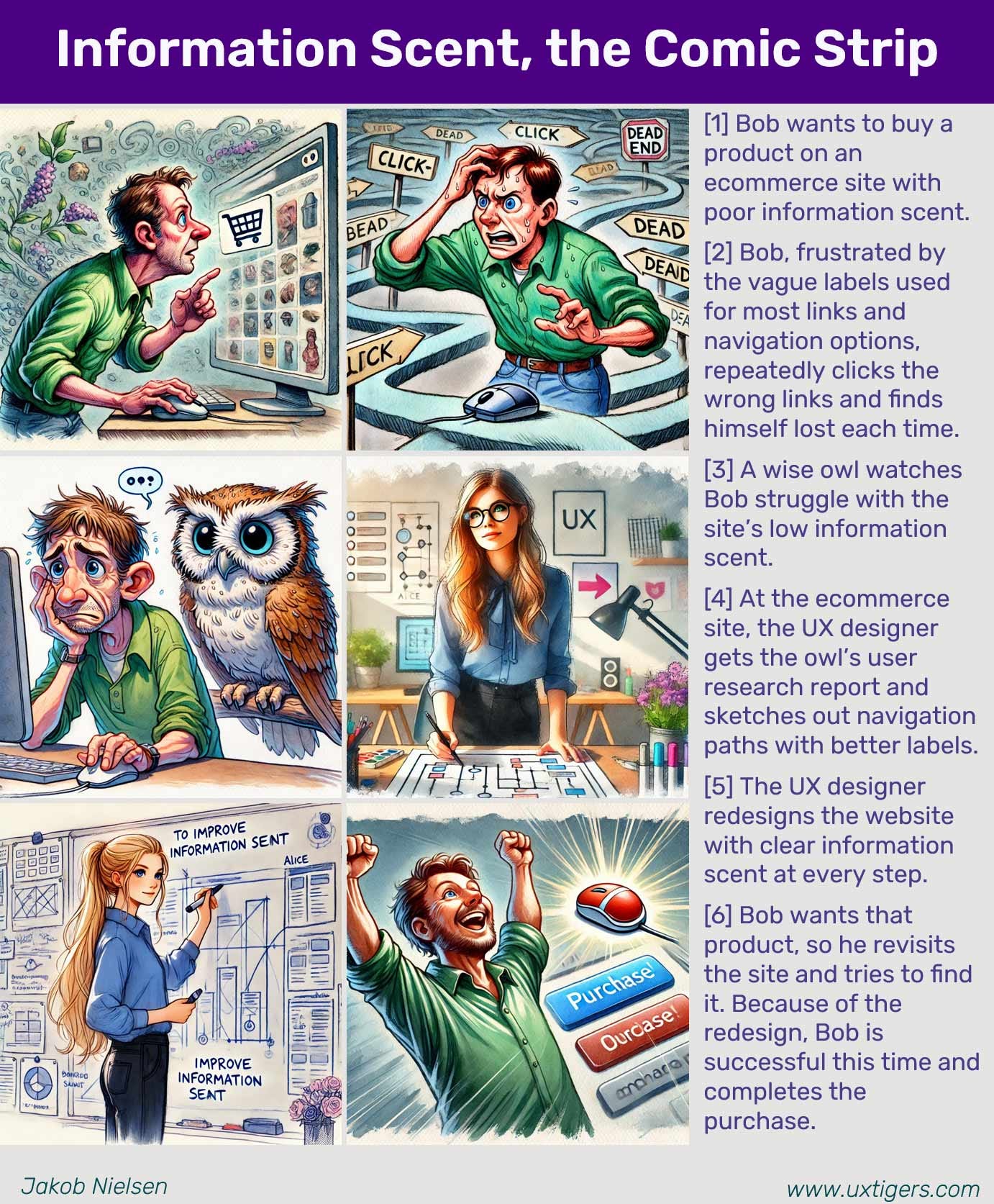
Users don’t read your website. They sniff it.
Information scent is the trail of cues that lets users guess, before they click, whether a path leads to the answers they want. The stronger the scent, the fewer wrong turns. (GPT Image 2)
Scent Is the Smell of Value Before You Arrive
A user shows up with a goal: “find a backpack that survives a rainy trek.” He or she then faces a screen crammed with links, tabs, and headings, and must guess which one pays off. That guess is information scent.
Definition: Information scent is the user’s imperfect estimate of how much value a path will deliver, formed entirely from the cues visible before committing to that path. A link reading “Waterproof backpacks, field-tested” reeks of value to our rainy-trek shopper. A link reading “Solutions” smells of nothing.
The estimate is imperfect on purpose. Users can’t see what’s behind a link, so they infer it from the label, the surrounding context, the visual treatment, and their prior experience with similar sites. Strong scent makes that inference fast and accurate. Weak scent forces blind guessing, and blind guessing is slow, frustrating, and abandonment-prone.
Here’s the part designers keep missing: your design emits the scent, but the user’s nose evaluates it, not yours. You ≠ the user’s nose. A label that’s obvious to the team that shipped it can be odorless to a first-timer who lacks your internal jargon, your org chart, and the three meetings where somebody won the argument for “Solutions.”
The Name Comes from Foxes, Not Focus Groups
Peter Pirolli and Stuart Card cooked up the concept at Xerox PARC in the 1990s. Pirolli gave a talk on it in 1993, published the first paper, “Information Foraging in Information Access Environments,” at CHI in 1995, and laid out the full theory in Psychological Review in 1999. Ed Chi and colleagues later gave scent a computational spine in their 2001 CHI paper on modeling user needs and actions from scent.
Why “scent”? Because the whole framework is borrowed from biology. Optimal foraging theory studies how animals decide where to hunt and when to give up on a depleting food source. Eric Charnov’s 1976 marginal value theorem supplies the math: a forager quits its current patch the moment the expected payoff there drops below what it could get by moving on. Pirolli and Card noticed that humans hunting for information behave the same way, and that animals locate prey by following its smell. So the cue that guides an information forager toward likely payoff got called scent. Cute, and it stuck.
The theory borrows its vocabulary from animals that forage for food. A fox follows the scent of prey; a user follows the scent of information. Same math, different woods. (Midjourney)
Scent Serves the Larger Hunt: Foraging
Information scent isn’t a standalone trick. It’s one gear inside information foraging, the fundamental theory of how people navigate to satisfy a question. Foraging says people hunt for value and are ruthlessly economical about effort. Scent is the signal they follow to do it.
The unit foragers work in is the patch: a search-results page, a category listing, a single article, a section of a document. Inside a patch you extract value until it thins out; then you decide whether to keep digging or leave for greener woods. The marginal value theorem draws the line: stay while the patch’s payoff beats what you expect elsewhere; leave the instant it doesn’t. Scent is the estimate that ranks the patches in the first place and tells the forager, at every fork, which way smells richest.
Information lives in patches: a search-results page, a category, a website (like this one!) with articles on a topic. Foragers stay in a patch only while its payoff beats what they expect to find elsewhere. Scent is the estimate that ranks the patches. (GPT Image 2)
This is also why users leave good sites fast. Information foraging is the reason Google makes visitors leave your site. The logic is brutal and correct: when a richer patch is one search away, users tolerate less thinness on yours. Scent tells them a better patch exists. They bolt. Your content didn’t get worse; the competition got a stronger smell.
Users don’t sample every source. They commit to the path that smells richest and ignore the rest, even when a slightly better option might be found within less-smelly material, one island over. (GPT Image 2)
Strong Scent = Fewer Wrong Turns = More Revenue
Now the useful part. Get scent right and you make users faster, and faster users convert, subscribe, and come back. That’s the whole business case.
Users scan; they don’t read. My eyetracking research turned up the F-pattern: people tear through the first couple of items in a list, then read less and less, drifting their eyes down the left edge. The practical fallout is that they judge a link on roughly its first 2 words, about 11 characters. In one of my studies, when those leading words were chosen well, 85% of users correctly predicted where a link would take them from that tiny stub of text. Waste the first 2 words on “Welcome to” or “Guide to,” and you’ve spent your scent budget on fumes.
Strong scent works by stacking honest cues at every branch:
Information-carrying link labels. Lead with the noun that matters. “Compare backpack warranties” carries scent; “More info” carries none.
Headings as trail markers. A page of blunt, descriptive subheads lets a scanner sniff the whole patch in seconds and dive where the payoff is.
Search snippets and category descriptions. A sentence of preview under each result or category lets users sniff before they commit, instead of clicking blind.
Scent continuity. The words a user clicks should greet them again as the headline of the page they land on. Continuity confirms the trail; a mismatch reads as a wrong turn.
Do all that, and rewriting alone can move the needle hard. In studies with John Morkes back in 1998, rewriting web pages for scannability and directness lifted measured usability by 124% and 159% in two separate tests. More than double, from words. Not a redesign, not a rebuild: words.
A user’s hunt for “best hiking backpacks,” dramatized across three pages: strong scent pulls her toward depth, clarity, and credibility, while fluff, pop-ups, and thin listicles bleed the scent until she’s ready to abandon the patch. Real users do this in seconds, minus the safari outfit. (GPT Image 2)
Weak and False Scent = The Self-Inflicted Wound
Most findability failures aren’t missing content. They’re present content with no smell, or the wrong smell. Four ways teams poison their own trail:
Odorless labels. “Learn More,” “Click Here,” “Read More,” “Products,” “Solutions,” and a lonely “Submit” are scent-free. Users can’t tell where they lead, so they either guess wrong or don’t click at all. Fix: replace the label with its destination. “Learn More” becomes “Compare backpack warranties.” One rewrite, real scent.
The scent mirage. A link that oversells emits a strong smell over an empty patch. The user follows it, finds fluff, and feels tricked. The punishment isn’t confined to that one link; it taxes your whole site’s credibility, because now every promising smell is suspect. Fix: promise exactly what you deliver. Clickbait is a loan against trust, and the interest is nasty.
Scent dilution. When ten links all smell equally relevant, the user can’t pick, so he or she starts pogo-sticking: click in, bounce out, click the next, bounce out, on and on. Fix: don’t give ten links equal scent. Give one link the strongest scent. Rank visually so the primary path is unmistakable and the secondary options recede.
The scent cliff. Scent is value divided by cost. Even a promising path gets abandoned when the cost spikes: a slow page, a pop-up demanding your email, a wall of intro fluff before the answer, an interstitial ad. The payoff was fine; the effort to reach it wasn’t. Fix: cut the cost, not just the confusion. Speed, directness, and getting out of the user’s way are scent multipliers. Kill the pop-ups. (Yes, all of them. The birds too.)
And the special case of mystery-meat navigation: an icon with no text label. A lone picture rarely carries reliable scent, because a hamburger, a gear, and a floppy disk mean different things to different people. Fix: label your icons. Every one.
9 Guidelines for Designing Strong Information Scent
Here are 9 rules that convert the theory into action. Each is concrete, testable, and cheap.
Front-load the words that carry meaning. Users often see only the first 2 words (about 11 characters) of a link or heading. Put the payoff noun first; bury “Welcome to,” “Guide to,” and “The Ultimate.”
Delete every empty label. “Learn More,” “Click Here,” “Read More,” “Solutions,” and standalone “Submit” carry zero scent. Name the destination instead: what will the user get on the other side of the click?
Make link text match its destination. The clicked words should reappear as the target page’s headline. This scent continuity confirms the trail and prevents the bounce-back that a mismatch triggers.
Never over-promise. A link that oversells is a scent mirage: strong smell, empty patch. Users penalize the credibility of your whole site, not just the one bad link.
Give one path the strongest scent, not ten paths equal scent. When everything smells the same, users pogo-stick in and out of pages. Rank options visually so the primary route is obvious.
Label your icons. A picture without words is mystery-meat navigation. Pair every icon with text; icons alone rarely emit dependable scent.
Show a preview at every branch. Snippets under search results and one-line descriptions under categories let users sniff before they commit. Naked link lists force blind clicks.
Cut the cost, not only the confusion. Scent is value ÷ effort. Slow pages, pop-ups, fluff intros, and interstitial ads raise effort until users bail at the scent cliff. Speed and directness are scent multipliers.
Keep breadcrumbs and clear “you are here” cues. Foragers need to know where the trail leads and where it came from. Orientation is scent for the path behind you.
Conclusion: Design for the Nose, Not the Org Chart
Users navigate by smell. They arrive with a goal, sniff the nearest cues, follow the strongest scent, and abandon any patch the moment its payoff drops below the next one over. You can’t argue them out of this. It’s the same evolved economy that sends a fox down the richest trail and past the thin ones, and it runs in seconds, below conscious thought.
So stop designing your site as an org chart and start designing it as a scent trail. Front-load the meaningful words. Kill the odorless labels. Match every link to its destination. Cut the cost of the hunt. Do that, and users find what they came for, buy the backpack, and remember that yours was the site that didn’t waste their time.
Weak scent, and they’re gone before you finish saying “Solutions.” Strong scent, and they follow their nose straight to your cash register. Scent = findability = profits. Give them something worth smelling.
Strong information scent allows users to find their way to the content they want. (GPT Image 2)
About the Author
Jakob Nielsen, Ph.D., is a usability pioneer with 43 years experience in UX and the Founder of UX Tigers. He founded the discount usability movement for fast and cheap iterative design, including heuristic evaluation and the 10 usability heuristics. He formulated the eponymous Jakob’s Law of the Internet User Experience. Named “the king of usability” by Internet Magazine, “the guru of Web page usability” by The New York Times, and “the next best thing to a true time machine” by USA Today.
Previously, Dr. Nielsen was a Sun Microsystems Distinguished Engineer and a Member of Research Staff at Bell Communications Research, the branch of Bell Labs owned by the Regional Bell Operating Companies. He is the author of 8 books, including the best-selling Designing Web Usability: The Practice of Simplicity (published in 22 languages), the foundational Usability Engineering (31,140 citations in Google Scholar), and the pioneering Hypertext and Hypermedia (published two years before the Web launched).
Dr. Nielsen holds 79 United States patents, mainly on making the Internet easier to use. He received the Lifetime Achievement Award for Human–Computer Interaction Practice from ACM SIGCHI and was named a “Titan of Human Factors” by the Human Factors and Ergonomics Society.
· Subscribe to Jakob’s newsletter to get the full text of new articles emailed to you as soon as they are published.
· Read: article about Jakob Nielsen’s career in UX
· Watch: Jakob Nielsen’s first 41 years in UX (8 min. video)


Thank you - love the summary and the reference to Information Foraging theory - however the article feels a bit too AI-generated for my taste.