
Progressive Disclosure: From Training Wheels to Week-Long AI Agents

Summary: Progressive disclosure puts the few features that serve most tasks on the first screen and defers the rest to a clearly labeled second level. The pattern has 4 decades of evidence behind it: novices learn faster and err less, while experts pay 1 click. It’s about to matter more than ever, because AI answers and long-running agents need layered revealing even more than settings screens do.

I made the comic strip for this article with GPT-Images-2.
Definition: Progressive disclosure is an interaction technique that initially shows the user only the most important options and reveals the specialized ones only when he or she asks for them, on a secondary display.
Example: A phone camera opens with shutter, zoom, and flash, while a “Pro” mode holds ISO, white balance, and RAW capture for enthusiasts. Many restaurants run the same play: a 1-page list of most-recommended wines on the table, the full 40-page wine list produced on a single question to the sommelier.
For once, our jargon-happy field named something honestly. The interface discloses (reveals) its capabilities progressively (in stages) instead of detonating all of them in the user’s face at once.
I think of it as the workbench model. A well-run workshop keeps the daily tools on the bench and the specialty gear in labeled drawers underneath. In the accompanying comic strip, that’s literally the design Zimo builds: Alice walks into a lab she declares “chaos,” and he clears the bench down to 3 controls with an Advanced Settings drawer in easy reach. She finishes her first task before he finishes explaining. Everything on the bench is level 1, everything in the drawer is level 2, and the entire discipline boils down to deciding, with data, what goes where.
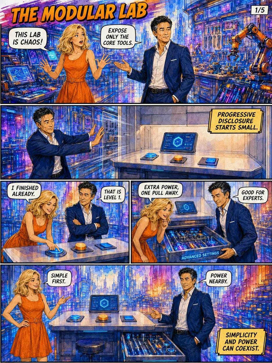
Zimo strips Alice’s chaotic lab down to 3 controls plus 1 labeled drawer: the entire discipline of progressive disclosure in a single piece of furniture.
So what earns a spot on the bench? Here’s a check you can run tomorrow, which I’ll call the workbench test: can a first-time user complete your product’s top task using only what’s visible on first load, without opening a single drawer? If not, your bench is cluttered, your drawer is overstuffed, or both.
Don’t confuse progressive disclosure with adaptive menus, which reshuffle options based on recent usage. Adaptive interfaces break spatial memory: the command you found yesterday has wandered off somewhere new today. Progressive disclosure keeps every control in a fixed, learnable location and varies only how much is currently expanded. Stability is half the benefit.
(User-driven customization is the honorable cousin: when a user pins a favorite from the drawer onto the bench, spatial memory survives, because the user did the moving and knows where things landed.)
Training Wheels: 4 Decades of Evidence
The classic evidence arrived in 1984, when John M. Carroll and Caroline Carrithers of IBM’s Watson Research Center published the “Training Wheels” study in Communications of the ACM. They took a commercial word processor and simply blocked its advanced functions for new users: a forbidden menu choice produced a polite “not available” message instead of a rabbit hole. Beginners on the training-wheels system learned the basic letter-typing task faster and scored better on a comprehension test afterward. The control group, meanwhile, burned almost 1/4 of its time recovering from exactly the error states the training interface had walled off. Errors you can’t reach are errors you can’t make. (Carroll remains one of my UX heroes, as I noted in a recent roundup.)
Beyond preventing mistakes, the walls create psychological safety, which encourages feature discovery. When users know they can’t accidentally trigger a catastrophic failure or get lost in a labyrinth of settings, they trade the anxiety of operation for the confidence of exploration.
The bicycle metaphor stuck, and so did the pattern. In 1992, Apple’s Macintosh Human Interface Guidelines (PDF) devoted a section to “Using Progressive Disclosure,” and Apple still ships a control family named for the technique: the disclosure triangle and its relatives. I like it because it’s the rare mechanism that improves learnability and efficiency at the same time.
Today the pattern is everywhere: Google’s famously bare homepage, the “Show more” link under every truncated review, the Save dialog that expands from a single filename field into a full folder tree. Your car practices it too: the dashboard shows speed, fuel, and a handful of warning lights, while the diagnostic port under the steering column offers the mechanic 100+ readouts. Nobody wants the full sensor feed at 70 mph. This ubiquity pays a dividend: thanks to Jakob’s Law, users arrive at your product already knowing how a well-labeled disclosure control behaves, so you inherit their training for free.

Training wheels for a robot: Nova the novice gets a locked panel and 3 portals instead of 30, and Hick’s Law handles the rest.
The Arithmetic of Fewer Choices
Why does hiding help? Let’s do the math the strip only gestures at. Hick’s Law (William Edgar Hick, 1952) says that the time to choose among n equally likely options grows with log2(n+1). Alice faces this exact tradeoff when she sprints for the corridor with 3 portals instead of the hall with 30: log2(31) is roughly 5 bits of decision information, while log2(4) is exactly 2 bits. Thus, the pure decision load drops by about 60%. (The whole task won’t speed up that much, since Hick’s Law covers the deciding rather than the doing, but shaving deliberation off every single interaction compounds quickly.)
Then there’s error prevention, which the Training Wheels study showed reclaims 1/4 of a beginner’s time. And there’s prioritization: a short level 1 teaches the product’s structure (“these 3 things matter most”) in a way no cluttered screen ever can.
What’s the cost of all this hiding? For experts, 1 click or 1 pull of the drawer. A click is cheap; confusion is expensive. The strip’s usage heat map shows the lopsided economics: a whopping 80% of tasks land on level 1, 20% on level 2, and both audiences get served by one design. Compare that to the traditional alternative of shipping a dumbed-down “lite” edition plus an intimidating “pro” edition, which splits your codebase, your documentation, and your budget. Making more money is the goal of UX in business, and progressive disclosure earns it twice: lower training and support costs on one side, higher task completion on the other. The scorecard is stark enough to tabulate:
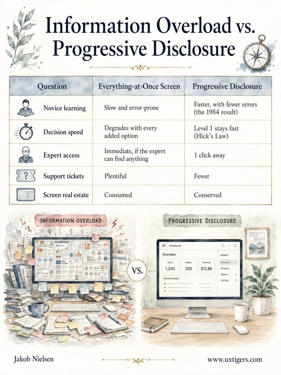
Note what the 80/20 split does not mean: two species of user. Alan Cooper nailed this in About Face (1995) with his term “perpetual intermediates”: most users learn enough to get their work done, then stop, and almost nobody becomes the settings-mastering power user that “expert mode” fantasies assume. Your expert is a regular user having a rare moment. He or she lives on the bench 80% of the time and visits the drawer for the occasional exotic task, which means progressive disclosure splits tasks by frequency, not people by skill. The bicycle metaphor misleads on exactly this point: training wheels come off, but the drawer stays put, and that’s fine. Nobody graduates, because there’s nothing to graduate from.

Bury a daily tool in the basement and the invoice arrives anyway, denominated in clicks and support tickets: disclosure debt charging interest.
Disclosure Debt: 6 Ways to Botch the Hiding
Badly executed progressive disclosure is worse than none. The failure modes are predictable:
The wrong split. Bury a daily-use feature and users pay an interaction tax on every visit. Alice’s elevator ride to the “basement level” for a tool she fetches every day is the whole failure mode in one image. The split must come from frequency-of-use data (analytics, field studies, support logs), not from whichever team shouted loudest at the roadmap meeting.
Too many levels. 2 levels serve almost every design. The strip’s signage for Level 2, Level 3, and Level 4 is played for laughs, but I’ve reviewed enterprise dashboards that made it look like documentary footage. Stop at 2. (A fixed sequence of steps is a different pattern: staged disclosure, AKA the wizard. This distinction becomes crucial in AI. A long-running agent can have many phases: launch, progress, interruption, partial result, handoff, resumption. Such a sequence doesn’t force the user through many nested levels. Phases are chronology; levels are findability. Confusing the two creates the worst of both worlds: an agent that takes a long time and still feels like a maze.)
Mystery-meat labels. A glowing door marked “More…” tells users nothing about what’s behind it: mystery-meat navigation, in Vincent Flanders’s imperishable 1998 coinage. Scanning users often judge a link by its first word or two, so front-load the meaning: “Advanced color settings,” never “More options…”
Out of sight, out of mind. Hidden features go undiscovered, and a warning tucked behind sliding panels, like the red alarm light Zimo finds shuttered away in the strip, goes unheeded until it gets expensive. A hidden convenience costs a click; a hidden alarm costs an incident.
Disclosure debt. Every wrongly buried feature charges interest in extra clicks and support tickets, creating a compounding liability. While the strip renders this as a blizzard of bills, the reality is closer to the ubiquitous settings screen containing options untouched for years.
Deception dressed as disclosure. The checkout arch that springs a $24.99 shipping fee at step 5 hides exactly what the user most wants to know. Economists politely call the tactic “drip pricing”; I call it lying in installments, and it’s prominent in my dark design patterns catalog. Decision-critical information (price, requirements, risks, privacy terms) belongs on level 1, before the user commits. Always.
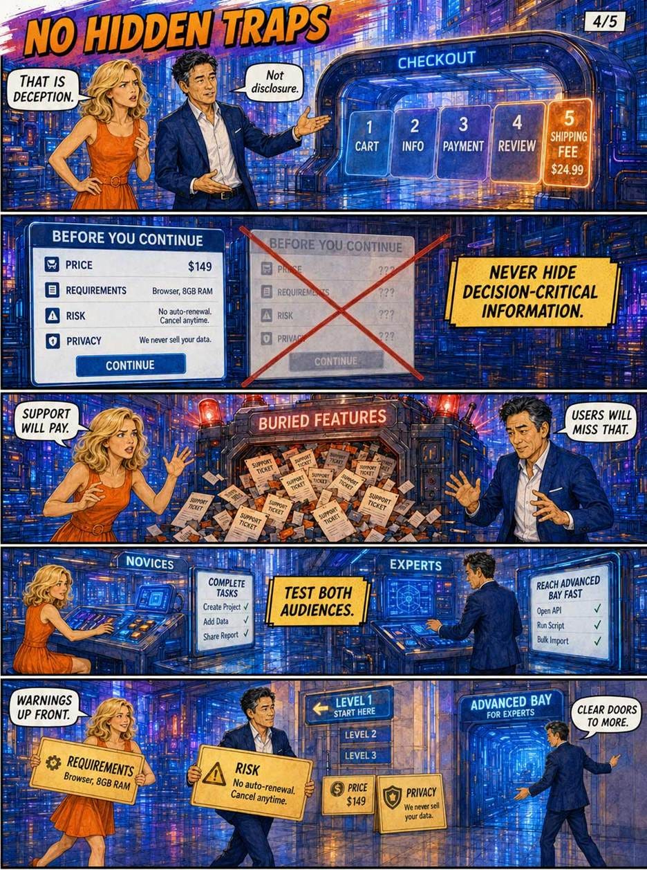
A $24.99 shipping fee lurking at checkout step 5 is drip pricing, and the strip files it where it belongs: under deception, not disclosure.
10 Design Guidelines for Progressive Disclosure
Split by frequency of use, and demand the data. Analytics, field studies, and support logs tell you what belongs on the bench; internal opinions don’t. When the data is thin, instrument first and split second.
Make level 1 self-sufficient. My rule of thumb: users should complete about 80% of their tasks without opening anything. If the top task requires a drawer, the design flunks the workbench test.
Stop at 2 levels. Each additional level multiplies clicks and halves discoverability. (My estimate, not a measurement, but I’d bet money on the direction.)
Label the door honestly. Say what’s inside: “Advanced color settings,” never “More…” A label that survives on its first 11 characters has earned its click.
Keep the door visible and consistent. One obvious control, in the same place, behaving the same way throughout the product, so the lesson learned on one screen transfers to all the others. An invisible level 2 is indistinguishable from a missing feature.
Never hide decision-critical information. Price, requirements, risks, and privacy terms stay on level 1, before commitment. For AI agents (see below), that means a run contract before the run. No exceptions, no step-5 ambushes.
Test both audiences. 5 novices should complete level-1 tasks unaided; 5 experts should reach level 2 in seconds. A design that aces one test and flunks the other has merely relocated the pain. Fix the split.
Prune on a schedule. Features accrete, and screens silt up with interface detritus. Book a winnowing session every release cycle and delete or demote whatever the data says nobody touches.
Layer AI answers. Verdict first, in 1 short paragraph; reasoning, sources, and detail behind disclosure controls. Label partial or preliminary output as exactly that.
Make long-running agents disclose by exception. Interrupt only for decision-critical events, digest the milestones, report progress as conceptual breadcrumbs, and keep the full activity ledger 1 click away. Then run the briefing test (defined below) on the result.
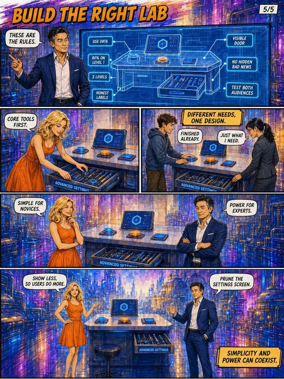
Zimo’s blueprint compresses the rules: data-driven splits, 2 levels, honest labels, visible doors, no hidden bad news, and testing with both audiences. One design, two happy crowds.
AI Needs Progressive Disclosure More Than GUIs Ever Did
Now to the frontier, where the pattern faces a paradox: AI products present the simplest front end in computing history while hiding more capability behind it than any software ever shipped. AI brought us the first new interaction paradigm in 60 years: intent-based outcome specification, where users state what they want instead of commanding each step.
The chat box is the most aggressive level 1 in interface history: an empty text field, nothing else. But the complexity didn’t vanish; it moved. Worse, it moved from recognition (spot the option and click it) back to recall (dredge the right request from memory), reversing 40 years of GUI progress. By stripping away visual affordances, the blank box creates a disclosure cliff, forcing novices to guess the AI’s capabilities instead of following a clear information scent.
Model pickers, reasoning-effort dials, system prompts, tool permissions, memory switches, and temperature settings now lurk in every AI product, usually scattered across menus with all the coherence of Alice’s pre-Zimo lab.
The workbench model applies verbatim: the plain prompt box on the bench, the tuning gear in 1 honest drawer. Prompting itself deserves levels: suggested follow-ups and starter templates on the bench for the blank-box problem, full prompt libraries and system-prompt editing 1 door deeper for the power users who genuinely want them. I’m an unapologetic AI enthusiast, but the usability of current AI tools deserves the criticism it gets, and haphazard control placement is exhibit A.
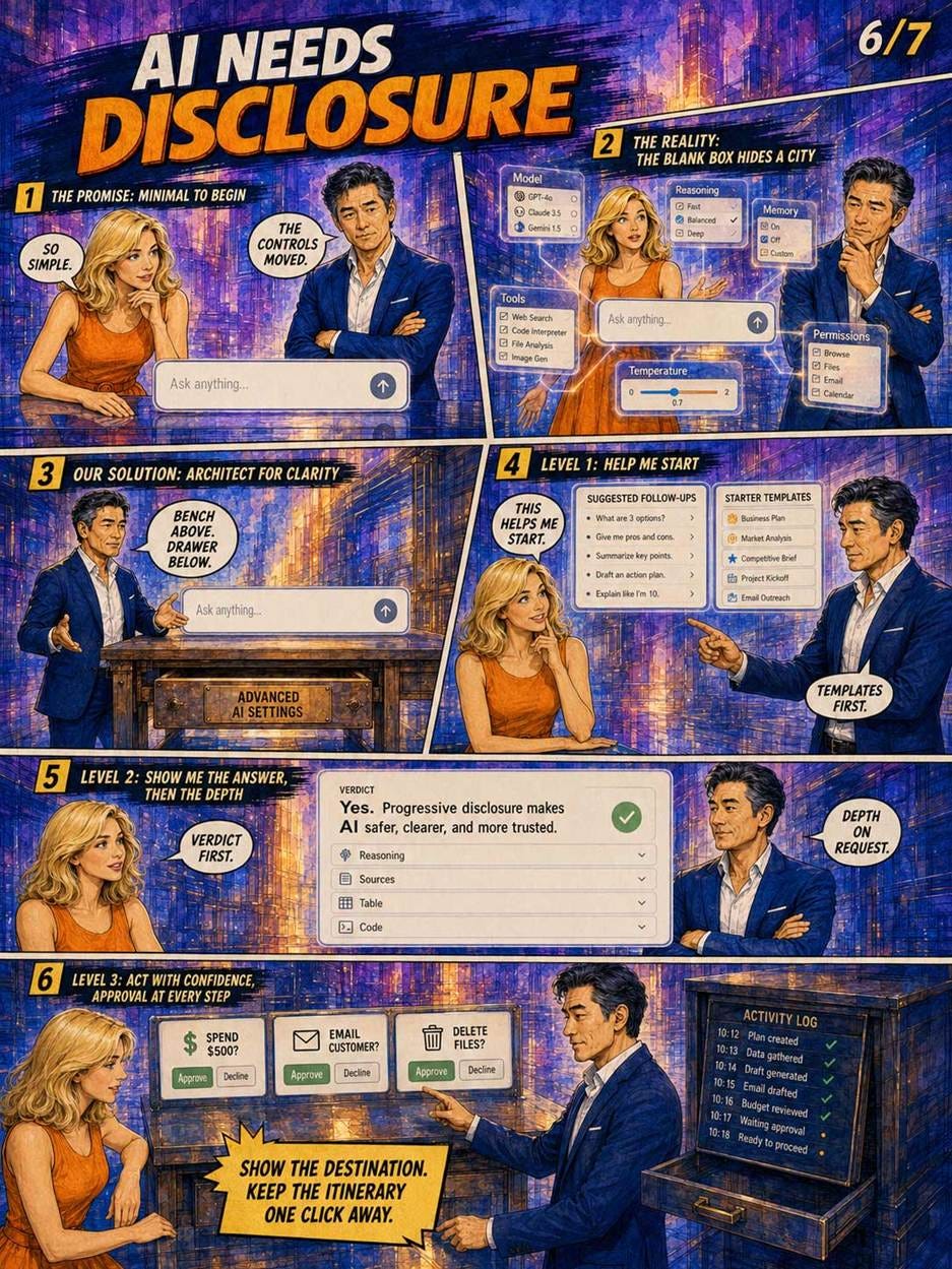
One empty text box, one hidden city of settings: the fix gives AI a bench, a drawer, and an approval gate for anything that spends, sends, or deletes.
The bigger opportunity is to redesign the answers. Conversational AI’s besetting sin is the 800-word reply to a yes/no question: a wall of prose is a feature dump in paragraph form. The fix is to layer the answer the way we layer a screen. Give the verdict in 1 short paragraph (level 1), then put the depth behind disclosure controls: the reasoning trace collapsed under a triangle (today’s chatbots literally hide their “thinking” behind Apple’s little 1990s control, which must count as the disclosure triangle’s killer app), sources behind chevrons, tables and code on request.
Deep Research reports already gesture at this: an executive summary up top, expandable sections below. Example: Ask an AI whether your website needs a redesign, and level 1 should be the verdict plus the 3 strongest reasons, while the page-by-page audit, the methodology, and the confidence caveats belong 1 tap deeper. The same goes for uncertainty: surface the answer, and disclose the error bars on request. Users who want depth click; everyone else is spared. Do not make people scroll past your homework to find your conclusion.
Agentic AI raises the stakes, because agents act on the world rather than merely describing it. We’ve graduated from treating AI as an intern to treating it as a coworker (see my 4 metaphors for working with AI), and nobody reviews a coworker by watching every keystroke; you review deliverables and spot-check the process. Here progressive disclosure governs actions and risk, not just information. Level 1 is the outcome plus any decision-critical action awaiting approval: spending money, emailing a human, deleting files. Level 2 is the full step-by-step trace. The activity log is the Advanced Settings drawer of agentic AI. An agent that narrates all 60 of its tool calls is as unusable as a settings screen with 60 toggles; an agent that hides the ledger entirely is untrustworthy. Show the destination on the bench, and keep the itinerary in the drawer, 1 click away, with diff views before anything consequential.
Slow AI: Progressive Disclosure Rotates From Space Into Time
The next twist is duration. As I analyzed in Slow AI: Designing User Control for Long Tasks, batch processing is coming back from the dead: you submit a job, you leave, you return later for the results, exactly like handing punch cards to the data center in 1970 and collecting the printout the next morning. Claude Sonnet 4.5 has reportedly run for 30 hours on a single task; comfortable turn-taking requires response times below 10 seconds, so the newest agents overshoot conversational pacing by 4 orders of magnitude.
Meanwhile, METR’s research finds that the length of tasks frontier AI can complete has been doubling roughly every 7 months for 6 years. (Their metric uses a 50% success rate on mostly software tasks, so treat the exact numbers as directional, but the trend line is hard to argue with.) If it holds for another 2–4 years, week-long agent runs will be routine; extend it 9 years and AI will tackle tasks that take humans 7 years, as I speculated in that article.
For a 10-second task, progressive disclosure divides space: bench versus drawer. For a 10-hour task, it must divide time: what interrupts you now versus what waits for you. The Slow AI design patterns are progressive disclosure wearing a wristwatch. The run contract shown before launch (ETA window, cost cap, what the agent won’t do) is guideline 6 territory: decision-critical information disclosed before commitment.
Example: A marketing team asking an agent to draft and score 1,500 newsletter variants might see a 6–10 hour window, a $220 cost cap, and a promise never to email an actual customer, and can then trim the scope or tighten the ceiling before a single token burns. Conceptual breadcrumbs report status in meaning rather than mechanics: “rejected the initial hypothesis after the first 50 papers” beats “downloaded paper 245.”
Tiered notifications interrupt only for true blocks, digest the milestones, and archive the rest. When the user returns after days away, a resumption summary rebuilds context: what you asked, what I decided, what it cost, what I need from you. And partial results should surface early, explicitly labeled (“preliminary, based on 40% of sources”), with a stop-and-keep option so the user can salvage value instead of waiting out a doomed run. Checking the drawer mid-run beats opening it after the money is spent.

A week-long run, disclosed on a schedule: a contract before launch, breadcrumbs of meaning during, interruptions only for true blocks, and a briefing wall any colleague can absorb in 30 seconds.
Stretch the horizon further and progressive disclosure rotates once more, from time into people. A run that spans a week outlives any one person’s attention: the initiator goes on vacation, a colleague inherits the review, a manager approves the budget extension. Multi-day agents therefore need disclosure levels for an audience of several: a shared briefing anyone can absorb, delegation rules for who gets interrupted when, and an annotated ledger for whoever picks up the run mid-flight. Space, then time, then people. Same pattern, bigger canvas.
For runs of an hour or more, the workbench test acquires a temporal twin, which I’ll call the briefing test: can a returning user absorb the status, the spend, and the pending decisions in 30 seconds? This is management by exception, borrowed from a century of business practice, and it points to where I predict the interface is heading: by 2030, the primary AI screen for knowledge workers will look less like a chat window and more like a morning briefing across a portfolio of tireless agents.
Note the deeper shift, though. When a run lasts a week, the designer can’t hand-place every reveal; the agent itself decides, moment to moment, what to surface and what to defer. The AI becomes the designer of its own progressive disclosure, so our guidelines become its instructions: honest labels for what it did, visible doors into its work, and no hidden bad news about budget overruns or dead ends. That’s a promotion for users, by the way, from operating tools to reviewing work, and nothing to fear for anyone willing to adapt.
Conclusion: Build the Right Lab (for Humans and Their Agents)
Alice’s opening line in the comic strip is “This lab is chaos!” and it doubles as a fair review of most settings screens, plus a few AI dashboards. But the fix isn’t heroic, and it hasn’t changed in 40+ years: put the 3 controls that matter on the bench, put the rest in a drawer with an honest label, keep the alarms in plain sight, and let the checkout tell the truth on page 1.
What has changed is the clientele. The lab now contains a robot, and soon the robot will run the lab for a week at a stretch while you check in over coffee. The same old discipline serves the novice on day 1, the expert on day 1,000, and the agent on hour 30: simplicity and power coexisting, in watercolor comics and in your product alike. And if the pattern survived the trip from 1984 word processors to 2026 agent dashboards, I’ll wager it survives whatever ships next: human psychology updates far more slowly than product roadmaps.
So schedule the pruning session, and apply the briefing test to your favorite AI agent. Show less, so users do more, even when the “user” is checking in on Friday about work assigned on Monday.
About the Author
Jakob Nielsen, Ph.D., is a usability pioneer with 43 years experience in UX and the Founder of UX Tigers. He founded the discount usability movement for fast and cheap iterative design, including heuristic evaluation and the 10 usability heuristics. He formulated the eponymous Jakob’s Law of the Internet User Experience. Named “the king of usability” by Internet Magazine, “the guru of Web page usability” by The New York Times, and “the next best thing to a true time machine” by USA Today.
Previously, Dr. Nielsen was a Sun Microsystems Distinguished Engineer and a Member of Research Staff at Bell Communications Research, the branch of Bell Labs owned by the Regional Bell Operating Companies. He is the author of 8 books, including the best-selling Designing Web Usability: The Practice of Simplicity (published in 22 languages), the foundational Usability Engineering (31,072 citations in Google Scholar), and the pioneering Hypertext and Hypermedia (published two years before the Web launched).
Dr. Nielsen holds 79 United States patents, mainly on making the Internet easier to use. He received the Lifetime Achievement Award for Human–Computer Interaction Practice from ACM SIGCHI and was named a “Titan of Human Factors” by the Human Factors and Ergonomics Society.
· Subscribe to Jakob’s newsletter to get the full text of new articles emailed to you as soon as they are published.
· Read: article about Jakob Nielsen’s career in UX
· Watch: Jakob Nielsen’s first 41 years in UX (8 min. video)
I'm glad I found this on TLDR. It was too long so I didn't read it. Here's my view. It's fine so long as the desktop categorises things the way the user does. Accepting there is no "correct" user. It's fine if there's a "other stuff" option even if it says "are you sure?" . But what's annoying is if it's not even clear there are more options, or the person deciding the UI decides that toggles which control behaviour based on the setting of other, unexposed, toggles are higher up the pecking order. And finally, the UI really does need to be intuitive. For example, the android "shizuku" app has a paragraph in it's setup instructions telling you how to navigate the AOSP UI because it's so broken.