
Required Fields in Forms: Best Design Practices

Summary: Form design should minimize required fields, collecting only essential data. High-friction fields like phone numbers and birthdates often trigger abandonment due to privacy concerns. Use an asterisk (*) to mark whatever fields are required. Success depends on balancing user motivation against friction: users will complete forms when the perceived value exceeds the combined cost of effort and privacy risk. However, long forms often incur a high cost in reduced conversion rates.
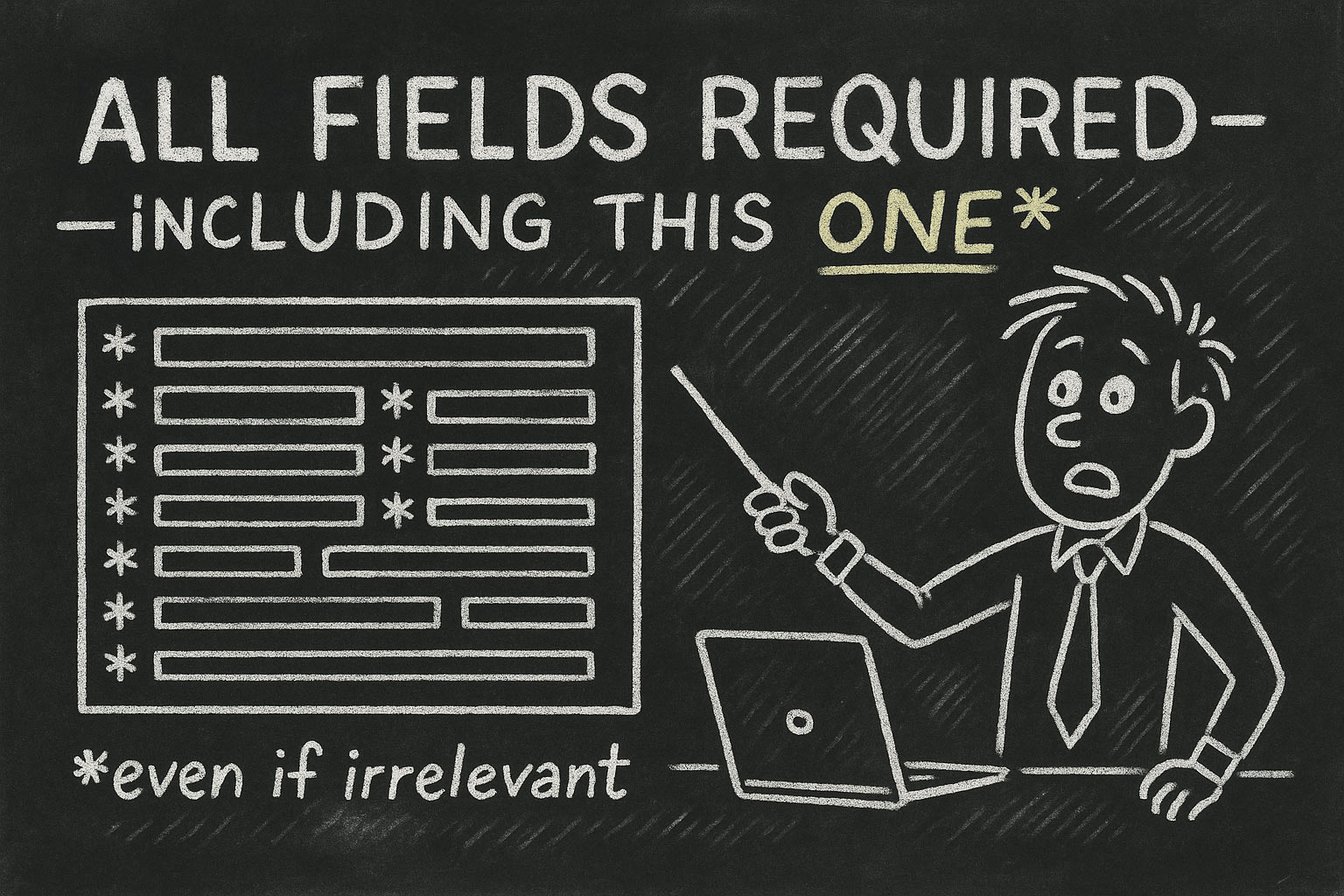
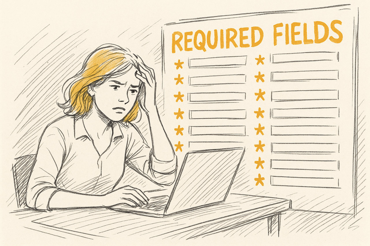
The cartoon (made with ChatGPT) is amusing because it is true and a perfect allegory for the user hostility embedded in countless digital experiences. The frustration it depicts is a direct cause of form abandonment, a silent killer of conversions.
If you don’t have time to read this entire article, I summarized it in a 3-minute song (YouTube).
The Principle of Justifiable Requirement: To Ask or Not to Ask?
The decision to make a field "required" begins long before an asterisk is ever considered. It is a strategic choice that should be subjected to rigorous scrutiny. The most fundamental question is not how to mark a field, but whether it should exist at all.
The default state of any potential form field should be “does not exist.” Every field added to a form introduces friction, increases the user’s cognitive load, and creates another potential point of failure. The number one form-design principle must be to collect only the data that is absolutely essential to fulfill the purpose of the form at that specific stage of the user journey.
A common design failure is the prioritization of “nice-to-have” marketing data over the user’s primary goal. The analysis must draw a sharp distinction between data that is critical for the immediate transaction versus data that is merely useful for future segmentation or sales outreach. If all confirmation messages will be via email, asking for a phone number is a user-hostile anti-pattern that serves the organization's desires at the user’s expense.

Every field on a web form must justify its existence. If it can’t meet a very high bar, cut it! (ChatGPT)
The Psychology of Asking: Trust, Privacy, and Perceived Value
A form is a negotiation of trust. With every field, the organization is making an “ask,” and the user is evaluating whether to comply. Users are inherently and justifiably cautious about sharing personal information online. Each field can either build or erode the trust required for a successful transaction.
In a 2018 study of 502 people, the top two reasons for abandoning online forms were security concerns (cited by 29% of users) and form length (cited by 27% of users). If anything, I expect these numbers to be higher today, as users have become more aware of dark patterns and security breaches and driven to insane levels of impatience by the likes of TikTok.
Certain fields carry a disproportionately high psychological cost, acting as potent triggers for these underlying privacy fears:
Phone Number: This is the archetypal high-friction field. The user’s mental model immediately and (often correctly) assumes it will be used for unwanted sales calls or marketing texts, a clear violation of their expected privacy.
Date of Birth: This field is often perceived as an unnecessary personal intrusion.
An automated 2021 analysis of the conversion rates of 40,000 landing pages, found that conversion rates dropped by about one-sixth on pages that requested either of these two. (This is probably not a fully accurate statistic, because it’s not based on A/B comparisons of the same pages with and without the fields. There are likely other differences between the sets of landing pages than purely the presence or absence of these fields.)
Users will only provide information if they believe the value they receive in return is greater than the combined cost of their effort and their privacy risk. The motivation must justify the friction. A long, demanding form for a high-value outcome like a mortgage application is understandable. A similarly long form for a low-value outcome like a free e-book is destined to fail.

Trust and privacy concerns are major determinants of whether users will complete your form and what information they’ll give you. The less trust-triggering questions you ask, the more people will give you other information. (ChatGPT)
The mere presence of a high-friction field like a phone number can act as a catalyst that amplifies a user's latent anxiety about privacy, even if the field is marked optional. The user sees the field, their internal “spam” alarm is triggered, and their overall trust in the form and the brand diminishes, making them less likely to complete even the “safe” fields. The request for a phone number is not just another data entry task; it is a specific, potent trigger for the broader, pre-existing security concern that makes an abstract fear of data misuse feel concrete and imminent. The best practice, therefore, is not just to make the phone number field optional, but to question its existence on the form at all. If it must be included, it requires active "damage control" in the form of a clear, compelling justification placed directly beside the field to preemptively defuse the user's anxiety.
A Framework for Deciding: The Question Protocol
Apply this simple decision tree to every potential field to ensure it justifies its existence:
Is this information essential for the primary function of this form to be completed right now? If the answer is no, the field should be eliminated.
If yes, is there a way to infer this information or gather it later in the customer lifecycle (when users have higher buy-in and trust)? For example, progressive profiling can be used to gather additional data from returning users over time. If the information can be deferred, it should be.
If it must be asked now, what is its psychological cost? Referencing the friction data associated with sensitive fields is critical here.
How can this cost be mitigated? The most effective mitigation is to transparently explain why the information is needed (e.g., “We need your mobile phone number to send a security code for this transaction”) and to provide clear trust signals such as privacy policy links and security badges.
Ultimately, the fields a company chooses to make mandatory are a direct reflection of its priorities and culture. A form that aggressively demands marketing data at the expense of the user experience signals a company culture that is sales-driven rather than user-centric. Users can perceive this, and it damages brand perception long before a “submit” button is ever clicked. My cartoon’s footnote, “*even if irrelevant,” is a perfect, if humorous, articulation of this user-hostile mindset.
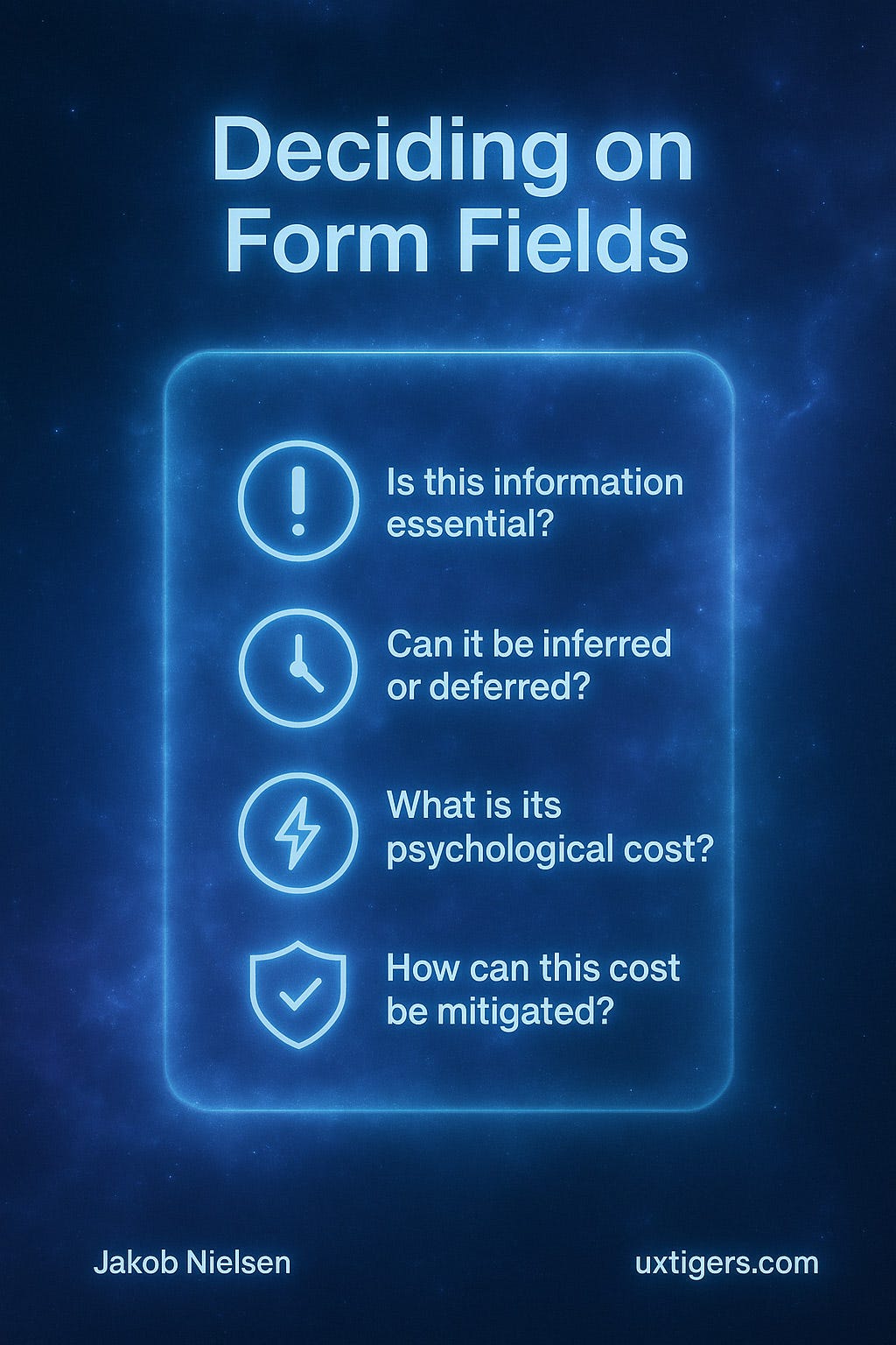
How to decide whether to include or eliminate a field on a form. (ChatGPT)
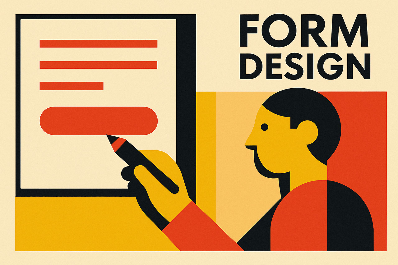
Visualizing the Requirements
Once the necessary fields have been identified and justified, the next challenge is to communicate their status to the user in a clear, efficient, and accessible manner.
The asterisk (*) is a long-standing and widely adopted convention for marking required fields. I recommend using it to comply with Jakob’s Law of the Internet User Experience: when all other websites have trained your customers to expect a certain user interface convention, you should follow that convention.
However, there are a few twists:
Mark Only Optional: When the vast majority of fields in a form are required, marking the one or two optional fields with the text "(optional)" is a superior approach. It dramatically reduces visual clutter and cognitive load, allowing users to infer that all unmarked fields are required. This strategy is a direct application of cognitive load theory; it conserves the user’s mental energy for the task itself, not for deciphering the interface.
Mark Both: For e-commerce checkouts, large-scale usability testing from the Baymard Institute strongly advocates for marking both required (with an asterisk) and optional (with “(optional)”) fields. Their research found this practice eliminated ambiguity and reduced validation errors. In their tests, 32% of users failed to complete a required field when only optional fields were marked, because they were forced to guess the status of unmarked fields.
The complete, correct solution is always a combination: a clear visual indicator paired with the corresponding programmatic attribute. The accessibility failures of the asterisk reveal a deeper truth: solutions designed for accessibility often create a superior experience for all users. While aria-required is for screen reader users, the corresponding visual best practice—using the explicit text "(required)" or "(optional)"—is clearer for sighted users, non-native speakers, and those with cognitive disabilities than a purely symbolic asterisk. Designing for the edge cases improves the experience for the mainstream, refuting the idea that accessibility is a niche concern and repositioning it as a catalyst for universal usability.
Form design is an undervalued part of user experience. However, as evidenced by the Baymard Institute data and other sources, a disproportionate share of the Internet’s business value still passes through these humble forms. Neglect form design at your peril. (ChatGPT)
Best Practices for “All Fields Required”
This brings us back to the cartoon's central premise: a form where every single field is mandatory. This specific scenario has its own set of best practices designed to avoid the absurdity of redundant signaling.
Marking every single field with an asterisk in a form where all are required is logically redundant and visually overwhelming. It is the epitome of visual noise, screaming “REQUIRED” at the user a dozen times when a single declaration would suffice. It adds zero new information after the first instance and only serves to increase the perceived complexity and hostility of the form.
The consensus best practice is to provide a single, clear instruction at the top of the form, such as “All fields are required.” This approach respects the user's intelligence and minimizes cognitive load.
Placement is key. This instruction must appear before the first form field. Users scan top-to-bottom, and placing the instruction at the end of the form (like a footnote) is highly ineffective, as users may have already made errors or become frustrated by the time they see it. While this is the best approach, some research suggests that users can still ignore or forget such instructions on very long forms, which reinforces the primary need to keep all forms as short as possible.
This approach embodies informational efficiency. Effective UI design, like effective language, conveys the necessary information with the minimum possible signaling. In an “all required” context, the information “this field is required” is a universal property. The most efficient way to communicate this is a single global statement, not N redundant local statements (asterisks).
Contextual Exception: When “Required” is Implicit
For very simple, common forms, even a global instruction may be unnecessary because the context makes the requirement implicit. Examples include:
A login form with only “Username” and “Password” fields.
A search engine homepage with a single search field.
A single-field newsletter signup form.
In these highly constrained and conventional contexts, adding “All fields are required” is stating the obvious and might add a sliver of unnecessary cognitive friction. It’s distracting, unnecessary, and patronizing.
The Form Length Paradox: Correlating Fields with Conversions
The relationship between the number of fields on a form and its conversion rate is more complex than the simple “shorter is better” mantra. While there is a strong general trend, the data reveals a more nuanced reality governed by user psychology.

The general rule for form design is that shorter is better, but there are exceptions. (ChatGPT)
A large body of evidence supports the general correlation: as the number of form fields increases, conversion rates tend to decrease. Forms with 3–5 fields often see the highest conversion rates, and even reducing the number of fields from four to three can increase conversions.
However, this is not a universal law. Some case studies show that increasing the number of fields can sometimes increase conversions.
The determining factor is not form length in isolation, but the balance between user motivation and perceived friction. When motivation is high (e.g., applying for a loan), users will tolerate a long form. When motivation is low (e.g., signing up for a newsletter), even a few high-friction fields will cause abandonment. The user is not counting fields; they are subconsciously evaluating the legitimacy and necessity of each question. If a question helps them get what they want, they will answer it. If it seems irrelevant or intrusive, they will leave.
The Multi-Step Solution: Managing Complexity and Maintaining Momentum
For genuinely long and complex forms, such as applications or detailed checkouts, breaking them into multiple, logically-grouped steps is a proven strategy to increase conversions. This approach works by leveraging several psychological mechanisms:
Reduced Cognitive Load: Presenting only a few questions at a time makes the entire process feel less overwhelming and more manageable.
“Foot-in-the-Door” Technique: By starting with easy, low-friction questions (like name or email), users make a small initial commitment. This makes them psychologically more likely to continue and complete the higher-friction questions later, a phenomenon related to the sunk-cost fallacy.
Gamification and Progress: A progress bar provides a clear visual indication of accomplishment and remaining effort, which motivates users to push through to completion.
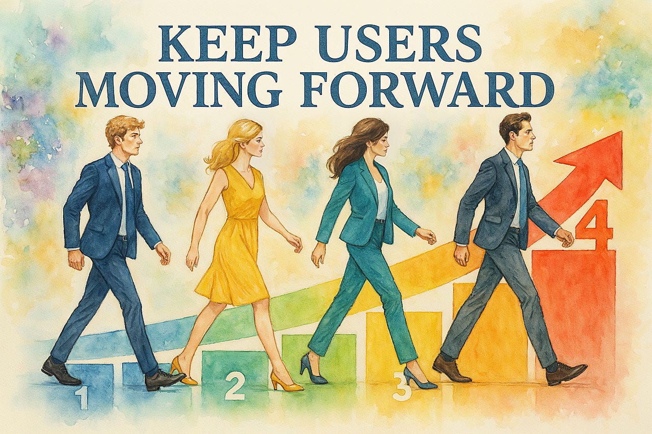
Keep users moving forward through a progression of form steps, each of which is easy and logical. (ChatGPT)
Conclusion: From Frustration to Function
Too many required fields can be extremely frustrating for users, leading your abandonment rates to explode. (ChatGPT)
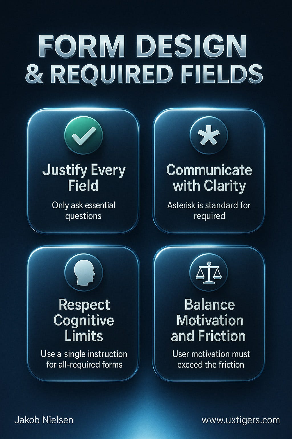
The journey from the frustrated user in the cartoon to a seamless, successful form submission is paved with evidence and empathy. The difference between a form that alienates and one that converts lies in research-backed understanding of human behavior. The core principles for intelligent form design are clear:
Justify Every Field: Practice ruthless data minimization. If a field is not absolutely essential for the immediate task, eliminate it.
Communicate with Clarity: The asterisk is the established way to mark required fields, but when most fields are required, mark only the few that are optional to reduce clutter. (And in the ideal case where everything is required, just say so.)
Respect Cognitive Limits: Use a single, global instruction for forms where all fields are required. Leverage multi-step designs to manage the complexity of longer forms.
Balance Motivation and Friction: Understand that form completion is a psychological equation, not just a UI problem. The user's motivation must always outweigh the friction you ask them to endure.
By applying these principles, designers and developers can transform forms from a source of frustration into a powerful engine for conversion, making them the solution, not the problem.
See/hear also: Song with a summary of the guidelines for required form fields (YouTube, 3 min.).
Summary of the guidelines in this article. (ChatGPT)
About the Author
Jakob Nielsen, Ph.D., is a usability pioneer with 42 years experience in UX and the Founder of UX Tigers. He founded the discount usability movement for fast and cheap iterative design, including heuristic evaluation and the 10 usability heuristics. He formulated the eponymous Jakob’s Law of the Internet User Experience. Named “the king of usability” by Internet Magazine, “the guru of Web page usability” by The New York Times, and “the next best thing to a true time machine” by USA Today.
Previously, Dr. Nielsen was a Sun Microsystems Distinguished Engineer and a Member of Research Staff at Bell Communications Research, the branch of Bell Labs owned by the Regional Bell Operating Companies. He is the author of 8 books, including the best-selling Designing Web Usability: The Practice of Simplicity (published in 22 languages), the foundational Usability Engineering (28,687 citations in Google Scholar), and the pioneering Hypertext and Hypermedia (published two years before the Web launched).
Dr. Nielsen holds 79 United States patents, mainly on making the Internet easier to use. He received the Lifetime Achievement Award for Human–Computer Interaction Practice from ACM SIGCHI and was named a “Titan of Human Factors” by the Human Factors and Ergonomics Society.
· Subscribe to Jakob’s newsletter to get the full text of new articles emailed to you as soon as they are published.
· Read: article about Jakob Nielsen’s career in UX
· Watch: Jakob Nielsen’s first 41 years in UX (8 min. video)
Dr. Nielson, I agree with your column. Sadly, the column itself is too long and redundant.
--- You do not mention the need to design forms -and their Colour! - to be user-attractive.
--- When a 'phone number is needed, the field should NOT flash a crimson alarm "Please Enter a valid number" as soon as the first digit is typed. The crimson color is hostile, and the user's entry should not be repelled with a "You idiot, wrong format," message eight or more times when the user is trying to comply.
--- All user satisfaction surveys are too long. They demand too many answers. And they Do Not Offer the respondent a chance to offer her/his own comment. Users may have useful ideas to improve the satisfaction, but when asked several screens of repetitive mandatory questions and then Denied any way to offer ideas that do not fit the "Rank the friendliness of the teammate who answered your call, from 0 to 9" standard mandatory question.
--- I almost never respond to satisfaction queries at all, after too many wretched experiences.
--- Good luck. The general standard is getting worse. / Phil Hocker, Alexandria, VA