Impact of Tokens on Image Generation
Summary: Removing and adding keywords in image prompting changes the generated images in unpredictable ways. Current prompt adherence is too weak to reliably steer the images through keyword editing.
Several months back, I undertook a fascinating challenge proposed by Umesh. The task was to create images using four distinct AI tools: Dall-E, Ideogram, Leonardo, and Midjourney. The prompt for all these tools was the same:
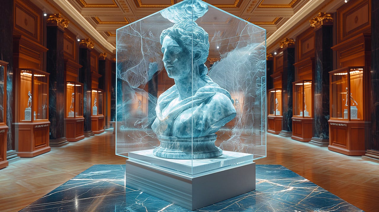
A striking photorealistic image showcases an ultra-detailed bust of a woman sculpture in exquisite blue marble, enclosed in a mesmerizing glass cube. The centerpiece of an opulent museum hall exudes sophistication and grandeur. The dynamic woman’s bust pose reveals intricate details, complemented by a richly adorned environment without overshadowing the main exhibit. Skillful lighting highlights the marble's sleek surface, casting captivating shadows and reflections.
This was a meticulously designed prompt by a prompting master. In response to some readers’ queries about the impact and importance of the extra tokens, I decided to repeat the experiment. However, this time, I trimmed the prompt down to its essence. I chose to use Midjourney, known for its high image quality, for this iteration. For all the images, I set Midjourney’s “stylize” parameter to a value of 800. In each case, Midjourney generated four images, and I selected the one I found most appealing to present here.
First, the full original prompt from Umesh:
Prompt 1: A striking photorealistic image showcases an ultra-detailed bust of a woman sculpture in exquisite blue marble, enclosed in a mesmerizing glass cube. The centerpiece of an opulent museum hall exudes sophistication and grandeur. The dynamic woman’s bust pose reveals intricate details, complemented by a richly adorned environment without overshadowing the main exhibit. Skillful lighting highlights the marble's sleek surface, casting captivating shadows and reflections. --s 800
Now, taking out the request for “intricate details” and hoping that Midjourney delivers something nice anyway:
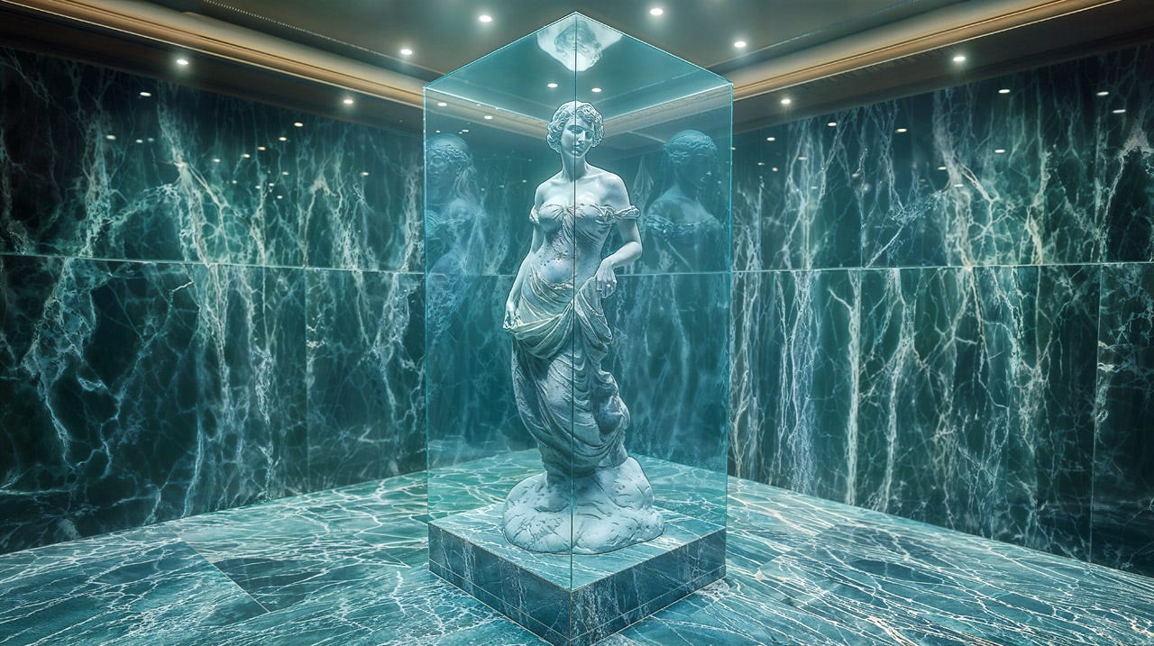
Prompt 2: A striking photorealistic image showcases an ultra-detailed bust of a woman sculpture in exquisite blue marble, enclosed in a mesmerizing glass cube. The centerpiece of an opulent museum hall exudes sophistication and grandeur. Skillful lighting highlights the marble's sleek surface, casting captivating shadows and reflections. --s 800
It's still a nice picture, but a full statue instead of a bust. What’s up, MJ? (The other variants included a group of many busts and other non-prompt-adherent pictures.)
Shaving off some more tokens in the prompt:
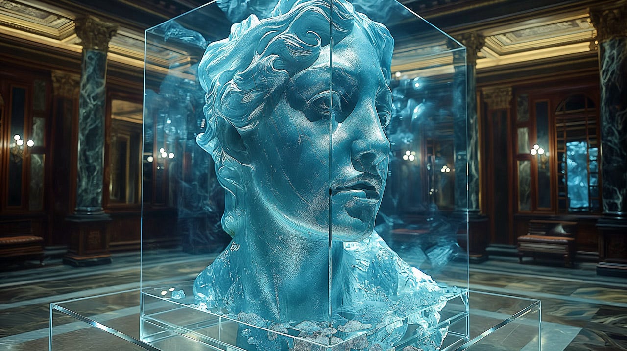
Prompt 3: A striking photorealistic image showcases an ultra-detailed bust of a woman sculpture in exquisite blue marble, enclosed in a mesmerizing glass cube. The centerpiece of an opulent museum hall. Lighting highlights the marble's sleek surface. --s 800
Now, we’re back to a bust, but not really a classical style. This looks more like modern art than anything the Greeks or Romans would have made.
As the fourth attempt, let’s remove the reference to lighting:
Prompt 4: A striking photorealistic image showcases an ultra-detailed bust of a woman sculpture in exquisite blue marble, enclosed in a mesmerizing glass cube. The centerpiece of an opulent museum hall. --s 800
I don’t think the lighting is any worse now, so this way of shortening the prompt was fine.
Fifth, I will remove some superlatives and stick to purely descriptive prompting:
Prompt 5: A photorealistic image of an ultra-detailed bust of a woman sculpture in blue marble, enclosed in a glass cube. The centerpiece of a museum hall. --s 800
About as pretty, but not as blue. I would have thought that as we get fewer tokens in the prompt, Midjourney would pay more attention to what remains, such as the specification of the color.
Now, let’s try to take away some of the actual specifications. First, ask for a bust in a glass cube, but don’t say that it’s in a museum, even though that would be true for almost all such busts:
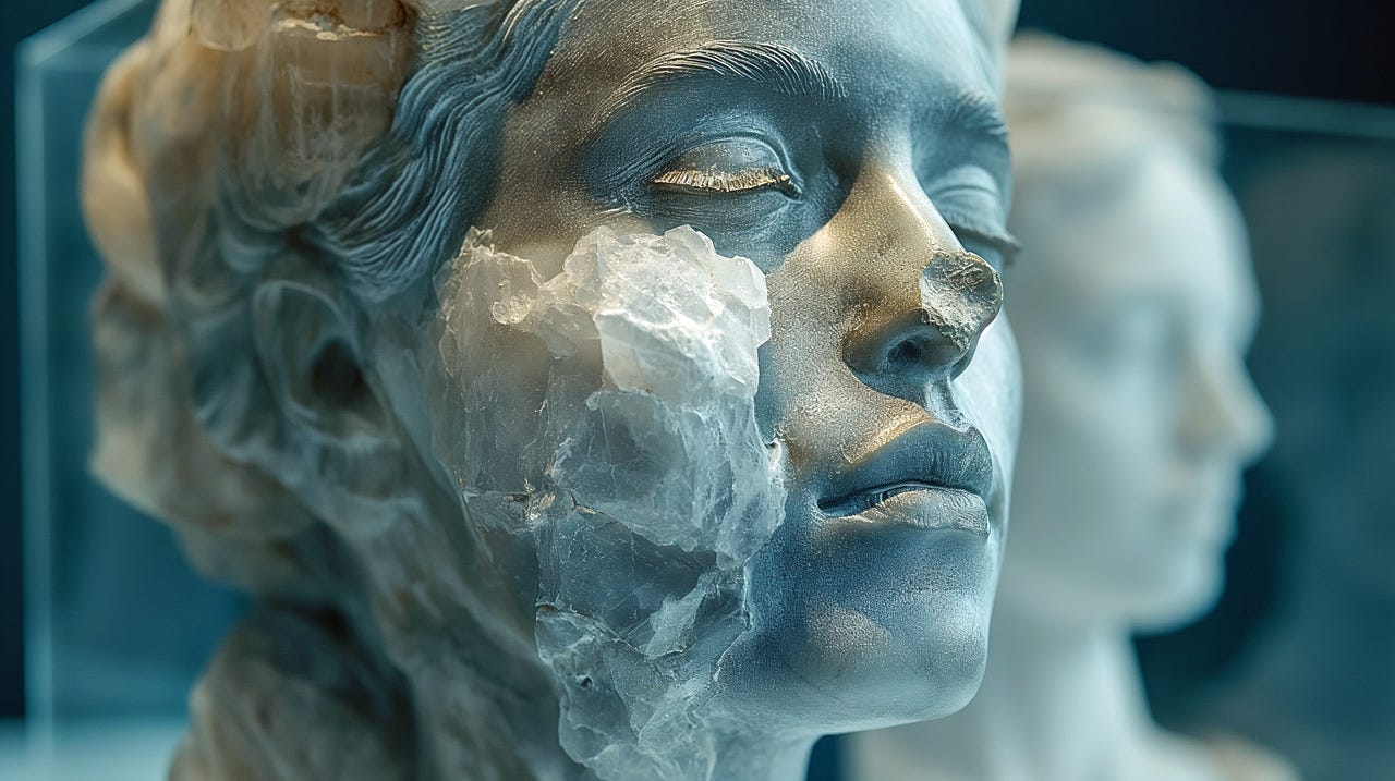
Prompt 6: A photorealistic image of a bust of a woman in blue marble, enclosed in a glass cube. --s 800
Though I retained the request for the glass cube, it seems to have gone missing. Maybe that’s why the nose has met with an accident.
Finally, just ask for the bust, with no additional information:
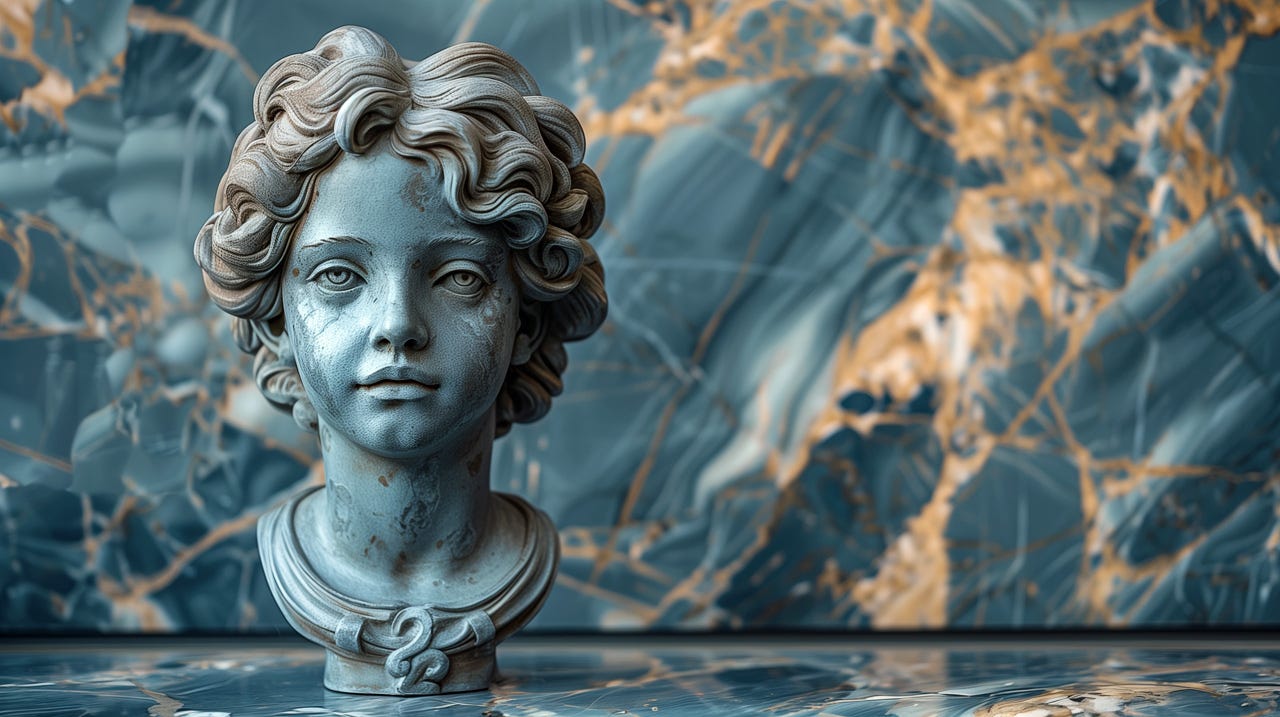
Prompt 7: bust of a woman in blue marble --s 800
Since we didn’t ask for these elements, it’s fair enough that we don’t get the glass cube or the museum. The actual bust is about as pretty as the other versions.
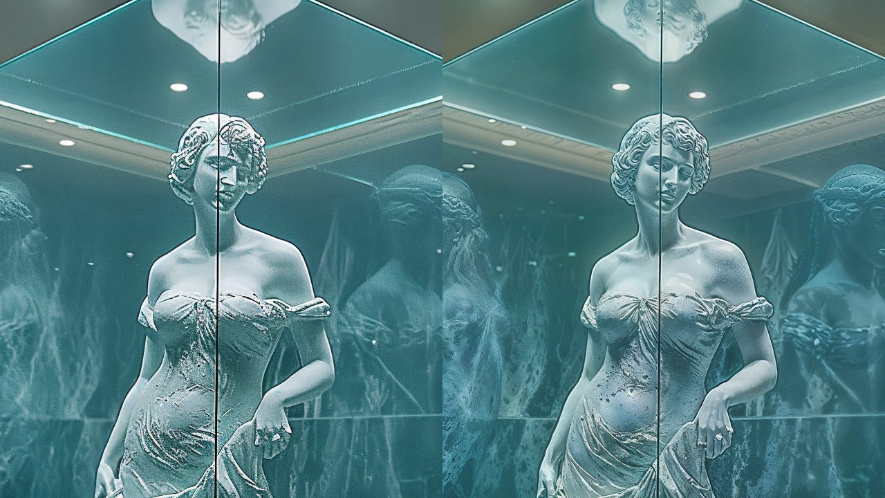
Something else we can do with AI-generated images is to upscale, which sometimes improves the image quality. I used the Leonardo universal upscaler for the second image, of the full statue:
Statue upscaled with Leonardo.
You can hardly tell the difference when seeing the images in low-resolution website representation. However, there are in fact improvements, which we can see in a close-up view:
Original image from Midjourney (left) compared with upscaled version from Leonardo (right).
To conclude, let’s recap some of the versions I created, using progressively fewer keywords in the prompt:
The blue bust, created with max keywords (upper left) and min keywords (lower right).
In this small experiment, using only one AI tool, I felt that the only versions that significantly deviated from the goal were number 2 (a full-sized statue) and number 7 (no museum case, but I also didn’t specify this in the prompt). For the other versions, prompt adherence was too weak to reliably conclude the impact of individual keywords on the generated images.
To get images that approximate your needs, current best practices rely more on iteration and trying multiple attempts than on the exact tokens employed in the image prompt.
About the Author
Jakob Nielsen, Ph.D., is a usability pioneer with 41 years experience in UX and the Founder of UX Tigers. He founded the discount usability movement for fast and cheap iterative design, including heuristic evaluation and the 10 usability heuristics. He formulated the eponymous Jakob’s Law of the Internet User Experience. Named “the king of usability” by Internet Magazine, “the guru of Web page usability” by The New York Times, and “the next best thing to a true time machine” by USA Today.
Previously, Dr. Nielsen was a Sun Microsystems Distinguished Engineer and a Member of Research Staff at Bell Communications Research, the branch of Bell Labs owned by the Regional Bell Operating Companies. He is the author of 8 books, including the best-selling Designing Web Usability: The Practice of Simplicity (published in 22 languages), the foundational Usability Engineering (27,007 citations in Google Scholar), and the pioneering Hypertext and Hypermedia (published two years before the Web launched).
Dr. Nielsen holds 79 United States patents, mainly on making the Internet easier to use. He received the Lifetime Achievement Award for Human–Computer Interaction Practice from ACM SIGCHI and was named a “Titan of Human Factors” by the Human Factors and Ergonomics Society.
· Subscribe to Jakob’s newsletter to get the full text of new articles emailed to you as soon as they are published.
· Read: article about Jakob Nielsen’s career in UX
· Watch: Jakob Nielsen’s 41 years in UX (8 min. video)






Fascinating study. Thank you. I tried a simpler experiment some time ago. One thing I tried was using Japanese sumi as a reference, Sesshu in particular. I found the results for western art far better than those for non western traditions. I plan to do this for North West Coast art at some point. Of course that will raise a lot of appropriation and copyright questions.