UX Roundup: Have AI Check You | Toast Notifications | GUI Course | Boring UX | Human Designer vs. AI Design
Summary: Turning the tables: Use AI to check your work | Toast notifications are a burnt GUI widget | Recommended course on interaction techniques | Boring UX is better UX | Do people prefer human-generated design or AI-generated design?
UX Roundup for March 25, 2024. (Midjourney)
Turning the Tables: Use AI to Check Your Work
Marc Busch from the wonderfully-named Austrian UX consultancy Rapid User Feedback wrote a useful article on the use of AI when analyzing qualitative user data. He mentions 3 forms of qualitative analysis:
Summary: Reduce the data volume while preserving essential content, providing a concise overview. AI excels at this process.
Explication: Augment the raw data with additional context. In principle, AI can link observations from the present study with existing knowledge — for example, triangulating with other research methods or known usability problems from past studies. In practice, current AI is rarely sufficiently knowledgeable about other information collected by our UX team, though with the increasingly large context windows offered by newer models, it should be possible to feed AI a collection of other existing reports and ask it how the new data relates to this existing information.
Structuring: Organize qual data based on specific criteria, dimensions, categories, or tags, to identify patterns, themes, or criteria for a structured representation of the material. AI can also help here, as shown in the case study of how GE transforms qual data into quant through AI analysis.
To me, the most interesting observation in Busch’s article is his advice to use AI as a check on human-derived structuring. Usually, we have the opposite advice: to have a human check the results from an AI analysis to guard against hallucinations and oversights.
However, this works both ways. After a human UX expert has tagged or otherwise structured a set of qualitative data, run that same data through AI and ask it to repeat the analysis. Most likely, you’ll find some cases where the human misclassified something or overlooked something.
Use AI to check your work. It’s a free colleague, and even if not as talented as you, it’ll find things you overlooked. (Midjourney)
Toast Interruptions Considered Burnt
So-called “toast” messages are proliferating in user interface designs. Toast messages are small, non-modal, unobtrusive notifications that provide users with brief feedback in response to an action they have taken within an application. These messages typically appear temporarily at the edge of the screen and do not interrupt the user’s current activity or require any user input to dismiss—they disappear automatically after a short duration.
The name was derived from the way these notifications pop up from the bottom of the screen in the same way toasted bread pops up from a toaster.
Toast messages are proliferating beyond their proper place. I think they are so much burnt bread because of their annoying combination of disruption and anxiety-introducing disappearance. (Midjourney)
In the beginning, when toasts were first introduced as a new GUI widget, I admit that I though they were cute. But now, they have turned positively annoying. One big reason is that designers can’t leave well enough alone. While a few toasts might be fine for a few types of notifications, many toasts spoil the broth — sorry, spoil the user experience.
Adam Silver recently posted a list of 5 reasons toast should become toast:
Toasts disappear quickly, which is nice if the user doesn’t need the information, but when toasts are used for information that users care about, it introduces anxiety to have to rush to read it before it vanishes.
Some toast messages change state, meaning that the user might miss an early state or click the wrong action. Even if you want to retain toast messages as a design option, absolutely ban changing toasts.
It can be unclear which action the toast relates to. Particularly on a big monitor, the toast may appear far away from the item it relates to.
Toasts can be distracting. Anything that appears and disappears causes motion in the user’s peripheral vision, which attracts the eye.
Toasts can also be hard to spot. Unless that animation is overdone and becomes truly annoying, there’s a risk that the user will overlook a more unobtrusive small toast that briefly appears at the edge of the screen. Adam Silver points out the additional accessibility problem that low-vision users may literally never see a toast if they have zoomed their screen magnifier to only show the area of current interest, meaning that the toast appears off-screen (off the magnified portion of the screen, that is).
This list of anti-toast UX considerations clearly proves that toasts can only be used for notifications that users will not mind missing. On the other hand, anything important should be shown in a regular overlay message that appears at the user’s current area of focus on the screen and doesn’t disappear until dismissed. (Dismissal doesn’t necessarily require a close box, though one should be present for consistency reasons and to ensure users of the feeling of control. For many messages, clicking anywhere else on the screen should suffice to make them go away.)
Recommended Course on Interaction Techniques
On May 14, Brad Myers is teaching an in-person course at the CHI conference in Hawaii on Interaction Techniques – History, Design and Evaluation. I strongly recommend this if you’re attending the conference or willing to travel that far for a course. Two reasons:
Most designers know much too little about interaction techniques and the proper way to employ the many GUI widgets at our disposal. A deeper understanding of interaction techniques will lead to less clunky applications and improved usability.
Myers is superbly qualified to teach this topic, with 40 years of experience researching interaction techniques. He’s the author of the forthcoming book Pick, Click, Flick!: The Story of Interaction Techniques, with a predicted publication date the day after the course. I read a preview copy of this book: it’s great, with the deepest and most detailed coverage of interaction techniques I have ever seen. (Myers is the Director of the Human-Computer Interaction Institute at Carnegie Mellon University, which probably has the best graduate program in UX. I’m often skeptical of professors, despite having been one myself many years ago, but Myers’ book and course are cases where 40 years of research pay off in encyclopedic knowledge.)
Applications would be much easier to use if designers had a deeper and more conceptual understanding of the wide range of GUI widgets and interaction techniques at their disposal. (Midjourney)
Boring UX Is Better UX
Adam Silver ended his post about toast notifications (discussed above) with a new UX slogan that I want to adopt as my own: “Boring UX Is Better UX.”
Adam used this statement to recommend using his simpler solution to the notification design problem: just putting the information on the screen in the spot where the user is already looking. This may be more boring than an animated toast, but it works better.
But really, the non-animated notification is only boring to the designers, who don’t get to flex their animation chops. We must consider the term “boring” in its proper context to appreciate our new UX slogan. I tried to make Midjourney draw me a picture of “boring,” and this is what I got. (I often like to experiment with single-word prompts as a way to get inspiration. In this case, though, the single-word prompt produced a misleading illustration for my concept.)
An attempt by Midjourney to visualize the word “boring.” This picture is misleading, relative to the UX slogan that “Boring UX Is Better UX,” because the user won’t actually look bored when faced with a boring user interface. Instead, she will be engaged and active (quite likely in a state of flow) while controlling the experience and accomplishing her task.
A better visual for the slogan “Boring UX Is Better UX,” again made with Midjourney. This image focuses on a user engaged in his work while using a design that’s unremarkable and doesn’t distract the user with clever but distracting design elements.
Why is boring better? Because the UI should not call attention to itself. Exciting design elements are often only exciting to the design team but get in the way of users mastering the computer and getting their tasks done. What’s exciting about computers is getting results, not admiring the design for its own sake.
Our Accelerating Future Requires New Strategies
Ethan Mollick wrote a useful article about ways companies can and should rethink their strategy now that AI is accelerating change. He proposed 4 areas that need strategy updates:
What valuable tasks will AI render obsolete? Be realistic about functions that can soon be automated, or that won’t be differentiators in the future when everybody can do previously-hard things themselves with AI.
What previously impossible tasks can AI unlock? Consider new possibilities. Infinite interns, personalized data analysts for everyone — how will this shift what you can achieve?
Which services can you expand or make cheap? AI makes customization cheaper. Can you offer services to a wider market or make previously exclusive offerings more accessible?
New expensive services for higher-end markets? AI boosts capabilities. Consider offering premium, personalized services to elite clients that were previously out of reach.
Mollick also makes the mind-blowing comment that it’s worth planning for new products and services that are impossible with current AI. We all expect the next generation of AI to be more capable than the current tools, so many advanced innovations will become possible soon.
Accelerating AI facilitates the takeoff of 4 classes of new strategic thinking (Midjourney)
Human Designer vs. AI Design
Sarah Gibbons conducted an experiment where she designed a visual for one of my favorite UX slogans, “It Depends,” and also used Ideogram to design 5 more versions. She posted all 6 designs to LinkedIn and asked users two questions: Which of the 6 designs is the one human-designed version, and which version do you prefer?
She has now published the results of this small experiment. It turned out that 49% of respondents could correctly identify the human-designed option. This is far beyond the 17% that would have resulted from a random choice between 6 options. Thus, human design (by a world-class designer) does differ from current AI design.
AI trying to sell its artwork. Still not as good as the work of the very best human designers. But Midjourney can already do a pretty good job, as shown here.
However, when asked which version people preferred, the human design only received 23% of the votes (a third higher than the average score of 17%) and narrowly lost out to one of the AI designs with 26%.
Personally, I liked the human design best from a visual perspective, though I was very impressed by the creativity shown by AI in one of its designs, which used a bidirectional roadsign, which I thought was a great way of visualizing the underlying message “It Depends.”
I used Midjourney to make another version of this idea, which you can see on Instagram. However, even though Midjourney often makes great graphics, its execution of this particular design leaves much to be desired.
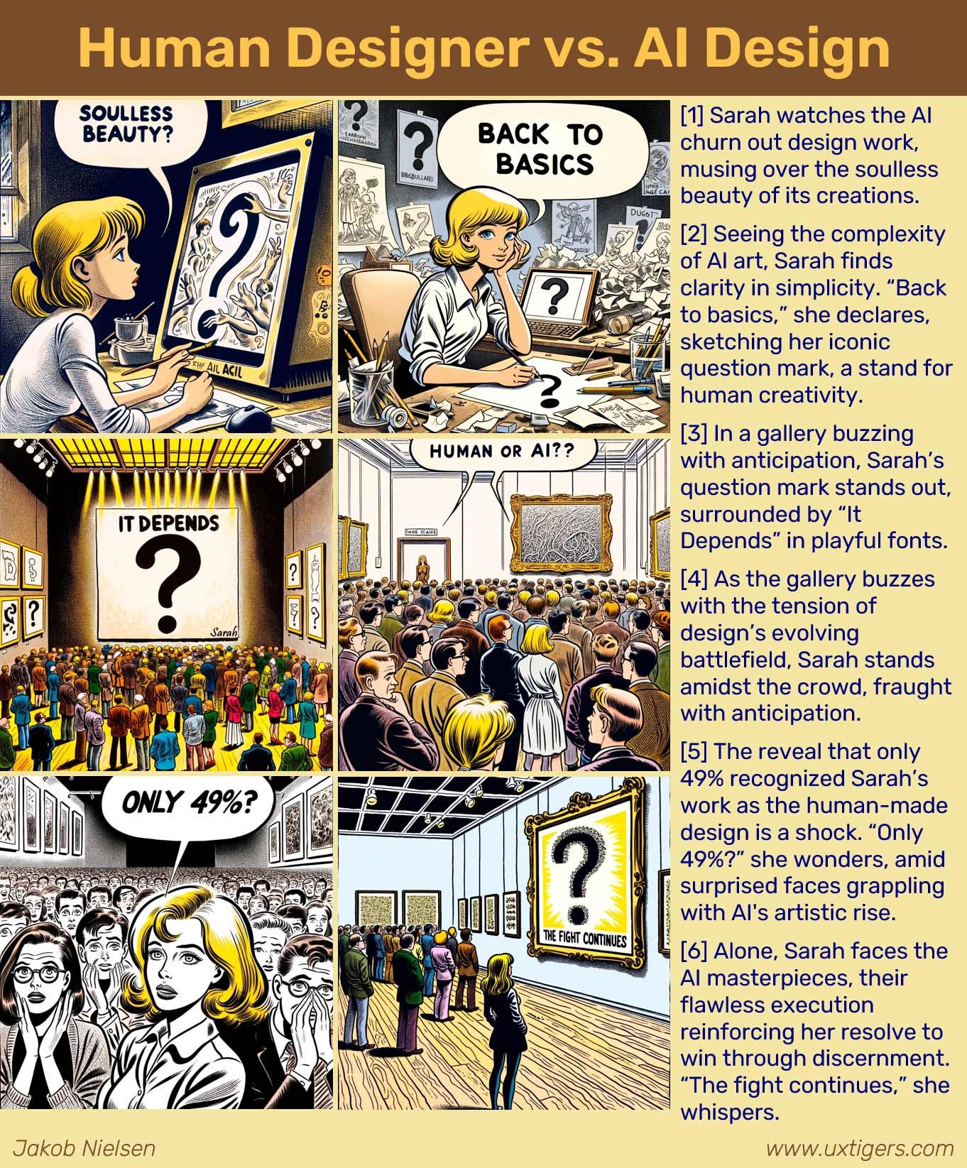
Here’s a comic strip I made with Story Illustrator GPT, inspired by Sarah Gibbon’s case study. While the “Sarah” character in the comic strip was inspired by the human Sarah, it’s important to note (as Google Gemini would say) that the character is not the person. The character is acting in ways that are determined by the internal story logic. Another important point is that the comic was fully rendered by AI, meaning that the “human-created designs” in the story are actually AI designs (from Story Illustrator GPT).
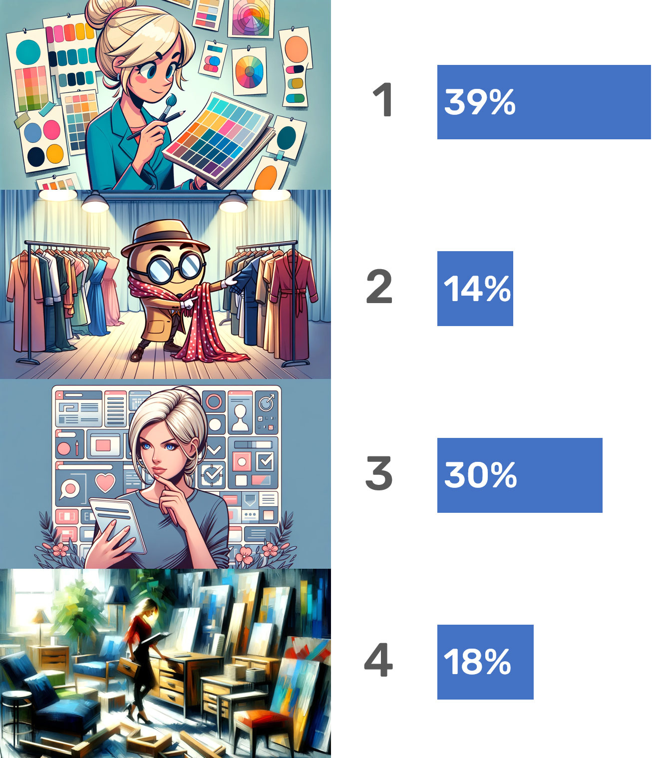
In a separate experiment, I asked my LinkedIn followers to judge 4 different AI designs, and again the outcome was inconclusive, as seen below.
My conclusion is that current AI is great at offering alternative ideas and that it can also produce acceptable visuals for many of these ideas. But it’s not yet up to the standards of the very best human designers.
My experiment in asking readers which of 4 AI-generated illustrations they thought was best for illustrating the concept of “designers applying good taste to select the best design from options generated by AI.” I ended up using illustration 3 for my article.

