UX Roundup: Luxury Usability | User Testing, the Movie | AI = Ozempic | Better Analytics | Job Hunt Advice | Design Similarity
Summary: Luxury websites have bad usability | Poster fail: User testing, the movie | AI is Ozempic for the company | Is Microsoft Clarity a better analytics solution than Google Analytics? | Two quick tips for job hunting | Two websites with same functionality look almost the same
UX Roundup for April 29, 2024. (Midjourney)
Luxury Websites = Lousy Usability
The Baymard Institute, which is the world’s leading experts on ecommerce user experience, has published a benchmark study of the usability of websites for luxury vendors, such as Louis Vuitton, Gucci, and Bang & Olufsen (full disclosure: I did a small amount of work with B&O around 40 years ago, but that was before the web).
Bottom line: of 7 luxury websites, 6 scored “mediocre” usability ratings and only 1 (Jimmy Choo) was “decent.” No luxury sites reached the “good” or “perfect” levels of usability on the Baymard scale.
Why are luxury sites so bad? Baymard doesn’t say, but I suspect it’s because these companies can currently get away with poor online service because they have established strong brands with reputations for high quality and desirability for the physical products that have often been slowly accumulated for as much as a century. (I had a good Bang & Olufsen hi-fi system as a teenager, and that was a long time ago.) Because customers desire those products, they’re willing to suffer bad website service as long as the in-store service is good.
Going forward, however, brand is experience in the digital world, and a negative experience with any one channel negatively impacts overall branding. The Halo Effect is real. These companies will (admittedly, slowly and very gradually) lose out to luxury newcomers who treat the digital channel as a first-class way of connecting with customers.
Nice sapphire necklace. Let’s just say it’s $500,000. Very few people will click “add to cart” for this product on an ecommerce site. If you can afford half a mil for a necklace, you’ll buy it in a store, after trying it on. Even so, online user experience is still part of building the brand and can’t be shabby. (Midjourney)
Poster Fail: User Testing, The Movie
Just for fun (and as a possible illustration for an article about usability studies), I prompted Midjourney to make a movie poster for me for “User Testing, The Movie.”
I’m sorry to say that the outcome was an abject failure. UX work is not as visually exciting as the classic James Bond movies. The following was Midjourney’s best attempt:
“User Testing, The Movie” poster made with Midjourney. I guess it tried to make up for the inherent lack of visual drama in the scene by duplicating a word.
AI Is Corporate Ozempic
I recently came across a very vivid quote by business-school professor Scott Galloway: “AI Is Corporate Ozempic,” highlighting his view that AI, much like the medication, offers a quick, transformative solution to companies seeking efficiency and profitability, albeit with potential long-term consequences that may not be immediately apparent. In the linked blog post, Galloway elaborates on this comparison, suggesting that AI and weight-loss drugs like Ozempic share several characteristics: both promise to streamline and enhance productivity (in the case of AI, by automating tasks and augmenting human capabilities), and both are being adopted more widely and rapidly than many are willing to acknowledge.
Whenever I discuss the benefits of eliminating old-school jobs that are no longer needed, I must point out that AI will not cause unemployment. AI and its associated economic boom will create many more new jobs than those old positions that are eliminated. This will benefit society because of the many new things that will be done to enhance our standard of living. What will those new things be? We don’t know yet, but human ingenuity is infinite — even more so when augmented by AI creativity. New business ideas will come, of that I have no doubt.
The only issue in transforming the economy to function at a much more productive level is that many people will need retraining to pick up new skills. Maybe doing UX (which will triple employment over the next decade), but mostly doing new things yet to be invented. Luckily, AI is great for training and for providing a seniority boost. But we do need more research on the best ways of using AI to expedite education, especially within nontraditional forms of education. This R&D must start now, because the world will need to retrain billions of workers over the next decade.
Scott Galloway says that “AI Is Corporate Ozempic,” meaning that it can slim down old-school companies that still operate as if it were the 2010s. In fact, AI is better than Ozempic, because the drug only causes about 20% weight loss, whereas AI will cut most companies’ workforce in half. (Ideogram)
Is Microsoft Clarity a Better Analytics Solution Than Google Analytics?
Ever since Google Analytics “upgraded” to version 4, I have heard bad things about it. Not that previous versions had great usability, since Google always treated enterprise as a poor cousin, relative to its consumer products, and especially Search. Fair enough, since Search makes virtually all the money.
But bad UX does leave an opening for a competitor, even in a free product. Microsoft Clarity may finally be the alternative with better usability for companies that don’t want to invest enough in analytics to buy one of the big and expensive packages.
I can’t say for sure that Clarity is the best free analytics solution, but I’m hearing good things. For example, Chris Callahan (whom I respect a lot) recently posted that, “I thought Clarity would be a compromise, but quite the opposite!” (This was a comment to a post by Kevin Robinson, who also gave uncommon praise to Clarity.)
Website analytics should be like a full-featured car dashboard that doesn’t just tell you how fast you’re going (number of pageviews), but also provides information about the health of the engine. (Midjourney)
Two Quick Tips for Job Hunting
Tip 1 (Dan Winer): The user experience for the hiring manager matters. If it’s easy and pleasant for him or her to process your application, you have a leg up over applicants who make life difficult for the hiring manager. Dan has several tips in the linked post, but the simplest of them all is to include your name in the file names for resumes and cover letters. He shares a fun (and depressing) screenshot of his folder with files labeled CV (1), CV (2), CV (3), etc. At least his computer added a different number to these identically-named files, but nothing that will help him quickly open the one he wants.
Instead, label your files something like jakob-nielsen-resume.pdf
Tip 2 (me): This job search will not be your last. If you scored a hard-to-come-by Internet domain for your portfolio that’s based on your name (or something else that’s easy to read), then don’t let it expire when you land the job. This is a common sin among students, who set up a fancy website for their first job hunt and then let it die.
Newsflash: very few people have the same job for 45 years. Chances are that you will be applying for another job one day. You don’t want that good domain to have fallen into the clutches of somebody else. Keep it. Domain registration fees are cheap, compared to the benefits of having a better job application in 5 or 10 years. If you land a new job one week sooner, or if you get $1K higher compensation because you are a more impressive candidate, you’ve covered your domain fees for several decades.
You don’t necessarily need to update your old portfolio site while you don’t need it for job applications, but at least keep it alive. You never know when you might get laid off and need your website back with a day’s notice.
This job hunt won’t be your last. Keep your rifle — ahem, portfolio site. (Midjourney)
DoorDash and UberEats, Two Websites with the Same Functionality, Look the Same
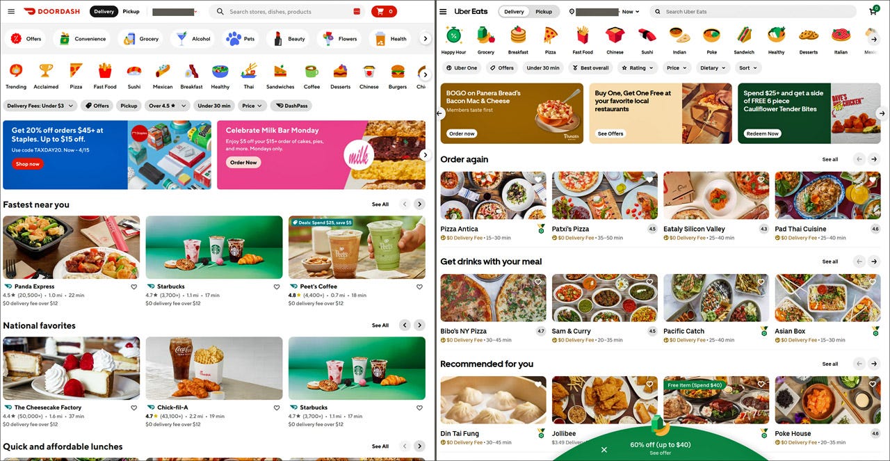
Jon Malkemus (VP of Design for Whatnot) posted a comparison between DoorDash and UberEats, two websites in the United States for ordering food delivered from restaurants. I took my own screenshots (see below) which confirm his conclusion that they look almost the same. Malkemus asked whether this is due to “a lack of creativity? Limiting tools? Or are we losing the art of visual design in order to compromise for accessibility and usability?”
My answer is similar to that posted by Jamal Nichols (Product Design Manager at Bolt): it’s the same reason why “all cars look so similar” or “why do toasters all look the same.” Once a product category has matured, any decent company will have figured out what customers want and need and the best way to deliver this service. Thus, the designs will be highly similar.
Screenshots of DoorDash and UberEats for a registered user after logging in. They do look similar.
A blur test on these two screenshots emphasizes their similarity. DoorDash (left) uses more striking colors for its promotions and has bigger images, but those are the only two differences that stand out. Once blurred, even the food photos look about the same.
In the case of food delivery, there’s an obvious need for customers to be able to specify the cuisine and to filter by various utilitarian options, such as price and delivery time. I’m sure it’s also been empirically determined that many customers repeatedly order from their favorite restaurants, making an “order again” feature a useful UI element. Finally, both companies have obviously learned that photos of the food are the best way to represent a restaurant in a food-delivery app. (Photos of the restaurant interior might be good for a reservations site, but are useless for delivery.)
In terms of layout, I personally prefer UberEat’s design with smaller tiles that allow for more options to be shown in the available space. (Twice as many restaurants: 12 vs. 6 in the initial above-the-fold view.) Of course, you want more data than my preference for this design decision, which could easily drive several percent increased sales. I’m surprised that these two companies — both of which have millions of datapoints and can run highly significant A/B tests — arrived at different solutions to the layout problem.
The icons for the various cuisines are more similar in visual style than they need to be from a usability or conversion perspective, but that’s the only point where I would agree to lament the lack of design creativity. For the functional aspects of these two UX solutions, form follows function and is determined by what lands the most orders.
Form follows function: if the shark isn’t streamlined it won’t swim fast enough to catch the fish. That’s why website designs converge on the same solutions, given enough time. (Midjourney)
Live Keynote by Jakob Nielsen: 10 Foundational UX Insights
I will present a live keynote on ADPList on May 15, 2024 on the topic of “10 Foundational UX Insights” in support of their mentorship mission. I thank my good friend (and stellar UX researcher) Alita Joyce from Google for being the session chair and managing the Q&A.
The event is free, but advance registration is required.
My speech is live on the Internet at these times:
San Francisco: 10 AM USA Pacific Time
New York: 1 PM USA Eastern Time
São Paulo: 2 PM Brazil Time
London: 6 PM British Summer Time
Paris/Berlin: 7 PM Central European Time
Dubai: 9 PM Gulf Standard Time
New Delhi: 10:30 PM India Standard Time
Singapore/Beijing: 1 AM the next day (May 16) Singapore Time/China Time
See the corresponding time in your time zone
Here’s the summary of the talk:
UX has come a long way since its early beginnings at Bell Labs in the 1940s. As we enter Year 2 of the AI revolution, it’s clear that the core principles of UX design are not being replaced but are evolving with AI integration. This journey through the 10 foundational insights of UX reminds us that while “there's nothing new under the sun,” the way we apply these insights is constantly changing. By embracing AI as a tool for enhancing these time-tested principles, we can create more personal user experiences than ever before. Let’s honor the past as we design for the future, ensuring that the essence of UX — empowering humans while making technology subservient — remains at the heart of everything we do.
Jakob Nielsen presents a live keynote on ADPList on May 15. (Midjourney)
About the Author
Jakob Nielsen, Ph.D., is a usability pioneer with 41 years experience in UX and the Founder of UX Tigers. He founded the discount usability movement for fast and cheap iterative design, including heuristic evaluation and the 10 usability heuristics. He formulated the eponymous Jakob’s Law of the Internet User Experience. Named “the king of usability” by Internet Magazine, “the guru of Web page usability” by The New York Times, and “the next best thing to a true time machine” by USA Today.
Previously, Dr. Nielsen was a Sun Microsystems Distinguished Engineer and a Member of Research Staff at Bell Communications Research, the branch of Bell Labs owned by the Regional Bell Operating Companies. He is the author of 8 books, including the best-selling Designing Web Usability: The Practice of Simplicity (published in 22 languages), the foundational Usability Engineering (26,919 citations in Google Scholar), and the pioneering Hypertext and Hypermedia (published two years before the Web launched).
Dr. Nielsen holds 79 United States patents, mainly on making the Internet easier to use. He received the Lifetime Achievement Award for Human–Computer Interaction Practice from ACM SIGCHI and was named a “Titan of Human Factors” by the Human Factors and Ergonomics Society.
· Subscribe to Jakob’s newsletter to get the full text of new articles emailed to you as soon as they are published.
· Read: article about Jakob Nielsen’s career in UX
· Watch: Jakob Nielsen’s 41 years in UX (8 min. video)


