
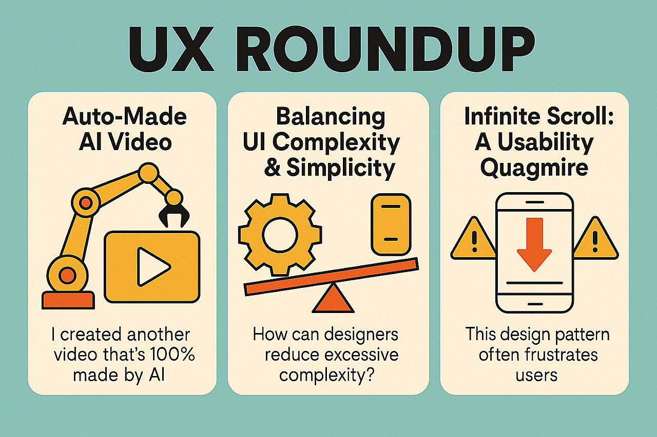
UX Roundup: UX in the Street | AI Video | Infinite Scroll | Simplicity vs. Features | Logo as Coin | AI Blooper | Midjourney Animation

Summary: Street interview video about the consistency heuristic | AI auto-generates full videos | Infinite scrolling is a usability quagmire to avoid | Simplicity vs. features | Make your logo into a gold coin | AI Blooper | Midjourney’s new animation tool alleviates the articulation barrier | Caption contest winner
UX Roundup for June 23, 2025. (ChatGPT).
Song about this newsletter. (YouTube, 2 min.)
Street Interview Video About Consistency and Standards
You’ve no doubt noticed the explosion of social media content made with Google’s Veo 3 AI-video generator. The most popular genre seems to be the street interviews, with some creators pushing the genre even further to “interview” historical characters.

I had to make my own: Street interviews about Usability Heuristic number 4, Consistency and Standards. (YouTube, 1 minute)
Most of the made-up street interview respondents I created are contemporary individuals, but I also included a pirate from 1650, a Roman Senator from 44 BC, and an Egyptian pyramid architect from 2000 BC. Of course, this video is mainly for entertainment, but it also serves an educational purpose: the interviewees present genuine arguments in favor of the heuristic.

I sent my AI interviewer on a trip through history to hear what (made-up) respondents had to say about user interface consistency and standards. (ChatGPT)
The lip sync is still not perfect, and might even have been better if I had used HeyGen, but the characters and backgrounds created by Veo 3 are far beyond anything HeyGen can do. See, for example, the camel caravan passing behind the pyramid architect. (I did prompt for the camels, but the people milling around in the other interview settings came for free with a prompt describing the general setting, such as “The Roman Forum.”)
There is no doubt that multimodal AI is the road ahead. You have probably also noticed that I have been using ChatGPT’s native image mode for almost all my illustrations recently.
Auto-Made AI Video
I created another video about Consistency and Standards that’s 100% made by AI. (YouTube, 2 min.). For this video, I used a new feature in CapCut version 6.4.0 that, given a topic, automatically writes a script, generates a voiceover by text-to-speech, designs background images, and compiles the lot into a video. In true CapCut spirit, there’s a huge range of visual styles available for the images, and I chose “90s pixel graphics” for this project.
CapCut can also auto-select background video clips from its extensive library of stock video footage, but apparently it has almost no stock footage that’s relevant to UX, because the result was truly lame and I am not sharing it.
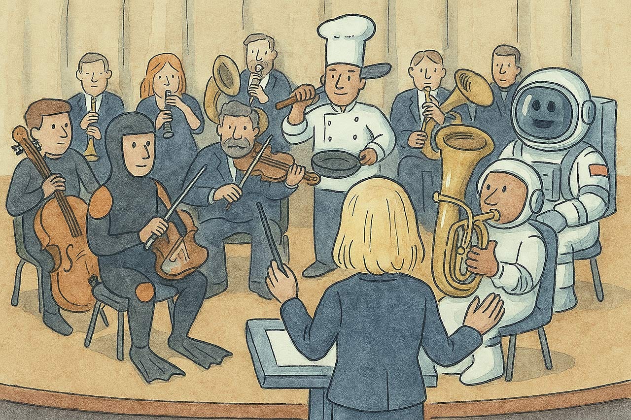
The new tools for one-stop AI video creation orchestrate a wide range of previously-separate talents. The quality is currently low, and somewhat resembles trying to perform a symphony with a chef and a frogman on the instruments, but integration is likely the only way we can bring video creation to the masses. (ChatGPT)
My assessment of this experiment:
CapCut wrote a good script about my heuristic. It’s explained about as well as one can do in two minutes.
The voiceover sounds good, though it mispronounced my name and also the word “demos” which is supposed to be short for “demonstrations” and not the Greek word for “the people.”
It quickly gets old to watch a video of nothing but still images that are only vaguely related to the narration. This last point is enough for me to recommend against using the current release of CapCut’s auto-generated video for my type of specialized topic. The feature may be more useful for more general topics that are better served by stock footage.
Despite my negative conclusion, it’s impressive that one can make a full video with AI, based on nothing but a specification of the topic.
The videos I auto-created with Medeo last month about heuristics 2 and 4 were somewhat more compelling in terms of the B-roll video that the AI created especially for my video. CapCut needs to step up its game and create custom video clips, as opposed to offering only the choice between custom-generated still images and stock video footage.
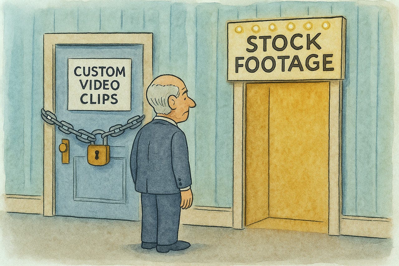
Custom-generated video clips make for much more engaging videos, at least for specialized topics. Thus, I was disappointed that CapCut’s AI-video maker currently only offers stock footage. The potential is clear, but it has not yet been realized. (ChatGPT)
Infinite Scroll: A Usability Quagmire to Avoid (Mostly)
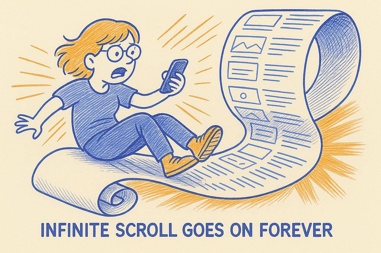
Infinite scroll, the design pattern that continuously loads content as users scroll down a page, promises seamless browsing. It’s popular on social media and image sites. However, this seemingly endless stream often creates a torrent of usability problems, frustrating users and hindering task completion. While it has a few niche applications, in most cases, infinite scroll is a detriment to good user experience.
The core problem with infinite scroll is its disregard for fundamental usability principles. Users quickly find themselves adrift in a sea of content with no landmarks and little control.
User Control & Freedom Trampled
One of the most basic user needs (indeed, usability heuristic number 3) is control and the freedom to navigate an interface confidently. Infinite scroll frequently violates this. Users often cannot easily return to a previous position; the browser's back button may reset their view to the top of the feed, a common and severe frustration. Without clear beginnings or ends, users feel lost, unable to gauge their progress or the scope of available content. This lack of an “emergency exit” or simple undo for navigation traps users in an unwanted state.
Infinite scroll traps users with few options to exert control over the experience. (ChatGPT)
Locating previously seen items on an infinitely scrolling page is particularly inefficient. The dynamic loading makes it impossible to bookmark specific points or share locations within the content stream. This disorientation creates a paradox of choice; users faced with an overwhelming, unstructured deluge of options struggle to make decisions, as they cannot easily compare or mentally flag items for later review.
The endless stream of information imposes a significant cognitive load, as users try to process content while simultaneously attempting to maintain their bearings. Beyond mental fatigue, infinite scroll can degrade system performance, leading to slower response times, janky scrolling, and increased memory usage, particularly on mobile or less powerful devices. These seemingly minor annoyances—lag, disorientation, navigational hurdles—accumulate, creating a deeply frustrating experience that often leads to task abandonment.
Task Analysis and Infinite Scroll
Goal-Oriented Tasks: When users are actively searching for specific information—such as on e-commerce sites, in search results, or databases—infinite scroll is a disaster. These tasks demand precise navigation, comparison capabilities, and the ability to easily refer back to items. Pagination is far superior for such goal-oriented activities, providing necessary structure and control.
Content with Inherent Structure or Endpoints: Content that has a logical beginning, middle, and end, like articles, books, or even finite sets of search results, should not be forced into an infinite stream. Doing so destroys narrative structure and violates user expectations of reaching a conclusion. Presenting finite content in an "infinite" wrapper is misleading and disorienting.
Pure Discovery and Passive Browsing (with Caveats): For platforms centered on casual exploration and serendipitous discovery, such as some social media feeds or image galleries (e.g., Pinterest), infinite scroll can be tolerated. Here, the user’s goal is often passive consumption (“lean back”) rather than active searching (“lean forward”).
Alternatives That Give Users Back Their Rightful Control
Traditional pagination provides clear structure, a sense of scope, and easy navigation to specific sections or items. It allows users to bookmark pages, share specific locations, and generally offers better performance and control. For most listings, search results, and catalogs, pagination is the reliable, user-friendly choice.
“Load More” buttons offer a practical middle ground. They reduce initial page load times while giving users explicit control over when additional content is fetched. This restores a sense of agency, transforming the experience from a system-driven flow to a user-initiated action. The button provides a natural pause point and ensures users can always reach the page footer.
Fundamental usability principles that reach back more than 30 years, such as user control, clear navigation, efficient task completion, and accessibility, must guide design choices. Infinite scroll, while superficially appealing for its continuous flow, frequently undermines these principles. Before falling into this trap, critically assess whether infinite scrolling truly serves user needs or merely introduces friction. Users’ ability to achieve their goals efficiently and without frustration remains the ultimate measure of good design, a standard that infinite scroll rarely meets.
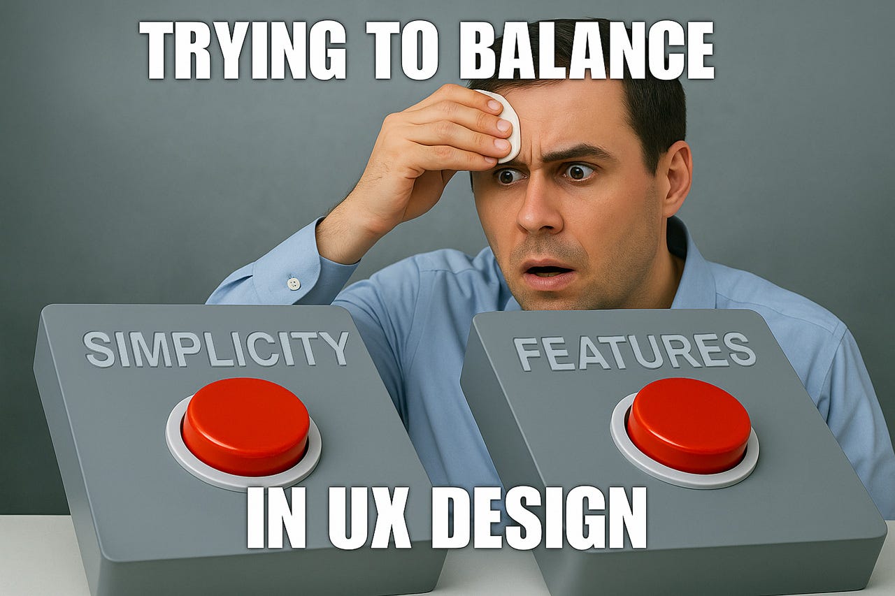
Simplicity vs. Features: A False Dichotomy That Harms User Experience
Since my most famous book, “Designing Web Usability: The Practice of Simplicity,” laid out the foundational arguments for clarity, I have consistently championed the cause of simplicity. Yet, the tug-of-war between a lean, straightforward user experience and a rich, multifaceted feature set continues to be one of the most significant and recurring challenges in the field of UX design. Product teams grapple with this conundrum daily: marketing (often prompted by customer requests or perceived gaps with competitors) articulate demands for ever-more capabilities, while users lament the ensuing complexity that makes products difficult to learn and frustrating to use.
Usability studies consistently show that feature bloat is a primary cause of failure in user interfaces. When confronted with too many options, users experience cognitive overload, leading to:
Increased task completion time: Users take longer to find what they need and navigate through convoluted pathways. Every extra click, every moment of hesitation, adds up.
Higher error rates: Complexity breeds mistakes. Users click the wrong options, misunderstand labels, or get lost in a maze of settings, leading to wasted effort and often, lost data.
Reduced satisfaction: Frustration is the enemy of satisfaction. A cumbersome interface leaves users feeling incompetent or annoyed, directly impacting their perception of the product and the brand.
Abandonment of the product: In many cases, users will simply give up. If the effort to use a product outweighs the perceived benefits, they will seek alternatives or revert to older, simpler methods. This is the ultimate usability failure.
Each additional feature incrementally increases the complexity of your interface, but the relationship isn’t linear; it’s combinatorial (which is even worse than exponential). Ten features don’t create ten units of complexity; they create a complex web of interactions that can produce 45 or more potential feature combinations.
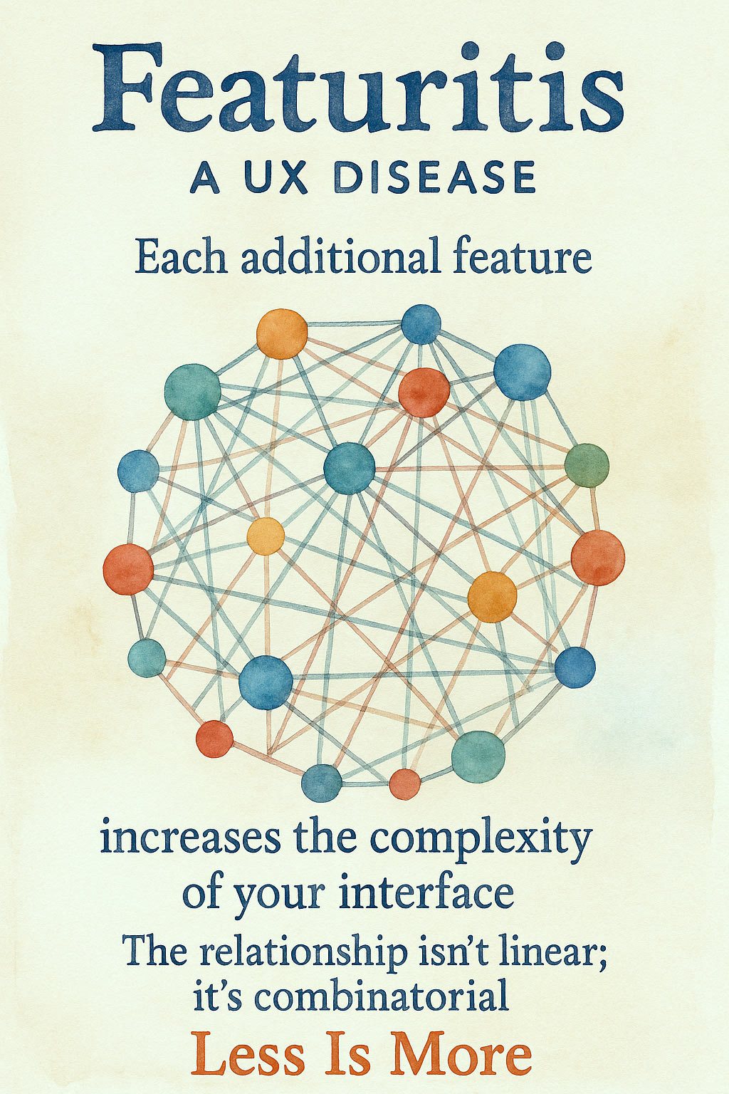
Features interact with each other in the user experience, so adding more features increases complexity combinatorially. (ChatGPT)
The Featuritis Disease
Product managers and developers often succumb to featuritis, believing that more capabilities translate to higher product value. This assumption is fundamentally flawed. Features users can’t find might as well not exist. They provide zero user value while imposing their complexity cost on the interface.
Product manager dilemma as a meme. (ChatGPT)
Balancing Act: Strategies for Reducing UI Complexity
How can designers include necessary functionality without overwhelming users? Several effective approaches:
1. Progressive Disclosure
Progressive disclosure is the most powerful technique for managing complexity. It follows a simple principle: show users only what they need when they need it. For example, a photo editing application might prominently expose “brightness” adjustments while tucking “color temperature” controls into an advanced panel.
In practice, this means:
Present primary functions immediately
Hide advanced or rarely used features in secondary interfaces
Use “learn more” patterns for optional information
Implement “advanced settings” sections for power users
2. Sensible Defaults
Default settings should reflect what most users need most of the time. A well-chosen default can eliminate the need for configuration for most users.
3. Contextual Controls
Instead of overwhelming users by displaying every conceivable action at all times, show controls that are directly relevant to the user’s current task, selection, or environment. Right-click (or secondary-click) contextual menus are a classic example. When you select text, a mini-toolbar with copy, paste, and basic formatting options might appear. In a photo gallery, selection of an image could reveal editing or sharing controls that were previously hidden.
4. Systematic Organization
Group related features using established patterns like the Gestalt principles. When users clearly see that a set of options belongs to a distinct functional group (e.g., “Page Layout Options” vs. “Security Settings”), they can more efficiently scan the interface and either engage with that group or bypass it entirely without needing to process each individual item. Use clear information architecture with logical categorization and consistent naming conventions.
5. User Testing as Filter
Before committing development resources to build new features, and certainly before releasing them, validate their utility and usability through empirical user testing with representative users. Ask the hard questions:
Does this proposed feature genuinely solve a significant, real-world problem for our target users? (Don’t just take feature requests at face value; understand the underlying need.)
Can users actually discover this feature when they need it?
Can they understand its purpose and use it successfully and efficiently to achieve their goal?
Is the added value of this feature substantial enough to justify the inherent increase in interface complexity and the usability tax it imposes on all users, even the ones who don’t need the feature?
What are users willing to trade to get this new feature? (This helps gauge true value.) User testing acts as an impartial arbiter, cutting through internal biases and assumptions. If users struggle, the feature needs rethinking, redesign, or hopefully, abandonment. Test early and iterate based on feedback.

Pruning features will usually improve your user experience. Less is More! (ChatGPT)
Value Through Restraint
The hallmark of sophisticated UX design isn’t adding ever-more features; it’s knowing which to exclude and how to present those you keep. Remember that every feature added imposes a usability tax on your entire interface.
The most successful digital products aren’t those with the most features, but those that help users accomplish their goals with minimal friction. As I’ve maintained throughout my career, simplicity isn’t the absence of capability; it’s the presence of clarity.
Your Logo as a Gold Coin

Prompt: Square image of a high-resolution photograph of a gold coin featuring the attached tiger logo as the device in the center of the field. Below this coin device, engrave the year 2023. Include finely detailed engravings, ornamental border patterns, and authentic coin textures like reeded edges, matte background, and polished raised elements. Add inscriptions of "UX TIGERS" at the top of the coin legend in bold lettering and at the bottom "FEARLESS USABILITY". The design should look like a professionally minted commemorative coin with symmetrical layout, precision detailing, and classic metallic shading, presented on a dark backdrop for contrast.
Prompt credit: Umesh. (I changed his prompt to place the year in the coin’s field instead of its legend, to make room for a motto.)
You can also use a portrait and play with Latin coin legends. Both coins were made with ChatGPT’s native image mode.

AI Blooper
For last week’s article about taking advantage of the AI transition period to transition your own career to prepare for the superintelligent future, I had the idea of visualizing people who still learn the old UX methods as the equivalent of honing their mammoth-hunting skills at a time when farming was becoming the way to acquire food: even if you are the apprentice of the world’s best mammoth hunter, your skills will be irrelevant in a farming village.
I created a nice image with ChatGPT of a mammoth hunter that resembles me slightly, which I featured in the newsletter. But I wanted to do better, so I turned to Flux Kontext [Max], which specializes in two things: (a) Photorealistic images, and (b) high fidelity in transferring image components to integrate with new images. Presto, I’m a caveman! The caveman worked, but the mammoth looked like a pet. Who could kill that adorable animal? And in any case, even though the prompt specified that the caveman is hunting the mammoth, he/I have no weapons.

Caveman “hunting” a wooly mammoth, made with Flux Kontext [Max], basing the caveman on a headshot of me.
Easier Video Animation with Midjourney
I made a short video comparing animations created with Midjourney ‘s new animation feature and my favorite video tool Kling from the same base image (made with ChatGPT), using a non-photorealistic style. (Instagram, 1 min.)
The animations recreate the dance break sequences from my recent video, "Progress Indicators Alleviate Slow Response Time" (YouTube, 2 min.).
Midjourney is clearly better at style adherence, where the entire clip is animated in the same visual style as the starting frame.
Kling is clearly better at producing cinematically interesting video.
Midjourney has poor prompt adherence (and a bad/non-existing physics world model) when asked to rotate the camera: first, the camera doesn't really rotate, and second, the robot musicians float into the scene.
Kling has bad style adherence, where the background colors change wildly during the animation.
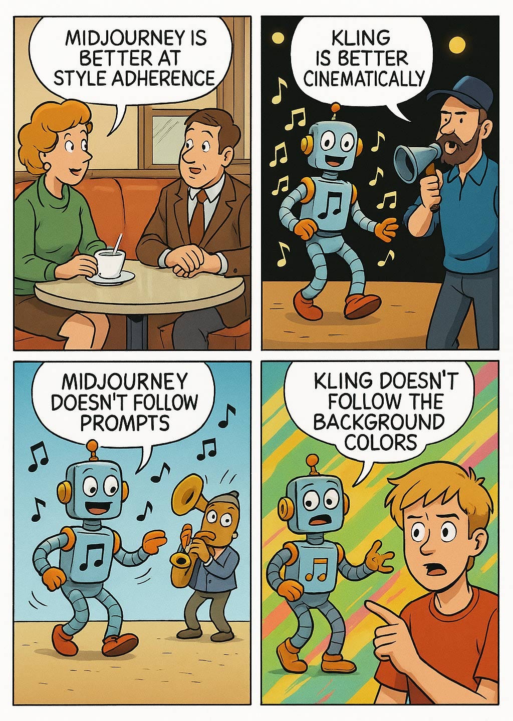
Different AI video models have different strengths. You should experiment with multiple models and choose the best one for each project. This need to know many AI models is typical of the current state of the field. (ChatGPT)
Midjourney offers a significant usability benefit, allowing users to animate an image without any additional prompting beyond clicking a button for “high” or “low” movement. (Credit to Justine Moore for pointing this out.) This alleviates the articulation barrier to using AI, making it easier for more people to create videos. In my example, Midjourney figured out for itself that the singer is dancing and the robots are playing their instruments (through image analysis, I assume).
The traditional prompt-based UI for AI video generation makes it difficult for many users to create videos because they are unable to describe their desired cinematic outcome in prose text. Improved creation usability will broaden the creator base by making it easier for more people to bring their visions to life through AI-generated videos.

Improving the usability of video creation will encourage more people to become creators. This again will vastly increase the amount of content being published. Much will be bad, but some will be great, and these gems would never have been created with lower-usability tools. (ChatGPT)
Caption Contest Winner
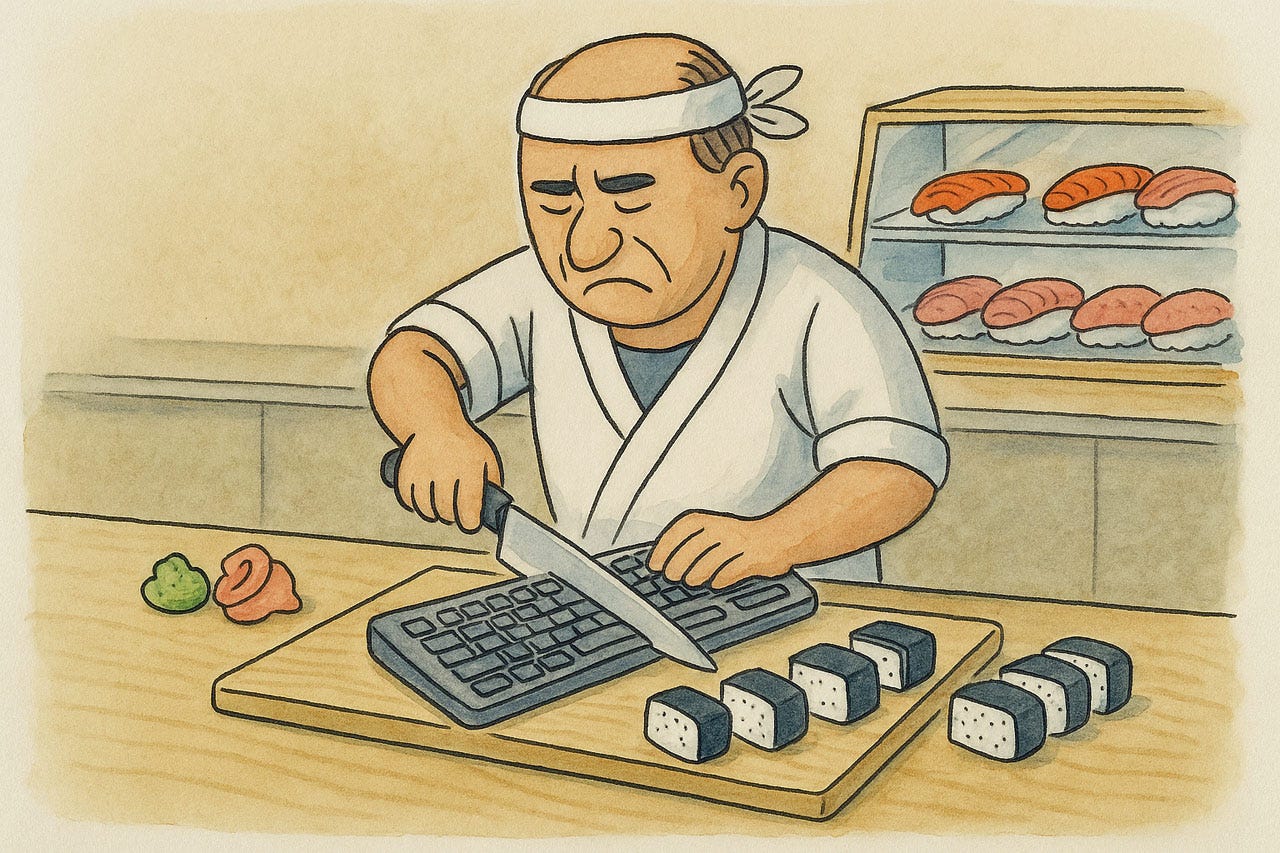
Last week, I posted the following absurd cartoon I made with ChatGPT and asked for suggested captions.
The winners are:
Keyboard short cuts! by Bjørn Furuknap, founder of a stealth company (and also in a slightly longer version by Lawrence Griffin, Data & AI Communications Strategist)
“You don’t like my Maki? I’ll give you Mac key!” by Nicole Herrmann, Sr. Digital Media Designer at Cox Automotive.
Does Jiro dream of electric sushi? by Brandon Ward, CXO at Precocity.
The last one is a clever mash-up of two completely different genres: the documentary film “Jiro Dreams of Sushi” (about a famous Tokyo sushi chef) and “Do Androids Dream of Electric Sheep?” (science fiction story by Philip K. Dick that was the inspiration for the famous Blade Runner movie).
About the Author
Jakob Nielsen, Ph.D., is a usability pioneer with 42 years experience in UX and the Founder of UX Tigers. He founded the discount usability movement for fast and cheap iterative design, including heuristic evaluation and the 10 usability heuristics. He formulated the eponymous Jakob’s Law of the Internet User Experience. Named “the king of usability” by Internet Magazine, “the guru of Web page usability” by The New York Times, and “the next best thing to a true time machine” by USA Today.
Previously, Dr. Nielsen was a Sun Microsystems Distinguished Engineer and a Member of Research Staff at Bell Communications Research, the branch of Bell Labs owned by the Regional Bell Operating Companies. He is the author of 8 books, including the best-selling Designing Web Usability: The Practice of Simplicity (published in 22 languages), the foundational Usability Engineering (28,655 citations in Google Scholar), and the pioneering Hypertext and Hypermedia (published two years before the Web launched).
Dr. Nielsen holds 79 United States patents, mainly on making the Internet easier to use. He received the Lifetime Achievement Award for Human–Computer Interaction Practice from ACM SIGCHI and was named a “Titan of Human Factors” by the Human Factors and Ergonomics Society.
· Subscribe to Jakob’s newsletter to get the full text of new articles emailed to you as soon as they are published.
· Read: article about Jakob Nielsen’s career in UX
· Watch: Jakob Nielsen’s first 41 years in UX (8 min. video)