


UX Roundup: Field Observation of Sticky Notes | Performative Privacy | Response Time Delays | Jakob Fireside Session | Content Supremacy

Summary: Users posting sticky note reminders = bad usability | Performative privacy vs. practical privacy | Response time delays: Endlessly watching the spinner | Jakob’s fireside chat at Dovetail’s Insight Out conference | Words rule the web
UX Roundup for June 30, 2025. (ChatGPT)
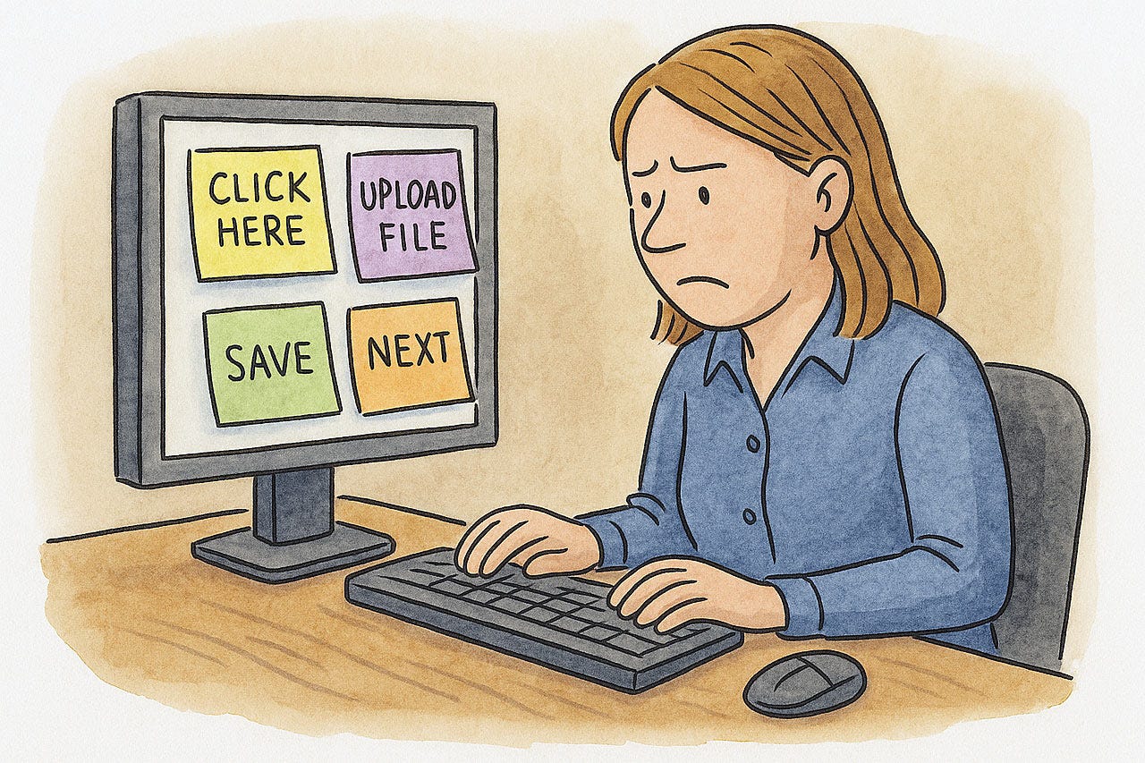
Sticky Note Reminders = Bad Usability
If you visit a customer location and observe a scene like this, it’s a sure sign of bad usability:
(ChatGPT)
When users need to write little shortcut reminders to themselves about how to accomplish tasks with your system, it’s usually due to one of two design flaws:
Poor findability and memorability: People can’t find features they need, and even after locating a feature once, they can’t find it the next time because the system is so convoluted that they can’t remember what they did.
Awkward workflow: Even after getting to the right starting point, the subsequent steps are illogical or so convoluted that it’s easier to write down a cheat sheet than to rely on the UI for guidance through the workflow.
The one piece of good news: if you do visit customer locations, you have a leg up on your competition, which usually stays comfortably at home. Seeing users’ sticky-note cheaters informs you of the actions they care about enough to write and post the notes, meaning that you can prioritize those actions for a redesign.
Performative Privacy vs. Practical Privacy
The digital landscape is cluttered with interfaces that claim to protect user privacy. Yet, many of these are mere gestures, offering little real protection while actively degrading the user experience. This is “performative privacy”: a facade that contrasts sharply with practical privacy violations, where user data is genuinely compromised, often through dark design. It is time to dismantle the annoying performances and rigorously penalize the actual harms.
The core of performative privacy is the appearance of diligence, a public display of concern that often masks inaction or ineffective measures. This is akin to “security theater,” where highly visible measures are implemented to create a feeling of safety or control, without substantially improving the underlying reality. Organizations may implement these measures based on perceived threats or regulatory pressure rather than on evidence of their effectiveness in protecting users.
The EU cookie banner is the quintessential example of performative privacy. Born from regulations like the General Data Protection Regulation (GDPR), these banners are intended to obtain user consent for non-essential cookies. However, their common execution is a study in how to frustrate users while offering minimal genuine choice.
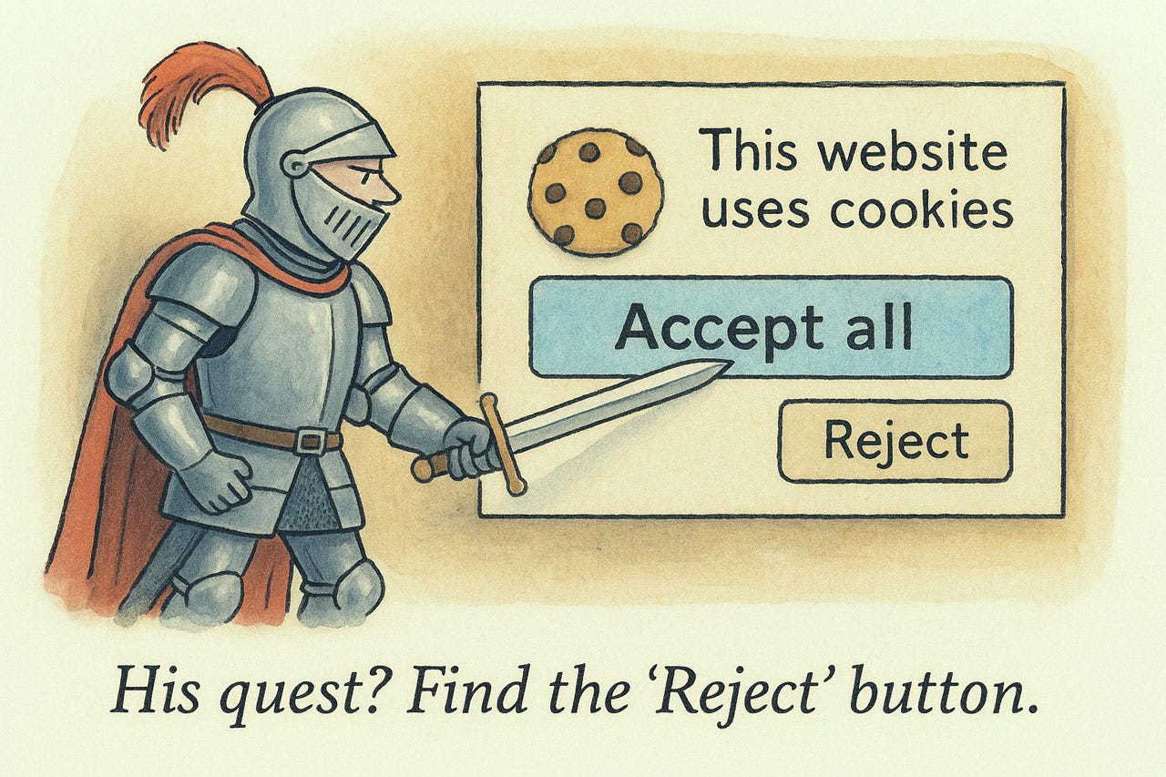
Cookie banners are performative privacy: they make EU busybodies feel good, but they don’t provide sufficient benefits to actual users to be worth their detrimental effect on the web user experience. (ChatGPT)
Users encounter interfaces that are confusing, annoying, or simply ineffective, leading to a realization that the promised control is illusory. This disconnect does more than just fail to protect privacy; it actively corrodes user trust. When users repeatedly encounter “privacy” features that are merely for show, they develop a justifiable skepticism towards all privacy claims, even those that might be legitimate. This cycle of disappointment and distrust is detrimental to the entire digital ecosystem, as users become less likely to engage positively or meaningfully with any privacy feature.
Furthermore, the widespread adoption of performative privacy mechanisms, driven by regulatory checkbox-ticking, has insidiously normalized a lower standard of user experience. Users become resigned to constant interruptions and cumbersome interactions if they are framed as being “for privacy,” even when the privacy benefit is minimal or non-existent. This creates a dangerous precedent where poor usability is tolerated, and even expected, under the guise of privacy protection, leading to phenomena like banner blindness and consent fatigue, where users simply click through to dismiss the nuisance.
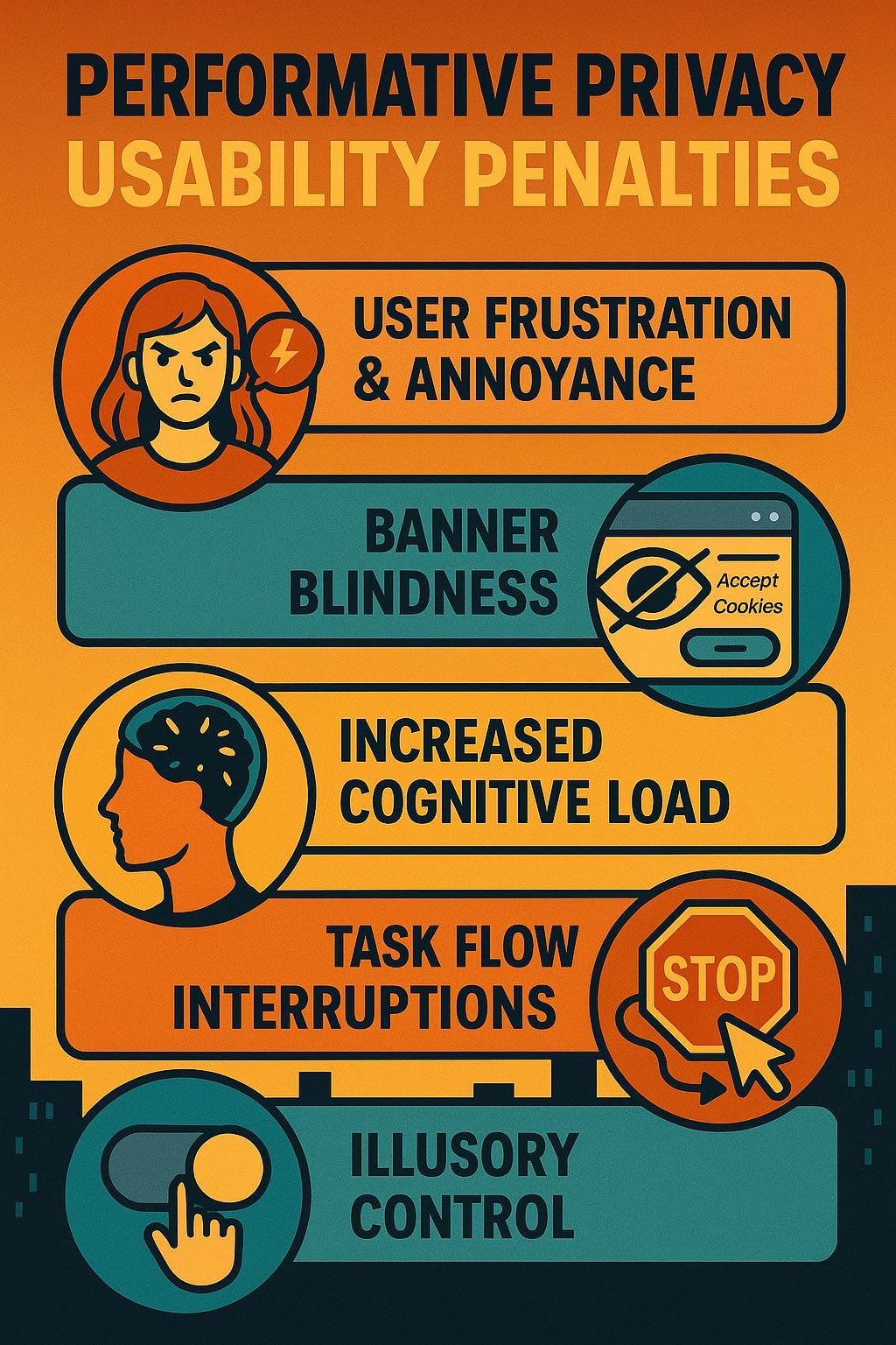
The Usability Cost of Performative Privacy
Performative privacy measures, exemplified by poorly designed cookie banners, exact a significant toll on web usability. These are not minor inconveniences; they are substantial usability failures that waste user time, increase cognitive load, and degrade the overall online experience. The usability downsides include:
User Frustration and Annoyance: Constant interruptions from banners that demand interaction before content can be accessed lead to predictably negative emotional responses. This directly violates the usability heuristic of “Aesthetic and minimalist design,” which dictates that interfaces should not contain irrelevant or rarely needed information, as every extra unit of information competes with relevant units and diminishes their relative visibility.
Banner Blindness: Overexposure to similar, intrusive prompts conditions users to ignore them or click reflexively to dismiss them, thereby nullifying their intended purpose. Users learn to bypass these obstacles as quickly as possible.
Increased Cognitive Load: Complex choices, unfamiliar jargon, inconsistent layouts, and multi-layered interfaces force users to expend unnecessary mental effort to understand and navigate these banners.
Interruption of User Tasks and Flow: Cookie banners obstruct content and disrupt the user's primary goal on the website, whether it’s reading an article, finding information, or completing a transaction.
Lack of Real Control or Understanding: Users often do not truly understand what they are consenting to, or, worse, their expressed choices are not technically honored by the website.
The damage is not isolated. While one poorly designed banner is an annoyance, the collective impact of nearly every website presenting such an obstacle has degraded the usability of the web as a whole. This systemic problem creates a persistent layer of friction across the entire browsing experience.
Performative privacy measures like the EU cookie banners are not free: they impose a substantial usability penalty on users. (ChatGPT)
The Real Threat: Practical Privacy Violations and Dark Patterns
While performative privacy is a significant source of user annoyance and wasted time, true breaches of user privacy are actively harmful. These violations are frequently facilitated by dark design patterns: deliberate user interface and user experience design choices intended to manipulate, deceive, or coerce users into actions they would not otherwise take, typically benefiting the company at the user's expense. The intent to mislead is a key characteristic.
A prime example of a dark pattern leading to a practical privacy violation is the deceptive contact list upload. Services may trick users into granting access to their entire address book under vague pretenses like “finding friends” or through misleading prompts that obscure the full implications of consent. Once access is granted, the service exploits these contacts by sending them unsolicited promotional emails or messages, effectively turning the user’s personal network into a source for spam. This is a direct violation of the contacts’ privacy, as they never consented to being contacted, and it damages the original user's reputation.
Other common dark patterns that result in true privacy violations include:
Obfuscated Privacy Settings: Making it unduly difficult for users to find, understand, or change their privacy preferences. This is often achieved through confusing navigation, jargon-laden descriptions, or burying critical controls deep within multiple sub-menus.
Pre-checked Consent Boxes for Data Sharing: Defaulting users into agreeing to share their personal data with third parties or for additional processing purposes. This violates the GDPR’s requirement for unambiguous, affirmative consent, which cannot be assumed from silence or pre-ticked boxes. (Even worse: the sites that deliberately violate Jakob’s Law by reversing the standard meaning of opt-in checkboxes so that an unchecked box supposedly grants permission.)
Sneaking: Covertly adding items, such as consent for additional data uses or marketing communications, into a user's workflow (e.g., during checkout or registration) without clear and prominent disclosure.
These tactics are not about appearing to respect privacy; they are about actively undermining it for commercial or other organizational gains.
The effectiveness of dark patterns in causing these practical privacy violations is not accidental. They systematically exploit known human cognitive biases, such as the default effect (making users more likely to stick with pre-selected options), authority bias (using fake testimonials or security seals), or loss aversion (framing choices to make users fear missing out if they don’t share data). Because users online typically operate with limited attention and cognitive resources, they are vulnerable to these manipulations, leading them to make decisions that are not in their best interest.
Instead of the current state of affairs, we need a two-pronged approach: implementing strong, enforceable regulations with substantial penalties for true privacy violations, and simultaneously eliminating the performative privacy elements that merely obstruct users without providing tangible benefits.
Finally, when site-specific privacy consent is absolutely necessary, requests should be minimalist, non-intrusive, use plain language, and offer simple, equally weighted choices for acceptance and rejection, akin to the streamlined approach I’ve always advocated.
User trust is a valuable, yet fragile, asset. Both performative annoyances and deceptive dark patterns systematically destroy it. The ultimate goal must be a web that respects users’ time, intelligence, and privacy simultaneously. True privacy protection and good usability are not mutually exclusive; indeed, they are complementary components of a trustworthy and effective digital environment.
Response Time Delays: Endlessly Watching the Spinner
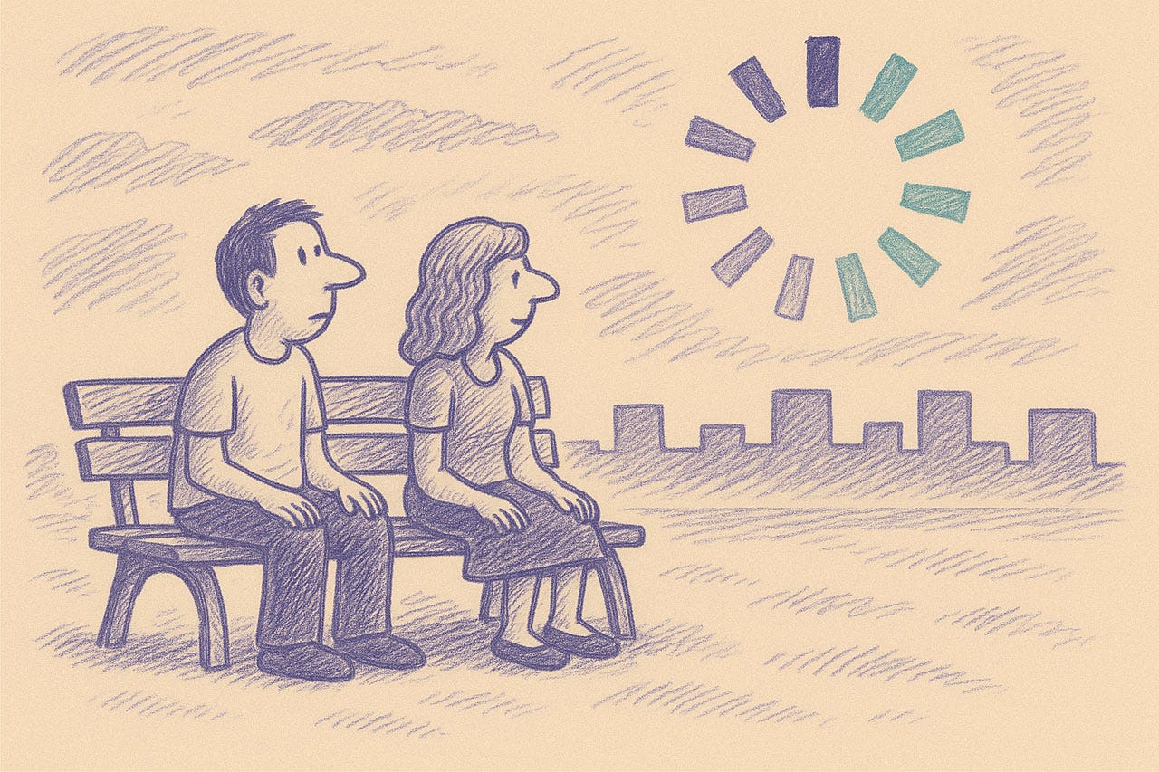
Is it sunrise or sunset? Are you a pessimist or an optimist? Do you think anything good will ever come from waiting longer for the computer to respond? (ChatGPT)
Welcome to the most unproductive place on Earth: the digital waiting room, where humans stare hopelessly at the spinning wheel of doom. The modern condition: humanity, hunched before the glow of a screen, held captive by the computer’s leisurely pace. Like ancient mariners watching for land that never appears, today’s users squander countless hours before the flickering altar of “Processing...” This isn’t mere inconvenience but a full-blown usability catastrophe.
The fundamental law of response time couldn't be simpler: Users experience time differently than computers. While your system happily executes millions of calculations, your users’ mental energy evaporates like morning dew in the Sahara. Each second of delay doesn’t just waste time, it actively destroys user experience. Respect the user’s cognitive limits and perception of time. When a user initiates an action, they have a mental model of cause and effect. Delays shatter this model, breeding frustration, uncertainty, and the dreaded click-fury that signifies a user pushed to the brink.
Watch my video about progress indicators (YouTube, 2 min.)
Decades of research have established 3 critical response time thresholds that determine user satisfaction:
0.1 Second: The Perception Boundary
At 0.1 second or less, interaction feels instantaneous, like extending your nervous system directly into the digital realm. This is the holy grail for efficient software. This magical threshold creates the feeling of direct manipulation, where technology becomes transparent. Users don’t perceive the computer as a separate entity but as a seamless extension of their intention. It’s the difference between flipping an electric light switch and waiting for a sputtering gas lamp to ignite.
1 Second: The Flow Threshold
Users notice the delay between 0.1–1 second but maintain their train of thought. The system feels responsive, if not instantaneous; like a well-trained assistant who pauses briefly before answering. Beyond 1 second (but under 10), users wade through digital molasses. Their attention begins fragmenting like ice in spring thaw. A simple spinner, that hypnotic vortex of vague activity, is the absolute minimum. It’s the system sheepishly admitting, “Yes, I'm a bit slow, but I haven’t crashed... yet.” It’s a digital shrug. Without it, users frantically click, wondering if their command disappeared into the digital void.
10 Seconds: The Attention Boundary
At 10+ seconds, you’ve broken the contract with your user. Their attention has fully disengaged, like a guest who's been waiting too long at your front door and decided to leave. A spinner alone becomes not just useless but actively insulting: a digital middle finger to your users’ valuable time. For these marathon operations, implement a precise progress indicator showing percentage completion. This is not merely a courtesy; it is a lifeline. It tells the user how much longer this digital purgatory might last. It allows them to decide whether to fetch a coffee, contemplate the meaning of life, or simply give up and curse your software. Without it, they are adrift in a sea of uncertainty, with that spinning sun mocking their optimism.
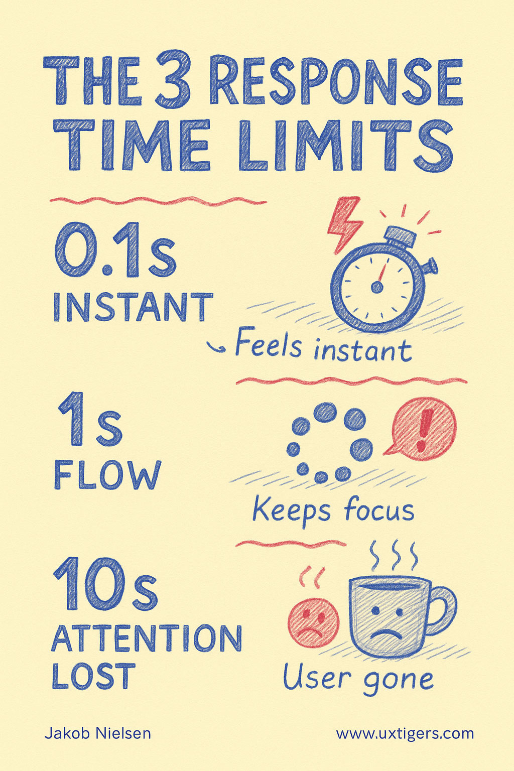
The three response time limits in UI design. (ChatGPT)
Remember: every interface that forces unnecessary waiting is stealing life from your users. They can never get those moments back. They are trapped in your system’s waiting room while their real lives — meetings, deadlines, family dinners — continue without them.
The simplest usability principle remains the most violated: Respect users’ time as the non-renewable resource it is. Optimize ruthlessly for speed, and when you can't be fast, be transparent about the wait. Anything less isn’t just poor design, it’s digital malpractice.
Jakob’s Fireside Chat at Dovetail’s Insight Out Conference
The video from my fireside chat session at Dovetail’s recent Insight Out Conference is now available: The past, present, and future of design and usability with Dr. Jakob Nielsen (YouTube, 29 minutes).
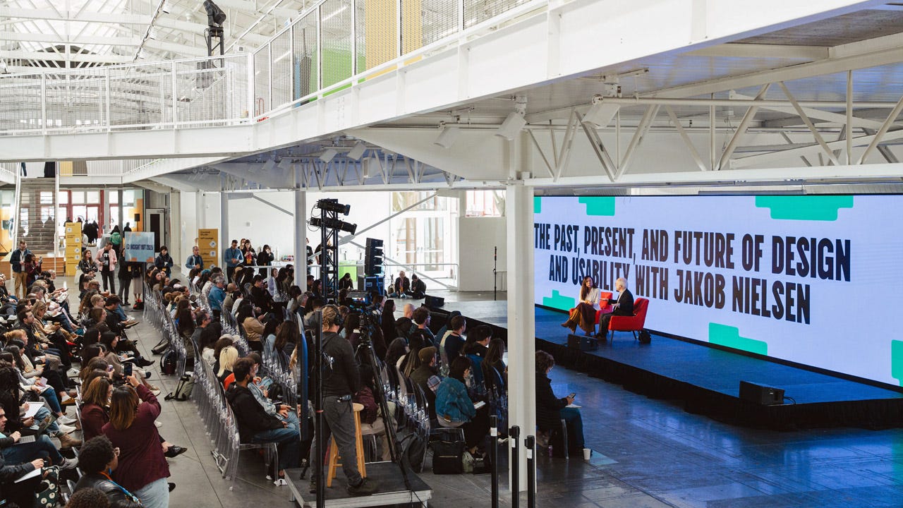
Photo from the plenary session at Dovetail’s Insight Out Conference in San Francisco. Great crowd: I met several old and new friends.
Some of the points I made in this session:
The Real Ethical Problem with AI is Its Delay, Not Its Perceived Dangers: My primary concern regarding artificial intelligence is not the adverse outcomes that often garner significant media attention (which have a strong negativity bias) but rather the profound ethical cost of delaying its widespread adoption. While specific negative incidents should certainly be addressed and fixed, the diffuse benefits of AI, such as improved education and healthcare in underserved global regions, far outweigh these. Unlike humans, computers allow us to fix bugs so the same mistake does not recur. For instance, despite alarming headlines about AI-driven car accidents, fully autonomous vehicles could eliminate about 3/4 of the 40,000 annual traffic fatalities in the U.S. alone. Therefore, in my view, delaying this progress is a far greater ethical failing than the risks themselves.
Declining ROI for UX is a Sign of Success, Indicating Its Commoditization: The decline in the return on investment (ROI) for UX work is, paradoxically, a signal of the industry's success, not its failure. In the early days of the Internet, design was often atrociously bad, allowing for stupendously big ROI where doubling revenues with minimal intervention was common. Today, design quality has significantly improved. While far from perfect, achieving substantial improvements now requires much more thorough research and investment for more incremental gains. This shift means UX has matured into a commodity: not in a pejorative sense, but as something ubiquitous, universally needed, and expected, much like water or electricity. Good UX is no longer a luxury but a fundamental component of doing business, reflecting rising customer expectations for quality across all digital products.
The Human Designer’s Future Lies in Orchestration, Judgment, and Interpersonal Skills, Not Handcraft: The design industry is poised for a significant transformation where AI will increasingly perform previously-handcrafted design work, including screen layouts, icon creation, color schemes, and even copywriting, usually better and cheaper than humans. The human designer’s role will elevate to that of an orchestrator: defining what should be done (agency), exercising critical judgment to select the best solutions from AI-generated options, and, crucially, managing interactions with other humans. I speculated whether a “scaling law for usability insights” exists for AI, meaning it might eventually know what constitutes good design. The indispensable human contributions will be setting direction, making final decisions, and skillfully navigating organizational dynamics to ensure buy-in for chosen designs. These are the inherently human skills.
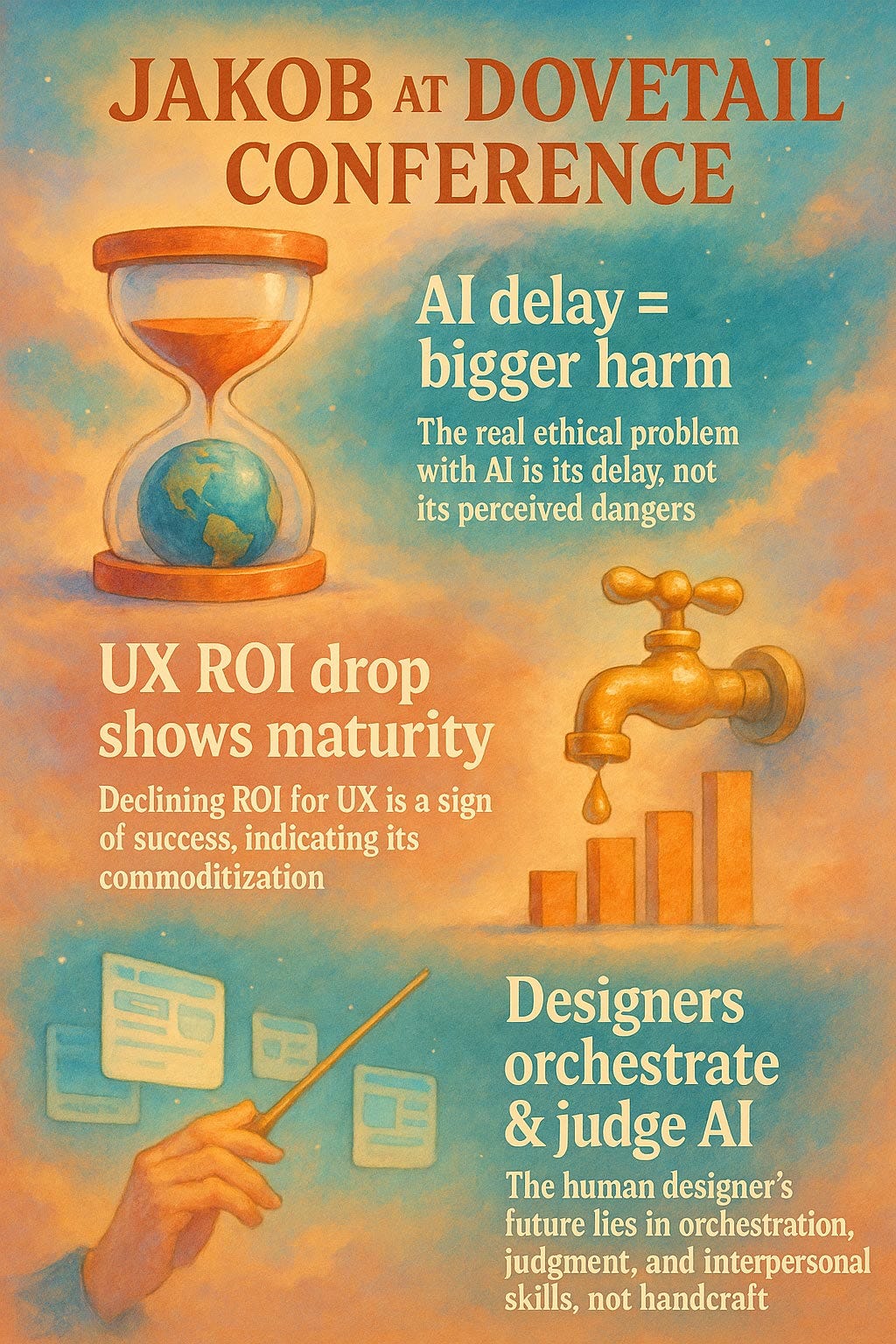
Some of the topics I discussed in the main-stage session at Dovetail Insight Out. Watch the video for full details. (ChatGPT)
Content Rules the Web

Content Guides Choice (ChatGPT).
Users don’t come to your website to admire your design. They come for content.
This fundamental truth remains unchanged since my earliest web usability studies in 1994: 30 years later, same conclusion. Whether users seek product information, news articles, or instructional videos, they arrive with specific goals. Content satisfies those goals. Design facilitates access. (Important, but irrelevant if there’s nothing interesting to access.)
Words dominate web content for good reason. Text communicates precisely, loads quickly, and remains accessible across devices. Users scan text ruthlessly, seeking trigger words that match their needs. Eye-tracking studies consistently show users ignore decorative elements while focusing laser-like on textual content that answers their questions.
Yes, images and videos serve important purposes. Product photos help purchasing decisions. Tutorial videos clarify complex procedures. But words typically provide the context, captions, and descriptions that make visual content meaningful. Without text, users struggle to determine relevance.
My “Content Guides Choice” slogan extends beyond individual pages. Information architecture, navigation labels, and search results all depend on carefully chosen words. Users make split-second decisions based on these textual cues. Poor word choices send users down wrong paths or, worse, to competitors’ sites.
Prioritize content strategy. Write clearly. Structure information logically. Test your words with real users. Beautiful interfaces fail when content disappoints.
A final business imperative for prioritizing words is that they are the way to entice AI answer engines like Perplexity or Deep Research to mention you. (SEO is dead, long live being featured in AI answers.)
About the Author
Jakob Nielsen, Ph.D., is a usability pioneer with 42 years experience in UX and the Founder of UX Tigers. He founded the discount usability movement for fast and cheap iterative design, including heuristic evaluation and the 10 usability heuristics. He formulated the eponymous Jakob’s Law of the Internet User Experience. Named “the king of usability” by Internet Magazine, “the guru of Web page usability” by The New York Times, and “the next best thing to a true time machine” by USA Today.
Previously, Dr. Nielsen was a Sun Microsystems Distinguished Engineer and a Member of Research Staff at Bell Communications Research, the branch of Bell Labs owned by the Regional Bell Operating Companies. He is the author of 8 books, including the best-selling Designing Web Usability: The Practice of Simplicity (published in 22 languages), the foundational Usability Engineering (28,699 citations in Google Scholar), and the pioneering Hypertext and Hypermedia (published two years before the Web launched).
Dr. Nielsen holds 79 United States patents, mainly on making the Internet easier to use. He received the Lifetime Achievement Award for Human–Computer Interaction Practice from ACM SIGCHI and was named a “Titan of Human Factors” by the Human Factors and Ergonomics Society.
· Subscribe to Jakob’s newsletter to get the full text of new articles emailed to you as soon as they are published.