


UX Roundup: UX Unicorns | Captcha Must Die | Flow in UX | Dark Design | Avatar Animation

Summary: We’re getting herds of UX unicorns | Captcha Must Die | Supporting the state of flow for users | If it feels like dark design, it probably is | HeyGen’s Avatar IV worked better with a photorealistic avatar than a cartoon character

UX Roundup for July 7, 2025. (GPT Image-1)
UX Unicorns Flourish
I was reviewing my 2023 article “Rebirth of the UX Unicorn?” in light of the situation in 2025. My analysis has held up well, and the main change I would make to the article is to swap that question mark in the title with an exclamation point:
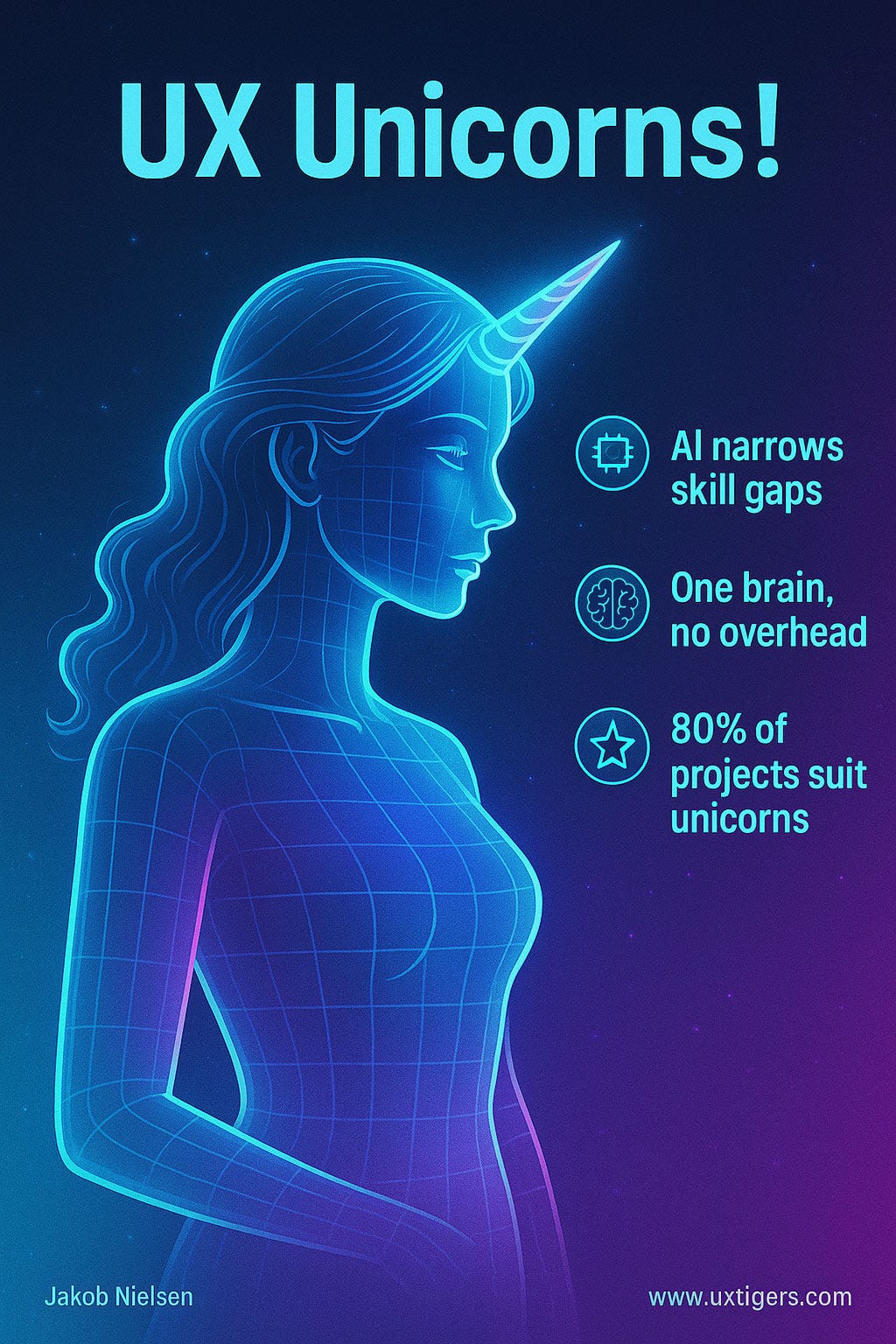
The points made in my 2023 article remain valid, and UX unicorns are now frequently observed in the wild. (ChatGPT)
Two additional points, based on recent events:
I was too conservative in simply describing the UX unicorns as professionals skilled in all aspects of user experience research and design. The emergence of AI-Native companies means that each employee now does a little of everything. The “UX” unicorn will likely also do some coding (especially vibe coding), some marketing, and some customer support, all of which integrate to produce even stronger products.
Not only are UX Unicorns now a given, but there are large herds of them roaming the landscape. These broad-skilled individuals are not as rare as they were two years ago. In fact, it seems common now to describe them as “UX generalists” since we’re no longer talking about something as rare as the original unicorns from mythology.

Large herds of UX Unicorns are now available for companies to hire when they want more efficient product design processes. (Mystic 2.5)
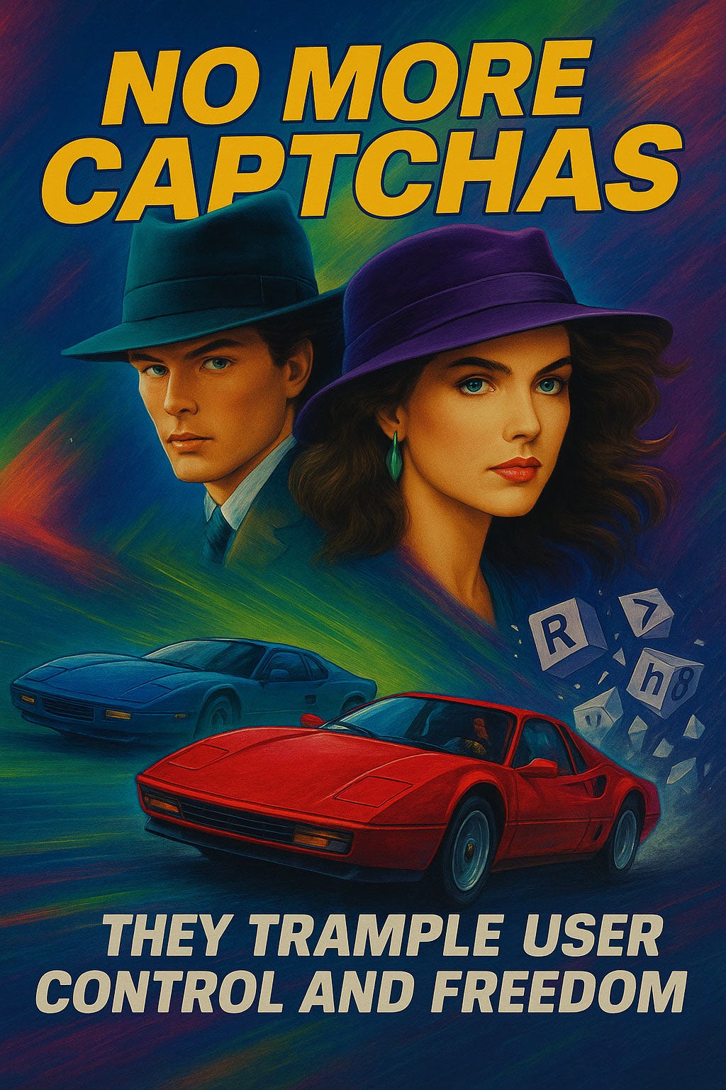
Captcha Must Die
Captchas are a scourge on the internet, a relic of a bygone era that must be eradicated. They waste billions of hours of human time each year, forcing users to prove they’re not robots in a futile attempt to keep bots at bay.
A cornerstone of good design is enabling users to achieve their goals quickly and efficiently. Users visit websites with specific tasks in mind, and any element that impedes their progress is a design flaw. Captchas are the antithesis of efficiency. They forcibly interrupt the user’s workflow, demanding they pause and engage in a cognitively taxing mini-game that is irrelevant to their actual objective. Individual users spend, on average, 9 to 15 seconds wrestling with each visual CAPTCHA. When aggregated across the vast expanse of the internet, this individual time wastage balloons into a monumental loss of human productivity. Estimates indicate that between 2010 and 2023, humanity collectively squandered approximately 819 million hours solving Captchas. This is not merely an inconvenience; it is a global drain on productivity, a theft of human lifespan on a vast scale.
Captchas deliberately slow down users and undermine the fundamental usability heuristic of user control and freedom. (ChatGPT)
Captchas are a usability curse. Distorted text, blurry images, and absurd puzzles: deliberately annoying! They’re also discriminatory, blocking people with visual impairments or cognitive disabilities from accessing websites.
The original intent behind CAPTCHA (“Completely Automated Public Turing Test to Tell Computers and Humans Apart”) was to provide a simple mechanism for websites to distinguish between legitimate human users and malicious automated bots. The idea was that humans could easily pass these tests, while computers would struggle. However, this premise has crumbled under the relentless advance of AI. The pathetic reality is that these tests now frequently fail at their most fundamental purpose. Modern AI systems not only solve CAPTCHAs but often do so with greater speed and accuracy than the humans they are supposed to filter out. This is not an incremental failure; it is a fundamental breakdown of CAPTCHA's core concept.
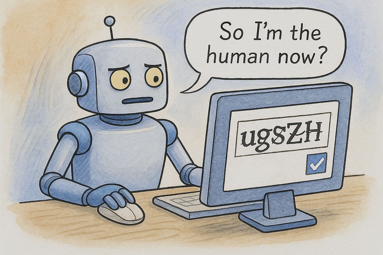
Captchas are a waste of time, since AI solves them better than humans do. (ChatGPT)
A key heuristic of user interface design is to prevent errors from occurring in the first place, or to make errors easy to recover from. Captchas do the opposite: they are inherently designed to be difficult, thereby inducing errors. Nearly 8% of users make a mistake on their first attempt to solve a Captcha, a figure that skyrockets to 29% when case sensitivity is introduced. The very nature of Captcha design — employing distortion, ambiguous characters (such as 'o' versus '0', or 'cl' versus 'd'), and sometimes problematic image resolution — makes them intrinsically error-prone.
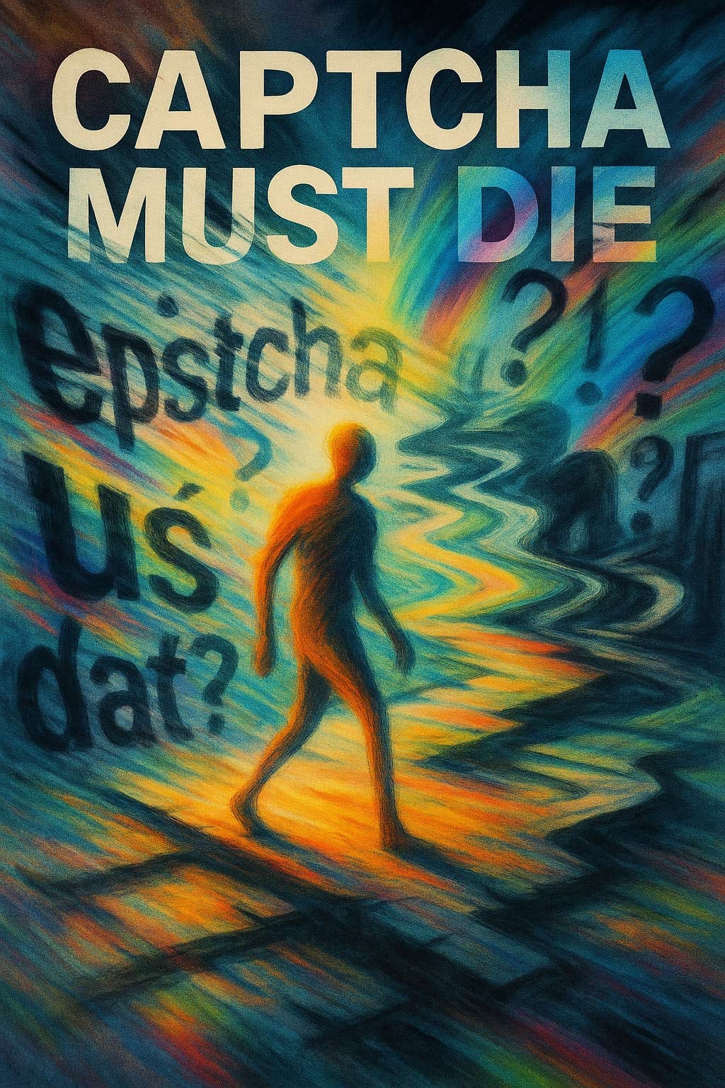
The persistence of Captchas is a direct assault on fundamental principles of web usability. Their continued use demonstrates a profound disregard for the user experience, transforming simple online interactions into exercises in frustration and wasted effort. Captchas must die now. Switch to smarter alternatives, including behavioral analysis, honeypots, or multi-factor authentication. Users deserve better than this outdated, infuriating mess.
Supporting the Flow State
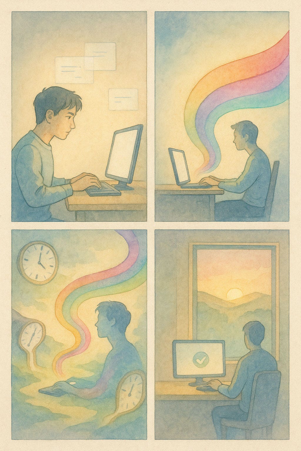
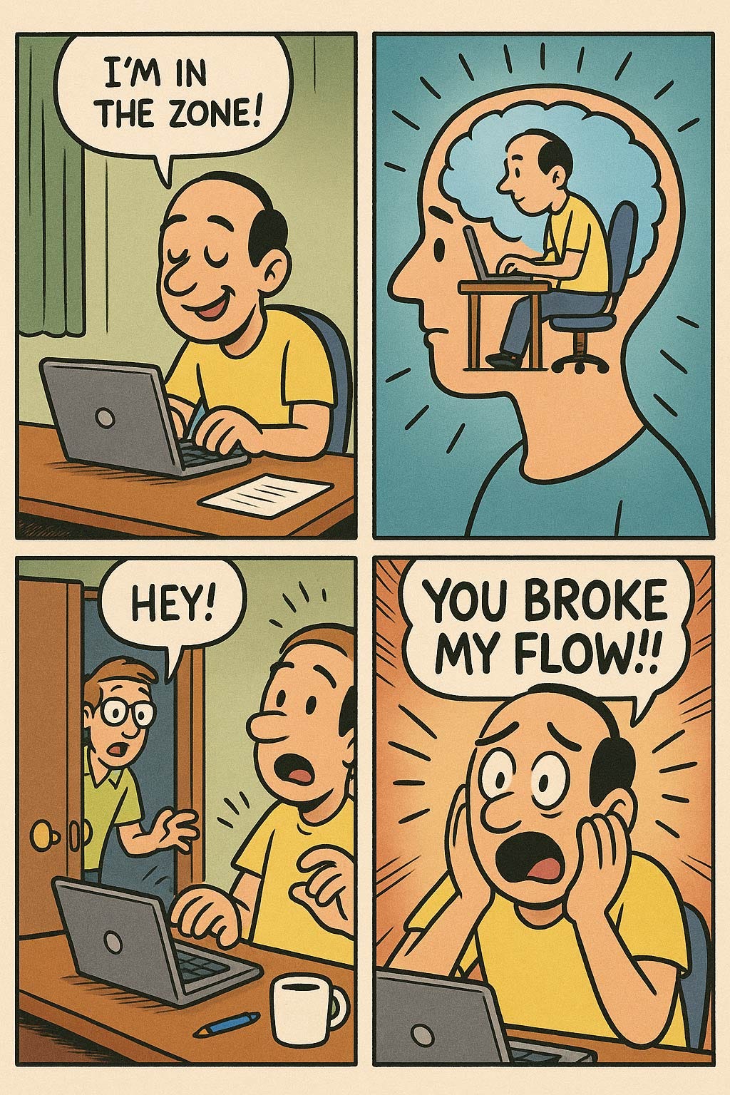
So-called “flow,” or “being in the zone,” happens when users are deeply and happily immersed in an interface.
What users actually experience in this state is a complete absorption in the task at hand. When “in flow,” a person becomes so involved in an activity that nothing else seems to matter. Their sense of time becomes distorted and hours can feel like minutes. Self-consciousness vanishes. The interaction feels effortless, as if the user is in complete control and the barrier between their goal and the system has dissolved. The task itself becomes its own reward. This is the state of peak productivity and focus that designers must support.
Time seems to vanish when you’re absorbed in a state of flow. You look up, and it’s midnight. (ChatGPT)
The importance of this state for the user is self-evident. A user in flow is a productive and satisfied user. They are accomplishing their goals without frustration, without confusion, and without the cognitive load of deciphering a poorly designed system. For the business, this translates to increased efficiency, higher user satisfaction, and, ultimately, a better bottom line.

Ease of use unlocks the flow experience. (ChatGPT)
What users actually experience in this state is a complete absorption in the task at hand. When in "flow," a person becomes so involved in an activity that nothing else seems to matter. Their sense of time becomes distorted—hours can feel like minutes. Self-consciousness vanishes. The interaction feels effortless, as if the user is in complete control and the barrier between their goal and the system has dissolved. The task itself becomes its own reward. This is the state of peak productivity and focus that designers claim to be chasing.
Maximum flow can dissolve time. (ChatGPT)
Flow is not magic. It is the simple, logical consequence of a usable design. It happens when the user interface gets out of the user’s way. When users are in a state of flow, they are not thinking about the interface; they are thinking about their task. The UI becomes an extension of their own mind, a tool so perfectly suited to the job that its presence is unfelt.

Being in the flow is a highly satisfying experience for humans, making it that much more unpleasant to be broken out of that state. (ChatGPT)
Why then do so many designs actively prevent users from achieving this state? It is because they ignore the fundamental principles of ease of use. A user cannot enter a state of flow if they are constantly interrupted by usability problems. Every moment a user spends trying to understand a confusing icon, recovering from an error, or searching for a hidden feature is a moment their concentration is broken.
Consider the following, which I have been advocating for decades:
Recognition, Not Recall: A user in flow does not have to remember where to find a specific function. The interface makes it obvious. They recognize their options and proceed without pausing to think. A cluttered or inconsistent design forces them to recall information, shattering their focus.
Error Prevention: There is no flow in a system that frequently leads the user into error. Even with clear error messages, the very act of having to correct a mistake is a jarring interruption. The best designs prevent errors from occurring in the first place, allowing for a smooth and uninterrupted workflow.
Consistency and Standards: When an interface behaves in a predictable and consistent manner, the user does not have to learn new rules for every new screen. They can apply their existing knowledge and remain focused on their task. Inconsistency breeds uncertainty and forces the user to pay attention to the interface itself, the very antithesis of flow.
Minimalist Design: Every extraneous element on the screen is a potential distraction. A clean, minimalist design that presents only the necessary information allows the user to focus on what is important. Visual clutter is the enemy of concentration.
Even though flow is a desired experience, it should not be a direct user interface design goal. Instead, focus on the hard, practical work of making the UI easy to use. Follow the established usability heuristics. Conduct user testing. Eliminate sources of friction. When the interface is effortless, flow will follow not as a matter of luck or artistry, but as a direct and predictable result of a disciplined, user-centered design process. It is, as always, a matter of engineering, not magic.
The pop-up barrage is a curse on modern user experiences in their own right. A further downside is that pop-ups disrupt flow. (ChatGPT)
Even a simple toast notification can disrupt flow. (ChatGPT)
Breaking flow is not just the result of bad UI design. Other humans are guilty just as often, though they usually don’t realize the damage they cause. Schedule distinct blocks of uninterrupted time for maximum productivity. (ChatGPT)
If It Feels Like a Dark Design Pattern, It Probably Is
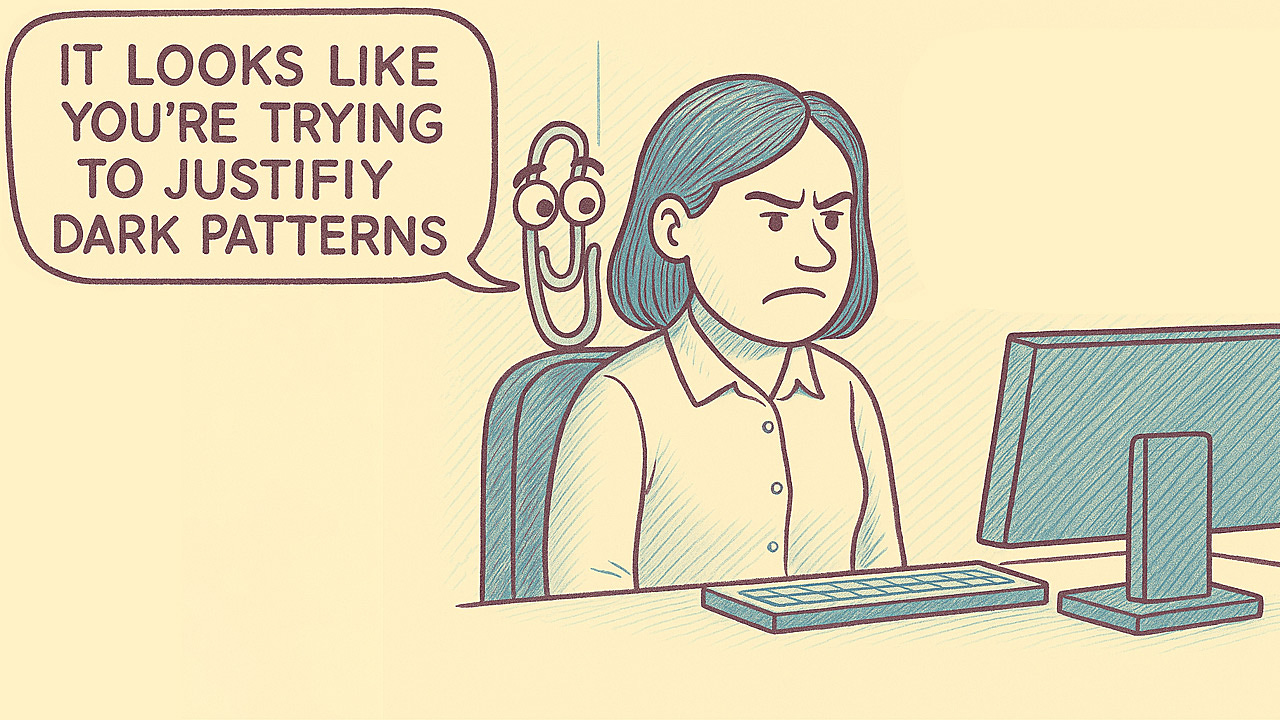
If you try too hard to justify your design, it may be a step too far toward the dark side. (ChatGPT)
The moment you find yourself crafting elaborate justifications for a design decision, stop. That uncomfortable feeling in your gut? Trust it. Designers who genuinely prioritize users rarely need complex rationalizations for their choices.
Dark design patterns are the antithesis of good usability. They exploit users’ cognitive limitations and trust to achieve business goals at the expense of user welfare. When you implement a pre-checked subscription box, hide the unsubscribe button, or make cancellation processes deliberately Byzantine, you're not being clever; you're being unethical.
The business consequences extend far beyond moral considerations. Users aren’t stupid. They remember companies that tried to trick them. That anger translates into abandoned shopping carts, negative reviews, and permanent brand damage.
Consider the simple test: Would you appreciate this design if you encountered it as a user? Would you recommend this experience to your grandmother? If the answer is no, you’ve likely crossed into dark pattern territory.
Some argue these patterns boost short-term metrics. Perhaps. But sustainable business success comes from respecting users, not deceiving them. Every time you make users work harder to achieve their goals, whether through confusing language, hidden costs, or forced continuity, you erode trust.
The most successful digital products make user goals and business goals align. Amazon’s one-click ordering doesn’t trick users into buying; it removes friction from a desired action. That’s the difference between good design and dark patterns: one empowers users, the other exploits them.
Stop rationalizing: if it feels wrong, it probably is. Start respecting your users. The path away from dark patterns isn’t complicated: design interfaces that help users accomplish their goals efficiently and transparently. Everything else is just excuses.
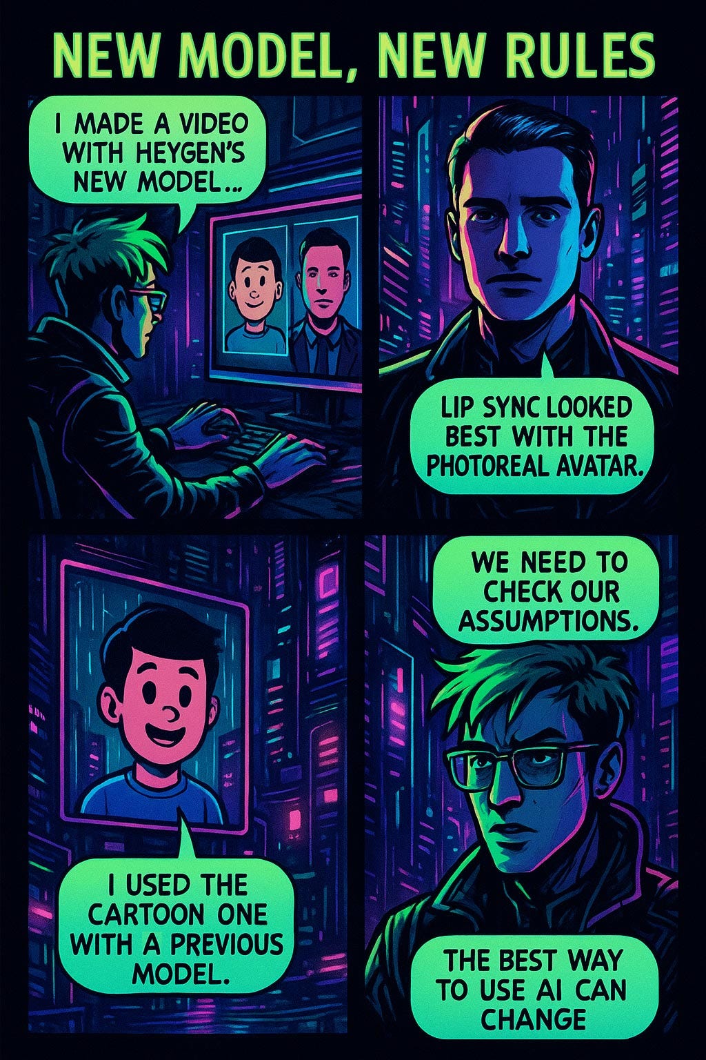
Heygen’s Avatar IV Worked Better with a Photorealistic Avatar Than a Cartoon Character
I made a short video with a side-by-side comparison of animating two avatars with HeyGen’s new Avatar IV model (YouTube, 1 min.): a photorealistic avatar and a cartoon character.
In this trial run, I thought HeyGen’s lip synch didn’t look good with the cartoon character, so I ended up using the photoreal avatar for my explainer video about GEO (Generative Engine Optimization).
I had used that cartoon character for a previous explainer video about AI Stigma that I made 4 months earlier with HeyGen’s previous avatar-animation model. At that time, HeyGen did well with the cartoon character — or at least as well as one can expect from AI lip synchronization.
The fact that my cartoon character worked well with HeyGen’s the previous AI model but failed with the new, and upgraded, AI model is a reminder that we should check our assumptions when changing to a new AI model. The best way to work with AI can change as the models change.
A new AI model can bring new rules for the best way to use it, compared to the best practices with the previous release. Check your assumptions when upgrading. (ChatGPT)
Ease Opens Every Door
Think of how many metaphorical doors are closed to people because they are too difficult to open.
One of the deep reasons to care about usability is that it is liberating for so many people when they can finally do things that were too difficult or cumbersome to be feasible before.
About the Author
Jakob Nielsen, Ph.D., is a usability pioneer with 42 years experience in UX and the Founder of UX Tigers. He founded the discount usability movement for fast and cheap iterative design, including heuristic evaluation and the 10 usability heuristics. He formulated the eponymous Jakob’s Law of the Internet User Experience. Named “the king of usability” by Internet Magazine, “the guru of Web page usability” by The New York Times, and “the next best thing to a true time machine” by USA Today.
Previously, Dr. Nielsen was a Sun Microsystems Distinguished Engineer and a Member of Research Staff at Bell Communications Research, the branch of Bell Labs owned by the Regional Bell Operating Companies. He is the author of 8 books, including the best-selling Designing Web Usability: The Practice of Simplicity (published in 22 languages), the foundational Usability Engineering (28,718 citations in Google Scholar), and the pioneering Hypertext and Hypermedia (published two years before the Web launched).
Dr. Nielsen holds 79 United States patents, mainly on making the Internet easier to use. He received the Lifetime Achievement Award for Human–Computer Interaction Practice from ACM SIGCHI and was named a “Titan of Human Factors” by the Human Factors and Ergonomics Society.
· Subscribe to Jakob’s newsletter to get the full text of new articles emailed to you as soon as they are published.
· Read: article about Jakob Nielsen’s career in UX
· Watch: Jakob Nielsen’s first 41 years in UX (8 min. video)
I read an article where a guy described AI as a "unicorn in a china shop." This post may remind me of that. I thought it was a great description.
A well-rounded UX roundup. Thanks for sharing.