

Summary: Dark design patterns | 8 usage patterns for ecommerce search | Search engine traffic drops rapidly | AI overcomes “The Mythical Man-Month” | AI does well in UI design vs. human designers | The story of Ada, Countess of Lovelace | Scenario for European AI until 2031 | Virtual girlfriends/boyfriends rack up double the use of dating apps | Job openings for data visualization design
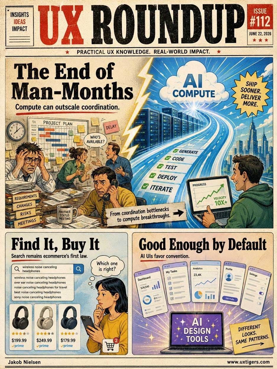
UX Roundup for June 22, 2026 (GPT-Images-2)
Dark Design Patterns Jazz
New music video: Dark Design (YouTube, 2 min.).
I tried a new approach for this song: simply showing background images instead of full B-roll animations. Let me know in the comments what you think of this style.

My newest song is a remake of my old Dark Design song with new music from Suno 5.5 and new images. (GPT-Images-2)
I made an earlier song about dark design in July 2024 (we’ve come a long way in AI media in those two years!).
See also my full article about Dark Design, including the 12 most common dark patterns.
8 Usage Patterns for Ecommerce Search
Search used to be almost the only thing that mattered on the Internet. That’s no longer the case, as users turn to AI answer engines instead of traditional search.
However, over the next 3–4 years, agentic shopping will likely grow only slowly, and users will still visit individual websites fairly frequently. These users still need support for local search on those websites.

Don’t sleep on your website’s search feature: it’s still important to help users find things. (GPT-Images-2)
Baymard Institute continues to publish excellent content about ecommerce usability. It recently released an in-depth article on how shoppers use search on ecommerce sites, based on extensive user research. The headline finding is that 46% of desktop sites and 58% of mobile sites have “mediocre or worse” search UX. Astounding since I know that I have personally championed the importance of ecommerce search since at least 1999.
In fact, my first rule of ecommerce usability has long been:

If the user can’t find the product, the user can’t buy the product. (GPT-Images-2)
Baymard presents 8 different use cases where users search in different ways. There should be one search box to rule them all, but on the backend, the website search engine must treat these searches differently and understand all these patterns on their own merits.
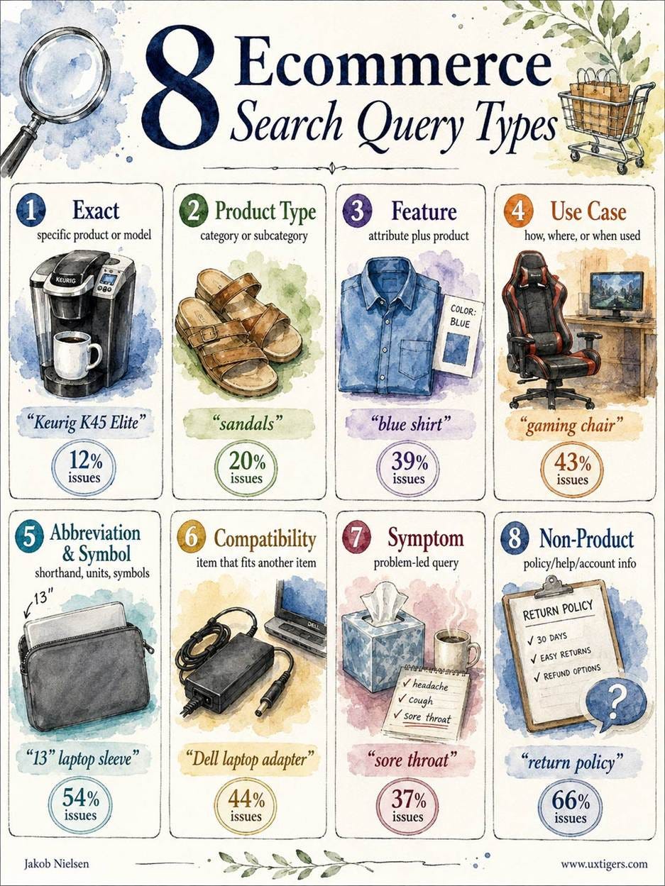
Baymard’s classification of 8 types of user queries on ecommerce sites. The numbers indicate the proportion of ecommerce vendors that have usability problems in dealing with that type of query, according to Baymard’s analysis of 170 ecommerce sites and apps. (GPT-Images-2)
Here are scenarios for these 8 query types, all drawn with GPT-Images-2:

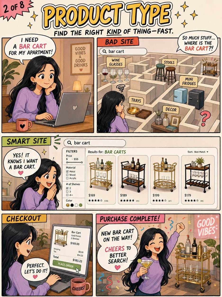




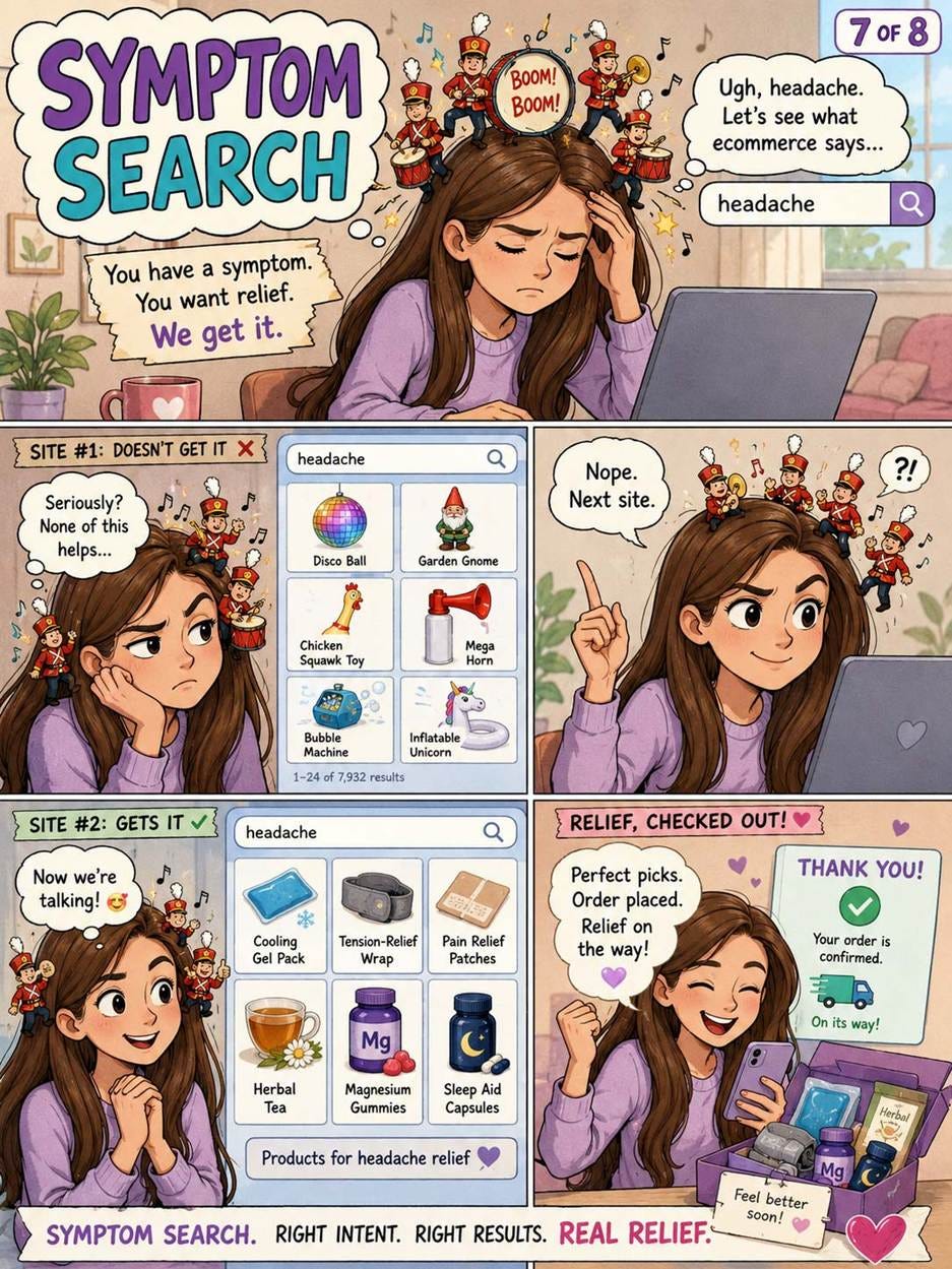
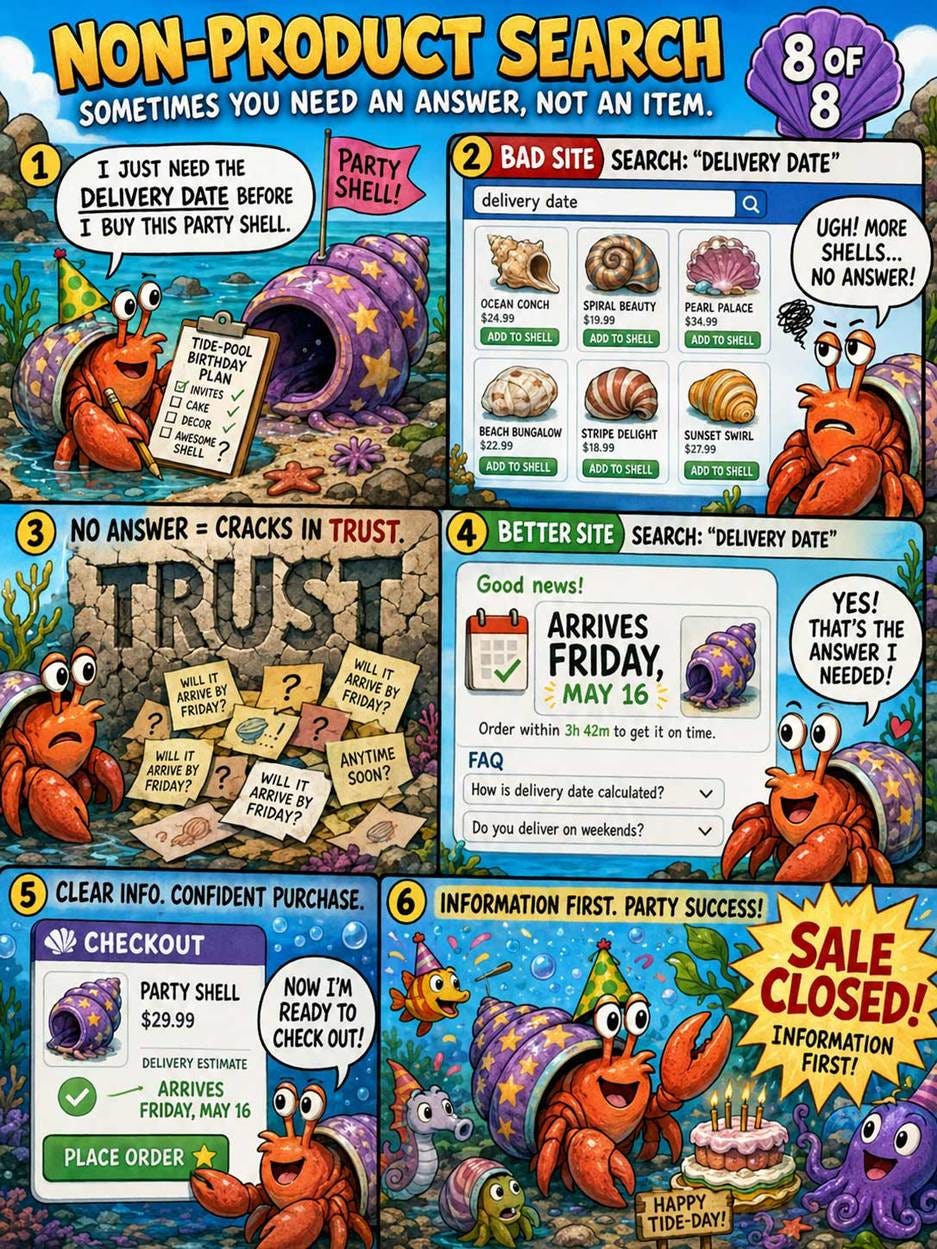
How will AI change these query patterns? I expect agentic ecommerce to dominate in the future, to the extent that there will be much fewer human visits to ecommerce sites, as people’s agents do most of the shopping for them. However, this will not eliminate the requirement to support all 8 query types, because the underlying user need will remain, whether it’s a human or an AI agent trying to satisfy it.
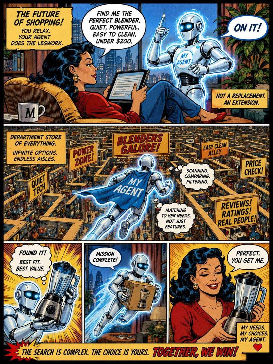
Agents will do most of the shopping in the future. (GPT-Images-2)
Queries by AI agents will likely be richer, especially for use-case and product-type searches, where the agent will know more about the user’s needs and context and provide that information as part of the query. We might easily see 1,000-word queries coming in from AI agents.
Agents also don’t tire and may be willing to spend tokens to review hundreds of products before recommending a shortlist to their user. This means we can’t just feed an agent a list of the top 10 hits.
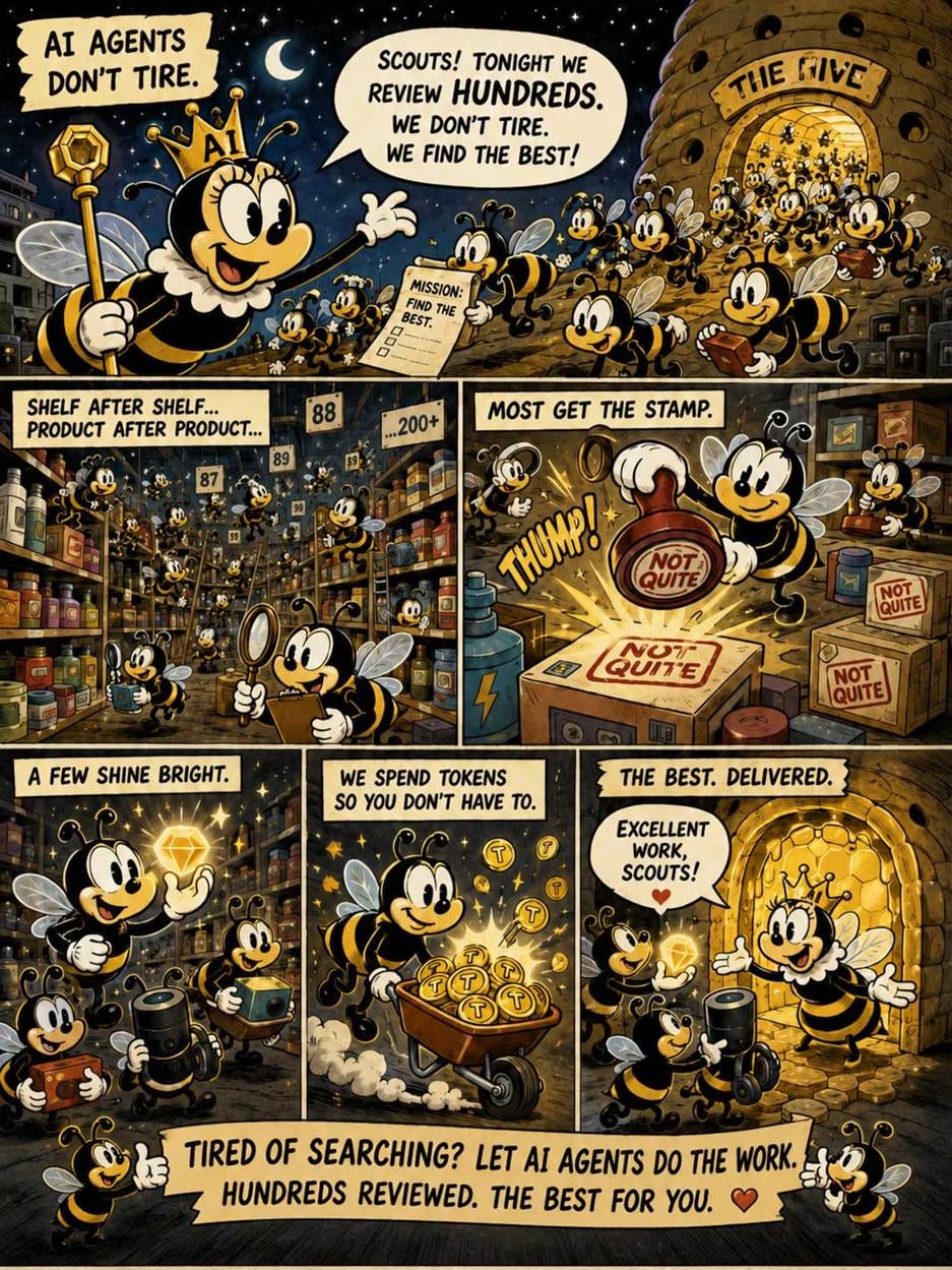
AI agents don’t tire, so ecommerce search may shift to involve much more elaborate queries with more content, and to have the agent review many more possible options than a human user would ever look at. (GPT-Images-2)

Despite the gradual move to AI-driven shopping, many sales still flow through the humble search box, so continue to give high priority to search usability for at least the next 5 years. (GPT-Images-2)
Search Traffic to Websites in Free Fall
As shown in the following chart, organic search traffic is now declining at a pace of more than one-third per year. (A 31% drop in 10 months.)
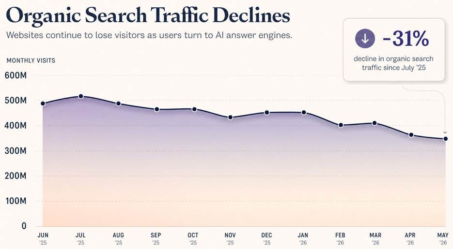
Traffic from search engines to websites tracked by Ahrefs according to A16Z.
Search still sends a lot of hits, so you can’t ignore SEO. But the writing is on the wall: GEO (generative engine optimization) will be the dominant way to pursue online visibility.
AI Defeats “The Mythical Man-Month”
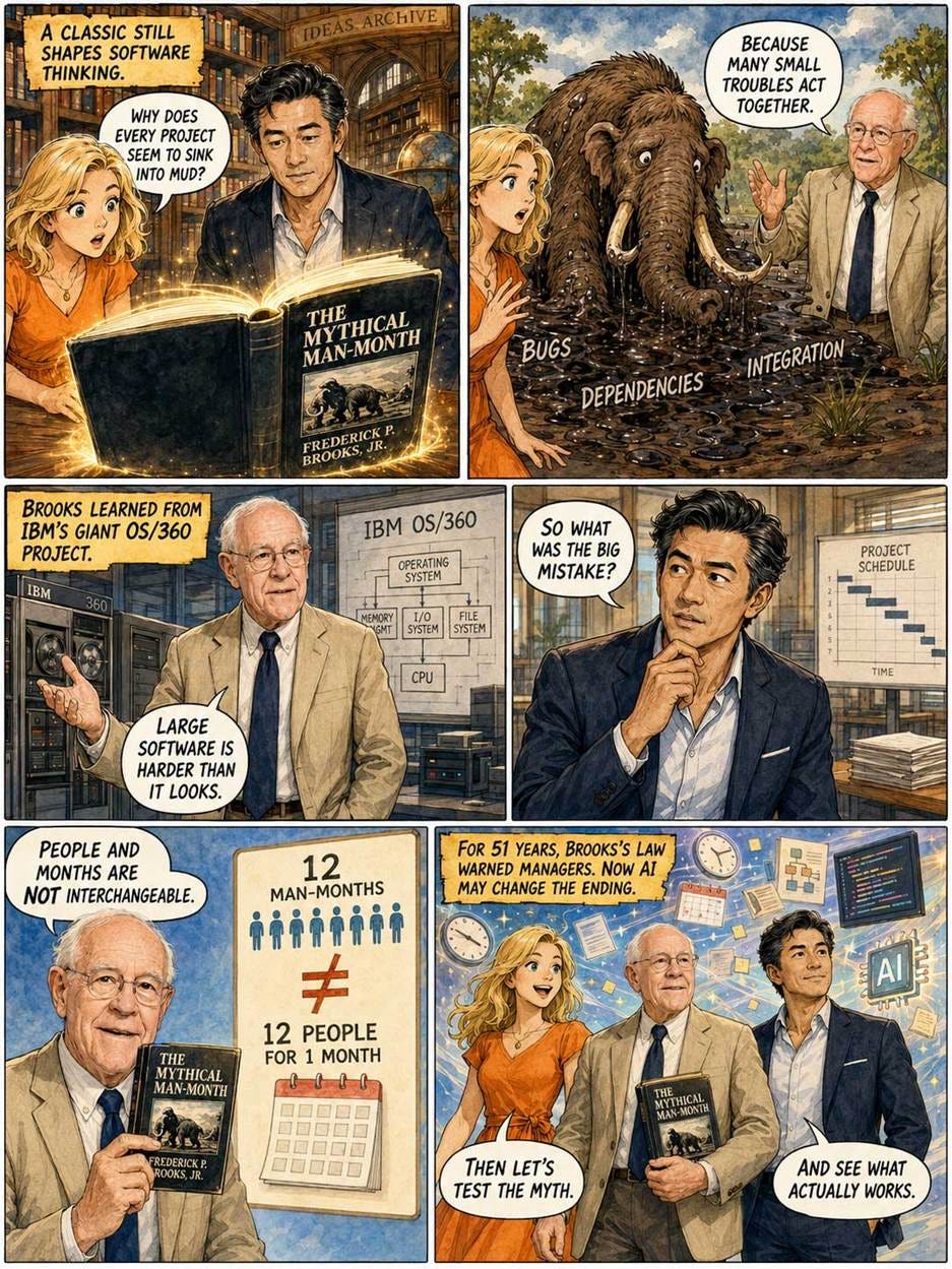
Frederick Brooks’s classic book “The Mythical Man-Month” is probably the most important book ever written about software engineering and is well worth reading today, even though it’s 51 years old, having been published in 1975.
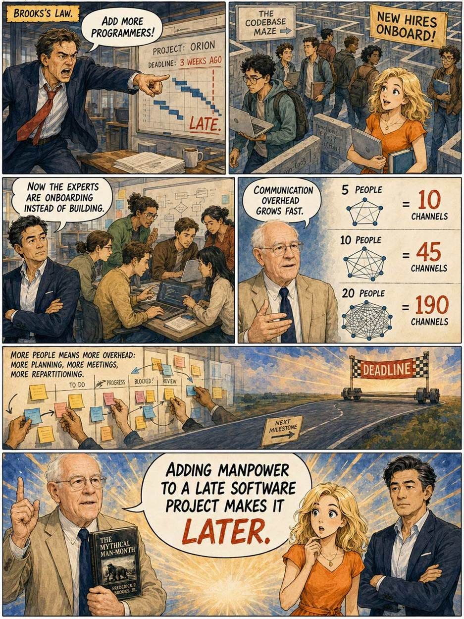
The title of the book refers to its main conclusion, which later became known as Brooks’s Law: “Adding manpower to a late software project makes it later.”
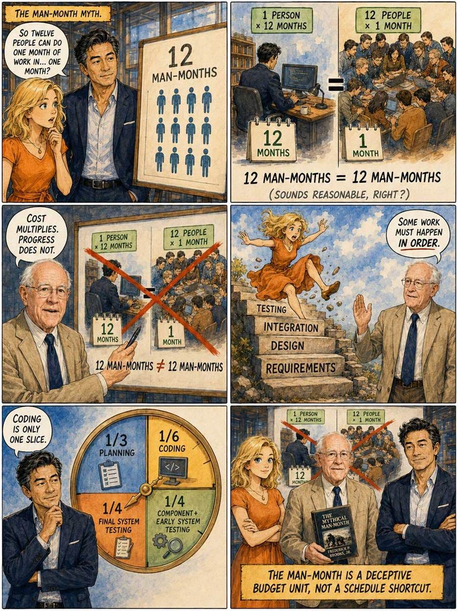
Before Brooks, the software industry based its thinking about software development budgets on the concept of man-months: one person working for one month. Thus, 12 man-months could be either one person working for a year or 12 people working for a month. In either case, the same budget, and the assumption was that both projects would produce the same software. Similarly, if a software project was behind schedule, the way to fix it was to add more staff.
The expectation was that programming would be similar to many other fields of human endeavor, where more staff does increase production. In farming, buy more land and hire more farmhands, and you grow more food. In manufacturing, add assembly lines and hire more workers, and you crank out more gadgets each day.
Brooks said no. Adding more staff will only delay your software project further, as these new people need to be brought up to speed. In general, the more people working on a software development project, the more communication and management overhead there is, and the less each person will produce. Ultimately, adding more development staff generates negative value. (That’s why the man-month is mythical: it doesn’t work for project budgeting or management.)
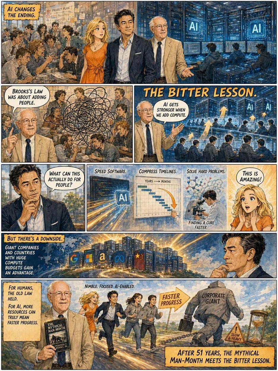
AI finally defeats this problem because of “the bitter lesson,” which was theme three in my history of AI. The bitter lesson is that AI doesn’t progress because of more clever human insight, but simply by adding ever-more compute. Every time we add compute, AI gets smarter and gets more done. This is true both for training-time compute during the development of a new AI model and for test-time compute used by reasoning models to think harder about problems.
Martin Casado from A16Z and Abhishek Nagaraj from the Haas School of Business at the University of California, Berkeley, wrote a nice overview of how AI finally defeats Brooks’s Law. With AI, we can add more resources to a project to get it done better and faster!
The implications of this insight are both good and bad, but the point holds in either case. What’s great about defeating Brooks’s Law is that we can escape the endlessly ballooning software timelines for any problem we really want solved. Just throw money at the problem by buying more compute. Is there a nasty disease we want cured? Allocate a few billion dollars in compute to solving that problem, and it will be solved by AI, if at all possible.
The negative side of defeating Brooks’s Law is that big companies and big countries get an advantage compared to small companies and small countries: if you’re big and rich, you can spend more on AI and solve your problems faster and better than your smaller competitors. In the old days, there was always a limit to how much big firms could dominate the economy, because smaller and more nimble firms could outcompete them. I still believe that small companies run in founder mode will defeat legacy behemoths, which seem incapable of embracing AI fast enough to benefit from the bitter lesson.
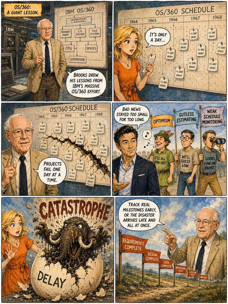
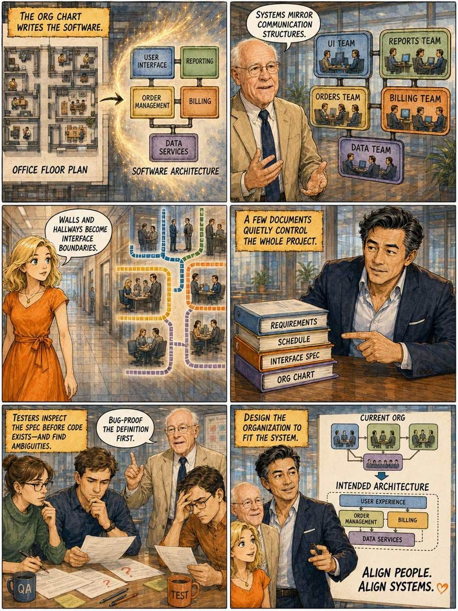
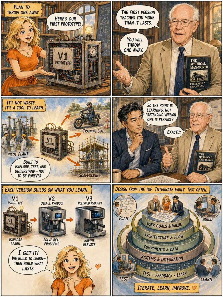
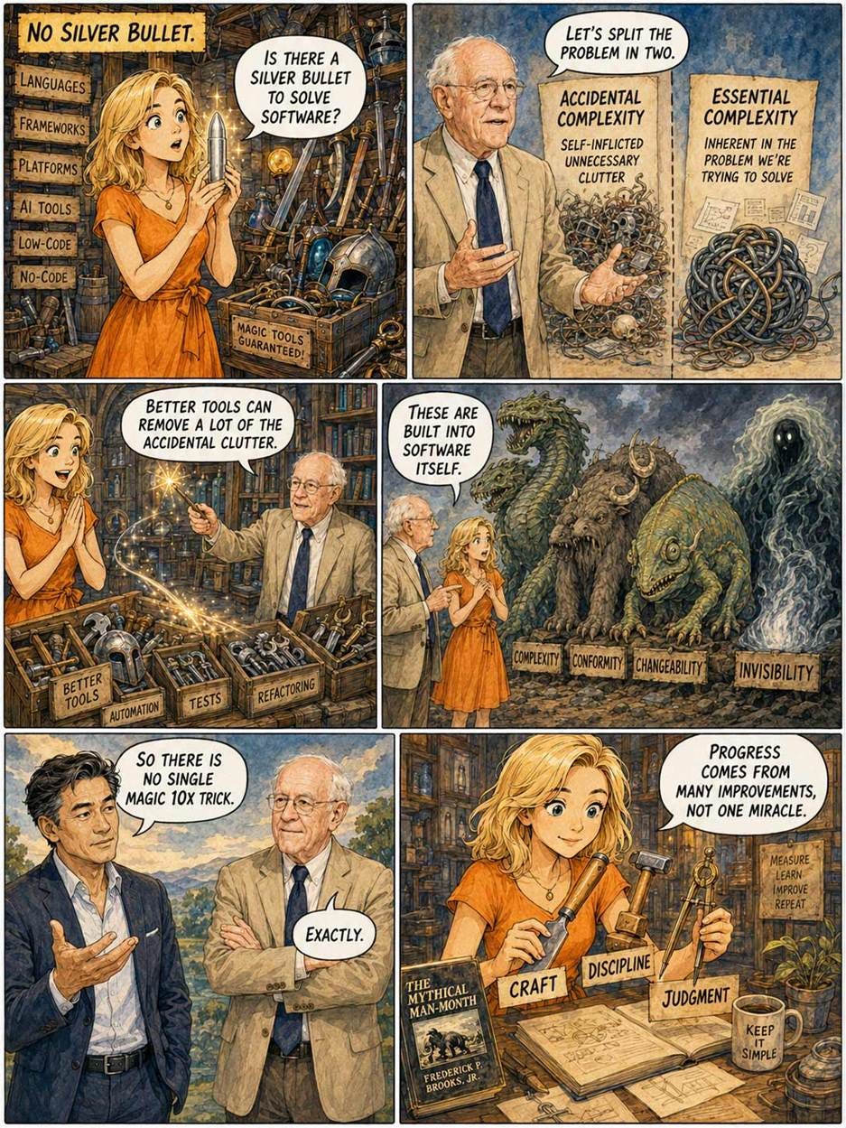
Here is a comic strip I made with GPT-Images-2 about The Mythical Man-Month and AI, reusing my characters Alice and Zimo from my AI History comic book in a slightly different cartooning style:



AI Does Well as a UI Designer vs. Human Designers
Many AI tools can now generate user interface designs. But how good are these designs, especially compared to UIs designed by human designers? In “Usable but Conventional: An Empirical Study on the UX of AI-Generated Interface Prototypes,” Karoline Romero and colleagues from Brazil offer a compelling and data-driven answer: AI is remarkably good at creating highly functional, usable interfaces, but it currently struggles to produce anything wildly original or emotionally engaging.
The authors put 5 AI UI-generating tools to the test, including most of the leading models: Stitch, Uizard, Figma with UX Pilot, Lovable, and Magic Patterns. Each AI generated one design, and these solutions were then compared with 5 human-designed user interfaces. The prototypes were shown without revealing authorship, and 92 participants evaluated all 10 with the UEQ-S survey instrument.
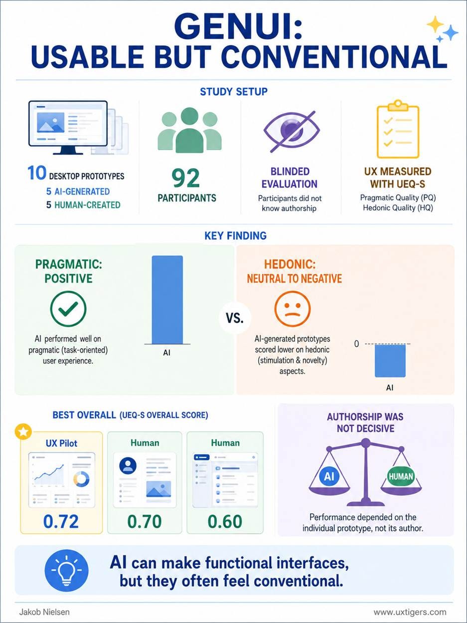
Study overview. (GPT-Images-2)
My main critique of this study is that design quality was evaluated through a user survey rather than by measuring actual user performance. We know people tend to like designs that work well, so satisfaction scores approximate usability but are not a true measure.
The core finding is simple: humans vs. AI mattered less than the specifics of each design. AI did not reliably beat humans, and humans did not reliably beat AI. Both kinds of prototypes appeared among the better and worse results. Prototype F, generated with Figma/UX Pilot, had the highest overall score at 0.72, followed closely by a human-designed prototype that scored 0.70. (A third human design won bronze with a score of 0.60.) UEQ scores range from -3 (worst) to +3 (best), with 0 being a neutral answer, so 0.72 and 0.70 represent respectable UI quality, but not truly stellar design.
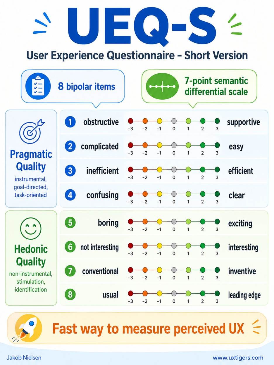
The shortened version of UEQ, UEQ-S, has 8 questions. (GPT-Images-2)
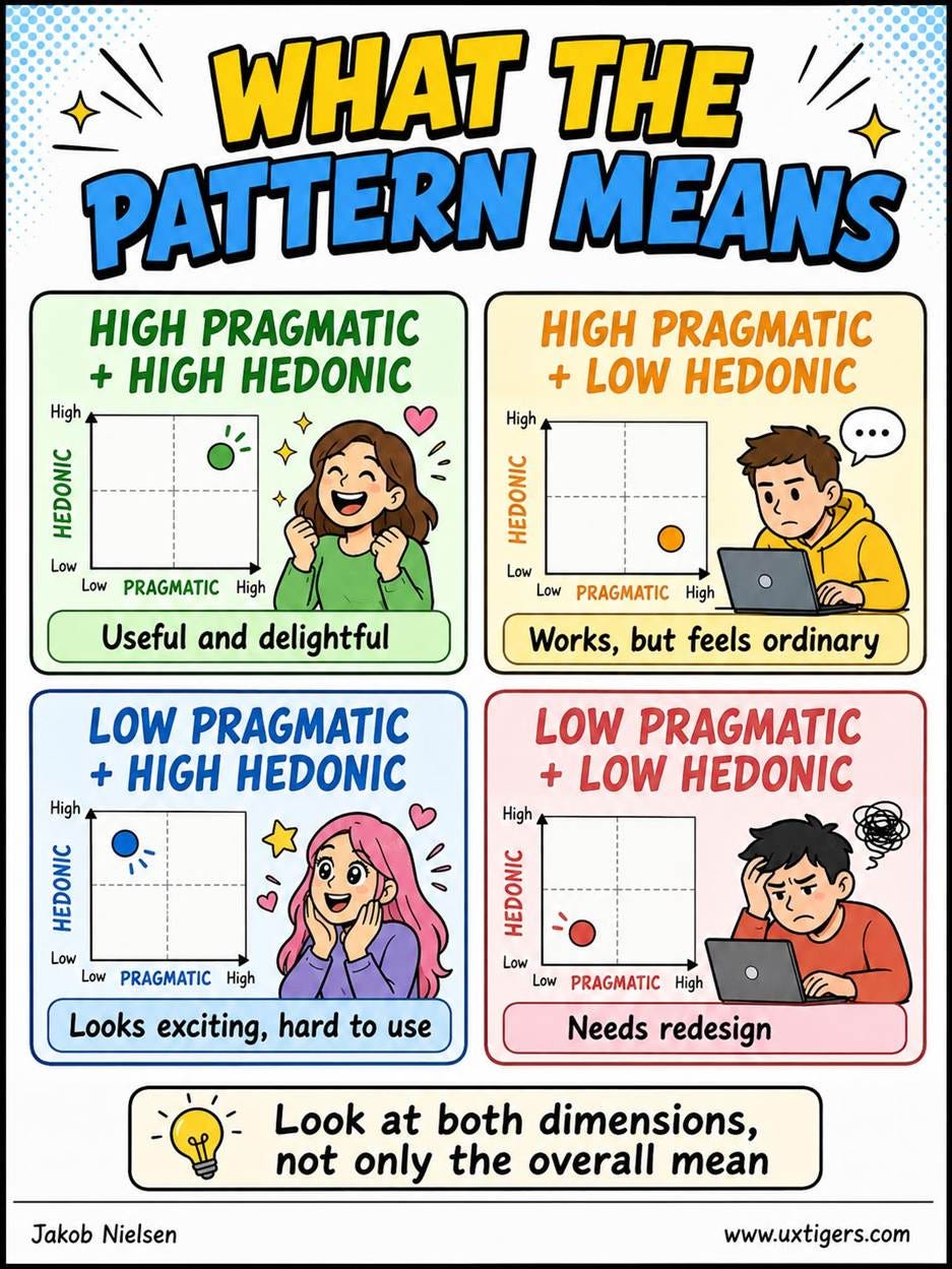
How to interpret UEQ scores. (GPT-Images-2)
Looking at the two winning designs, the top overall AI design (from Figma) had a pragmatic score of +1.1 and a hedonic score of +0.3. In other words, users found it fairly easy to use but not very exciting (though not actually boring). The top human design had a pragmatic score of +1.6, so considered somewhat easier to use than the AI design, but a hedonic score of -0.2, meaning that it was a little boring and definitely more boring than the AI design.
Averaged across all 5 AI designs, the average pragmatic score was +1.0, and the average hedonic score was -0.2. Current AI tends to generate conventional solutions, driven by its training data.
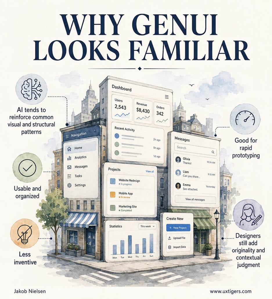
AI user interface designs currently look very conventional because the AI models have internalized the main usability guidelines and been trained on earlier designs already on the Internet. (GPT-Images-2)
However, one practical difference between humans and AI as designers is that it’s cheap to get multiple AI designs, but expensive to get many human designs. Thus, the average quality of AI design matters less than the quality of the best AI design. (Assuming that you are able to pick the best AI design to implement, based on either usability data or superior UX judgment, which is not as common as you might expect.)
In this way of thinking, AI already beats human designers, at least according to the data from this study.
I caution against interpreting this study as proving that Figma’s AI-generated user interface designs are the best, even though Figma’s UX Pilot received the highest score. Usability depends on the tasks and the users, and it is very likely that other AI tools would score better in other case studies.
Many discussions of AI design tools are seduced by the wrong question: “Can AI be creative?” A better industry question is: “Can AI reliably produce a usable first version that a design team can improve?” On that question, the answer is already yes. If you place a high value on hedonic scores, such as an innovative expression of your brand, then the current AI design tools won’t deliver a satisfying final solution, but they will likely create a workable initial prototype with decent usability that human designers can then improve.
The finding that GenUI prototypes are conventional should be interpreted through Jakob’s Law, which states that users spend most of their time on other sites and therefore expect a new site to work like the sites they already know. The same principle extends beyond websites to mobile apps and newer interaction styles, including AI-driven interfaces. When old interaction elements cross into new technologies, their behavior should remain familiar unless there is a compelling reason to change it.
This is why “conventional” is not an insult in commercial UI design. For a museum installation, novelty may be a goal. For a banking dashboard, medical workflow, checkout flow, enterprise procurement system, or AI productivity tool, novelty is usually a cost. Every unfamiliar control taxes the user’s memory, increases training requirements, slows task completion, and raises the probability of errors. Users arrive at a product with a job to do, not yearning to admire the designer’s originality.
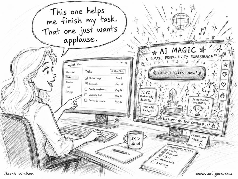
For many practical design projects, helping users accomplish their tasks is more important than impressing them with creativity. (GPT-Images-2)
This principle will become more important as models improve. Future GenUI systems will not merely generate static screens from prompts. They will generate working flows, adapt layouts to user intent, tailor explanations to expertise, incorporate brand and design-system constraints, produce production-ready code, and adapt the UI to each individual user. The temptation will be to make every interface fluid, dynamic, and “magical.” The better direction is not arbitrary novelty, but contextually appropriate conventionality: familiar structures adapted to the user’s task, role, history, device, permissions, and momentary intent.
A more capable GenUI system should ask: What is the user trying to accomplish? Which familiar pattern best supports that intent? What information can be omitted, delayed, summarized, or prefilled? Where does the AI need to show its work? Where does the user need control, undo, comparison, or confirmation? In this future, the UI may be generative, but the usability standards must become stricter, not looser.
Designers working in industry should take five actions now. First, make AI-generated prototypes a normal part of early ideation, but generate several alternatives rather than blessing the first plausible output. Second, feed GenUI tools with product constraints: design-system rules, accessibility requirements, domain vocabulary, user roles, known failure modes, and examples of approved patterns. Third, evaluate AI-generated interfaces with task-based usability testing, not screenshot admiration. The study’s own limitation is important: participants evaluated static prototypes, while engagement and stimulation often emerge during interaction.
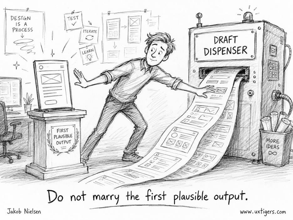
Getting many alternative UI designs from AI is cheap. In most cases, you should also consider subscribing to multiple generative-UI tools, so that you can work from an even wider range of design ideas. AI subscriptions cost far less than human staff, so AI expenses are strongly leveraged. (GPT-Images-2)
Fourth, separate pragmatic and hedonic evaluation. A prototype that is clear but dull may be excellent for enterprise workflow software and insufficient for a consumer product that competes on delight. Conversely, a visually exciting AI interface that violates familiar patterns may be commercially dangerous. Fifth, define an “innovation budget” for each project. Decide which parts of the interface must follow convention, which may be adapted, and which few moments deserve invention.
The Story of Ada, Countess of Lovelace
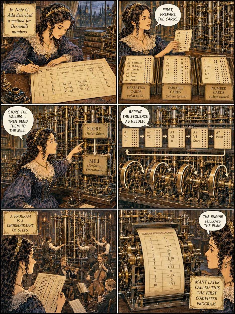
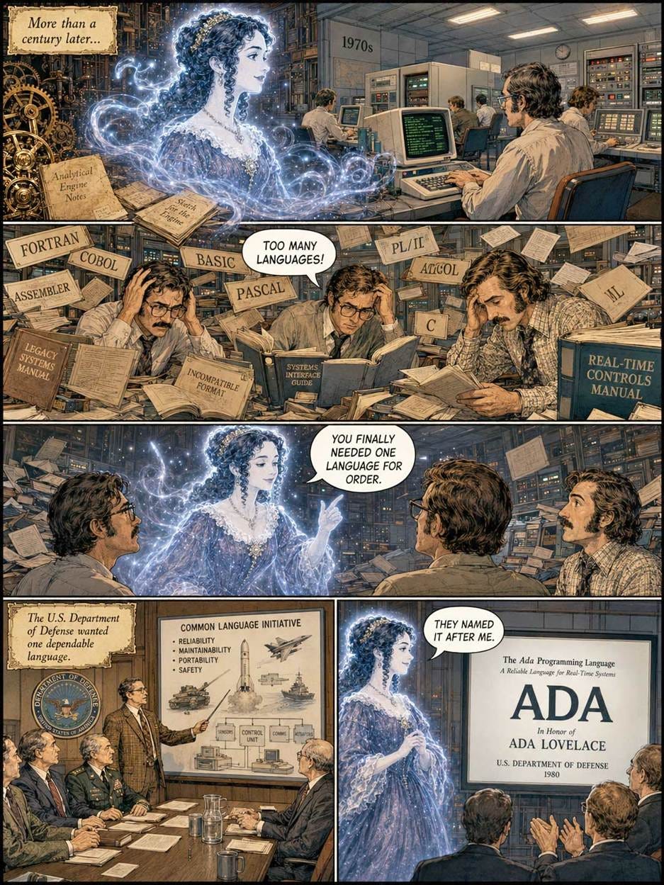
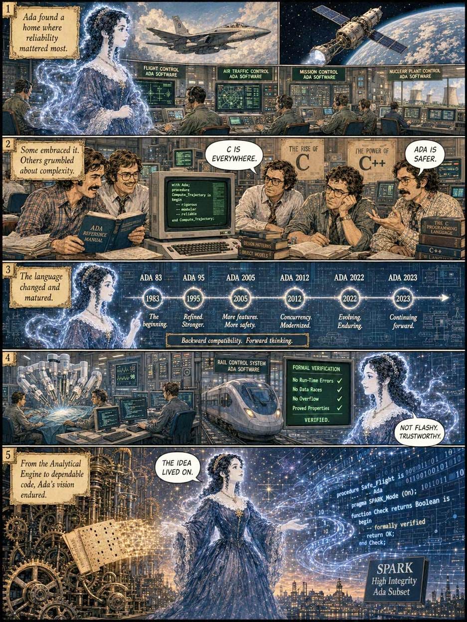
The Right Honourable Augusta Ada King, Countess of Lovelace (informally called Ada Lovelace), was an English noblewoman and the daughter of the famous poet Lord Byron, who played a small part in the history of artificial intelligence. However, she played a bigger part in the history of computing, as told in this comic strip (made with GPT-Images-2):


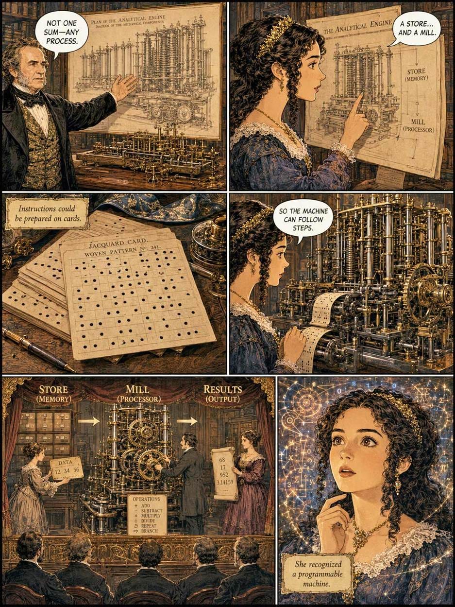
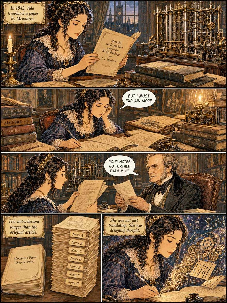



Europe 2031: How AI Might Play Out in the EU
Very interesting scenario titled Europe 2031, written by a broad team of European experts, mapping out a plausible future for the EU and AI from now until 2031. I hope things don’t turn out the way they describe, but the scenario is plausible.
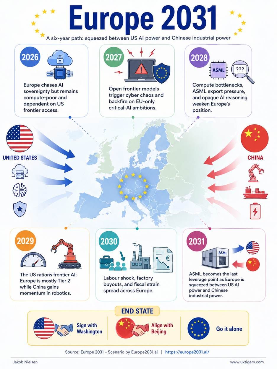
The scenario assumes the EU is paralyzed by slow decision-making, dependence on legacy companies, burdensome union rules, and stifling regulations, meaning that it can’t build power plants and AI data centers at nearly the required pace to stay on top of AI advances. This is predicted to be true even after leaders such as the French President and the German Chancellor recognize the urgency of AI. You may or may not agree, but given the inability of almost all European countries to address major challenges over the last decade, I find it plausible that EU investments in AI infrastructure will prove too little, too late. (My own native country of Denmark and its neighbor Sweden have been partial exceptions to EU paralysis, but are too small to make a difference.)
The scenario depends on two expected developments that I had not considered before:
First, access to the absolutely newest and largest frontier models is necessary for cybersecurity, since the best AI is the only way to defend against the Mythos-level AI models’ abilities to discover and execute cyberattacks. Because of the strategic security implications of the highest-end AI, the US government will reserve access to these models for some time after they are developed, thus locking the EU out of the ability to defend itself against cyberattacks. This again crushes the European economy as AI-driven cyberattacks become magnitudes worse than anything we have experienced before.
Second, even though the US will have 10x the EU’s AI compute in this scenario, it proves to be too little for the desired use of AI to defend the country and build the economy. As a result, the US government institutes rationing of access to frontier AI from other countries. This means that the EU economy and safety suffer even more, since it has not been able to build sufficient homegrown compute.
Both of these predictions portray the US government as the bad guy who’s looking out for its own interests at the expense of foreigners. What can I say, the scenario was written by a bunch of Europeans. But they may not be wrong. The US government has already instituted “export controls” prohibiting foreigners from using Anthropic’s Fable 5 model. It also has an executive order reserving access to the most advanced AI for itself for a month before public release, and it’s plausible that this period could be extended in the coming years, as advanced AI becomes essential for national security and defense against crippling cyberattacks.
Same for compute rationing. We saw during Covid how many countries prohibited the export of even minor items like facemasks, aiming to protect their own citizens at the expense of foreigners. Quite plausible that countries will treat AI compute the same way, since plentiful advanced AI will be the only way for an economy to survive.
Now that SpaceX is worth $2 trillion, it will presumably proceed with its plans to build 100 TW of orbital compute, but such greatly expanded capacity won’t arrive in time to avoid the “Europe 2031” scenario. We still need full speed ahead on orbital compute because we will need it by 2040 to avoid even worse AI rationing than predicted in the scenario.
How to avoid the “Europe 2031” scenario from coming true?
The most likely option is to hope for the US government to be benevolent instead of prioritizing its own strategic interests and its own citizens’ living standards. However, hope is not a strategy.
The best option is to locate a time machine and return to 2022 and start a crash program to build out European compute and electricity generation. However, time machines are hard to come by.
The fallback option is to start the crash build-out now, recognizing that it won’t be enough by 2031, but at least it will save them by 2035.
Virtual Girlfriends and Boyfriends Used Twice as Much as Dating Apps
We haven’t heard much about AI companions recently, but in the past they have often ranked among the main consumer application categories for AI. Justine Moore (my favorite venture capitalist) apparently still tracks this space, because a few days ago she posted that AI Companion apps now have more than twice the usage of Dating apps. (In the U.S. alone, users spent 700 million hours in Q1 with their virtual girlfriends/boyfriends and only 300 million hours on dating apps.)

AI companion apps are now used twice as much as dating apps. (GPT-Images-2)
This data serves as a powerful reminder of the need to pay attention to what users do and not just what they say, since few people will come clean about their relationships with AI companions.
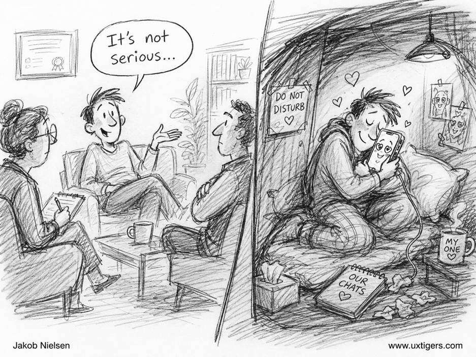
Lesson number one about user research: don’t rely on self-reported data. What people say and what they do often differ. (GPT-Images-2)
Data Visualization Design Job Openings
Epoch AI has job openings for a Senior Product Designer and a Product Designer, with both positions being remote (North/South American time zones preferred).
These two roles focus on designing visualizations and dashboards for complex research data.
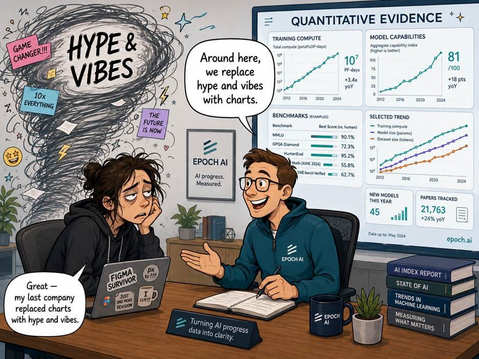
Epoch AI does a great job collecting data about AI trends. They are now hiring designers to make this complex data easier to understand. Even better! (GPT-Images-2)
Epoch AI is a multidisciplinary research institute that curates and analyzes data on AI progress in order to explain how the technology is developing and what its economic and societal implications might be. Founded in 2021 as a volunteer effort to rigorously track metrics such as training compute and model capabilities, it now produces empirical reports, models, and visualizations that aim to replace “hype and vibes” with quantitative evidence on AI trends. Its work focuses on identifying the driving forces behind advances in AI, benchmarking and forecasting capabilities, and making these findings accessible to policymakers, researchers, and the broader public to support more informed decision-making about the technology’s future.
Epoch AI is best known for its empirical work on training compute trends and AI scaling, which helped establish the now widely cited estimate that compute used in frontier AI training runs has grown by roughly 4–5× per year, with costs and power use rising in tandem. Closely related are their public databases of AI models and capabilities, now tracking thousands of systems and dozens of benchmarks, which are frequently used by policymakers, labs, and analysts to ground claims about AI progress in systematically collected evidence.
About the Author
Jakob Nielsen, Ph.D., is a usability pioneer with 43 years experience in UX and the Founder of UX Tigers. He founded the discount usability movement for fast and cheap iterative design, including heuristic evaluation and the 10 usability heuristics. He formulated the eponymous Jakob’s Law of the Internet User Experience. Named “the king of usability” by Internet Magazine, “the guru of Web page usability” by The New York Times, and “the next best thing to a true time machine” by USA Today.
Previously, Dr. Nielsen was a Sun Microsystems Distinguished Engineer and a Member of Research Staff at Bell Communications Research, the branch of Bell Labs owned by the Regional Bell Operating Companies. He is the author of 8 books, including the best-selling Designing Web Usability: The Practice of Simplicity (published in 22 languages), the foundational Usability Engineering (30,807 citations in Google Scholar), and the pioneering Hypertext and Hypermedia (published two years before the Web launched).
Dr. Nielsen holds 79 United States patents, mainly on making the Internet easier to use. He received the Lifetime Achievement Award for Human–Computer Interaction Practice from ACM SIGCHI and was named a “Titan of Human Factors” by the Human Factors and Ergonomics Society.
· Subscribe to Jakob’s newsletter to get the full text of new articles emailed to you as soon as they are published.
· Read: article about Jakob Nielsen’s career in UX
· Watch: Jakob Nielsen’s first 41 years in UX (8 min. video)
Sorry, but I can’t really focus on the UX content here.
The image choices take over my attention, and this is not just about this one post. I keep seeing the same pattern across the newsletters: visually patchy images with no clear thread, combined with a surprisingly narrow and at times sexist portrayal of women.
Men are shown across different ages, roles, and levels of authority. Women are mostly young, conventionally attractive, aestheticized, decorative, emotional, or positioned in relation to men. The lack of diversity is also hard to ignore.
For UX content, this matters. Visuals are part of the user experience too. If the image curation repeatedly makes some readers feel reduced or excluded, it weakens the credibility of the content.
Unless this improves, I will probably unsubscribe. At this point, the visuals mostly make me irritated rather than engaged with the UX arguments.