UX Roundup: 10 UX Insights | Dark Design | Y Oslo | Low-Latency Voice | Movie Posters | Hero Videos
Summary: Top 10 foundational UX insights | 76% of online services use dark design patterns | Jakob goes to Oslo | Low-latency voice communication from the new Moshi AI model | Posters for “User Testing, the Movie” | Using video as hero images in social media posts
UX Roundup for July 12, 2024. (Ideogram)
Top 10 Foundational UX Insights
My ADPList keynote on the “10 Foundational UX Insights” can now be watched on YouTube.
Keynote summary: UX has come a long way since its early beginnings at Bell Labs in the 1940s. As we enter Year 2 of the AI revolution, it’s clear that the core principles of UX design are not being replaced but are evolving with AI integration. This journey through the 10 foundational insights of UX reminds us that while “there's nothing new under the sun,” the way we apply these insights is constantly changing. By embracing AI as a tool for enhancing these time-tested principles, we can create more personal user experiences than ever before. Let’s honor the past as we design for the future, ensuring that the essence of UX — empowering humans while making technology subservient — remains at the heart of everything we do.
A key takeaway from the talk is the cumulative nature of UX insights. Rather than superseding one another, new discoveries build upon and complement existing knowledge. This cumulative effect results in an ever-expanding toolkit for UX professionals, enabling them to create increasingly sophisticated and user-friendly designs. My keynote emphasized the importance of mastering both foundational and cutting-edge UX principles to achieve great design.
Alita Joyce from Google expertly moderated the session. As always, she was great at transforming the audience chat into insightful questions, so keep watching to the end for the Q&A section!
In UX, there’s nothing new under the sun in the sense that all our big old insights still hold sway. And yet, we keep discovering new big UX insights every five years or so. (Midjourney)
While on the topic of ADPList, which hosted my keynote: it’s currently the organization doing the most good for the world’s UX community and the best place to improve your design skills and grow your career. They currently have a job opening for a Marketing Lead. This is a remote, worldwide work-from-anywhere job.
76% Of Online Services Use Dark Design Patterns
An analysis across 26 countries of 642 websites and mobile apps offering subscription services found that 76% used dark design patterns. Even worse, 67% of the services used multiple dark design patterns. (9% used a single dark design pattern, and 24% didn’t use dark design — or at least, the inspectors didn’t find any.)
The International Consumer Protection and Enforcement Network (ICPEN) conducted the analysis between January 29 and February 2, 2024. (See the report on their website: 3-page PDF file.) ICPEN is a group of consumer protection law enforcement agencies founded in 1991 at Denmark’s Consumer Ombudsman initiative. Current membership still includes the Danish Ombudsman, plus the FTC in the United States, the Competition and Markets Authority in the UK, India’s Department of Consumer Affairs, and the E.U. Directorate-General for Justice and Consumers as an observer (since each E.U. country is a direct member).
The most common dark design patterns in this study included:
Drip pricing: adding new non-optional charges to the price right before completing a purchase.
Subscription traps: automatically renewing a subscription after a free trial without consent.
Sneaking: the inability of the consumer to turn off a subscription’s auto-renewal within the purchase flow. A whopping 81% of subscription sites featured this particular dark design pattern.
False hierarchy: visually presenting unfavorable (to the user) options more prominently.
See also:
My overview of the 12 most common dark design patterns that were outlawed in India.
My music video about dark design — for a lighter take on this dark topic.
Subscription traps and other dark design patterns are much too common, according to a new international analysis of 642 websites and apps. (Ideogram)
Jakob Goes to Oslo
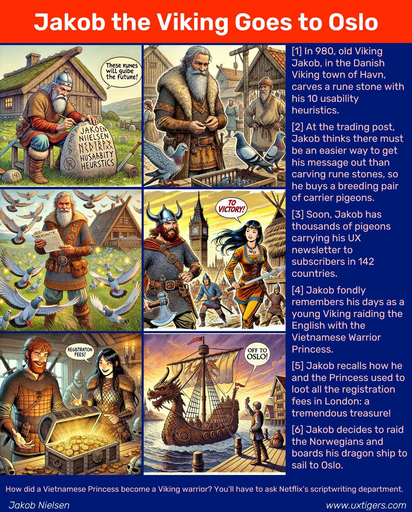
I’m rediscovering my Viking heritage and raiding Oslo. I have a plenary session at the Y Oslo conference on October 30-31. This is Norway’s leading UX conference — possibly even the biggest in Scandinavia.
I was planning to wait and announce this closer to the event, but they are already almost sold out of tickets for in-person attendees, filling the main Oslo concert hall to capacity. (You can also attend remotely, and since most of the sessions are in English, this is a good opportunity for anybody to get an injection of UX goodness. They have an exciting speaker lineup.)
Use the discount code JAKOBY to save 25% on both physical and digital tickets.
Here’s a comic strip about my raiding days (ahem, my conference speaking experience):
Comic strip made with Umesh’s Story Illustrator GPT. Yes, I know Viking helmets didn’t have horns (horned helmets were used in Denmark around 900 BC, almost 2,000 years before my story), but AI thrives on stereotypes. Panel 1 shows a realistic helmet, whereas Panel 4 features a fantasy helmet.
8 People, 6 Months = Low-Latency Voice Mode
French AI Lab Kyutai has launched Moshi, a new voice assistant capable of expressing 70 different emotions and styles. Moshi supports real-time voice conversations with minimal latency. The English version of its AI-generated voice sounds natural and very expressive. However, the underlying conversation model is not very capable: when I tried to talk with Moshi, it sounded great, but the actual conversation was inane — and quickly degenerated into absurdity. Moshi would probably be better off using Mistral, Falcon, or Claude as its backend, though these AI models might currently not provide sufficiently low latency to support the super-fast Moshi UI.
Smooth real-time voice conversation by the French Moshi model. Impressively low latency, but absurd content. (Leonardo)
What’s more impressive is that this new voice model was reportedly developed by 8 people in 6 months. An example of the SuperTeam performance I discussed recently. When a team has only top 0.01% staff and is kept small and free of management overhead, it can accelerate with AI support and ship at lightspeed. (Impressive that such a high-speed team is found in Europe, notorious for lagging behind in AI. However, Mistral is also French and is one of the most impressive LLM projects. Classic French elitism may have a modern-day revival.)
France led the world in balloon technology. Now, it leads Europe in AI. (Midjourney) Yes, I know that the Eiffel Tower was built a hundred years after the first French balloon experiments, but you can’t draw Paris without its iconic tower — or at least Midjourney can’t.
Movie Poster
Here’s an idea that’s probably mostly useful for team building or as a fun slide when introducing a project in an all-hands meeting. Make a movie poster with a title that relates to the project or team mission and list key people as the stars. The prompt can be ultra-simple as seen by the examples below. All you need to do is select between portrait and landscape formats, both of which can be interesting.
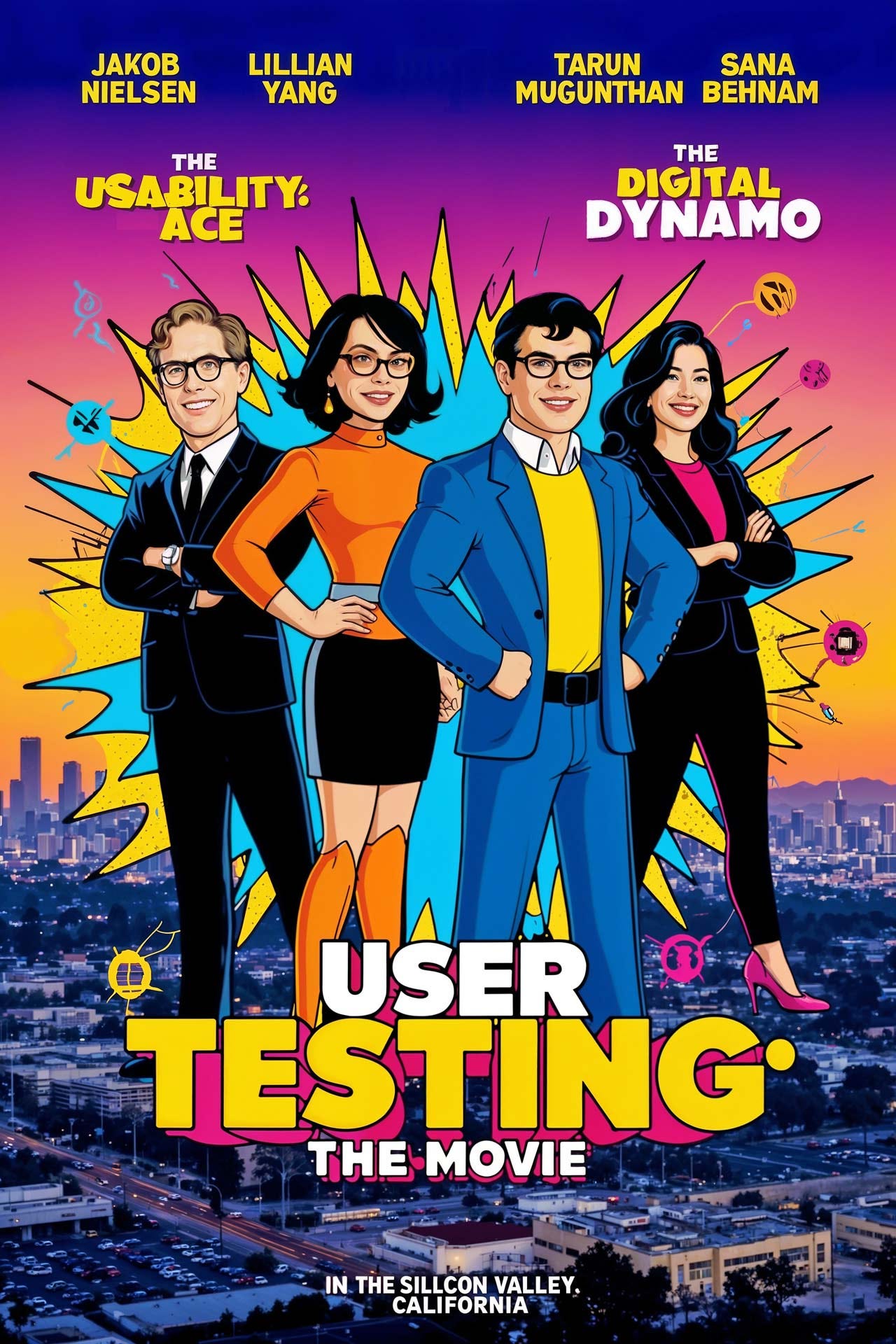
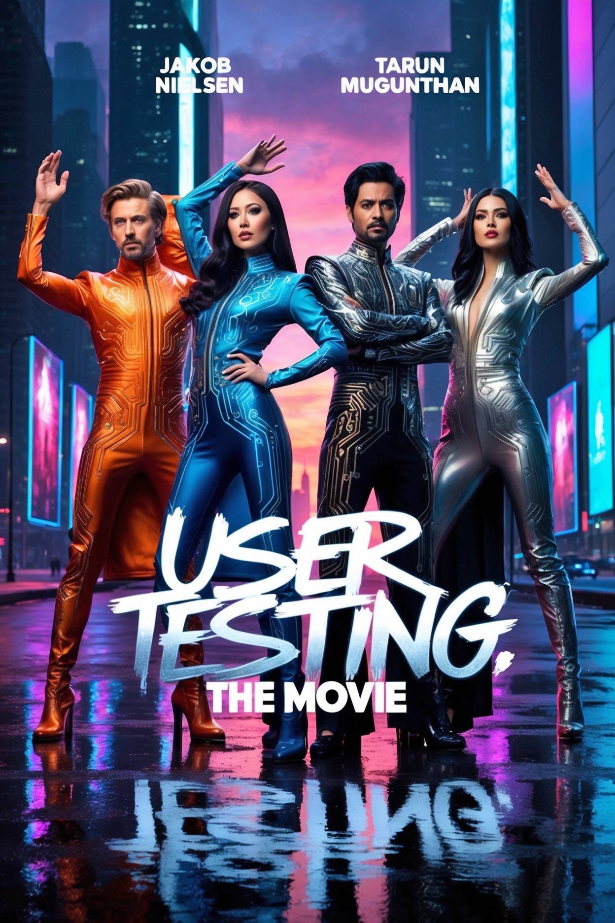
Here are two posters I made with Leonardo to help promote my recent interns Sana Behnam, Tarun Mugunthan, and Lillian Yang:
Prompt for both posters: Movie poster for a film titled "User Testing: the Movie" starring "Jakob Nielsen" "Lillian Yang" "Tarun Mugunthan" "Sana Behnam". I wish I still had as much hair as the ‘Jakob’ in these posters, and I’ve never seen Tarun or Sana wear eyeglasses.
Character consistency is not currently good enough to depict actual people in the posters, so the more cartoonish styles may work better for now. For the portrait-format poster, I used Leonardo Phoenix’s built-in “Graphic Design Pop Art” preset style.
I can’t help but show you one more movie poster from Leonardo, which I love because of the computer-circuit superhero costumes it gave us. Of course, I don’t like that it forgot to render the names of two of my costars in this poster. On the other hand, in most of the posters, Leonardo got the sex right and ethnicity approximately right for all 4 “stars,” based purely on our names. (It can’t know that it’s a long time since I had blond hair, let alone a full head of hair.)
Once image-generating AI improves character consistency and can use uploaded portraits correctly when generating multiple characters, such pretend movie posters will be a killer. Whatever style you want, you can get it. I didn’t prompt for specific movie genres, but I recommend you experiment with them as a next step.
Compare these nice posters with the miserable movie poster I got a few months ago, the first time I tried to make a poster for “User Testing, The Movie.” AI is improving by leaps and bounds.
Using Video as Hero Images in Social Media Posts
I have experimented with using short AI-generated animations as the hero images when posting announcements of my new newsletters on LinkedIn. See 4 examples that I uploaded to my Instagram channel:
Subtle animation of an infinity symbol to signify the potential for future UX improvements.
Music video about the future of education in the age of AI (on YouTube)
I am ashamed to admit that these animated hero images generate about 3-4 times the social-media traffic as my traditional postings with still images. Even though some of these animations are nice enough, I don’t like how they intrude on the user’s visual perception. (That’s, of course, why they attract eyeballs.)
Now that AI has made it incredibly easy to animate anything, I expect social media to be flooded with animations. Why publish an image when an animation gets much more traffic and takes a minute to make in Luma or Runway?
However, once social media is fully polluted with animations, they’ll lose much of their effectiveness, so I hope we’ll soon return to a calmer user experience.
Hijacking eyeballs through animated hero images on social media postings. I hope this is a temporary phase. (Midjourney) — Just to prove my point, it took me 15 seconds of user time (plus a minute of response time delay) to create an animation of this image, using Leonardo’s image-to-video feature.
About the Author
Jakob Nielsen, Ph.D., is a usability pioneer with 41 years experience in UX and the Founder of UX Tigers. He founded the discount usability movement for fast and cheap iterative design, including heuristic evaluation and the 10 usability heuristics. He formulated the eponymous Jakob’s Law of the Internet User Experience. Named “the king of usability” by Internet Magazine, “the guru of Web page usability” by The New York Times, and “the next best thing to a true time machine” by USA Today.
Previously, Dr. Nielsen was a Sun Microsystems Distinguished Engineer and a Member of Research Staff at Bell Communications Research, the branch of Bell Labs owned by the Regional Bell Operating Companies. He is the author of 8 books, including the best-selling Designing Web Usability: The Practice of Simplicity (published in 22 languages), the foundational Usability Engineering (27,123 citations in Google Scholar), and the pioneering Hypertext and Hypermedia (published two years before the Web launched).
Dr. Nielsen holds 79 United States patents, mainly on making the Internet easier to use. He received the Lifetime Achievement Award for Human–Computer Interaction Practice from ACM SIGCHI and was named a “Titan of Human Factors” by the Human Factors and Ergonomics Society.
· Subscribe to Jakob’s newsletter to get the full text of new articles emailed to you as soon as they are published.
· Read: article about Jakob Nielsen’s career in UX
· Watch: Jakob Nielsen’s 41 years in UX (8 min. video)


