Summary: Jakob Nielsen has worked in user experience since 1983. Much has changed, including his own journey from academia to practice, but the mission remains the same: to make computers suitable and pleasant for humans.
I started working in user experience in 1983 — 41 years ago at the time of this writing. People often ask me why and how I got into usability. For the full story, we have to go back much further.
I Was a Space Age Baby
All the world’s newspapers carried the same headline the day I was born. No, it was not “Future Usability Guru Born in Copenhagen.” It was “Soviet Union Launches World’s First Artificial Satellite.” I was born just after the launch of Sputnik and the start of the space race. At the time, everybody thought they were living in the Space Age. Computers existed but were called “electronic brains” and took up entire rooms.
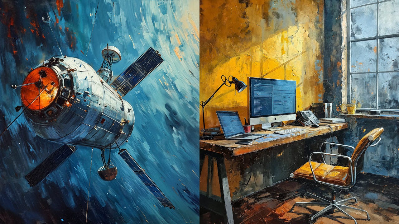
Today, even though satellites are essential for GPS and weather forecasting services, nobody will say we live in the space age. To pick one word to characterize the current era, most people would probably say that we live in the Computer Age, though maybe that’ll soon change to the AI Age.
Space Age or Computer Age? The defining characteristic of our era has changed during my lifetime. (Midjourney)
I had a fairly unremarkable childhood, loving comic books and The Beatles. Two experiences would later be of significance:
My father was a psychology professor and took me to tour his lab, where I saw many exciting experiments with mirrors and labyrinths. I even got to play with some terrifying metal puppets that some researchers used in experiments to see whether they could get a newborn baby monkey to believe that a simulacrum was its mother. (Those were the heydays of pre-IRB studies.)
My mother was a clinical psychologist specializing in children and the second woman to earn a Ph.D. in psychology in Denmark. She subjected me to a broad spectrum of IQ tests to calibrate her understanding of new tests by measuring a known quantity (me).
Both of these early childhood memories stayed with me in later life and gave me a firm belief that we can study behavior and measure it. Those were important influences in embracing empirical user research.
High School and University: A Tale of Two Computers
I was supremely bored in high school because I lacked intellectual challenge. I skipped many classes but was saved from becoming a juvenile delinquent by a computer. This was the early 1970s, so my high school was not computerized, but it had an extremely primitive programmable calculator, which consumed most of my time in 1973.
In 1974, I progressed to using a real computer: a second-generation computer in the basement of the university Computer Science Department. The GIER computer was a model from 1961 and was already obsolete when I used it. One of my buddies was the son of Denmark’s most famous Computer Science professor and got a few of us high school kids access to this obsolete computer, which nobody was using except for a few rare runs of software that hadn’t been ported to newer computers.
The computer only had 5 KB of RAM memory. (I’m talking kilo-bytes, not mega-bytes or giga-bytes.) The input was punched paper tape. Despite these limitations, the machine occupied an entire room.
While primitive, I loved using this computer, and my time with it severely cut into my school attendance. However, I learned more about computers in 3 years of using this obsolete computer than in getting a master’s degree in computer science.
I loved that underpowered computer because it was a pre-timesharing model. One person used it at a time. In effect, it was a room-sized personal computer, years before the actual PC. Hands-on access to the computer meant it was mine while I was using it. (Of course, the next hour, it belonged to one of my buddies.) Complete human control over the computer.
After high school, I studied computer science at that same university. I was now allowed access to a grown-up computer: a high-powered Control Data Corporation (CDC) mainframe. This computer was many times faster than the machine I had loved in high school, but I hated it. The user experience was suffocating. The time-sharing user interface and line-mode command language were beneath contempt, and I sincerely doubt that the documentation had ever been under the care of a professional technical writer, because it was close to incomprehensible.
This experience of transferring from a pleasant, empowering (if weak) computer to an oppressive, unpleasant (if powerful) computer was probably the most critical influence in making me abandon traditional computer science and embrace UX as my profession. I knew computers could be more pleasant to use, so I wanted to recapture that feeling and bring it to the world.
A Stint in Academia
I got a Ph.D. because both my parents were Ph.D.s. But also because there were no real jobs in user experience in Denmark at the time. (Actually, there were 3 jobs in the entire country, but they were taken.) I became a university professor and taught a top-rated course on user interface design for some years.
I advised several talented graduate students. One is now a Principal Designer for Microsoft Office, and another founded one of Denmark’s biggest web design agencies years later, after the Web took off. But mostly, my students suffered the same fate as myself: unable to get user interface jobs because no Danish companies had UX staff in the 1980s. (Except for those 3 jobs that were already taken.) They got good jobs as developers, but what a waste of UX talent.
Today, UX is in a very different place with 3 million jobs around the world, and I strongly recommend against getting a Ph.D. The opportunity cost of going without industry experience for multiple years will hinder your advancement for decades. The best route for UX professionals is to spend the least amount of time in the clutches of the education system and go out and start working on real design projects as soon as possible. (The only exception is if you want to be a university professor, in which case you need a Ph.D. But for industry jobs, it’s a waste.)
Being a university professor was helpful in a paradoxical way: The department was very under-resourced compared with the rich corporate labs I otherwise worked at. At one point, I complained about the lack of funding to my mentor, Dr. John D. Gould from IBM. He was a no-nonsense guy and a brilliant empirical scientist who could design a research study to investigate anything. John told me to work the situation to my advantage. I did, and invented discount usability engineering: the way to get better usability results with fewer resources.
The university did one other good thing for my career: it was a job that encouraged the writing of textbooks. I wrote Hypertext and Hypermedia, the world’s second book on hypertext. (Ben Shneiderman beat me to market by a few months and gave me a newfound appreciation for the urgency of shipping products sooner rather than later.) This was not my most important or best-selling book (that was Designing Web Usability). Still, it was possibly my most pioneering and forward-looking work, because it was published in 1989, two years before the Web launched in 1991.
From Academia to the Real World
I already mentioned how my parents influenced me to embrace empirical usability research. They had a second significant influence on me, even later. My dad was originally a university professor and the Vice President of the second-largest university in Denmark. But then he changed careers and became a television executive. My mom was originally a research psychologist working at the university hospital, partly seeing patients, but primarily conducting fundamental research on using tests for diagnostic purposes. She stuck with psychology but became a therapist in private practice.
Just like my parents had left academia, I did too. At first, it was only a small step because I accepted a job as a Member of Technical Staff (MTS) at Bell Communications Research. Bellcore was the spinoff from Bell Labs owned by the Regional Bell Operating Companies in the United States. (The telephone companies that provided local telephony service, as opposed to long-line operators like AT&T that supported long-distance calls.) Bellcore was run in the true Bell Labs spirit as a fundamental research laboratory with world-class scientists who published breakthrough research papers as their main deliverable. At the time, it was one of the world’s 3 leading research centers within the user interface field.
I had a second job offer in 1990 that would have been a more radical departure from academia: Apple Computer wanted me to join Project Pink and invent its next-generation user interface. This was a very enticing opportunity, but ultimately, Bellcore had the better offer. In retrospect, it’s lucky that I didn’t join Apple, because shortly after I could have become a member of that next-generation project, it was canceled. Apple chose a much more mundane user interface as its destiny. (Basically, what they still have. A version of Steve Job’s UI from NeXT Computer, which was relabeled OS X.) It’s a shame for the world’s users that Pink wasn’t allowed to proceed, because their UI vision was much more radical and would have offered much better support for knowledge workers. But for my career, it was good not to be associated with a doomed project.
Instead, I made many significant contributions to advancing UX at Bellcore, including defining the list of 10 usability heuristics still in use today.
By 1994, it was clear to me that even though Bellcore was one of the world’s greatest research centers, it was not the place to change the world. The web was exploding, but the phone companies were much too conservative and slow-moving to embrace the revolution in telecommunications and its vastly increased impact on the world.
I moved to Sun Microsystems, which had a great slogan, “The Network Is the Computer,” and a more silly slogan, “We Put the Dot in Dot-Com.” Both slogans symbolized the company’s status as a world leader in the web revolution. They offered me the super-prestigious position of Distinguished Engineer (top 0.1% of technical staff), so there was nothing to do but accept and move to Silicon Valley and become a driving force in making the web usable. My transition from academia to the real world was complete.
I was only at Sun Microsystems for 4 years, but it was another defining experience. I became a proliferate inventor instead of turning out science papers and was awarded 79 United States patents for my inventions during those 4 years. During the first many years of my career, user interfaces were not deemed patentable, so it was only while I was at Sun that I even tried to patent anything. After I left, I didn’t have that all-important legal department available to handle the excessive paperwork in patent filings. I soon trained my brain to stop considering whether an idea would be patentable.
It was exciting for me to join the Distinguished Engineers team, which included many of the world’s top computer experts, such as the inventors of the Java programming language and public-key cryptography. The intelligence of the Bellcore scientists and the Sun DEs was probably the same: both teams were exclusively composed of people in the top 0.1% of the world population in IQ. But there was a distinct difference in how that brainpower was applied. The Bell scientists followed the principle that the best way to predict the future is to invent it. For example, I had the equivalent of Zoom in my office in 1993, with the ability to place a video call to any of the other researchers at the click of a mouse. But it was all about individual brilliant ideas. In contrast, the Distinguished Engineers excelled in systems thinking and architectural planning of how their inventions would adapt and integrate over decades. This bigger and longer-term thinking was yet another influence on my career development.
Three Main Achievements
Among the many things I have done, here are the 3 most significant.
Gold, silver, and bronze achievements: Discount usability, the defining book about Web usability, raising public awareness of UX. (Medals by Leonardo.)
Discount usability and the 10 usability heuristics. In 1989, I presented a paper at an international HCI conference, arguing for the then-radical notion of simplifying the usability process to make it faster and cheaper. (Many people now like various lean methods, but back then, deviating from the gold-plated — but slow and expensive — methodologies was heresy.) I argued that usability should rest on 3 pillars: simplified UI prototypes, scaled-back qualitative user testing (usually with around 5 users), and heuristic evaluation. This combination allows for fast iterative design. More importantly, the low cost of the methods supports a high number of iterations within the available budget and schedule. In 1994, I further refined heuristic evaluation to define the list of 10 usability heuristics we still use today, 30 years later.
The book, “Designing Web Usability.” This book was published at the height of the dot-com mania in 1999 and reset the design practice in many budding web companies. It was the highest-selling book I ever wrote and was translated into 22 languages. This book was the defining manifest for a user-centered web and design simplicity. It was on the shelf of every web design agency, whether or not they agreed with my simplicity reform movement. (Many didn’t, so their clients might win awards but would go out of business.)
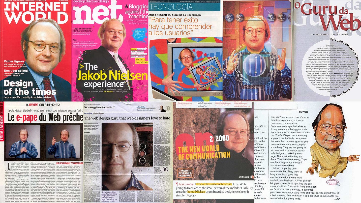
Public awareness of UX. I conducted about 2,000 press interviews during the decade from 1995 to 2005. When I was in Europe, meeting clients during the day, followed by dinner with local journalists, and then returning to the hotel for two more hours of telephone interviews with publications in the United States during their workday was common. This strong publicity push for UX placed it on the map, created awareness outside our narrow group of specialists, and contributed to creating several thousand new UX jobs worldwide.
A few of the many magazine covers and press interviews from my publicity campaign to raise public awareness of usability. Thousands of UX people probably had this effort to thank for their jobs, because this intense press coverage convinced many executives to care about UX.
The Story of Jakob and Google
Shreya Shah is a talented UX designer from India with a side project to draw biographical comic strips. She produced a great strip for me, summarizing the story of my membership of Google’s advisory board in its early days when Google was a startup. (Later, Google became a behemoth of a corporation with more than enough on-staff experts, so it no longer needs an advisory board.)
The background is that Terry Winograd, a professor of Human-Computer Interaction at Stanford University in Silicon Valley, had invited me to lecture on some of my work in 1998. After my talk, Terry invited me to tour his lab and meet some of his graduate students. One of the Ph.D. students was a bright young fellow named Larry Page, who showed me his project to enhance the relevance of web search results.
I was very impressed with the usability implications of the PageRank mechanism. I had been studying the usability of web search for years and was thoroughly unimpressed with the leading search engines, such as Excite, Infoseek, AltaVista, and Yahoo! They all competed more on cluttering up their homepages than on better ranking. As the web grew at an unprecedented pace in those years (paralleling the growth of AI now), billions of pages were added, making usability decline rapidly due to bad sorting of the search results.
Later, I heard that Page and Sergei Brin were starting a search engine company to bring their invention to the masses, instead of being confined to an academic laboratory. I was so thrilled that I offered to invest in this startup, which was to become Google. To this very day, this is the only startup I have felt strongly enough about to invest in. Unfortunately for my finances, fledgling Google already had plenty of money from real venture capital investors, so they turned my investment offer down. But Larry Page said that even though they didn’t need money, they needed usability advice, and he invited me to join the company’s advisory board.
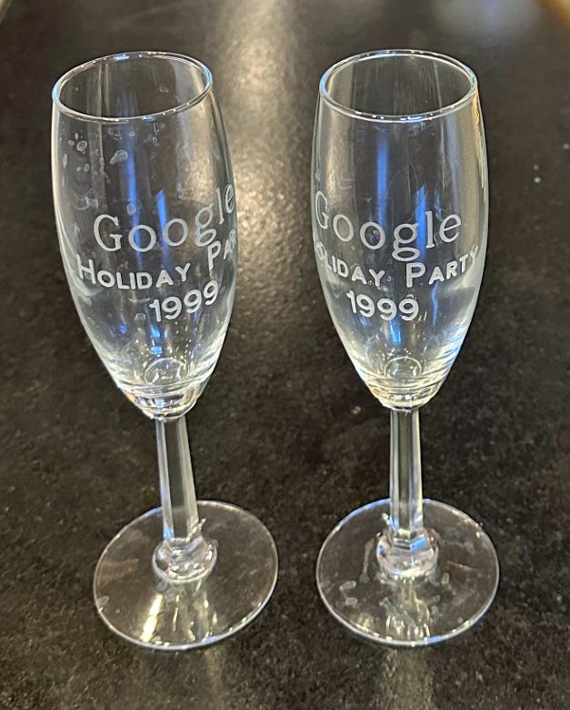
Swag I got at Google’s first holiday party in 1999. Considering that the company’s revenue was only $220,000 for the entire year, they must have spent a high percentage of the year’s budget on that party, even though they only gave away cheap champagne glasses. (Real photo.)
I served on Google’s advisory board until the company had grown big enough to have all the needed expertise in-house. One particularly fun memory from the early meetings at Google’s first offices in Palo Alto is that we had to meet around the ping-pong table because they didn’t have a proper conference room with a table big enough for the entire advisory board.
In those days, I recommended Google to everybody who would listen. Nobody knew what that odd name represented, but it usually only took one search to convert people into regular users. It’s somewhat like recommending the paid versions of ChatGPT 4 Turbo or Perplexity AI these days. People who only know free AI are gobsmacked when they see the real deal.
Here’s the comic strip:
Lifetime Video Retrospectives
I recorded a short (8 min.) video with an overview of my career when The Human Factors and Ergonomics Society named me a “Titan of Human Factors” in 2024.
My acceptance speech for the ACM SIGCHI Lifetime Achievement Award for Human-Computer Interaction Practice is also online (2013, 84 min.).
An original Titan from Greek mythology. In 2024, Jakob Nielsen was named a “Titan of Human Factors” by The Human Factors and Ergonomics Society. (Midjourney.)
Technology Changes, the Mission Remains the Same
During my 41 years with UX, I have worked with many technologies:
Mainframe computers, where commands were issued with function keys or line-mode command languages with obscure command abbreviations (like ls for listing the files in a directory). I only summarized my career in this article, but I also worked a stint at IBM.
Personal computers, both character-based and graphical user interfaces.
Telephone UI, including the hated phone trees.
Mobile devices and tablets.
AI and intent-based user interfaces.
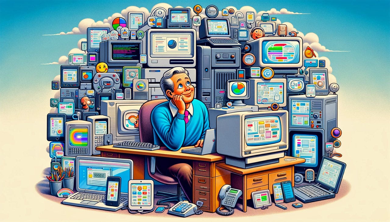
Technology changes; usability principles remain steady. (Dall-E)
I have found it very useful when new UI technologies come around to compare them with past technologies. While the surface characteristics change, many basic usability concerns remain the same. This is definitely true for some of the most fundamental UX questions, such as who the users are and what they are trying to achieve. After all, that’s what we must design for.
But even specific UI questions can often be informed by experience of past designs. For example, many early web user interfaces were heavily dominated by form-filling designs, where users would complete an entire page’s worth of fields before pressing the submit button and passing their data to the server. This interaction style was highly reminiscent of the IBM mainframe interactions I had studied a decade earlier.
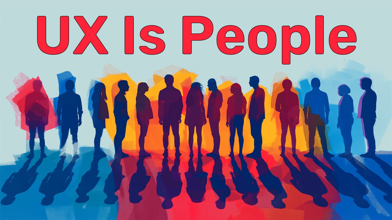
Possibly my favorite UX slogan, even if I didn’t coin it until 2018. (Midjourney)
While technology changes rapidly, and often dramatically, our UX methodologies remain remarkably steady. As I say, UX Is People, and human characteristics change little or none from one decade to the next. Therefore, how we study people and their interactions with computers also doesn’t change much. Of course, some changes happen, such as moving most user testing from happening in a usability lab to happening remotely over the Internet.
Finally, my mission has remained absolutely constant for all of my 41 years in UX: make computers suitable for normal humans instead of forcing users to adapt to the technology.
Infographic Summarizing This Article
Feel free to copy or reuse this infographic, provided you give this URL as the source.






Thank you for all your amazing contributions to our discipline, Jakob Nielsen!
“For example, I had the equivalent of Zoom in my office in 1993“ was that the coax video tool we had that Sue Dumais was working on? I think a lot of the design thinking from Cruiser has still not been fully developed :-)