Usability Labs: Cool or Old School?
Summary: Richly illustrated historical overview of the transformation of usability labs from dedicated spaces to Zoom calls, raising questions about the future needs for in-lab research.
Much of history’s most important user research was conducted in dedicated usability laboratories. The typical configuration of a usability lab was as follows:
Two separate rooms: one for the user and one for the observers.
Sometimes, the study facilitator would sit with the test participant in the user room, and sometimes, he or she would sit in the observation room and interact with the user as a “voice of God” booming from a ceiling-mounted loudspeaker.
A one-way mirror separated the two rooms so that the observers could see the user, but the user would not be distracted by the observers and their antics.
Several cameras in the user room to film the user from multiple angles.
In the old days, a dedicated camera was used to film a close-up view of the user’s computer screen so that the observers could see (on a separate TV monitor) a somewhat blurred image of what the user was reacting to.
Starting in the early 2000s, with the introduction of screen-recording software like Camtasia, the user’s screen was electronically duplicated on one or more slave monitors in the observation room, allowing the observers to see exactly the same as the user, in full resolution.
A green plant in the corner of the user room to make the lab setting slightly less clinical. However, since the plant was often fake, I am unsure how successful it was.
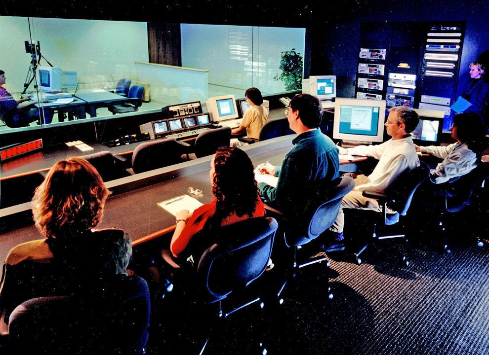
Here’s a photo of a usability lab around 1994. More pictures later in this article.
One of Sun Microsystem’s usability labs, where I ran the world’s first web usability study in 1994. More photos from this lab at the end of this article. Note the two rows of seats for team members to observe studies and take notes. The observation room was often packed, though we staged a study for the photographer in this case.
Thomas Stokes provides an exciting history of usability labs, going back to Bell Labs’ pioneering research in the 1940s as the world’s first UX team, working on the design of products like the numeric telephone keypad.
Remote Usability Testing: A Strong Lab Competitor
We already ran some remote usability studies when I worked at Sun Microsystems in the 1990s because of the need to test specialized Unix system administrators who were thin on the ground in any one location. However, remote testing took off in the mid-2000s with dedicated SaaS platforms that often integrated recruiting (usually with a user panel) with recording the actual test sessions on the user’s computer at his or her location. No need for a lab! (But you do need to recruit your own test participants, for example, through User Interviews, which is my preferred service, though there are many others.)
Today, you can run a moderated remote study through Zoom. No special software is needed. Or you can use platforms like UserTesting (a new company that integrates the old UserZoom, which used to be my preferred remote platform and the old Usertesting.com), dscout (specialized in diary studies but also useful for user testing), or many other tools that support unmoderated testing (which I don’t like as much). Services like Optimal Workshop support remote card sorting and other specialized studies. There are now so many services that this article would be very long and tedious if I had to list them all.
Come the Covid pandemic of 2020, all user research went remote. Some user research is now being conducted in person again, but most studies are still remote.
In-person research is invaluable for field research, where being on-site at the users’ companies or homes provides substantial additional insights into their work environment or personal life. Traditional usability studies account for maybe 90% of all user research and are the single most valuable method for improving user interface design.
Standard user testing, whether qualitative (which I prefer) or quantitative (which has its place, in rare cases), can be conducted perfectly well through the many remote services. Not having to travel allows you to cast a much wider net for study participants and also facilitates including international users. Scheduling is also easier when you don’t have to book lab time.
Can We Dispense With Usability Labs?
User Interviews surveyed 929 user researchers in May 2023 about where they conduct their studies. The following pie chart shows the distribution between people doing in-person versus remote studies. Remote studies overwhelmingly eclipse in-person approaches, capturing a commanding 87% of the preference share.
Where user researchers say they conduct their studies — data from User Interviews, 2023.
We’re still left with 13% of researchers who mostly do in-person studies, and they obviously need a place to run this research. The 41% of researchers who intermittently conduct in-person testing will also need a study location occasionally.
However, in-person testing doesn’t necessarily require a dedicated usability lab. Many studies can be conducted quite well in a regular conference room. You can run a study as long as you can close the door to ensure the test participant’s privacy and prevent interruptions. (I strongly recommend against testing in a cubicle unless you’re doing a field study at a customer location where your users work in cubes.)
You don’t need all the fancy video equipment we used in the old days, as shown in the photos at the end of this article. Today, you only need screen recording software, which can be Zoom’s “Share Screen” feature. A pixel-perfect representation of the user’s screen can be broadcast over the cloud to the observers’ own computers, allowing them to watch from any location. (Simultaneously, you transmit a video and audio feed from a webcam pointed at the user.) Thus, the expensive one-way mirror is also not needed. Observation by design team members and even stakeholders can be magnified when people don’t need to make their way to a dedicated room at a specific time to be able to observe a test session. This is great for getting buy-in for usability research findings because nothing beats the personal experience of watching a few customers struggle with your beloved product.
These days, I mainly recommend doing in-person user testing in meeting rooms. If you’re designing an AI system to summarize legal documents, go to a law firm and test with senior attorneys in the conference room. Going to the users’ location makes it easier to recruit high-paid staff to participate.
In his overview article, Thomas Stokes concludes that there’s still a need for dedicated usability labs. In particular, they are great for testing hardware and physical products, where you still benefit from watching and recording multiple camera angles. A dedicated space allows the lab to be configured for specialized uses, anywhere from testing nuclear powerplant control rooms to a living room-like environment.
I agree with Stokes, though I also am a big fan of conference-room discount testing. I believe there will be usability labs in the future, but not as many as in the past. Research is not tied to a particular magic room. The function of the usability lab will survive, even if the specialized testing laboratories are in decline. In-person testing is superior to remote in many cases, and you need a room to be with the user. We must also record the session and distribute a video and audio feed to other team members who want to observe. The usability lab lives on in spirit!
Usability Lab Photos Circa 1995
I found an old set of PR photos in my files of the SunSoft usability lab, probably taken in 1995 or so. At the time, usability was hot, and I spent substantial time doing press interviews. This set the stage for recognizing usability during the dot-com bubble and creating many UX jobs in the booming industry.
A simulated usability study in the test room. The big one-way mirror hides the observers in the back room. (I would always start a test by mentioning that I had a few colleagues watching from the back to put the participant at ease because everybody immediately knew upon entering the room that something was behind that big mirror.) I'm playing the user in this staged test for our PR efforts. Oh, the youth — I was only 37 years old and the Sun Microsystems Distinguished Engineer for usability engineering. The facilitator is played by Janice Rohn, the SunSoft usability group manager who was in charge of building the labs (now Head of Customer Research and Experience at Intel). Note that in an actual usability session, the facilitator would usually sit slightly behind and to the side of the participant. Janice’s position was chosen to look good in the PR photo because I would have obscured the usual facilitator spot. Believe it or not, the hulking computer was considered a high-powered workstation in 1995.
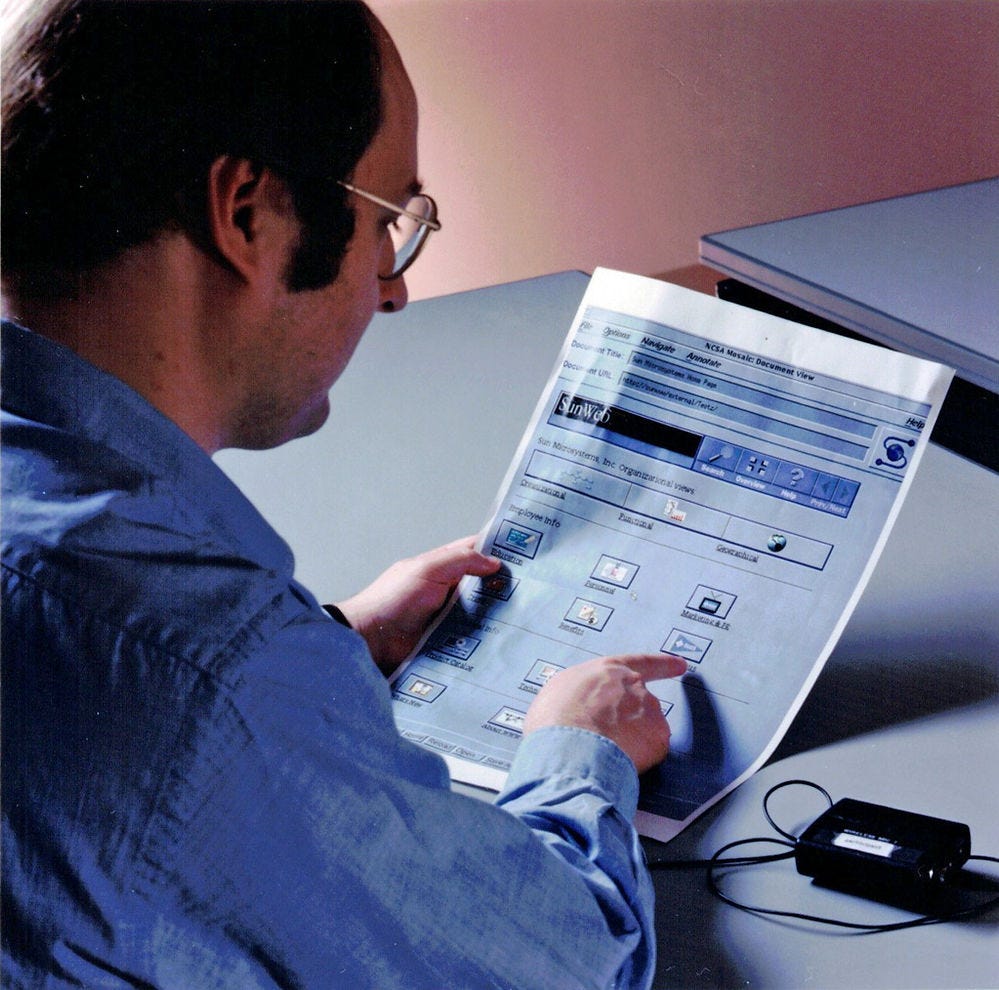
In addition to testing live software (hardware was studied in a separate lab run by the hardware group), the usability lab was also used for testing paper prototypes. Here, I follow the standard instruction to pretend my finger is the mouse and point where I would click. Note that the oversized paper is a printout of how web browsers looked in 1995: This is NCSA Mosaic, complete with the goofy “S” logo in the upper right corner. Note also the battery pack for the lavaliere microphone, which we always used to capture good audio of the user’s thinking-aloud comments.
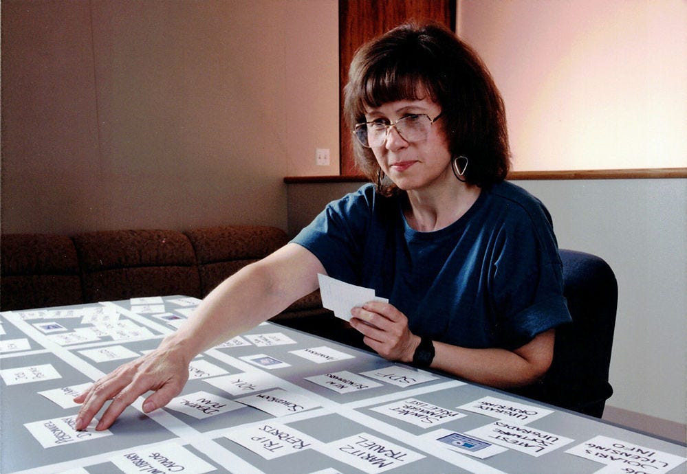
Closed card sorting. One more method we employed in the usability lab. For these studies, the ceiling-mounted overhead camera came in handy to record where the user placed the cards. Here, I’m testing a proposed information architecture for the company’s intranet in what I believe might have been the world’s first intranet usability research in 1994. We printed out oversized copies of the icons for the proposed categories. We asked the users to sort cards representing the main topics into boxes created with masking tape, depending on where they would expect to find each topic.
The ceiling-mounted overhead camera ran on tracks, but moving it was noisy and invariably caused the test participant to look up, so we tried to position it correctly before the start of the session. All the lab cameras were the highest quality in 1993, which only meant 704x480 NTSC resolution.
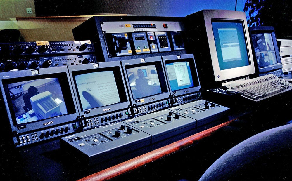
Back in the observation room. These are the camera controls used by the test facilitator (or an assistant) to operate the 4 cameras in the user test room remotely. Note that camera 2 shows a tight zoom on the printed documentation so that we can see what the user is reading. (Yes, back then, software came with a big binder of documentation written by more than 100 tech writers who also worked in the human factors engineering department.)
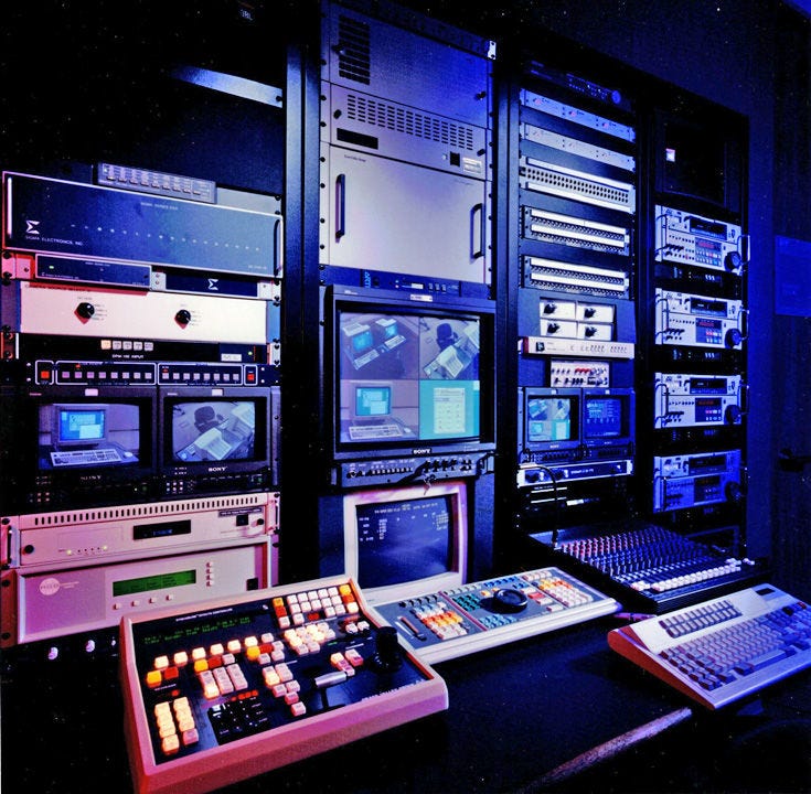
The video editing equipment used to produce highlight tapes. People doing video editing in software today don’t know how good they have it.
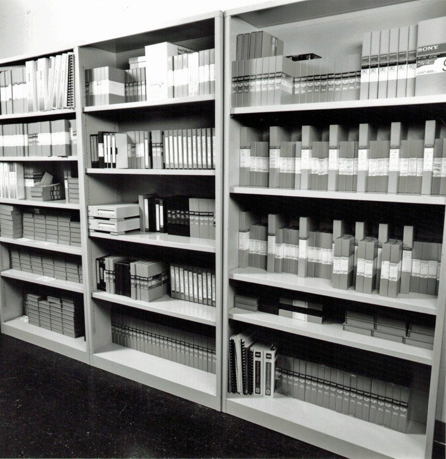
Library of video tapes from past studies. Saving wall space is one side benefit of digital video recording, beyond the crisper image quality.
The only indispensable part of any usability lab, even if you only have a temporary lab set up in a conference room for the duration of a study. There must be a sign on the door to prevent people from barging in and disrupting your test user.
About the Author
Jakob Nielsen, Ph.D., is a usability pioneer with 40 years experience in UX. He founded the discount usability movement for fast and cheap iterative design, including heuristic evaluation and the 10 usability heuristics. He formulated the eponymous Jakob’s Law of the Internet User Experience. Named “the king of usability” by Internet Magazine, “the guru of Web page usability" by The New York Times, and “the next best thing to a true time machine” by USA Today. Previously, Dr. Nielsen was a Sun Microsystems Distinguished Engineer and a Member of Research Staff at Bell Communications Research, the branch of Bell Labs owned by the Regional Bell Operating Companies. He is the author of 8 books, including the best-selling Designing Web Usability: The Practice of Simplicity (published in 22 languages), Usability Engineering (26,283 citations in Google Scholar), and the pioneering Hypertext and Hypermedia. Dr. Nielsen holds 79 United States patents, mainly on making the Internet easier to use. He received the Lifetime Achievement Award for Human–Computer Interaction Practice from ACM SIGCHI.
· Subscribe to Jakob’s newsletter to get the full text of new articles emailed to you as soon as they are published.


