Jakob’s Law of the Internet User Experience
Summary: Users spend most of their time on other websites, so they expect your site to work like all the other sites they already know. When a design deviates from users’ expectations, usability suffers. Don’t be arrogant and assume that your new design idea is so brilliant that it can overrule decades of user habituation.
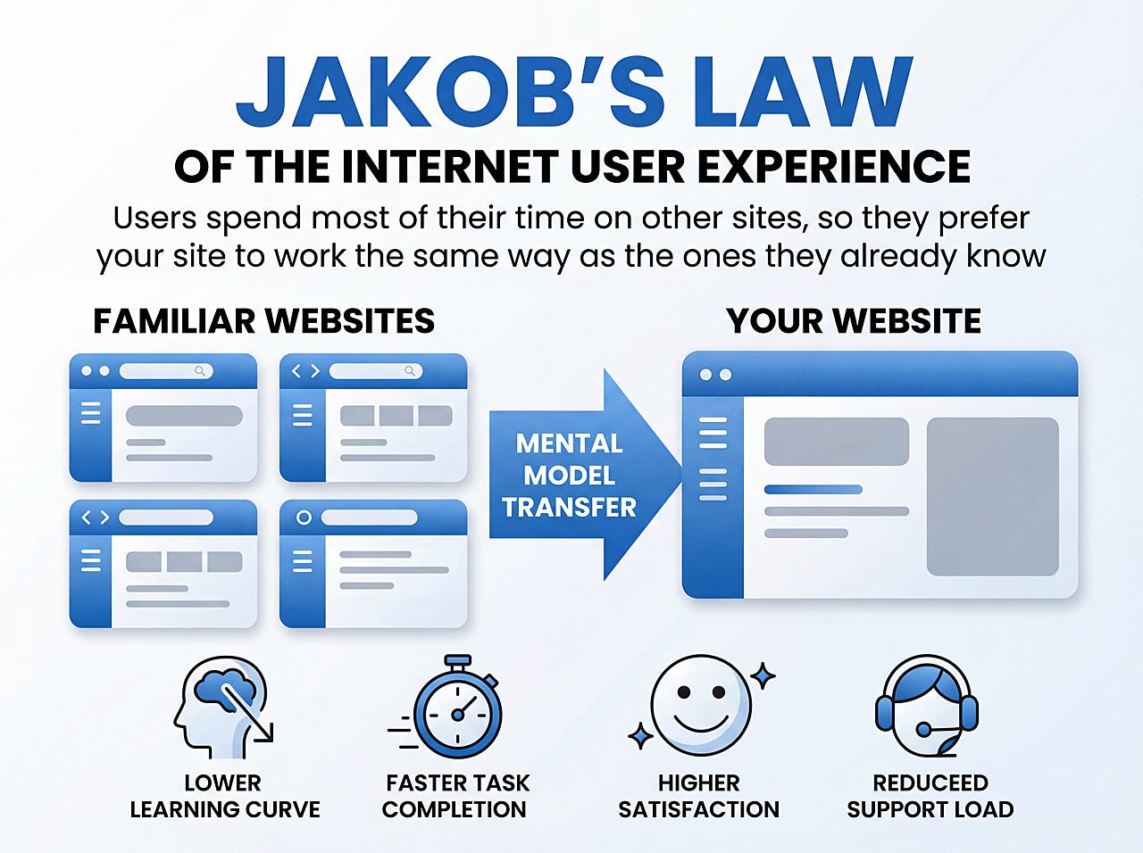
Jakob’s Law of the Internet User Experience states, “Users spend most of their time on other websites, so they expect your site to work like all the other sites they already know.” I formulated this law in 2000, and it has been proven many times ever since.
Permalink for this article: https://www.uxtigers.com/post/jakobs-law
Even though the Law refers explicitly to websites, it holds for any situation where users encounter a wide variety of designs without being tied to only using a single system for the vast majority of their time. Mobile apps are such an example where Jakob’s Law applies by extension.
There are three main drivers of Jakob’s Law:
The web (and similar domains, like mobile apps) offers a teeming multitude of individual services, and users flitter between them, only allocating a small percentage of their time to any particular website. Your website is but a grain of sand in this majestic universe.
Each user’s user experience is constructed from the totality of what they encounter across the many websites they visit over many years. Any slight variations are ignored, and the commonalities engrave themselves on the user’s brain. Users’ mental model of “the web” builds slowly over time, piece by piece, through reinforcement from those design patterns they often encounter.
Now that users have a mental model synthesized from most other websites, they apply it to form expectations for any other website — such as yours. If your website complies with these expectations, it’s easy to use. If the design violates users’ expectations, they will use it wrong and get into trouble.
A website will have to be incredibly useful and compelling for users to go through the hassle of learning a different interaction style just for that site. Don’t count on your site being one of those rare exceptions. Even if a subset of users deems your platform exceptionally compelling, a significant proportion will find it less so and disengage. You can kiss about 80% of your potential customer base goodbye if you violate Jakob’s Law.
If these boats follow Jakob’s Law, once you can sail one of them, you can sail another without trouble. (“Consistency” by Midjourney.)
Jakob’s Law in Practice
There are plenty of established patterns for web design that follow Jakob’s Law. For example:
Search. A website should offer search (unless it’s a tiny site); it should be shown as an open text box at the top of the page, preferably to the right. I’m not claiming that my new website, uxtigers.com, is perfect (I made it in 4 hours), but it follows the search guidelines, and I bet very few users have had trouble locating the search on this page:
How to implement search on a website according to Jakob’s Law: Do the same as millions of other sites! Other examples of Jakob’s Law in this screenshot include a logo in the upper left corner and placing the main navigation options at the top of the page.
Shopping cart. I’ll spare you the screenshot because you know this little icon unless you've been sequestered in a WiFi-free cave since Amazon.com pioneered this design lexicon in 1994. More important, your customers know where to click when they want to see the products they are about to buy.
Visible scroll bars and other standard GUI widgets. How to move up and down a web page? Scroll!
Pinch-to-Zoom. Those mobile apps that follow this pattern users like. They hate those that require you to do something else to enlarge objects.
CTA buttons. You may think that yelling at the user with a loud, chromatically intense button is a high-pressure sales tactic in poor taste. But since almost all sites pressure users to take that desired action, this design pattern is so common that users have come to expect it. Use a subtle and gentle design for your “add to cart” or “subscribe to newsletter” buttons, and you risk that users overlook it because they expect a vivid design for the primary calls to action.
Users go where design follows Jakob’s Law. It’s easier to use a new website if you already know the design conventions it follows. (Imagen)
Violating Jakob’s Law
In the screenshot from my site, I called out having the logo in the upper left corner as an excellent example of complying with Jakob’s Law. Some audacious websites dare to defy this sacred law by blasphemously centering their logos. In one study, centered logos caused a 6-fold increase in the number of users who failed to navigate to the site’s homepage in a single click (4% failed with left-aligned logos, a whopping 24% with the centered ones).
Introducing an “innovative design” that violates Jakob’s Law will usually cause more usability problems than it’s worth. (Nano Banana 2)
A particularly egregious example is the emerging design pattern usually called scrolljacking. Just the name alone should send shivers down your spine. Why would anybody embrace a design pattern named after crimes like hijacking, skyjacking, and carjacking, which are the handiwork of terrorists and the worst gangsters? Scrolljacking doesn’t involve guns, but it is an assault against users and their rights to a comfortable user experience guided by Jakob’s Law.
Scrolljacking consists of overriding the browser’s native scroll behavior to produce custom animations or transitions on a website. As users drag the scroll bar thumb, turn the scroll wheel on their mouse, swipe up on a touchscreen, or perform any of the other standard behaviors that trigger scrolling, guess what happens? No scrolling! Instead, some rogue design element shape-shifts before your very eyes.
In my list of positive examples of Jakob’s Law in practice, I just mentioned standard GUI scrolling. Traditional scrolling is an incredibly empowering mechanism that makes users feel in control of the experience: How do you move up or down a long page? You scroll. What happens if you scroll down? You get to see the information below the current fold. These two solid facts of operating a graphical user interface turn “use” into “control” in the user's mind. It’s one of our most sacred duties as UX professionals to support human empowerment, with our fundamental ideology being that users should master the computer, not the other way around.
Designers who put scrolljacking into a user interface violate their duty to humanity. They’re so intoxicated by their “creative genius” that they trample on humans’ inalienable right to control our computers.
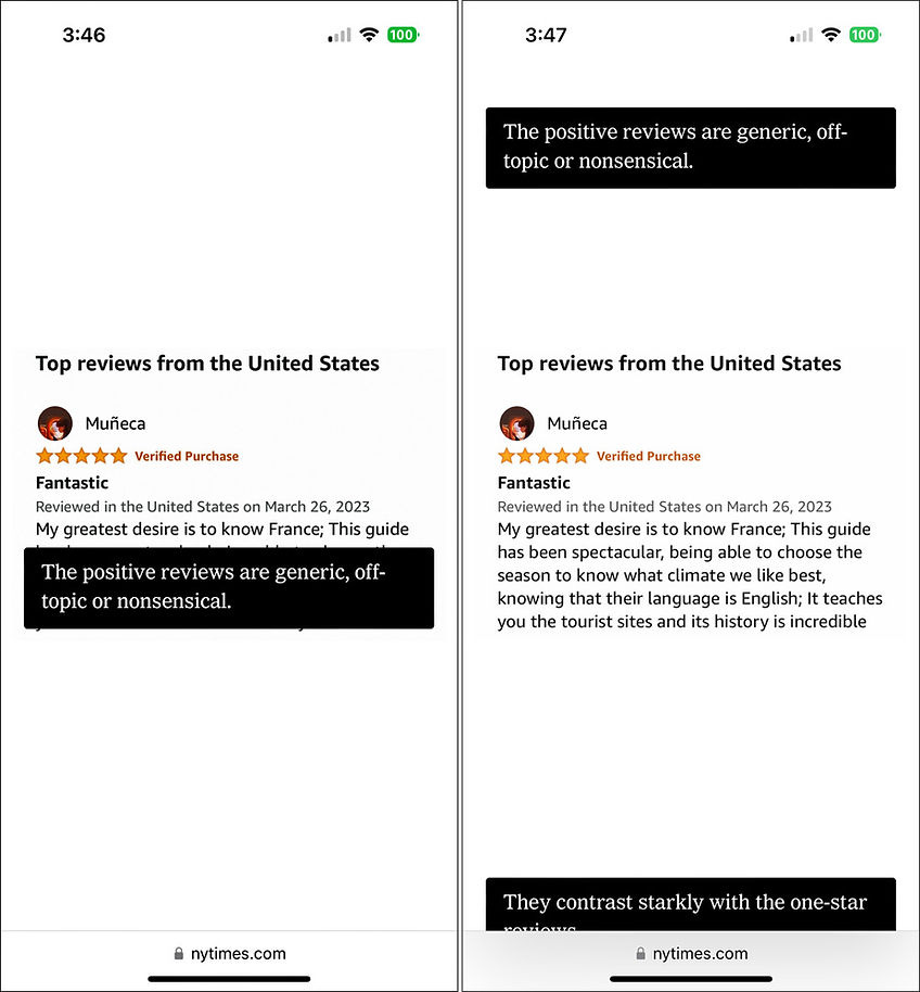
Here’s a recent example of scrolljacking from the nytimes.com website:
Scrolljacking example from reading an article about deceptive product reviews in a mobile browser. The difference between the left and right screenshots is that the user has scrolled about half a screenful worth. But did we move half a screen down the article? No, we didn’t — evil design.
As you scroll, the article stands still, as if frozen in time by some malevolent sorcerer. Only the callouts for the illustration move. It's diabolical!
A much better design would either show all the callouts in a single illustration or use a slider or carousel to allow users to progress through the alternate views of that illustration.
Scrolling should move the user up or down the page. That’s it! No more, no less.
A recent user study provides additional examples of the evilness of scrolljacking, which had the following nasty effects on the research participants:
Disorientation. Users got lost and had a reduced sense of place. Long scrolljacks aggravated this, but disorientation was less of an issue with very short scrolljack episodes that maybe only moved one thing around.
Hassle. More work to navigate up and down the page, as it froze in place while the user scrolled through the scrolljack episode as if needing to walk through quicksand.
Annoyance. Users felt their precious time was being squandered on meaningless scrolljacking gimmicks when they just wanted to move fast through a page to reach the one point they were interested in.
Extra bad on mobile. These troublesome effects were magnified for mobile users.
So, let's make it crystal clear: Scrolling should move you up or down the page. Period. End of story. Anything else is a UX crime.
The Future of Jakob’s Law
I have no doubt that we’ll see fresh violations of Jakob’s Law every year because some designers always want to prove their chops by trying something new. I claim that it’s the true test of design skills to do great work within the constraints of user expectations. But some designers don’t believe me and go rogue. Most of those designs will fail in the market because they will cause users more trouble than they are worth.
Even if a new design is hypothetically 10% better than the prevailing standard, users won’t use it if it causes them 20% worth of aggravation and learning overhead the first few times they attempt using the design. The learning curve is a harsh master, and only the crème de la crème of deviant designs will survive the grueling ascent up the curve of many repeated exposures needed for users to become familiar with a violation of Jakob’s Law.
Of course, an innovative design is substantially better every now and then than the old options, or it addresses a new need so well that users pick up on it. Gradually, more and more design patterns reach the elevated peak of user expectations and become the new standard. Then, according to Jakob’s Law, you should implement such an innovation. But unless you’re willing to lose substantial amounts of traffic and revenue, do wait until then.
New UI and Jakob’s Law
As mentioned, Jakob’s Law doesn’t only apply to websites. It also applies to new interaction styles, like voice-driven UI, augmented or virtual reality, and AI-driven interactions.
Inherent in new interaction styles is that they don’t yet have well-defined standards of their own. Such standards will emerge, and if you design for these new technologies, you should keep a sharp eye out for competing designs and assess whether most of them converge on particular design patterns. As this happens, obey Jakob’s Law and apply these patterns to your system ASAP.
Exactly because new tech is wild tech from a usability perspective, it becomes more imperative to honor Jakob’s Law for those interaction elements that have crossed over from traditional technologies. For example, if you support scrolling, avoid scrolljacking and make your scrolling behave as similarly as possible to conventional GUI scrolling. Or, if you have buttons or pop-up menus, make them follow as many conventions as possible. Don’t reinvent those wheels unless you want to go down in flames.
It’s tempting to think that entering new territory comes with a license to discard all the baggage from the old world. Some baggage deserves to be jettisoned if the limitations of old technology dictated certain aspects of a traditional design pattern. But only do so reluctantly. If you only achieve a slight performance gain from a drastic deviation from tradition, it’s not worth doing.
The future is a kaleidoscope of multimodal UI, where users will alternate between designs built on different technologies. People will still use desktop computers and mobile phones for many tasks and move back and forth between that old tech and several new-tech solutions. Users’ sense of control and familiarity will suffer if every platform is different.
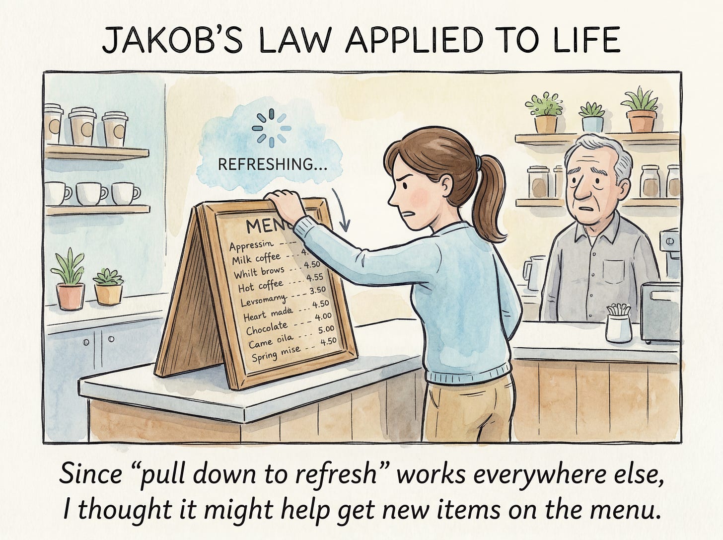
Even though Jakob’s Law applies to more than websites, it may not transfer all the way to the physical world, so that people will expect a café menu to behave the same way as the feed in a social app on their mobile device. (Nano Banana 2)
Conclusion in 3 Bullet Points
🌍 The web is big. Your site is small.
🔄 Users have habits.
⚠️ Break habits, lose users.
Poetic Conclusion
Haiku:
Surfing other waves,
Expecting the familiar,
A web norm engraves.
Longer poem:
Three whispers guide users, in code, they’re sewn:
A fleeting dance on the web, a momentary loan.
Years of clicks and scrolls, a mental throne.
Expectations set, in silicon and stone.
Break the law, and alone you’ll moan.
Poems for my many Chinese-speaking friends:
网络之海漂泊,
遍览众多他乡,
界面熟悉为常。
用户心有所属,
寻熟识的设计,
体验众网之光。
Teapots: You know how to use one; you know how to use them all — except for that one special teapot. (This is a UX insider joke.) Image by Midjourney.
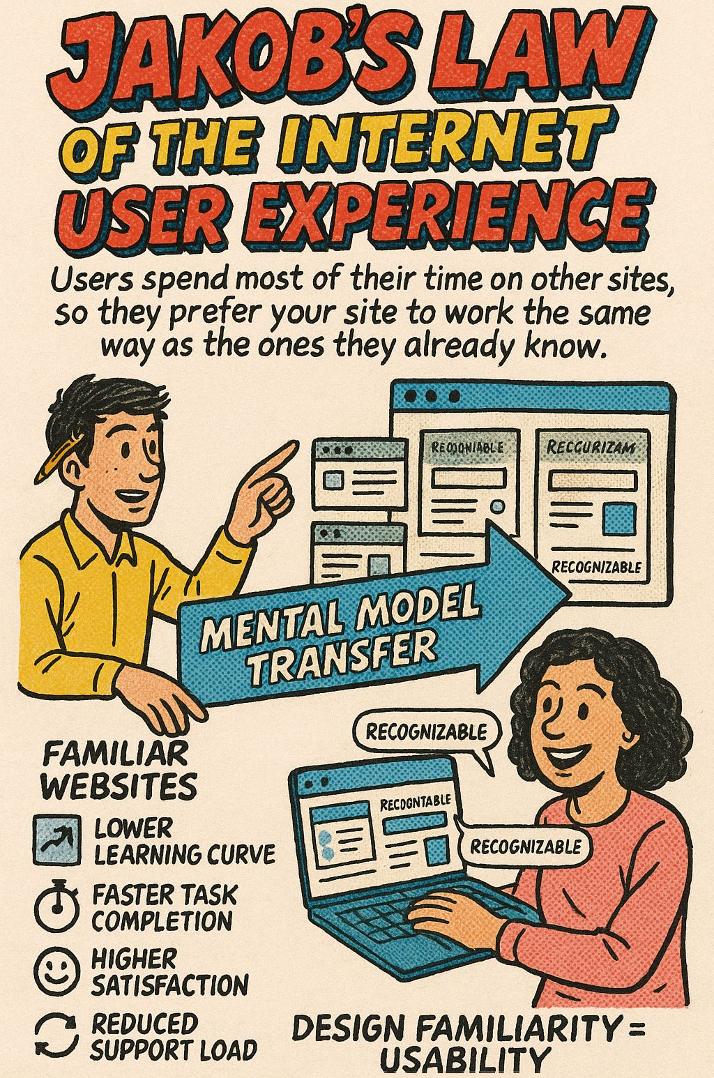
Jakob’s Law as drawn by ChatGPT’s native image model.
About the Author
Jakob Nielsen, Ph.D., is a usability pioneer with 43 years experience in UX and the Founder of UX Tigers. He founded the discount usability movement for fast and cheap iterative design, including heuristic evaluation and the 10 usability heuristics. He formulated the eponymous Jakob’s Law of the Internet User Experience. Named “the king of usability” by Internet Magazine, “the guru of Web page usability” by The New York Times, and “the next best thing to a true time machine” by USA Today.
Previously, Dr. Nielsen was a Sun Microsystems Distinguished Engineer and a Member of Research Staff at Bell Communications Research, the branch of Bell Labs owned by the Regional Bell Operating Companies. He is the author of 8 books, including the best-selling Designing Web Usability: The Practice of Simplicity (published in 22 languages), the foundational Usability Engineering (30,073 citations in Google Scholar), and the pioneering Hypertext and Hypermedia (published two years before the Web launched).
Dr. Nielsen holds 79 United States patents, mainly on making the Internet easier to use. He received the Lifetime Achievement Award for Human–Computer Interaction Practice from ACM SIGCHI and was named a “Titan of Human Factors” by the Human Factors and Ergonomics Society.
· Subscribe to Jakob’s newsletter to get the full text of new articles emailed to you as soon as they are published.
· Read: article about Jakob Nielsen’s career in UX
· Watch: Jakob Nielsen’s first 41 years in UX (8 min. video)








Is there a resource or spiffy rule of thumb, for deciding what areas actually need research versus copying conventions?