Classic Usability Important for AI
Summary: AI products are fraught with basic usability errors, violating decades-old UX findings. Simple fixes will save AI users much pain, but AI companies should also invest in fundamental user research and integrate UX with development to address new issues like managing ideation abundance.
The design landscape of contemporary AI products is nothing less than a wilderness of egregious usability transgressions. Astoundingly, these errors are elementary and could have been avoided with the most rudimentary knowledge of usability findings that are almost 30 years old.
Permalink for this article: https://www.uxtigers.com/post/classic-usability-ai
When I make statements like this, a common retort is that millions use these technologies; ergo, the situation cannot be as dire as I claim. The uptake of ChatGPT was faster than any significant technology in the past. True, but I have two counterarguments:
Yes, AI has millions of users, but they are the early adopters who are notoriously willing to experiment with half-baked technology. In contrast, the mainstream audience requires products to work smoothly and will abandon any user interface that’s too difficult to use. The late adopters will be even harder to reach with anything less than a perfectly intuitive design.
Anything in life is a cost–benefit analysis, and users will persist through more pain if the gain is sufficiently large. (AI currently offers unprecedented benefits, such as beautiful illustrations for free in 20 seconds.) This doesn’t mean the pain is good, or people will continue patronizing unpleasant user experiences when competitors launch better-designed ones.
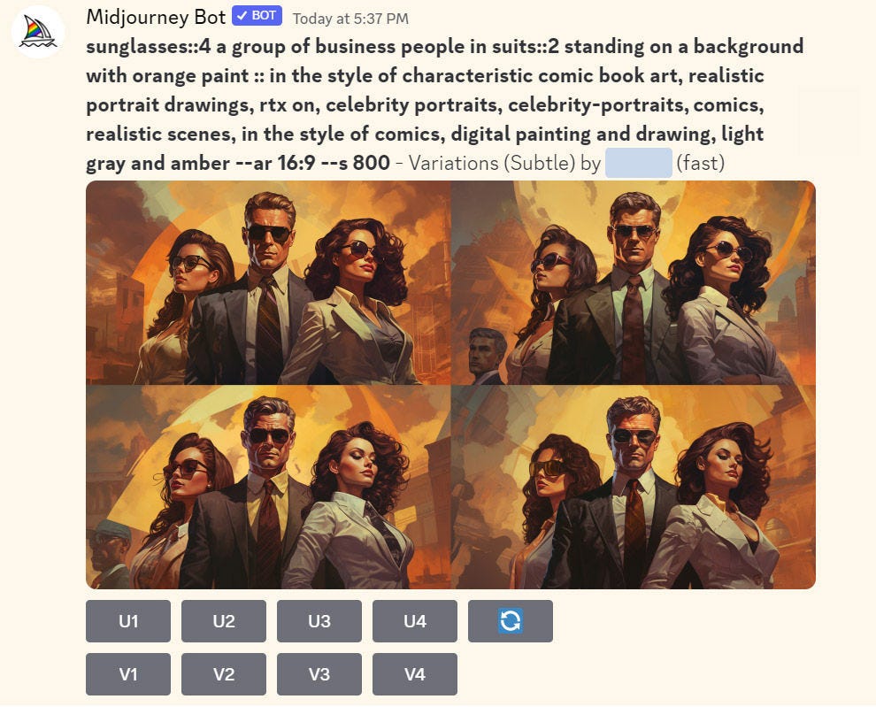
Using a product with lousy usability can be compared to navigating reality through darkened spectacles. It’s harder to see but not impossible, so people will struggle through their difficulties if the reward is large enough. But we could also remove the sunglasses indoors, which would be the usability professional’s preferred solution instead of leaving users to suffer. (“Businesspeople with sunglasses” by Midjourney.)
Elementary Usability Follies in Current AI
I have two examples, both from Midjourney. I apologize for hitting on this product, which I like and use daily because of its beautiful imagery. I also suffer daily from its design stupidities that could have been fixed with virtually no development resources if they had understood some of history's most well-known usability principles.
My first example screams a lack of UX professionalism. Midjourney’s inconsistent parameter ranges for image generation:
--quality: 0.25 to 1
--iw (image weight): 0 to 2
--chaos: 0 to 100
--stylize: 0 to 1,000
--weird: 0 to 3,000
Even the rawest recruit to the UX profession can spot the usability problem in this list. Ever heard of “Nielsen’s 10 heuristics,” which are usually taught on Day 1? Heuristic 4 is Consistency. It’s been on my list for 29 years, but consistency has been a common UX goal for much longer.
Such wild inconsistency between features is a classic symptom of a company that has never had a UX professional darken its door. Also known as developer-driven design, where each programmer decides in the shower that morning the range for his or her feature. There’s no designer to create unity within an organizational ethos devoid of design cohesion.
A single, consistent range for all parameters would enhance the user experience. While varying default values might be acceptable, the range inconsistency is a blatant usability error.
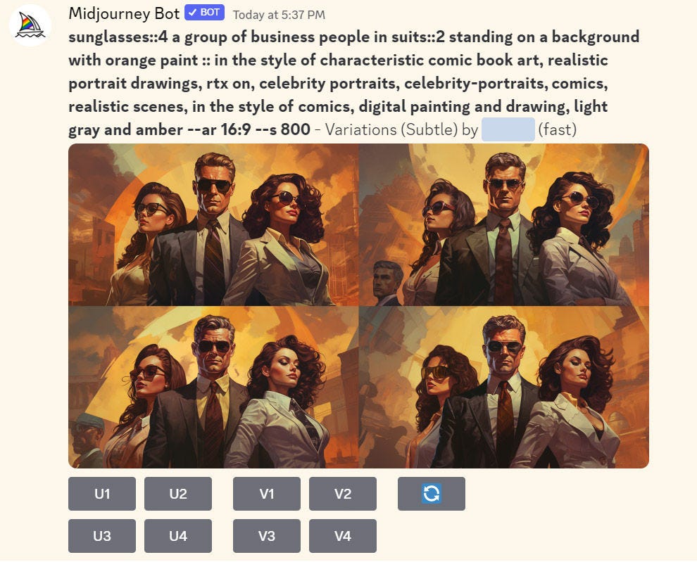
The second example is the classic GUI problem of button layout. Midjourney generates 4 images for each prompt. These 4 versions are shown as thumbnails in a simple grid layout, followed by buttons for upscaling or further varying a specific image. See the screenshot below: button U1 upscales thumbnail 1, button U2 upscales thumbnail 2, and so on.
Midjourney’s user interface with buttons to upscale (U) and vary (V) thumbnails 1 through 4.
Spot the problem? Don Norman rides again because users are hurt by an elementary usability problem discussed to exhaustion in his classic book The Design of Everyday Things, first published in 1988 as The Psychology of Everyday Things.
Don’s example was the difficulty of deciding which rotating knob controlled the heat in which burner on a typical kitchen stove:
A range with multiple burners in a 2D layout and control knobs in a 1D layout. (Leonardo.AI)
The usability problem stems from the fundamental difficulty of mapping between the one-dimensional layout of the controls and the two-dimensional layout of the items they are acting on. Every second time I use Midjourney, I count my way through the thumbnails to remind myself which one is number 3 (the bottom left).
The solution is simple: use the same layout for controls and targets, as in my proposed redesign below.
Proposed alternate UI, with a more direct mapping between the control buttons and the thumbnails, using a 2-dimensional layout for both.
Ideation Is Free = More Ideas to Manage
AI also creates new usability problems. As discussed in my article on how AI supports creativity, ideation is free with AI because we can ask it to generate as many ideas as we like at no extra cost. For example, for my recent article reporting measurement results on how fast users can answer questions with search or AI, I wanted an illustration of the “Battle of the Bots: Google and ChatGPT are duking it out for question-answering superiority.” I quickly made three different AI tools generate 238 illustrations of this idea. In the old days, when I would have commissioned an illustrator from Upwork, I might have paid for maybe three alternate designs before my budget required me to settle for one of them.
More options are nice, but they introduce the new UI problem of managing ideation abundance. The multiple designs are not random variations but are driven by prompt tweaks and varying parameter settings. (For example, what finetune model to use in Leonardo: you get different results from DreamShaper vs. Absolute Reality, but it’s not apparent how the model impacts the output, so it’s necessary to keep trying and compare results.)
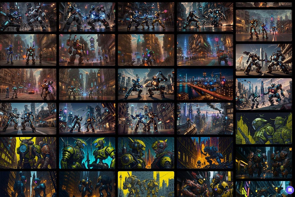
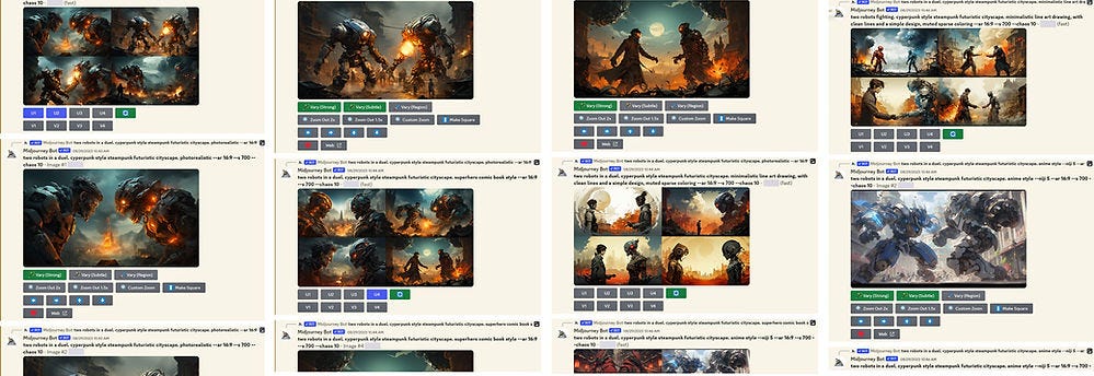
Something as simple as a 2D vs. 1D layout of past iterations impacts the user’s ability to understand past variations and return to the most promising ones after a detour that didn’t work out. Compare the 2D thumbnail layout in Leonardo.AI vs. the long scrolling list presented by Midjourney:
Leonardo.AI’s overview of some of the fighting robots I had generated. I can review 122 images in 4.5 screenfuls.
Scrolling through 4 screenfuls of fighting robots in Midjourney. The lack of an overview quickly makes the user lose any sense of place and makes it harder to revisit past versions. Scrolling through the 76 versions I generated with Midjourney would take 4 times as much scrolling — through an oppressive 16 screenfuls on a 4K monitor.
Leonardo’s information density gives the user 27 designs each time he or she scrolls, whereas Midjourney only presents 5. Lower density increases the feeling of being lost in information space.
It’s an open question how to design the optimal UX for managing ideation abundance. Some tools allow you to mark specific versions as favorites that can be retrieved quickly and allow a better overview of the best options generated so far. But in general, the explosive increase in ideation volume is not a problem that has received attention from AI vendors. They focus on creating a plethora of assets for users, not on helping people manage those assets. Existing solutions are inadequate because the extent of options produced during ideation can increase by a factor of a hundred. (Generally, managing 10 things versus 1,000 things requires different user interfaces and other features.)
Better I in AI Makes Better X in UX
In this article, I have focused on how traditional usability insights can improve current AI tools. Just hire some UX people. Preferably good ones, but even average UX specialists will already know all the points I raised above and know how to redesign AI tools to incorporate these old-school usability findings.
Do the simple things first and do them now. Why inflict needless suffering on hundreds of millions of early AI adopters? A small budget and a small UX hiring round will be virtual penicillin for these wounds.
But simple UX fixes are not enough. More significant improvements are also needed, requiring deeper UX research and design, necessitating hiring top-shelf UX staff. Many experience improvements will need updates to the underlying “intelligence” in the AI tools so that they reflect human needs rather than be driven by engineering insights, as has been the case until now.
AI is no different than any previous technologies. It’s always been true that great UX comes from the intense intertwining of UX insights and engineering ingenuity. AI scientists need to focus their research on advancing those aspects of AI that must change to meet human needs.
A simple example continues the saga of my fighting robots. I turned to Ideogram, a brilliant new generative AI tool for images that meets a substantial user need neglected by earlier products like Midjourney, Leonardo, and DALL-E: including text inside images. My vision was to label the two fighting robots with the names of the two services that were put to the test in the research study: Google and ChatGPT. If you’ve ever seen editorial cartoons in newspapers, you’ll know that labeling abstract characters is a common cartoonist trick. The old image tools can’t do this, but Ideogram can do it.
Not so fast. Yes, Ideogram can label one item in an image. It can’t label two objects. I attempted 10 iterations for a total of 40 pairs of fighting robots, but even if one was labeled “Google” or “ChatGPT,” the other robot didn’t get the other label specified in the prompt. What Ideogram can do today is shown by this example of its artwork:
Ideogram knows typography but cannot reliably put text together with more than one object. It’s a one-label AI for now. (The prompt “woman wearing a T-shirt saying X” works, but a prompt wanting X and Y as labels for different image elements will fail.)
UX Investment Needed for AI Usability
My four decades in this industry distill to a trilogy of irrefutable truths:
User interface quality requires an intentional design; good UI never arises when the design is a byproduct of the implementation.
You need talented designers specializing in interaction design, not designers who are good at other types of design (let alone people with no design skills).
The design must be driven by user research insights and iteratively refined through usability testing.
The more you break new ground, the more foundational user research you need. (Companies that stay on well-trodden grounds can rely more on existing usability guidelines and the design team’s experience from past projects.) AI design projects are the newest of the new since AI is the first genuinely new UI paradigm in 60 years, flipping from command-driven interactions to intent-based outcome specification. Translation: AI firms need more UX, not less.
It is not at all more “natural” to depend on “conversational design” because this style leads to plenty of usability problems, such as violating usability heuristic number 1, the visibility of system state.
Sadly, the leading AI firms have virtually no skilled UX professionals on staff. As of August 31, 2023, LinkedIn shows the following staffing numbers:
OpenAI (the company behind ChatGPT): 1,122 employees, 6 UX or design professionals (plus a few freelancers). 0.5% UX coverage.
Midjourney (the best generative image service): 86 employees, 0 UX professionals. (3 employees have “UX” in their profiles but are not dedicated UX professionals.) 0.0% UX coverage.
Runway (the leading AI for video): 95 employees, 5 UX professionals. 5.3% UX coverage.
Bravo, Runway. Boo, OpenAI, and double-boo Midjourney.
Yes, LinkedIn search isn’t perfect, and some people have job titles or biographies that don’t fully reflect their assignments or expertise. However, given the unexplored nature of how to match AI with human needs, these companies should have 10% or more UX staff, so it doesn’t matter whether LinkedIn is off by a few tenths of a percent, which it surely is.
Woe to humanity because the future is not being designed according to our needs.
More on AI UX
This article is part of a more extensive series I’m writing about the user experience of modern AI tools. Suggested reading order:
AI Vastly Improves Productivity for Business Users and Reduces Skill Gaps
Ideation Is Free: AI Exhibits Strong Creativity, But AI-Human Co-Creation Is Better
AI Helps Elite Consultants: Higher Productivity & Work Quality, Narrower Skills Gap
The Articulation Barrier: Prompt-Driven AI UX Hurts Usability
UX Portfolio Reviews and Hiring Exercises in the Age of Generative AI
Navigating the Web with Text vs. GUI Browsers: AI UX Is 1992 All Over Again
UX Experts Misjudge Cost-Benefit from Broad AI Deployment Across the Economy
ChatGPT Does Almost as Well as Human UX Researchers in a Case Study of Thematic Analysis
“Prompt Engineering” Showcases Poor Usability of Current Generative AI
About the Author
Jakob Nielsen, Ph.D., is a usability pioneer with 40 years experience in UX. He founded the discount usability movement for fast and cheap iterative design, including heuristic evaluation and the 10 usability heuristics. He formulated the eponymous Jakob’s Law of the Internet User Experience. Named “the king of usability” by Internet Magazine, “the guru of Web page usability" by The New York Times, and “the next best thing to a true time machine” by USA Today. Before starting NN/g, Dr. Nielsen was a Sun Microsystems Distinguished Engineer and a Member of Research Staff at Bell Communications Research, the branch of Bell Labs owned by the Regional Bell Operating Companies. He is the author of 8 books, including Designing Web Usability: The Practice of Simplicity, Usability Engineering, and Multimedia and Hypertext: The Internet and Beyond. Dr. Nielsen holds 79 United States patents, mainly on making the Internet easier to use. He received the Lifetime Achievement Award for Human–Computer Interaction Practice from ACM SIGCHI.
Subscribe to Jakob’s newsletter to get the full text of new articles emailed to you as soon as they are published.


Nah, the interface works brilliantly. Midjourney has a sh*t interface, yet it's the dominant diffusion model. Why is that, you might ask? They are piggybacking on an existing platform, a massive platform such as Discord. The fact that you don't use it doesn't negate the fact that many others do. Yeah, the ranges are weird but almost nobody uses parameters. Yes, the generations can be hard to navigate but you do have a profile on midjourney's site where you can see a gallery. Yes, the ordering of the upscale/variation buttons isn't the most intuitive... in the first 2 minutes, but it's second nature after a couple of rolls. All in all, there will be less and less UX with generative AI. The interface is plain text and just voice in the very near future, and the output is something that requires mininmum tweaking. I'm sad to say this, as a UX professional, but UX will soon become obsolete. ChatGPT can interpret and analyse a 100 page PDF, then output a summary and plot it on a graph. How many clicks and workflows would that require just a couple of years ago - 200? 500? It's just a sentence now.
How in all f**k can you even dignify a product based entirely on theft with a UX review? They used exclusively pirated material and wreak havoc on the image professionals they stole from. It’s like criticizing the UX of a guillotine.