Photos Improve Website Usability and Credibility
Summary: High-quality, detailed photographs convey information with authenticity, fostering trust in the content provided on a website. Investing in premium images is essential, as indistinct or amateurish pictures can perplex users and erode credibility. But AI-generated images can sometimes substitute at drastically lower cost.
Words are the most important element of website usability, and I often cover content usability. Yet “content” transcends mere words; it encompasses images as well. In particular, photography is a pivotal communication instrument for many websites, though it’s also often woefully underutilized or abused. Photos are a silent yet expressive storyteller, infusing vitality into many websites when aptly applied.
Here’s a great example of content-enriching photography from an article by SeriousEats.com on how to prepare a steak with sous vide (a cooking technique):
A photo from a SeriousEats.com article shows how steaks look after being cooked in a sous-vide machine set to various temperatures. Should this picture fail to stir your appetite, you’re vegetarian.
The imagery here is not mere decoration but a communicative force in 5 ways:
Show, don’t tell. I can see how beef looks when cooked to various temperatures, which is a much better way of communicating than only using words like “rare” or “medium,” which have different interpretations. Even if I don’t agree with the author’s labels, I can recognize the steak that suits my preference and then dial in that temperature on my sous-vide cooker.
Specific. The figure shows the exact temperatures used to cook the steaks the author considers rare, medium, and well-done. Steaks are also shown for the two common intermediate values of medium-rare and medium-well, and I don’t think any meat lover will need to have those two steaks labeled to understand the photo.
Credible. Everything else in that article and on that website now has elevated credibility because the author bothered to cook 5 steaks and photograph them. Based on the photo, I believe SeriousEats.com isn’t fabricating information but is a reliable source of culinary wisdom that merits trust.
Good photo technique. Clear image, crisp focus, well-lit, no extraneous background or foreground. Just the steaks, ma’am.
Highly detailed. The steaks are big enough in this photo that we can easily discern specific details and the exact appearance of the meat at each temperature.
Extra credit to SeriousEats.com for supporting international users by stating temperature readings in both Fahrenheit and Celsius. (This is not a photo issue, but a critical usability guideline nonetheless.)
Bad Web Photos
The internet is blighted by subpar photography that reverses one or more of the above bullets:
Not showing anything important. Redundant filler photos induce unnecessary scrolling, prolong download time, and squander users' time as they attempt to make sense of meaningless imagery.
Generic. For example, a generic stock photo of a steak on a skillet (or even in a sous vide machine) would not be helpful. Even a photo of a medium-rare steak (labeled as such) that had been cut through to show us its color would not be nearly as valuable as the progression of 5 steaks cooked at a spectrum of temperatures.
Unbelievable. Stock photos often violate this guideline as well. How many customer service staff look like supermodels with perfect makeup? I’m not saying that you must shoot staff on a bad hair day because everybody wants to look good in photos, but actual photos of real team members are more credible than anything that clearly comes from a catalog.
Blurry photos or poor technique. Bad lighting, flawed color correction, wrong focus (or too narrow focus, blurring essential elements of bigger objects) — the number of ways a photoshoot can go wrong is legion.
Insufficient detail. Usually caused by using a too-small photo. Since I was the champion of small images during the Internet’s dial-up era (in defense of snappy response times), you may be surprised to see me condemn small photos. But often, photos are only useful if they’re big enough to show all the details of interest. One way of compromising is to initially show a thumbnail and then enlarge the photo when the user clicks the thumbnail. But even thumbnails need to be big enough that users can differentiate them and click only the one(s) of interest. And when the user asks for a photo to be enlarged, you need to make it really big, not just 25% bigger.
Relevance-Boosted Thumbnails
The standard way of producing thumbnails is to shrink each photo to, say, 10% of the original size. Regrettably, this often produces an image where the key components are so minuscule and difficult to discern that users can't identify what the thumbnail is depicting.
This usability problem can be mitigated by first cropping the original photo to emphasize the most important area of communicative value and then only shrinking this smaller area. If you pick, say, a quarter of the original image to be made into the thumbnail, then even if the thumbnail is 10% of the original image, the preserved visual elements will appear at 20% of their original size, thus enhancing their recognizability.
See, for example, these two thumbnails of an elephant image I created in Midjourney. The right thumbnail that focuses on the animal makes it much easier to tell that this is an elephant. (This example also shows that most guidelines for AI-generated imagery align with those for photography.)
Thumbnails of an elephant. Original Midjourney.
Photo Variations
If one photo is good, many photos are often better. Capture a product from many angles and allow users to switch views easily. A simple interaction technique like clicking thumbnails or even just a “next photo” button usually beats making users struggle to manipulate a rotating 3D view.
For products that come in many variants — such as different colors or sizes — photos of each variant will help users pick the one they want. This will save you much more money in returns processing than you’ll pay for the extra photoshoot.
When providing photographs of many different items, consistency in style, color, composition, and tone makes it easier for users to understand the differences between the items and creates a cohesive visual experience. Such consistency communicates a sense of professionalism that builds credibility and strengthens your brand.
Context or Isolation?
One major stylistic decision is whether to show the subject of a photo in sole majesty, devoid of distracting visual elements. Perhaps even on a pure white background. This can work in an example like the steaks at the beginning of this article. It’s much easier to compare the 5 levels of doneness when there’s nothing else in the image. Present 5 steaks on plates with all the trimmings, and the user’s task becomes more challenging.
Other times, context helps. A review of a steakhouse restaurant would gain from that photo of the steak on the plate, enabling you to see how they serve the dish. In fact, the review would even benefit from a second photo of the dining room.
Context can also help users visualize how a product is used. Showing something next to a known-sized reference object facilitates understanding of how large something is. For example, showing a model holding a bag instantly indicates whether it’s a small or large bag.
Images as Hypertext Links
The web is based on hypertext: you click, you get. What should you get if you click an image? Photos are highly concrete as they depict a specific item. This means users usually expect to get information about that item if they click its picture. Having an item represent a broader category can cause usability problems unless the page design makes it abundantly clear that each member of an image set represents a category and not the exact item being depicted in each image.
These photos on the homepage of specialisedhardwares.com clearly represent product categories and not individual products.
Words Still Matter
Photo captions are not always necessary, but they usually are. Make them concise, descriptive, and factual.
Photography ROI is High
Outstanding photography demands you to pull out all the stops: a fancy studio, a high-end camera, endless lighting tricks, and a great photographer. The last component is the most crucial. I've been awestruck by the transformative power of adept photographers who conjure brilliance with minimal equipment.
This is not cheap, but superior photos elevate your website to such an extent that the cost is worth paying.
AI or Real?
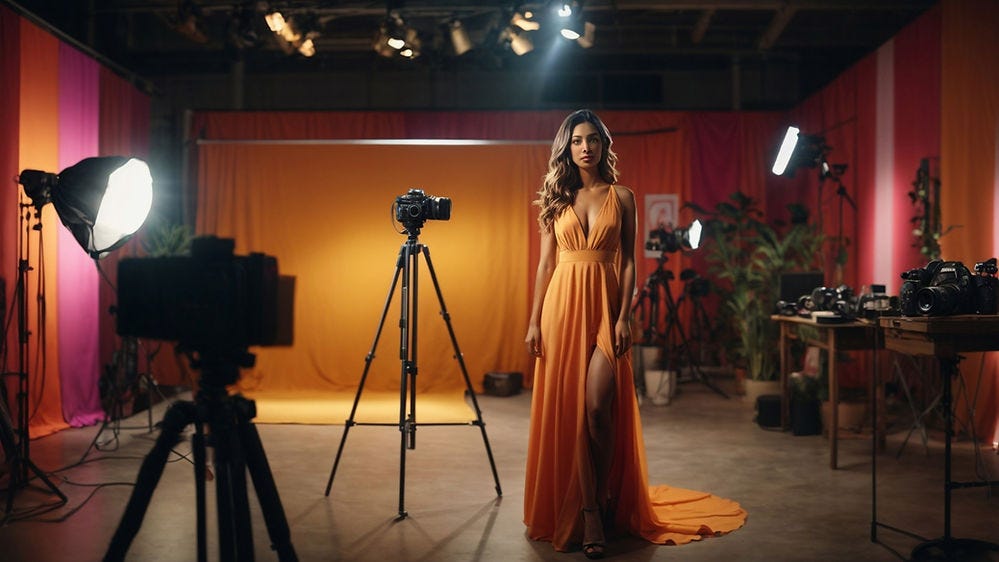
AI-rendered visuals offer reasonable facsimiles at budget-friendly rates. On occasion, this suffices. For example, I don’t pretend that I crashed a fashion shoot to bring you the following image, which merely serves the role of reminding you of a studio session. However, when image veracity is paramount, you have no alternative but to opt for genuine photography.
Photo studio generated by Leonardo.AI.
Whether you want to show something specific is the main deciding factor whether to use real photography or an AI-generated image. If yes, you need a photo of that item, not an AI simulation, which will be so much fake news.
In the above example, I just wanted to remind you of the overhead inherent in a professional photoshoot. I’m not recommending a particular photographer, specific high-end cameras or lighting equipment, a modeling agency, or anything else needed to photograph that dress to its best advantage. (It’s not even an actual dress because I’m not discussing a particular fashion brand.)
If you were writing about such specifics, you must commission a real photo and include those items.
In e-commerce, displaying the unvarnished truth is not optional—it's obligatory. Customers will rightly feel cheated if AI makes up product images. It’s an ethical question how much you might allow yourself to use AI to enhance images. I lean toward accepting many such manipulations outside of news coverage.
For example, the image below is a pure AI creation. But let’s say that we were selling an activewear line. In that case, we need to shoot a live model wearing an actual outfit. But do we need to haul her (and all the photo equipment) atop a craggy peak to realize the art director’s vision? No., we can shoot her in a studio and use AI for the background. We’re not selling the mountain scenery, so faking it doesn’t seem unethical. (It would be a different story if we were advertising a mountain yoga retreat; in that case, the only ethical choice is to spring for a photo shoot at that location.)
Yoga on a mountain by Midjourney. Great for an article on a general health site about the benefits of low-impact exercise for older people, but inadequate for that same topic on the website for an activewear brand.
Lastly, there's merit in exploring non-photorealistic visuals when your agenda doesn't hinge on showcasing specific products. More abstract or simplified representations can be more potent in encapsulating the essence of your argument. The following cartoon-style picture of a photo session may actually be better at visualizing my point about the voluminous hardware requisite for a stunning, authentic photograph.
Fashion photo shoot, by Leonardo.AI, requesting a cartoon style.
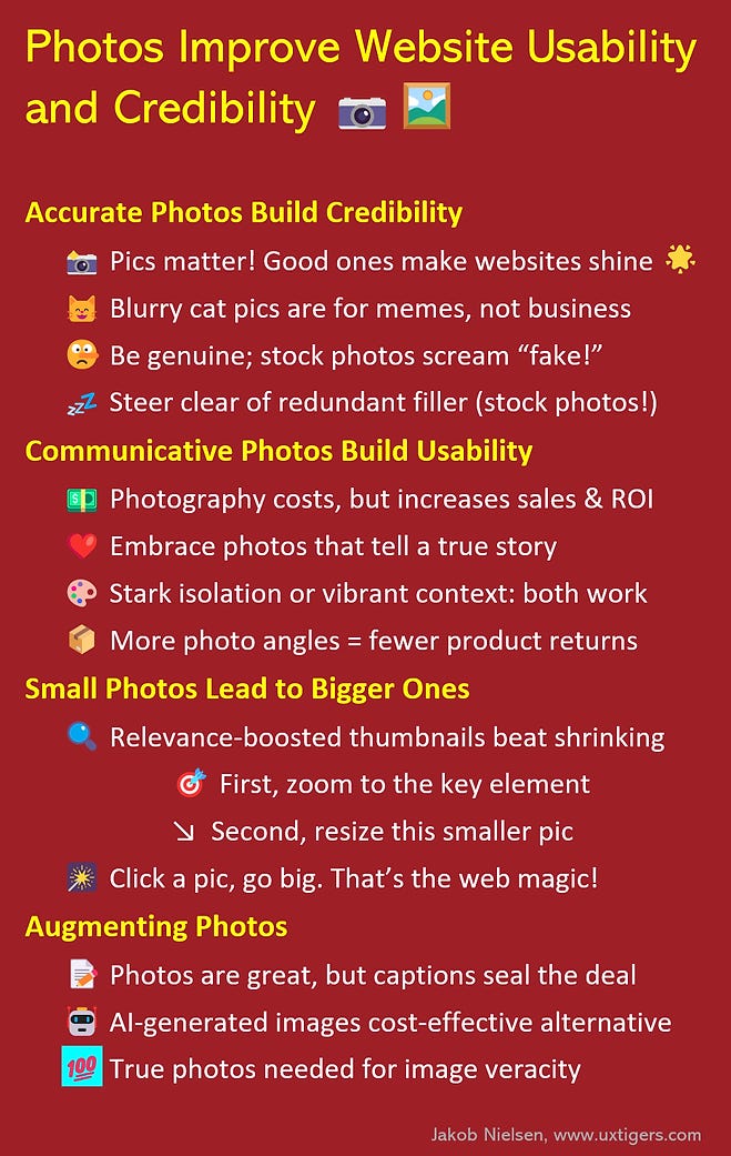
Infographic to Summarize This Article
Feel free to copy or reuse this infographic, provided you give this URL as the source.
About the Author
Jakob Nielsen, Ph.D., is a usability pioneer with 40 years experience in UX. He founded the discount usability movement for fast and cheap iterative design, including heuristic evaluation and the 10 usability heuristics. He formulated the eponymous Jakob’s Law of the Internet User Experience. Named “the king of usability” by Internet Magazine, “the guru of Web page usability" by The New York Times, and “the next best thing to a true time machine” by USA Today. Previously, Dr. Nielsen was a Sun Microsystems Distinguished Engineer and a Member of Research Staff at Bell Communications Research, the branch of Bell Labs owned by the Regional Bell Operating Companies. He is the author of 8 books, including the best-selling Designing Web Usability: The Practice of Simplicity (published in 22 languages), Usability Engineering (26,283 citations in Google Scholar), and the pioneering Hypertext and Hypermedia. Dr. Nielsen holds 79 United States patents, mainly on making the Internet easier to use. He received the Lifetime Achievement Award for Human–Computer Interaction Practice from ACM SIGCHI.
· Subscribe to Jakob’s newsletter to get the full text of new articles emailed to you as soon as they are published.


🧠