Time Scales of UX: From 0.1 Seconds to 100 Years
Summary: UX unfolds over time, with a factor of 31 billion from the shortest time period of interest (0.1 seconds for the illusion of instantaneous response time) to the longest time span we can realistically consider (a century for major social channels).
User experience lives in time, as denoted by the word “experience.” It’s not a place or a thing, even though UX is delivered through a UI on a screen (or other hardware, such as a speaker for voice interactions).
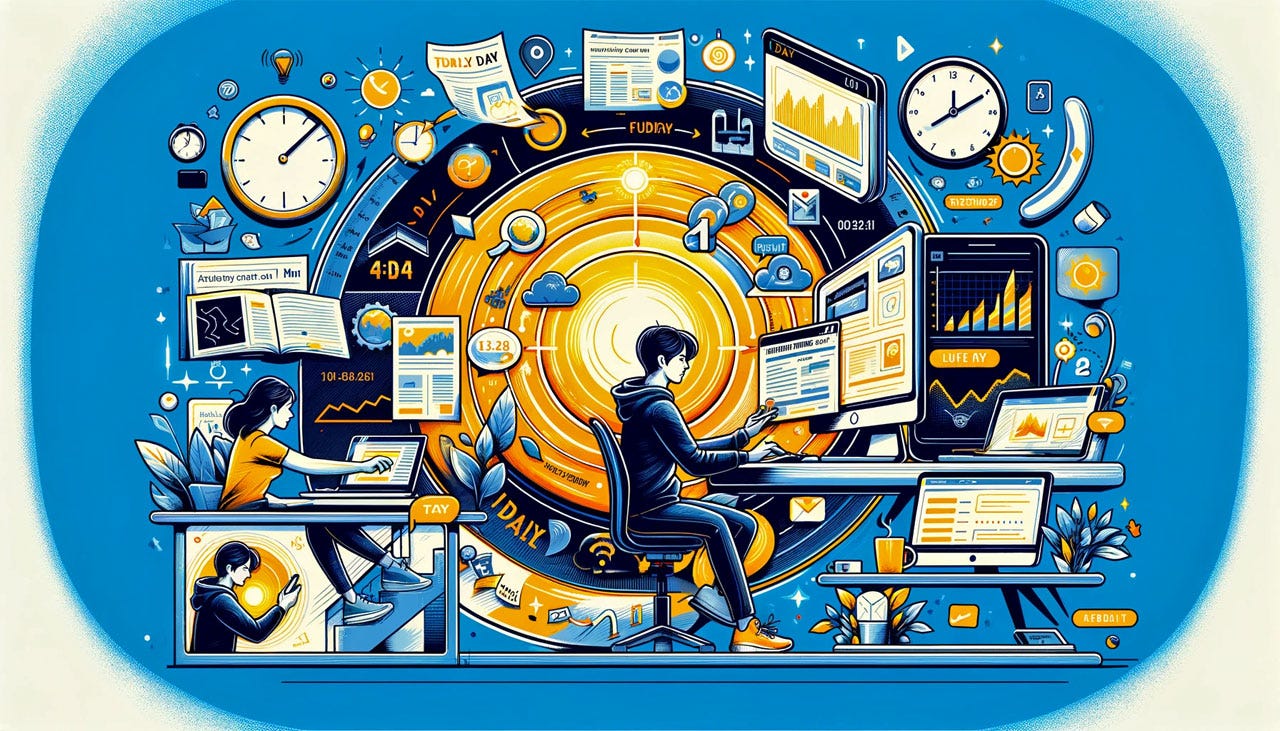
Time is the main medium for interaction design. (Midjourney.)
Screen sizes vary by about a factor of 300: the face of a smartwatch is about 1,000 square millimeters, whereas the screen of a 32-inch monitor takes up approximately 283,000 square millimeters. In contrast, as shown in this article, the time scales we must consider in UX vary by a factor of 31 billion from 0.1 seconds to 100 years. In other words, the time variability of UX is 100 million times greater than its physical variability.
Experience happens across an extensive range of time scales, from 0.1 seconds to a century. (Dall-E)
0.1 Seconds
Millisecond UX is the realm of perceptual psychology. Since the human brain doesn’t change, these time limits don’t change either.
The fastest phenomenon we usually consider is the initial visceral impression of a visual design. Gitte Lindgard found that users can distinguish between more and less attractive visual appeal of a web page after an exposure of as little as 50 ms, or 1/20 of a second.
0.1 seconds (100 ms) creates the illusion of instantaneous response — that is, the outcome feels like the user, not the computer caused it. You click the “A” button on the keyboard, and the letter “A” appears on the screen. If this happens in under 0.1 s, you made that happen. (Of course, it’s the computer painting the screen, but it feels like you did so.) This level of responsiveness is crucial to support the sensation of physicality in computer-created objects, allowing the user to manipulate them directly in the simulated on-screen space. (Direct manipulation is one of the essential GUI techniques that define the 4th generation user interface that has been dominant for the last 40 years since the Macintosh launched in 1984).
Most eye fixations in eyetracking studies last less than 0.1 seconds.
Response times of less than 0.1 seconds are needed for the illusion of instantaneous actions and the associated feeling of physicality in the user interface, even though it’s just a bunch of glowing dots on the screen. Longer than 0.1 seconds, and users can tell the delay. (Dall-E)
1 Second
Subsecond response times allow the user to maintain a seamless flow of thought. You can tell there’s a delay, so you’ll feel that the computer (rather than yourself) is generating the outcome. As long as they get results in less than a second, users still feel in control of the overall experience and work freely rather than wait on the computer. The fact that there’s no significant delay supports exploration and immersive creativity as users try out alternatives without the impression of wading through molasses. Sadly, most AI systems currently don’t meet this requirement, making use unpleasant.
A delay of less than 1 second between clicking a link and getting the destination web page is required for users to feel they are freely navigating a website. Slower response times and users will visit fewer pages.
Keeping users “in the flow” is crucial for user happiness and fulfillment. Again, this requires most actions to take less than 1 second so that users feel that they are using the computer freely instead of waiting for it. (Dall-E.)
10 Seconds
10 seconds is the maximum delay before the user’s attention drifts. It’s incredibly taxing to stay focused and alert in the absence of activity, but users can keep their attention on the goal for about 10 seconds. They can also retain information about what they are doing in short-term memory so that when the computer is done, they can proceed to the next step while preserving the previous mental context.
With delays between 1 and 10 seconds, users perceive themselves to be at the mercy of the computer and wish for greater speed, so they are not exploring as freely as with subsecond response times. But the crux is that a person can retain short-term memory and focus on the goal for up to 10 seconds, even if the wait is unpleasant. After 10 seconds, people start thinking about other things, making it harder to get their brains back on track once the computer finally does respond. Users will need to reorient themselves when resuming their task after a delay of more than 10 seconds.
Somewhere between 10 seconds and a minute is the time users allocate to a web page visit before they decide to leave it, in case it doesn’t satisfy their needs.
After 10 seconds of waiting, users become bored, and their attention starts to wander. You’re at significant risk of losing that customer. (Dall-E)
1 Minute
If people like the first page they encounter when visiting a website, they may stay longer and visit more pages. Even so, most website visits last 2–4 minutes.
Internet videos must also be short: viewing numbers drop off a cliff after a few minutes.
10 Minutes
If a website is excellent and solves users’ problems, their visit may stretch to 10 minutes. Rarely longer, though this does happen.
1 Hour
Usability test sessions usually last around one hour. Possibly two hours for those in-person studies that are relatively rare these days. Participating in a test is intense, no matter how often we tell the user, “We’re not testing you; we’re testing the design.” Fatigue sets in during that potential second hour for many study participants.
One hour is also a typical duration for a complete web task where the user researches or solves a problem through visits to multiple websites, each of which is typically only visited for a few minutes.
Fatigue sets in about an hour of intense computer use with complex tasks like those encountered in a usability study. (Dall-E)
1 Day
One day is the expectation for customer service turnaround when the customer asks a question requiring human intervention. Turnaround of less than a minute is expected for simple problems that the user expects the computer to solve.
Many users engage in monitoring behavior where they check certain things daily — for example, a newspaper or the stock market. You are golden if you can habituate users to engage with your service daily.
1 Week
Other habits are weekly. Habituating users to visit you every weekend or read your newsletter every Monday is still golden. Don’t push it, and try to build daily habits if your service naturally encourages longer delays. As long as you’re a habit, you have that user.
Users engage in many tasks during the day. If you can habituate them to return to your service daily or weekly, you have a big advantage over anybody else. (Dall-E)
1 Month
Many B2B sales are not the traditional single-user transactions we know from B2C e-commerce websites. Instead, multiple users at several levels of the organization may be visiting your website over a period of a month (sometimes more). Decisions by committee are slow, but these purchases are often worth millions of dollars, so thoroughness is expected.
Instead of a single-user user experience, we are designing for an organizational experience, and B2B websites must support the internal workings of this entire process across a month or more. Simple examples include having persistent storage of configuration options that can be viewed and edited by multiple users and the ability to create custom documents along the lines of “convince your boss” that can be forwarded from one user to another.
The B2B decision process often requires coordinating many individual users across departments and organizational levels, including committee meetings and other red tape. (Dall-E.)
1 Year
A year’s continued use is required for users to build up substantial expertise in an application. It may often take a decade to become a genuine expert user of a complex app, but after a year, users will have substantial knowledge of how to use the system and should no longer be considered novice users.
Very few services can realistically expect to see frequent use over a year, so their design should emphasize usability for first-time visitors and for returning visitors who will have forgotten most of what they learned about the UI during previous visits.
However, suppose you are one of the few services to be used frequently. In that case, you must design features to support experienced users who are more interested in efficiency than learnability.
Supporting reuse of past interactions can stretch from several months to several years. Maintaining a prompt library in a generative-AI application is one example, and managing old emails is another. Most current user interfaces offer no or little ability for users to benefit from their past interactions, though it is very common for users to repeatedly or intermittently perform similar tasks.
10 Years
Organizational change usually takes over a year and often a decade or more. It’s hard enough to change a single person, but an entire company is a sluggish organism.
Resistance to organizational change is why most companies move very slowly up the UX maturity scale. A few people may recognize the urgency of better UX, but they won’t have much impact until everybody is on board and has changed the default processes of the organization.
Some user data must live for multiple decades. For example, this is true of financial account information, such as stock holdings’ purchase date and price. Realistically, you will migrate to new implementations several times during such long periods. This, again, means that you need a migration strategy to preserve user data. From a usability perspective, these migrations should be seamless. It’s amazing how often big and rich companies require users to reset their login data after moving to a new system. Move the users’ data for them!
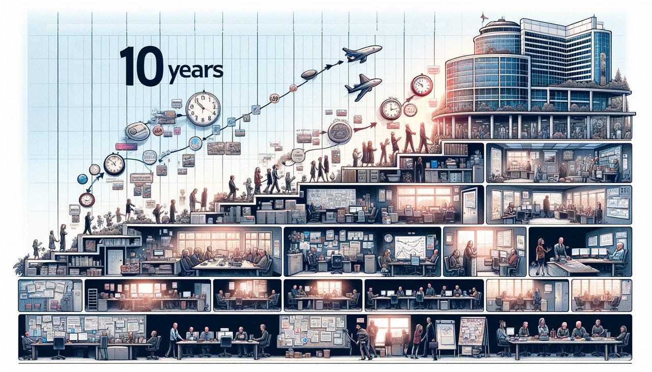
Organizational change can take a decade when you need a big company’s myriad parts to align on a new way of doing business. (Dall-E)
100 Years
Some of the most significant changes to society can take a century. While we don’t directly design for the way our great-grandchildren will live and work, such long-term substantial changes should be considered and tracked.
For example, the growth of AI may turn the education system upside-down and eliminate most traditional institutions, from elementary schools to universities. People at all stages may learn better from individualized instruction from an AI than from even the best teacher. AI might support just-in-time learning in smaller chunks instead of the current system of multi-year degrees. And lifetime learning is almost a given. Will this happen? It’s hard to tell, but it’s a possibility, especially given the high cost and abysmal results of the current education system.
One century-long change is near and dear to me: the evolution of the UX field from its birth around 1950 at Bell Labs until it will be more or less fully grown in 2050 with an estimated 100 million UX professionals worldwide.
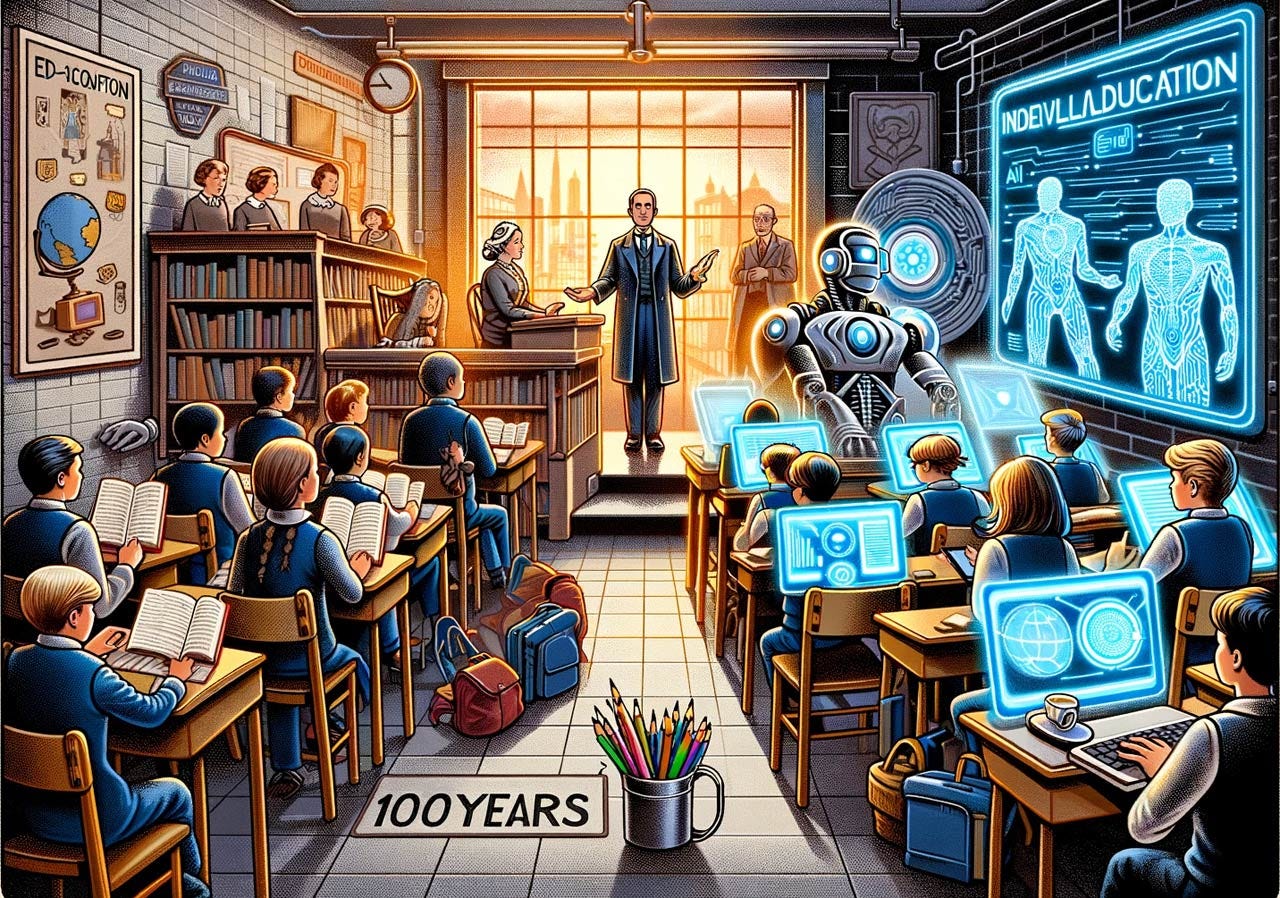
Big changes in society may take a century. For example, the education system has been founded on mass instruction from elementary school to undergraduate college, where a large mass of students is instructed by a single teacher moving at the same pace for everybody, regardless of their learning capacity and interests. AI might drive a change to individualized learning, where fast learners move fast and slow learners are not left behind but learn at their own pace. Contrary to Dall-E’s image, I am not sure this approach will retain the stereotype of everybody sitting together in a classroom stuffed with students all the same age. Physical infrastructure changes may be needed, which is one more reason such changes won’t happen speedily. The concept of lifelong learning on demand sounds good, but it will require employers to stop caring about degrees.
Short or Long Time Spans for Design Decisions?
We’ve seen how some UX design decisions determine events lasting about the same time as snapping your fingers, whereas others can take a century to unfold fully. A factor of 31 billion between the shortest and the longest time spans in our field.
That’s a wide spectrum to keep in mind and one of the reasons UX is a complicated field that requires a high IQ to do well. Not every individual design decision ranges across this 31-billion-fold stretch. But the totality of our work does.
Sometimes, you will find yourself in arguments with people looking at a different part of the time spectrum than you are. Both perspectives may be valid, but they often require very different solutions. Knowing about the range of time scales in UX will help you resolve such situations.
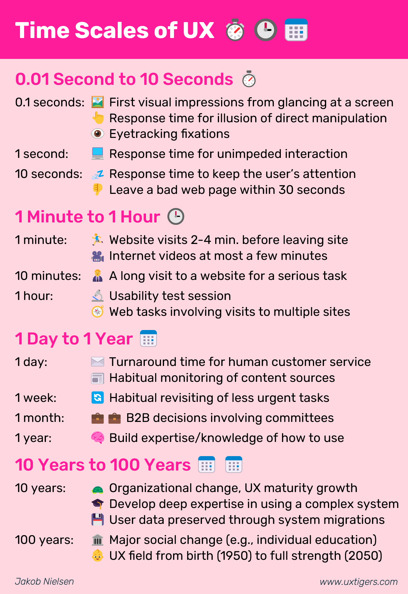
Infographic to Summarize This Article
Feel free to copy or reuse this infographic, provided you give this URL as the source.


