UX News: Winning UX Tools | Error Messages | Showing Payment Options | Virtual Girlfriend | UX Talent | Revolutionizing Content Business
Summary: Award-Winning AI-Enabled UX Design & Research Tools You Need to Try | Flow chart for writing better error messages | Presenting alternate payment options in a checkout flow | High-Caliber UX Talent Open for Roles in UK/Dubai | Could AI be your emotional companion? | An Upcoming Must-Read Book on AI's Impact on Content Business
Here are Jakob’s UX news items for September 18: pieces you won't want to miss but don't need an email for each.
Two UX Online Tools Receive Awards
Gartner Group has issued its annual awards for promising vendors, including UX services, for the first time.
Maze: AI-supported user research, including recruiting, online testing, user interviews and surveys, etc.
Uizard: Using generative AI to convert sketches into wireframes and prototypes.
Note the commonality: both tools come with a heavy dollop of AI. For example, Maze can generate follow-up questions on the fly to computer-administered interview questions. The example given on their website is that the user writes, “I think your app is sometimes too slow,” which makes the AI generate the follow-up question, “Are there any specific moments when you experience the app running slowly?” Surely, this example was chosen to show the product in the best light possible. I would worry that some follow-up questions might be less exemplary.
But the true question is not whether the AI currently is as good as the best human expert at conducting user interviews. First, most humans are not that great at constructing follow-up questions in the moment. Second, whatever user research staff you have is guaranteed to be too few to conduct all the interviews that could be helpful.
Remember Nielsen’s Third Law of AI: AI scales, humans don’t. So, if the tool works (which I don’t know for sure), it will greatly increase user data, which is sorely needed in most companies.
The AI ingredient in both tools is a reason in itself to give them a try. Any day you do old-school UX work with no AI support is one more nail in the coffin to degrade your career prospects in two years when AI experience will be mandatory as the tools improve. Nielsen’s Second Law of AI: You won't lose your job to AI, but to someone who uses AI better than you do.
By way of disclaimer, I have no experience with either tool, so I can’t vouch for their usefulness or value-for-price. I place a medium level of trust in Gertner in this matter, meaning they have experienced UX staff and a long tradition of evaluating software vendors. I don’t trust the award enough to sign a big contract, but it’s enough to recommend giving these two companies a further look — then make up your mind after a small test project.
Gartner awarded gold medals to Maze and Uizard as this year’s promising UX solutions vendors. (Medals by Leonardo.)
Crafting Error Messages That Enhance UX
Strategize your error messages with this nifty flowchart for precise tone and content.
Showing Payment Options in Ecommerce Checkout
Don't even think about hiding payment options in dropdowns; it's a UX sin. Payment choices must be visible and scannable. The Baymard Institute's latest study reaffirms this: keep options clear, branded with logos, and easily accessible. Abandoning dropdowns is non-negotiable for any serious designer aiming for seamless checkout UX
Dropdowns caused usability problems in earlier research due to the good old out-of-sight, out-of-mind principle. Users scan the checkout page for their preferred payment option (usually visualized by a PayPal logo, various credit card logos, and so forth). If they spot the choice they want, they’re happy and select it. They may abandon the checkout flow if they don’t see the payment option they’re looking for (because it’s hidden in a dropdown menu).
The Baymard Institute conducted the research. I am a big fan of this company. Not because two fellow Danes founded it. I would have liked the company just as much if it had been based in Estonia or India. I like that Baymard issues detailed usability guidelines for ecommerce websites based on extensive, repeated user testing. The guidelines cost USD $1,800 per year, quickly recovered through increased sales by any ecommerce site with more than $10M in annual sales. (Assuming that the design team follows the guidelines, of course.)
In the latest research round, Baymard didn’t find any checkout flows with dropdown menus for the payment options, so we can facetiously say that the UI design doesn’t matter. Of course, the design guideline to avoid dropdowns for this choice still holds and should be recalled for active duty if any designer were to propose such a design.
Here are the 5 best practices for optimizing payment-choice UX. For an in-depth dive, check out the full article, replete with illustrative screenshots:
🛒 Offer alternate payment options. A substantial set of users prefer a different payment method than credit cards. This differs between countries, but it might be PayPal, Alipay, or online banking. In Baymard’s research, 11% of shoppers had abandoned a purchase during the last quarter because they couldn’t use their preferred payment option. That’s a lot of lost sales.
🔘 Use radio buttons for the list of options unless you have good reasons for another design. Avoid drop-down menus that hide the options so users can’t scan for their preferred choice.
🎨 Show the logo for each payment option. They’re not just for branding and trust; they guide users' eyes and accelerate decision-making. (Baymard doesn’t include this guideline in the article, but based on eyetracking studies, I think it’s an excellent way to support scanning.)
💳 Default to the most common payment method. Check your logs for your customers’ preference — this is usually a credit card payment in the United States.
🔗 Clarify external payment routing with microcopy. Set the expectation that users will be taken to a different site to complete the payment by stating this right within the button that takes the user from your page to their page. (Yes, this means changing button copy dynamically, as the user makes his or her selection from the radio button listing.) People tend to ignore instructional text elsewhere on the page and thus will be surprised when the payment page is not on your site.
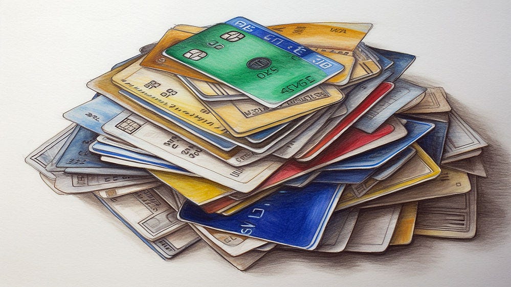
Users want a choice of payment options; this increases ecommerce sales. Show options with logos and use radio buttons for the selection. (“Pile of credit cards” by Midjourney.)
UX Talent Seeking UK or Dubai Job 🇬🇧 🇦🇪
My former colleague, Dr. Mayya Azarova, is looking for a job, preferably in the UK or Dubai. She is beyond extremely smart and skilled. Super prestigious degree (if that matters to you): Ph.D. from UCSD (Don Norman was an advisor!). One of the rare UX anthropologists qualified to conduct both field research and traditional qualitative user research.
Dr. Azarova was awarded the UK High Potential Individual (HPI) visa (which should tell you something) when she was kicked out of the U.S. due to the American immigration rules that don't account for talent. (It's unprofessional to comment on politics, so I won't say what I think of those rules.)
For more information: Mayya Azarova’s LinkedIn profile and videos where she explains the contextual inquiry field study method and how many users to visit for one of these studies. (Both videos are worth watching whether or not you have any openings because you probably ought to do more field research.)
New Killer App: AI as Virtual Girlfriend/Boyfriend
A fascinating article from A16Z predicts that AI companions [will be] one of the first few killer use cases of generative AI for everyday consumers. I have no insights to support or refute this point, but it’s well-argued in the article. And it behooves us to think of new experiences that AI opens up, not just of how it makes existing work more efficient.
How AI Is Changing the Content Business Landscape
I’m going out on a limb to recommend a book I have not read because it has not been published yet: “AI: The Next Revolution in Content Creation” by Dr. Mario García. Since I haven’t read the book, this is not an actual endorsement, but more of a heads-up that you should pay attention to this book because it’s likely to be an exciting advance in our thinking about AI use in many different businesses, from corporate communications to the few surviving legacy news publishers.
Reading the news has changed, and the content business must change with the readers' experience. (Leonardo)
Mario García is one of the world’s most respected and experienced designers with an impressive portfolio, having designed major publications like The Wall Street Journal and the South China Morning Post. García and I didn’t always see eye to eye during the dot-com bubble because I thought he was too wedded to ideas from the print world that were suboptimal for the online technology of the day. (He undoubtedly thought I was too strict in my quest for minimal website graphics when everybody knows big images make a bigger impact — except when they take 30 seconds to download.) I have always respected García as one of the world’s best designers. And now he’s gone Future-Mario in a big way, making it even more imperative to listen to him.
For a great example of García’s modern thinking about using AI in design, see his analysis of layout ideation from Midjourney as applied to newspaper font pages. A great read and a reminder that (a) ideation is free with AI, but that (b) you need a human in the loop to winnow AI-generated ideas so that you only launch the good ones (after an iterative process with human refinement) and leave the wacky ideas on the drawing board, never to be inflicted on a customer.
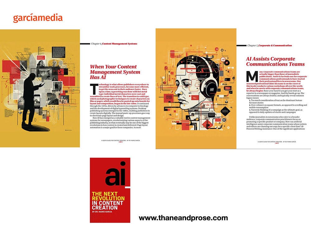
Sample chapter openings from Mario García’s upcoming book. I placed an advance order and recommend that you do as well if your work revolves around content creation, design, or management — or even if you’re a free-spirit independent influencer like myself.
About the Author
Jakob Nielsen, Ph.D., is a usability pioneer with 40 years experience in UX. He founded the discount usability movement for fast and cheap iterative design, including heuristic evaluation and the 10 usability heuristics. He formulated the eponymous Jakob’s Law of the Internet User Experience. Named “the king of usability” by Internet Magazine, “the guru of Web page usability" by The New York Times, and “the next best thing to a true time machine” by USA Today. Before starting NN/g, Dr. Nielsen was a Sun Microsystems Distinguished Engineer and a Member of Research Staff at Bell Communications Research, the branch of Bell Labs owned by the Regional Bell Operating Companies. He is the author of 8 books, including Designing Web Usability: The Practice of Simplicity, Usability Engineering, and Multimedia and Hypertext: The Internet and Beyond. Dr. Nielsen holds 79 United States patents, mainly on making the Internet easier to use. He received the Lifetime Achievement Award for Human–Computer Interaction Practice from ACM SIGCHI.
Subscribe to Jakob’s newsletter to get the full text of new articles emailed to you as soon as they are published.


