UX Roundup: IDEO Cut in Half | Dall-E Characters | AI New UI Paradigm
Summary: Design firm IDEO cut half its staff since 2020, with most layoffs in 2023 | Happy World Usability Day Nov. 9 | OpenAI Keynote livestreamed over the Internet today | Prompting Dall-E to retain characters through seed reuse | AI Is First New UI Paradigm in 60 Years
UX Roundup for November 6. Bird by Leonardo.
Design Firm IDEO Has Laid Off Half its Staff Since 2020
Well-reported article in Fast Company and interesting LinkedIn discussion on a post by article writer Mark Wilson about the severe downsizing of design firm IDEO:
IDEO is eliminating 32% of headcount in 2023 alone
Since 2020, staff has been cut in half (exact percentage not given in the article)
Rumor reported in the article is that annual revenue fell from $300M to $100M
You might think that I’m gloating over the bad fortunes of a competitor, but that’s not my errand here. I have always respected IDEO as one of the world’s better design firms, even back when I ran a UX consultancy and lost some client deals to them. (I also won some, don’t worry.) Now that I’m an independent influencer, I couldn’t care less about the fortunes of individual UX companies since I focus on helping the world’s users.
Empty design office by Leonardo.
To me, IDEO was always too focused on glamour and on hyping fancy design. In contrast, my approach was to make UX cheap and practical with the goal of increasing company profits through conversion optimization. (My bigger goals were always to improve the standard of living for the world population and to make technology less frustrating for normal people, but the only realistic way of achieving these two goals is to help one company at a time ship better products and websites.)
But as I said, despite having different values, I respect IDEO. The town of UX is big enough to accommodate both glamour design and usability design.
Empty design office by Dall-E. Which version do you prefer? Leonardo’s is prettier, whereas Dall-E’s is less realistic but tells the story about why the office is empty. The contrast between the two illustrations makes my point about the contrasting design visions. I like them both, but if I could run only one, I would pick this one by Dall-E.
Going back to basics, cutting half the staff is not a sign that something is fundamentally wrong with IDEO, as was the message of that Fast Company article I linked. The company is 32 years old, and nothing lasts forever — certainly not big staff numbers. In particular, many firms overexpanded during the boom times, and setbacks are the norm right now. Setbacks are not a sign of failure, just a sign of adjusting to more realistic circumstances.
As for how IDEO’s bad news relates to UX in general, I agree with Mike Sukow’s analysis that we’re seeing a more efficient, leaner design processes that will benefit the industry in the long term. This is particularly true as more and more firms build better and bigger internal UX teams and thus need less expensive external consulting. Companies that used to be UX clients have transformed themselves into UX doers. This is good news: We have won!
For my general take on this year’s flood of bad news about UX, I refer you to my article, The UX Angst of 2023, as summarized in this infographic. In particular, AI increases business professionals’ productivity by anywhere from 33% to 66%, so any UX company that goes AI-first will have a strong future, with much demand to help clients increase profitability through AI deployments in enterprise software. (On Oct. 3, IDEO’s homepage didn’t sport a single occurrence of the word “AI” despite 23 feature stories about less-relevant topics. Ignoring the biggest thing to happen to UX in 60 years is not a way to attract customers.)
Feel free to copy or reuse this infographic, provided you give this URL as the source.
Happy World Usability Day: Thursday, November 9, 2023
The annual celebration of usability, World Usability Day, is this Thursday. Check the World Usability Day website for possible events near you: each year typically features around 50 events in about 25 countries. (My email newsletter has subscribers in 118 countries, so there is still some way to go before we have enough celebration events.)
My suggestion for you: on Nov. 9, post to your social media one design that has made you happy (or at least pleased) because of good usability. Let’s be positive on this day of celebration. (On other days, feel free to post about products with terrible usability, of which there are too many to count.)
My own example is the reordering process on nuts.com: it takes me less than a minute from typing in the (blissfully short) URL into the browser until I’m done, as long as I am placing a repeat order on this website. I eat a lot of macadamia nuts 😄
User experience has gone global in a big way this decade. Happy World Usability Day 2023! (Globe by Leonardo.)
OpenAI Keynote Livestreamed Today, November 6
OpenAI’s developer conference opens today, November 6, with a keynote address at 10:00 AM US Pacific Time (6 PM London time, 7 PM Berlin time; here’s a link to convert to your time zone).
You can watch the live stream on YouTube. I hope they are smart enough to keep a recording of the talk at this same URL after the event, in case you missed the live stream.
I have no idea whether this will be an exciting or a boring talk, but I plan to watch for two reasons:
OpenAI is currently the most important company in the AI space, with products like ChatCPT and DALL-E. It’ll be worth getting a feel for their thinking.
OpenAI is notoriously uncommunicative, with no user documentation or advice for using these essential products. Maybe there will be a bit of useful info in the keynote.
Prompting Dall-E to Retain Characters through Seed Reuse
Image-generation tools like Leonardo and Midjourney have long offered the ability to generate more images that retain most stylistic elements by reusing the same “seed” in subsequent prompts. We can now make Dall-E do the same using a prompting hack in ChatGPT. Simon Willison provides an in-depth explanation of the feature, with many illustrations, but here’s the short version.
Evolve images in a persistent style by reusing the random seed in generative AI. (Dall-E.)
The seed introduces a random but consistent variation into the image generation process. This “noise” is essentially a pattern that the AI uses to generate the image. The seed value is unimportant in itself, as its job is to make the results random. However, it does mean that the AI will use a different number at each prompt, producing different results unless the same seed value is reused. (I got this explanation from Perplexity.AI, which I’m using instead of search engines these days. What you just read is its output after light human editing. Always supplement any AI output with human review and editing.)
Use a prompt like this to get the seed used for an image you like: “What’s the seed for the left image.”
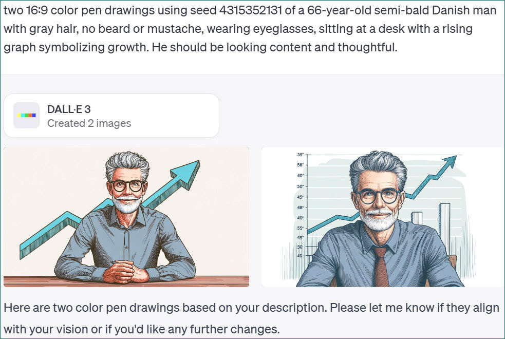
Here is an example of how this works. I was trying to generate a character who looks somewhat like myself. I got one I liked, except for having too much hair and sporting a beard. So I asked ChatGPT for the seed used in the nice picture and issued a new prompt, asking for the character to be semi-bald and clean-shaven. Sadly, Dall-E refuses to draw older men without a gray beard. It takes the cliché of graybeards too literally. It also has a strong preference for people with a full head of hair. So, its stereotypes prevented me from getting a character who looks like me. But it’s certainly a good example of character persistence.
Reusing the seed preserves the character, both in looks and dress, except for minor variations (open collar vs. necktie). So, if you generate a character you like, you can get more images featuring him or her.
AI Is the First New UI Paradigm in 60 Years
AI is introducing the third user-interface paradigm in computing history, shifting from command-based interaction to intent-based outcome specification, where users tell the computer what they want, not how to do it, reversing the locus of control.
The full article has much more detail, but here’s an infographic summarizing the 3 UI paradigms:
Feel free to copy or reuse this infographic, provided you give this URL as the source.
About the Author
Jakob Nielsen, Ph.D., is a usability pioneer with 40 years experience in UX. He founded the discount usability movement for fast and cheap iterative design, including heuristic evaluation and the 10 usability heuristics. He formulated the eponymous Jakob’s Law of the Internet User Experience. Named “the king of usability” by Internet Magazine, “the guru of Web page usability" by The New York Times, and “the next best thing to a true time machine” by USA Today. Previously, Dr. Nielsen was a Sun Microsystems Distinguished Engineer and a Member of Research Staff at Bell Communications Research, the branch of Bell Labs owned by the Regional Bell Operating Companies. He is the author of 8 books, including the best-selling Designing Web Usability: The Practice of Simplicity (published in 22 languages), Usability Engineering (26,283 citations in Google Scholar), and the pioneering Hypertext and Hypermedia. Dr. Nielsen holds 79 United States patents, mainly on making the Internet easier to use. He received the Lifetime Achievement Award for Human–Computer Interaction Practice from ACM SIGCHI.


