UX Roundup: Hindsight Bias | Rubric for Insightful AI | User-Contributed Photos | Black Forest AI
Summary: Stakeholders deem UX work to be “obvious” | Rubric for scoring insightful use of AI | Make it easy to see all user-contributed photos | New image-generation model from Black Forest Labs
UX Roundup for August 12, 2024. (Ideogram) — I challenge you to make an image with another AI image generator that shows a flock of flamingos spelling the word “UX.” I tried Midjourney, Leonardo, and the new Flux without success. If you can do it, please post your image in the comments together with the prompt.
Hindsight Bias: When Stakeholders Claim that UX Work Is “Obvious”
Usability research and UI design both suffer from hindsight bias: once a result has been created, it seems obvious.
You study users and discover X. After presenting this new X insight to stakeholders, they claim that “Obviously, X is true.” While nice to have your findings accepted, this claim of obviousness undermines the value of your work. Why pay good money for research to prove something obvious?
You proceed through many rounds of iterative design to create a UI for something, ending up with design Y as your suggested solution to the design problem. After presenting this new Y design to stakeholders, they claim that “Obviously, Y is the way to design this. Y is clearly a great and easy UI for this feature.” While nice to have your design accepted, this claim of obviousness undermines the value of your work. Why pay good money for a designer to spend that much time, only to end up with the obvious solution?
These two bullets are parallel writing at their finest because these two sides of the coin are the same. Good UX work — whether research or design — should result in something that’s clear, easy, and (yes) obviously the right thing.
The problem is that this outcome (again, whether research findings or UI design) is only obvious after the fact. Before doing the research, we didn’t know X. And before the designer created and discarded many inferior solutions, design Y didn’t exist in the world.
With hindsight, most UX deliverables are obvious, because they are clear and easy. But only in hindsight. Without doing the UX work, we couldn’t know.
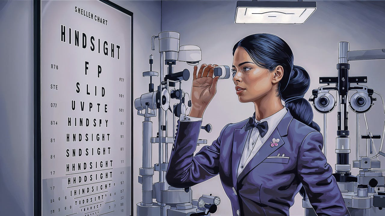
“Hindsight is 20/20” is a classic saying for a reason — where “20/20” means “perfect vision.” (Ideogram)
The conclusion that UX work has low value because it only creates obvious deliverables is hindsight bias.
Mani Pande is head of UX Research at Cisco and one of my favorite UX experts (I have quoted her before in this newsletter on benchmarking and on writing better headlines for user research findings) has an excellent article on combating hindsight bias in UX. She suggests 4 approaches:
Reframe the conversation: Acknowledge familiar issues upfront and provide context for recurring customer pain points. This shifts focus from obvious findings to unaddressed problems. Additionally, incorporate external data points, such as competitor information or industry trends, to enhance relevance and interest for stakeholders.
Conduct a poll: Make presentations interactive by polling stakeholders at the beginning about key questions or predictions. This approach helps demonstrate how accurate or inaccurate their assumptions were, effectively challenging the notion that the information was already known. This technique is particularly useful for both qualitative and quantitative researchers, especially those conducting regular tracking studies.
Contextualize research: Before presenting findings, conduct a comprehensive workshop with stakeholders to review past efforts and failures in addressing similar issues. This process helps shift perception from obvious findings to appreciating actionable insights. Additionally, relate the research to the current product roadmap, distinguishing between addressable and non-addressable issues to increase its practical value and impact on priorities.
Assumption mapping: Engage stakeholders by documenting their assumptions and confidence levels before conducting research. Create a visual grid representing these assumptions. After completing the research, revisit the initial assumptions and compare them with the findings. Group the assumptions into validated, lower confidence, and higher confidence categories based on the data. This approach effectively illustrates how research aligns with or challenges initial expectations, moving the conversation beyond “I knew this all along.”
Common across these 4 tactics is the importance of documenting the “before” state. What did people know or suspect before hearing the research results or seeing the proposed new design solution? By increasing the salience of the “before” knowledge, we increase the value of the “after” knowledge by making the delta between the two explicit.
“Installing irrigation and planting flowers have made this area more beautiful.” Stakeholders will appreciate your excellent landscaping results more if you start out by showing a photo of how the area looked before you worked on it. (Midjourney)
Rubric For Scoring Superficial vs. Insightful AI Use
Mike Kenz published a useful rubric for scoring the use of AI. Even though this is positioned as a tool for assigning grades to students, you can use it in a professional context to score the use of AI for work. Just replace “student” with “I/my” if using the rubric as a self-assessment tool and “employee” if you're a manager coaching your staff.
For example, the topic of prompting strategy is classified at one of 4 levels. “Needs improvement” is characterized by “Student [I/employee] makes little to no use of prompting strategies or may have used AI like a search engine.” In contrast, “exemplary” is described as “Student [I/employee] shows understanding of purpose and task through specific prompting strategies that align with the overall objective. Student [I/employee] demonstrates flexibility in their [my] response to AI when/if certain prompting strategies do not produce the desired outcome.”
Of course, it’s hard to remain objective when scoring your own performance. But please try!
(Hat tip to Sofia Fenichell for alerting me to this rubric.)
Grading stacks of student papers is a chore for teachers. (And for university professors teaching a popular class, as I remember from 40 years ago.) A good rubric makes grading easier, and this is also true for self-assessment of your own professional performance. (Midjourney)
Make It Easy to See All User-Contributed Photos
The Baymard Institute, which is the world leader in e-commerce usability, released the findings from a study of how ecommerce shoppers approach user-contributed product photos. Those are photos uploaded by other users who have bought that product (or visited that restaurant or hotel), which are separate from the professional photos produced by vendors themselves. (The vendors’ photos are extremely important for usability, but that’s another story.)
Maybe not surprisingly, study participants were incredibly eager to see many user-contributed photos. These photos are considered to be more credible, more real, and more useful in that they show the product in real use in various contexts.
(I refer to “photos” here, because that’s what the study addressed, but I suspect that the story is similar regarding user-contributed videos. Videos are less scannable, but for some product categories, seeing a video is even more useful than seeing a photo.)
More surprisingly, many ecommerce sites made it unduly hard to see multiple user-contributed photos. Typically, users had to click into each individual review, one at a time, to see the photos uploaded with that review.
It would be better to provide thumbnail overview pages that afford one-click access to all the available user-contributed photos of the current product. Also, when viewing a single photo, offer carousel-like controls to move to the next and previous image.
People want to see a wide range of user-contributed photos when they shop online, for example for furniture. (Midjourney)
New Image-Generation Model from Black Forest Labs
Startup Black Forest Labs has launched a new ImageGen model called Flux. In fact, 3 models: Flux.1 [pro], [dev], and [schnell]. “Schnell” is German for fast, and Black Forest Labs seems to be a German company, even though they don’t make much of this on their website which doesn’t even have an address. This seems to make BFL the second major EU-based AI company (after pioneering Mistral from France).
[dev] and [schnell] are smaller, faster, and cheaper models, but the big brother is the most interesting. The announcement claims to have benchmark data that shows that [pro] is better at both prompt adherence and image quality than the current leaders, like Midjourney, Ideogram, and Leonardo. They do admit that Ideogram retains a slight edge in typography, which has been the bane of AI image generation since the start but is getting better with each release.
Unfortunately, Flux.1 is not a real product. It doesn’t have a website with a decent user interface for using this image model. The company seems to target being a backend provider to 3rd party image-generation services, which is why they have only released a developer user interface with atrocious usability.
I used the nasty developer interface to make the following image with Flux.1 [pro]:
Image generated from the prompt “A robot artist is painting a canvas with a landscape picture of a dark forest” (Flux.1[pro])
Compare with the image made with the same prompt in Midjourney:
I’ll grant Flux that its image may look a little more polished, but it’s also more boring. I like Midjourney’s touch of the paint splatters on the robot artist. Of course, it’s a matter of style preferences which image you prefer and which painting-within-the-image you like better. FLUX seems more drawn to Romanticism admiring the sublime nature, whereas Midjourney is somewhere between the Barbizon School and Impressionism.
Several existing AI image services are integrating Flux, but it’s unclear whether they all offer the high-end “Pro” model. Civitai is honorable enough to admit that they only offer the cheaper “Dev” version, which won’t give you a representative understanding of the capabilities of the full model.
Currently, the best place to access Flux seems to be Freepik, which I used for all the Flux-generated images for last week’s article on disruptive innovation in design.
I have seen many comments lauding Flux as a “Midjourney-killer.” This is a vast overstatement in my judgment. Flux does have Midjourney-level image quality, especially for photorealistic images and also somewhat better prompt adherence (including typography), which will remain Midjourney’s weak spot until release 7 hopefully improves prompt adherence and achieves better language understanding of the prompts.
But Midjourney is superior in its wide range of artistic styles and non-realistic illustrations, which are my favorite approach to illustrations in this newsletter. More important, even though I was a harsh critic of Midjourney’s poor usability last year, this year, Midjourney’s usability has improved by leaps and bounds after launching a web-based UI. (They still rely too much on obscure command flags.) The main point is that Midjourney actually has a UI that’s (somewhat) optimized to serve creators, whereas Flux is only a background AI model with no UI of its own. Yes, we can plug this model into a variety of online services (there’s even a pure command-line chat UI for Flux on Poe) but an add-on approach will never create nearly the same usability as an integrated design.
As an analogy from the hardware world, Flux is like the old-school “plug and pray” approach to adding peripherals to a Microsoft PC, whereas Midjourney is more like Apple’s top-to-bottom integrated stack where they design all the components to work together seamlessly. To Microsoft’s credit, modern USB-C connectors have mostly overcome the “plug and pray” nightmare of the past, but for those of us who remember, it serves as a warning against a non-integrated user experience built by cobbling together independent elements.
About the Author
Jakob Nielsen, Ph.D., is a usability pioneer with 41 years experience in UX and the Founder of UX Tigers. He founded the discount usability movement for fast and cheap iterative design, including heuristic evaluation and the 10 usability heuristics. He formulated the eponymous Jakob’s Law of the Internet User Experience. Named “the king of usability” by Internet Magazine, “the guru of Web page usability” by The New York Times, and “the next best thing to a true time machine” by USA Today.
Previously, Dr. Nielsen was a Sun Microsystems Distinguished Engineer and a Member of Research Staff at Bell Communications Research, the branch of Bell Labs owned by the Regional Bell Operating Companies. He is the author of 8 books, including the best-selling Designing Web Usability: The Practice of Simplicity (published in 22 languages), the foundational Usability Engineering (27,319 citations in Google Scholar), and the pioneering Hypertext and Hypermedia (published two years before the Web launched).
Dr. Nielsen holds 79 United States patents, mainly on making the Internet easier to use. He received the Lifetime Achievement Award for Human–Computer Interaction Practice from ACM SIGCHI and was named a “Titan of Human Factors” by the Human Factors and Ergonomics Society.
· Subscribe to Jakob’s newsletter to get the full text of new articles emailed to you as soon as they are published.
· Read: article about Jakob Nielsen’s career in UX
· Watch: Jakob Nielsen’s 41 years in UX (8 min. video)


thank you Jakob for the shout-out, I am a big fan of your work since my PhD days
Generé la imagen en Adobe Firefly , pero no la puedo añadir.