


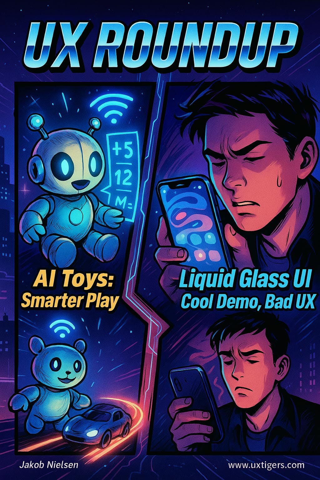
UX Roundup: Caption Contest | AI Toys & Appliances | Liquid Glass

Summary: Caption contest | OpenAI + Mattel team up for AI toys | Apple Liquid Glass has poor usability
UX Roundup for June 16, 2025. (ChatGPT)
Caption Contest: What Is the Sushi Chef Doing?
I made the following cartoon with ChatGPT, and I like the absurdity of this situation, but I don’t have a great caption for it. What is the sushi chef doing? Exercise your funny bone and suggest a caption: captions could be descriptive, or a quote the chef is thinking or saying.
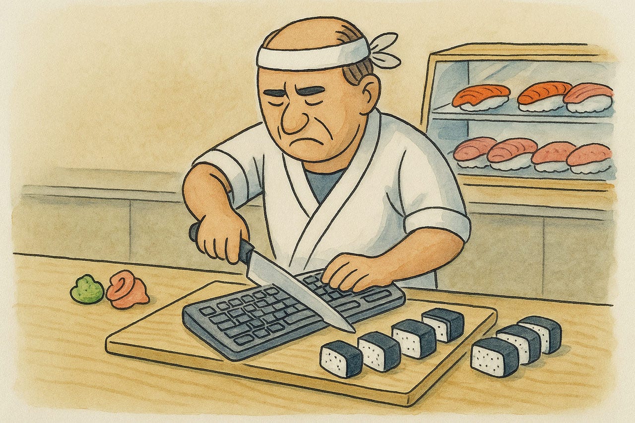
Please add your caption to the thread I posted on LinkedIn. I’ll select the best caption and run it in next week’s newsletter, so this is your chance for eternal (?) fame.
AI Toys and Appliances
I am very excited to see what AI-enabled toys will result from the partnership between OpenAI and Mattel (the iconic toy company behind brands like Barbie and Hot Wheels). I certainly see great educational opportunities, but also more engaging, more fun, and more varied play, including individualizing play for each child's unique interests.

In 1992, a "Talking Barbie" famously declared, "Math is hard!" to the dismay of many. With the power of AI, a future Barbie could not only solve complex mathematical problems but, more importantly, could act as a playful and engaging tutor, helping children grasp mathematical concepts through interactive stories and games tailored to their learning pace. (ChatGPT)
AI-enabled toys can bring to life the “Young Lady’s Illustrated Primer” from Neal Stephenson’s 1995 science fiction novel The Diamond Age. (Highly recommended if you like SiFi.)
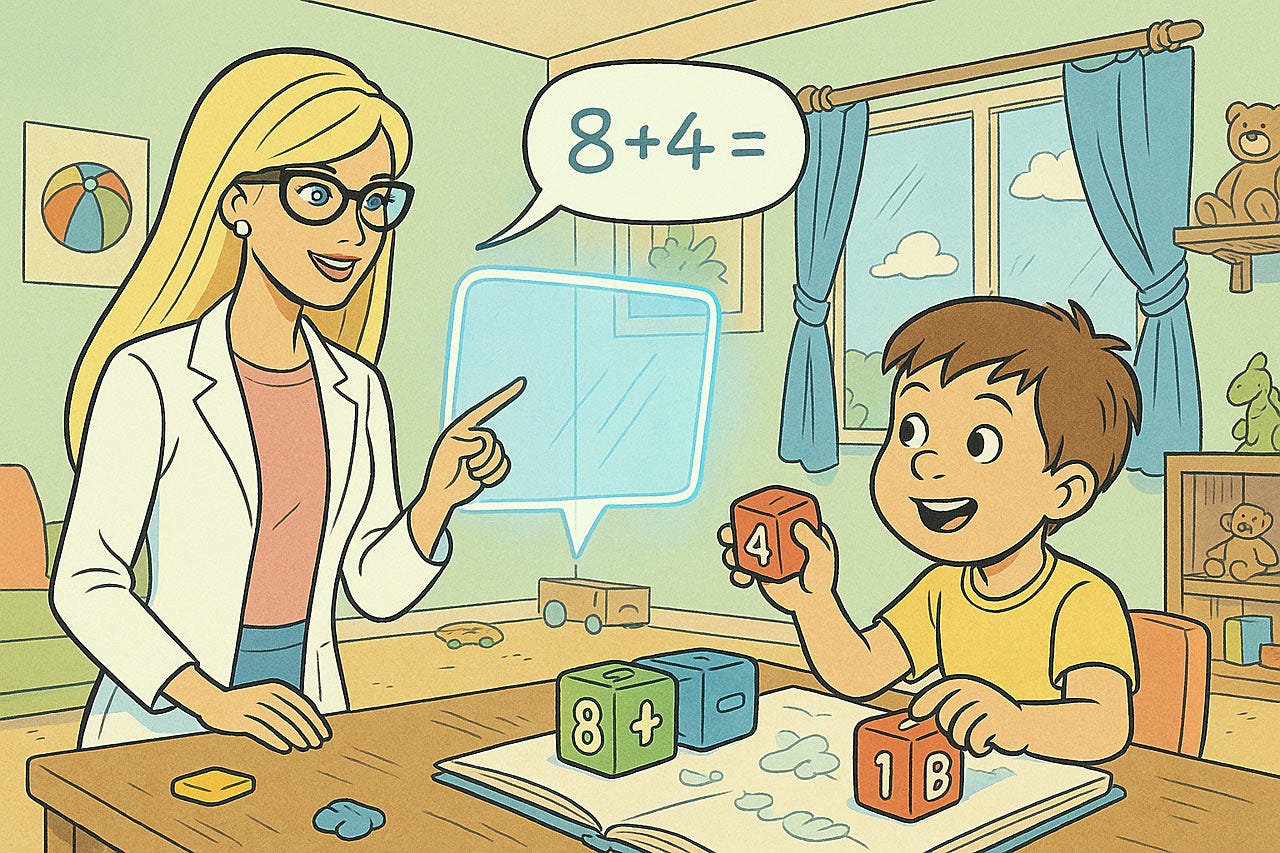
Initially, an AI-enabled toy will be like having a personal teacher for your child, to inject a dose of education during playtime. Later, I expect all toys to embody intelligence and communicate and coordinate with each other, resulting in more physically engaging smart play that’s multimodal and very different from anything supplied by human teachers. (ChatGPT)
I am much more positive about OpenAI teaming up with a big toy company than I am about them spending a fortune on Jony Ive’s design firm to design AI appliances. Ive is undeniably a gifted industrial designer, and the resulting AI appliances will undoubtedly be beautiful. However, aesthetics are only one facet of user experience. The usability of a product (how it works) is far more critical than its surface appearance.
Jony Ive’s history at Apple is a cautionary tale: he did good work while restricted to the appearance of the hardware, but once he took over responsibility for the software UI as well, Apple’s usability started to dive and has never fully recovered. He was guilty of many usability atrocities, such as flat design and thin fonts.
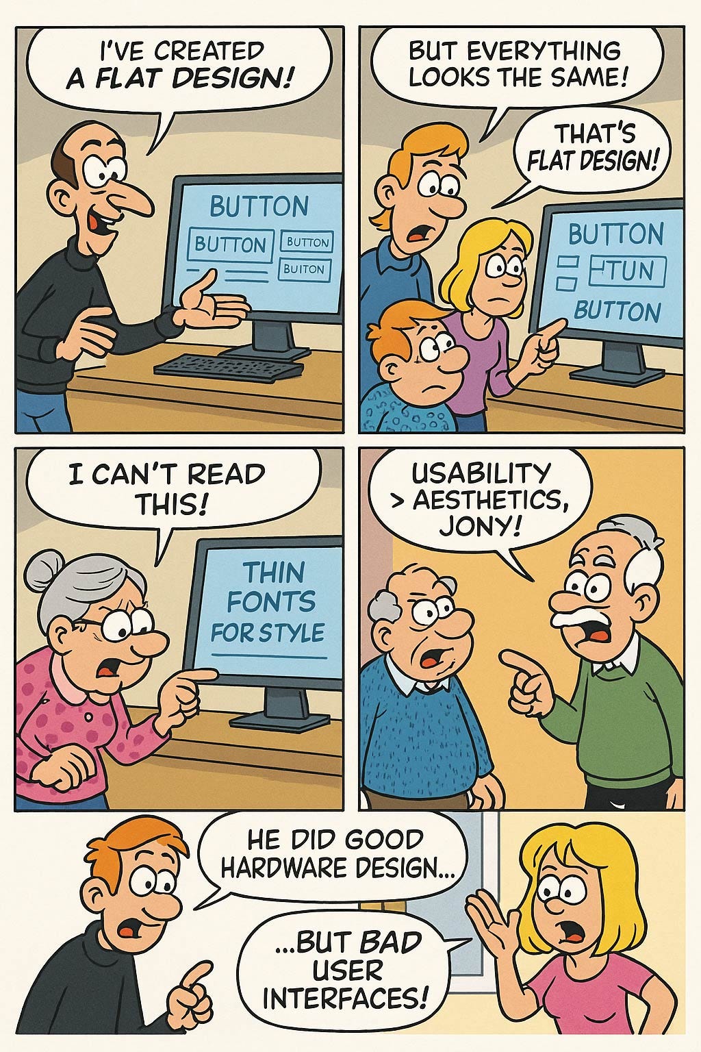
Flat design stripped away many of the visual cues that made the interface intuitive. Buttons lost their dimensionality, making them harder to identify as interactive elements. This move, driven by a minimalist philosophy, often came at the expense of clarity and ease of use.
Perhaps one of the most egregious usability offenses of Ive’s tenure as Apple’s Chief Design Officer was the introduction of ultra-thin fonts. While these typefaces may have looked elegant on a designer’s high-resolution display, they were a nightmare for many users, particularly those over the age of 40 or anyone with less-than-perfect vision. The low contrast of these wispy fonts against a stark white background made them difficult to read, causing eye strain and frustration.
Ive’s design choices highlight a tendency to prioritize a specific, minimalist aesthetic over the practical needs of a diverse user base. While Ive’s early work at Apple, focused on hardware, was groundbreaking, his later influence on software demonstrated a blind spot for human-computer interaction.
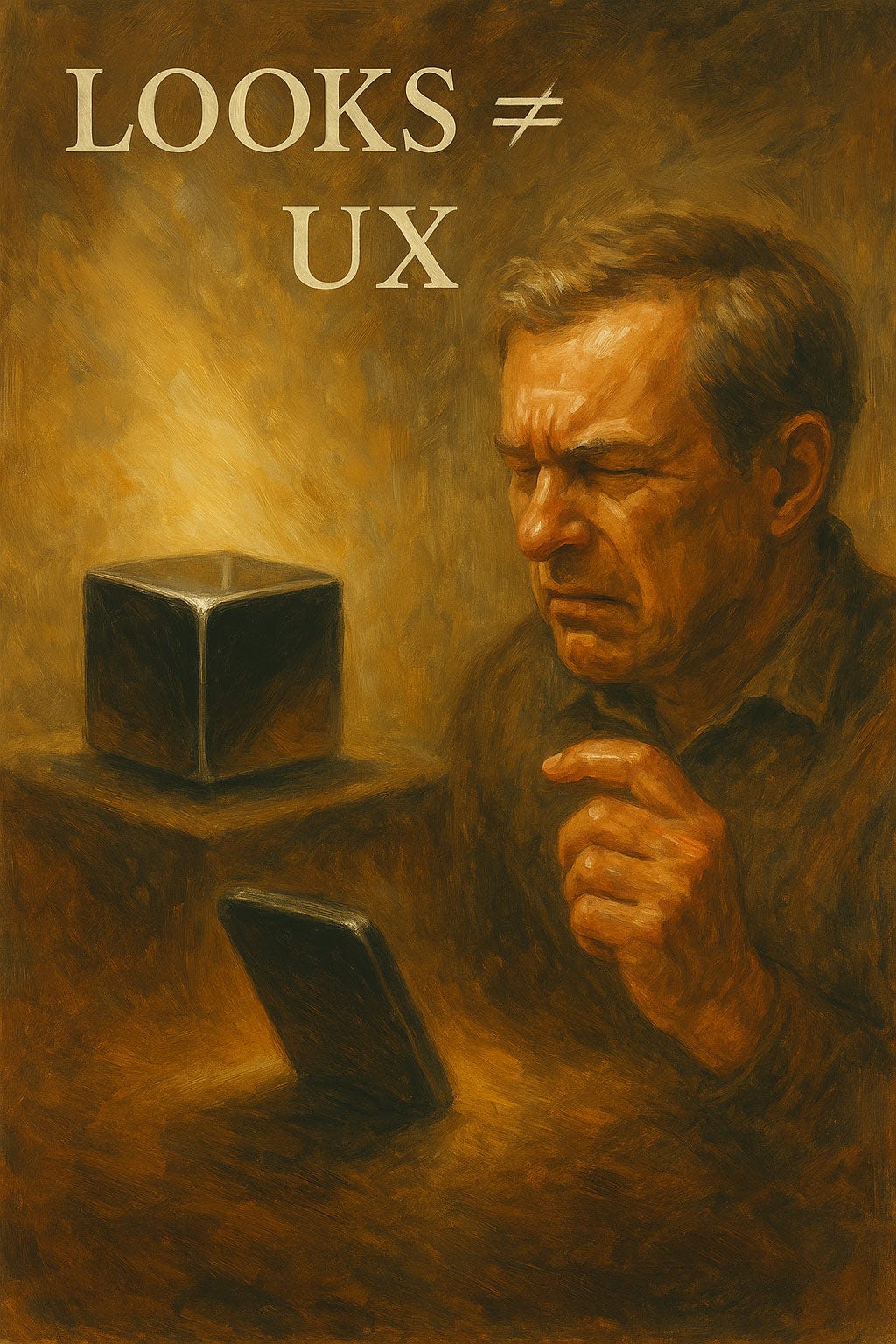
Sleek looks and shiny hardware are insufficient to create an engaging and usable experience. In fact, by diverting design resources from usability considerations, they may have a net negative effect on UX. (ChatGPT)
My guess as to why OpenAI fell into the trap of engaging Jony Ive is that they don’t understand user experience design (being a bunch of geeks) but have a simplistic model that “design is design,” regardless of the type of design, and is dominated by appearance.
Design Directives for AI Toys (and Future AI Appliances)
Surface Delight ≠ Sustained Engagement
Shiny plastic fades; interaction patterns persist. Prototype play flows before sculpting the chassis.
Affordances Must Survive Childhood Abuse
Touch and gestures should support sticky, shaky, or gloved hands. Design for the grimy reality, not the pristine studio shot.
Explainable AI for Eight‑Year‑Olds
Kids ask why and deserve answers. Embed conversational rationales (“I suggested this track layout because it’ll give you a bigger loop‑de‑loop!”).
Parental Overrides in Hardware
AI toys should include a literal off switch and a visible privacy indicator. A parent shouldn’t need one more app to enforce bedtime.
Contrast and Size Still Matter
If Apple can trip over skinny fonts, so can toy designers. Use bold typography and chunky icons; your users are still working on fine motor skills.
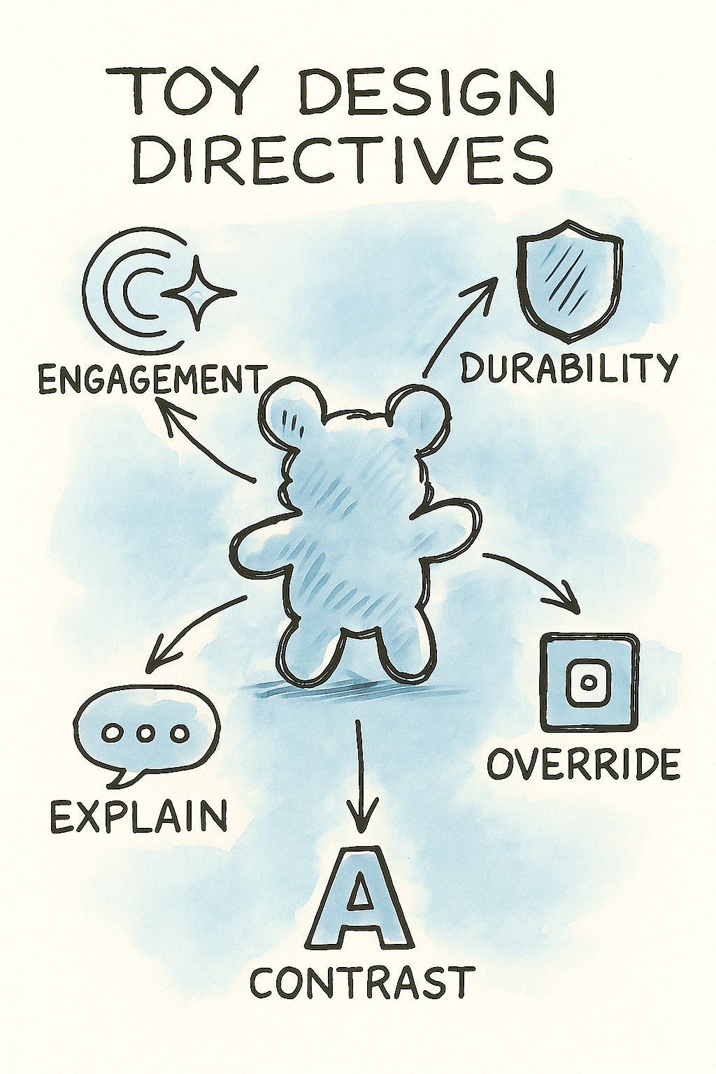
5 UX considerations for AI toys. (ChatGPT)
AI toys must work in the messy world of real kids, not just in the design studio. (ChatGPT)
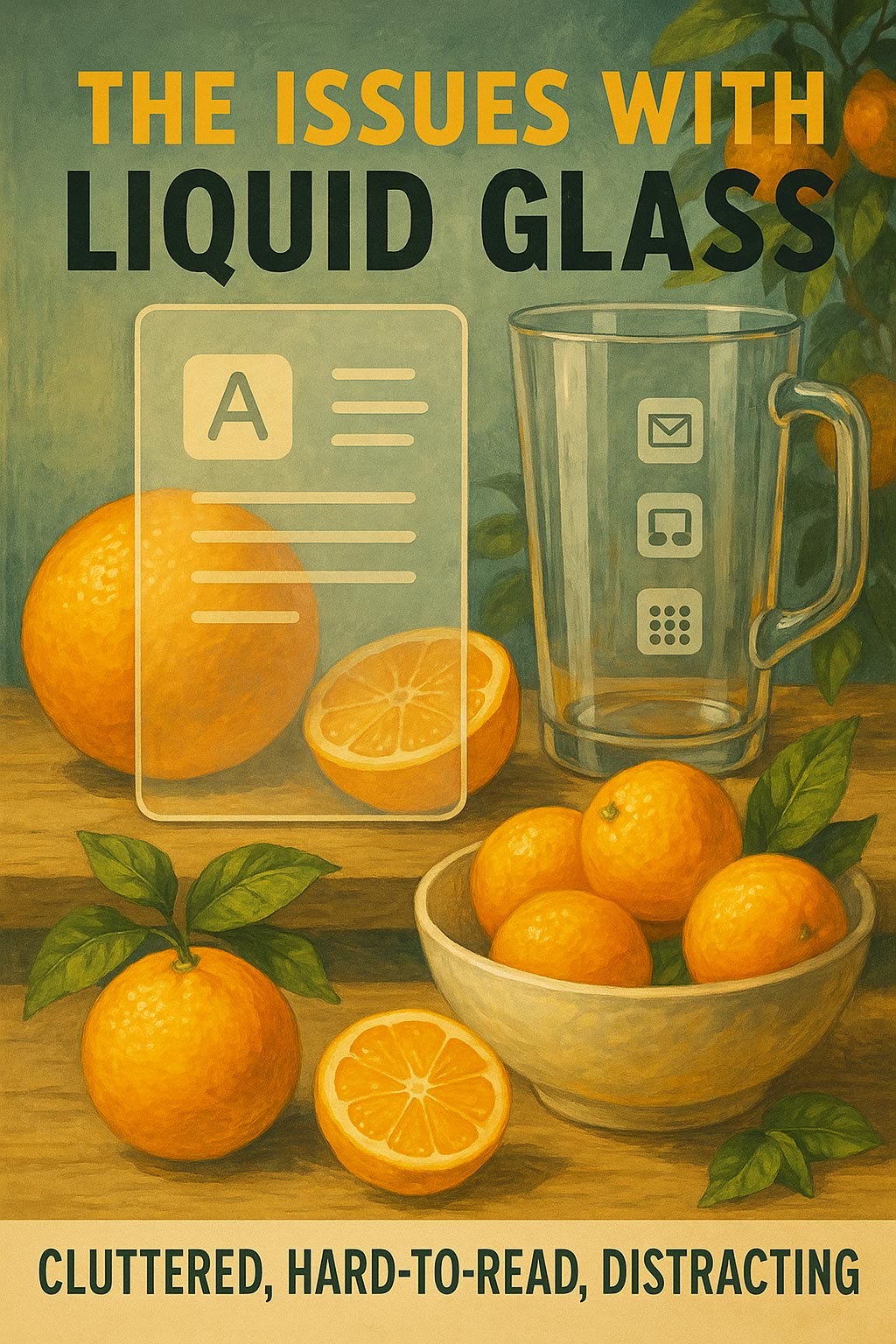
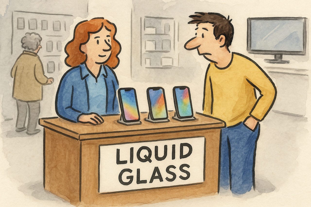
Apple Liquid Glass UI
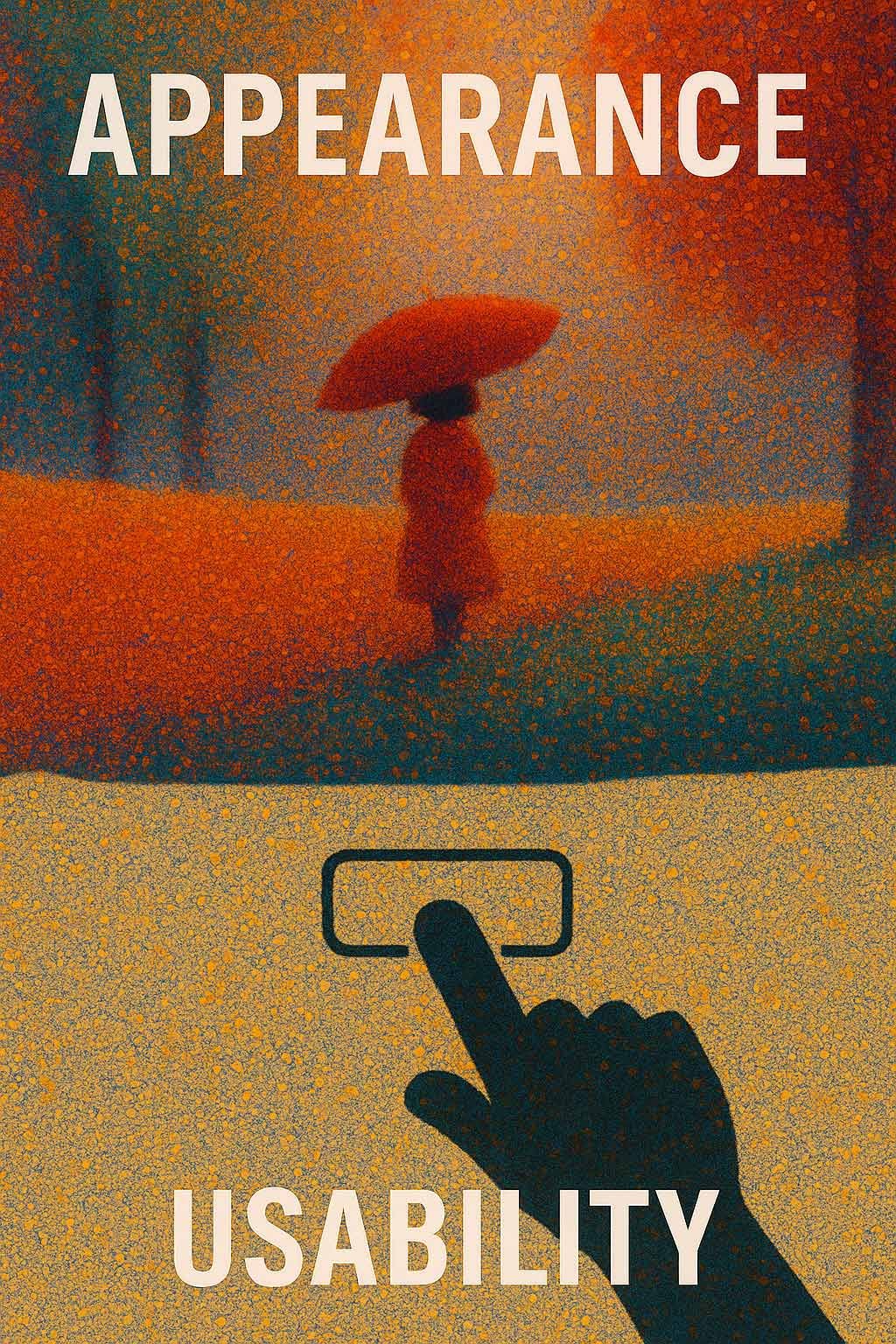
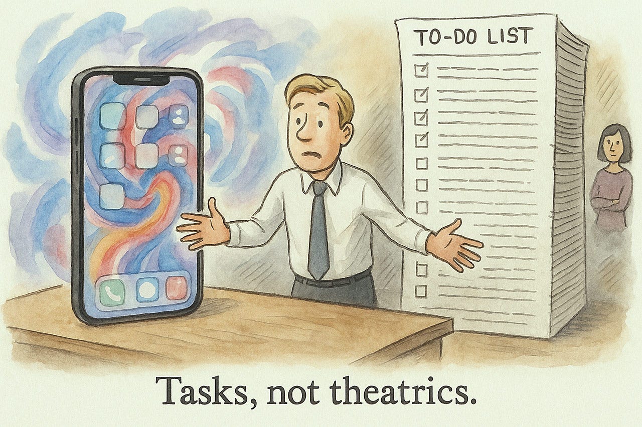
The tension between designing for appearance and designing for usability is even more pronounced in Apple’s new “Liquid Glass” style, introduced with iOS 18.
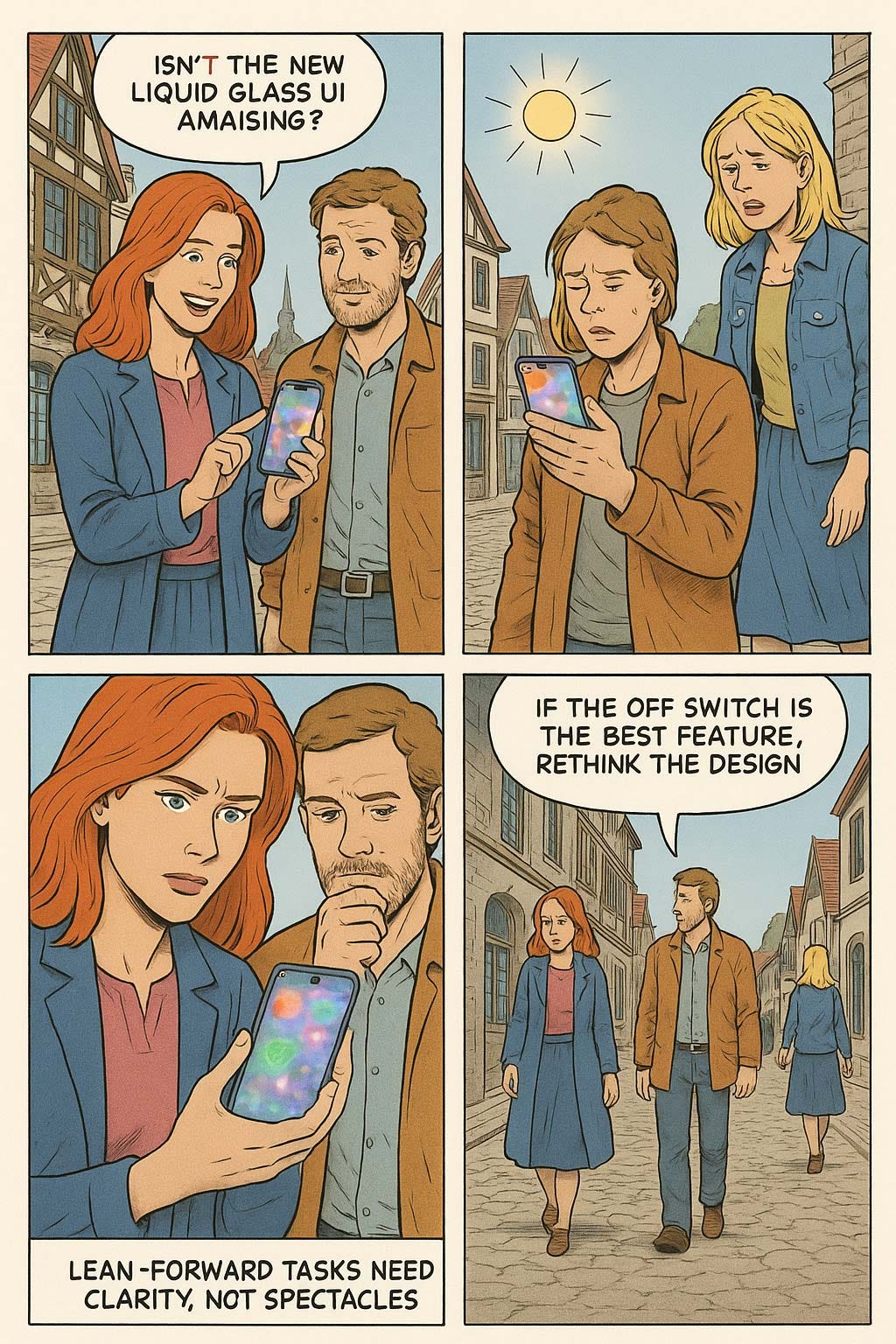
There is no doubt that the Liquid Glass style makes for extremely cool demos, as shown in several videos that have been circulating on social media. Those animations look good when you lean back and admire them. However, a “lean-back” experience is not what user interface design is about. UX is “lean-forward” — it’s interaction design, where users have to engage with the UI to achieve their goals, not to admire it.
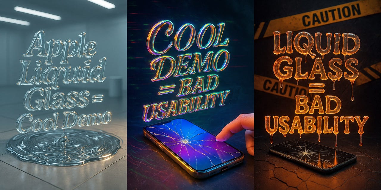
Do the math: when something looks cool in a demo, it often has bad usability in real use. That certainly seems to be the case for Apple’s “Liquid Glass” user interface style. (ChatGPT)
The difference between demos and real use is really that between watching and doing. Two completely different modes of experience:

A fast car chase, complete with explosions, is exciting to watch in an action movie, but you don’t want your daily commute to look this way. (Midjourney)

If you’re the driver behind the wheel, then a quiet drive is more pleasant than a car chase. Even better, if it’s an AI-driven car and you can sit back and enjoy the landscape. (Midjourney)
Demonstrations are the enemy of usability assessment. They present a flawless, curated path through a user interface, a spectacle completely divorced from the messy reality of genuine user interaction. Judging usability by watching a demo is to misunderstand how people fundamentally use systems.
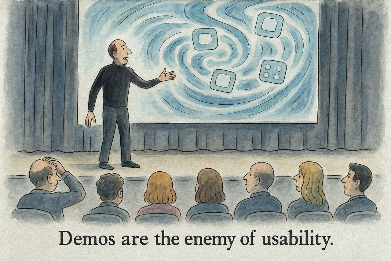
The core issue is the chasm between passive observation and active use. A demo lulls you into a false sense of security. The presenter glides through the interface, never making a wrong turn, never encountering a confusing label, and never needing to recover from an error. Every click is perfect, every feature discovery seamless. This is not user experience; it is a performance.
In a demo, each step seems obvious, because the presenter explains it. Less so when users need to figure things out on their own. (ChatGPT)
Real users, however, do not follow a script. They hesitate, they question, they make mistakes. True usability is uncovered when a user has control and freedom. Does the user understand the information architecture? Can he or she recover from errors without frustration? These are questions a demo can never answer.
Watching a slick presentation of a UI is, at best, a summary of its features. It is not a measure of its learnability, efficiency, or user satisfaction. To truly gauge the usability of a design, you must observe real users as they attempt to complete real tasks. Anything less is not only a disservice to your users but a surefire path to a product that shines in a demo but fails in the real world.
People want to do things with computers. Sometimes this is the task is to have fun, such as watching a music video, but even then, the UI should not grab attention for itself. Support users, bamboozle them. (ChatGPT)
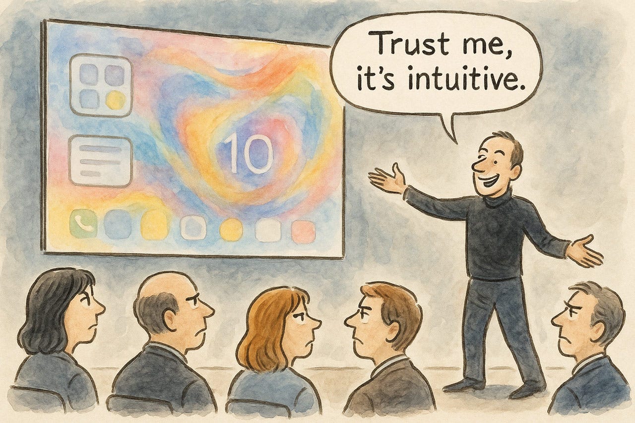
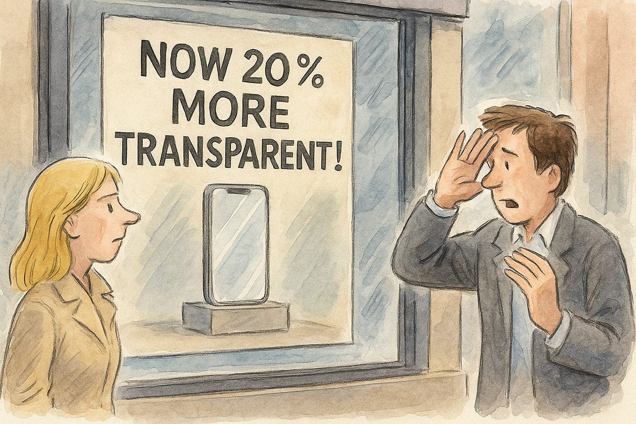
I’ve seen some design influencers praise Liquid Glass for being beautiful (I agree) and for being a bold visual refresh that injects emotion and expressiveness into the UI. I disagree with these latter points: yes, the new design may be bold and different, but those are negative qualities in UX, where design should serve the users and not impose itself. The supposed emotion and expressiveness are felt when watching the demo for the first time, but in repeated use, excessive animation quickly grows old and feels annoying rather than refreshing.
Another argument for Liquid Glass is that it supposedly sets the stage for augmented-reality products. This is a spurious argument for two reasons:
Most important, phones are not AR goggles, and thus need a different user experience. So even if Liquid Glass were the perfect UI for AR, that’s not a reason to use it elsewhere. (Yes, we do want consistency between platforms in things like the functionality of an on-off toggle, and thankfully, Liquid Glass does preserve the functionality of GUI widgets, even as it alters their appearance.)
Even in AR, I question the usability of transparent overlays. In most cases, opaque overlays are likely to have better usability. They simply need to be minimal and get out of the way most of the time.
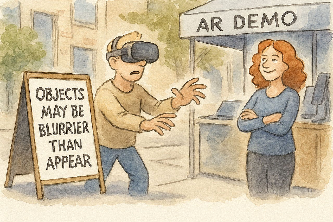
Transparent overlays are probably not even good for augmented reality goggles. (ChatGPT)
Finally, AR should not be the tail that’s allowed to wag the dog of general-purpose UI design. I was very skeptical when Apple launched its Vision Pro goggles, dismissing it as mostly hype as early as June 2023. An analysis I confirmed when more Vision Pro usage data became available in February 2024. (Vision Pro does seem useful for specialized use cases, such as surgery. However, that specific example is not a strong argument in favor of deferring to the platform, as it will likely be considered medical malpractice in 10 years to let a human surgeon anywhere near a scalpel. Very soon, all surgery will be performed by AI-driven robots with perfect multimodal understanding of all telemetry data without the need for goggles.)
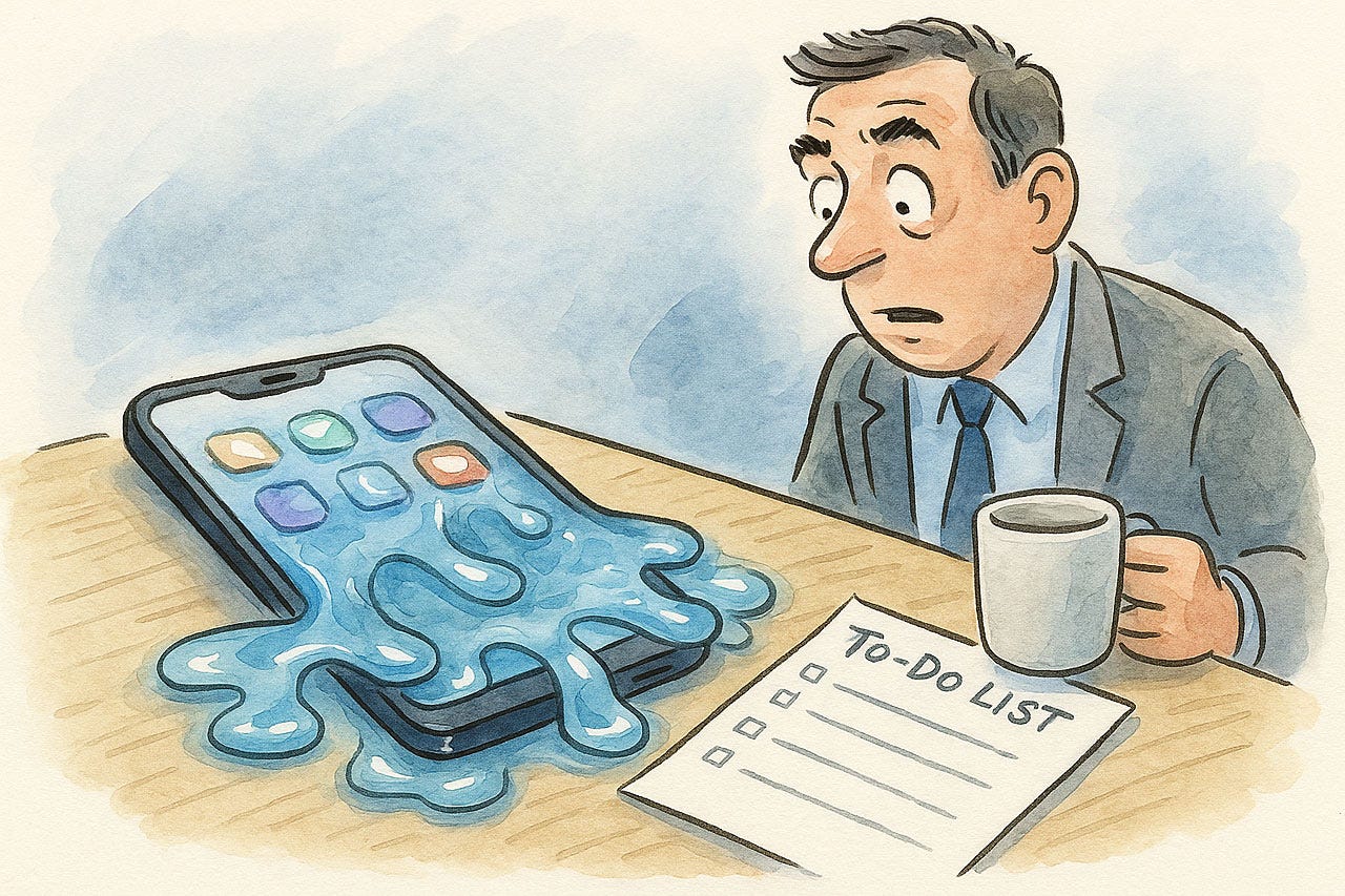
The usability arguments against Liquid Glass are much more compelling:
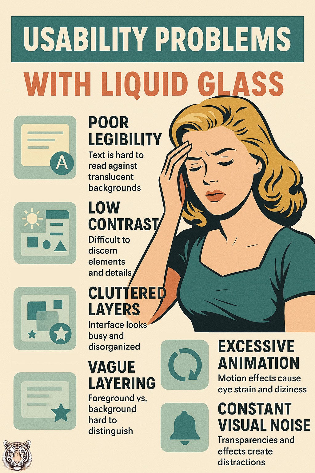
Users struggle to read text and icons due to poor legibility. Translucent backgrounds frequently undermine readability, making notifications and labels hard to read at a glance against variable content. This forces users, especially those in a hurry or outdoors, to spend extra time and effort to discern information, which is a direct hit to task efficiency.
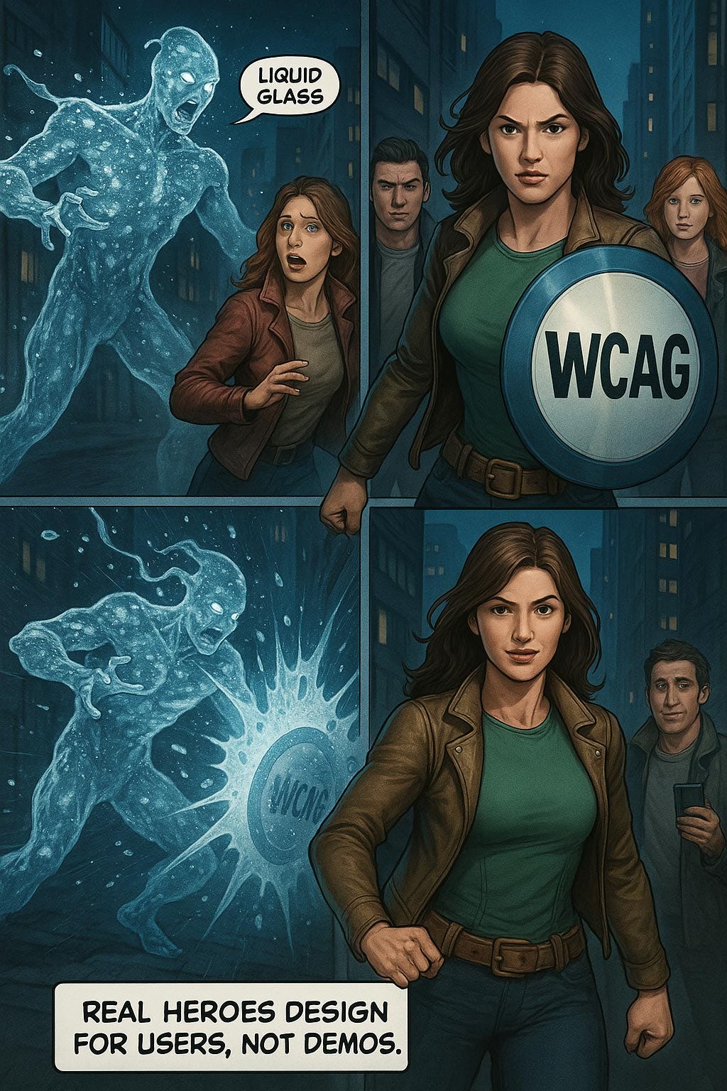
Low contrast creates significant readability problems for all users. When text or icons are placed on a translucent pane, background colors and shapes can bleed through, rendering interface elements unpredictable and hard to see. Many screens in the beta fail to meet WCAG contrast guidelines, creating obvious barriers for low-vision users and making text challenging to read even for people with normal vision in bright light.
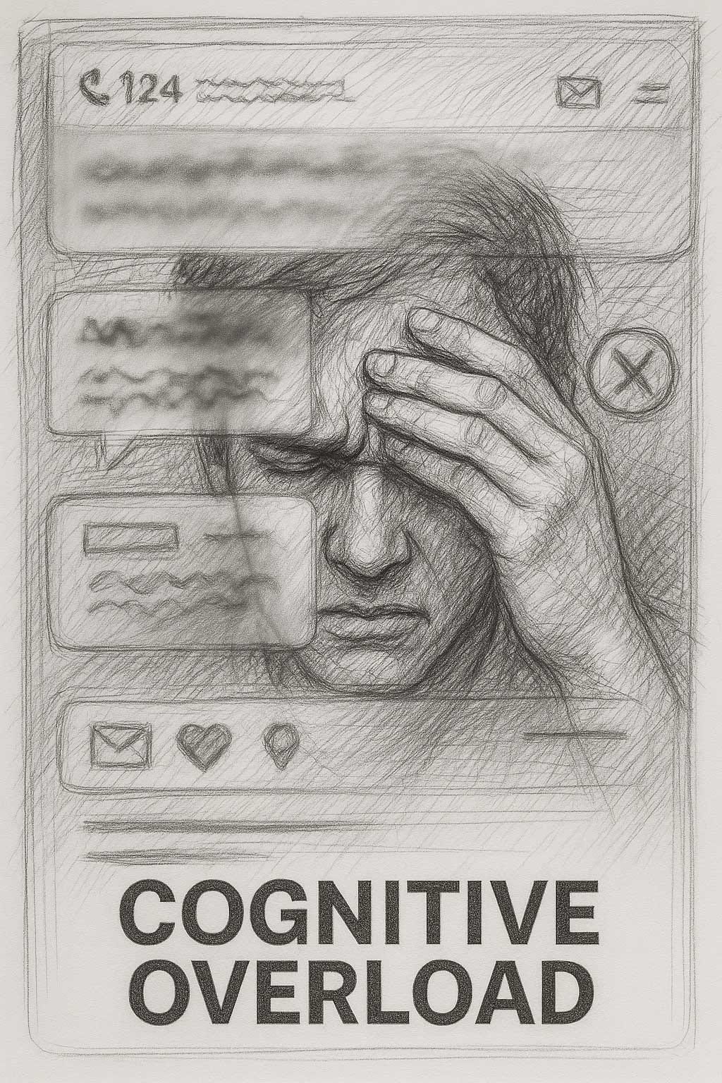
Cluttered layers make the interface confusing and difficult to use. Controls have insufficient separation from the content behind them, making the screen look busy and disorganized. This forces the user’s brain to decipher a muddled stack of icons and shapes, increasing the mental effort required to navigate.

Vague layering causes user disorientation and context loss. The heavy use of blur and transparency makes it difficult for users to distinguish between foreground and background content, leading to moments of confusion. (The Gestalt principle of figure vs. ground is otherwise one of the main ways users make sense of visual design.) When users must mentally disentangle interface layers, every interaction takes more cognitive effort, violating Steve Krug’s classic usability mantra: “Don’t make me think.”
Excessive motion and animation risk triggering sensitivity issues. The constant animation of translucent layers, especially when opening menus or scrolling content, can cause eye strain and dizziness. This presents a clear accessibility pitfall for users with vestibular disorders.
Constant visual noise increases distraction and mental fatigue. The shifting transparencies and background effects create a form of visual multitasking, forcing users to divide their attention between their task and the interface itself. This high cognitive load is mentally fatiguing, as users must consciously filter out decorative effects that are constantly vying for their attention.
The most common complaint I have heard voiced by UX influencers is that Liquid Glass lowers accessibility, to which defenders have pointed to Apple’s features for disabling or scaling back the effects. However, we know that most users do not customize their preference settings, and even users without disabilities will suffer reduced usability from Liquid Glass. If the best you can say about a feature is that it’s possible to disable it, that’s a good reason not to introduce it in the first place.
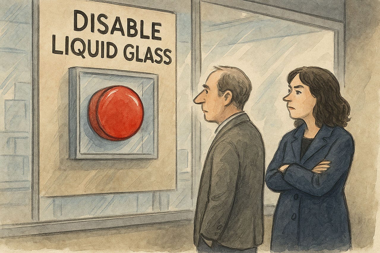
A main benefit being promoted by the defenders of Liquid Glass is the ability to disable it. To me, that’s an argument for not having this design in the first place. (ChatGPT)
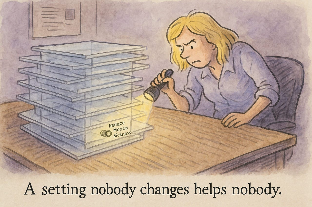
Realistically, most users never touch the preference settings. While preferences can sometimes be useful for a few users, it’s incumbent on designers to optimize the default user experience since that’s what most people will be using. (ChatGPT)
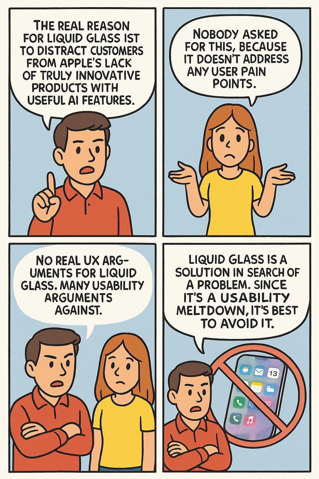
In a final assessment of Liquid Design, the most damning point comes from asking, “what problem does it solve?” The true answer is to serve as a distraction from Apple’s lack of compelling AI products or features, which will soon cause a significant exodus from their platform, as users flock to Android and Chinese platforms with better AI. However, leaving this internal company dysfunction behind, there is no user experience problem that Liquid Glass solves.
The real reason for Liquid Glass is to distract customers from Apple’s lack of truly innovative products with useful AI features. (ChatGPT)
Nobody asked for this, because it doesn’t address any user pain points. (ChatGPT)
No real UX arguments for Liquid Glass. Many usability arguments against. I rest my case.
Liquid Glass is a solution in search of a problem. Since it’s a usability meltdown, it's best to avoid it. (ChatGPT)
Conclusion:
About the Author
Jakob Nielsen, Ph.D., is a usability pioneer with 42 years experience in UX and the Founder of UX Tigers. He founded the discount usability movement for fast and cheap iterative design, including heuristic evaluation and the 10 usability heuristics. He formulated the eponymous Jakob’s Law of the Internet User Experience. Named “the king of usability” by Internet Magazine, “the guru of Web page usability” by The New York Times, and “the next best thing to a true time machine” by USA Today.
Previously, Dr. Nielsen was a Sun Microsystems Distinguished Engineer and a Member of Research Staff at Bell Communications Research, the branch of Bell Labs owned by the Regional Bell Operating Companies. He is the author of 8 books, including the best-selling Designing Web Usability: The Practice of Simplicity (published in 22 languages), the foundational Usability Engineering (28,612 citations in Google Scholar), and the pioneering Hypertext and Hypermedia (published two years before the Web launched).
Dr. Nielsen holds 79 United States patents, mainly on making the Internet easier to use. He received the Lifetime Achievement Award for Human–Computer Interaction Practice from ACM SIGCHI and was named a “Titan of Human Factors” by the Human Factors and Ergonomics Society.
· Subscribe to Jakob’s newsletter to get the full text of new articles emailed to you as soon as they are published.
· Read: article about Jakob Nielsen’s career in UX
· Watch: Jakob Nielsen’s first 41 years in UX (8 min. video)