UX Roundup: Live Tomorrow | Irrelevant User Research | Good Taste or Numbers | Business Impact | Ideogram v. 0.2 | UX Angst
Summary: Jakob live on ADPlist tomorrow | Wasting user research on low-value questions | Frame UX work for higher business impact | AI impact on the design profession: good taste is a career differentiator, as UX becomes more data-driven | Ideogram now in version 0.2 | Many UX newbies worry about the future of their chosen field: Don’t worry, it’ll be fine!
UX Roundup for December 4, 2023.
Live Interview Tomorrow, December 5
I am doing a live “fireside chat” with ADPlist tomorrow, Tuesday, December 5, at 5pm USA Pacific time. (Somewhat like an “ask me anything,” but with video instead of text.) Free, but registration required.
Corresponding times:
San Francisco (USA Pacific time): December 5, at 5pm
New York (USA Eastern time): December 5, at 8pm
São Paulo (BRT): December 5, at 10pm
London (GMT): December 6, at 1am
Paris/Berlin: (CET): December 6, at 2am
Dubai (GST): December 6, at 5am
New Delhi (IST): December 6, at 6:30am
Bangkok (ITC): December 6, at 8am
Singapore/Beijing (SGT/CST): December 6, at 9am
Seoul (KST): December 6, at 10am
Sydney (AEDT): December 6, at 12pm
Link to convert this time into your own time zone.
I tried to generate a character who looks a little like myself, and this is as good as it gets with my prompting skills. “Fireside chat” by Leonardo. (At least is a closer match than what I generated in June for my article on how AI extends the creative careers of older knowledge workers.)
Wasting User Research on Low-Value Questions
The biggest problem in UX is companies not conducting enough user research. But paradoxically, it’s also a problem when certain stakeholders get so enamored with user research that they commission the UX department to waste resources on researching questions of no value to the business.
British UX veteran David Hamill provided a wonderful example of wasteful user research in a recent post.
A proposed new product feature was under discussion in an unnamed company. (It turned out that the feature was useless, and it was never released.) The design for the feature included an illustrated figure who was introducing the concept to users. There had been discussions going up to senior levels about whether this figure should be a scientist or a wizard. David was asked to conduct research to resolve this debate.
Of course, it’s best to resolve design debates by user research, but it’s also best not to waste the company’s money. In this example, the proposed study would clearly have minuscule ROI — in fact, since the feature was never released, the research would have had zero ROI. The study should not be done, and luckily, David convinced management not to waste their money.
Given limited resources, user research should be focused on those research questions that are most likely to create insights of value to customers and the business. Not on resolving vanity debates.
Should a new feature be explained to users by a character who looks like a scientist or a wizard? This is a distinctly tertiary research priority, very low on ROI compared to researching whether it’s worth building this feature in the first place and how it should be designed if the initial research shows promise. (Scientist and Wizard by Dall-E.)
AI Changing the Design Profession
The latest episode of the “Future of UX” podcast features a 55-minute interview with Sarah Gibbons, the strongest UX talent I have met in my 40-year career. It’s always worth listening to Gibbons, who is a great communicator, but this interview is fascinating because it focuses on the changes to the design profession necessitated by AI.
The interview drilled into the initial hurdles and strategies for embracing AI, particularly for novices or those encumbered by workplace constraints. Gibbons emphasized the absence of a universal formula for AI integration, advocating for a personalized approach that weaves AI seamlessly into daily tasks. For UX practitioners, immersing in AI technology is imperative. Gibbons urged rapid AI fluency, harnessing its power to navigate the swiftly changing tech landscape.
I particularly liked her pushing listeners to dive into AI, pushing its limits, not just in professional settings but also in everyday life, such as cooking or movie selection. UX professionals must immerse themselves in AI technology, preferably with a hands-on approach to explore and experiment with AI. The advantage of using AI in everyday life is that it feels lower-risk and safer to people, especially those who are new to UX and may not trust themselves to discern between good vs. bad outputs if using AI for product design. It’s almost as if the two skills (UX & AI) have to be practiced in parallel and not always together...how to use AI fluently alongside maturing one’s UX skillset. It is hard to do both simultaneously if you’re new to the field. Thus, practicing AI at home/away from work may provide a safer playground where one is more likely to discern outputs and thus push boundaries.
Sarah Gibbons recommends using AI in everyday life as a low-risk way to immerse yourself in its capabilities quickly. (Dall-E)
Gibbons highlighted the role of AI in both the divergent (ideation) and convergent (synthesis) phases of the design process, pointing out that while AI can aid in generating a multitude of ideas and concepts, the final refinement and decision-making still heavily rely on human judgment and expertise. The role of designers in an AI-integrated world will evolve, with much future value coming from keen discernment (some would say “good taste”). She anticipated significant changes in how designers and researchers approach their work, spurred by AI’s evolving capabilities. Gibbons predicted a seismic shift in the roles of designers and researchers as AI’s analytic abilities catalyze new approaches in research and design, leading to more precise, data-driven outcomes.
Gibbons finally envisioned a future where AI’s role in design extends beyond practical applications to influencing design education and training. As AI becomes a standard part of the design toolkit, there will be a growing need for designers and researchers to be proficient in AI-related skills understanding how to collaborate with AI to achieve the best results effectively.
AI will drive a duality in the UX profession. On the one hand, skilled designers will create value by applying good taste when selecting from many AI-generated options. On the other hand, UX research and design will become more precise and data-driven. Taste or numbers? Probably both! (Images by Dall-E)
Frame UX Work for Higher Business Impact
The winner of the Jakob Nielsen award for best social media post of November 2023 goes to Dan Winer (Head of Design for Smile.io). He posted a 6-step plan for framing UX work in terms of business impact.
Following this advice will enhance your career and give you a bigger impact on your company’s business. (But I’m repeating myself because showing business impact is the main way to get promoted.)
When discussing UX designs or usability findings, frame your work in terms of the business impact and profitability. Better UX leads to higher profits, but you must explain this, because must business leaders won’t make the connection on their own. Otherwise they will think of you as a source of well-chosen color schemes and cute journey maps. (Dall-E.)
Emphasize benefits rather than features when presenting UX to stakeholders. Sadly, Dall-E doesn’t know how to spell, because I don’t think Dan Winer wanted us to SOB or emphasize “lusts.” Anyway, “Benefits” is spelled correctly in this illustration and that’s the takeaway both of us want you to leave with.
Ideogram Version 0.2
Ideogram is one of the minor players in image generation. It’s major claim to fame is that it can do somewhat accurate typography. It still has plenty of misspellings, though, so you need to double-check any artwork before use.
It recently launched version 0.2. As the numbering indicates, this is still very much a work in progress. You can try both versions for yourself: the version switcher is hidden (bad UX) under a dropdown menu to the right of the text input field.
Based on my limited experimentation, I am not super-impressed with the progress between version 0.1 and 0.2. It does seem to spell better, with fewer images that have to be discarded due to typos.
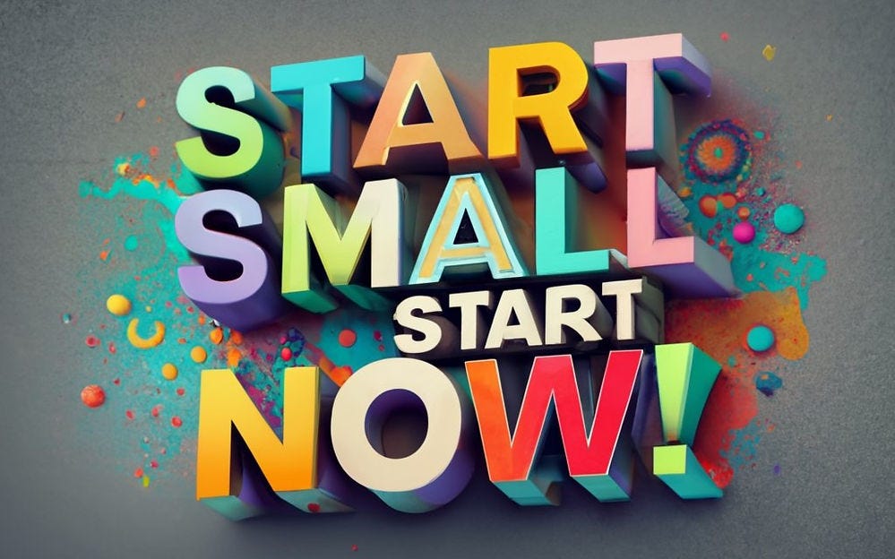
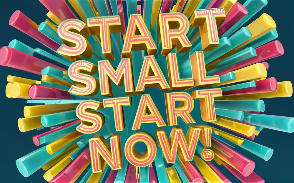
Here are v. 0.1 and 0.2 attempts to render my current favorite slogan for encouraging UX professionals to stop procrastinating and start experimenting with the use of AI in UX. Amir Ansari commented on one of my LinkedIn postings about AI tools for various steps of the UX process that one of the biggest barriers to adaptation is people having “fear of the unknown.” I’m sure he’s right, and my answer is that the best way to change the unknown to something known is to try out a small AI project with low risk — i.e., not something you ship to customers or clients! My slogan comes in handy in this situation. (See also article Getting Started with AI for UX.)
Ideogram version 0.1.
Ideogram version 0.2. More complex graphics, but I am not sure I like it better than the v.0.1 image.
UX Angst
You think UX is tanking? Think again. The UX sky’s not falling; it’s reshaping. AI integration will facilitate a UX renaissance, while the profession’s rapid growth shows enduring viability. Old timers, stop lamenting. Newbies, gear up for a killer decade in UX.
The full article has much more detail, but here’s an infographic with a summary:
Feel free to copy or reuse this infographic, provided you give this URL as the source: https://jakobnielsenphd.substack.com/p/ux-angst-of-2023
About the Author
Jakob Nielsen, Ph.D., is a usability pioneer with 40 years experience in UX and the Founder of UX Tigers. He founded the discount usability movement for fast and cheap iterative design, including heuristic evaluation and the 10 usability heuristics. He formulated the eponymous Jakob’s Law of the Internet User Experience. Named “the king of usability” by Internet Magazine, “the guru of Web page usability” by The New York Times, and “the next best thing to a true time machine” by USA Today. Previously, Dr. Nielsen was a Sun Microsystems Distinguished Engineer and a Member of Research Staff at Bell Communications Research, the branch of Bell Labs owned by the Regional Bell Operating Companies. He is the author of 8 books, including the best-selling Designing Web Usability: The Practice of Simplicity (published in 22 languages), Usability Engineering (26,390 citations in Google Scholar), and the pioneering Hypertext and Hypermedia (published two years before the Web launched). Dr. Nielsen holds 79 United States patents, mainly on making the Internet easier to use. He received the Lifetime Achievement Award for Human–Computer Interaction Practice from ACM SIGCHI.
· Subscribe to Jakob’s newsletter to get the full text of new articles emailed to you as soon as they are published.


