UX Roundup: Size Matters | AI-UX Job Opening | New Midjourney App | Urgency for UX in AI | Eye Contact
Summary: Visualize the size of objects on ecommerce product pages | Job Openings: UX Research Generative AI @ Microsoft | Midjourney’s soon-to-come new app is in Alpha release: watch the video | UX must urgently embrace AI | ChatGPT getting lazy | AI causes drop in search traffic | Maintaining eye contact in video meetings
UX Roundup for December 18, 2023. Merry Christmas from all of us here at UX Tigers. (“All of us” just being Jakob.) Even if you don’t celebrate Christmas, I hope you have a happy and peaceful last few days of the year.
Visualize the Size of Objects on Ecommerce Product Pages
Two old sayings combine for today’s design guideline:
Size Matters.
Show, Don’t Tell.
When shopping online, users rely on the product photos to substitute for the hands-on experience of the physical product in in-person retail. The Baymard Institute recently published a nice list of UX guidelines for e-commerce product pages, one of which is the well-known (but often violated) idea of visualizing the size of objects by including an in-scale element in the picture. I experienced this guideline in action during my first e-commerce usability project in 1999, where users’ understanding of a bag was enhanced by an image showing the bag being carried by a person.
Image similar to the one that tested well in 1999, making it easy for users to estimate the size of a bag. (Midjourney.)
Don’t just show the product you’re selling. Show something with a known size together with the product to allow users to assess the size of the product at a glance. Humans are the measure of all things, according to Protagoras (485-415 BC), so including a person in the picture is often the best way to show users how big your product is. For smaller objects, maybe show a hand holding the product.
It’s not enough to state product dimensions in a list of specs. First, users sometimes overlook such details, but more importantly, most people are terrible at visualizing something concrete based on abstract data.
“I thought I was buying a chair for myself, not for my doll.” Sorry, lady, you should have patronized an ecommerce site with “in-scale” visualizations in the product photos. Ironically, my illustration would work as a product photo in this regard because it clearly shows the doll-sized scale of the chair. (Doll chair by Dall-E.)
Job Openings: UX Researcher / Research Manager for Generative AI @ Microsoft
The following may be the most important job openings I have seen this year, and since I doubt a lot of companies will post new jobs in the last two weeks of the year, they may just take the cake for all of 2023.
Principal UX Researcher at Microsoft for Copilot and Generative AI
Principal UX Research Manager at Microsoft for Copilot and Generative AI
If you want to shape the future of the world and help billions of people double their standard of living over the next 30 years, you need to work on the UX of AI. (See also my infographic below.) I have been hammering home that message for most of the year, ever since it became obvious that AI is the next revolution (and that AI is real, not hype).
Sadly, almost all of the big AI foundation projects blatantly ignore UX (and thus have no UX job openings), making opportunities thin on the ground for making that big impact I’m calling for.
Microsoft is an honorable exception, as we can see from these job postings. (Microsoft has also been publishing interesting research on the actual use of AI in companies, which is more proof of their commitment to shipping better AI, not just any AI.)
Hat tip to Penny Collisson (Director of Research for Copilot AI) for alerting me to these job opportunities.
Microsoft also has a job opening for a UX researcher for the Azure AI platform. This feels less important to me than making Copilot great: the difference between helping billions of normal users (Microsoft Office) and millions of geeks (Azure). Still worth doing, absolutely! And this additional job opening does confirm Microsoft’s status as the rare AI-focused company with a strong UX effort.
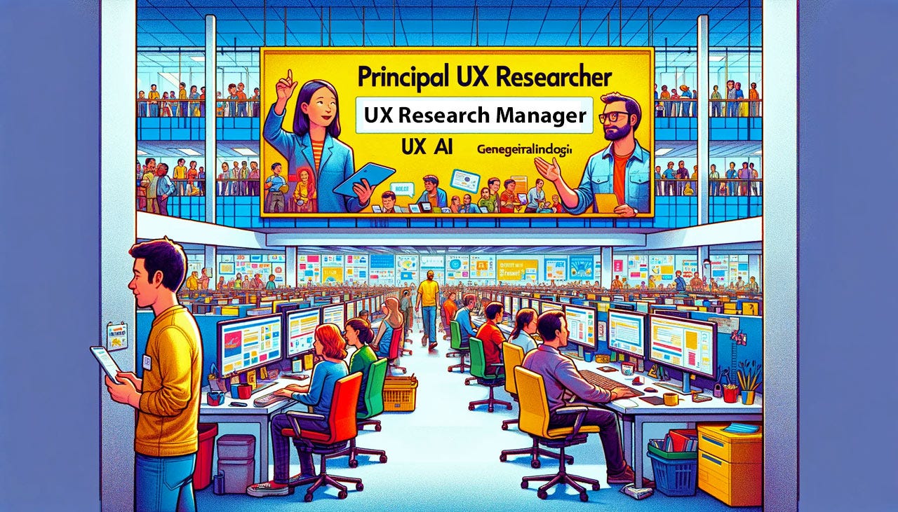
Dall-E’s interpretation of the Microsoft job openings for UX researchers and a research manager to work on UX for AI. One would almost think that Dall-E is jealous of Microsoft’s product getting a quality lift, because it depicts a rather nasty cubicle farm, which does not match the Microsoft campus. (It’s about 15 years since my last visit, but the Softies worked in nice offices back then.)
Here’s the interpretation from Microsoft Designer. A nicer work environment than what Dall-E depicted, but still not how it actually looks. And they can’t even spell their own name.
Midjourney’s interpretation of a Microsoft UXR group meeting. More like I envision the reality, except they all have Apple laptops. I’ll stop prompting now!
One More AI UX Job: Senior Designer at Runway
Runway is the leading company supporting generative AI for video: text to moving images. We know from services like YouTube how powerful it is to open up video creativity beyond the tired Hollywood firms and legacy movie stars. Runway will likely support the next expansion of creativity and even broader availability of niche video content, from B2B to individual users reminiscing about their grand aunt Margareth.
A further point in Runway’s favor is that it’s more or less the only one of the major AI platforms to have a true UX team in place.
Right now, Runway has a job opening for a Senior Product Designer. Check it out.
YouTube was just the first stage of democratizing video production. Runway and other video-creating generative AI are the second stage and will lead to an even bigger explosion in micro-targeted video publishing. (In a year or two, illustrations like this will be videos, at least in many other influencers’ newsletters. Being somewhat of a conservative usability guy, I might stick with still images, but we’ll see.) Picture by Dall-E.
Midjourney: New App Now in Alpha
This demo video of an alpha release of the forthcoming Midjourney app is worth watching for anybody frustrated by the terrible usability of its current UI. It's always hard to judge UX from demos, becuase the presenter knows exactly where to click and can always make it sound reasonable. That said, this does look like a massive step up. Maybe they had a UX intern work on the design for a week. (Given the immense amount of low-hanging fruit in the old design, it doesn't take much to make it better.)
I didn't see anything that I would classify as a "wow" moment, convincing me that they have made deep advances driven by more fundamental user research and design talent. Maybe for release 2.0 they can afford more than an intern.
Enough snark. This is a big win for users and for the company, so the sooner they ship, the better.
I am particularly happy that the app meets many of my criteria for a hybrid prompt-GUI interface for AI, as I have been calling for since June. I recommend that everybody upgrades to the new app as soon as it ships.
We need a hybrid UI for artificial intelligence, that combines text-based prompting with a graphical user interface with sliders, buttons, and other controls that users can click without having to remember obscure commands and even more obscure parameters (as in the current Midjourney UI). Luckily Midjourney is now moving in this recommended direction, as evidences by the Alpha release of their new app. (Dall-E.)
UX Must Urgently Embrace AI
I still see too much reluctance on the part of many UX professionals to go all-in with our AI future. Too much handwringing about possible downsides. Guess what, the downsides will be much worse without UX involvement than with UXers in the driver’s seat (or at least on the projects.) Since AI use improves productivity by anything from 33% to 66% or more, it’ll happen with or without you.
One of my first articles about the intersection of UX and AI was, UX Needs a Sense of Urgency About AI, which came out half a year ago. I still stand by this piece, and as a way of inducing you to get moving in the new year, here’s my infographic to summarize it:
Feel free to copy or reuse this infographic, provided you give this URL as the source: https://jakobnielsenphd.substack.com/p/ux-needs-a-sense-of-urgency-about
Lazy ChatGPT
In recent weeks, I have seen complaints that ChatGPT has become lazy. I can confirm this from my own experience. I used to be able to use a single prompt to generate 80 suggestions for brief bullet items with emojis to promote articles like this on LinkedIn. Now, ChatGPT just generates an initial set of 10 variations of the first item, but doesn’t give me the rest unless I repeatedly issue a prompt to “please continue with the next set of bullet items.”
Similarly, Dall-E (the image-generating part of ChatGPT) used to always produce 4 alternate images for every prompt. Now, it only gives me one, and it’s necessary to say, “please give me more images in a variety of different artistic styles.” Very annoying to experience this service decline, especially as a paid customer.
Without knowing why ChatGPT has turned lazy, my guess is that this is caused by scarce inference compute. We know that they stropped accepting new paid accounts for several weeks, which no self-respecting company would do unless they truly were unable to provide service.
ChatGPT is not working as hard as it used to. Leonardo.
AI Kills 20-40% of Search-Driven Traffic to News Sites
The Wall Street Journal reports that moving from search to AI-driven question-answering causes a drop of 20-40% in the traffic publishers used to get from search engines. (Link requires subscription!)
This is based on pilot data from the roughly 10 million users currently testing Google’s “Search Generative Experience.” WSJ furthermore reports that Google used to drive 40% of the traffic to news sites.
Taking the middle of the estimate of a 20-40% drop gives us a 30% median estimate for lost search engine traffic. I think this is likely a severe underestimate of the long-term effect of users moving from search engines to AI for getting their questions answered. We know from studies by Microsoft and in Hong Kong that AI is 112%-158% faster at answering questions than traditional search, so most users will be moving from search to AI over the next few years, especially as AI is only going to get better.
But let’s take the conservative estimate of the WSJ survey of news publishers. 40% of traffic used to come from search, and 30% of that traffic will be lost. These two percentages multiply to an estimate that websites will lose 12% of their current traffic by the change from search to AI for answering user questions. I think 25% traffic loss is a more likely estimate of the effect 5 years from now.
📉 Start planning now to lose 25% of your traffic 📉
What to do? I wrote an entire article about this a month ago: Website Survival Without SEO in the Age of AI.
Our new AI overlords will kill 25% of traffic for most websites. That’s the problem when sites rely on overlords in the first place: websites used to be thrown some crumbs from the search engines that scooped up an undue percentage of the value created by content providers. Now that users will turn from search to AI to get their questions answered, these crumbs become dust. At least Google will still throw websites a handful of dust, but it behooves website owners to change strategy to create tighter relationships with their users. (AI Overlord by Dall-E).
Maintaining Eye Contact in Video Meetings
NVIDIA has released an AI-driven feature to modify live video to make it seem like you are looking into the camera and thus maintaining eye contact with the audience (even though you’re actually looking at the person you’re talking to, who is typically in the middle of your computer screen). The demo is a little creepy: the speaker has a stiff, unceasingly direct stare.
But we really do need this eye-contact feature in Zoom, Teams, etc. It is alienating when people don’t look at each other when they’re talking, but that’s what the current technology enforces. And when doing public speaking through videoconferencing, it’s unpleasant and alienating to keep speaking to the camera instead of the audience.
When I posted a recommendation of this feature to my LinkedIn feed, one reader comment complained about “outsourcing interpersonal skills” to AI.
I don’t think looking into the camera instead of looking at the person you are talking to is an “interpersonal skill.” It’s a workaround for bad technology, and as a UX guy, I’m fully on board with fixing the tech to be more humane: my most fundamental ideology is that technology must adopt to human needs, people shouldn't have to change to serve technology. Yes, this means “faking” your outgoing video stream to the extent that it will no longer be the exact pixels recorded by the camera. But it will reflect the human truth that I am indeed looking at you while talking with you.
This is thus a great example that the worries about false AI videos need to be adjusted for the actual human experience. Yes, the so-called “deepfakes” will likely mostly be unethical or illegal most. But maybe we need another word for shallowfaking videos in a benign manner that stay true to the user’s intent, even while modifying some pixels.
Eye contact is important for human communication. Technology currently impedes this basic human need, making video meetings feel alienating because the camera is not in the same spot as the person you are talking to. More technology can fix the problem. (Dall E.)
Unwrapping AI: A UX Perspective
A one-hour webinar this Wednesday, December 20 at 8am USA Pacific time = 11am Eastern time = 4pm London time = 5pm Berlin time. A discussion between Sarah Gibbons and Kate Moran. They are the top two talents I know, in UX design and user research, respectively. Either one is worth a listen, so the two together should be very exciting.
Free, but advance registration required.
What’s inside the box? Find out Wednesday as the dynamic GibMo duo unwraps it live. (Midjourney)
About the Author
Jakob Nielsen, Ph.D., is a usability pioneer with 40 years experience in UX and the Founder of UX Tigers. He founded the discount usability movement for fast and cheap iterative design, including heuristic evaluation and the 10 usability heuristics. He formulated the eponymous Jakob’s Law of the Internet User Experience. Named “the king of usability” by Internet Magazine, “the guru of Web page usability” by The New York Times, and “the next best thing to a true time machine” by USA Today. Previously, Dr. Nielsen was a Sun Microsystems Distinguished Engineer and a Member of Research Staff at Bell Communications Research, the branch of Bell Labs owned by the Regional Bell Operating Companies. He is the author of 8 books, including the best-selling Designing Web Usability: The Practice of Simplicity (published in 22 languages), Usability Engineering (26,460 citations in Google Scholar), and the pioneering Hypertext and Hypermedia (published two years before the Web launched). Dr. Nielsen holds 79 United States patents, mainly on making the Internet easier to use. He received the Lifetime Achievement Award for Human–Computer Interaction Practice from ACM SIGCHI.
· Subscribe to Jakob’s newsletter to get the full text of new articles emailed to you as soon as they are published.


